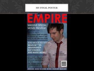
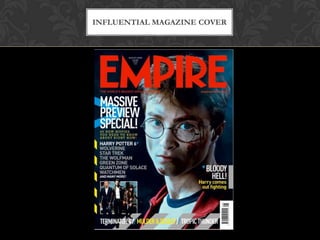
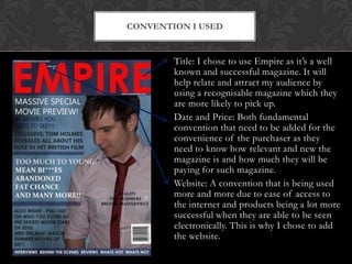
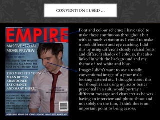
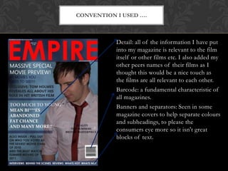
The document discusses the conventions used in designing a magazine cover for a class project. It describes using the recognizable magazine title "Empire" to attract an audience. Date and price are included as they are fundamental for consumers. The website is added to increase accessibility. Fonts and colors are varied throughout to make the cover eye-catching while maintaining continuity. An actor is featured in a suit rather than looking disheveled to portray a different message. Details included relate to the film and other student films. A barcode and banners/separators are used to break up blocks of text as seen in other magazines.
