Download to read offline

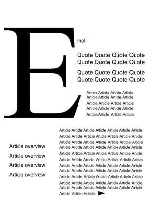

The document provides details on the layout and design choices for a magazine cover and contents page. It discusses using a color palette of red, white, black and gold. Images will be relaxed in tone to create a calm atmosphere for readers. Larger, closer images will be used on the contents page for impact. A gold color will be used for the double page spread to match the images, going against the main color scheme. Font and image placement were considered carefully to guide the reader's eye through the pages.


