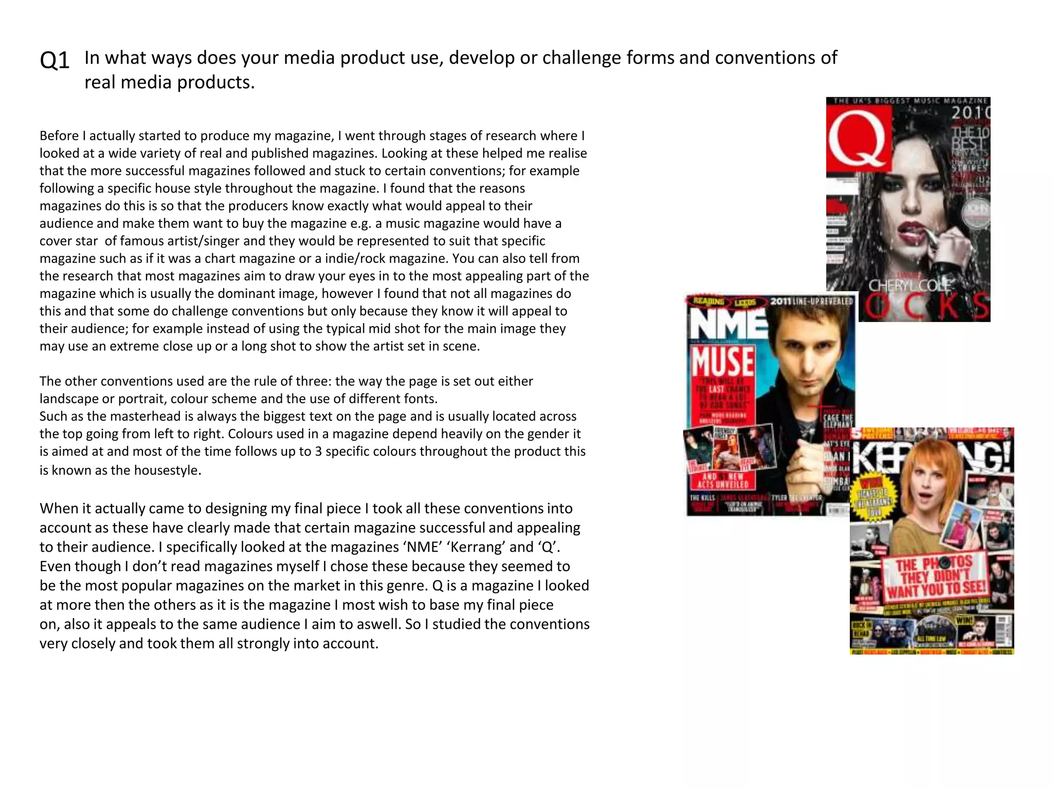
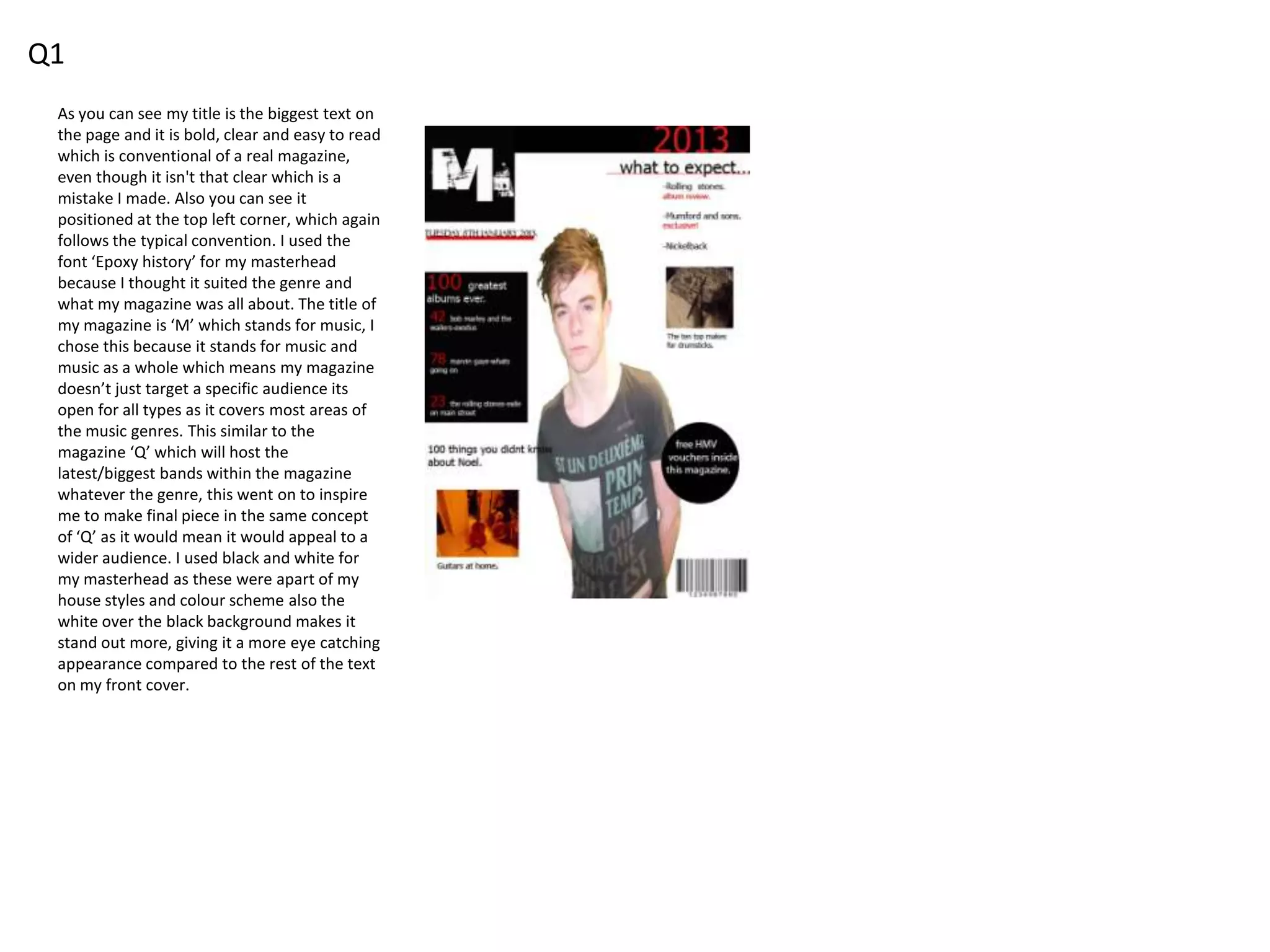
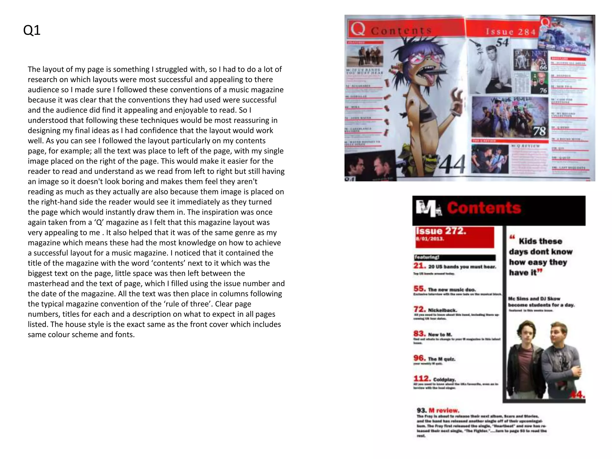
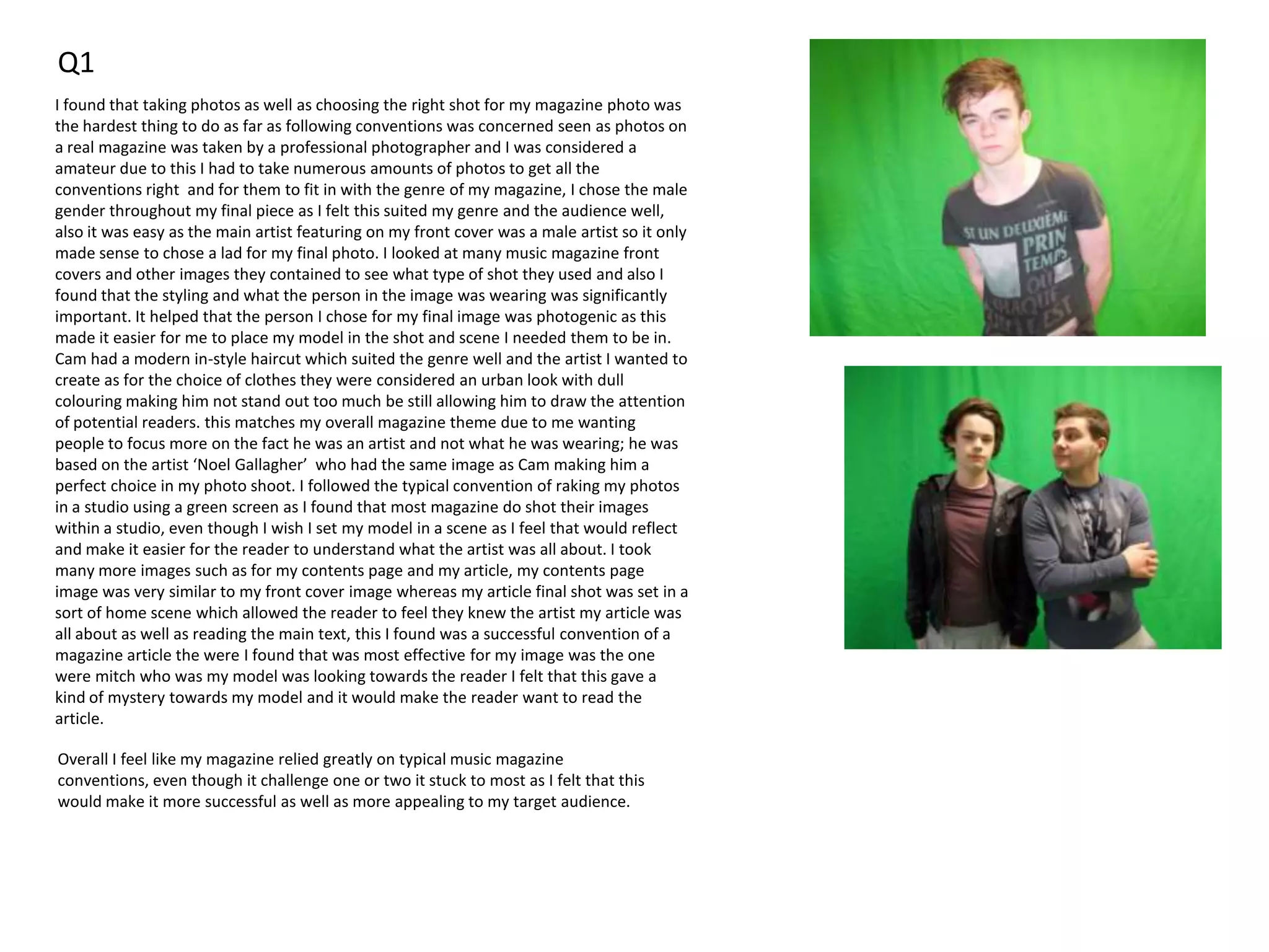
Q1 In what ways does your media product use, develop or challenge forms and conventions of
real media products.
Before I actually started to produce my magazine, I went through stages of research where I
looked at a wide variety of real and published magazines. Looking at these helped me realise
that the more successful magazines followed and stuck to certain conventions; for example
following a specific house style throughout the magazine. I found that the reasons
magazines do this is so that the producers know exactly what would appeal to their
audience and make them want to buy the magazine e.g. a music magazine would have a
cover star of famous artist/singer and they would be represented to suit that specific
magazine such as if it was a chart magazine or a indie/rock magazine. You can also tell from
the research that most magazines aim to draw your eyes in to the most appealing part of the
magazine which is usually the dominant image, however I found that not all magazines do
this and that some do challenge conventions but only because they know it will appeal to
their audience; for example instead of using the typical mid shot for the main image they
may use an extreme close up or a long shot to show the artist set in scene.
The other conventions used are the rule of three: the way the page is set out either
landscape or portrait, colour scheme and the use of different fonts.
Such as the masterhead is always the biggest text on the page and is usually located across
the top going from left to right. Colours used in a magazine depend heavily on the gender it
is aimed at and most of the time follows up to 3 specific colours throughout the product this
is known as the housestyle.
When it actually came to designing my final piece I took all these conventions into
account as these have clearly made that certain magazine successful and appealing
to their audience. I specifically looked at the magazines ‘NME’ ‘Kerrang’ and ‘Q’.
Even though I don’t read magazines myself I chose these because they seemed to
be the most popular magazines on the market in this genre. Q is a magazine I looked
at more then the others as it is the magazine I most wish to base my final piece
on, also it appeals to the same audience I aim to aswell. So I studied the conventions
very closely and took them all strongly into account.
Q1
As you can see my title is the biggest text on
the page and it is bold, clear and easy to read
which is conventional of a real magazine,
even though it isn't that clear which is a
mistake I made. Also you can see it
positioned at the top left corner, which again
follows the typical convention. I used the
font ‘Epoxy history’ for my masterhead
because I thought it suited the genre and
what my magazine was all about. The title of
my magazine is ‘M’ which stands for music, I
chose this because it stands for music and
music as a whole which means my magazine
doesn’t just target a specific audience its
open for all types as it covers most areas of
the music genres. This similar to the
magazine ‘Q’ which will host the
latest/biggest bands within the magazine
whatever the genre, this went on to inspire
me to make final piece in the same concept
of ‘Q’ as it would mean it would appeal to a
wider audience. I used black and white for
my masterhead as these were apart of my
house styles and colour scheme also the
white over the black background makes it
stand out more, giving it a more eye catching
appearance compared to the rest of the text
on my front cover.
Q1
The layout of my page is something I struggled with, so I had to do a lot of
research on which layouts were most successful and appealing to there
audience so I made sure I followed these conventions of a music magazine
because it was clear that the conventions they had used were successful
and the audience did find it appealing and enjoyable to read. So I
understood that following these techniques would be most reassuring in
designing my final ideas as I had confidence that the layout would work
well. As you can see I followed the layout particularly on my contents
page, for example; all the text was place to left of the page, with my single
image placed on the right of the page. This would make it easier for the
reader to read and understand as we read from left to right but still having
an image so it doesn't look boring and makes them feel they aren't
reading as much as they actually are also because them image is placed on
the right-hand side the reader would see it immediately as they turned
the page which would instantly draw them in. The inspiration was once
again taken from a ‘Q’ magazine as I felt that this magazine layout was
very appealing to me . It also helped that it was of the same genre as my
magazine which means these had the most knowledge on how to achieve
a successful layout for a music magazine. I noticed that it contained the
title of the magazine with the word ‘contents’ next to it which was the
biggest text on the page, little space was then left between the
masterhead and the text of page, which I filled using the issue number and
the date of the magazine. All the text was then place in columns following
the typical magazine convention of the ‘rule of three’. Clear page
numbers, titles for each and a description on what to expect in all pages
listed. The house style is the exact same as the front cover which includes
same colour scheme and fonts.
Q1
I found that taking photos as well as choosing the right shot for my magazine photo was
the hardest thing to do as far as following conventions was concerned seen as photos on
a real magazine was taken by a professional photographer and I was considered a
amateur due to this I had to take numerous amounts of photos to get all the
conventions right and for them to fit in with the genre of my magazine, I chose the male
gender throughout my final piece as I felt this suited my genre and the audience well,
also it was easy as the main artist featuring on my front cover was a male artist so it only
made sense to chose a lad for my final photo. I looked at many music magazine front
covers and other images they contained to see what type of shot they used and also I
found that the styling and what the person in the image was wearing was significantly
important. It helped that the person I chose for my final image was photogenic as this
made it easier for me to place my model in the shot and scene I needed them to be in.
Cam had a modern in-style haircut which suited the genre well and the artist I wanted to
create as for the choice of clothes they were considered an urban look with dull
colouring making him not stand out too much be still allowing him to draw the attention
of potential readers. this matches my overall magazine theme due to me wanting
people to focus more on the fact he was an artist and not what he was wearing; he was
based on the artist ‘Noel Gallagher’ who had the same image as Cam making him a
perfect choice in my photo shoot. I followed the typical convention of raking my photos
in a studio using a green screen as I found that most magazine do shot their images
within a studio, even though I wish I set my model in a scene as I feel that would reflect
and make it easier for the reader to understand what the artist was all about. I took
many more images such as for my contents page and my article, my contents page
image was very similar to my front cover image whereas my article final shot was set in a
sort of home scene which allowed the reader to feel they knew the artist my article was
all about as well as reading the main text, this I found was a successful convention of a
magazine article the were I found that was most effective for my image was the one
were mitch who was my model was looking towards the reader I felt that this gave a
kind of mystery towards my model and it would make the reader want to read the
article.
Overall I feel like my magazine relied greatly on typical music magazine
conventions, even though it challenge one or two it stuck to most as I felt that this
would make it more successful as well as more appealing to my target audience.

Evaluation q1

  • 1.
    Q1 In whatways does your media product use, develop or challenge forms and conventions of real media products. Before I actually started to produce my magazine, I went through stages of research where I looked at a wide variety of real and published magazines. Looking at these helped me realise that the more successful magazines followed and stuck to certain conventions; for example following a specific house style throughout the magazine. I found that the reasons magazines do this is so that the producers know exactly what would appeal to their audience and make them want to buy the magazine e.g. a music magazine would have a cover star of famous artist/singer and they would be represented to suit that specific magazine such as if it was a chart magazine or a indie/rock magazine. You can also tell from the research that most magazines aim to draw your eyes in to the most appealing part of the magazine which is usually the dominant image, however I found that not all magazines do this and that some do challenge conventions but only because they know it will appeal to their audience; for example instead of using the typical mid shot for the main image they may use an extreme close up or a long shot to show the artist set in scene. The other conventions used are the rule of three: the way the page is set out either landscape or portrait, colour scheme and the use of different fonts. Such as the masterhead is always the biggest text on the page and is usually located across the top going from left to right. Colours used in a magazine depend heavily on the gender it is aimed at and most of the time follows up to 3 specific colours throughout the product this is known as the housestyle. When it actually came to designing my final piece I took all these conventions into account as these have clearly made that certain magazine successful and appealing to their audience. I specifically looked at the magazines ‘NME’ ‘Kerrang’ and ‘Q’. Even though I don’t read magazines myself I chose these because they seemed to be the most popular magazines on the market in this genre. Q is a magazine I looked at more then the others as it is the magazine I most wish to base my final piece on, also it appeals to the same audience I aim to aswell. So I studied the conventions very closely and took them all strongly into account.
  • 2.
    Q1 As you cansee my title is the biggest text on the page and it is bold, clear and easy to read which is conventional of a real magazine, even though it isn't that clear which is a mistake I made. Also you can see it positioned at the top left corner, which again follows the typical convention. I used the font ‘Epoxy history’ for my masterhead because I thought it suited the genre and what my magazine was all about. The title of my magazine is ‘M’ which stands for music, I chose this because it stands for music and music as a whole which means my magazine doesn’t just target a specific audience its open for all types as it covers most areas of the music genres. This similar to the magazine ‘Q’ which will host the latest/biggest bands within the magazine whatever the genre, this went on to inspire me to make final piece in the same concept of ‘Q’ as it would mean it would appeal to a wider audience. I used black and white for my masterhead as these were apart of my house styles and colour scheme also the white over the black background makes it stand out more, giving it a more eye catching appearance compared to the rest of the text on my front cover.
  • 3.
    Q1 The layout ofmy page is something I struggled with, so I had to do a lot of research on which layouts were most successful and appealing to there audience so I made sure I followed these conventions of a music magazine because it was clear that the conventions they had used were successful and the audience did find it appealing and enjoyable to read. So I understood that following these techniques would be most reassuring in designing my final ideas as I had confidence that the layout would work well. As you can see I followed the layout particularly on my contents page, for example; all the text was place to left of the page, with my single image placed on the right of the page. This would make it easier for the reader to read and understand as we read from left to right but still having an image so it doesn't look boring and makes them feel they aren't reading as much as they actually are also because them image is placed on the right-hand side the reader would see it immediately as they turned the page which would instantly draw them in. The inspiration was once again taken from a ‘Q’ magazine as I felt that this magazine layout was very appealing to me . It also helped that it was of the same genre as my magazine which means these had the most knowledge on how to achieve a successful layout for a music magazine. I noticed that it contained the title of the magazine with the word ‘contents’ next to it which was the biggest text on the page, little space was then left between the masterhead and the text of page, which I filled using the issue number and the date of the magazine. All the text was then place in columns following the typical magazine convention of the ‘rule of three’. Clear page numbers, titles for each and a description on what to expect in all pages listed. The house style is the exact same as the front cover which includes same colour scheme and fonts.
  • 4.
    Q1 I found thattaking photos as well as choosing the right shot for my magazine photo was the hardest thing to do as far as following conventions was concerned seen as photos on a real magazine was taken by a professional photographer and I was considered a amateur due to this I had to take numerous amounts of photos to get all the conventions right and for them to fit in with the genre of my magazine, I chose the male gender throughout my final piece as I felt this suited my genre and the audience well, also it was easy as the main artist featuring on my front cover was a male artist so it only made sense to chose a lad for my final photo. I looked at many music magazine front covers and other images they contained to see what type of shot they used and also I found that the styling and what the person in the image was wearing was significantly important. It helped that the person I chose for my final image was photogenic as this made it easier for me to place my model in the shot and scene I needed them to be in. Cam had a modern in-style haircut which suited the genre well and the artist I wanted to create as for the choice of clothes they were considered an urban look with dull colouring making him not stand out too much be still allowing him to draw the attention of potential readers. this matches my overall magazine theme due to me wanting people to focus more on the fact he was an artist and not what he was wearing; he was based on the artist ‘Noel Gallagher’ who had the same image as Cam making him a perfect choice in my photo shoot. I followed the typical convention of raking my photos in a studio using a green screen as I found that most magazine do shot their images within a studio, even though I wish I set my model in a scene as I feel that would reflect and make it easier for the reader to understand what the artist was all about. I took many more images such as for my contents page and my article, my contents page image was very similar to my front cover image whereas my article final shot was set in a sort of home scene which allowed the reader to feel they knew the artist my article was all about as well as reading the main text, this I found was a successful convention of a magazine article the were I found that was most effective for my image was the one were mitch who was my model was looking towards the reader I felt that this gave a kind of mystery towards my model and it would make the reader want to read the article. Overall I feel like my magazine relied greatly on typical music magazine conventions, even though it challenge one or two it stuck to most as I felt that this would make it more successful as well as more appealing to my target audience.