Question 1 Part 2 – In what
ways does your media product
use, develop or challenge
forms and conventions of real
media products?
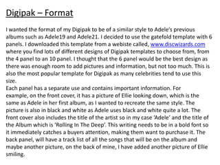
Digipak – Format
I wanted the format of my Digipak to be of a similar style to Adele’s previous
albums such as Adele19 and Adele21. I decided to use the gatefold template with 6
panels. I downloaded this template from a webiste called, www.discwizards.com
where you find lots of different designs of Digipak templates to choose from, from
the 4 panel to an 10 panel. I thought that the 6 panel would be the best design as
there was enough room to add pictures and information, but not too much. This is
also the most popular template for Digipak as many celebrities tend to use this
size.
Each panel has a separate use and contains important information. For
example, on the front cover, it has a picture of Ellie looking down, which is the
same as Adele in her first album, as I wanted to recreate the same style. The
picture is also in black and white as Adele uses black and white quite a lot. The
front cover also includes the title of the artist so in my case ‘Adele’ and the title of
the Album which is ‘Rolling In The Deep’. This writing needs to be in a bold font so
it immediately catches a buyers attention, making them want to purchase it. The
back panel, will have a track list of all the songs that will be on the album and
maybe another picture, on the back of mine, I have added another picture of Ellie
smiling.
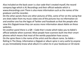
Also included on the back cover is a bar code that I created myself, the record
company logo which is XL Recordings and their official website which is
www.xlrecordings.com There is also more information such as the names of the
producer and the recorder.
On the other panels there are other pictures of Ellie, some of her on the swing that
are shots taken from my music video one of the pictures has no information on
and another one has the logos of Twitter and Facebook so that the people who
view this Digipak know they can access more information about Adele on these
websites.
On another panel there is a QR – Code that I create which takes you to Adele’s
official website when scanned. Most people have scanners built into their smart
phones which means that most of the worlds population have access.
On the spine there is the name of the artist and the album name. So Adele –
Rolling In The Deep. Information a Digipak or album spine is very useful to anyone
as you Immediately know what album it is when its in your bookcase or CD stand.
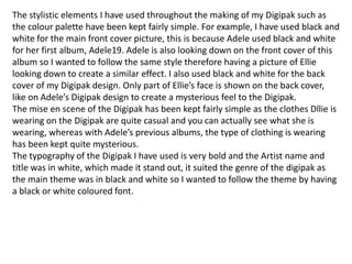
The stylistic elements I have used throughout the making of my Digipak such as
the colour palette have been kept fairly simple. For example, I have used black and
white for the main front cover picture, this is because Adele used black and white
for her first album, Adele19. Adele is also looking down on the front cover of this
album so I wanted to follow the same style therefore having a picture of Ellie
looking down to create a similar effect. I also used black and white for the back
cover of my Digipak design. Only part of Ellie’s face is shown on the back cover,
like on Adele’s Digipak design to create a mysterious feel to the Digipak.
The mise en scene of the Digipak has been kept fairly simple as the clothes Dllie is
wearing on the Digipak are quite casual and you can actually see what she is
wearing, whereas with Adele’s previous albums, the type of clothing is wearing
has been kept quite mysterious.
The typography of the Digipak I have used is very bold and the Artist name and
title was in white, which made it stand out, it suited the genre of the digipak as
the main theme was in black and white so I wanted to follow the theme by having
a black or white coloured font.
Magazine Advert

The mise en scene for the advert was similar to the style. For example I used the
same image that was used for the Digipak because the advert and the Digipak
itself need to link together in some way so that the audience and buyers know
what to expect when the album itself is released.
I have done the same for the typography I used the same font type and colour. I
also used a different colour for some other information to make the advert look
more appealing.

Other information I used for the advert where titles of other songs that will be
included on the Digipak. Social networking symbols such as the Facebook and
Twitter logos as most people have an account for at least one of these websites. I
have also included Adele’s official website so people can find out more
information.

Question1

  • 1.
    Question 1 Part2 – In what ways does your media product use, develop or challenge forms and conventions of real media products?
  • 2.
    Digipak – Format Iwanted the format of my Digipak to be of a similar style to Adele’s previous albums such as Adele19 and Adele21. I decided to use the gatefold template with 6 panels. I downloaded this template from a webiste called, www.discwizards.com where you find lots of different designs of Digipak templates to choose from, from the 4 panel to an 10 panel. I thought that the 6 panel would be the best design as there was enough room to add pictures and information, but not too much. This is also the most popular template for Digipak as many celebrities tend to use this size. Each panel has a separate use and contains important information. For example, on the front cover, it has a picture of Ellie looking down, which is the same as Adele in her first album, as I wanted to recreate the same style. The picture is also in black and white as Adele uses black and white quite a lot. The front cover also includes the title of the artist so in my case ‘Adele’ and the title of the Album which is ‘Rolling In The Deep’. This writing needs to be in a bold font so it immediately catches a buyers attention, making them want to purchase it. The back panel, will have a track list of all the songs that will be on the album and maybe another picture, on the back of mine, I have added another picture of Ellie smiling.
  • 3.
    Also included onthe back cover is a bar code that I created myself, the record company logo which is XL Recordings and their official website which is www.xlrecordings.com There is also more information such as the names of the producer and the recorder. On the other panels there are other pictures of Ellie, some of her on the swing that are shots taken from my music video one of the pictures has no information on and another one has the logos of Twitter and Facebook so that the people who view this Digipak know they can access more information about Adele on these websites. On another panel there is a QR – Code that I create which takes you to Adele’s official website when scanned. Most people have scanners built into their smart phones which means that most of the worlds population have access. On the spine there is the name of the artist and the album name. So Adele – Rolling In The Deep. Information a Digipak or album spine is very useful to anyone as you Immediately know what album it is when its in your bookcase or CD stand.
  • 4.
    The stylistic elementsI have used throughout the making of my Digipak such as the colour palette have been kept fairly simple. For example, I have used black and white for the main front cover picture, this is because Adele used black and white for her first album, Adele19. Adele is also looking down on the front cover of this album so I wanted to follow the same style therefore having a picture of Ellie looking down to create a similar effect. I also used black and white for the back cover of my Digipak design. Only part of Ellie’s face is shown on the back cover, like on Adele’s Digipak design to create a mysterious feel to the Digipak. The mise en scene of the Digipak has been kept fairly simple as the clothes Dllie is wearing on the Digipak are quite casual and you can actually see what she is wearing, whereas with Adele’s previous albums, the type of clothing is wearing has been kept quite mysterious. The typography of the Digipak I have used is very bold and the Artist name and title was in white, which made it stand out, it suited the genre of the digipak as the main theme was in black and white so I wanted to follow the theme by having a black or white coloured font.
  • 5.
    Magazine Advert The miseen scene for the advert was similar to the style. For example I used the same image that was used for the Digipak because the advert and the Digipak itself need to link together in some way so that the audience and buyers know what to expect when the album itself is released. I have done the same for the typography I used the same font type and colour. I also used a different colour for some other information to make the advert look more appealing. Other information I used for the advert where titles of other songs that will be included on the Digipak. Social networking symbols such as the Facebook and Twitter logos as most people have an account for at least one of these websites. I have also included Adele’s official website so people can find out more information.