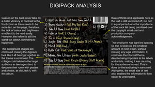
DIGIPACK ANALYSIS
The album cover is simple in terms of
what is on it. However, it looks busy
because of all the imagery and colour.
The Jack U logo is seen in the central
third of the album front cover. The bright
yellow makes it stand out against the
busy background and as it is bold, it
makes it eye catching and easy to see.
The colour has connotations of
happiness and youthfulness, relating to
the EDM genre as listeners gain
happiness from the music, and tend to
be a younger audience of teens and
young adults. It would be the first thing
audiences are drawn to due to the size
of the logo as well, as it covers almost
the whole front cover. This makes the
logo memorable and will stick with
people due the vibrancy.
The logo could be seen either as a
smiling face, connoting to positivity
within the genre as the audience would
gain positive feelings from listening to
EDM. However, it could also be seen as
the two artist’s heads as the dots and
them being connected through the music
due to the album being a collaboration
between Skrillex and Diplo. Therefore, it
could also connote to cohesion and how
the genre brings people together. The
repeated use of the logo in Jack U’s
work, such as their music videos, would
result in the logo being easily noticed, so
audiences would immediately know that
the album belonged to them. It’s in sans
serif, connoting to informality and the
target audience. The font is like it’s been
handwritten due to the indents in the
‘eyes’ of the U symbol, relating to
creativity and it appears hand made,
along with the cut and stick style
background.
DIGIPACK ANALYSIS
The ‘Mad Decent’ record label is seen
in the top right third of the front cover,
as well as the ‘Owlas’ label in the left
upper corner. This is so that the labels
get the recognition they deserve and
to show how well produced the album
is as they are recognisable labels so if
the audience knows of any other
artists with the same producers, they
can judge for themselves if it is worth
the purchase or not. It also infers to
the audience what genre of music to
expect if they couldn’t already tell.
There is also a parental advisory sticker
in the bottom left third, indicating the
content of the album isn’t appropriate for
younger people due to it containing
adult themes or explicit language. This
suggests that EDM as a genre isn’t for
everyone, highlighting the audience of
young adults as being the main focus as
the content within this album is most
closely related to people of that age.
This would attract the target audience
due to their interests typically being
seen as risky, such as graffiti or other
anti social related activities.
DIGIPACK ANALYSIS
The background takes on a collage
style, where a lot of images are used of
the artists as they’ve grown up. They
chose to put their own personal stamp
on the front cover so that audiences
can relate as they are shown as normal
people who have their own everyday
lives, yet still significant as they make
music and perform, relating to Dyer’s
Paradox of the Star theory. The collage
effect also shows how busy they’ve
been and how hard they’ve worked as it
shows many different stages of their
lives. Alternatively, it could connote to
their music being EDM, as many
elements of the genre seem busy and
upbeat, like the background. The
images also include many other people
too, implying that the EDM genre is
worldwide and positively impacts lives
of all kinds of people.
The collage of images behind the logo
have been darkened as well as edited so
that they’re less saturated, or some have
been filtered in black and white, giving an
old vibe to them. This means the
audience can infer that they’ve been
taken over time as they look rustic and
vintage. The use of editing for these
images also helps the logo to be seen
even more so, as it is very bright with the
yellow colour, compared to the duller
background. Therefore, despite the
background being busy, everything can
still be separated easily.
DIGIPACK ANALYSIS
The CD has a very simple design yet
still links in with the rest of the
digipack visually, due to the use of
colour. The bright yellow is the main
colour used and has reversed the logo
to being black, whereas on the front
cover, it was yellow. The colours used
are very noticeable against each other
and connote to light and dark, relating
to a concert environment, where EDM
fans would be in a dark place and the
strobe lights would bring colour to the
setting.
The signature is not part of the
original design, as this was a signed
copy.
The trademark symbol is also
apparent as being part of the Jack U
logo as the artists’ use it in all of their
work and so want it to be just in use
for their branding. Therefore, Jack U
wanted to protect their branding from
other competition and stand out as
unique. The font of this follows the
same hand drawn style as the logo,
connoting to the hard work and
planning that Jack U had to go
through pre album release.
DIGIPACK ANALYSIS
The back cover is conventional due
to the track list being the main
focus. This is visible by the text
taking up the most amount of room,
as well as it being the largest text
on the page. Therefore, the
audience is drawn to this initially.
The track list is conventional as it’s
in chronological order, allowing for
easy navigation when the CD is in
use. The font of the track list is fluid
with the logo as they both take on a
handwritten style. The language
used is basic, however, certain
track names connote specifically to
the EDM genre, such as ‘Don’t Do
Drugs Just Take Some Jack U’,
implying fans of EDM tend to be
more lenient towards drug use than
other genres.
Brackets are seen as a way of
separating the number to the track
name which is also conventional.
Then, the features are in brackets,
as well as being yellow again,
further separating out the
information. The differing colour
choice means that the features
stand out slightly more, and as they
appear on all but one song, it means
the artists’ get recognition from Jack
U fans, benefiting both as the
audience would want to listen to
more songs by the features, or if
they recognise one, it increases
familiarity and attraction to the
album. They would then be more
inclined to purchase the album if
they see an artist featured, which
they already know of and like.
DIGIPACK ANALYSIS
The barcode appears on the top left
third of the digipack which is
unconventional as it tends to be at
the bottom. However, the placement
would be due to the corner looking
bare without it as the text doesn’t
stretch for the width of the album.
Therefore, it fills a gap and looks
more complete.
Underneath, the logos of the
production companies appear again,
giving them further recognition as
they had an important role in the
making of the album. These have all
been kept the same size, signifying
they are all equally important with
their involvement.
The logo is the main focus
throughout this digipack as it’s
visible within the track names
themselves, where ‘U’ is seen in
place of ‘you’. This is another
feature which the target audience
would find relatable due to the
ages being typically more involved
in text talk, so they can read this
and understand it better than
people in older generations.
There is small print at the bottom,
a conventional placement for
production credits and information
concerning copyright laws and
warnings. Although this is small,
as it is information that the
audience are least concerned
about, it’s still important to be
seen as it helps protect the work
of the artists’.
DIGIPACK ANALYSIS
Colours on the back cover take on
a duller vibrancy in contrast to the
front cover as there needs to be
more text on this page, therefore,
the lack of colour and brightness
enables it to be read easily.
However, the yellow is still the
stand out colour, connoting to
happiness.
The background images are
continued, making the digipack
look like it all belongs together as
the theme is continued. The
collage could relate to the target
audience as teenagers tend to
decorate their room with posters
and photos, as did Jack U with
this album.
Rule of thirds isn’t applicable here as
the text is still sectioned off, but not
in equal parts due to the importance
of the track list being prioritised over
the copyright small print and
production company
acknowledgement.
The small print has tight line spacing
so that is takes up the smallest
amount of room it can, without
missing any legal information. It
continues the informal theme,
despite being important to the labels
and artists, making it less daunting
for the audience to read. This is
done by the text being in sans serif.
Aiding this, the small size of text
also enables the information to look
easier to understand.
The advertisement for the
Jack U album is very plain
as it doesn’t give anything
away about the album
content, such as song
names. ‘New Album Out
Now’ is seen in the top right
of the poster. It’s written in
uppercase, connoting to
urgency so it catches the
audience’s attention as
they view it as important.
The language here is
simple as it gets to the
point. There is an element
of mystery too, intriguing
the audience due to the
lack of information
displayed.
The same background montage
has been used here to attract the
audience as there is a lot to look
at, meaning they’d be intrigued by
all the colours and shapes. It also
connotes to the EDM genre and
audience because of the themes
displayed within the imagery; a
gun sticker is shown, connoting to
violence which can be associated
with youths and recklessness.
Also, the images display the
artists wearing casual clothing,
another convention of EDM as
they like to be comfortable when
at concerts.
DIGIPACK ANALYSIS
The parental advisory symbol is shown here as well, acting as a warning to audiences that may be more easily offended and implying
that the target audience is of a mature age and therefore no younger than 16. The reason this is put in place is if the songs contain:
‘strong language or depictions of violence, sex, or substance abuse to such an extent as to merit parental notification’. Displaying this
is not a legal requirement, meaning they wanted to emphasise that it could be considered shocking to some listeners if they weren’t
made aware prior to the purchase of the album. They also intended to appeal to their target audience as much as they could.

Digipack analysis

  • 1.
    DIGIPACK ANALYSIS The albumcover is simple in terms of what is on it. However, it looks busy because of all the imagery and colour. The Jack U logo is seen in the central third of the album front cover. The bright yellow makes it stand out against the busy background and as it is bold, it makes it eye catching and easy to see. The colour has connotations of happiness and youthfulness, relating to the EDM genre as listeners gain happiness from the music, and tend to be a younger audience of teens and young adults. It would be the first thing audiences are drawn to due to the size of the logo as well, as it covers almost the whole front cover. This makes the logo memorable and will stick with people due the vibrancy. The logo could be seen either as a smiling face, connoting to positivity within the genre as the audience would gain positive feelings from listening to EDM. However, it could also be seen as the two artist’s heads as the dots and them being connected through the music due to the album being a collaboration between Skrillex and Diplo. Therefore, it could also connote to cohesion and how the genre brings people together. The repeated use of the logo in Jack U’s work, such as their music videos, would result in the logo being easily noticed, so audiences would immediately know that the album belonged to them. It’s in sans serif, connoting to informality and the target audience. The font is like it’s been handwritten due to the indents in the ‘eyes’ of the U symbol, relating to creativity and it appears hand made, along with the cut and stick style background.
  • 2.
    DIGIPACK ANALYSIS The ‘MadDecent’ record label is seen in the top right third of the front cover, as well as the ‘Owlas’ label in the left upper corner. This is so that the labels get the recognition they deserve and to show how well produced the album is as they are recognisable labels so if the audience knows of any other artists with the same producers, they can judge for themselves if it is worth the purchase or not. It also infers to the audience what genre of music to expect if they couldn’t already tell. There is also a parental advisory sticker in the bottom left third, indicating the content of the album isn’t appropriate for younger people due to it containing adult themes or explicit language. This suggests that EDM as a genre isn’t for everyone, highlighting the audience of young adults as being the main focus as the content within this album is most closely related to people of that age. This would attract the target audience due to their interests typically being seen as risky, such as graffiti or other anti social related activities.
  • 3.
    DIGIPACK ANALYSIS The backgroundtakes on a collage style, where a lot of images are used of the artists as they’ve grown up. They chose to put their own personal stamp on the front cover so that audiences can relate as they are shown as normal people who have their own everyday lives, yet still significant as they make music and perform, relating to Dyer’s Paradox of the Star theory. The collage effect also shows how busy they’ve been and how hard they’ve worked as it shows many different stages of their lives. Alternatively, it could connote to their music being EDM, as many elements of the genre seem busy and upbeat, like the background. The images also include many other people too, implying that the EDM genre is worldwide and positively impacts lives of all kinds of people. The collage of images behind the logo have been darkened as well as edited so that they’re less saturated, or some have been filtered in black and white, giving an old vibe to them. This means the audience can infer that they’ve been taken over time as they look rustic and vintage. The use of editing for these images also helps the logo to be seen even more so, as it is very bright with the yellow colour, compared to the duller background. Therefore, despite the background being busy, everything can still be separated easily.
  • 4.
    DIGIPACK ANALYSIS The CDhas a very simple design yet still links in with the rest of the digipack visually, due to the use of colour. The bright yellow is the main colour used and has reversed the logo to being black, whereas on the front cover, it was yellow. The colours used are very noticeable against each other and connote to light and dark, relating to a concert environment, where EDM fans would be in a dark place and the strobe lights would bring colour to the setting. The signature is not part of the original design, as this was a signed copy. The trademark symbol is also apparent as being part of the Jack U logo as the artists’ use it in all of their work and so want it to be just in use for their branding. Therefore, Jack U wanted to protect their branding from other competition and stand out as unique. The font of this follows the same hand drawn style as the logo, connoting to the hard work and planning that Jack U had to go through pre album release.
  • 5.
    DIGIPACK ANALYSIS The backcover is conventional due to the track list being the main focus. This is visible by the text taking up the most amount of room, as well as it being the largest text on the page. Therefore, the audience is drawn to this initially. The track list is conventional as it’s in chronological order, allowing for easy navigation when the CD is in use. The font of the track list is fluid with the logo as they both take on a handwritten style. The language used is basic, however, certain track names connote specifically to the EDM genre, such as ‘Don’t Do Drugs Just Take Some Jack U’, implying fans of EDM tend to be more lenient towards drug use than other genres. Brackets are seen as a way of separating the number to the track name which is also conventional. Then, the features are in brackets, as well as being yellow again, further separating out the information. The differing colour choice means that the features stand out slightly more, and as they appear on all but one song, it means the artists’ get recognition from Jack U fans, benefiting both as the audience would want to listen to more songs by the features, or if they recognise one, it increases familiarity and attraction to the album. They would then be more inclined to purchase the album if they see an artist featured, which they already know of and like.
  • 6.
    DIGIPACK ANALYSIS The barcodeappears on the top left third of the digipack which is unconventional as it tends to be at the bottom. However, the placement would be due to the corner looking bare without it as the text doesn’t stretch for the width of the album. Therefore, it fills a gap and looks more complete. Underneath, the logos of the production companies appear again, giving them further recognition as they had an important role in the making of the album. These have all been kept the same size, signifying they are all equally important with their involvement. The logo is the main focus throughout this digipack as it’s visible within the track names themselves, where ‘U’ is seen in place of ‘you’. This is another feature which the target audience would find relatable due to the ages being typically more involved in text talk, so they can read this and understand it better than people in older generations. There is small print at the bottom, a conventional placement for production credits and information concerning copyright laws and warnings. Although this is small, as it is information that the audience are least concerned about, it’s still important to be seen as it helps protect the work of the artists’.
  • 7.
    DIGIPACK ANALYSIS Colours onthe back cover take on a duller vibrancy in contrast to the front cover as there needs to be more text on this page, therefore, the lack of colour and brightness enables it to be read easily. However, the yellow is still the stand out colour, connoting to happiness. The background images are continued, making the digipack look like it all belongs together as the theme is continued. The collage could relate to the target audience as teenagers tend to decorate their room with posters and photos, as did Jack U with this album. Rule of thirds isn’t applicable here as the text is still sectioned off, but not in equal parts due to the importance of the track list being prioritised over the copyright small print and production company acknowledgement. The small print has tight line spacing so that is takes up the smallest amount of room it can, without missing any legal information. It continues the informal theme, despite being important to the labels and artists, making it less daunting for the audience to read. This is done by the text being in sans serif. Aiding this, the small size of text also enables the information to look easier to understand.
  • 8.
    The advertisement forthe Jack U album is very plain as it doesn’t give anything away about the album content, such as song names. ‘New Album Out Now’ is seen in the top right of the poster. It’s written in uppercase, connoting to urgency so it catches the audience’s attention as they view it as important. The language here is simple as it gets to the point. There is an element of mystery too, intriguing the audience due to the lack of information displayed. The same background montage has been used here to attract the audience as there is a lot to look at, meaning they’d be intrigued by all the colours and shapes. It also connotes to the EDM genre and audience because of the themes displayed within the imagery; a gun sticker is shown, connoting to violence which can be associated with youths and recklessness. Also, the images display the artists wearing casual clothing, another convention of EDM as they like to be comfortable when at concerts. DIGIPACK ANALYSIS The parental advisory symbol is shown here as well, acting as a warning to audiences that may be more easily offended and implying that the target audience is of a mature age and therefore no younger than 16. The reason this is put in place is if the songs contain: ‘strong language or depictions of violence, sex, or substance abuse to such an extent as to merit parental notification’. Displaying this is not a legal requirement, meaning they wanted to emphasise that it could be considered shocking to some listeners if they weren’t made aware prior to the purchase of the album. They also intended to appeal to their target audience as much as they could.