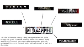
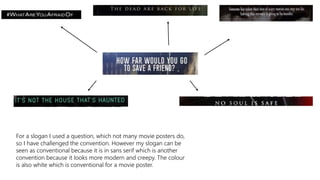
The document discusses conventions used in movie posters and magazine covers. Some key conventions mentioned include:
1) The movie title is always the largest text to clearly identify the film.
2) Movie posters often use white text/background for contrast and visibility.
3) Horror posters commonly feature close-up or mid-shot facial images to showcase expressions.
4) Magazines consistently place the masthead as the largest text for brand recognition.
5) Both use prominent central images and text to attract attention and promote featured films/stories.