PROXIMITY
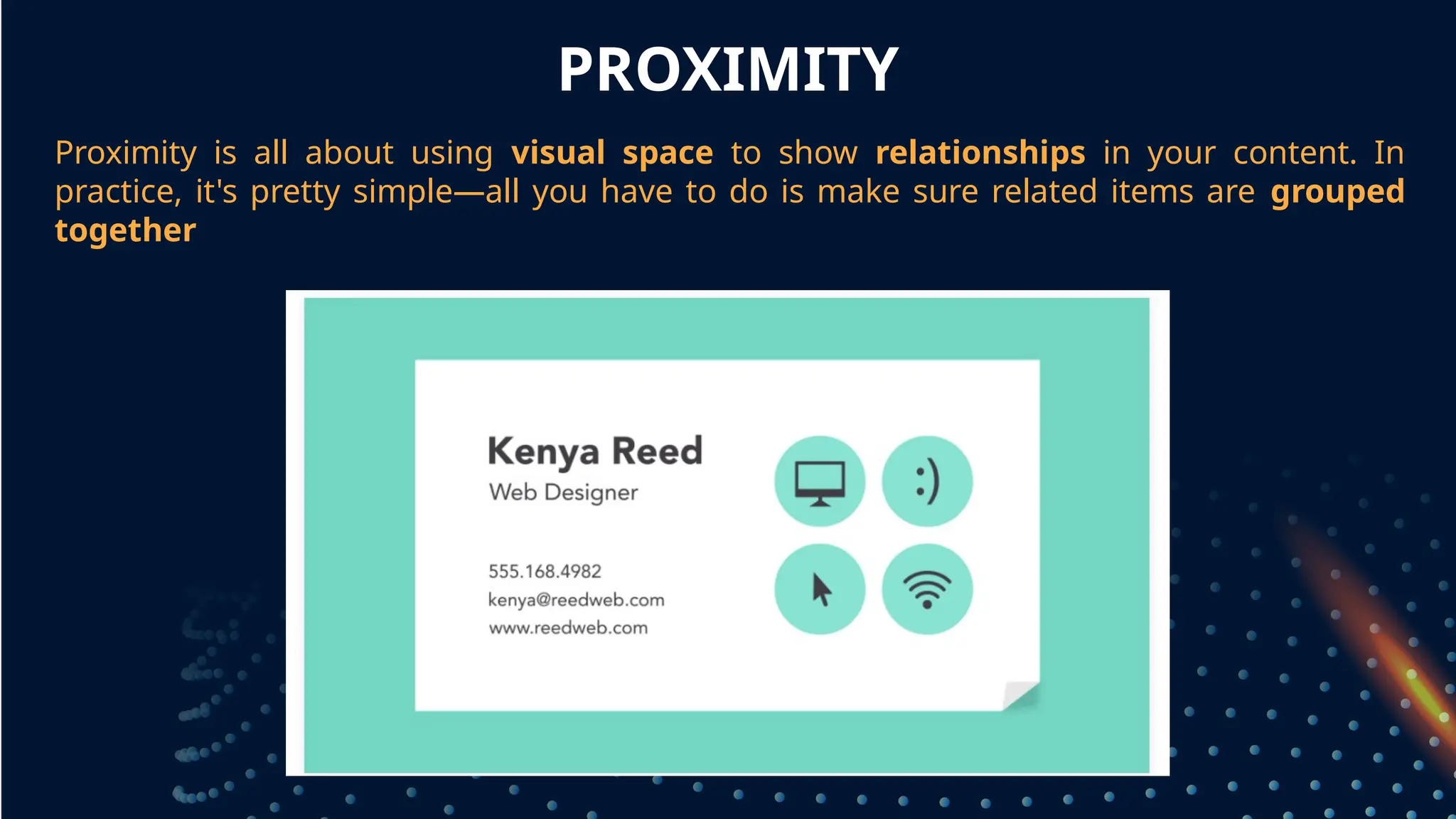
Proximity is allabout using visual space to show relationships in your content. In
practice, it's pretty simple—all you have to do is make sure related items are grouped
together
grouped together
6.
WHITE SPACE
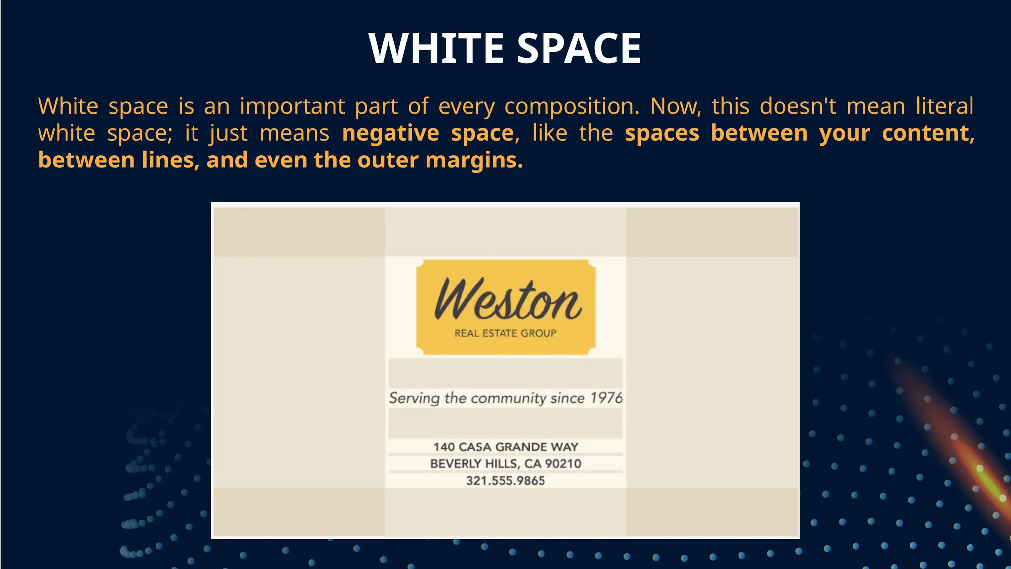
White spaceis an important part of every composition. Now, this doesn't mean literal
white space; it just means negative space, like the spaces between your content,
between lines, and even the outer margins.
grouped together
7.
PROXIMITY
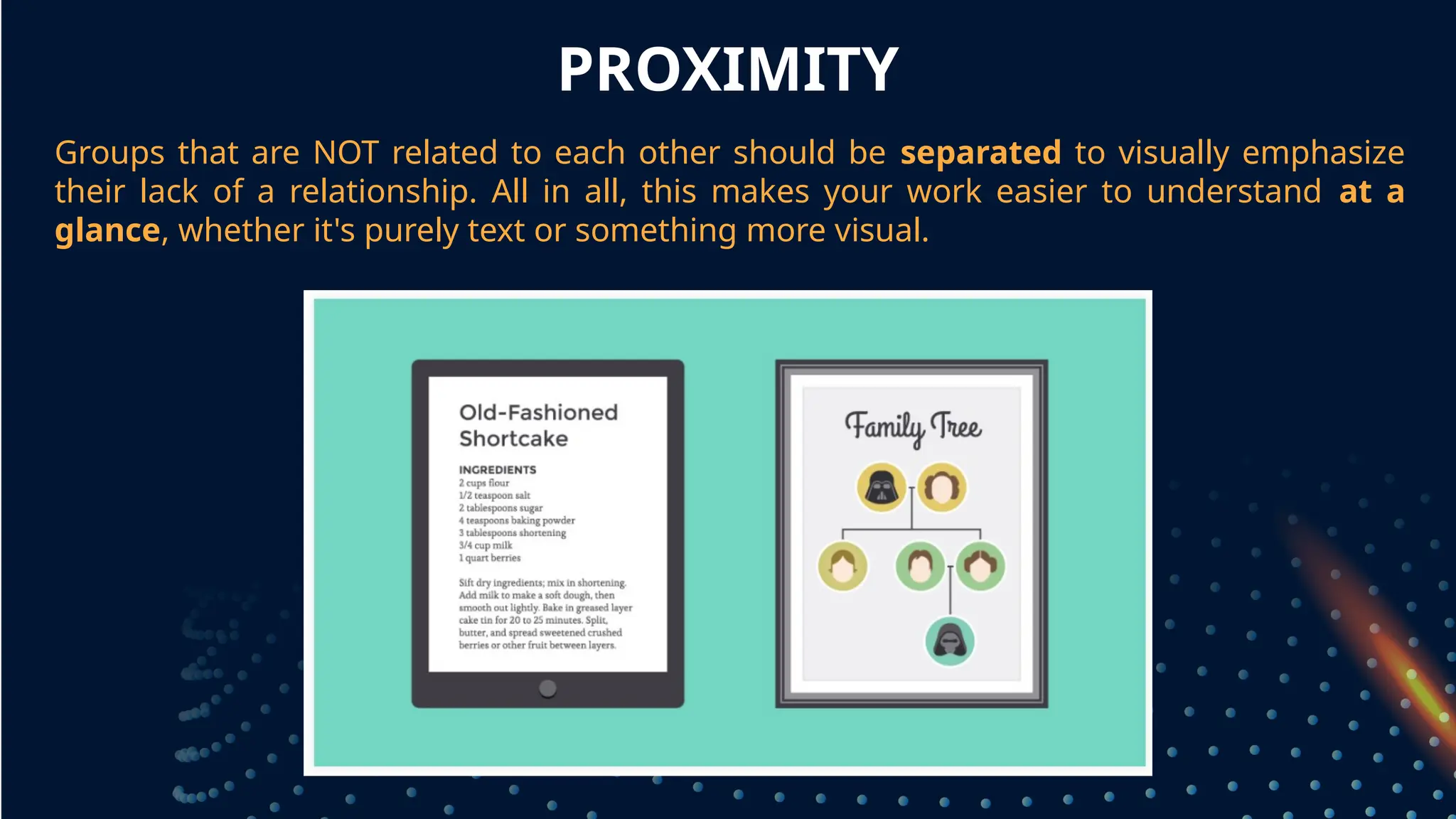
Groups that areNOT related to each other should be separated to visually emphasize
their lack of a relationship. All in all, this makes your work easier to understand at a
glance, whether it's purely text or something more visual.
grouped together
8.
WHITE SPACE
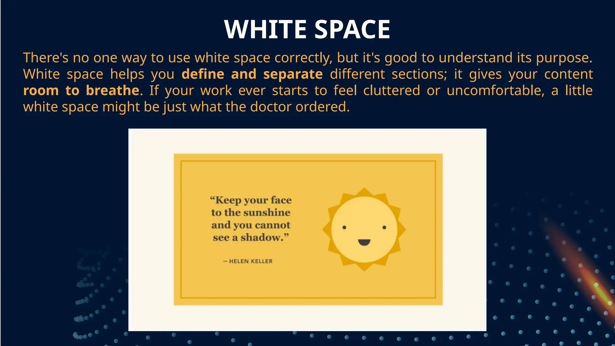
There's noone way to use white space correctly, but it's good to understand its purpose.
White space helps you define and separate different sections; it gives your content
room to breathe. If your work ever starts to feel cluttered or uncomfortable, a little
white space might be just what the doctor ordered.
grouped together
9.
ALIGNMENT
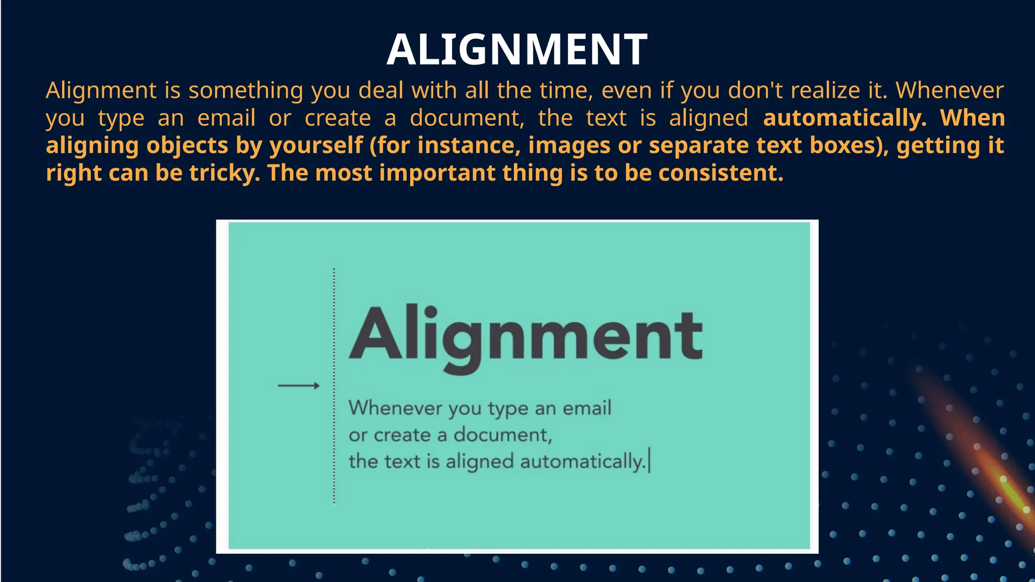
Alignment is somethingyou deal with all the time, even if you don't realize it. Whenever
you type an email or create a document, the text is aligned automatically. When
aligning objects by yourself (for instance, images or separate text boxes), getting it
right can be tricky. The most important thing is to be consistent.
grouped together
10.
ALIGNMENT
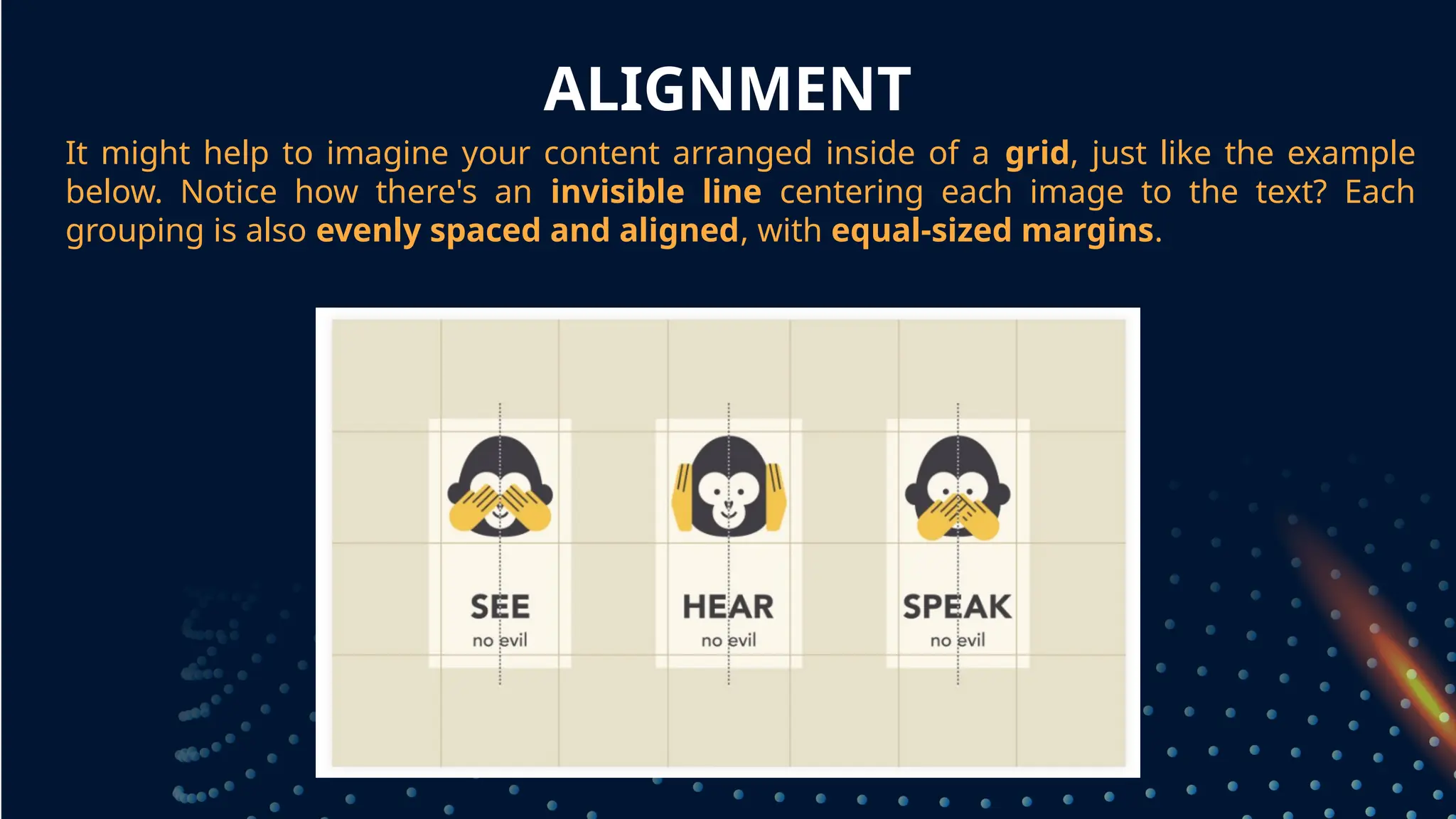
It might helpto imagine your content arranged inside of a grid, just like the example
below. Notice how there's an invisible line centering each image to the text? Each
grouping is also evenly spaced and aligned, with equal-sized margins.
grouped together
11.
CONTRAST
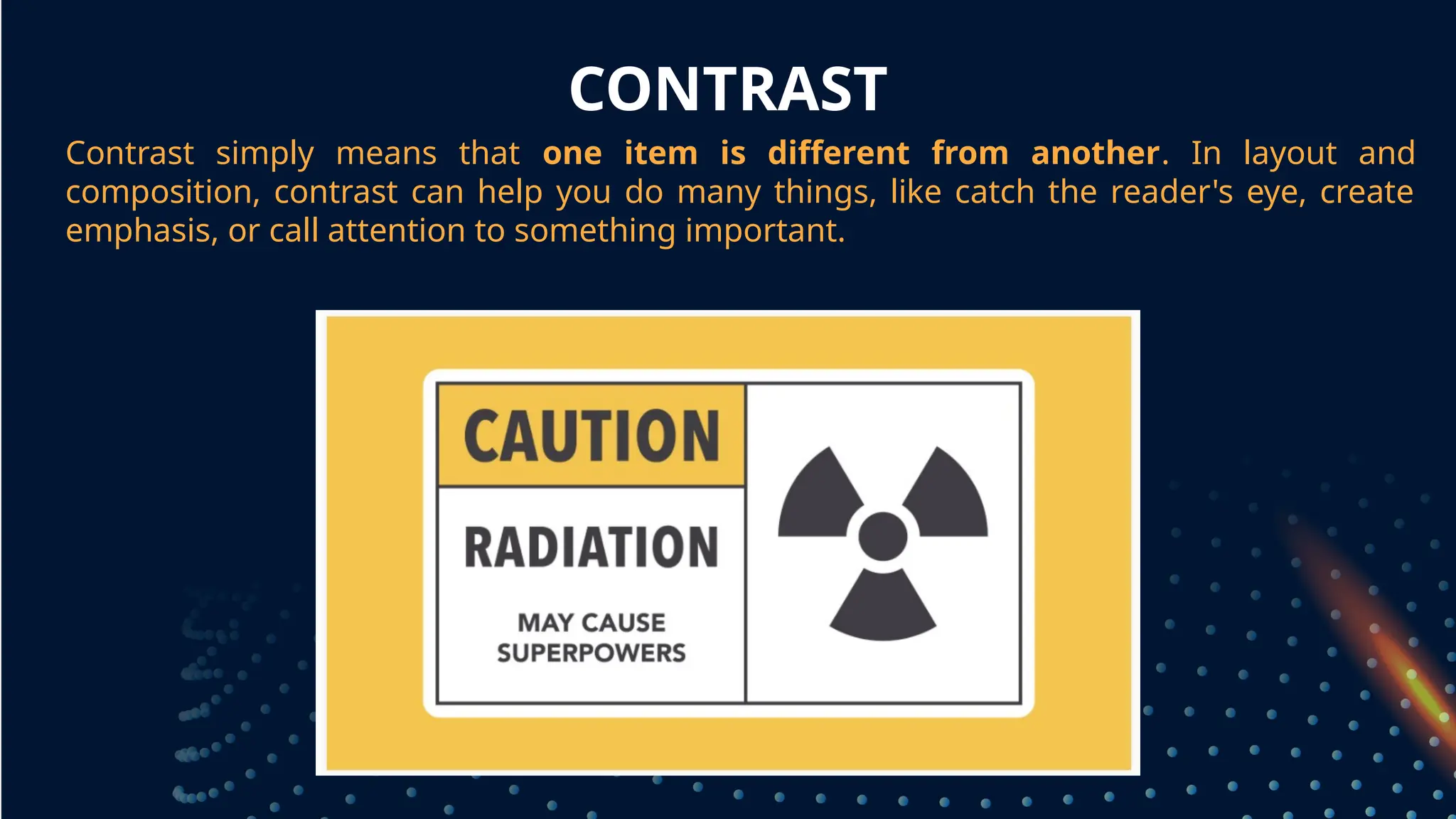
Contrast simply meansthat one item is different from another. In layout and
composition, contrast can help you do many things, like catch the reader's eye, create
emphasis, or call attention to something important.
grouped together
12.
CONTRAST
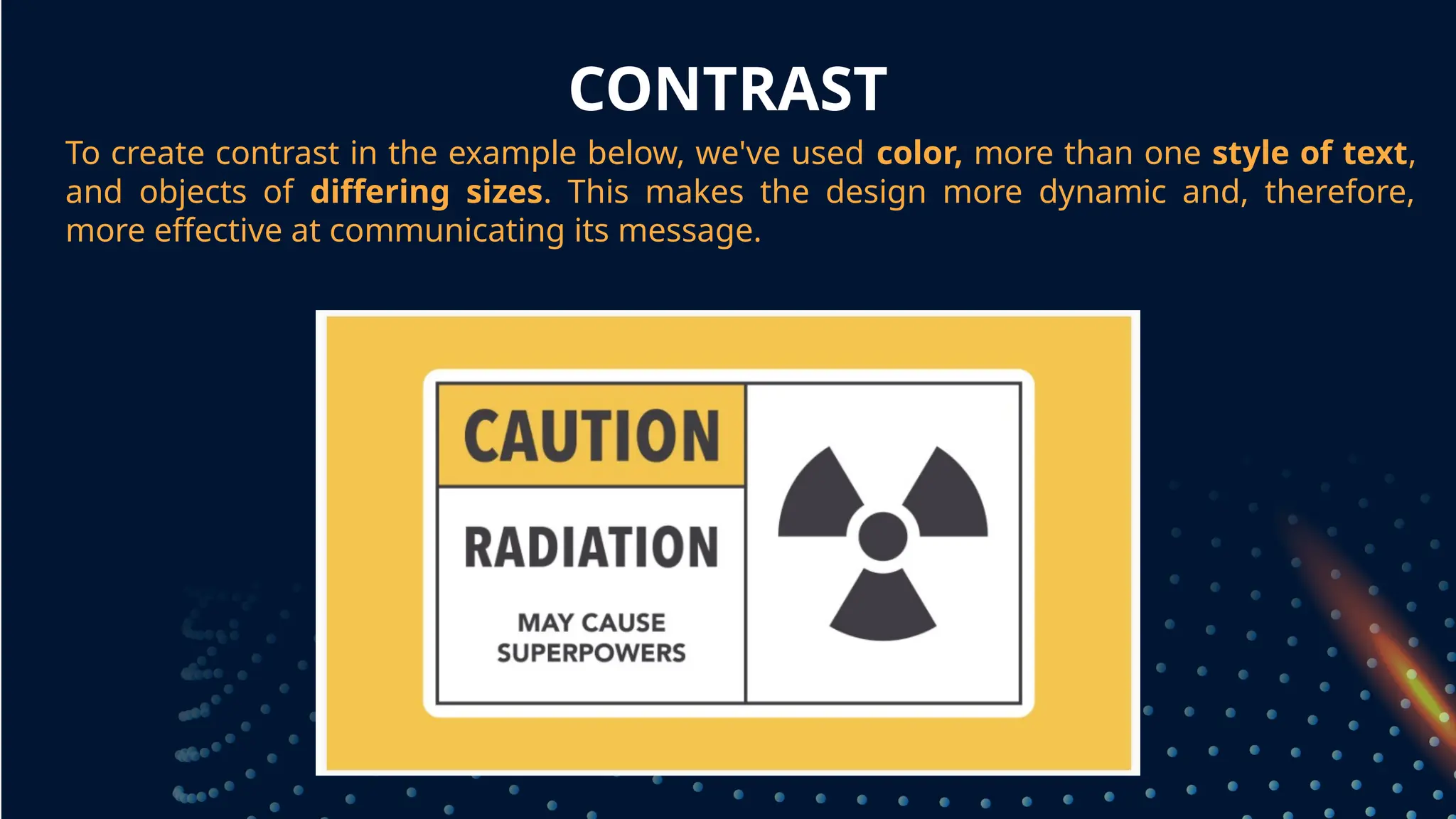
To create contrastin the example below, we've used color, more than one style of text,
and objects of differing sizes. This makes the design more dynamic and, therefore,
more effective at communicating its message.
grouped together
13.
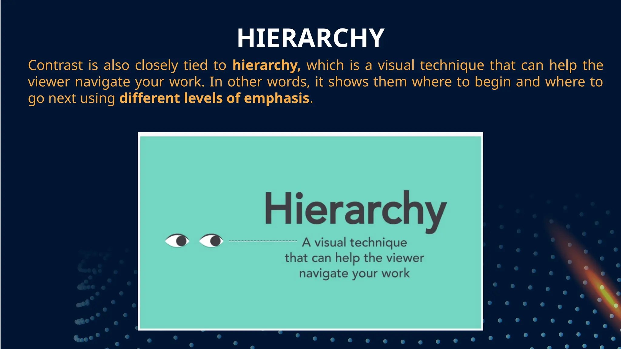
HIERARCHY
Contrast is alsoclosely tied to hierarchy, which is a visual technique that can help the
viewer navigate your work. In other words, it shows them where to begin and where to
go next using different levels of emphasis.
grouped together
14.
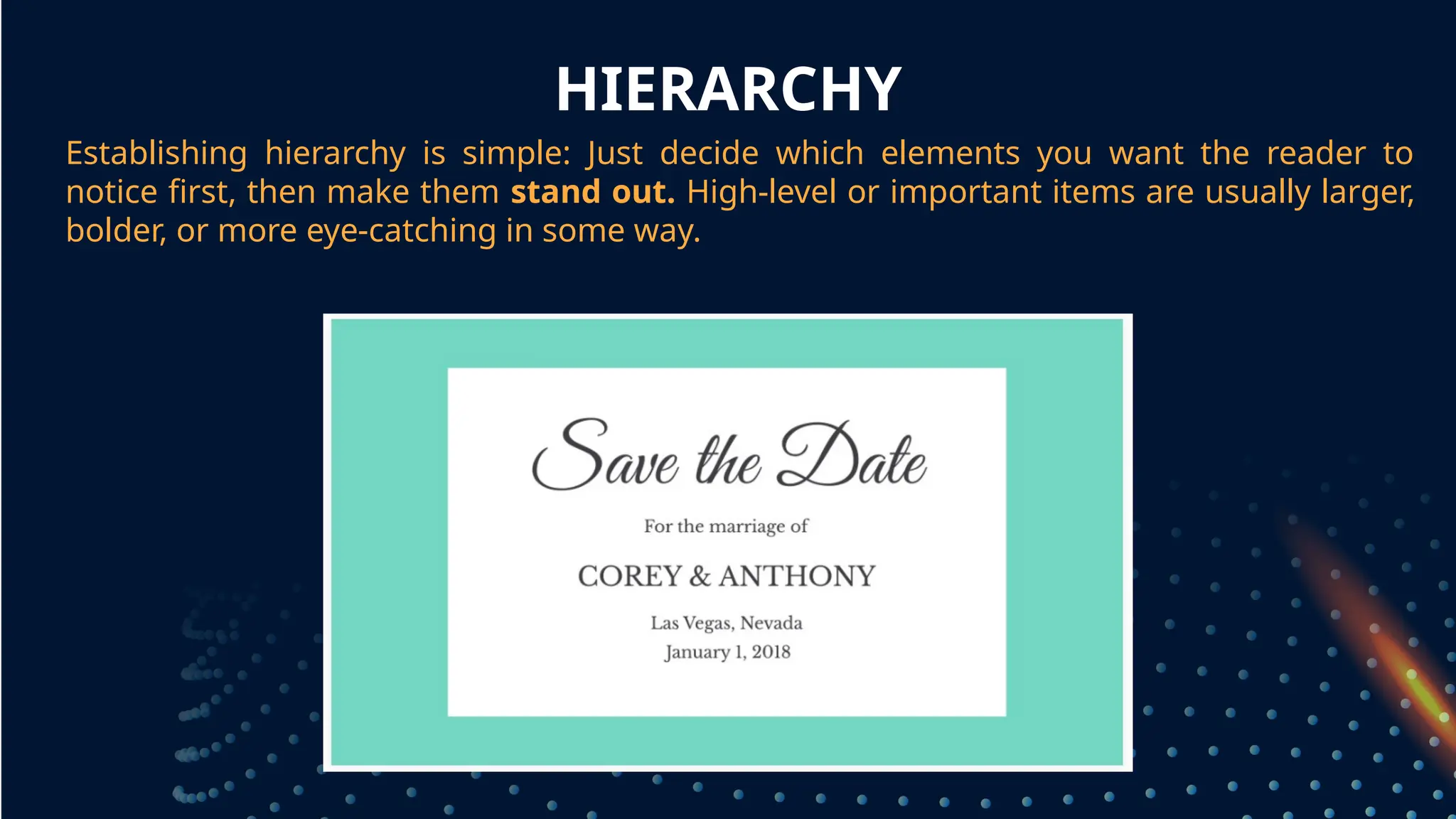
HIERARCHY
Establishing hierarchy issimple: Just decide which elements you want the reader to
notice first, then make them stand out. High-level or important items are usually larger,
bolder, or more eye-catching in some way.
grouped together
15.
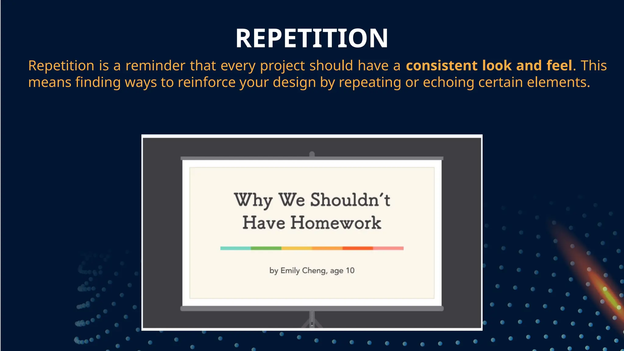
REPETITION
Repetition is areminder that every project should have a consistent look and feel. This
means finding ways to reinforce your design by repeating or echoing certain elements.
grouped together
16.
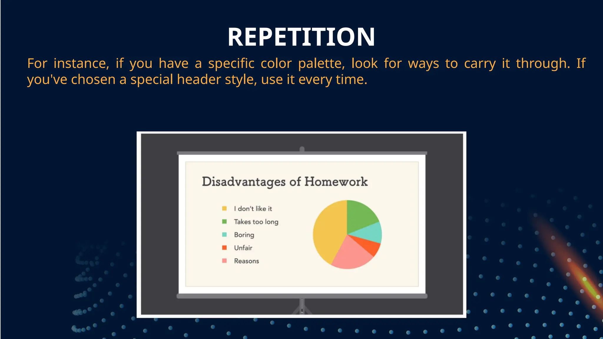
REPETITION
For instance, ifyou have a specific color palette, look for ways to carry it through. If
you've chosen a special header style, use it every time.
grouped together
17.
REPETITION
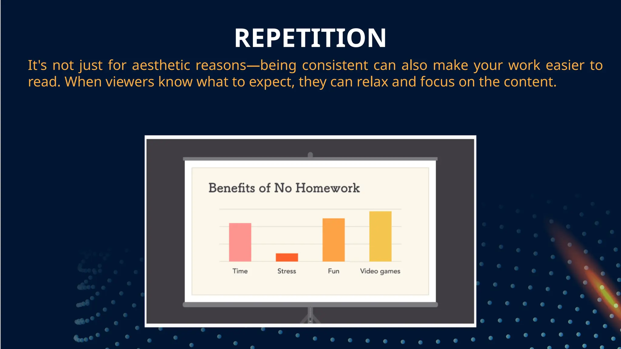
It's not justfor aesthetic reasons—being consistent can also make your work easier to
read. When viewers know what to expect, they can relax and focus on the content.
grouped together
18.
BALANCE
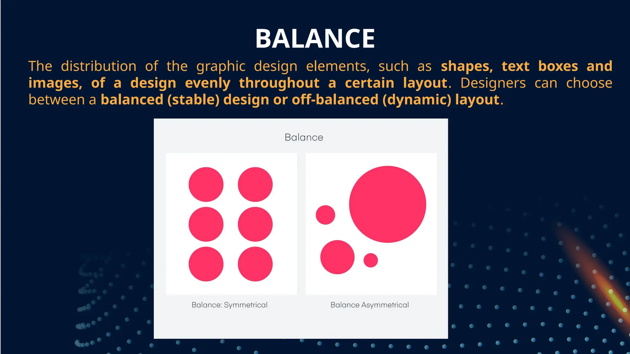
The distribution ofthe graphic design elements, such as shapes, text boxes and
images, of a design evenly throughout a certain layout. Designers can choose
between a balanced (stable) design or off-balanced (dynamic) layout.
grouped together
19.
BALANCE
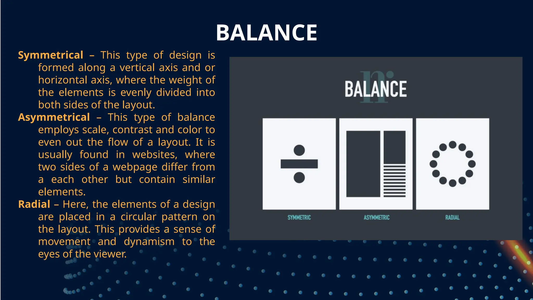
Symmetrical – Thistype of design is
formed along a vertical axis and or
horizontal axis, where the weight of
the elements is evenly divided into
both sides of the layout.
Asymmetrical – This type of balance
employs scale, contrast and color to
even out the flow of a layout. It is
usually found in websites, where
two sides of a webpage differ from
a each other but contain similar
elements.
Radial – Here, the elements of a design
are placed in a circular pattern on
the layout. This provides a sense of
movement and dynamism to the
eyes of the viewer.
20.
EMPHASIS
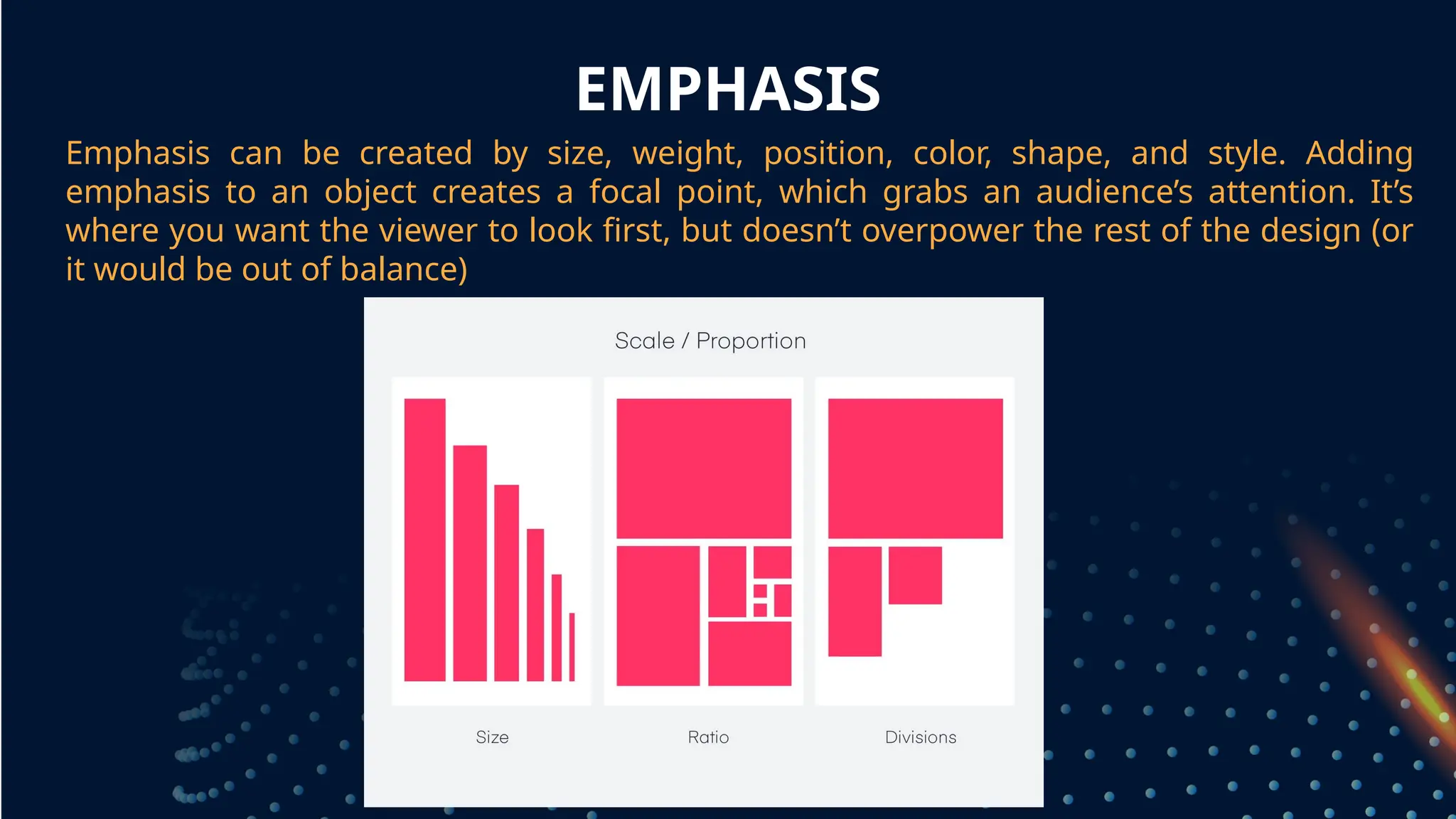
Emphasis can becreated by size, weight, position, color, shape, and style. Adding
emphasis to an object creates a focal point, which grabs an audience’s attention. It’s
where you want the viewer to look first, but doesn’t overpower the rest of the design (or
it would be out of balance)
grouped together
21.
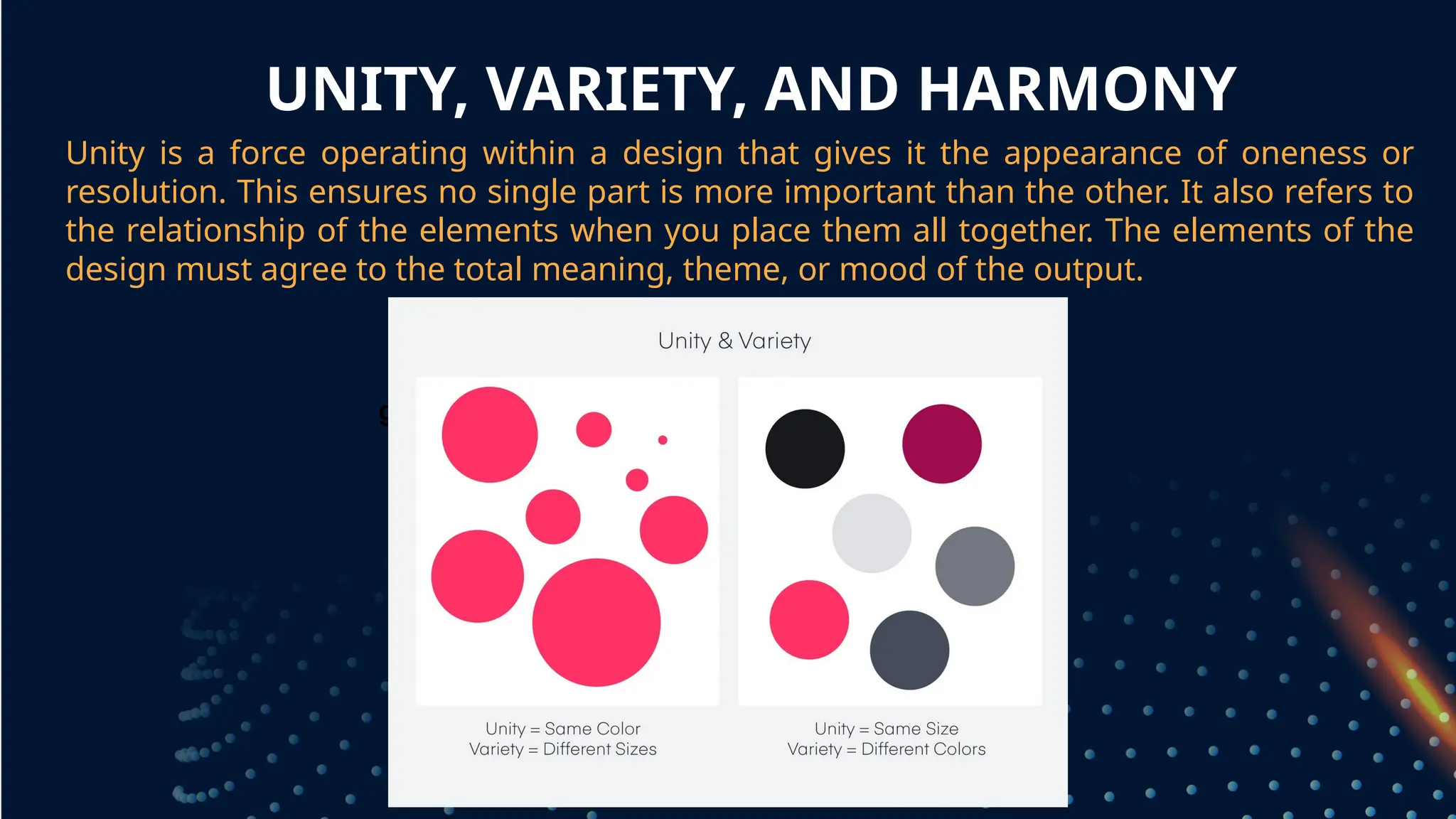
UNITY, VARIETY, ANDHARMONY
Unity is a force operating within a design that gives it the appearance of oneness or
resolution. This ensures no single part is more important than the other. It also refers to
the relationship of the elements when you place them all together. The elements of the
design must agree to the total meaning, theme, or mood of the output.
grouped together