Downloaded 135 times
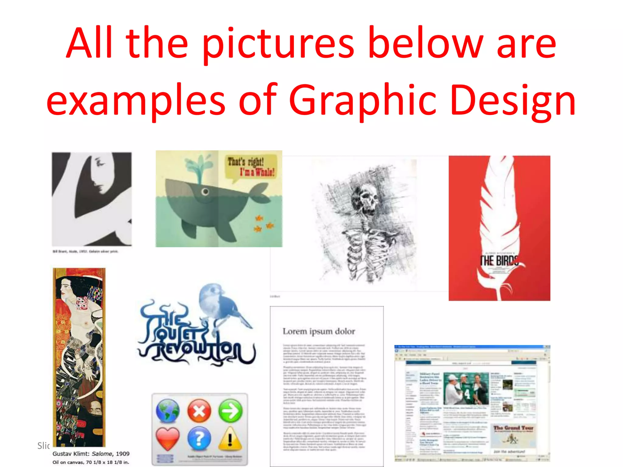


This document provides an introduction to graphic design. It begins by defining graphic design as focusing on visual communication and presentation using symbols, images, and words. Graphic design was born from art and technology, specifically printing. The document then discusses the fundamental questions a graphic designer considers when working on a project, such as the communication objectives, hierarchy of information, guiding the eye across the page, intended audience, and tone of voice. Finally, it outlines the basic tools and elements - including point, line, shape, pattern, texture, space, size, type, color, and images - that graphic designers use to solve design problems and effectively communicate visual messages and ideas.
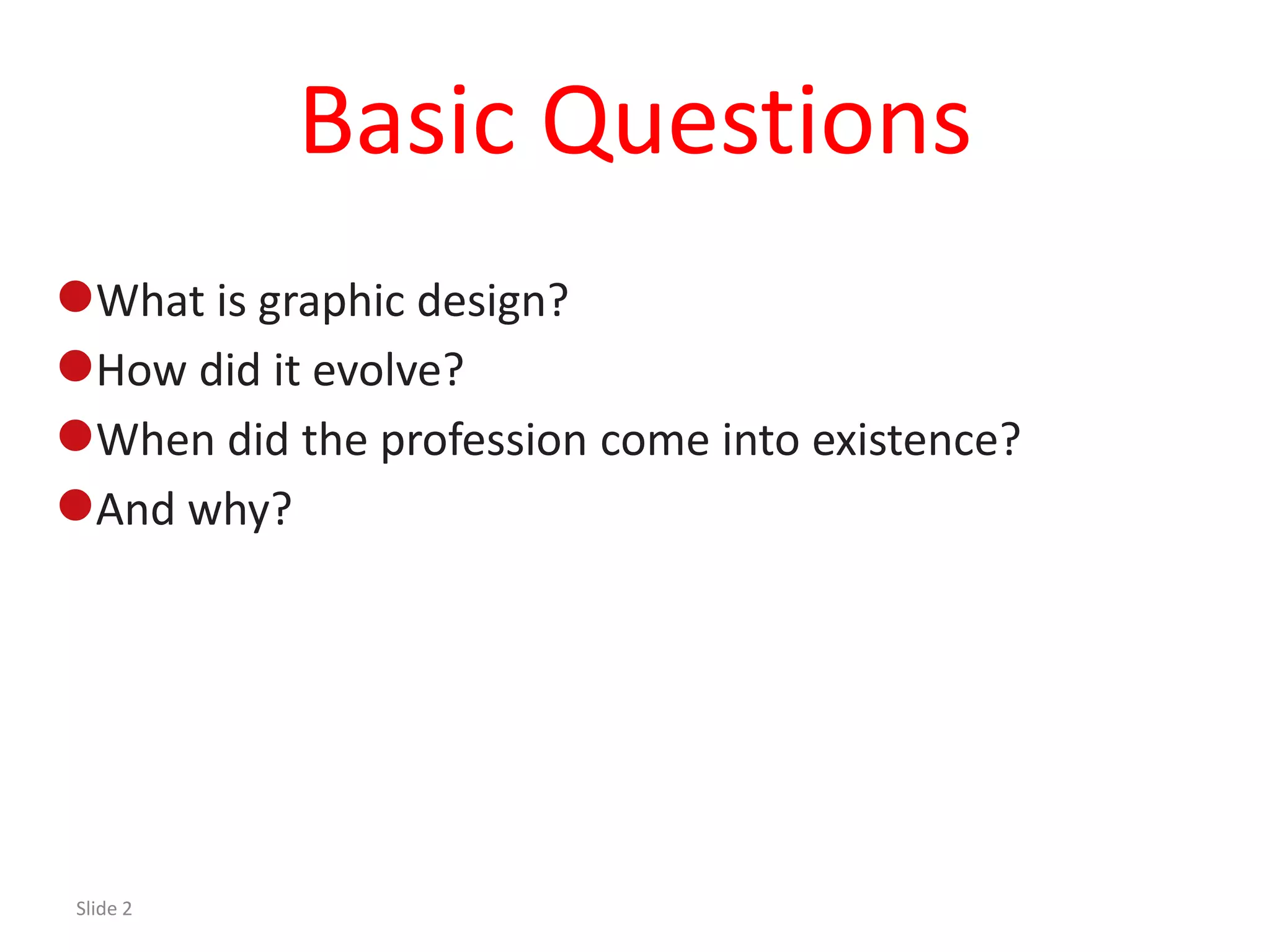
This section introduces graphic design, its evolution, and the basic questions regarding its nature.
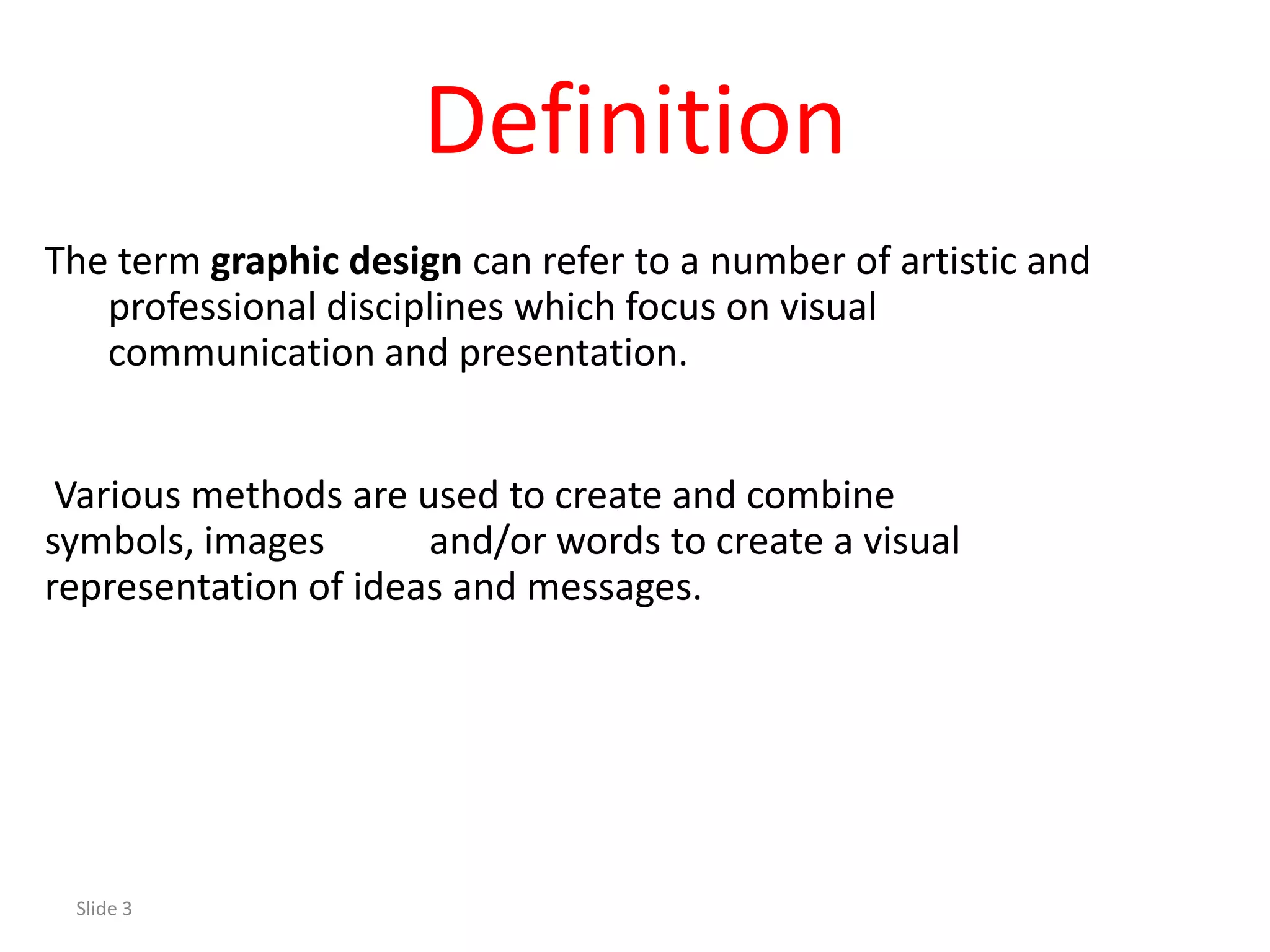
Defines graphic design, focuses on visual communication, and discusses its origins in art and technology.
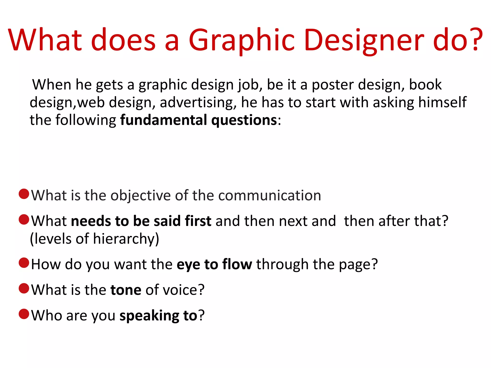
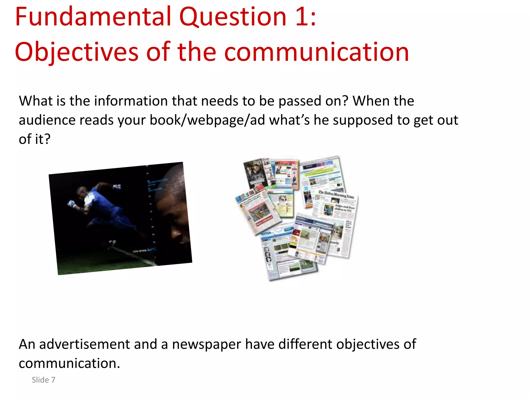
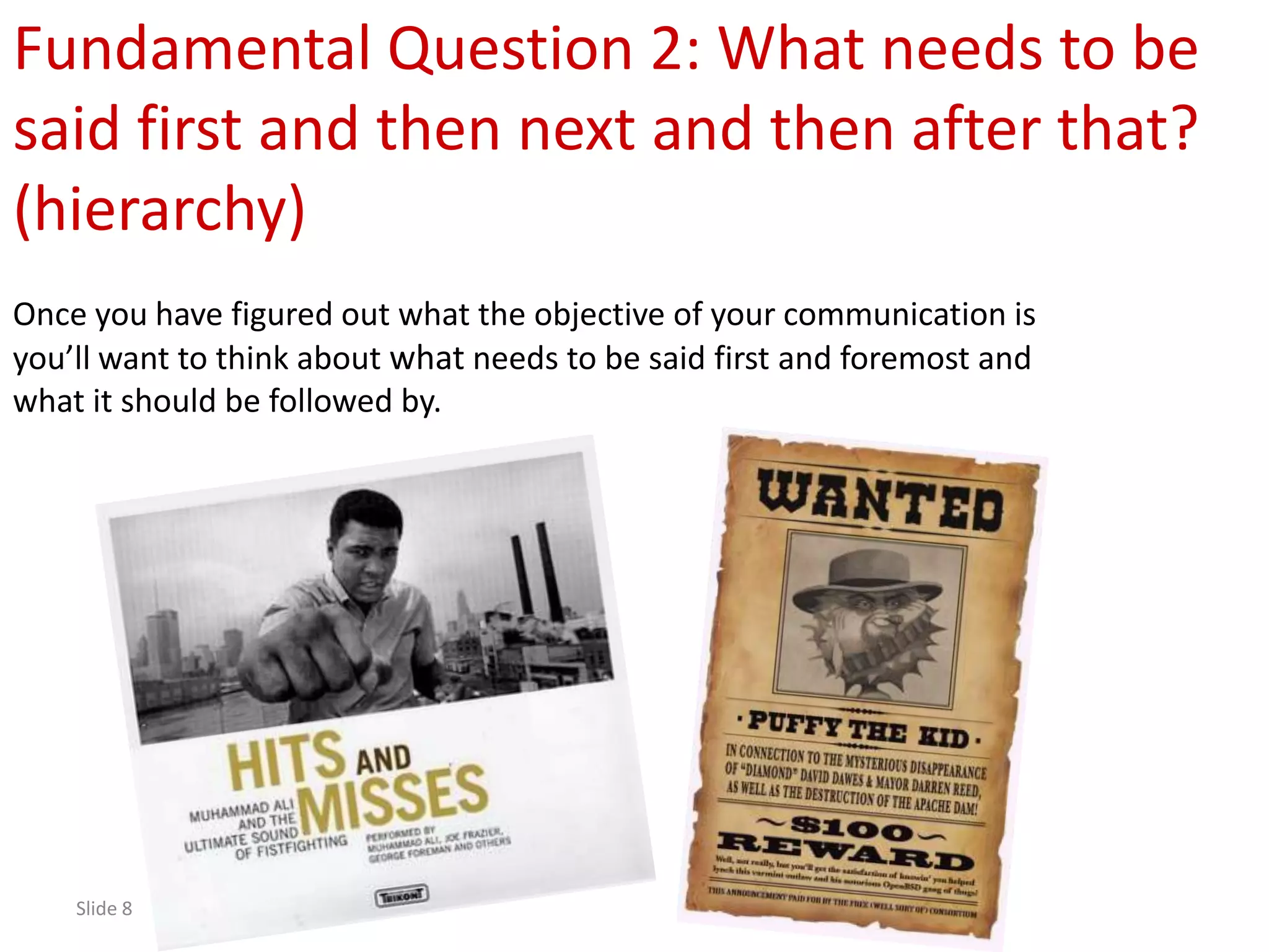
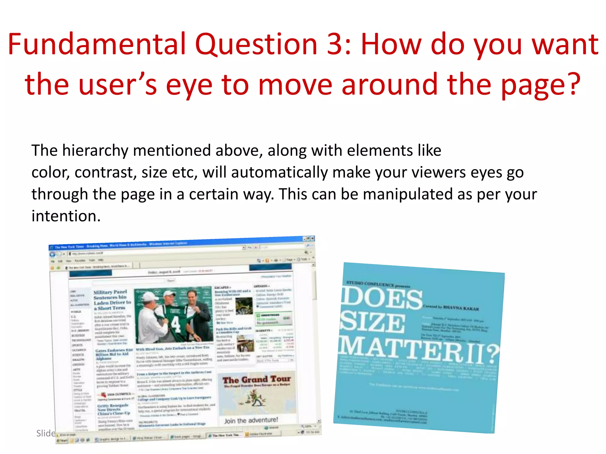
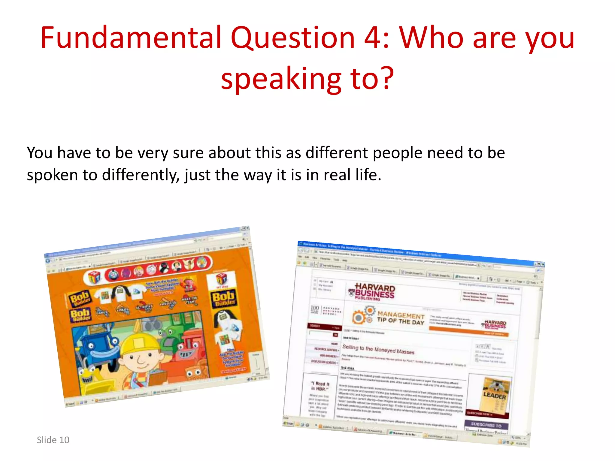
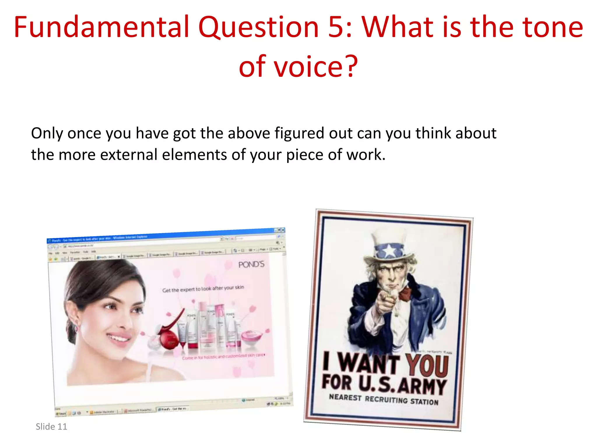
Explores fundamental questions a graphic designer asks when beginning a project to ensure effective communication.
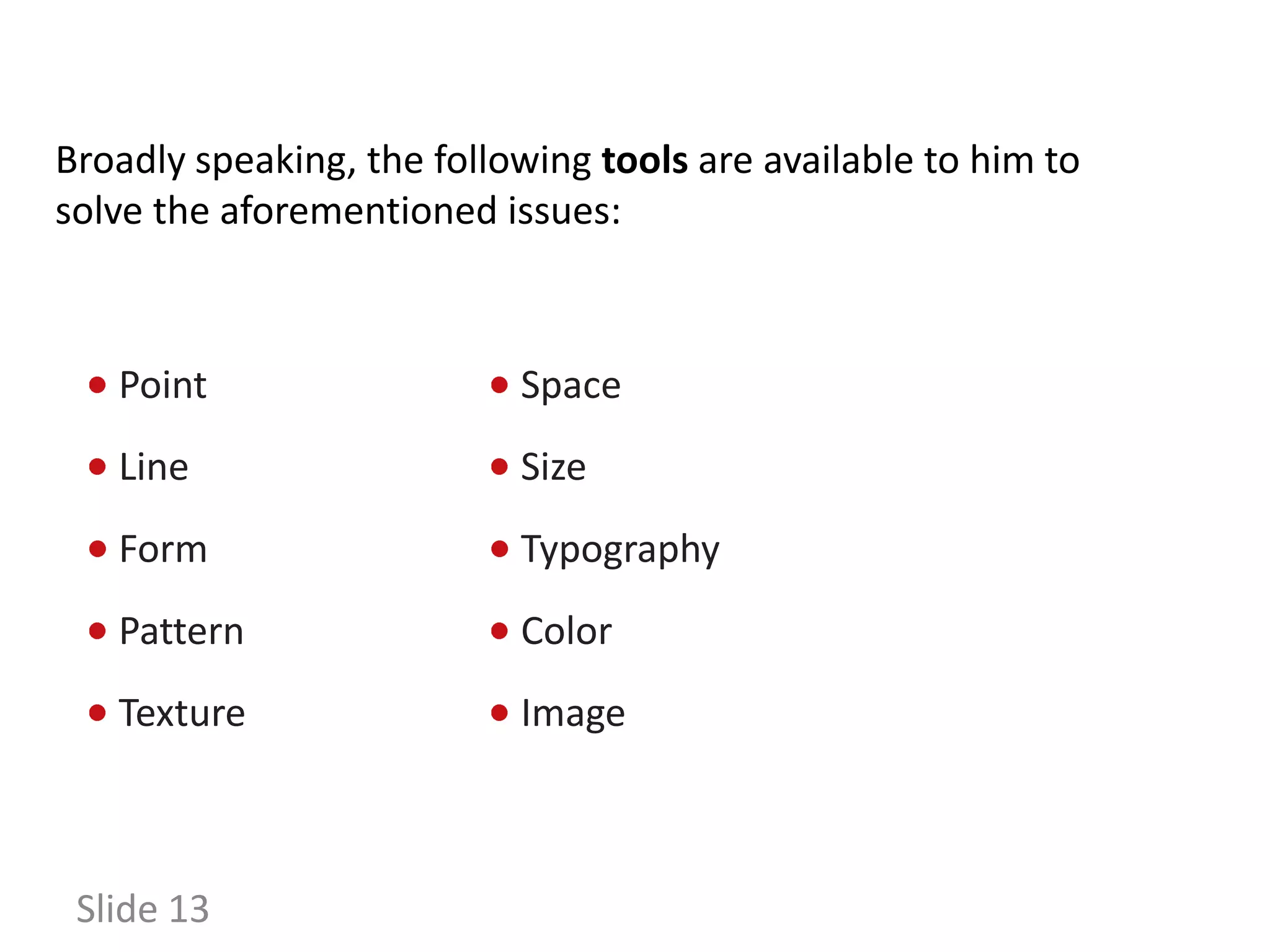
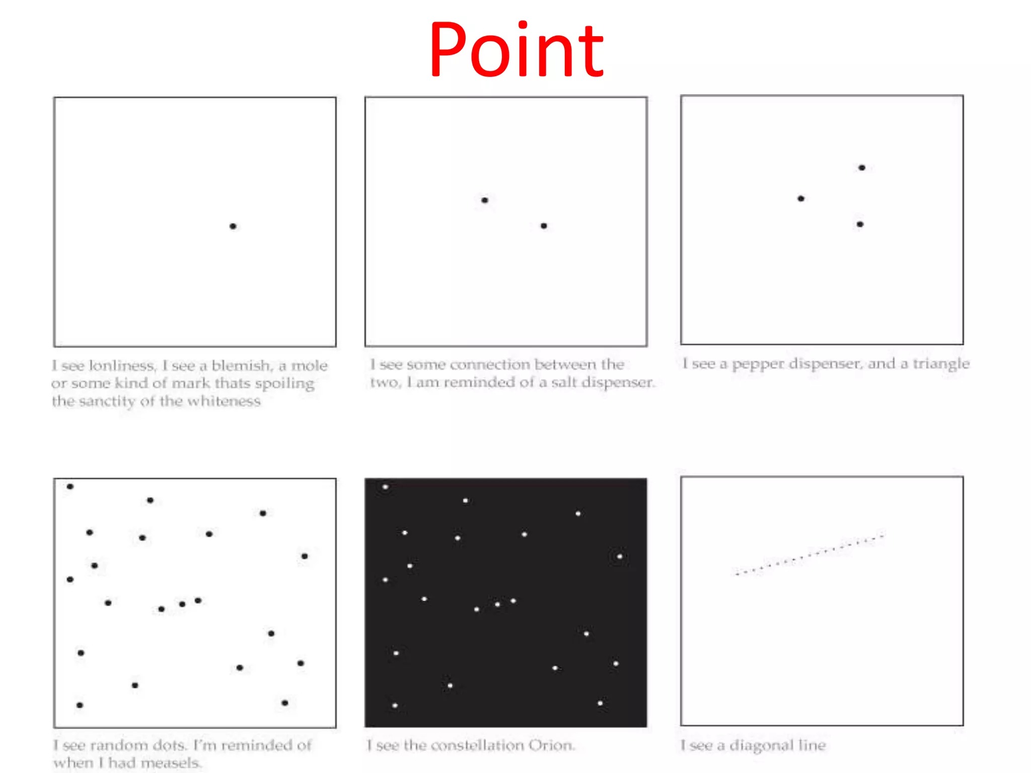
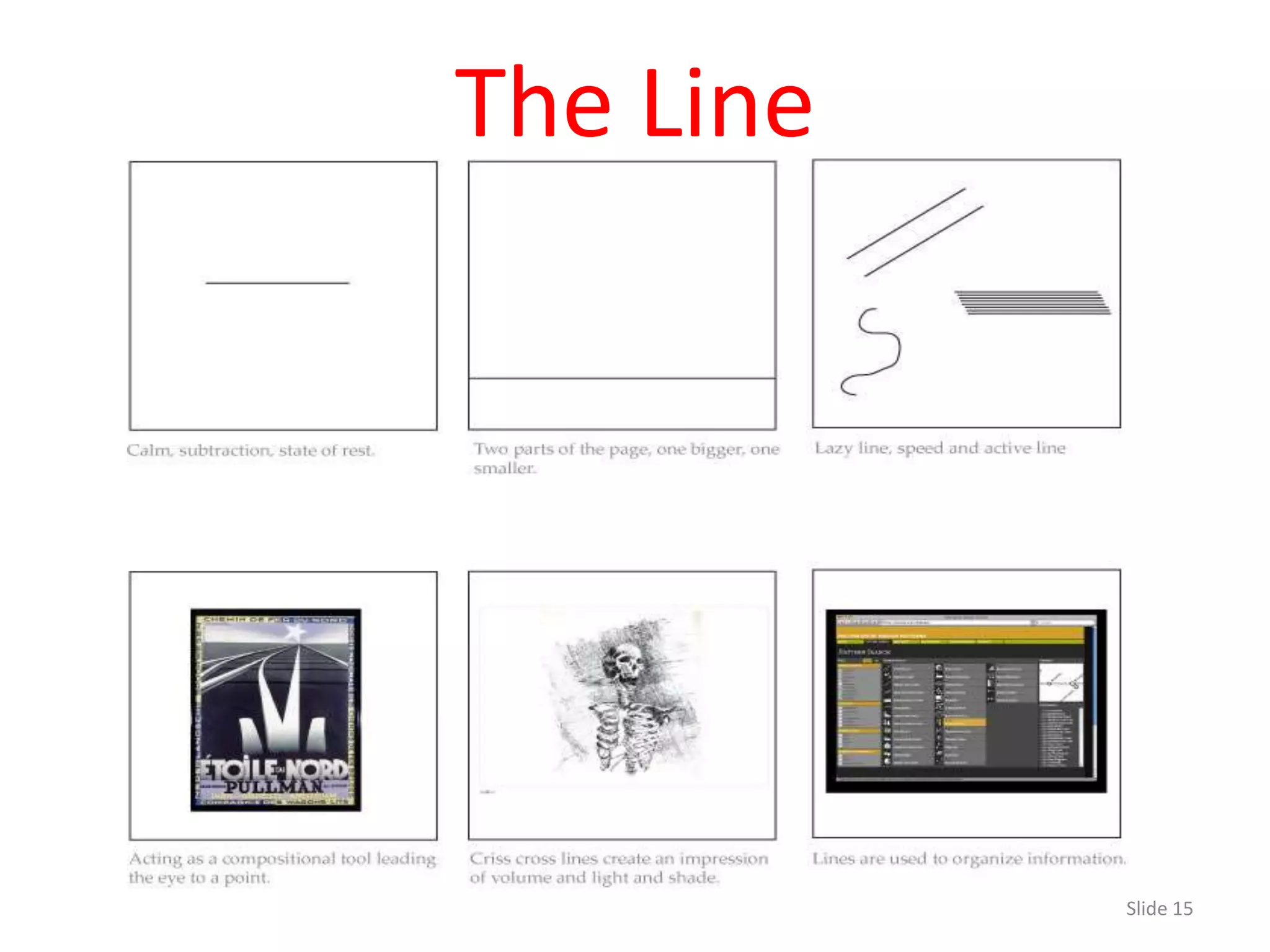
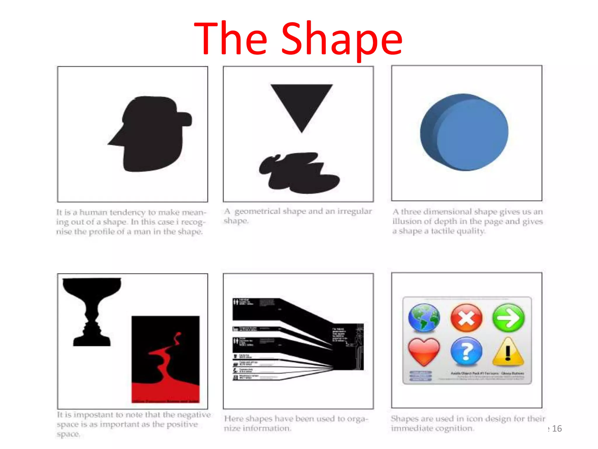
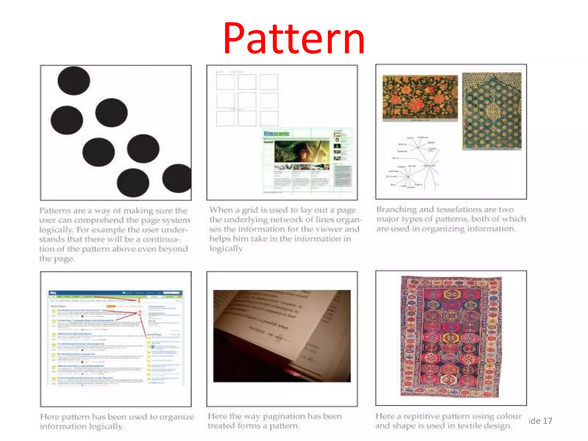
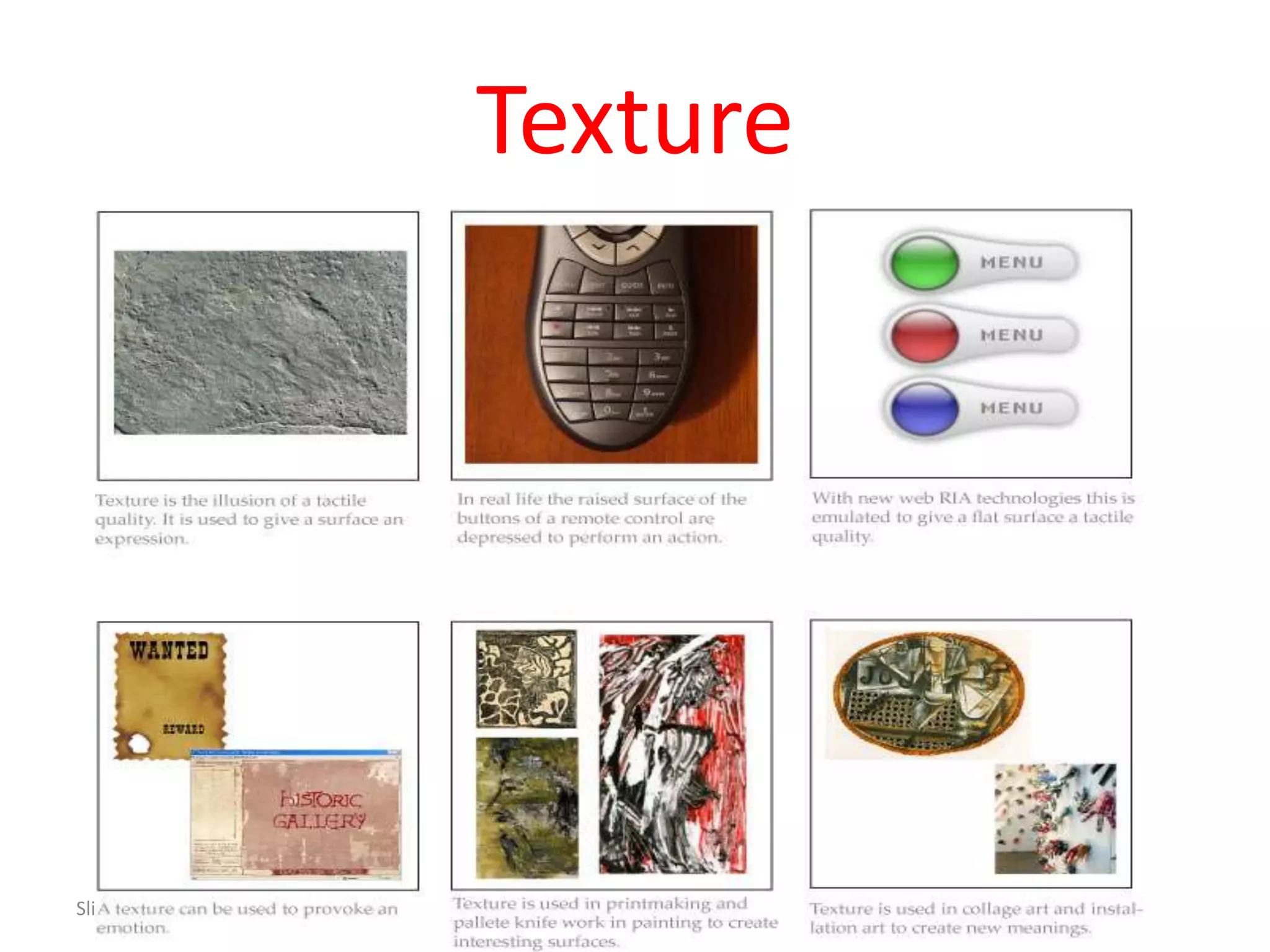
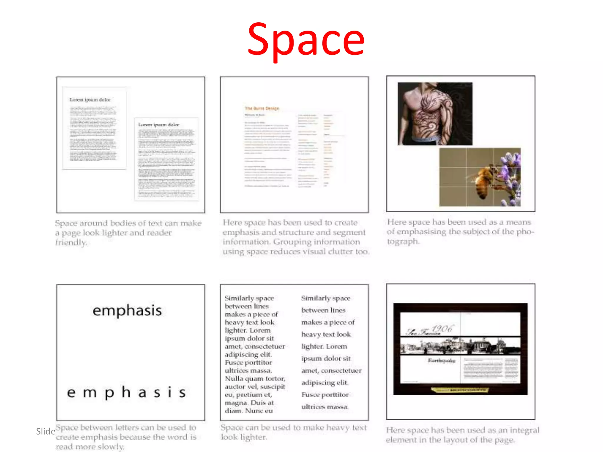
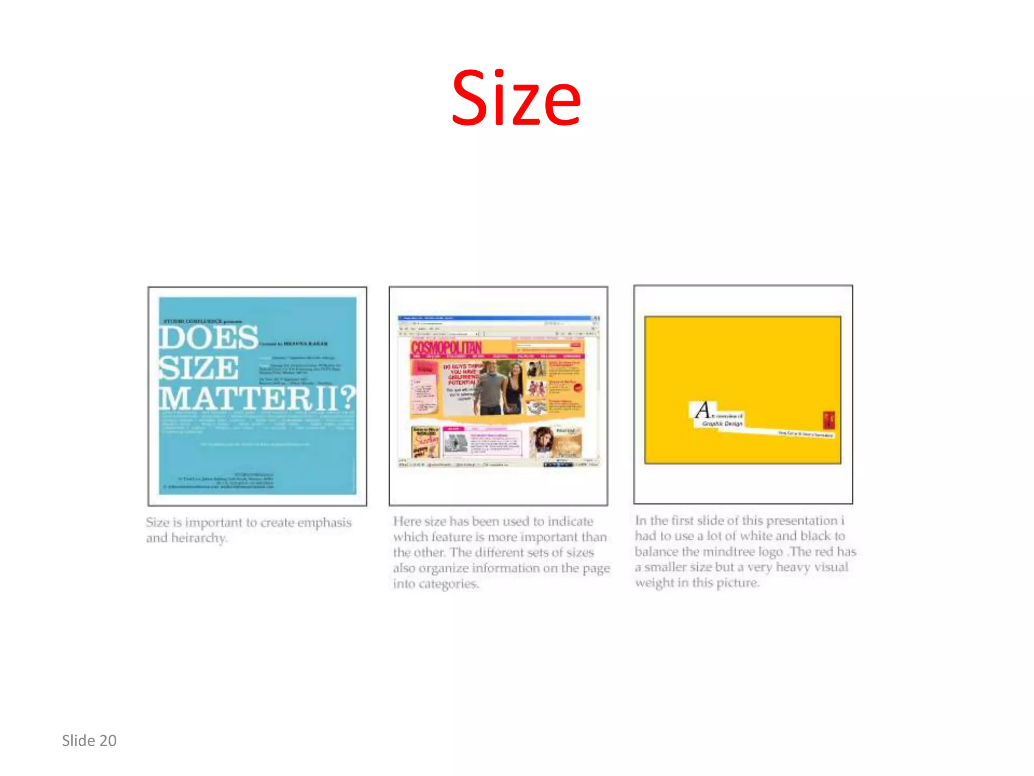
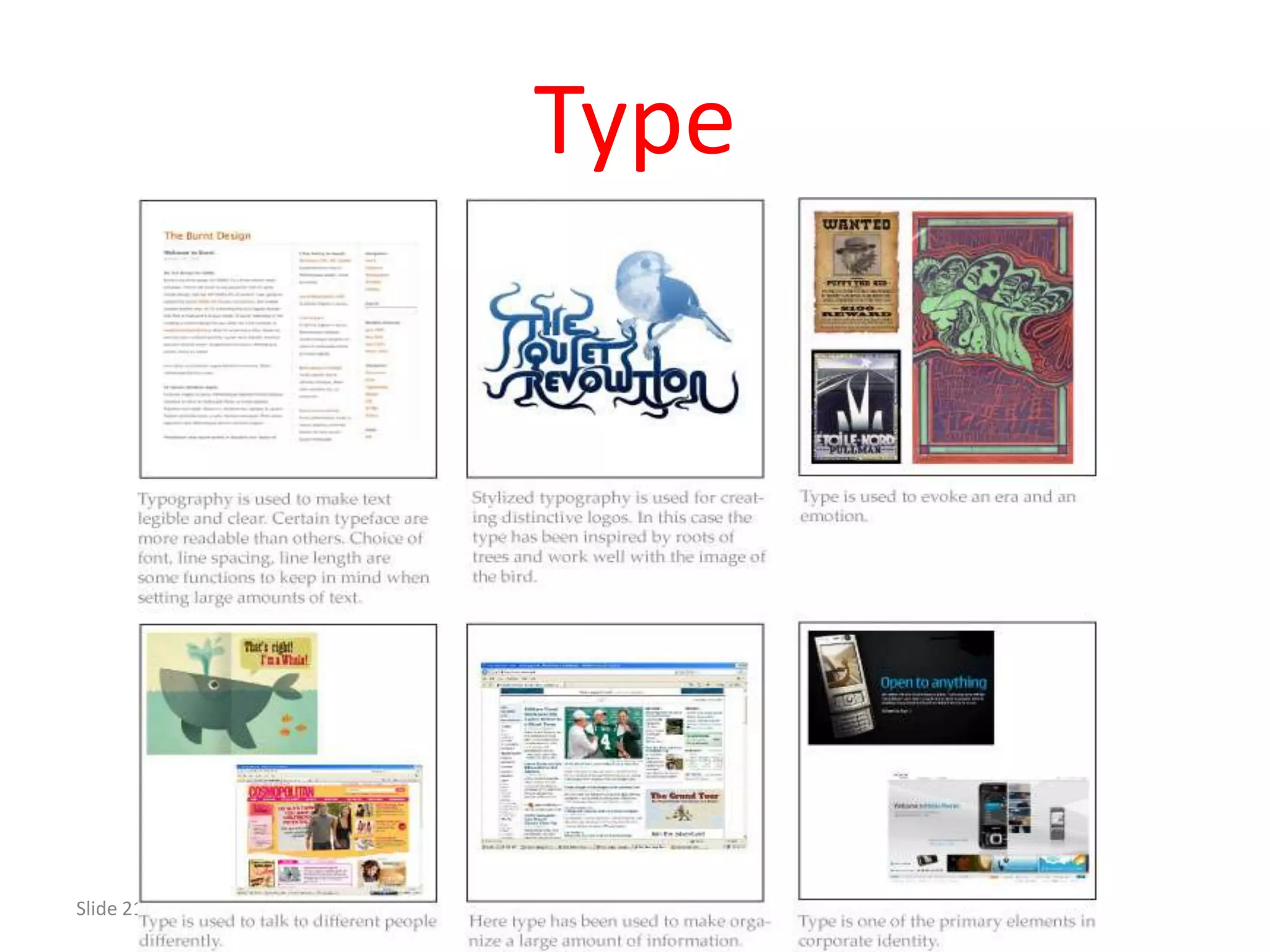
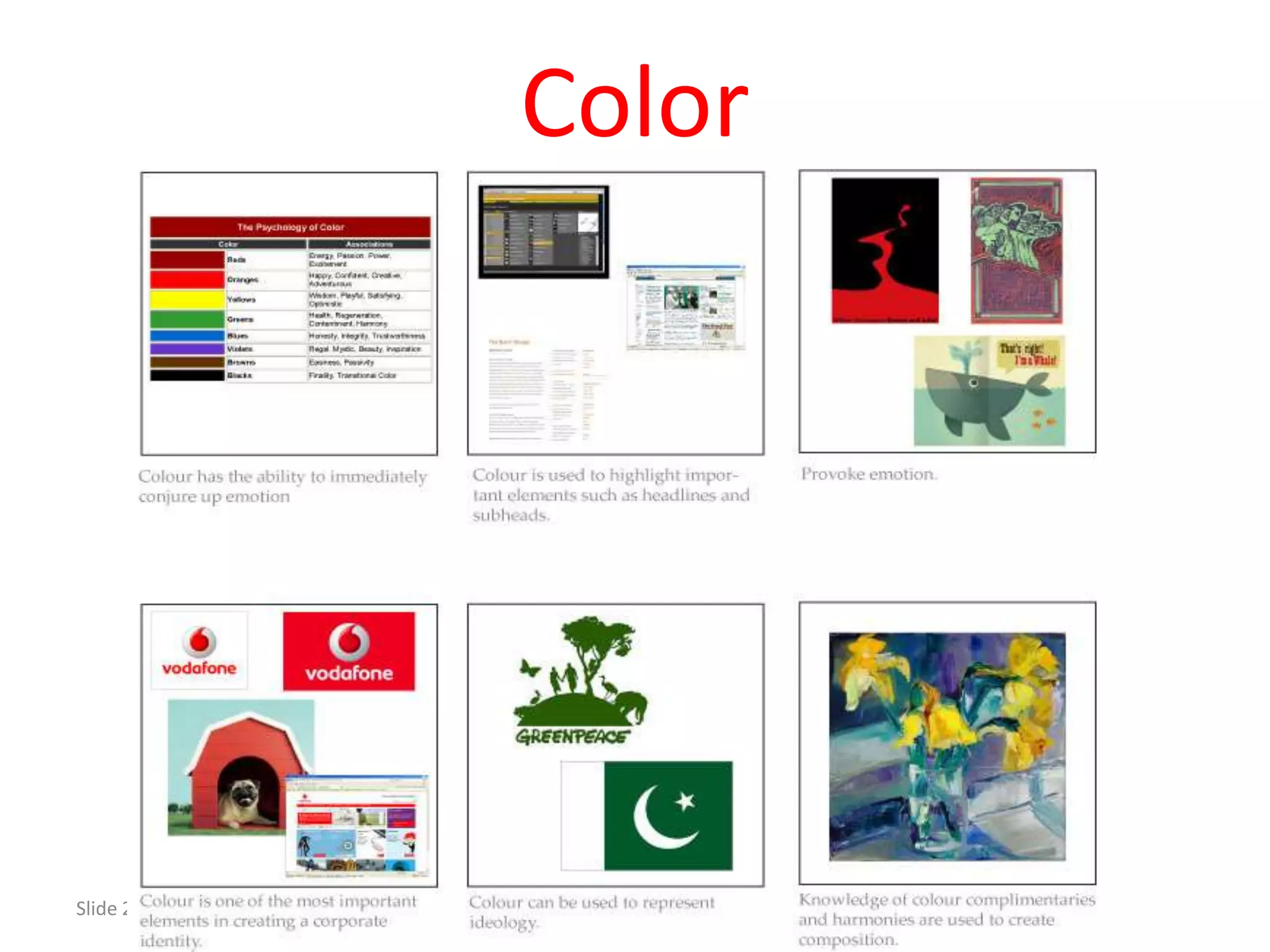
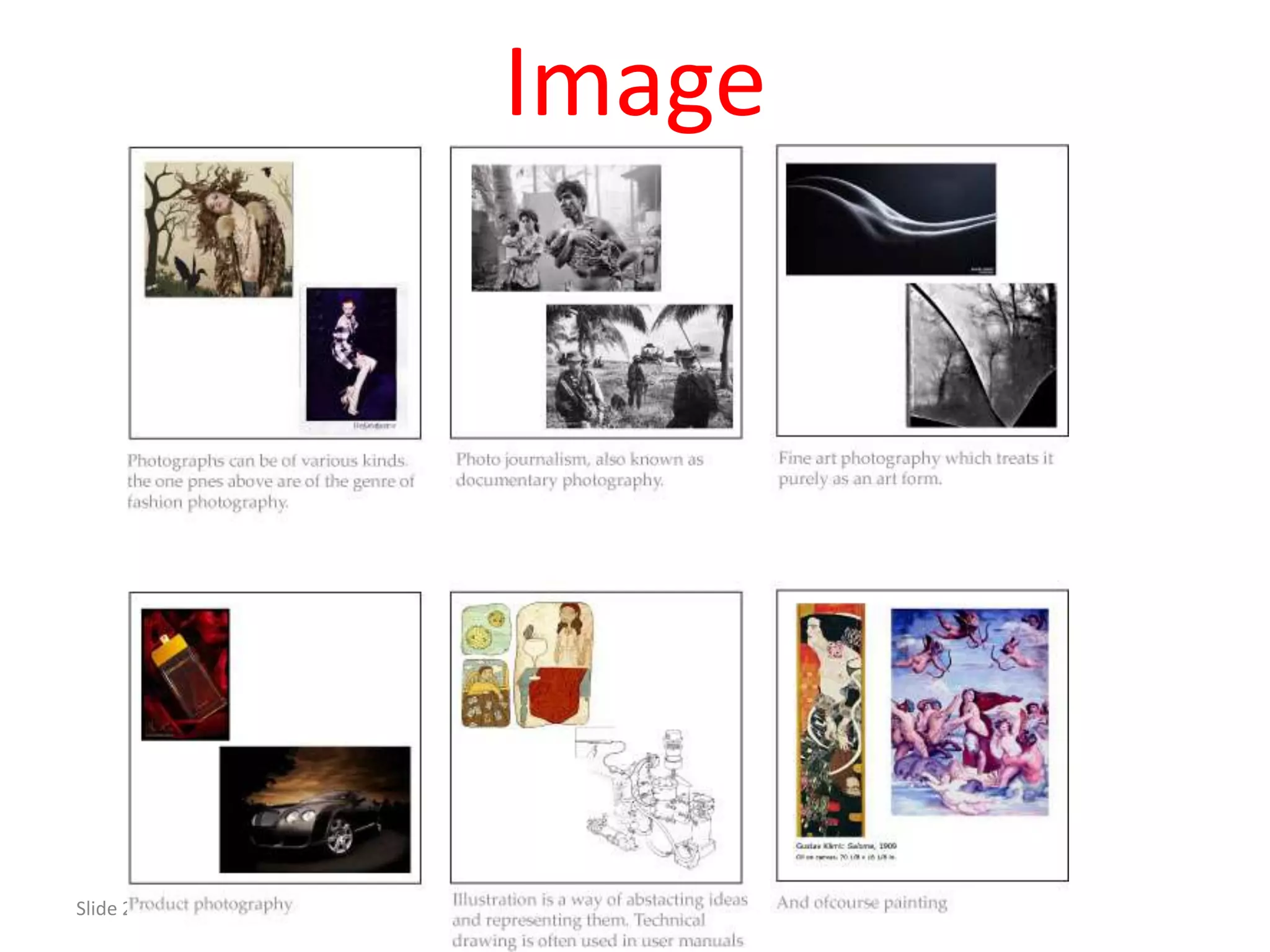
Lists essential tools for graphic designers including point, line, shape, texture, color, and images.
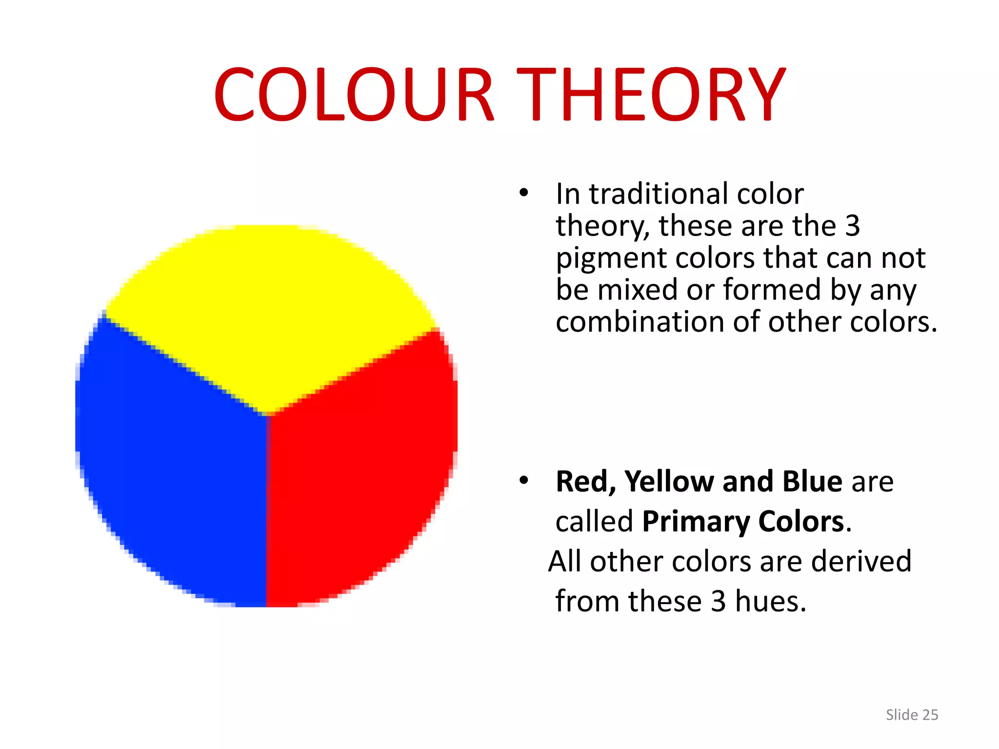
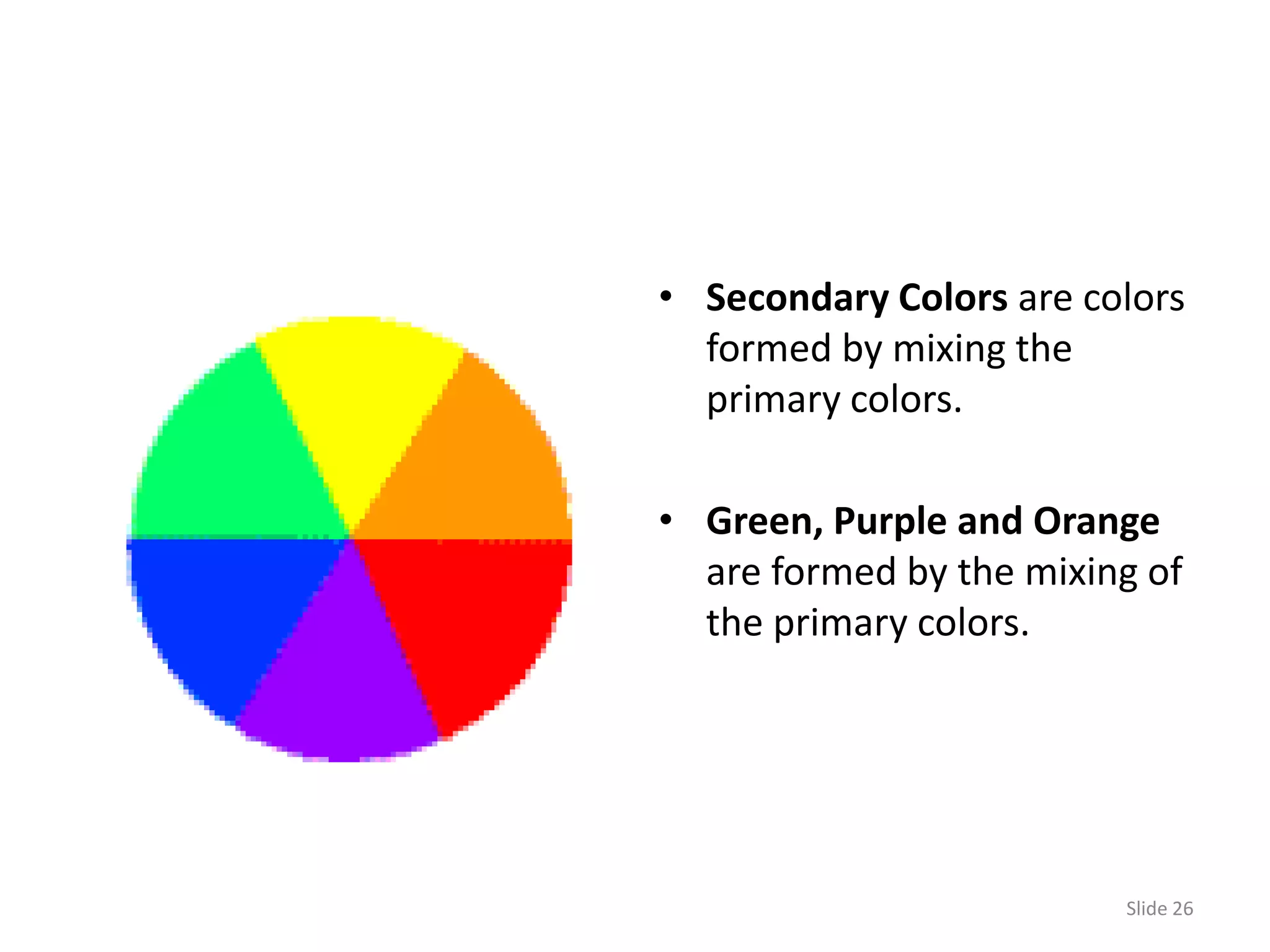
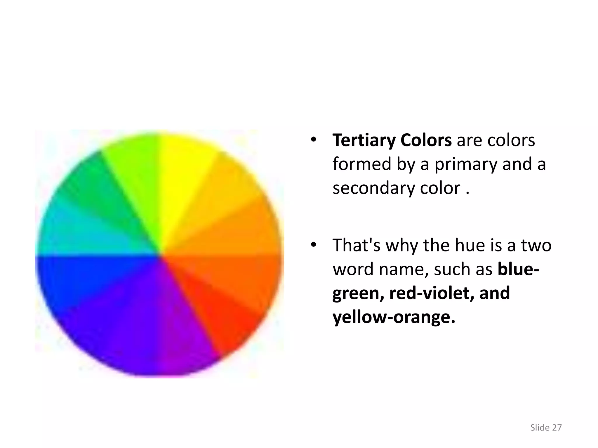
Introduces basic color theory including primary, secondary, and tertiary colors necessary for graphic design.
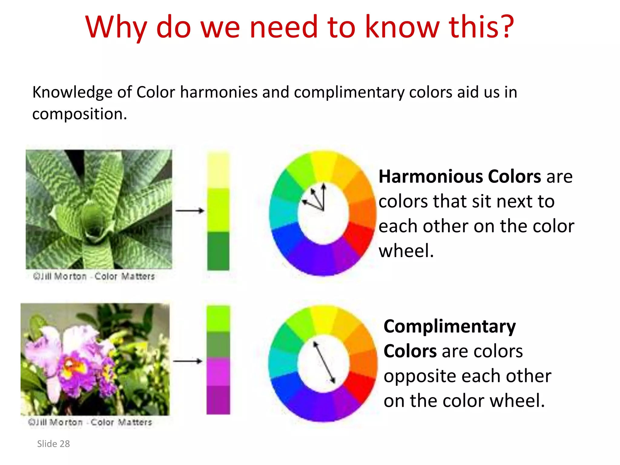
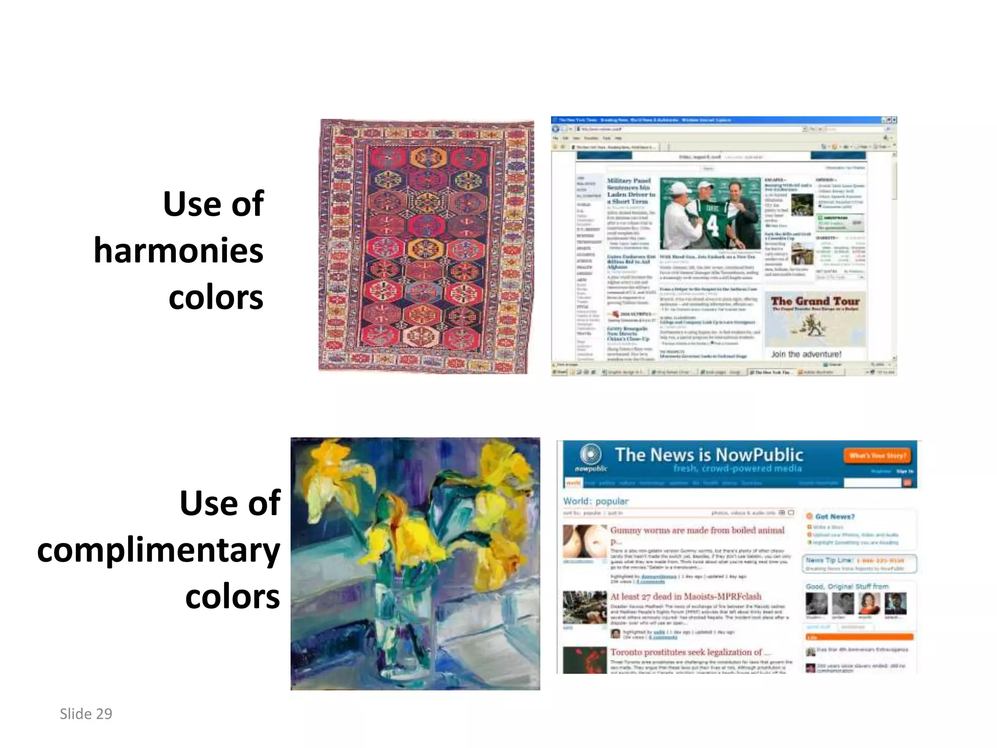
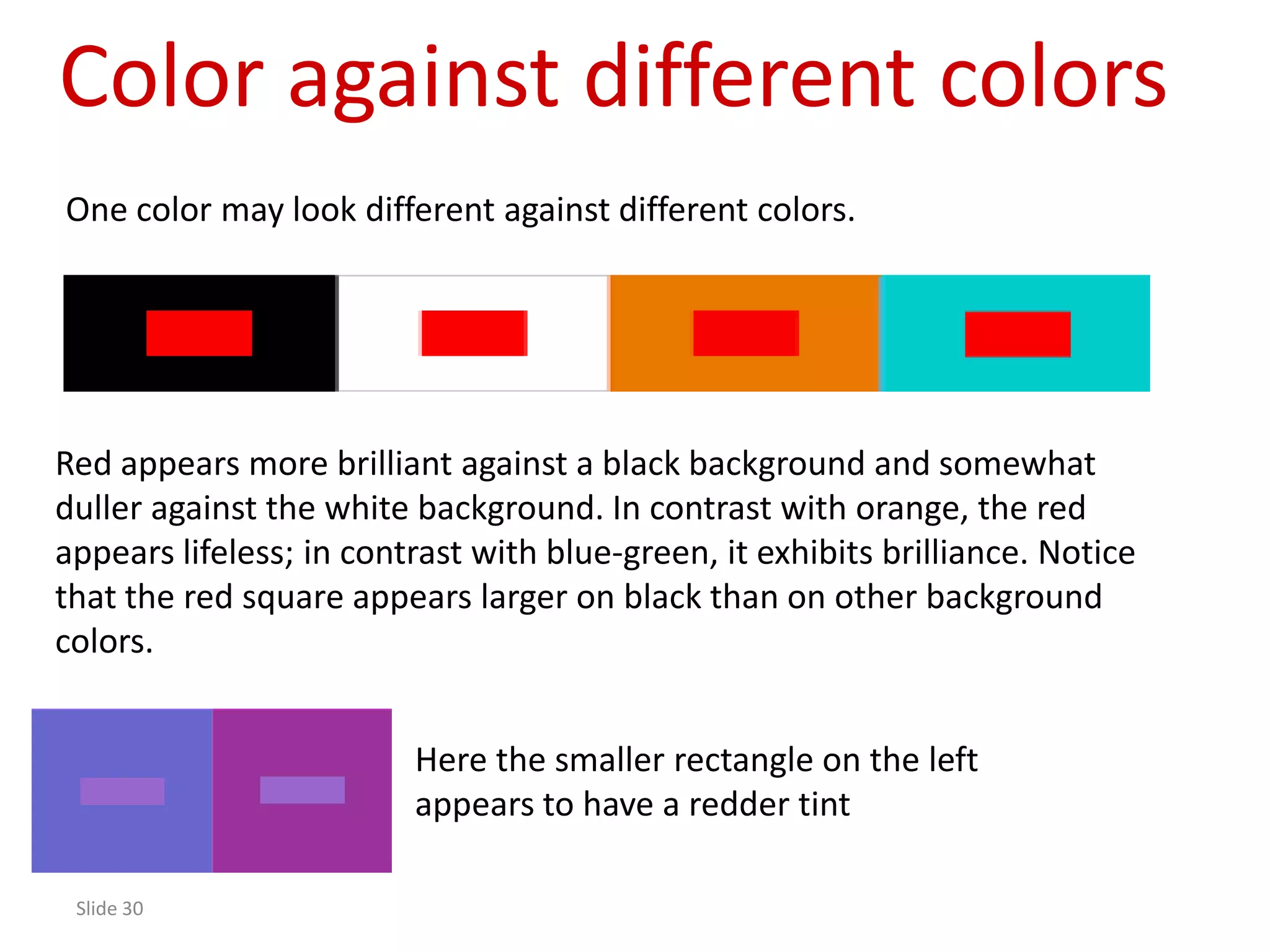
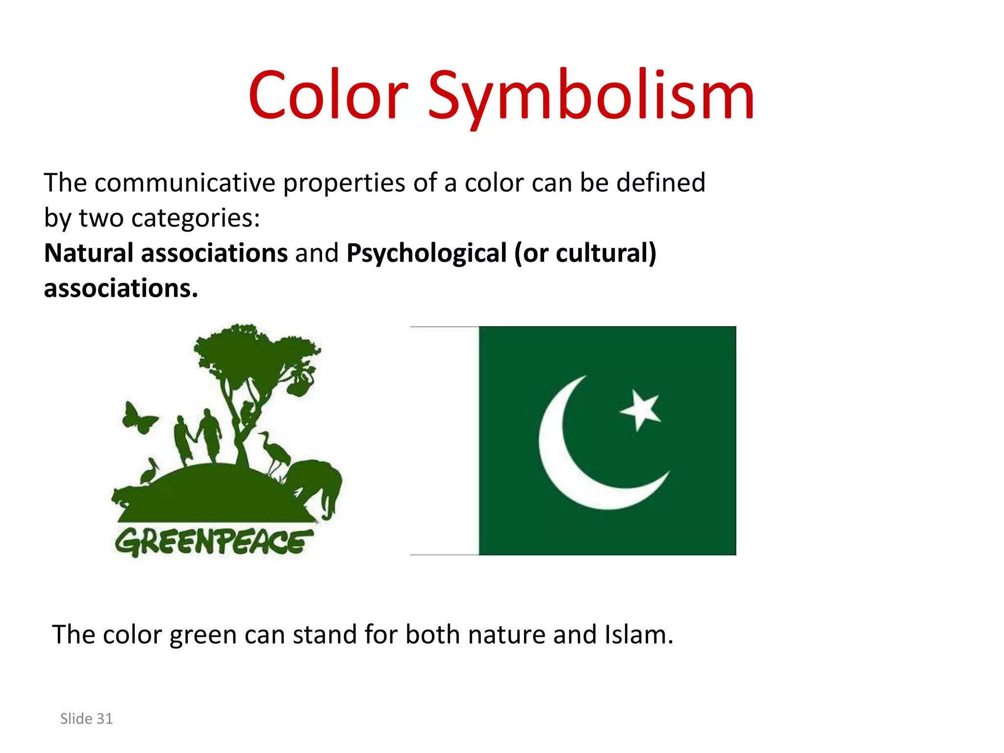
Discusses harmonious and complimentary colors, how colors appear differently together, and their symbolic meanings.


![Introduction to Graphic Design PDF [slideshare]](https://cdn.slidesharecdn.com/ss_thumbnails/prologuegraphicdesignslideshare-190815200118-thumbnail.jpg?width=640&height=640&fit=bounds)


![PowerISO 9.2 Mac Crack + Serial Key Free Download 2026 [Latest] Software.pptx](https://cdn.slidesharecdn.com/ss_thumbnails/software-251207185653-5d5700e6-thumbnail.jpg?width=640&height=640&fit=bounds)


![WinRAR Crack 7.13 Final Mac Keygen 2026 Download [Latest] Software.pptx](https://cdn.slidesharecdn.com/ss_thumbnails/software-251207185858-eb450678-thumbnail.jpg?width=640&height=640&fit=bounds)
![CleanMyMac X v5.2.8 Crack for MacOS Full Version [Latest] pptx](https://cdn.slidesharecdn.com/ss_thumbnails/softwareoverview-251207194121-a81f0142-thumbnail.jpg?width=640&height=640&fit=bounds)


