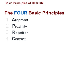
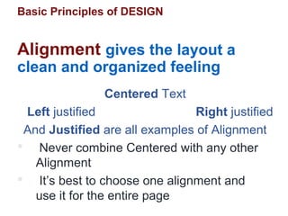
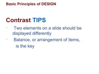
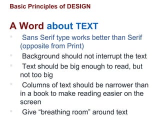
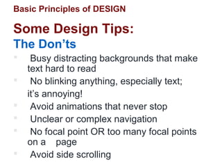
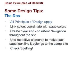
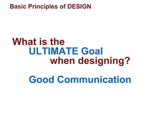
Basic Principles of
DESIGN
Oscar Gutiérrez G. MScOscar Gutiérrez G. MSc
Sources: The Non-Designers Design Book
The Non-Designers Book
Ron Woolley, www.dtp-aus.com
@ScarGutierrez
gutierrezgomez.Oscar
mscoscargutierrez
Basic Principles of DESIGN
 Type
 Color
 Shapes
 Lines
 Graphics
Looking at Design
“Elements” on the slide
Basic Principles of DESIGN
The FOUR Basic Principles
1 Alignment
2 Proximity
3 Repetition
4 Contrast
Basic Principles of DESIGN
Alignment gives the layout a
clean and organized feeling
Centered Text
Left justified Right justified
And Justified are all examples of Alignment
 Never combine Centered with any other
Alignment
 It’s best to choose one alignment and
use it for the entire page
Basic Principles of DESIGN
Alignment
 All elements should be visually
connected
 Avoid arbitrary placement
 Turn off borders
 Organization is the key
Basic Principles of DESIGN
Proximity
 Items that are related to each other
should be intellectually grouped
together
 Organizes information
 Provides a clear structure and brings
balance to the layout
Basic Principles of DESIGN
Proximity
 Use Heads, Sub heads, Type Faces
(light, bold, semibold, etc.) as tools to
help group items
 Keep visual space between elements
 Unity and Organization are the key
 Do not be afraid to use “White Space,”
but do not use too much
Basic Principles of DESIGN
Repetition
 Select a constant aspect and repeat it
throughout the ppt to tie disparate
parts together
 A few elements of Repetition are:
Fonts, Color, Bullets, Texture,
Graphics, and Format
Basic Principles of DESIGN
Repetition
 A layout without Repetition feels and
looks bland
 Consistency, or developing a unified
theme, is the key
Basic Principles of DESIGN
 Creates a Focal Point to pull the viewer in
 Avoid elements that are similar - if everything has equal
priority, then nothing has priority
 What is not the same - make different
Contrast
Basic Principles of DESIGN
Contrast creates INTEREST
emphasize TYPE
EMPHASIZE type
emphasize type
EMPHASIZE type
emphasize type
emphasize TYPE
Contrast in weight:
BOLD
BOLD ITALIC
ITALIC
NORMAL
Basic Principles of DESIGN
LOOK
HERE
Contrast by Emphasizing Type
Blahbity blah blah blah. Blah blah blah blahbity blah. Blah blah blah blahbity
blah blah blah. Blahbity blah blah blah. Blahbity blah blah blah. Blah blah blah
blahbity blah blah blah. Blah blah blah blahbity blah. Blahbity blah blah blahbity
blah blah. Blahbity blah blah blah. Blah blah blahbity blah blah blahbity blah.
Basic Principles of DESIGN
Contrast by
Emphasizing
a Graphic
Blahbity blah blah blah. Blah blah
blah blahbity blah. Blah blah
blah blahbity blah blah blah.
Blahbity blah blah blah. Blahbity
blah blah blah. Blah blah blah
blahbity blah blah blah.
Basic Principles of DESIGN
… and still more CONTRAST in
Shape, Position, or Color
The
silver fox
jumped into
the blue lake
PositionPosition
try some
COLOR
COLOR
COLOR
COLOR
Basic Principles of DESIGN
 Two elements on a slide should be
displayed differently
 Balance, or arrangement of items,
is the key
Contrast TIPS
Basic Principles of DESIGN
 Sans Serif type works better than Serif
(opposite from Print)
 Background should not interrupt the text
 Text should be big enough to read, but
not too big
 Columns of text should be narrower than
in a book to make reading easier on the
screen
 Give “breathing room” around text
A Word about TEXT
Basic Principles of DESIGN
A Word about COLOR
 Color creates contrast
 Warm colors (reds, oranges) come forward - command attention
 Cool colors (blues, greens) recede
Warm
COLORS
Cool
COLORS
Basic Principles of DESIGN
 Please…no big, dorky buttons
A Word about BUTTONS
Basic Principles of DESIGN
 Primary goal is to make it easy for visitors to
get the information they need - the key is
Organization
 Whatever style you choose, make it clear
and simple to follow
 Beware! Do not sacrifice clear
communication for unclear cleverness.
A Word about NAVIGATION
Basic Principles of DESIGN
Visualize Look at the work of others
- What catches your eye?
Criticize Separate good from bad
- What style do you like?
Analyze Study the world around you
- What looks good?
LOOK at the World
Like a DESIGNER
Basic Principles of DESIGN
 Busy distracting backgrounds that make
text hard to read
 No blinking anything, especially text;
it’s annoying!
 Avoid animations that never stop
 Unclear or complex navigation
 No focal point OR too many focal points
on a page
 Avoid side scrolling
Some Design Tips:
The Don’ts
Basic Principles of DESIGN
 All Principles of Design apply
 Link colors coordinate with page colors
 Create clear and consistent Navigation
throughout the site
 Use repetitive elements to make each
page look like it belongs to the same site
 Check Spelling!
Some Design Tips:
The Dos
Basic Principles of DESIGN
What is the
ULTIMATE Goal
when designing?
Good Communication

ppt Pitch: Basic design principles

  • 1.
    Basic Principles of DESIGN OscarGutiérrez G. MScOscar Gutiérrez G. MSc Sources: The Non-Designers Design Book The Non-Designers Book Ron Woolley, www.dtp-aus.com @ScarGutierrez gutierrezgomez.Oscar mscoscargutierrez
  • 2.
    Basic Principles ofDESIGN  Type  Color  Shapes  Lines  Graphics Looking at Design “Elements” on the slide
  • 3.
    Basic Principles ofDESIGN The FOUR Basic Principles 1 Alignment 2 Proximity 3 Repetition 4 Contrast
  • 4.
    Basic Principles ofDESIGN Alignment gives the layout a clean and organized feeling Centered Text Left justified Right justified And Justified are all examples of Alignment  Never combine Centered with any other Alignment  It’s best to choose one alignment and use it for the entire page
  • 5.
    Basic Principles ofDESIGN Alignment  All elements should be visually connected  Avoid arbitrary placement  Turn off borders  Organization is the key
  • 6.
    Basic Principles ofDESIGN Proximity  Items that are related to each other should be intellectually grouped together  Organizes information  Provides a clear structure and brings balance to the layout
  • 7.
    Basic Principles ofDESIGN Proximity  Use Heads, Sub heads, Type Faces (light, bold, semibold, etc.) as tools to help group items  Keep visual space between elements  Unity and Organization are the key  Do not be afraid to use “White Space,” but do not use too much
  • 8.
    Basic Principles ofDESIGN Repetition  Select a constant aspect and repeat it throughout the ppt to tie disparate parts together  A few elements of Repetition are: Fonts, Color, Bullets, Texture, Graphics, and Format
  • 9.
    Basic Principles ofDESIGN Repetition  A layout without Repetition feels and looks bland  Consistency, or developing a unified theme, is the key
  • 10.
    Basic Principles ofDESIGN  Creates a Focal Point to pull the viewer in  Avoid elements that are similar - if everything has equal priority, then nothing has priority  What is not the same - make different Contrast
  • 11.
    Basic Principles ofDESIGN Contrast creates INTEREST emphasize TYPE EMPHASIZE type emphasize type EMPHASIZE type emphasize type emphasize TYPE Contrast in weight: BOLD BOLD ITALIC ITALIC NORMAL
  • 12.
    Basic Principles ofDESIGN LOOK HERE Contrast by Emphasizing Type Blahbity blah blah blah. Blah blah blah blahbity blah. Blah blah blah blahbity blah blah blah. Blahbity blah blah blah. Blahbity blah blah blah. Blah blah blah blahbity blah blah blah. Blah blah blah blahbity blah. Blahbity blah blah blahbity blah blah. Blahbity blah blah blah. Blah blah blahbity blah blah blahbity blah.
  • 13.
    Basic Principles ofDESIGN Contrast by Emphasizing a Graphic Blahbity blah blah blah. Blah blah blah blahbity blah. Blah blah blah blahbity blah blah blah. Blahbity blah blah blah. Blahbity blah blah blah. Blah blah blah blahbity blah blah blah.
  • 14.
    Basic Principles ofDESIGN … and still more CONTRAST in Shape, Position, or Color The silver fox jumped into the blue lake PositionPosition try some COLOR COLOR COLOR COLOR
  • 15.
    Basic Principles ofDESIGN  Two elements on a slide should be displayed differently  Balance, or arrangement of items, is the key Contrast TIPS
  • 16.
    Basic Principles ofDESIGN  Sans Serif type works better than Serif (opposite from Print)  Background should not interrupt the text  Text should be big enough to read, but not too big  Columns of text should be narrower than in a book to make reading easier on the screen  Give “breathing room” around text A Word about TEXT
  • 17.
    Basic Principles ofDESIGN A Word about COLOR  Color creates contrast  Warm colors (reds, oranges) come forward - command attention  Cool colors (blues, greens) recede Warm COLORS Cool COLORS
  • 18.
    Basic Principles ofDESIGN  Please…no big, dorky buttons A Word about BUTTONS
  • 19.
    Basic Principles ofDESIGN  Primary goal is to make it easy for visitors to get the information they need - the key is Organization  Whatever style you choose, make it clear and simple to follow  Beware! Do not sacrifice clear communication for unclear cleverness. A Word about NAVIGATION
  • 20.
    Basic Principles ofDESIGN Visualize Look at the work of others - What catches your eye? Criticize Separate good from bad - What style do you like? Analyze Study the world around you - What looks good? LOOK at the World Like a DESIGNER
  • 21.
    Basic Principles ofDESIGN  Busy distracting backgrounds that make text hard to read  No blinking anything, especially text; it’s annoying!  Avoid animations that never stop  Unclear or complex navigation  No focal point OR too many focal points on a page  Avoid side scrolling Some Design Tips: The Don’ts
  • 22.
    Basic Principles ofDESIGN  All Principles of Design apply  Link colors coordinate with page colors  Create clear and consistent Navigation throughout the site  Use repetitive elements to make each page look like it belongs to the same site  Check Spelling! Some Design Tips: The Dos
  • 23.
    Basic Principles ofDESIGN What is the ULTIMATE Goal when designing? Good Communication