Deerhunter promo poster
•Download as DOCX, PDF•
0 likes•46 views
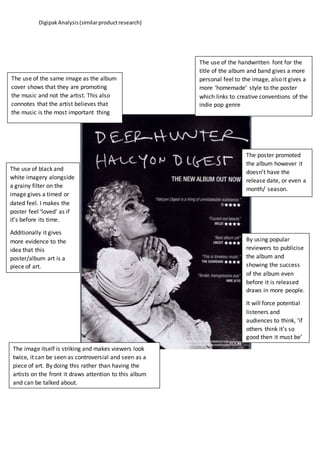
The document analyzes the design choices in a digipak album cover. It notes that using the same image as the album cover promotes the music over the artist. The handwritten font for the title and band name gives a personal, homemade feel that fits with the indie pop genre. The black and white imagery and grainy filter create a vintage, dated look that presents the poster as a piece of art from before its time. Quotes from positive early reviews are used to generate interest in the album before its release date is stated. The striking, potentially controversial image draws attention to the album as a work of art rather than focusing on the artists.
Report
Share
Report
Share
Recommended
GEORGE EZRA
The poster follows the "z-pattern" technique to grab attention. It first shows the artist's name in bold capital letters. Second, it shows the artist himself so viewers know what he looks like. This helps build an emotional connection. Third, it lists the debut album title and fact. Finally, it promotes the artist's website where viewers can find social media links and buy the album. The high angle shot focuses on the artist dressed in bright red while others look elsewhere, identifying him as most important. The poster and album cover contain the same images, making the album easy to find. Earthy colors suggest a folk genre, while diverse ages and genders target both male and female adults.
Album advertisements
The advertisement for Two Door Cinema Club's album "Tourist History" uses the same picture as the album cover to help viewers recognize the band and album in stores. The poster prominently displays "Sold Out" to convey that their tour is actually sold out and make the band seem exciting. While the album cover centers the band name, the poster places it at the top due to its rectangular shape, as posters typically list the title above rather than in the middle.
Fueled by ramen
Fueled By Ramen is an American record label founded in 1996 that is now owned by Warner Music Group. It started by signing bands in the pop punk genre like Fall Out Boy and Panic! At The Disco. While initially focused on punk, the label's artists now cover a wide range of rock styles. The document analyzes why the student chose Fueled By Ramen as the label for their fictional artist, noting connections to bands like Panic! At The Disco through their exploration of different rock genres and ability to inspire passionate fandoms, especially among emo music fans.
Evaluation Question 1
The document discusses how the author analyzed existing music videos, magazines, and albums to identify common codes and conventions. They then applied these conventions, such as shots of the band performing and lyrics matching the visuals, to their own music video, magazine ad, and album cover while conforming to an indie genre. Some conventions were challenged, like not showing the artist's face on the cover or having the male body as the object of voyeurism, to widen the target audience and show nonconformity to mainstream styles. Research into other products informed creative choices to connect the author's pieces and engage intended explorers and reformers as an audience.
Jessie j ‘who you are’
The document summarizes a music advertisement for Jessie J's album "Who You Are". The advertisement follows typical conventions by including images of the artist, album name, singles, and website. Jessie J's close-up image takes up two-thirds of the page to emphasize her importance. The bottom contains information about singles and features in black for visibility. Label logos are in the corners. The colors black, white, and gold create a sophisticated style representing Jessie J's image. The typography uses her signature handwritten style. The target audience is mostly female fans who will be attracted to Jessie J's appearance and aspire to be like her.
Analysis of student advert
The document analyzes a student music advertisement poster. It notes that the title of the album stands out against the dark background to catch people's attention. It also describes that the poster features an extreme close-up of the artist with a stern expression, intending to convey that his music is serious rather than party music. Additionally, it points out that the release date is prominently displayed across the bottom of the artist's face to emphasize its importance.
Advert conventions
The document discusses key elements that should be included in advertisements for music artists and albums. These include prominently displaying the artist's name, album name, a recognizable logo, imagery consistent with the album, websites for further information, and the album release date or notification that the album is available.
Evaluation question 3
The document summarizes feedback gathered from interviews with members of the target audience, ranging from ages 18 to 40+, regarding several texts and a video. The interviews were recorded and analyzed. The feedback showed that the recurring themes across the texts helped create branding identification. While the monochrome theme supported the dark, gritty concept, opinions differed on whether the focus was more on the artist or the music.
Audience feedback on ancillary task
The document summarizes feedback from 5 participants on album covers and posters created as part of an ancillary task. Participants felt the products captured the artist's personality through facial expressions and consistent outfit. They also noted the animated drapes and hanging CD as unique elements. However, some felt the background was too plain. Overall, participants saw a clear fun and energetic brand image conveyed through the colorful designs and fonts used. The creator was pleased with the positive feedback but also saw room for improvement by adding new outfits and a more interesting background.
Evaluation task 3
The document describes collecting feedback from a focus group on a music campaign. It discusses preparing questions in advance and collecting feedback through handwritten notes and video recording. The focus group provided feedback on the digipack, whether elements linked together, colors worked, genre could be identified, and visibility on store shelves. Recording the session allowed for more detailed feedback. Analyzing demographic and psychographic profiles provided insight into responses. The focus group identified strengths like color combination and star image, and weaknesses such as unclear artist/album names and lack of certain elements.
Katy perry website analysis
The document describes an artist's website that is promoting her new album and tour. The main page features a bright picture from her new album and informs visitors about the album and upcoming tour dates. Other pages allow fans to listen to music, view tour dates and ticket information, watch videos, see photos, and access merchandise and social media links. Bright colors and a consistent style are used throughout to draw attention and connect with fans.
Recovered file 1
The main image features the artist, Lana Del Rey, directly addressing the camera. She has a vintage, retro style conveyed through her hair, makeup, and the background inclusion of a vintage car. While her appearance seems hyper-realistic, it presents her as an indie artist rather than a mainstream pop star. Large bold text spans the top of the image advertising the album title. The color scheme matches the American flag, relating to her patriotic identity. Overall, the advert subverts some conventions by portraying Del Rey in a vintage, classy manner to appeal to indie fans rather than using sex to sell to mainstream audiences.
Creating a logo
The student has created an artist persona named Tim Starr with a quirky style inspired by musicians like Morrissey and Robert Smith. They are working on designing a digipack to promote their album. Through brainstorming and gathering feedback from their target audience online, they have chosen the album name "Sanity of a Different Kind". This name captures the theme of being different or strange while avoiding a too deterministic meaning. The student will now focus on designing the logo and visual presentation of the artist name and album title on the digipack to successfully brand their artist.
Evaluation Question 2
The music video and ancillary tasks effectively represented the indie rock genre through their use of mise-en-scene, influences, and conventions. The music video featured live performance shots of the band interspersed with a narrative to engage viewers. Lighting, camerawork, editing, and a black and white filter were used to symbolize the protagonist's emotions and conform to indie conventions. The ancillary tasks, a magazine ad and album packaging, featured close-ups of the frontman to develop the band's brand and referenced other iconic indie bands and magazines. A consistent green color scheme across tasks also helped establish the band's identity.
Evaluation q1 2
The document discusses conventions in music videos and how the music video being created challenges some conventions. It analyzes the song "Girl" by Jamie XX, noting the ambiguous genre leaves conventions ambiguous. It describes researching similar artists to determine the target audience would be 16-21 year olds who use social media like Tumblr. Since the song only has lyrics for "I want your love" and "Give me your love", a montage depicting a love story was chosen as it would fit the style and appeal to the target audience. The music video challenges the theory that videos strictly follow standards for distribution by having an authentic, ambiguous song and genre. It is influenced by director Gaspar Noe's original, cinematic style
Focus group
The focus group was informed about R&B music and asked preliminary questions to assess participants' existing knowledge of R&B artists. Participants did not initially name R&B artists as favorites but became more engaged after discussion. Old and new R&B music videos were then shown and participants preferred older videos with more narrative elements that helped tell a story. Modern videos focusing on wealth and sexuality were less favored. Participants' preferences between performance and narrative videos varied, with some preferring the storytelling of narrative videos but performance videos focusing directly on the artist and song also proving popular.
Conventions of Digipaks
The document discusses conventions for digipak album covers and compares them to the digipak a student created. It notes several common elements of digipaks including featuring the artist prominently, including a parental advisory warning if needed, using bright colors to catch the eye, displaying the album and artist name, including the record label logo, and listing the songs. It then describes the specific elements included in the student's digipak, such as the artist and album name on the front and back, consistent coloring, a song listing, and parental advisory warning.
Poster Analysis
This poster analyzes several music posters and identifies common design elements used to promote albums and artists. Key elements identified include featuring popular singles, clear display of the artist and album name, prominent images of band members to promote their image, bold fonts and colors that convey the genre, and retro or vintage aesthetics that suggest indie or alternative styles. The analysis discusses how these elements are intended to attract attention, communicate genre cues to potential buyers, and promote album and artist sales.
Conventions and Comparisons of Music Posters
Comparing my music poster to other examples of posters, as well as research into the conventions of Music Posters
Magazine advert analysis
This magazine advertisement analyzes the design elements used to promote an artist's album. The album name and artist name are centered at the top to immediately catch the eye. The main image features the artist looking introspectively back, relating to the album's theme. Additional details like the release date and website address provide important information to audiences in a clear, easy-to-read format without overwhelming them. The consistent color scheme and font create a professional look that will appeal to the target demographic.
Advert analysis 2
This advertisement is for the debut album of the band Kasabian. It features an ambiguous figure that is half black and half white, representing the band's dark and light sides. It does not show the individual band members, making it unique compared to typical band advertisements. The advertisement uses black and white colors to highlight important text like the album and band name. It also lists popular singles from the album, which may attract people familiar with those songs who don't know they are by Kasabian.
Tom a3
This document analyzes the cover designs of various artists' digipaks and identifies common conventions used. It finds that many artists feature prominent images of themselves to identify the artist and attract fans. Some challenge conventions by omitting text or using landscape images instead of portraits. Artists also commonly include the album and artist name to promote the content and artist brand. Overall, the document examines how different artists employ standard design elements or innovative approaches in crafting their digipak covers.
Media evaluation2
The document discusses the effectiveness of combining a music album with additional promotional materials, including a digipak, magazine advertisement, and music video.
The digipak uses a consistent pink, red, and white color scheme that creates a warm, romantic atmosphere fitting the album's theme. Shot types like medium close-ups create intimacy between the artist and audience. Font styles and inclusion of lyrics further engage the target audience.
The magazine advertisement uses a similar image as the digipak for consistency. It also features the digipak cover to familiarize audiences with both products. Shared color schemes and fonts between the digipak and ad ensure clear linking of the products. Interactive elements and reviews alleviate promotion of the artist
Music videos task 2
The music video helps promote Big Time Rush by featuring Snoop Dogg, gaining fans from his audience. Music videos also help promote album sales by showing close-ups of band members' faces so fans recognize them at concerts. Ariana Grande's videos sexualize her through scant clothing and positions according to the male gaze theory. Artists can also be promoted through social media appearances and features in other artists' music videos to expand their fan base.
Music video purposes work sheet one direction
The document discusses the purposes and benefits of music videos for the boy band One Direction and their target audience. It provides examples of how One Direction and their record label use music videos and other promotional strategies to:
1) Promote their albums and extend their income through concert tours and merchandise sales. This includes a 7 hour livestream online to promote their album Midnight Memories.
2) Reach new audiences and generate additional revenue through related products like a perfume and vinyl album sold at record stores.
3) Create synergy across multiple marketing outlets like t-shirts, watches, and a movie to significantly increase their income beyond just album sales.
4) Employ producers' promotional strategies like television
Conventions of magazine digipak adverts
The document outlines the key conventions to include in a magazine advertisement for a music album. It recommends including the artist name, album name, release date and purchase information, reviews and ratings, album cover image, tour dates, and websites. This information promotes the artist and their latest album or single, informs audiences when and where the music can be purchased or seen live, and helps generate interest in the product.
Kendrick lamar’s websites
The document describes Kendrick Lamar's artist website. It discusses how the homepage uses music and imagery to promote his albums and engage fans. It also describes how subsequent pages provide information on tour dates while encouraging fans to purchase his music and feel connected through social media integration and exclusive content. The website is both informative and promotional, maintaining a consistent theme while including interactive elements that bring fans closer to the artist.
Others interpretation be there
The document provides a list of ideas that were submitted for possible music videos for the song "Be There" by Seafret. The ideas range from narrative storylines involving love and breakups to purely performance-based videos with locations like beaches, deserts, forests, and cities. Some ideas incorporate elements like slow motion, lighting, nature shots, and instrumentation.
You oughta know
The document analyzes Alanis Morisette's music video for "You Oughta Know" in the context of Goodwin's theory of musical structure and storytelling. It discusses how the musical structure builds emotion from verse to chorus, and how Morisette's ragged appearance and the suitcase prop help tell the story of her emotional journey after a breakup. By addressing an unnamed "you" and using no other actors, the video enhances the song's relatability for audiences while also featuring Morisette's star performance.
Costume, actors and props
The document discusses the costume, actors, and props for a blues rock music video. For costumes, the actors will wear mostly black attire or normal clothes to fit the blues rock genre. Three teenage actors are chosen - Kieran Goodall on guitar, Reuben Leishman who is available and has equipment, and Louis Keu who has a car - because they can all give a good performance. The only props needed are the musical instruments.
More Related Content
What's hot
Audience feedback on ancillary task
The document summarizes feedback from 5 participants on album covers and posters created as part of an ancillary task. Participants felt the products captured the artist's personality through facial expressions and consistent outfit. They also noted the animated drapes and hanging CD as unique elements. However, some felt the background was too plain. Overall, participants saw a clear fun and energetic brand image conveyed through the colorful designs and fonts used. The creator was pleased with the positive feedback but also saw room for improvement by adding new outfits and a more interesting background.
Evaluation task 3
The document describes collecting feedback from a focus group on a music campaign. It discusses preparing questions in advance and collecting feedback through handwritten notes and video recording. The focus group provided feedback on the digipack, whether elements linked together, colors worked, genre could be identified, and visibility on store shelves. Recording the session allowed for more detailed feedback. Analyzing demographic and psychographic profiles provided insight into responses. The focus group identified strengths like color combination and star image, and weaknesses such as unclear artist/album names and lack of certain elements.
Katy perry website analysis
The document describes an artist's website that is promoting her new album and tour. The main page features a bright picture from her new album and informs visitors about the album and upcoming tour dates. Other pages allow fans to listen to music, view tour dates and ticket information, watch videos, see photos, and access merchandise and social media links. Bright colors and a consistent style are used throughout to draw attention and connect with fans.
Recovered file 1
The main image features the artist, Lana Del Rey, directly addressing the camera. She has a vintage, retro style conveyed through her hair, makeup, and the background inclusion of a vintage car. While her appearance seems hyper-realistic, it presents her as an indie artist rather than a mainstream pop star. Large bold text spans the top of the image advertising the album title. The color scheme matches the American flag, relating to her patriotic identity. Overall, the advert subverts some conventions by portraying Del Rey in a vintage, classy manner to appeal to indie fans rather than using sex to sell to mainstream audiences.
Creating a logo
The student has created an artist persona named Tim Starr with a quirky style inspired by musicians like Morrissey and Robert Smith. They are working on designing a digipack to promote their album. Through brainstorming and gathering feedback from their target audience online, they have chosen the album name "Sanity of a Different Kind". This name captures the theme of being different or strange while avoiding a too deterministic meaning. The student will now focus on designing the logo and visual presentation of the artist name and album title on the digipack to successfully brand their artist.
Evaluation Question 2
The music video and ancillary tasks effectively represented the indie rock genre through their use of mise-en-scene, influences, and conventions. The music video featured live performance shots of the band interspersed with a narrative to engage viewers. Lighting, camerawork, editing, and a black and white filter were used to symbolize the protagonist's emotions and conform to indie conventions. The ancillary tasks, a magazine ad and album packaging, featured close-ups of the frontman to develop the band's brand and referenced other iconic indie bands and magazines. A consistent green color scheme across tasks also helped establish the band's identity.
Evaluation q1 2
The document discusses conventions in music videos and how the music video being created challenges some conventions. It analyzes the song "Girl" by Jamie XX, noting the ambiguous genre leaves conventions ambiguous. It describes researching similar artists to determine the target audience would be 16-21 year olds who use social media like Tumblr. Since the song only has lyrics for "I want your love" and "Give me your love", a montage depicting a love story was chosen as it would fit the style and appeal to the target audience. The music video challenges the theory that videos strictly follow standards for distribution by having an authentic, ambiguous song and genre. It is influenced by director Gaspar Noe's original, cinematic style
Focus group
The focus group was informed about R&B music and asked preliminary questions to assess participants' existing knowledge of R&B artists. Participants did not initially name R&B artists as favorites but became more engaged after discussion. Old and new R&B music videos were then shown and participants preferred older videos with more narrative elements that helped tell a story. Modern videos focusing on wealth and sexuality were less favored. Participants' preferences between performance and narrative videos varied, with some preferring the storytelling of narrative videos but performance videos focusing directly on the artist and song also proving popular.
Conventions of Digipaks
The document discusses conventions for digipak album covers and compares them to the digipak a student created. It notes several common elements of digipaks including featuring the artist prominently, including a parental advisory warning if needed, using bright colors to catch the eye, displaying the album and artist name, including the record label logo, and listing the songs. It then describes the specific elements included in the student's digipak, such as the artist and album name on the front and back, consistent coloring, a song listing, and parental advisory warning.
Poster Analysis
This poster analyzes several music posters and identifies common design elements used to promote albums and artists. Key elements identified include featuring popular singles, clear display of the artist and album name, prominent images of band members to promote their image, bold fonts and colors that convey the genre, and retro or vintage aesthetics that suggest indie or alternative styles. The analysis discusses how these elements are intended to attract attention, communicate genre cues to potential buyers, and promote album and artist sales.
Conventions and Comparisons of Music Posters
Comparing my music poster to other examples of posters, as well as research into the conventions of Music Posters
Magazine advert analysis
This magazine advertisement analyzes the design elements used to promote an artist's album. The album name and artist name are centered at the top to immediately catch the eye. The main image features the artist looking introspectively back, relating to the album's theme. Additional details like the release date and website address provide important information to audiences in a clear, easy-to-read format without overwhelming them. The consistent color scheme and font create a professional look that will appeal to the target demographic.
Advert analysis 2
This advertisement is for the debut album of the band Kasabian. It features an ambiguous figure that is half black and half white, representing the band's dark and light sides. It does not show the individual band members, making it unique compared to typical band advertisements. The advertisement uses black and white colors to highlight important text like the album and band name. It also lists popular singles from the album, which may attract people familiar with those songs who don't know they are by Kasabian.
Tom a3
This document analyzes the cover designs of various artists' digipaks and identifies common conventions used. It finds that many artists feature prominent images of themselves to identify the artist and attract fans. Some challenge conventions by omitting text or using landscape images instead of portraits. Artists also commonly include the album and artist name to promote the content and artist brand. Overall, the document examines how different artists employ standard design elements or innovative approaches in crafting their digipak covers.
Media evaluation2
The document discusses the effectiveness of combining a music album with additional promotional materials, including a digipak, magazine advertisement, and music video.
The digipak uses a consistent pink, red, and white color scheme that creates a warm, romantic atmosphere fitting the album's theme. Shot types like medium close-ups create intimacy between the artist and audience. Font styles and inclusion of lyrics further engage the target audience.
The magazine advertisement uses a similar image as the digipak for consistency. It also features the digipak cover to familiarize audiences with both products. Shared color schemes and fonts between the digipak and ad ensure clear linking of the products. Interactive elements and reviews alleviate promotion of the artist
Music videos task 2
The music video helps promote Big Time Rush by featuring Snoop Dogg, gaining fans from his audience. Music videos also help promote album sales by showing close-ups of band members' faces so fans recognize them at concerts. Ariana Grande's videos sexualize her through scant clothing and positions according to the male gaze theory. Artists can also be promoted through social media appearances and features in other artists' music videos to expand their fan base.
Music video purposes work sheet one direction
The document discusses the purposes and benefits of music videos for the boy band One Direction and their target audience. It provides examples of how One Direction and their record label use music videos and other promotional strategies to:
1) Promote their albums and extend their income through concert tours and merchandise sales. This includes a 7 hour livestream online to promote their album Midnight Memories.
2) Reach new audiences and generate additional revenue through related products like a perfume and vinyl album sold at record stores.
3) Create synergy across multiple marketing outlets like t-shirts, watches, and a movie to significantly increase their income beyond just album sales.
4) Employ producers' promotional strategies like television
Conventions of magazine digipak adverts
The document outlines the key conventions to include in a magazine advertisement for a music album. It recommends including the artist name, album name, release date and purchase information, reviews and ratings, album cover image, tour dates, and websites. This information promotes the artist and their latest album or single, informs audiences when and where the music can be purchased or seen live, and helps generate interest in the product.
Kendrick lamar’s websites
The document describes Kendrick Lamar's artist website. It discusses how the homepage uses music and imagery to promote his albums and engage fans. It also describes how subsequent pages provide information on tour dates while encouraging fans to purchase his music and feel connected through social media integration and exclusive content. The website is both informative and promotional, maintaining a consistent theme while including interactive elements that bring fans closer to the artist.
What's hot (19)
Viewers also liked
Others interpretation be there
The document provides a list of ideas that were submitted for possible music videos for the song "Be There" by Seafret. The ideas range from narrative storylines involving love and breakups to purely performance-based videos with locations like beaches, deserts, forests, and cities. Some ideas incorporate elements like slow motion, lighting, nature shots, and instrumentation.
You oughta know
The document analyzes Alanis Morisette's music video for "You Oughta Know" in the context of Goodwin's theory of musical structure and storytelling. It discusses how the musical structure builds emotion from verse to chorus, and how Morisette's ragged appearance and the suitcase prop help tell the story of her emotional journey after a breakup. By addressing an unnamed "you" and using no other actors, the video enhances the song's relatability for audiences while also featuring Morisette's star performance.
Costume, actors and props
The document discusses the costume, actors, and props for a blues rock music video. For costumes, the actors will wear mostly black attire or normal clothes to fit the blues rock genre. Three teenage actors are chosen - Kieran Goodall on guitar, Reuben Leishman who is available and has equipment, and Louis Keu who has a car - because they can all give a good performance. The only props needed are the musical instruments.
Lyrics analysis
The song expresses feelings of deep love and dependence on another person. The narrator feels they have given everything to this person and cannot live without them. They promise to always be there for the other person, especially when needed and if they are alone. The narrator wants to grow old with this person and cannot leave them, showing their strong feelings and commitment to a long-term future together. However, the other person has not revealed if they feel the same deeply for the narrator, leaving them desperate to know the other's feelings.
Remember the time analysis
The music video for Michael Jackson's song "Remember the Time" tells a narrative story set in ancient Egypt over nearly 10 minutes. Jackson portrays a wizard who entertains the Pharaoh's bored Queen with his dance and singing, asking her to "remember the time" they were together. The jealous Pharaoh summons his guards, but Jackson escapes through elaborate choreography. The video draws from several media theories, portraying Jackson as the hero, the Queen as the princess, and Eddie Murphy's Pharaoh as the villain. It also uses codes of action and lyrics to advance the narrative and give meaning through binary oppositions between Jackson and Murphy's characters.
Ideas drafting - mac video
This document contains initial ideas and thoughts from peers who listened to a song, including dreamy and blurred images, a tired man, a chronological narrative to the lyrics, psychedelic and trippy images, slow motion, bright colors from the 1960s, references to a woman named Michelle, alcohol and getting drunk, objects appearing out of place, contrasting open and closed spaces, and color filters. The document notes that these varied ideas will be useful resources for producing a music video that appeals to the target audience.
Narrative theory
Narrative theory analyzes how media texts communicate meaning about events through organized spatial and temporal relationships. It views narrative as a chain of causally linked events that have a beginning, middle, and end embodying a judgment about the nature of those events. Various theorists have proposed models for analyzing narratives, including Propp's characterization types, Todorov's equilibrium stages, Barthes' codes, and Levi-Strauss' exploration of binary oppositions reflecting a culture's values. More recent trends include nonlinear and self-reflexive postmodern narratives. Narrative analysis examines how elements like editing, camerawork and sound construct meaning for audiences.
Target audience
The document discusses comments left on the music video for Seafret's song "Be There" on YouTube. It notes that a Nielsen study found teens prefer free, ad-supported music streaming over other listening methods. The comments on the video suggest it was successful in reaching its target audience, which can be implied from the video to be young adults aged 18-24, as most of the characters shown are of those ages. However, the video also includes older and younger characters and does not target a specific gender.
Audience theory
This document summarizes four theories of audience:
1) The Frankfurt School viewed audiences as passive, accepting media messages without question.
2) Katz and Lazarsfield's Two Step Flow Theory proposed that opinion leaders influence others through interpersonal communication.
3) Katz and Blumler's Uses and Gratifications Theory found that audiences actively consume media to fulfill different needs.
4) David Morley's Nationwide Audience Theory described three types of readings that audiences can have: dominant, negotiated, and oppositional.
Narrative theory
This document discusses various theories of narrative analysis that can be applied to different media. It defines narrative as a chain of causally linked events with a beginning, middle, and end. Narrative theory analyzes how media texts communicate events. Several theorists are discussed, including Propp, who identified common character archetypes in folk stories, and Todorov, who proposed a 5-stage model of narrative structure. Other theorists mentioned are Barthes, Levi-Strauss, and Cameron. The document also discusses postmodern narratives and how narrative analysis considers elements like editing and sound to create meaning for audiences.
Media language
This document discusses several key technical elements of media including mise-en-scene, editing, sound, and camera work. It also covers codes, semiotics, and different types of signs including symbolic, iconic, and indexical signs. Finally, it discusses Roland Barthes' work applying semiotic concepts to culture and how signs can take on dominant ideological meanings within a society.
Floor plan wolves without teeth
The floor plan depicts a house with two beds and two wardrobes separated by two doors. Other locations mentioned in the document are a forest and a hill within the forest.
Narrative theory- Taylor swift
1) The music video follows the breakup of Taylor Swift and her ex-boyfriend, with Taylor as the hero and her ex as the villain.
2) Using Todorov's model, the initial relationship is in equilibrium, the breakup disrupts this, and Taylor's realization and final conversation with her ex work to establish a new equilibrium of being single.
3) Applying Barthes' codes, the action code shows the fighting, the referential code the argument, and the enigma code teases the audience during Taylor's final conversation with her ex.
Fluorescent adolescent
The document analyzes the music video for the song "Fluorescent Adolescent" by the Arctic Monkeys using various narrative theories. It identifies the main characters according to Propp as the man in the black jacket being the hero and the clowns being the villains. Todorov's model of narrative identifies the initial equilibrium of the clowns attacking, the disruption when the men fight them off, and the recognition of disruption when the clowns get angry. Barthes' semiotic analysis finds codes of action, reference, and semantics, with the main enigma being that the hero and main clown were actually friends as children. Levi-Strauss suggests viewers typically see clowns as evil
Music video analysis
Within Lana Del Rey's music video for "Video Games", many elements of Goodwin's music video analysis theory can be found. The song structure follows a typical verse-chorus form. Unconventional instruments are used to highlight the alternative nature of the artist and genre. Imagery from home videos in the past contrasts with scenes of modern rebellion, linking Lana to past generations and implying a loss of youthful innocence over time. Personal pronouns and recollections of explicit experiences that undermine innocence allow the story and message to feel both personal yet relatable to different audiences.
The black keys little black submarines goodwin analyses
The Black Keys' music video for "Little Black Submarines" features a performance-based video of the band playing at a gig. The video emphasizes their performance through canted camera angles and zoomed shots that frantically move between close-ups of the band members and their instruments. While the video lacks a narrative, it reinforces the band's abstract and blues rock style through a grainy film effect and shots of their mundane setting in an isolated shack. The editing pace of the video matches the increasing tempo of the song throughout.
Genre theory
This document discusses genre theory and the concept of genre. It provides definitions of genre from various theorists like Warren Buckland who describes genre as categorizing films into groups based on their type. The document discusses how genre helps audiences and industries classify works and influences what is produced. It also notes that while genres provide structure and familiarity, deviations can confuse or please audiences. Several genre theorists are quoted discussing topics like genres borrowing conventions, genres being defined by repeated codes and conventions, and genres changing over time and contexts.
Analysis of high hopes
The document analyzes the music video for Kodaline's "High Hopes" using narrative theory. It identifies three main characters - two men and a woman. The first man is suicidal but is saved by the woman, making her the hero and him the princess according to Propp's theory. However, their roles could be reversed when she gets in his car to escape the men chasing her, making him the hero and her the princess. These chasing men are identified as the villains. The video also touches on Todorov's theory of equilibrium, showing a sense of calm between the two protagonists before the villain disrupts it by shooting them. It briefly explores the postmodern theme of flashbacks when the couple
Viewers also liked (20)
The black keys little black submarines goodwin analyses
The black keys little black submarines goodwin analyses
Similar to Deerhunter promo poster
Poster Research
The document summarizes and analyzes two album promotion posters by Rihanna and Lana Del Rey. Both posters prominently display the artist and album name in large font to attract attention. The Rihanna poster also includes the album cover art and song listings, while using bright colors appealing to her target audience. The Lana Del Rey poster stands out for its large size, and uses a black and white theme consistent with the album's style. While the document learner key similarities in attracting audience attention, it also notes the posters' minimal designs with few images and text.
Evaluation 2
The document discusses the design of various components of a digipak for a music album, including the front cover, inside cover, disc, and back cover. Research was conducted on conventions for indie/pop album packaging. Key conventions followed include featuring the artist prominently and using cohesive color schemes and fonts. Some conventions were challenged, such as including a personal photo on the inside cover and using bright colors. The overall design aims to effectively market an unsigned band and link the packaging to the music video's theme of a relationship.
Analysis of posters and adverts.
The document discusses conventions of tour posters and magazine advertisements. It analyzes several examples of tour posters from different genres to understand what elements make an effective poster. Key conventions included are the artist name, tour dates and locations, special guests, and website. Magazine advertisements similarly include the artist name and album/song title but may omit release dates as a marketing strategy. Color choice and imagery are also important design elements analyzed across the examples.
Analysis of posters and adverts.
The document discusses conventions of tour posters and magazine advertisements. It analyzes several examples of tour posters from different genres to understand what elements make an effective poster. Key conventions included are the artist name, tour dates and locations, special guests, and website. Magazine advertisements promote specific albums or songs rather than full tours. They may omit release dates as a marketing strategy. Overall the document examines various advertising examples to inform the design of a media coursework product.
Conventions of a CD.
The document discusses conventions of CD design based on an analysis of existing CDs. It finds that conventions are less straightforward than initially thought. Every CD contains the record label, but designs vary widely. Men's CDs typically don't feature the artist's image and aim for creative/aesthetic designs suggesting power. Women's CDs have more varied designs, sometimes featuring the artist sexually and sometimes not. The analyzed CDs conform to expected conventions like featuring the artist/album name and label, while breaking conventions like not including the artist's image.
In what ways does your media product use, develop or challenge forms and conv...
The poster summarizes how a media product they created for the band Alt-J's album "Breezeblocks" both follows and challenges conventions of real media products. The poster includes the album name, release date, and reviews as typical posters do. However, it challenges conventions by using an enlarged album cover as the background rather than a solid color, and including a partial face image rather than avoiding images of the band members. Similarly, the tour poster includes the tour name, dates, locations, and ticket website as normal, but challenges conventions by using an album art background and band performance image rather than more typical designs. The digipak also follows conventions by including the album art, song list, and barcode, but challenges
Product comparisons
This document discusses strategies for designing effective promotional album posters and covers. It examines how to apply the "route of the eye" concept to guide the viewer's attention in a quick and impactful way. Key elements discussed include placing the band name and album title prominently, including images of the band and CD for recognition, highlighting new releases or reviews to generate hype, and showing the record label for branding. Color, font, and layout are also addressed to make the design appealing, identifiable within the genre, and similar to successful existing products. Comparing to other examples allows one to determine if their own design achieves these goals of attracting attention, conveying necessary information efficiently, and relating appropriately to the target market.
Evaluation question 2
The document describes the creation of ancillary products - a digipak cover and advert - to accompany a music video for promotional purposes. Key points:
- The ancillary products and music video were created for an A2 media project on the song "Chipmunk Flying High" by the artist.
- Elements like the title, artist name, and plain design were consistent across products to clearly link them and show they were part of the same project.
- The digipak cover was designed to be recognizable on store shelves and appeal to fans of the rap genre through its plain style.
- Inside the digipak, reviews and photos were included to help audiences decide which songs to listen to
Pendulum research
The Pendulum website uses consistent branding techniques to promote the band's image and music. These include prominently displaying their name in a consistent font across all pages and using album artwork as the background. The site also advertises their latest single with a banner and background option, provides music playback, and offers fans exclusive membership. Similarly, the album packaging utilizes the bold, colorful imagery associated with the band as its theme throughout the cover, inside, and back. Posters promoting the band also employ matching bright colors, club scenes, and the repeated logo to create a recognizable style and appeal to their target audience.
Eval q2
The document discusses the branding and promotion of an indie pop band called "Peace of Lions".
The author created a music video, magazine advertisement, and CD digipak to promote the band's new album. Consistency was important to create a cohesive marketing campaign. Similar fonts, colors, and urban imagery were used across products.
The products are intended to appeal to the target audience of 16-24 year olds by portraying the band members as normal and relatable rather than constructed images. Locations and aesthetic choices also follow conventions of the indie pop genre.
Music magazine's signs and signifiers
Both magazines use iconic images of popular rock bands on the front covers to represent the genre of music and attract fans of the bands. They portray the bands wearing all black using serious facial expressions and low camera angles to fit the stereotypical aggressive image associated with rock music. The magazines use colors like black, white and dark greens that symbolize concepts like power, wealth and darkness linked to the rock genre. The typography features words and logos that would be instantly recognizable to fans. Inside, large central images of bands are iconic signs for readers, while the language and informal tone in the contents pages aim to appeal to the teenage audience.
Jack johnson digipak anaylsis
ferqtgerqtwerrtetertretrwetrwetrew gfds gfsfds greswrtw 435235 t
retw trew
jirejtwkrtyre
ytre
tre
ty676ewtwryrehyuhtreh ouorjyn otoyj
tu573657657564746736yhjkyyewdhyu65tr
Jack johnson digipak anaylsis media studies
jack Johnson, digipak analysis, media studies, 2014, coursework, media media media media, coursework, year 13, coursework
Digipak Research
The document discusses design elements that were researched for inclusion in a digipak album cover. Some key elements discussed include:
- Using bright colors that were popular in album covers from the 1970s to draw attention to the cover.
- Including an image of the band to make the album recognizable and inform audiences about the artists.
- Placing the band and album name prominently on the front and spine for visibility and easy discovery on store shelves.
- Making the track list the clear focus on the back cover without other distracting elements.
Digipak research
The document discusses design elements that were researched for inclusion in a digipak album cover. Some key elements discussed include:
- Using bright colors that draw the eye as well as images of the band to make the album recognizable.
- Placing the band and album name prominently to identify the artist and title.
- Keeping the track list as the sole focus on the back cover so it is easy to read.
- Incorporating consistent colors, fonts, and layouts across the digipak surfaces to create a cohesive design.
Digipack and poster analysis
This document analyzes the digipak and promotional poster for Lady Gaga's album "Joanne" to understand how they effectively attract her target audience. The album cover features only a small part of Gaga's face, making it simplistic and focusing attention on her. The third song is highlighted differently, suggesting it is important. The poster matches the album cover's theme and colors, showing Gaga casually dressed and holding headphones to imply the album is worth listening to. Phrases are included to intrigue audiences and direct them to listen across music platforms.
Question2
The document discusses creating a unified theme and style across a band's promotional products. It examines how other bands use consistent imagery, styles and color schemes. It then details how the author established a theme of "looking and watching" by featuring voyeuristic footage in the music video and images of a smashed camera in the album packaging and magazine ad. Red, black and white were used as core colors to appeal to the indie/rock genre audience. By keeping the band members anonymous, it creates intrigue and focuses the audience on the music itself, in line with indie/rock values. Taken together, the products form a cohesive and effective promotional package.
You Me At Six digipak analysis
The digipak for You Me At Six's album "The Final Night Of Sin At Wembley Arena" follows conventions of the genre in several ways. It prominently displays the band name and album title. Imagery includes a dark, moody shot of the empty venue and a crowded shot from the concert. Extra content like two CDs, a DVD, and a booklet encourage fans to purchase the digipak. Contradictory shots of the empty and full venue convey how the band needs fan support to succeed.
Evaluation
The document discusses the creation of various media products including a video, album packaging, and website for a musician. The goal was to create a consistent visual style and "star image" across all products that audiences could associate with the artist. Specific design elements like forest imagery, typefaces, and color schemes were carried over from the video to the album packaging and website to reinforce the artist's brand identity. Consistency of visuals and easy navigation were prioritized to improve the audience experience across all of the artist's media.
Digipak and poster analysis
The document analyzes the front cover and poster of a pop album. The front cover features a medium close-up shot of the artist looking over his shoulder, referencing his past and career progression. The bold title "Believe" is the main focus, conveying the album's message of trust, faith, and confidence. The poster continues this theme, showing the artist transitioning from busking to a professional musician. Both the cover and poster prominently display the artist's name and album title for recognition, and include consistent black and gold coloring, the artist's fashion style, and lists of songs to promote album purchases.
Similar to Deerhunter promo poster (20)
In what ways does your media product use, develop or challenge forms and conv...
In what ways does your media product use, develop or challenge forms and conv...
Recently uploaded
Executive Directors Chat Leveraging AI for Diversity, Equity, and Inclusion
Let’s explore the intersection of technology and equity in the final session of our DEI series. Discover how AI tools, like ChatGPT, can be used to support and enhance your nonprofit's DEI initiatives. Participants will gain insights into practical AI applications and get tips for leveraging technology to advance their DEI goals.
Hindi varnamala | hindi alphabet PPT.pdf
हिंदी वर्णमाला पीपीटी, hindi alphabet PPT presentation, hindi varnamala PPT, Hindi Varnamala pdf, हिंदी स्वर, हिंदी व्यंजन, sikhiye hindi varnmala, dr. mulla adam ali, hindi language and literature, hindi alphabet with drawing, hindi alphabet pdf, hindi varnamala for childrens, hindi language, hindi varnamala practice for kids, https://www.drmullaadamali.com
DRUGS AND ITS classification slide share
Any substance (other than food) that is used to prevent, diagnose, treat, or relieve symptoms of a
disease or abnormal condition
South African Journal of Science: Writing with integrity workshop (2024)
South African Journal of Science: Writing with integrity workshop (2024)Academy of Science of South Africa
A workshop hosted by the South African Journal of Science aimed at postgraduate students and early career researchers with little or no experience in writing and publishing journal articles.clinical examination of hip joint (1).pdf
described clinical examination all orthopeadic conditions .
Natural birth techniques - Mrs.Akanksha Trivedi Rama University
Natural birth techniques - Mrs.Akanksha Trivedi Rama UniversityAkanksha trivedi rama nursing college kanpur.
Natural birth techniques are various type such as/ water birth , alexender method, hypnosis, bradley method, lamaze method etcTypes of Herbal Cosmetics its standardization.
Physiology and chemistry of skin and pigmentation, hairs, scalp, lips and nail, Cleansing cream, Lotions, Face powders, Face packs, Lipsticks, Bath products, soaps and baby product,
Preparation and standardization of the following : Tonic, Bleaches, Dentifrices and Mouth washes & Tooth Pastes, Cosmetics for Nails.
BÀI TẬP BỔ TRỢ TIẾNG ANH 8 CẢ NĂM - GLOBAL SUCCESS - NĂM HỌC 2023-2024 (CÓ FI...
BÀI TẬP BỔ TRỢ TIẾNG ANH 8 CẢ NĂM - GLOBAL SUCCESS - NĂM HỌC 2023-2024 (CÓ FI...Nguyen Thanh Tu Collection
https://app.box.com/s/y977uz6bpd3af4qsebv7r9b7s21935vdISO/IEC 27001, ISO/IEC 42001, and GDPR: Best Practices for Implementation and...
Denis is a dynamic and results-driven Chief Information Officer (CIO) with a distinguished career spanning information systems analysis and technical project management. With a proven track record of spearheading the design and delivery of cutting-edge Information Management solutions, he has consistently elevated business operations, streamlined reporting functions, and maximized process efficiency.
Certified as an ISO/IEC 27001: Information Security Management Systems (ISMS) Lead Implementer, Data Protection Officer, and Cyber Risks Analyst, Denis brings a heightened focus on data security, privacy, and cyber resilience to every endeavor.
His expertise extends across a diverse spectrum of reporting, database, and web development applications, underpinned by an exceptional grasp of data storage and virtualization technologies. His proficiency in application testing, database administration, and data cleansing ensures seamless execution of complex projects.
What sets Denis apart is his comprehensive understanding of Business and Systems Analysis technologies, honed through involvement in all phases of the Software Development Lifecycle (SDLC). From meticulous requirements gathering to precise analysis, innovative design, rigorous development, thorough testing, and successful implementation, he has consistently delivered exceptional results.
Throughout his career, he has taken on multifaceted roles, from leading technical project management teams to owning solutions that drive operational excellence. His conscientious and proactive approach is unwavering, whether he is working independently or collaboratively within a team. His ability to connect with colleagues on a personal level underscores his commitment to fostering a harmonious and productive workplace environment.
Date: May 29, 2024
Tags: Information Security, ISO/IEC 27001, ISO/IEC 42001, Artificial Intelligence, GDPR
-------------------------------------------------------------------------------
Find out more about ISO training and certification services
Training: ISO/IEC 27001 Information Security Management System - EN | PECB
ISO/IEC 42001 Artificial Intelligence Management System - EN | PECB
General Data Protection Regulation (GDPR) - Training Courses - EN | PECB
Webinars: https://pecb.com/webinars
Article: https://pecb.com/article
-------------------------------------------------------------------------------
For more information about PECB:
Website: https://pecb.com/
LinkedIn: https://www.linkedin.com/company/pecb/
Facebook: https://www.facebook.com/PECBInternational/
Slideshare: http://www.slideshare.net/PECBCERTIFICATION
PCOS corelations and management through Ayurveda.
This presentation includes basic of PCOS their pathology and treatment and also Ayurveda correlation of PCOS and Ayurvedic line of treatment mentioned in classics.
How to Build a Module in Odoo 17 Using the Scaffold Method
Odoo provides an option for creating a module by using a single line command. By using this command the user can make a whole structure of a module. It is very easy for a beginner to make a module. There is no need to make each file manually. This slide will show how to create a module using the scaffold method.
Digital Artifact 1 - 10VCD Environments Unit
Digital Artifact 1 - 10VCD Environments Unit - NGV Pavilion Concept Design
RPMS TEMPLATE FOR SCHOOL YEAR 2023-2024 FOR TEACHER 1 TO TEACHER 3
RPMS Template 2023-2024 by: Irene S. Rueco
The History of Stoke Newington Street Names
Presented at the Stoke Newington Literary Festival on 9th June 2024
www.StokeNewingtonHistory.com
Recently uploaded (20)
Executive Directors Chat Leveraging AI for Diversity, Equity, and Inclusion
Executive Directors Chat Leveraging AI for Diversity, Equity, and Inclusion
South African Journal of Science: Writing with integrity workshop (2024)
South African Journal of Science: Writing with integrity workshop (2024)
Pride Month Slides 2024 David Douglas School District
Pride Month Slides 2024 David Douglas School District
Natural birth techniques - Mrs.Akanksha Trivedi Rama University
Natural birth techniques - Mrs.Akanksha Trivedi Rama University
BÀI TẬP BỔ TRỢ TIẾNG ANH 8 CẢ NĂM - GLOBAL SUCCESS - NĂM HỌC 2023-2024 (CÓ FI...
BÀI TẬP BỔ TRỢ TIẾNG ANH 8 CẢ NĂM - GLOBAL SUCCESS - NĂM HỌC 2023-2024 (CÓ FI...
ISO/IEC 27001, ISO/IEC 42001, and GDPR: Best Practices for Implementation and...
ISO/IEC 27001, ISO/IEC 42001, and GDPR: Best Practices for Implementation and...
How to Build a Module in Odoo 17 Using the Scaffold Method
How to Build a Module in Odoo 17 Using the Scaffold Method
Digital Artefact 1 - Tiny Home Environmental Design
Digital Artefact 1 - Tiny Home Environmental Design
RPMS TEMPLATE FOR SCHOOL YEAR 2023-2024 FOR TEACHER 1 TO TEACHER 3
RPMS TEMPLATE FOR SCHOOL YEAR 2023-2024 FOR TEACHER 1 TO TEACHER 3
Deerhunter promo poster
- 1. DigipakAnalysis(similarproductresearch) The use of the same image as the album cover shows that they are promoting the music and not the artist. This also connotes that the artist believes that the music is the most important thing The use of the handwritten font for the title of the album and band gives a more personal feel to the image, also it gives a more ‘homemade’ style to the poster which links to creative conventions of the indie pop genre The use of black and white imagery alongside a grainy filter on the image gives a timed or dated feel. I makes the poster feel ‘loved’ as if it’s before its time. Additionally it gives more evidence to the idea that this poster/album art is a piece of art. The poster promoted the album however it doesn’t have the release date, or even a month/ season. By using popular reviewers to publicise the album and showing the success of the album even before it is released draws in more people. It will force potential listeners and audiences to think, ‘if others think it’s so good then it must be’ The image itself is striking and makes viewers look twice, it can be seen as controversial and seen as a piece of art. By doing this rather than having the artists on the front it draws attention to this album and can be talked about.