
Recommended
More Related Content
What's hot
What's hot (20)
Viewers also liked
Viewers also liked (14)
Similar to Evaluation - Question 1
Similar to Evaluation - Question 1 (20)
Recently uploaded
Recently uploaded (20)
Evaluation - Question 1
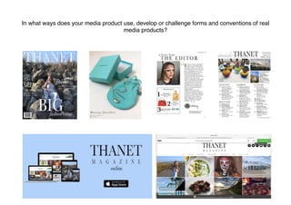
- 1. In what ways does your media product use, develop or challenge forms and conventions of real media products?
- 2. FRONT COVER I stuck with the common conventions for my masthead. I had a serif mast head in a stand out colour which contrasts with the background of the magazine. I placed the title on two lines which isn't a common convention but has been seen used in some regional magazines. I also followed the convention of having then name of the region. I also added a slight glossy sheen to it which is a common convention of the regional magazines The Cheshire Magazine and Kensington and Chelsea Magazine. I used the convention of airbrushing and enhancing the model on photoshop. This is so the cover star looks more appealing to the audience and more likely to capture their attention. Because I used a female on the cover I also followed the convention of them wearing makeup to also enhance the aesthetic appeal and attract the female target prudence of my magazine. I airbrushed the cover star by smoothing/evening the skin tone and covering up dark circle and blemishes. I also followed the convention of having a the main image shot in high key lighting. It was also kept in colour as in other regional magazines I’ve researched. My media product is a ‘fashion special’ of a popular regional lifestyle magazine, which is loosely based on The Cheshire Magazine and Kensington and Chelsea Magazine as I like the style of theirs. I followed the front cover convention of having a cover image with a person. According to Mulvey woman are used in media for the male gaze and I stuck with the convention of using simple serif text with minimal punctuation but made sure it was still short sentences that capture the readers attention and keep them informed with whats inside the magazine (uses and gratifications theory) I stuck with my house them white font as it’s contrasting, it stands out against the darker background and looks professional. I put some of I also added small subheading below to give a bit more insight into whats inside the magazine but I still kept it short to keep the audience wanting more. This fits under Roland Barthes: Enigma Code, which leaves the audience guessing and makes them want to read on and find out more. This is a very common convention of magazines so I decided to include it.
- 3. ADIVERTISMENT PAGE I kept the common convention of it being an advert for a local company. This keeps it personal and useful for the audience. This links to the uses and gratifications theory of gratification surveillance as the audience is gaining information. I stuck with the common convention of adding an address of the company so its easily assessable and informative for the readers. High key lighting is used to shoot the product. This is a common convention as it makes the product more autistically pleasing and detail can be seen on the image. The name of the magazine is the largest font on the page this is a common convention of regional magazines. I also chose a font that contrasts the background with the colour. As in many other adverts I airbrushed and edited the image to make it more ascetically pleasing to the audience to draw them in.
- 4. EDITORIAL PAGE I stuck with the common convention of regional magazines of having an editorial page with text written by the editor to the readers. This creates a personal relationship between the editor and the reader. (uses and grat). This uses and conforms to hegemonic norms, so conforms to my audiences beliefs making it more relatable to them. I kept the common conventions of having a small picture of the editor and a signature next to it. I also put social media tags to connect it to the magazine and create a wider audience. It will also help to appeal more to the younger side of my target audience as they're statistically more involved in social media Lots of regional magazines feature editorial picks or favourites so I decided to also include it in my editorial page. I used the conventional picture for my editorial page. This breaks up the text and makes it more interesting than just text. It makes it Large titles are often used in regional magazines as they attract the attention of the audience. Using titles like mine make it seem more personal to the audience as if its a ‘letter’ just for them. This creates a personal relationship with the readership. (uses and gratifications theory)
- 5. CONTENTS PAGE Titles are used to organise the text neatly it also creates easy guidance around the page. More short sentences are used to give insight and inform the readers (uses and grat) of what is inside the magazine. This is a common convention of all magazines not just regional ones so I decided to include it in mine. I also stuck with serif font in black to contract the white background and stick with my house theme. I stuck with the simple lay out of columns for the text and pictures on a separate part of the page. This is often used in regional magazines to keep the page looking neat and atheistically pleasing for the reader. It also makes it easier to navigate. For the pictures I kept them relevant to the articles and the text which helps create a connection. I also added page numbers on to them to create easy navigation to the rest of the magazine. This is a common convention of regional magazines. I stuck with the common convention of having the magazines logo at the top of the page to create brand awareness. It is also the largest text on the page to attract attention to it. To fit the house theme of more neutral colours I used grey for the title ‘inside’ to still contrast the background but not draw away from the other text. Using other titles By adding the date and issue number it keeps the magazine informative for the readers. This is often used in magazines. I also added ‘cover info’ to further the readerships knowledge. This is sometimes used in regional magazines such as Cheshire Magazine but isn't a very common convention. It is more often used in fashion magazines. I also added the magazines website to the bottom of the page to help the audience interact with the magazine between issues. I also added page numbers. This is on every page and is a common convention to help people navigate round the magazine.
- 6. BILLBOARD Billboards aren't to common for regional magazines so it was hard to create a billboard mainly based on codes and conventions. I did find one for The Resident so I used it to help my create it. As in The Resident I stuck to having a plain background. This will help to create brand awareness if people keep seeing it and therefor will associate the colour to the brand every time they see it. This isn't just a common convention of regional magazines it is a very common convention in most media productions and advertising. I also decided to include and follow the convention of having the information that the magazine can be found on a variety of different platforms. This can create a wider audience and keep readers up to date between issues. I put the logo as the biggest font on the page. This helps to catch peoples eyes and create brand awareness as in the Resident and other billboards for thousands of other brands.
- 7. WEBSITE I stuck with the common convention of having the logo as the largest text on the page. This is commonly used in magazine websites as it attracts peoples attentions if they recognise the logo. It also creates brand awareness. As in other magazines I have added pictures with links to articles this makes the page aesthetically pleasing and interesting to look at. If the audience is also attracted to the pictures there more likely to click on it and read the article. Also as in other regional magazine websites I added articles below, including a small paragraph about it and a picture. A social media tag attracts a younger audience and keeps the audience interactive. This is a common convention of magazine websites. I included the common convention of having a subscription sign up form on the Home page to build a more permanent reader base. By keeping it simple it also makes people more likely to fill it in as it wont take as long.