Chikkabanavara Call Girls: 🍓 7737669865 🍓 High Profile Model Escorts | Bangal...
Question 1
1. In what ways do your media products use, develop or challenge forms and conventions of real
media products
Before constructingmyfinal magazine,Iresearchedintoexistingmusicmagazines.Ilookedcarefully
at theircodesand conventionsintermsof the frontcover,contentspage anddouble page spread.
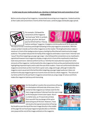
For example,Ifollowedthe
conventionsof the magazine
“we heart pop”With itssymbols
and pink,girlyfont. We heart
pophas billeditself asa“Gossip,
Fashion andboys”magazine.Ittargetsa similaraudienceof 13-21 yearsold.
The layoutformat isverybusyand brightfollowingsimilar popmagazine conventions.Withthe
unique symbol itstandsoutfromothermagazinesonthe market.The brightpinkcolourmakesit
standout infront of the backgroundasit givesa boldgirlyeffectthatwill standouttothe target
audience.The symbol reducesthe formalityof the magazine andmakesitseemmore ‘informal’and
‘casual’therefore targetingayoungerage range.I alsofollowedthe conventionsasmy mastheadis
capitalisedhowevermostmagazinesdisplayasingle artistinfrontof the mastheadtomake them
lookmore prominent.Ididnotconformto thisas I feltthat thistookattentionawayfromother
elementsof the magazine.Iconformedtothe vibe magazinesfontsastheyare boldanddistinctive
highlightingimportanttopicsandtocatch the eye of the readers.I have not conformedtoblenders
magazine conventionsastheirmainfontisquite rustic,edgyandrough,althoughitmakesthe
magazine seemcasual andinformal therefore targetingayoungertargetaudience itdoesnot
conformto the pop magazine genre asitseemsmore of a font to a Rock magazine. The coloursof
my fontsconformto the we heartit magazine conventionsasusingarange of coloursand fonts
makesthe magazine lookbusyandinteresting.
For the headline I stuckto the conventionsof having
it inthe bottomlefthandside of the cover,thisis
similartoVibe magazine asitallowsroomforthe
mainimage and doesn’tdistractfromthe mainimage
as thishelpsgive itmore coverspace.Alsoit
isa betterarea,as if it wasto be printed,
there wouldn’tbe anydangerof the spine
obstructinganyof the text.However,Ihave
not stuckto the typical conventionof having
the headline overthe topof the mainimage directlyinthe middle
of the page like we heartpopmagazine typicallydoesasIfeltthis
overpoweredthe restof the imagesandtexton the magazine.
2. In termsof graphology,mycoverwas unique and
differentcomparedtoothermagazinesonthe
market.My magazine includesamasthead,
secondaryleadsandplugsconformingtomagazines
like we heartpop.My magazine hasstuck to the rule
of thirdswhichallows easynavigationasthe textis
displayedoneitherside of the image whichoccupies
the middle third.Ihave usedsecondaryarticleswitharange of imageslike
magazine like we heartpopandcompany.I didthisas I wantedtomake the magazine busyand
interestingforthe readersotheyfeel excitedtoreadall of the story’snotjustthe mainone whichis
whatmany magazinespurelyfocuson.
I have stuck to cosmopolitan’smagazines
conventionsusingfeminine,curvedfontfor
my headline.Iusedthe font“miamanueva”
to give a handwritteneffect.This addsamore casual feel butalsomakes
the magazine seemmore feminineusingcurved,flickingeffectswhich
create quite an elegant,delicate effect.Ihoweveramnot conformingto
the Q magazinesstereotypeastheirfontisharshand boldto add a more
serioustone,howevermyfontisalsosimilarasI have usedwhite to
define thistextasthiscolourcontrastswiththe colourful image behind
it.
I have useda mid-shotwhichlinkstothe sugarmagazine.Thisallowsadetailedshotof the face
emphasizingdirecteye contactwiththe camerahoweveritstill allowsforsome backgroundtobe
seenandoutfitchoicestobe emphasized.The space aroundthe artistcan alsobe usedby the
secondaryleadswhichthendoesn’tdistractfromthe mainimage.
In terms of mise-en-scene Ididn’tuse similarcostumeslike the
magazine cosmopolitan.Iwantedmyartistto wearwhite asthis
representspurity,perfectionandinnocentswhichshowsthe artistin
a positive light,Ialsodidn’twanttoemphasize the clothestoo much
whichiswhyI didn’tdressthe artistin dramaticpatternedoutfitasI
reallywantedthe covertobe more aboutthe headline andthe artist
herself ratherthanitall beingaboutwhatshe is wearing.This
howeverwasnotthe case forcosmopolitanasbecause theyare a
fashionmagazine all the emphasiswouldhave beenfocusedonthe
outfitthe artistwas wearingsotherefore thatiswhyitisso dramatic.
3. I thinkI have stuckto the typical colourscheme of
musicmagazinesof a popgenre.Which was tough
to tackle duringthe makingprocessas shown
frommy firstdraft.I thinkthe colourscheme that
my genre of magazine isclosesttooisthe
magazine we heartpopas it usesbrightboldpinksandpurples.Iusedmagentapink
to reinforce the fact the majorityof my audience will be female andthenaddedin
orangesand bluesascontrast to thinsthe highlightspecificthingswithinthe
magazine.Ialsofeltthatusing3 coloursratherthan one or two whichIhad usedin
my firstdraftof thismagazine workedbetterasit made the magazine lookbusier
more interestingforthe youngertargetaudience. However,the we heartpop
magazine hasmore purple toneswhereasmine hasmore blue andpinktones.And
has beendone specificallytomake the magazine lookmore funandvibrantforthe
teenage audience.
I have not stuckto the conventionsof thiscontentspage asI have
includedaneditor’slettertoact as an introductiontothe
magazine.Thismagazine doesnotinclude one of theseandmay
be because the mainfocusfor thismagazine wasthe image.
The mastheadof my contentspage conformsto typical
conventions,itislocatedatthe top of the page soit can be clearly
seenandrelatestothe existingmagazine asitusesaboldfont
witha boldblackcolourto emphasize the textinordertoallow for
maximumimpact.
I howeverhave addedsecondaryimagesinmycontentspage
whichchallengesthe layoutof the existingmagazine.Ihave done
thisas it givesinsightintothe articles.
Image wise,Ido nothave a particular“mainimage”as I feltarange
of imagesfromthe pageswithinthe magazine wouldbe more
effective.Howevermostof the makeshave toartistthat was on the
fontcoveron themwhichhighlightsherimportance withinthe
magazine showingthattheyare the mainfeature.
My contentspage stickstothe conventionsof acontentspage as it as
easy to readcolumnsfor easynavigationwhichisalsowhatthe
existingmagazinehasinorderto spiltupeacharticle type.However,
my magazine doesthisinaboxingformatto groupindividual pieces
of informationsothatreaderscaneasilylocate keyarea theywantto
read.Numbersare alsoclearlyhighlighted,howeverinmycontents
page I have emphasisedthesemore asIfeltthiswasthe most
importantpiece of informationasitallowsreaderstoeasilylocate
the article thywantedto read,ina fastpassedhassle free way.
4. I have stuck to the typical conventionsformydouble page
spreadinthe sense thatI have usedthe mainimagesasa
focal pointfor mymagazine withsecondaryimagestobuild
up the artist’sprofile.Thismagazinealsoreliesonmultiple
imagestomake the magazine interestingandcolourful.
I was inspiredbythe heartbackgroundof the existing
magazine backgroundasthe heartsgave a famine feel tothe
magazine.Ifeel thatforthistype of genre verypatternedbackgroundsare extremelyrelevantasthy
make that magazine seemfunandexciting.
Both magazineshave usedsome formof speech
marks as to whatthe artist mainlysaidinorderto
sumup the story. Speechmarksalsohelpthe
readerto know that thishas come directlyfrom
the artist.This iseffectiveasitintroducesthe
article andgivesreadersaninsightintowhatitis
about.
My double page spreadissimilartothismagazine
arrangement,Ihave includedamid-shotimage
and a secondaryimage togive more of an insightintothe article andtomake the main focusabout
the artist.This hasalso beendone bythe existingmagazine tobreakupthe textmakingitlooklike a
Q&A formatand the textisalsodisplayedincolumnstoallow foreasynavigation.Ihoweverdidnot
write as muchfor the double page spreadasI felta lotof informationwouldintimidatethe readers,
I therefore made the magazine focusmore onthe imagesandkeyquotationsof whatthe artistsaid
makingiteasiertoread.