
Recommended
More Related Content
What's hot
What's hot (20)
Viewers also liked
Similar to Auxiliary magazine deconstruction
Similar to Auxiliary magazine deconstruction (20)
Recently uploaded
Recently uploaded (20)
Auxiliary magazine deconstruction
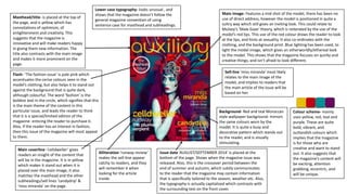
- 1. Masthead/title- is placed at the top of the page, and is yellow which has connotations of optimism, of enlightenment and creativity. This suggests that the magazine is innovative and will make readers happy in giving them new information. The title also contrasts with the main image and makes it more prominent on the page. Issue date ‘AUGUST/SEPTEMBER 2014’ is placed at the bottom of the page. Shows when the magazine issue was released. Also, this is the crossover period between the end of summer and autumn, which subtly communicates to the reader that the magazine may contain information that is specifically tailored to the season, weather etc. Also, the typography is actually capitalised which contrasts with the surrounding text on the front cover. No barcode or price Flash- ‘The fashion issue’ is pale pink which accentuates the cerise colours seen in the model’s clothing, but also helps it to stand out against the background that is quite dark, although colourful. The word ‘fashion’ is the boldest text in the circle, which signifies that this is the main theme of the content in this particular issue, and leads the reader to think that it is a special/limited edition of the magazine- enticing the reader to purchase it. Also, if the reader has an interest in fashion, then this issue of the magazine will most appeal to them. Main coverline -‘celldweller’ gives readers an insight of the content that will be in the magazine. It is in yellow which makes it stand out when it is placed over the main image, it also matches the masthead and the other subheadings/sell lines ‘candydrip’ & ‘miss miranda’ on the page. Main image- Features a mid shot of the model, there has been no use of direct address, however the model is positioned in quite a sultry way which still gives an inviting look. This could relate to Mulvey’s ‘Male Gaze’ theory, which is reiterated by the use of the model’s red lips. This use of the red colour draws the reader to look at the lips, and hints at sexuality. It also co-ordinates with the clothing, and the background print. Blue lighting has been used, to light the model image, which gives an otherworldly/ethereal look to the model. This shows that the magazine focuses on quirky and creative things, and isn’t afraid to look different. Background- Red and teal Moroccan style wallpaper background- mirrors the same colours worn by the model. It is quite a busy and decorative pattern which stands out to the reader, and is visually stimulating. Lower case typography- looks unusual , and shows that the magazine doesn’t follow the general magazine convention of using sentence case for masthead and subheadings. Sell-line ‘miss miranda’ most likely relates to the main image of the model, and implies to readers that the main article of the issue will be based on her. Alliteration ‘runway review’ makes the sell-line appear catchy to readers, and they will remember it when looking for the article inside. Colour scheme- mainly uses yellow, red, teal and purple. These are quite bold, vibrant, and outlandish colours which implies that the magazine is for those who are creative and want to stand out. It also suggests that the magazine’s content will be exciting, attention grabbing, eccentric, and will be unique.
- 2. Caption- ‘with dramatic makeup and voluminous curls, dolls may seem like sweet wallflowers but it takes confidence to be this bold’. This provides the reader with extra information surrounding the main image, and encourages the reader to read the article about it. Credit- provides details of when the photograph was taken, and credits the photographer and makeup stylist. Issue date- tells the reader of when the magazine issue was released. Magazine name- reiterates that this is a copy of ‘Auxiliary’ magazine. Flash- is yellow, which co- ordinates with the subheadings on the left side of the contents spread. It also stands out against the grey colouring of the main image. It tells readers that they can purchase issues on the magazine’s website too. Masthead/heading ‘Contents’ is bold, and is placed at the top of the page, making it stand out. It also informs readers that this page will give them a greater insight of what the magazine issue contains, and where they can find particular areas of information. Small image preview of front cover, placed beside this is a caption and credits of who designed it. Header box – divides the page up, and is black which makes the white text stand out. Also it contains information in regards to the sell lines that were on the front cover, and specifies the page details of these featured articles. Key anchorage text ‘Doll face’ relates to the main image, it is in a contrasting colour which makes it attention grabbing. Subheadings are yellow like the masthead on the front cover. The font is also bigger than the text underneath them, which makes them more eye- catching. The subheadings ‘beauty’, ‘lifestyle’, ‘music’ etc., helps to catergorise the information on stories and articles in the magazine into clear sections. The body text of information on the stories in the magazine is separated into two columns, which makes them clearer to read. Main image – features a mid shot of a model. The image itself looks quite gothic and dark, which would convey that the magazine has alternative and gothic themes. Also the model’s makeup is dark and doll like which relates to the line ‘doll face’. Background- is white which makes the text and main image stand out on the page. Colour scheme- predominantly uses the colours white, grey, black, and yellow. This is quite a neutral colour scheme, where yellow is the boldest and stands out the most. This could symbolically show that the magazine is individual and will stand out against competition. Also it does not appear too busy, or over facing, which means readers will not be discouraged from looking at it.
- 3. Magazine name- reiterates that this is a copy of ‘Auxiliary’ magazine. Issue date- tells the reader of when the magazine issue was released. Credit- provides details of when the photograph was taken, and credits the photographer and makeup stylist, editor etc. Website link- synergy allows readers to further engage with brand, product, and find out more about the magazine. Issues can also be purchased on this website, which helps the magazine to target a broader audience. Main image – features a long shot of a model. The image itself looks quite gothic and dark, which would convey that the magazine has alternative and gothic themes. The image is candidly posed showing that the magazine is realistic and down to earth in it’s approach. The natural landscape environment the main image is taken in, also helps to show this, and the stormy skies indicates that darkness again. Background- is white which makes the text and main image stand out on the page. Key anchorage text ‘Gloomth’ relates to the main image, it is in a contrasting white colour which makes it attention grabbing.It also uses a calligraphy like typography, which helps the magazine relate to the gothic genre. Heading- ‘Designer spotlight’ is white, capitalised and placed in a black strip which makes it stand out. It introduces the article, and gives the impression that the main image displays this ‘designer’ and that the interview will be with and about them. ‘Auxiliary FASHION’ is placed next to the heading, meaning the readers eyes will naturally move to it. Th fact that ‘fashion’ is capitalised shows that this article belongs to a particular section that is purely based on fashion; much like how the newspaper has a show biz and entertainment section. It helps to catergorise and give context to the article, so readers who like fashion will know how to easily find this article. Main body text/article- is in an interview format. So it keeps to the conventional setup of a magazine article, however it is only in one column of text and not multiple which is where it defies convention. It helps to provide a focal point to the article. Feature images – show the same model, in candid and quirky poses which connotes that she will be fun and unique, and that the article is about her. It also adds more visual interest to the article page. Colour scheme- predominantly uses black, white, and a beige/grey shades, which is quite a gloomy look, that again relates to the gothic aesthetic and the ‘gloomth’ line., But it introduces an element of sophistication, and ruralness – indicating that the magazine is natural in its style.