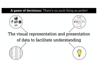
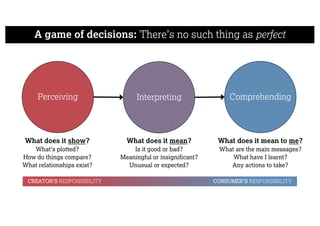
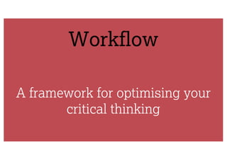
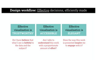
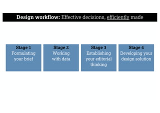
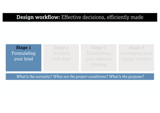
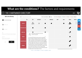
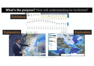
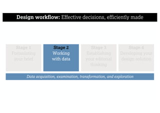
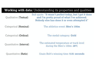
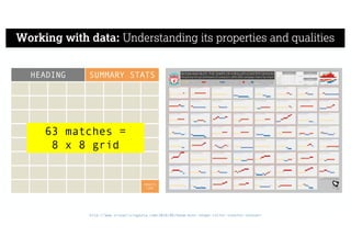
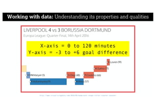
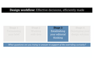
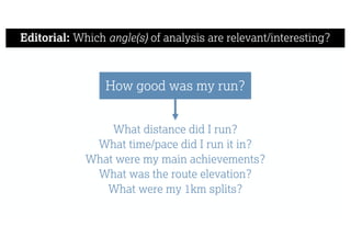
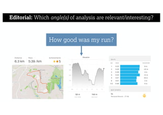
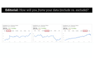
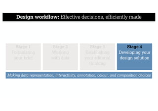
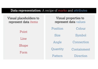
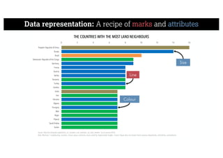
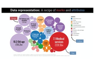
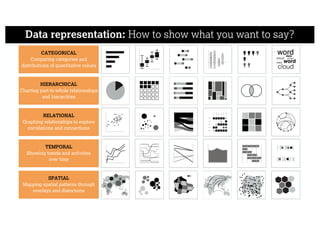
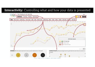
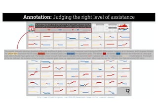
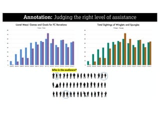
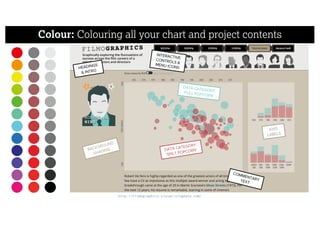
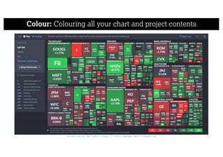
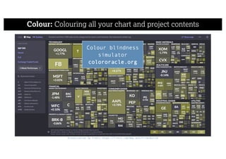
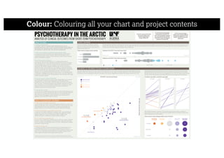
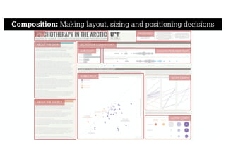
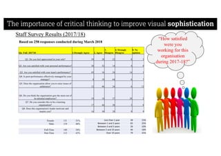
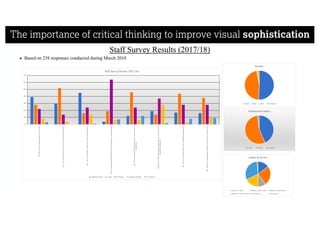
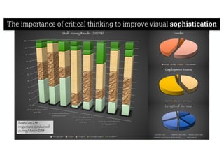
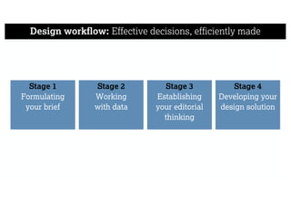
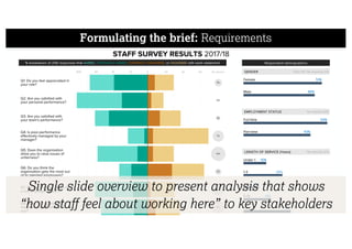
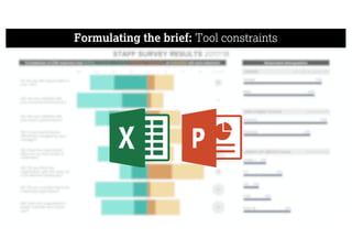
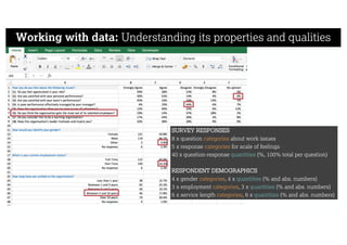
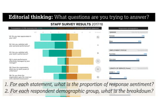
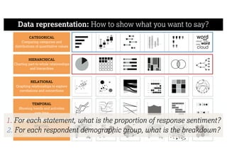
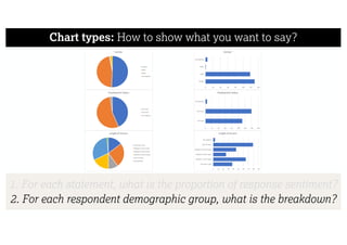
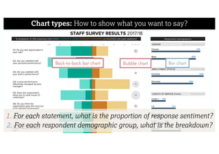
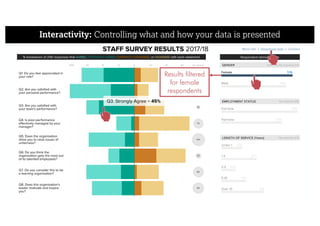
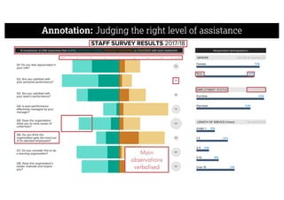
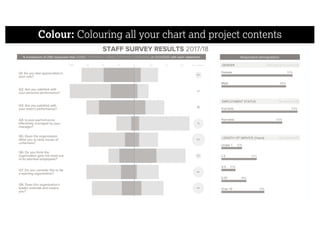
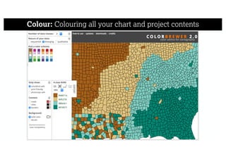
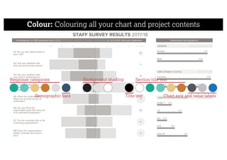
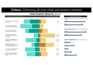
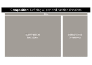
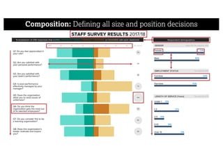
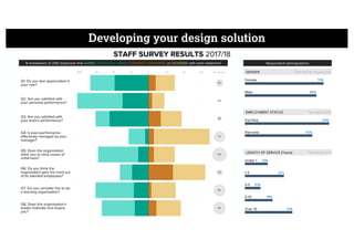
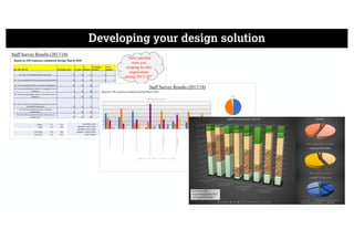
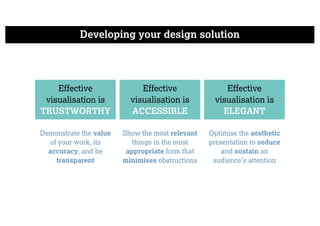
DATA VISUALISATION
A GAME OF DECISIONS
Andy Kirk
andy@visualisingdata.com
www.visualisingdata.com
@visualisingdata
IMPERFECTIONS
COMPLEXITIES
The visual representation and presentation
of data to facilitate understanding
A game of decisions: There’s no such thing as perfect
Perceiving Interpreting Comprehending
What does it mean?
Is it good or bad?
Meaningful or insignificant?
Unusual or expected?
What does it show?
What’s plotted?
How do things compare?
What relationships exist?
What does it mean to me?
What are the main messages?
What have I learnt?
Any actions to take?
CREATOR’S RESPONSIBILITY CONSUMER’S RESPONSIBILITY
What colour shall we make the axis lines?
How thick should the lines be?
How long should the lines be?
How will we label them?
Should we label them?
Do we want tick marks as well?
Do we even need the lines?
It depends.
A game of decisions: Complex more than complicated
To make the best decisions you need to be familiar with all your
options and aware of the things that will influence your choices.
A game of decisions: Complex more than complicated
THINGS YOU
COULD DO
THINGS YOU
WILL DO
“IT DEPENDS”
Workflow
A framework for optimising your
critical thinking
Effective
visualisation is
TRUSTWORTHY
Effective
visualisation is
ACCESSIBLE
Effective
visualisation is
ELEGANT
Design workflow: Effective decisions, efficiently made
Do I have believe that
what I see is faithful to
the data and the
subject?
Am I able to
understand this work
with a proportionate
amount of effort?
Does the way this work
is presented inspire me
to engage with it?
Design workflow: Effective decisions, efficiently made
Stage 1
Formulating
your brief
Stage 2
Working
with data
Stage 3
Establishing
your editorial
thinking
Stage 4
Developing your
design solution
Design workflow: Effective decisions, efficiently made
Stage 1
Formulating
your brief
Stage 2
Working
with data
Stage 3
Establishing
your editorial
thinking
Stage 4
Developing your
design solution
What’s the curiosity? What are the project conditions? What’s the purpose?
http://filmographics.visualisingdata.com/
“What is the pattern of success or failure in the
movie careers of a range of notable actors/directors?”
What’s the curiosity? “An eagerness to understand something”
What are the conditions? The factors and requirements
https://github.com/propublica/weepeople
What are the conditions? The factors and requirements
http://chartmaker.visualisingdata.com/
What’s the purpose? How will understanding be facilitated?
https://www.bbc.co.uk/weather
Explanatory Exploratory
Exhibitory
Design workflow: Effective decisions, efficiently made
Stage 1
Formulating
your brief
Stage 3
Establishing
your editorial
thinking
Stage 4
Developing your
design solution
Stage 2
Working
with data
Data acquisition, examination, transformation, and exploration
Working with data: Understanding its properties and qualities
Qualitative (Textual)
Bolt quote: “It wasn't perfect today, but I got it done
and I’m pretty proud of what I've achieved.
Nobody else has done it or even attempted it”
Categorical (Nominal) The athletics event: Men's 100m
Categorical (Ordinal) The medal category: Gold
Quantitative (Interval)
The estimated temperature at track level
during the Men's 100m: 28℃
Quantitative (Ratio) Usain Bolt’s winning time: 9.81 seconds
HEADING SUMMARY STATS
CREDITS
LOGO
63 matches =
8 x 8 grid
Working with data: Understanding its properties and qualities
http://www.visualisingdata.com/2016/05/boom-bust-shape-roller-coaster-season/
Working with data: Understanding its properties and qualities
http://www.visualisingdata.com/2016/05/boom-bust-shape-roller-coaster-season/
X-axis = 0 to 120 minutes
Y-axis = -3 to +6 goal difference
Working with data: Understanding its properties and qualities
WHO?
WHAT?
HOW
MUCH?
Working with data: Understanding its properties and qualities
Design workflow: Effective decisions, efficiently made
Stage 1
Formulating
your brief
Stage 4
Developing your
design solution
Stage 2
Working
with data
Stage 3
Establishing
your editorial
thinking
What questions are you trying to answer in support of the overriding curiosity?
Editorial: Which angle(s) of analysis are relevant/interesting?
How good was my run?
What distance did I run?
What time/pace did I run it in?
What were my main achievements?
What was the route elevation?
What were my 1km splits?
Editorial: Which angle(s) of analysis are relevant/interesting?
How good was my run?
Editorial: How will you frame your data (include vs. exclude)?
Design workflow: Effective decisions, efficiently made
Stage 1
Formulating
your brief
Stage 2
Working
with data
Stage 3
Establishing
your editorial
thinking
Stage 4
Developing your
design solution
Making data representation, interactivity, annotation, colour, and composition choices
Data representation: A recipe of marks and attributes
Shape
Line
Form
Point
Size
Position
Angle
Pattern
Quantity Containment
Connection
Symbol
Colour
Visual placeholders to
represent data items
Visual properties to
represent data values
Direction
Data representation: A recipe of marks and attributes
Size
Colour
Line
Data representation: A recipe of marks and attributes
Shape
Colour
Size
Data representation: How to show what you want to say?
CATEGORICAL
Comparing categories and
distributions of quantitative values
TEMPORAL
Showing trends and activities
over time
HIERARCHICAL
Charting part-to-whole relationships
and hierarchies
SPATIAL
Mapping spatial patterns through
overlays and distortions
RELATIONAL
Graphing relationships to explore
correlations and connections
Data representation: How to show what you want to say?
Interactivity: Controlling what and how your data is presented
http://www.visualisingdata.com/olympics2016/
Annotation: Judging the right level of assistance
http://www.visualisingdata.com/2016/05/boom-bust-shape-roller-coaster-season/
Annotation: Judging the right level of assistance
Colour: Colouring all your chart and project contents
http://filmographics.visualisingdata.com/
Colour: Colouring all your chart and project contents
Visualisation by FinViz https://finviz.com/map.ashx?t=sec&st=w1
Colour: Colouring all your chart and project contents
Visualisation by FinViz https://finviz.com/map.ashx?t=sec&st=w1
Colour blindness
simulator
colororacle.org
Colour: Colouring all your chart and project contents
BAR CHART UNIVARIATE BUBBLE PLOT
BUBBLE PLOT
SLOPE GRAPH
MATRIX CHART
Composition: Making layout, sizing and positioning decisions
TITLE
ABOUT THE DATA
HEADLINES
ABOUT THE SUBJECT
SECTIONS & COMMENTARY
Composition: Making layout, sizing and positioning decisions
Visualisation by Andy Kirk http://www.visualisingdata.com/olympics2016/
Composition: Making layout, sizing and positioning decisions
WHO?
WHAT?
HOW
MUCH?
Composition: Making layout, sizing and positioning decisions
Demonstration
A framework for optimising your
critical thinking
The importance of critical thinking to improve visual sophistication
Design workflow: Effective decisions, efficiently made
Stage 1
Formulating
your brief
Stage 2
Working
with data
Stage 3
Establishing
your editorial
thinking
Stage 4
Developing your
design solution
Single slide overview to present analysis that shows
“how staff feel about working here” to key stakeholders
Formulating the brief: Requirements
Formulating the brief: Tool constraints
Working with data: Understanding its properties and qualities
SURVEY RESPONSES
8 x question categories about work issues
5 x response categories for scale of feelings
40 x question-response quantities (%, 100% total per question)
RESPONDENT DEMOGRAPHICS
4 x gender categories, 4 x quantities (% and abs. numbers)
3 x employment categories, 3 x quantities (% and abs. numbers)
6 x service length categories, 6 x quantities (% and abs. numbers)
1. For each statement, what is the proportion of response sentiment?
2. For each respondent demographic group, what is the breakdown?
Editorial thinking: What questions are you trying to answer?
Data representation: How to show what you want to say?
CATEGORICAL
Comparing categories and
distributions of quantitative values
TEMPORAL
Showing trends and activities
over time
HIERARCHICAL
Charting part-to-whole relationships
and hierarchies
SPATIAL
Mapping spatial patterns through
overlays and distortions
RELATIONAL
Graphing relationships to explore
correlations and connections
1. For each statement, what is the proportion of response sentiment?
2. For each respondent demographic group, what is the breakdown?
Chart types: How to show what you want to say?
Q1.	Do	you	feel	appreciated
in	your	role?
Q2.	Are	you	sa sfied	with
your	personal	performance?
Q3.	Are	you	sa sfied	with
your	team's	performance?
Q4.	Is	poor-performance
effec vely	managed	by	your
manager?
Q5.	Does	the	organisa on
allow	you	to	raise	issues	of
unfairness?
Q6.	Do	you	think	the
organisa on	gets	the	most
out	of	its	talented	employee..
Q7.	Do	you	consider	this	to	be
a	learning	organisa on?
Q8.	Does	this	organisa on's
leader	mo vate	and	inspire
you?
Category
Strongly	Agree
Agree
Disagree
Strongly	Disagree
No	opinion
1. For each statement, what is the proportion of response sentiment?
2. For each respondent demographic group, what is the breakdown?
Chart types: How to show what you want to say?
0 10 20 30 40 50 60 70 80 90 100
Q1.	Do	you	feel	appreciated	in	your
role?
Q2.	Are	you	sa sfied	with	your
personal	performance?
Q3.	Are	you	sa sfied	with	your
team's	performance?
Q4.	Is	poor-performance	effec vely
managed	by	your	manager?
Q5.	Does	the	organisa on	allow	you
to	raise	issues	of	unfairness?
Q6.	Do	you	think	the	organisa on
gets	the	most	out	of	its	talented
employees?
Q7.	Do	you	consider	this	to	be	a
learning	organisa on?
Q8.	Does	this	organisa on's	leader
mo vate	and	inspire	you?
Category
No	opinion
Strongly	Disagree
Disagree
Agree
Strongly	Agree
Strongly	Agree Agree Disagree Strongly	Disagree No	opinion
0 20 40 60 0 20 40 60 0 20 40 60 0 20 40 60 0 20 40 60
Q1.	Do	you	feel	appreciated	in	your
role?
Q2.	Are	you	sa sfied	with	your	personal
performance?
Q3.	Are	you	sa sfied	with	your	team's
performance?
Q4.	Is	poor-performance	effec vely
managed	by	your	manager?
Q5.	Does	the	organisa on	allow	you	to
raise	issues	of	unfairness?
Q6.	Do	you	think	the	organisa on	gets
the	most	out	of	its	talented	employees?
Q7.	Do	you	consider	this	to	be	a	learning
organisa on?
Q8.	Does	this	organisa on's	leader
mo vate	and	inspire	you?
Category
Strongly	Agree
Agree
Disagree
Strongly	Disagree
No	opinion
1. For each statement, what is the proportion of response sentiment?
2. For each respondent demographic group, what is the breakdown?
Chart types: How to show what you want to say?
-90 -80 -70 -60 -50 -40 -30 -20 -10 0 10 20 30 40 50 60 70
Q1.	Do	you	feel	appreciated	in
your	role?
Q2.	Are	you	sa sfied	with	your
personal	performance?
Q3.	Are	you	sa sfied	with	your
team's	performance?
Q4.	Is	poor-performance
effec vely	managed	by	your
manager?
Q5.	Does	the	organisa on	allow
you	to	raise	issues	of	unfairness?
Q6.	Do	you	think	the
organisa on	gets	the	most	out
of	its	talented	employees?
Q7.	Do	you	consider	this	to	be	a
learning	organisa on?
Q8.	Does	this	organisa on's
leader	mo vate	and	inspire	you?
0 10
Agreement Disagreement No-opinion
1. For each statement, what is the proportion of response sentiment?
2. For each respondent demographic group, what is the breakdown?
Chart types: How to show what you want to say?
-90 -80 -70 -60 -50 -40 -30 -20 -10 0 10 20 30 40 50 60 70
Q1.	Do	you	feel	appreciated	in
your	role?
Q2.	Are	you	sa sfied	with	your
personal	performance?
Q3.	Are	you	sa sfied	with	your
team's	performance?
Q4.	Is	poor-performance
effec vely	managed	by	your
manager?
Q5.	Does	the	organisa on	allow
you	to	raise	issues	of	unfairness?
Q6.	Do	you	think	the
organisa on	gets	the	most	out
of	its	talented	employees?
Q7.	Do	you	consider	this	to	be	a
learning	organisa on?
Q8.	Does	this	organisa on's
leader	mo vate	and	inspire	you?
Agreement Disagreement No-opinion
1. For each statement, what is the proportion of response sentiment?
2. For each respondent demographic group, what is the breakdown?
Chart types: How to show what you want to say?
Gender
Female
Male
Other
No response
Employment Status
Full-Time
Part-Time
No response
Length of Service
Less than 1 year
Between 1 and 3 years
Between 3 and 5 years
Between 5 and 10 years
Over 10 years
No response
Female
Male
Other
No response
0 20 40 60 80 100 120 140
Gender
Full-Time
Part-Time
No response
0 20 40 60 80 100 120 140 160
Employment Status
Less than 1 year
Between 1 and 3 years
Between 3 and 5 years
Between 5 and 10 years
Over 10 years
No response
0 10 20 30 40 50 60 70 80 90
Length of Service
1. For each statement, what is the proportion of response sentiment?
2. For each respondent demographic group, what is the breakdown?
Chart types: How to show what you want to say?
Back-to-back bar chart Bar chartBubble chart
1. For each statement, what is the proportion of response sentiment?
2. For each respondent demographic group, what is the breakdown?
Interactivity: Controlling what and how your data is presented
Q3. Strongly Agree = 45%
More info | Download data | Contact
Results filtered
for female
respondents
Annotation: Judging the right level of assistance
Main
observations
verbalised
Colour: Colouring all your chart and project contents
Response categories
Demographic bars
Background shading
Title text
Section title text
Chart axis and value labels
Colour: Colouring all your chart and project contents
Composition: Defining all size and position decisions
Survey results
breakdown
Demographic
breakdown
Title
Composition: Defining all size and position decisions
Developing your design solution
Demonstrate the value
of your work, its
accuracy, and be
transparent
Show the most relevant
things in the most
appropriate form that
minimises obstructions
Optimise the aesthetic
presentation to seduce
and sustain an
audience’s attention
Effective
visualisation is
TRUSTWORTHY
Effective
visualisation is
ACCESSIBLE
Effective
visualisation is
ELEGANT
Learn more! ‘Introduction to Data Visualisation’ online course
https://campus.sagepub.com/introduction-to-data-visualisation
DATA VISUALISATION
A GAME OF DECISIONS
Andy Kirk
andy@visualisingdata.com
www.visualisingdata.com
@visualisingdata
Data Visualisation: A Game of Decisions

Data Visualisation: A Game of Decisions

  • 1.
    DATA VISUALISATION A GAMEOF DECISIONS Andy Kirk andy@visualisingdata.com www.visualisingdata.com @visualisingdata
  • 2.
  • 3.
    The visual representationand presentation of data to facilitate understanding A game of decisions: There’s no such thing as perfect
  • 4.
    A game ofdecisions: There’s no such thing as perfect Perceiving Interpreting Comprehending What does it mean? Is it good or bad? Meaningful or insignificant? Unusual or expected? What does it show? What’s plotted? How do things compare? What relationships exist? What does it mean to me? What are the main messages? What have I learnt? Any actions to take? CREATOR’S RESPONSIBILITY CONSUMER’S RESPONSIBILITY
  • 5.
    What colour shallwe make the axis lines? How thick should the lines be? How long should the lines be? How will we label them? Should we label them? Do we want tick marks as well? Do we even need the lines? It depends. A game of decisions: Complex more than complicated
  • 6.
    To make thebest decisions you need to be familiar with all your options and aware of the things that will influence your choices. A game of decisions: Complex more than complicated THINGS YOU COULD DO THINGS YOU WILL DO “IT DEPENDS”
  • 7.
    Workflow A framework foroptimising your critical thinking
  • 8.
    Effective visualisation is TRUSTWORTHY Effective visualisation is ACCESSIBLE Effective visualisationis ELEGANT Design workflow: Effective decisions, efficiently made Do I have believe that what I see is faithful to the data and the subject? Am I able to understand this work with a proportionate amount of effort? Does the way this work is presented inspire me to engage with it?
  • 9.
    Design workflow: Effectivedecisions, efficiently made Stage 1 Formulating your brief Stage 2 Working with data Stage 3 Establishing your editorial thinking Stage 4 Developing your design solution
  • 10.
    Design workflow: Effectivedecisions, efficiently made Stage 1 Formulating your brief Stage 2 Working with data Stage 3 Establishing your editorial thinking Stage 4 Developing your design solution What’s the curiosity? What are the project conditions? What’s the purpose?
  • 11.
    http://filmographics.visualisingdata.com/ “What is thepattern of success or failure in the movie careers of a range of notable actors/directors?” What’s the curiosity? “An eagerness to understand something”
  • 12.
    What are theconditions? The factors and requirements https://github.com/propublica/weepeople
  • 13.
    What are theconditions? The factors and requirements http://chartmaker.visualisingdata.com/
  • 14.
    What’s the purpose?How will understanding be facilitated? https://www.bbc.co.uk/weather Explanatory Exploratory Exhibitory
  • 15.
    Design workflow: Effectivedecisions, efficiently made Stage 1 Formulating your brief Stage 3 Establishing your editorial thinking Stage 4 Developing your design solution Stage 2 Working with data Data acquisition, examination, transformation, and exploration
  • 16.
    Working with data:Understanding its properties and qualities Qualitative (Textual) Bolt quote: “It wasn't perfect today, but I got it done and I’m pretty proud of what I've achieved. Nobody else has done it or even attempted it” Categorical (Nominal) The athletics event: Men's 100m Categorical (Ordinal) The medal category: Gold Quantitative (Interval) The estimated temperature at track level during the Men's 100m: 28℃ Quantitative (Ratio) Usain Bolt’s winning time: 9.81 seconds
  • 17.
    HEADING SUMMARY STATS CREDITS LOGO 63matches = 8 x 8 grid Working with data: Understanding its properties and qualities http://www.visualisingdata.com/2016/05/boom-bust-shape-roller-coaster-season/
  • 18.
    Working with data:Understanding its properties and qualities http://www.visualisingdata.com/2016/05/boom-bust-shape-roller-coaster-season/ X-axis = 0 to 120 minutes Y-axis = -3 to +6 goal difference
  • 19.
    Working with data:Understanding its properties and qualities
  • 20.
    Working with data:Understanding its properties and qualities
  • 21.
    Working with data:Understanding its properties and qualities WHO? WHAT? HOW MUCH?
  • 22.
    Working with data:Understanding its properties and qualities
  • 23.
    Design workflow: Effectivedecisions, efficiently made Stage 1 Formulating your brief Stage 4 Developing your design solution Stage 2 Working with data Stage 3 Establishing your editorial thinking What questions are you trying to answer in support of the overriding curiosity?
  • 24.
    Editorial: Which angle(s)of analysis are relevant/interesting? How good was my run? What distance did I run? What time/pace did I run it in? What were my main achievements? What was the route elevation? What were my 1km splits?
  • 25.
    Editorial: Which angle(s)of analysis are relevant/interesting? How good was my run?
  • 26.
    Editorial: How willyou frame your data (include vs. exclude)?
  • 27.
    Design workflow: Effectivedecisions, efficiently made Stage 1 Formulating your brief Stage 2 Working with data Stage 3 Establishing your editorial thinking Stage 4 Developing your design solution Making data representation, interactivity, annotation, colour, and composition choices
  • 28.
    Data representation: Arecipe of marks and attributes Shape Line Form Point Size Position Angle Pattern Quantity Containment Connection Symbol Colour Visual placeholders to represent data items Visual properties to represent data values Direction
  • 29.
    Data representation: Arecipe of marks and attributes Size Colour Line
  • 30.
    Data representation: Arecipe of marks and attributes Shape Colour Size
  • 31.
    Data representation: Howto show what you want to say? CATEGORICAL Comparing categories and distributions of quantitative values TEMPORAL Showing trends and activities over time HIERARCHICAL Charting part-to-whole relationships and hierarchies SPATIAL Mapping spatial patterns through overlays and distortions RELATIONAL Graphing relationships to explore correlations and connections
  • 32.
    Data representation: Howto show what you want to say?
  • 33.
    Interactivity: Controlling whatand how your data is presented http://www.visualisingdata.com/olympics2016/
  • 34.
    Annotation: Judging theright level of assistance http://www.visualisingdata.com/2016/05/boom-bust-shape-roller-coaster-season/
  • 35.
    Annotation: Judging theright level of assistance
  • 36.
    Colour: Colouring allyour chart and project contents http://filmographics.visualisingdata.com/
  • 37.
    Colour: Colouring allyour chart and project contents Visualisation by FinViz https://finviz.com/map.ashx?t=sec&st=w1
  • 38.
    Colour: Colouring allyour chart and project contents Visualisation by FinViz https://finviz.com/map.ashx?t=sec&st=w1 Colour blindness simulator colororacle.org
  • 39.
    Colour: Colouring allyour chart and project contents
  • 40.
    BAR CHART UNIVARIATEBUBBLE PLOT BUBBLE PLOT SLOPE GRAPH MATRIX CHART Composition: Making layout, sizing and positioning decisions TITLE ABOUT THE DATA HEADLINES ABOUT THE SUBJECT SECTIONS & COMMENTARY
  • 41.
    Composition: Making layout,sizing and positioning decisions Visualisation by Andy Kirk http://www.visualisingdata.com/olympics2016/
  • 42.
    Composition: Making layout,sizing and positioning decisions WHO? WHAT? HOW MUCH?
  • 43.
    Composition: Making layout,sizing and positioning decisions
  • 44.
    Composition: Making layout,sizing and positioning decisions
  • 45.
    Demonstration A framework foroptimising your critical thinking
  • 46.
    The importance ofcritical thinking to improve visual sophistication
  • 47.
    The importance ofcritical thinking to improve visual sophistication
  • 48.
    The importance ofcritical thinking to improve visual sophistication
  • 49.
    Design workflow: Effectivedecisions, efficiently made Stage 1 Formulating your brief Stage 2 Working with data Stage 3 Establishing your editorial thinking Stage 4 Developing your design solution
  • 50.
    Single slide overviewto present analysis that shows “how staff feel about working here” to key stakeholders Formulating the brief: Requirements
  • 51.
    Formulating the brief:Tool constraints
  • 52.
    Working with data:Understanding its properties and qualities SURVEY RESPONSES 8 x question categories about work issues 5 x response categories for scale of feelings 40 x question-response quantities (%, 100% total per question) RESPONDENT DEMOGRAPHICS 4 x gender categories, 4 x quantities (% and abs. numbers) 3 x employment categories, 3 x quantities (% and abs. numbers) 6 x service length categories, 6 x quantities (% and abs. numbers)
  • 53.
    1. For eachstatement, what is the proportion of response sentiment? 2. For each respondent demographic group, what is the breakdown? Editorial thinking: What questions are you trying to answer?
  • 54.
    Data representation: Howto show what you want to say? CATEGORICAL Comparing categories and distributions of quantitative values TEMPORAL Showing trends and activities over time HIERARCHICAL Charting part-to-whole relationships and hierarchies SPATIAL Mapping spatial patterns through overlays and distortions RELATIONAL Graphing relationships to explore correlations and connections 1. For each statement, what is the proportion of response sentiment? 2. For each respondent demographic group, what is the breakdown?
  • 55.
    Chart types: Howto show what you want to say? Q1. Do you feel appreciated in your role? Q2. Are you sa sfied with your personal performance? Q3. Are you sa sfied with your team's performance? Q4. Is poor-performance effec vely managed by your manager? Q5. Does the organisa on allow you to raise issues of unfairness? Q6. Do you think the organisa on gets the most out of its talented employee.. Q7. Do you consider this to be a learning organisa on? Q8. Does this organisa on's leader mo vate and inspire you? Category Strongly Agree Agree Disagree Strongly Disagree No opinion 1. For each statement, what is the proportion of response sentiment? 2. For each respondent demographic group, what is the breakdown?
  • 56.
    Chart types: Howto show what you want to say? 0 10 20 30 40 50 60 70 80 90 100 Q1. Do you feel appreciated in your role? Q2. Are you sa sfied with your personal performance? Q3. Are you sa sfied with your team's performance? Q4. Is poor-performance effec vely managed by your manager? Q5. Does the organisa on allow you to raise issues of unfairness? Q6. Do you think the organisa on gets the most out of its talented employees? Q7. Do you consider this to be a learning organisa on? Q8. Does this organisa on's leader mo vate and inspire you? Category No opinion Strongly Disagree Disagree Agree Strongly Agree Strongly Agree Agree Disagree Strongly Disagree No opinion 0 20 40 60 0 20 40 60 0 20 40 60 0 20 40 60 0 20 40 60 Q1. Do you feel appreciated in your role? Q2. Are you sa sfied with your personal performance? Q3. Are you sa sfied with your team's performance? Q4. Is poor-performance effec vely managed by your manager? Q5. Does the organisa on allow you to raise issues of unfairness? Q6. Do you think the organisa on gets the most out of its talented employees? Q7. Do you consider this to be a learning organisa on? Q8. Does this organisa on's leader mo vate and inspire you? Category Strongly Agree Agree Disagree Strongly Disagree No opinion 1. For each statement, what is the proportion of response sentiment? 2. For each respondent demographic group, what is the breakdown?
  • 57.
    Chart types: Howto show what you want to say? -90 -80 -70 -60 -50 -40 -30 -20 -10 0 10 20 30 40 50 60 70 Q1. Do you feel appreciated in your role? Q2. Are you sa sfied with your personal performance? Q3. Are you sa sfied with your team's performance? Q4. Is poor-performance effec vely managed by your manager? Q5. Does the organisa on allow you to raise issues of unfairness? Q6. Do you think the organisa on gets the most out of its talented employees? Q7. Do you consider this to be a learning organisa on? Q8. Does this organisa on's leader mo vate and inspire you? 0 10 Agreement Disagreement No-opinion 1. For each statement, what is the proportion of response sentiment? 2. For each respondent demographic group, what is the breakdown?
  • 58.
    Chart types: Howto show what you want to say? -90 -80 -70 -60 -50 -40 -30 -20 -10 0 10 20 30 40 50 60 70 Q1. Do you feel appreciated in your role? Q2. Are you sa sfied with your personal performance? Q3. Are you sa sfied with your team's performance? Q4. Is poor-performance effec vely managed by your manager? Q5. Does the organisa on allow you to raise issues of unfairness? Q6. Do you think the organisa on gets the most out of its talented employees? Q7. Do you consider this to be a learning organisa on? Q8. Does this organisa on's leader mo vate and inspire you? Agreement Disagreement No-opinion 1. For each statement, what is the proportion of response sentiment? 2. For each respondent demographic group, what is the breakdown?
  • 59.
    Chart types: Howto show what you want to say? Gender Female Male Other No response Employment Status Full-Time Part-Time No response Length of Service Less than 1 year Between 1 and 3 years Between 3 and 5 years Between 5 and 10 years Over 10 years No response Female Male Other No response 0 20 40 60 80 100 120 140 Gender Full-Time Part-Time No response 0 20 40 60 80 100 120 140 160 Employment Status Less than 1 year Between 1 and 3 years Between 3 and 5 years Between 5 and 10 years Over 10 years No response 0 10 20 30 40 50 60 70 80 90 Length of Service 1. For each statement, what is the proportion of response sentiment? 2. For each respondent demographic group, what is the breakdown?
  • 60.
    Chart types: Howto show what you want to say? Back-to-back bar chart Bar chartBubble chart 1. For each statement, what is the proportion of response sentiment? 2. For each respondent demographic group, what is the breakdown?
  • 61.
    Interactivity: Controlling whatand how your data is presented Q3. Strongly Agree = 45% More info | Download data | Contact Results filtered for female respondents
  • 62.
    Annotation: Judging theright level of assistance Main observations verbalised
  • 63.
    Colour: Colouring allyour chart and project contents
  • 64.
    Colour: Colouring allyour chart and project contents
  • 65.
    Colour: Colouring allyour chart and project contents Response categories Demographic bars Background shading Title text Section title text Chart axis and value labels
  • 66.
    Colour: Colouring allyour chart and project contents
  • 67.
    Composition: Defining allsize and position decisions Survey results breakdown Demographic breakdown Title
  • 68.
    Composition: Defining allsize and position decisions
  • 69.
  • 70.
  • 71.
    Developing your designsolution Demonstrate the value of your work, its accuracy, and be transparent Show the most relevant things in the most appropriate form that minimises obstructions Optimise the aesthetic presentation to seduce and sustain an audience’s attention Effective visualisation is TRUSTWORTHY Effective visualisation is ACCESSIBLE Effective visualisation is ELEGANT
  • 72.
    Learn more! ‘Introductionto Data Visualisation’ online course https://campus.sagepub.com/introduction-to-data-visualisation
  • 73.
    DATA VISUALISATION A GAMEOF DECISIONS Andy Kirk andy@visualisingdata.com www.visualisingdata.com @visualisingdata