Download to read offline


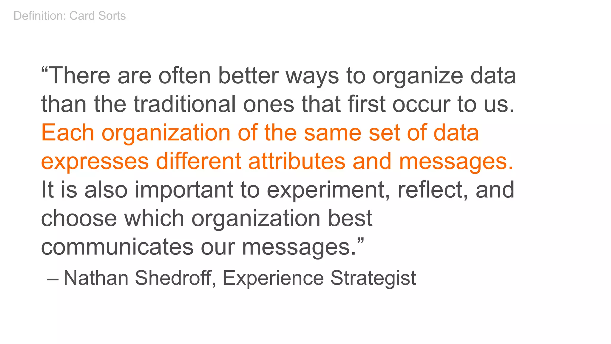
![William James on User Research?
“[I]n a delicate inquiry like this, little is
to be gained by distributing circulars.
A single patient with the right sort of
lesion and a scientific mind, carefully
cross-examined, is more likely to
deepen our knowledge than a
thousand circulars answered as the
average patient answers them, even
though the answers be never so
thoroughly collated by the
investigator.”
– William James, “The Consciousness of Lost Limbs,”
1887
Discovery: User Research](https://image.slidesharecdn.com/introtouxdesign120719-191209022232/75/Introduction-to-User-Experience-Design-12-07-19-90-2048.jpg)
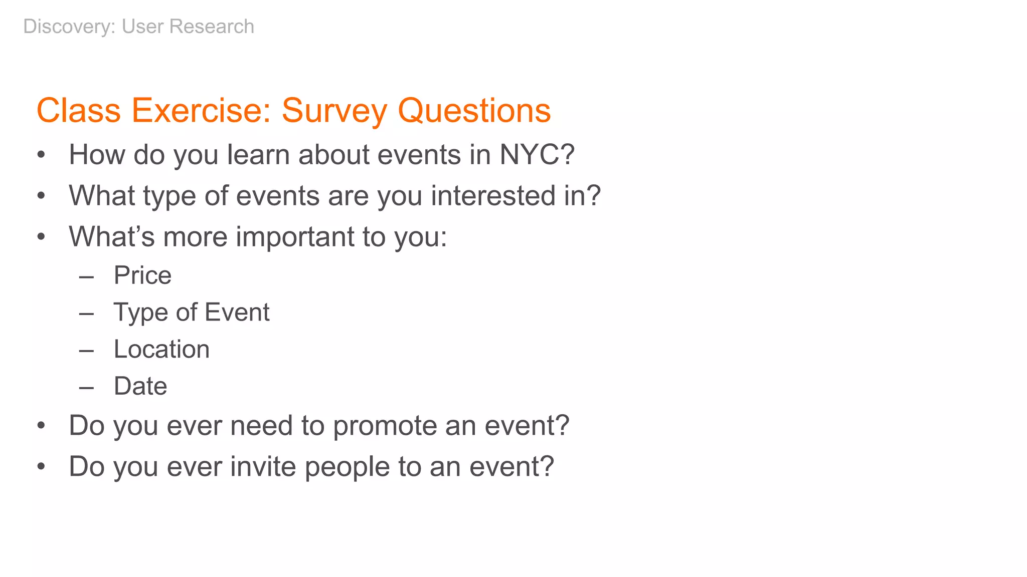


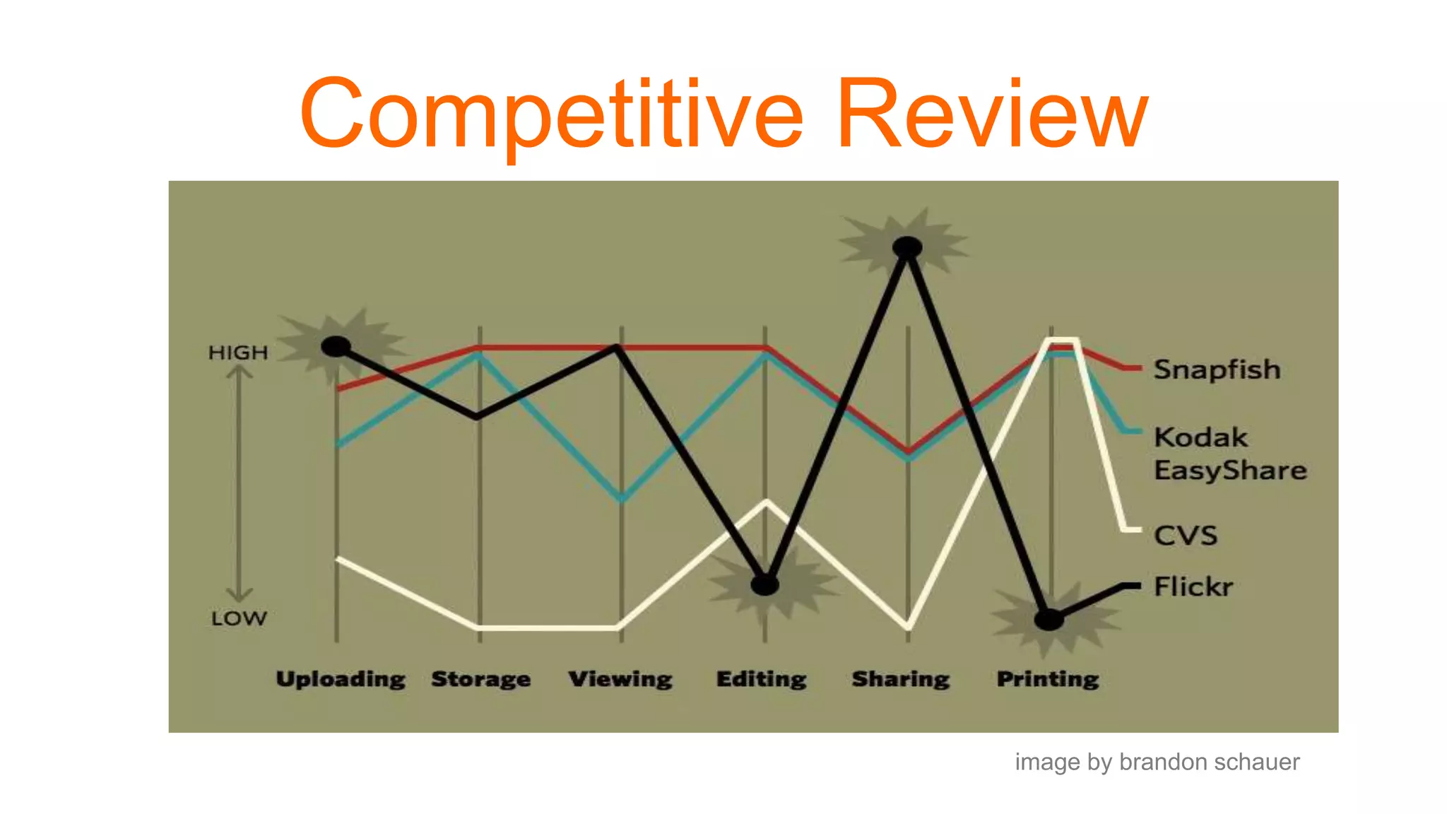
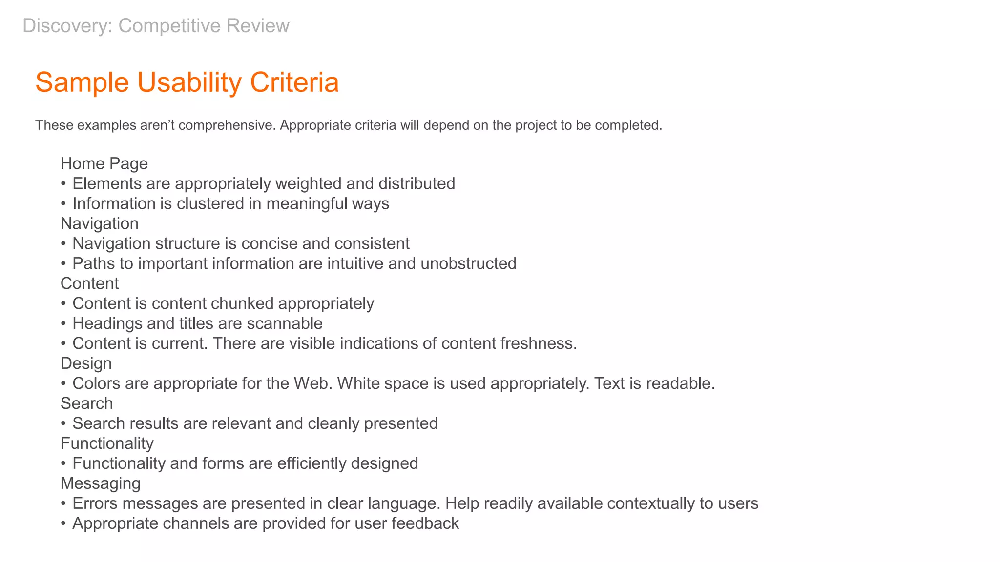
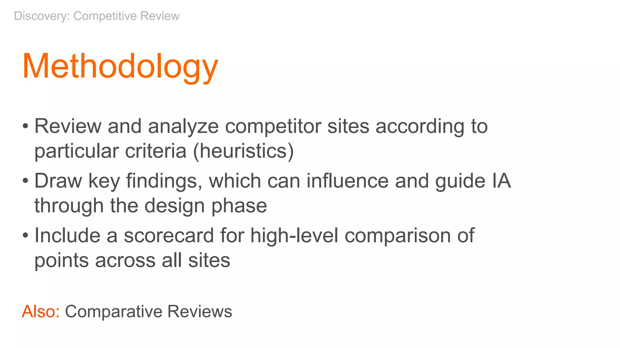
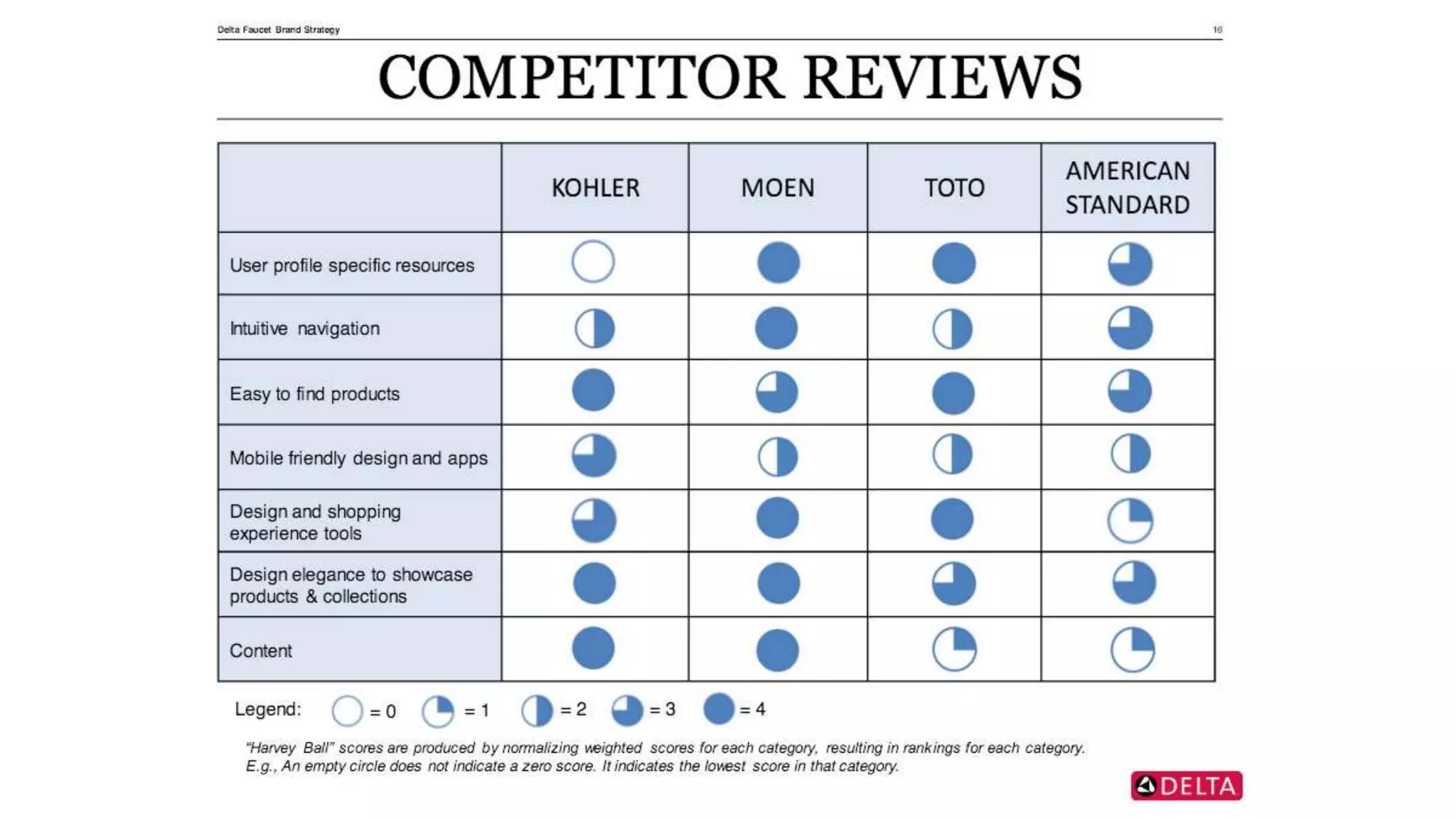

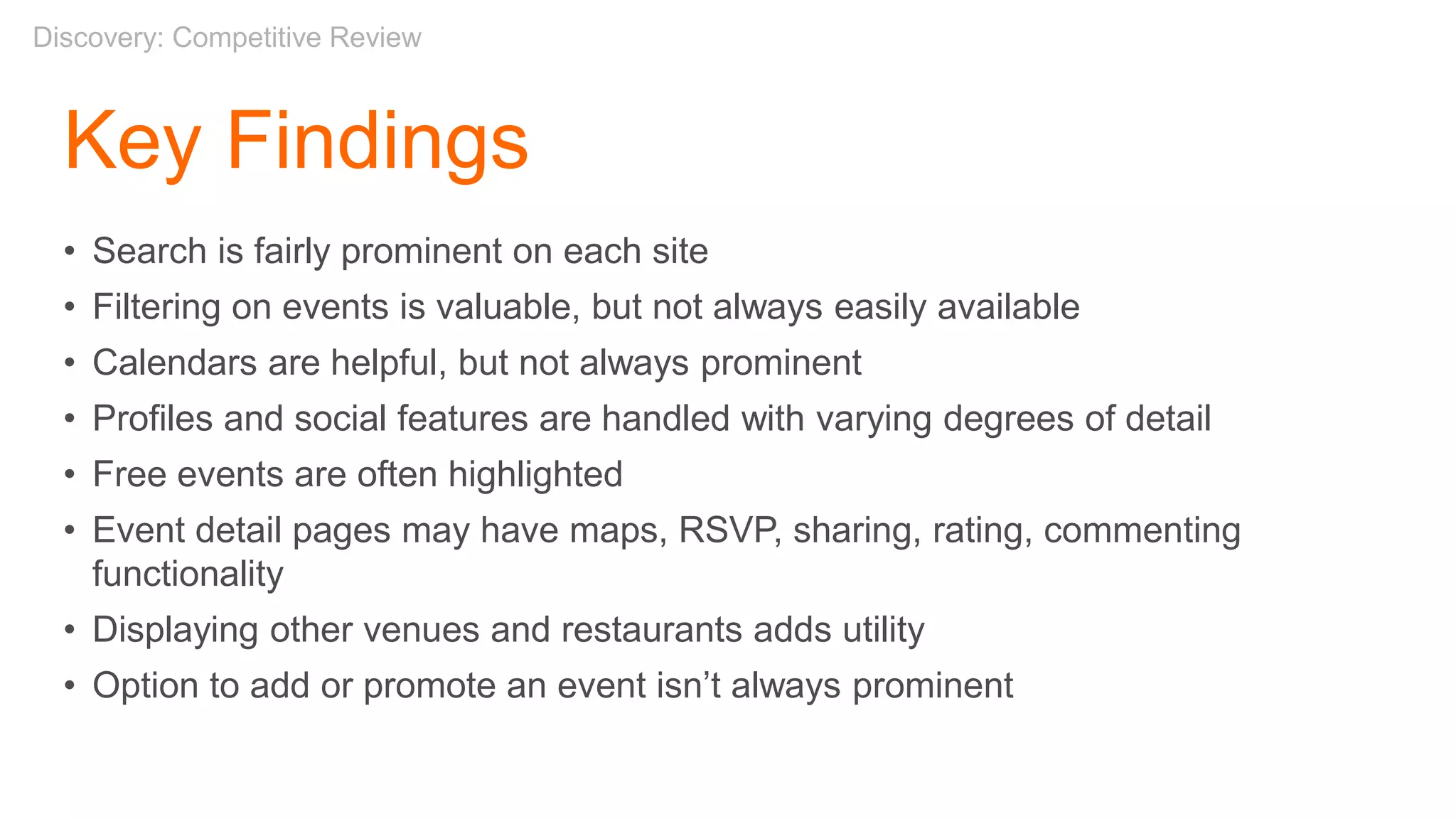


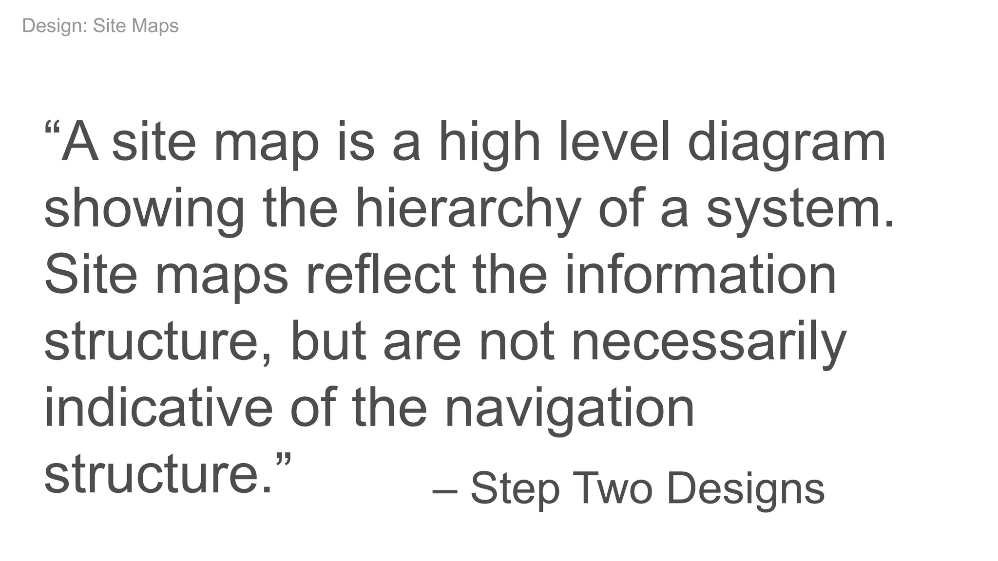
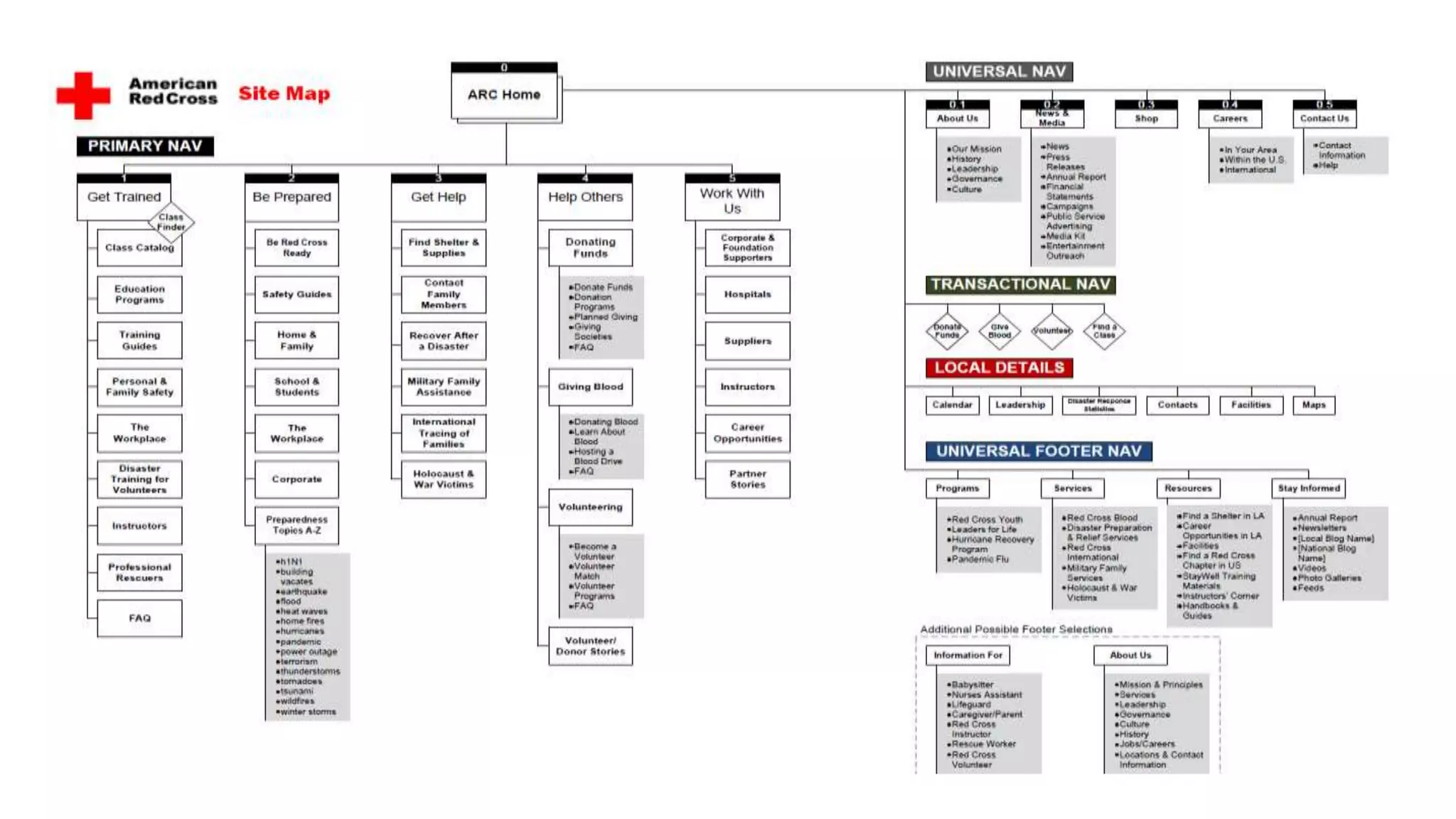
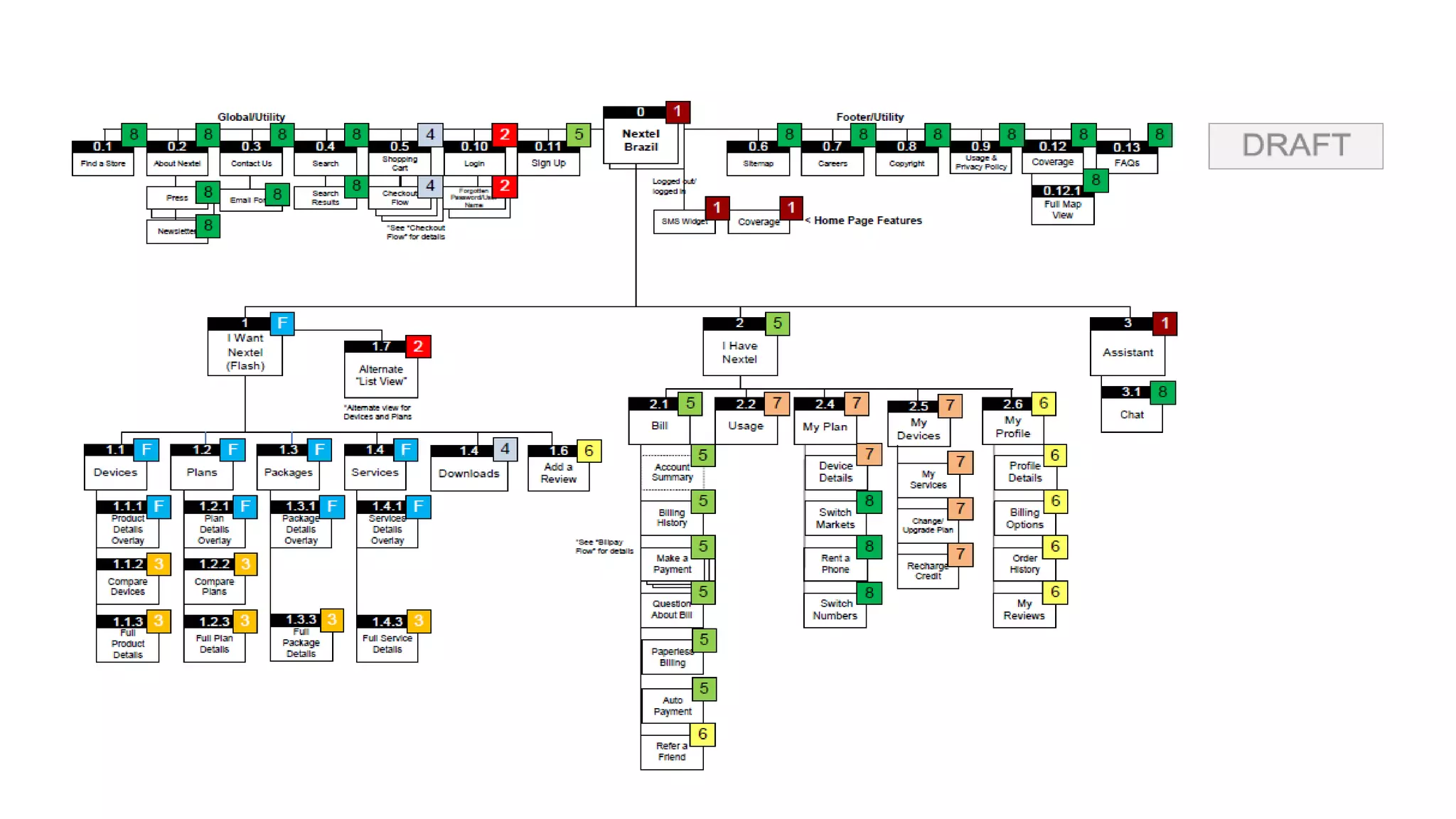
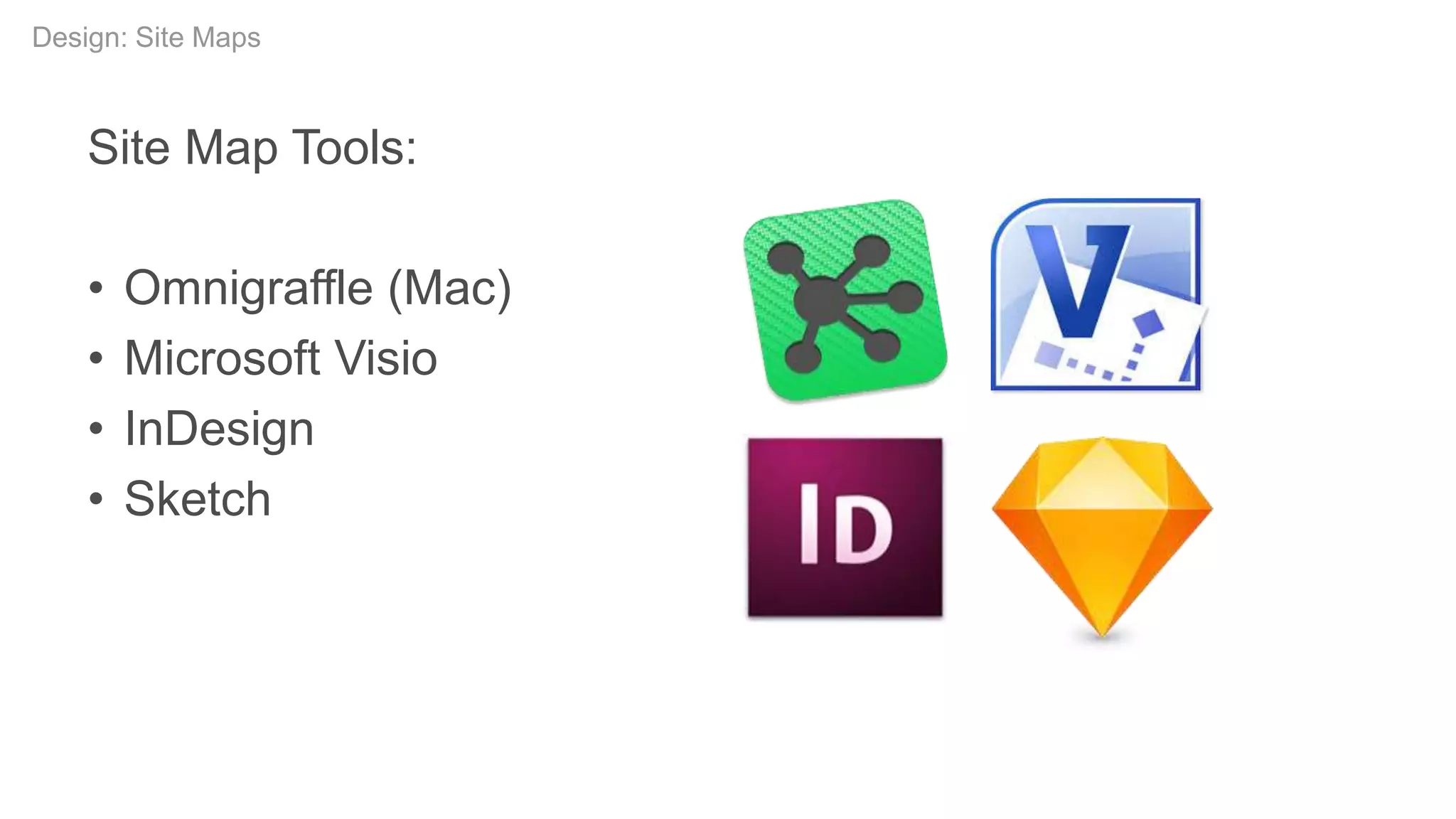

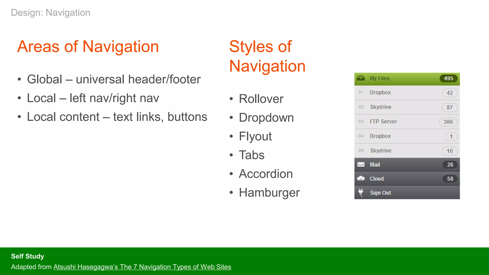
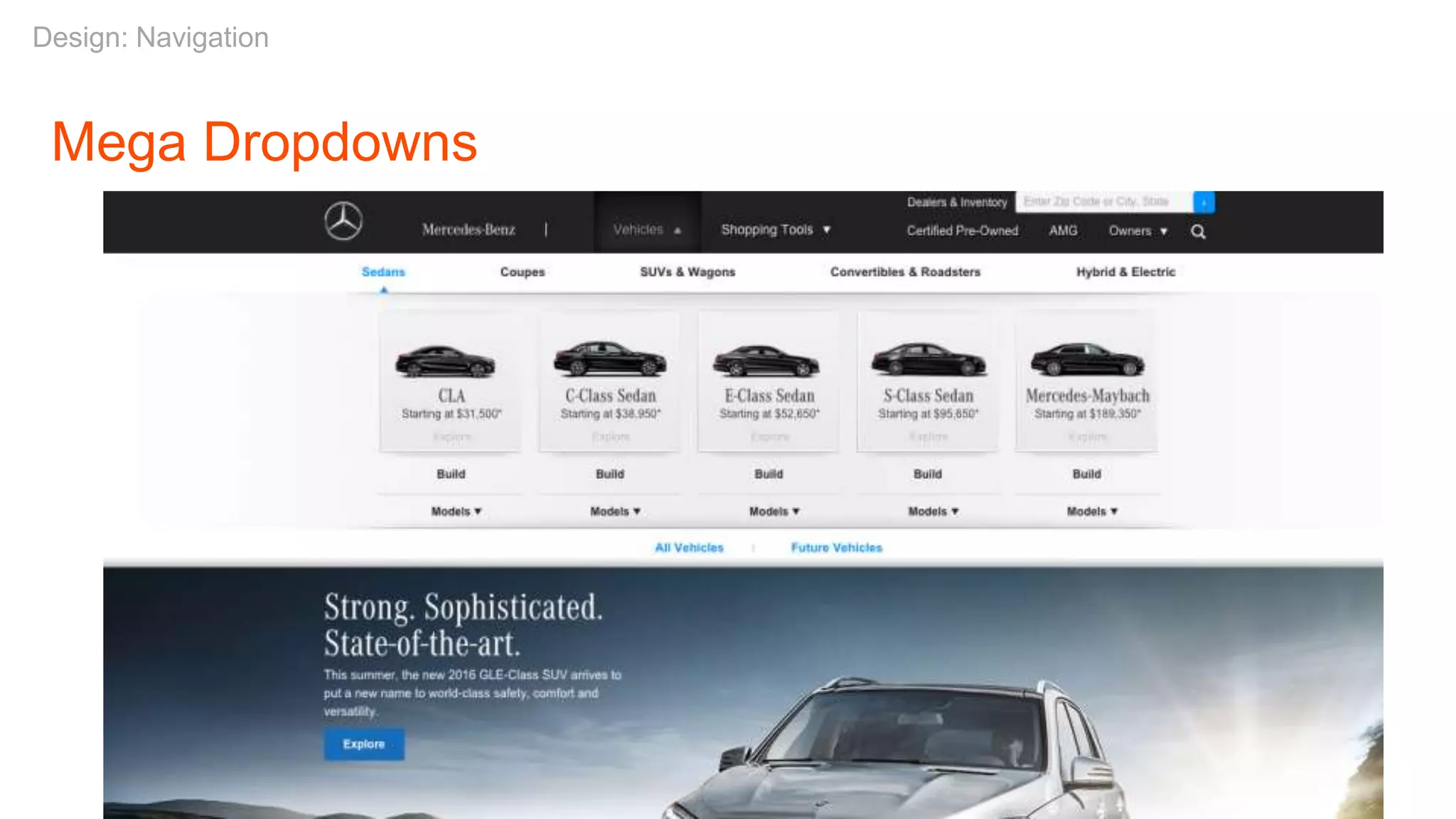
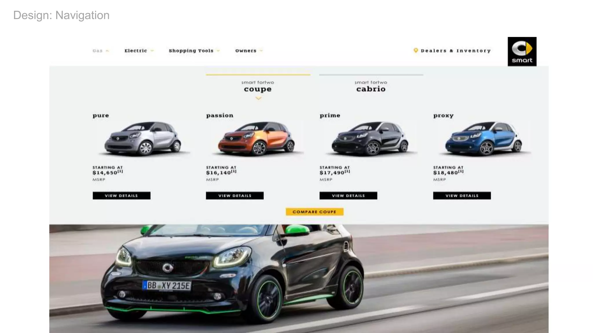
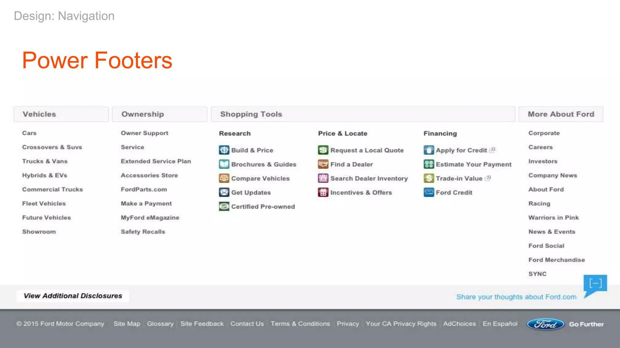


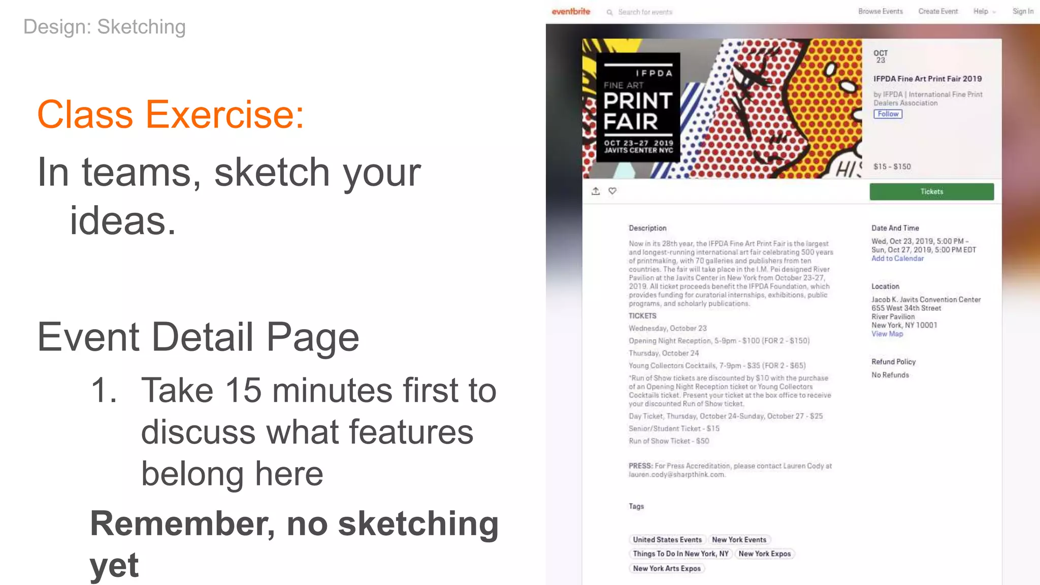


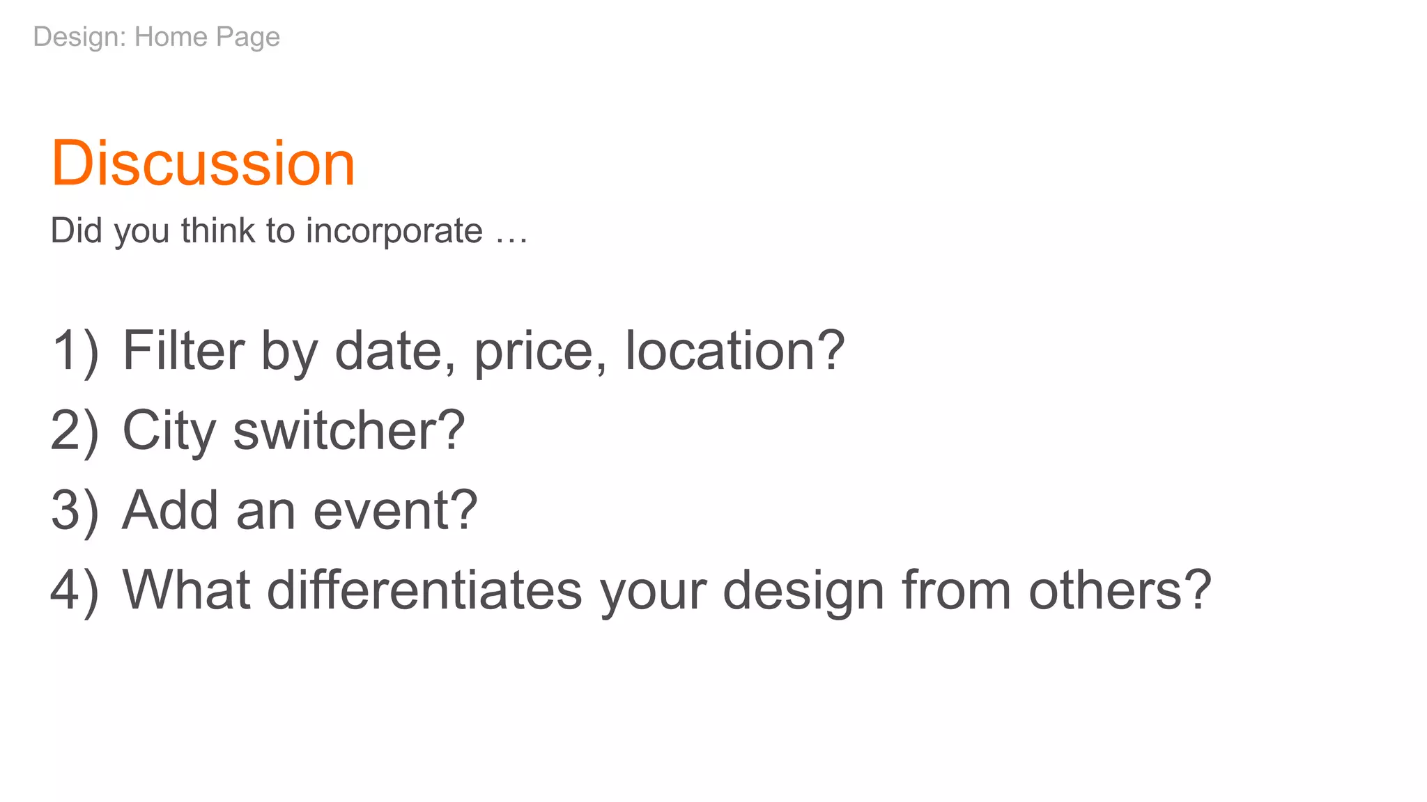
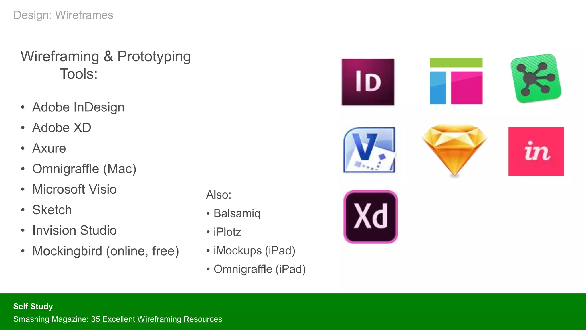
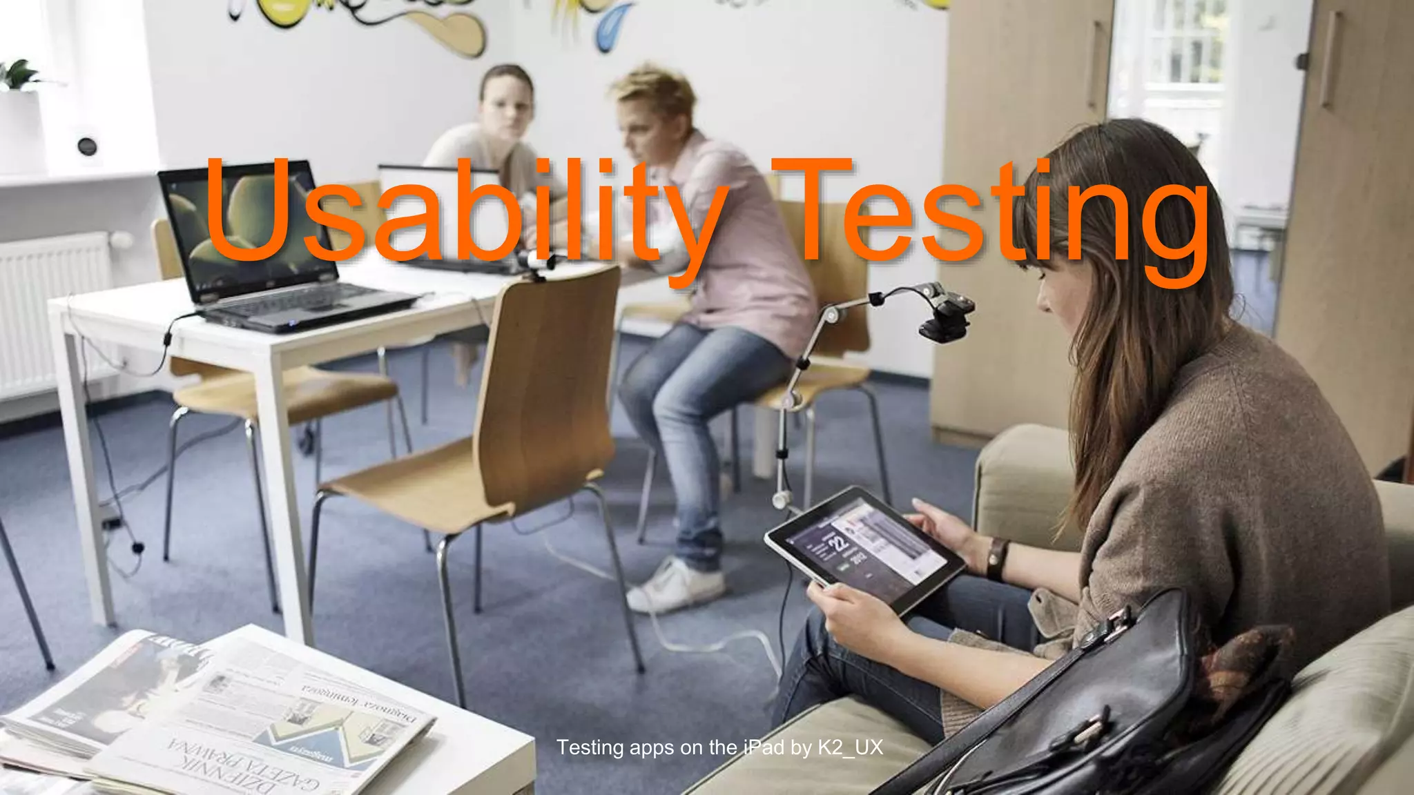
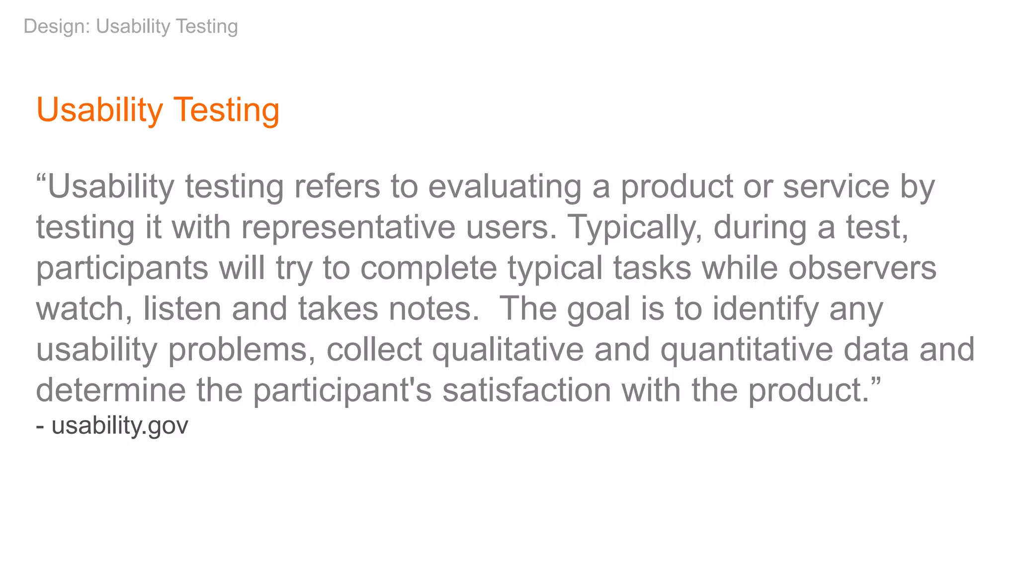
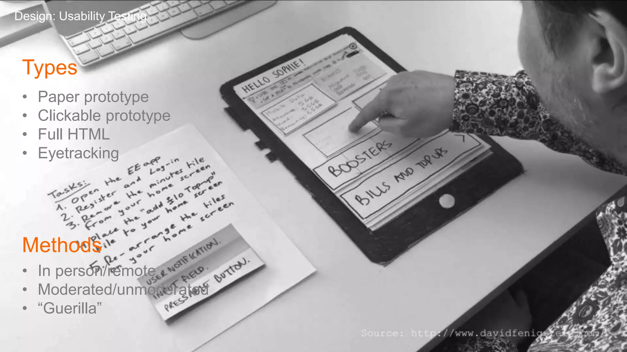


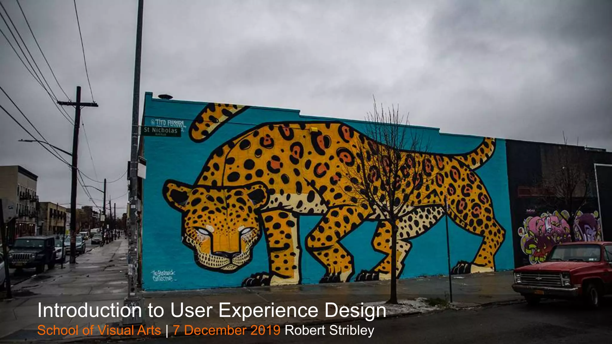
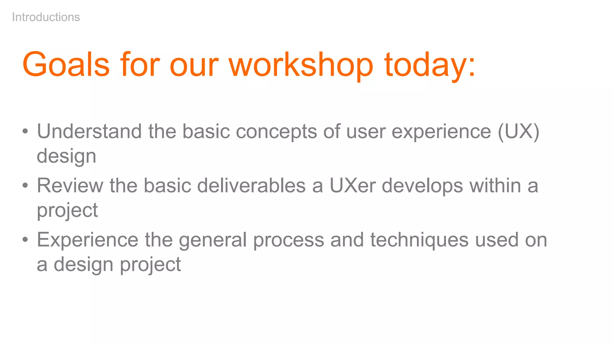
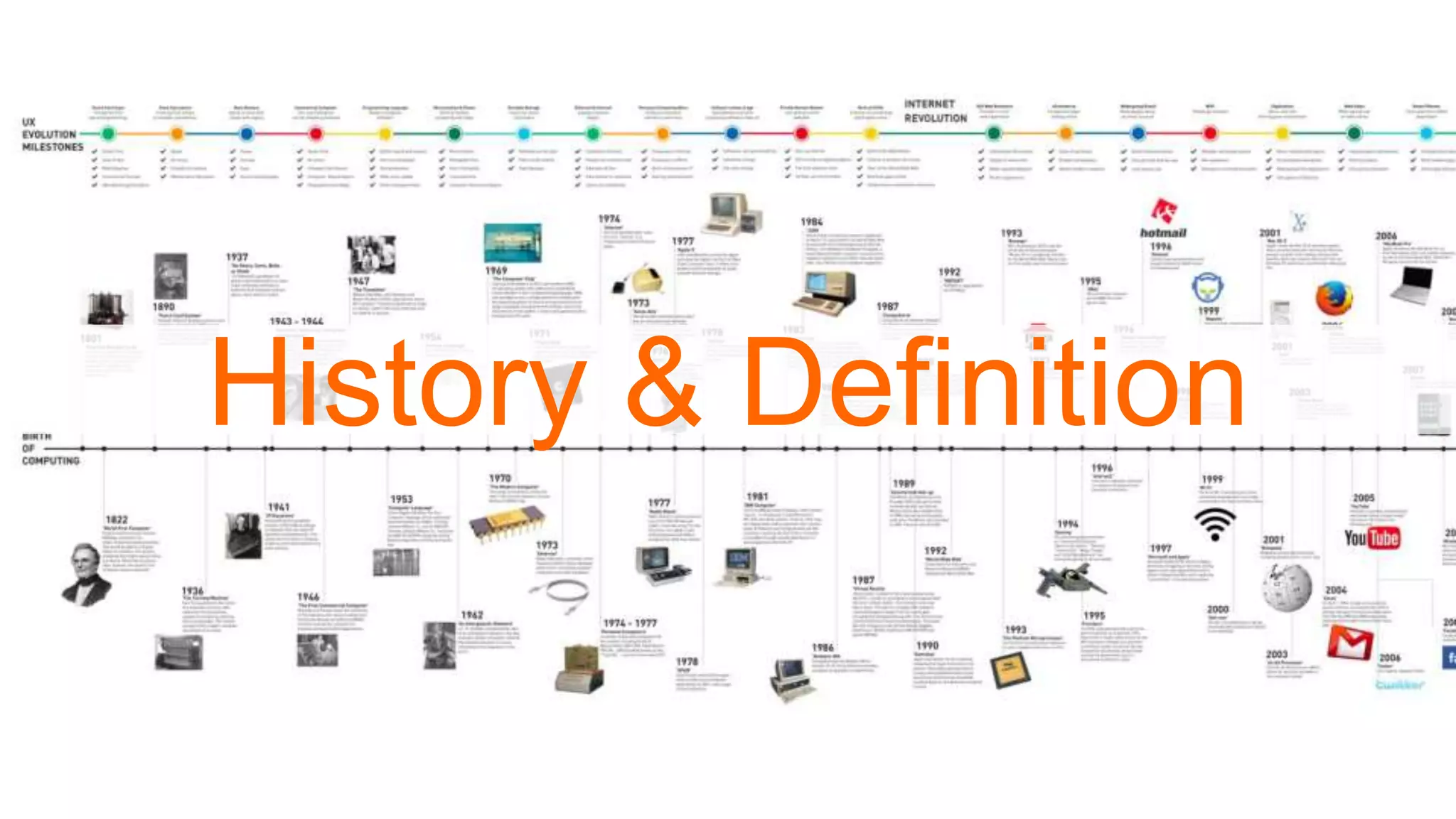
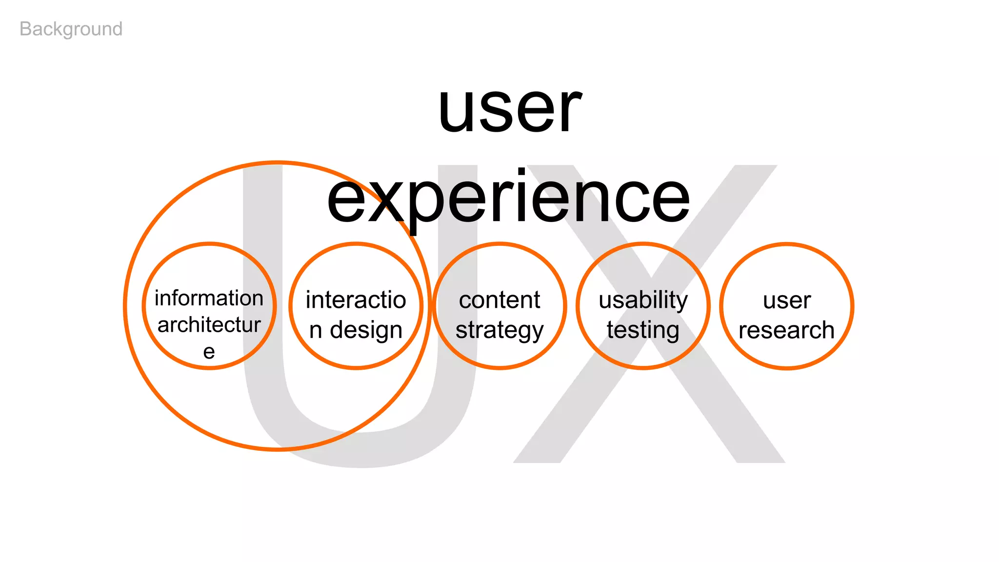
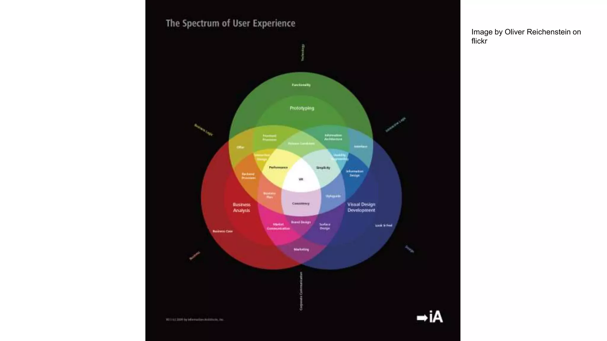
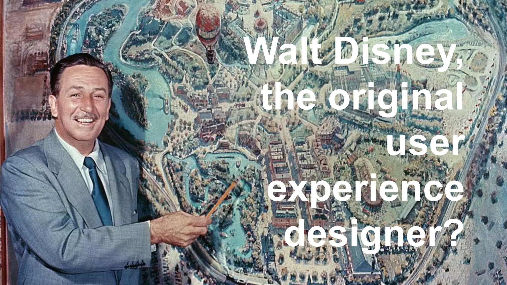
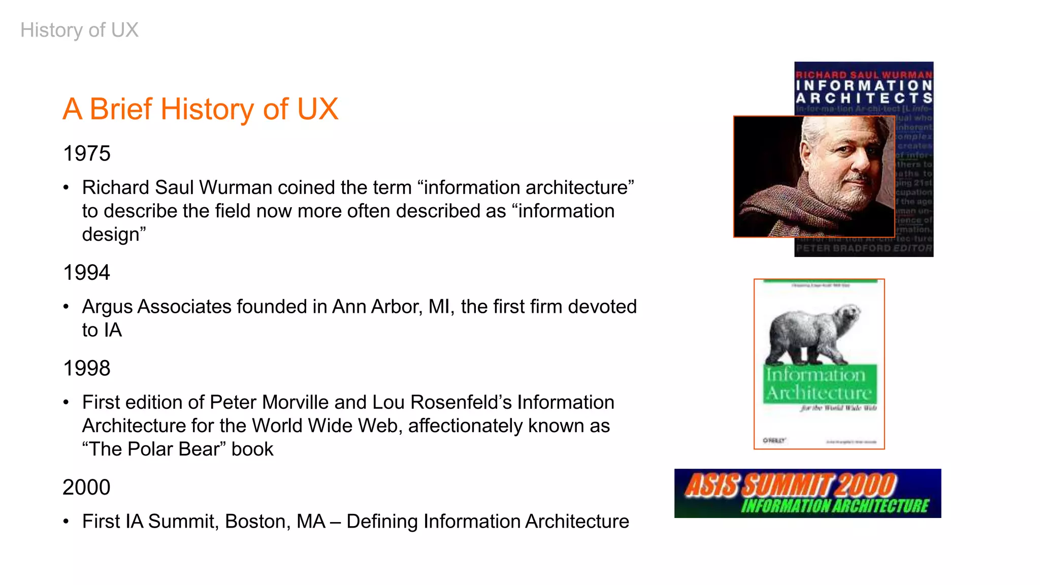
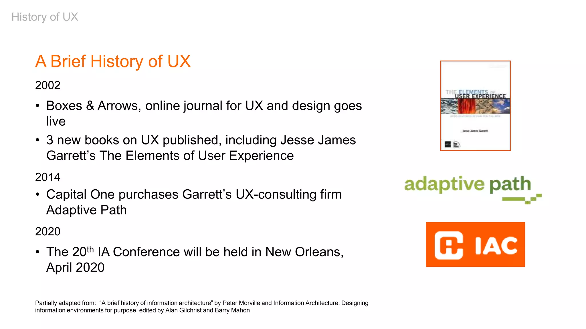
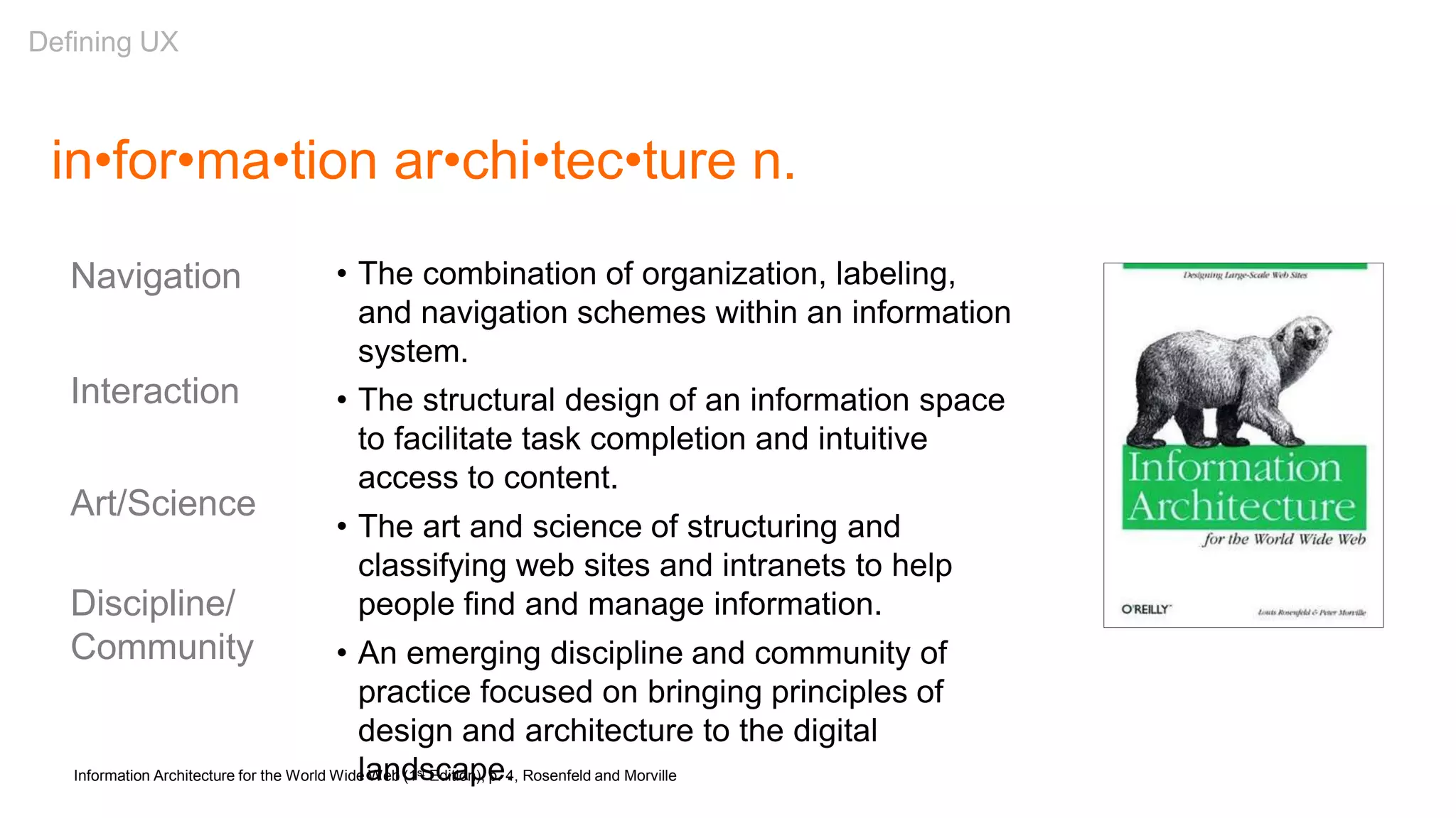
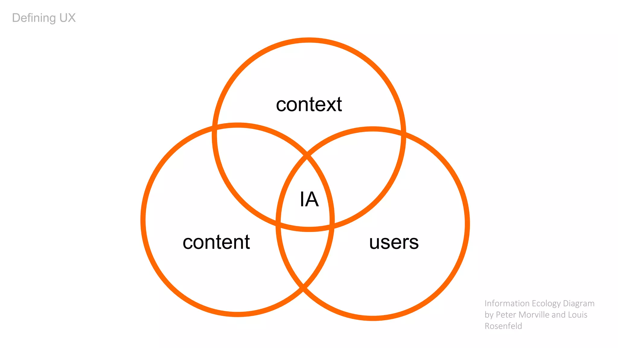
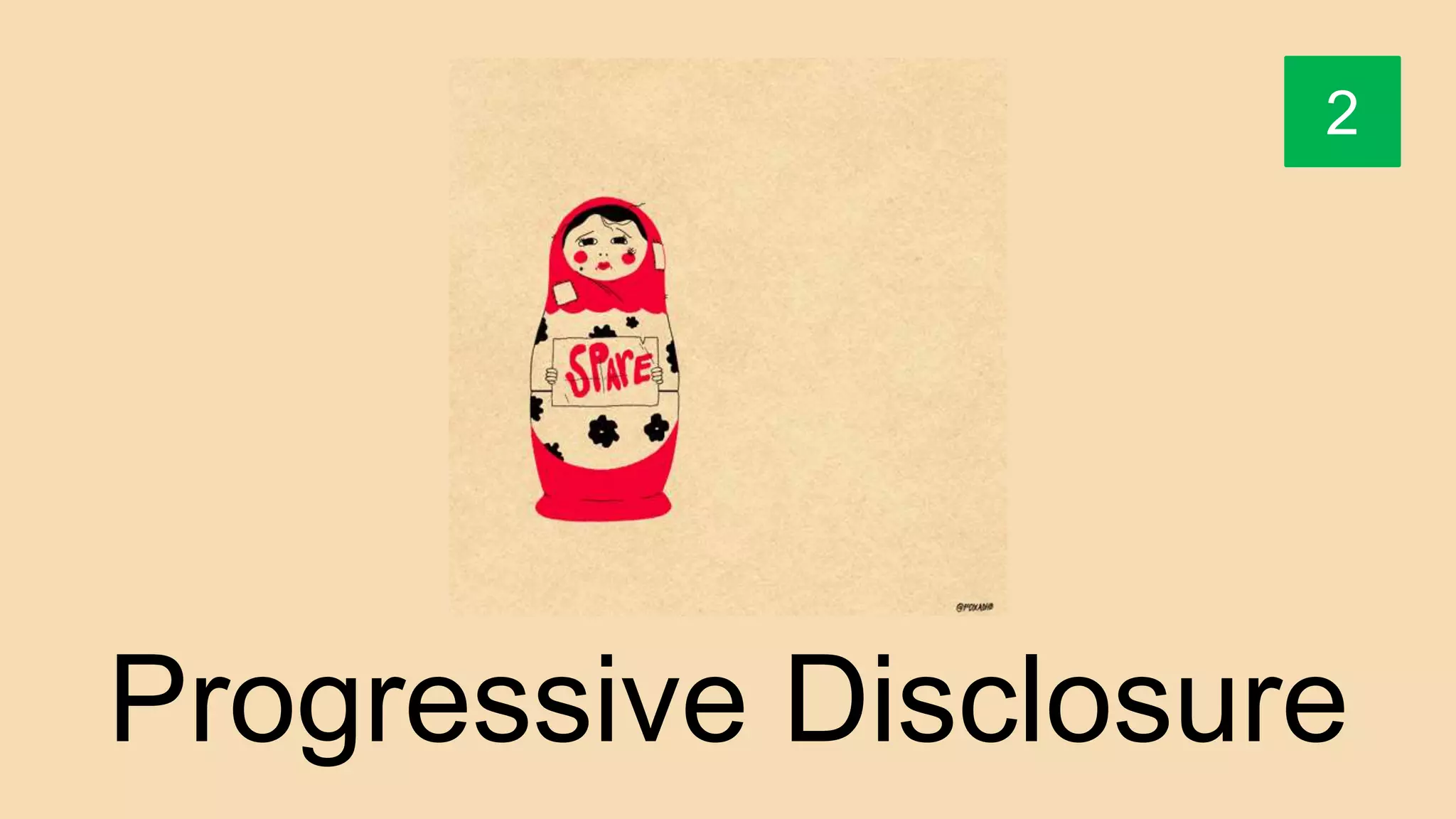
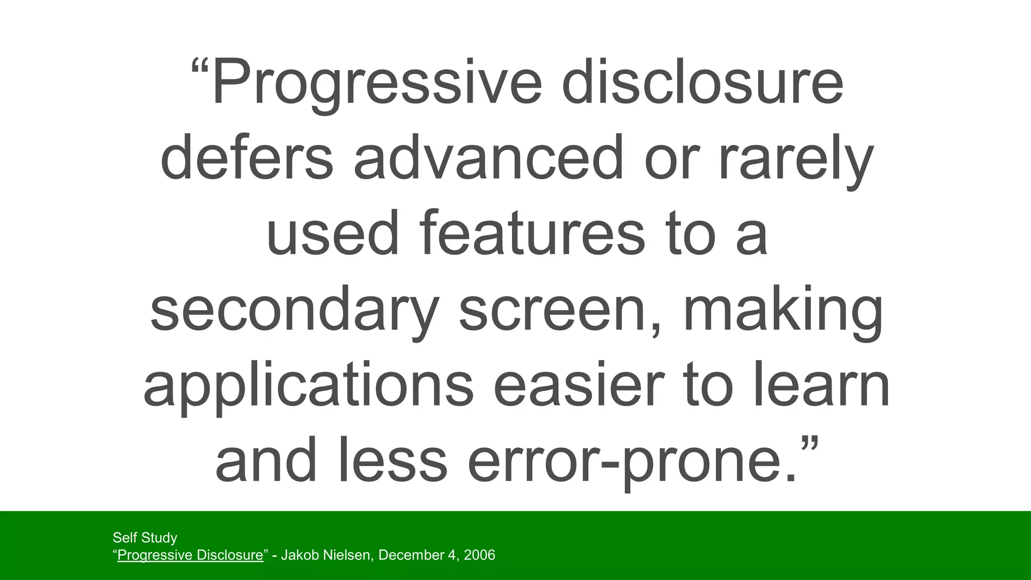
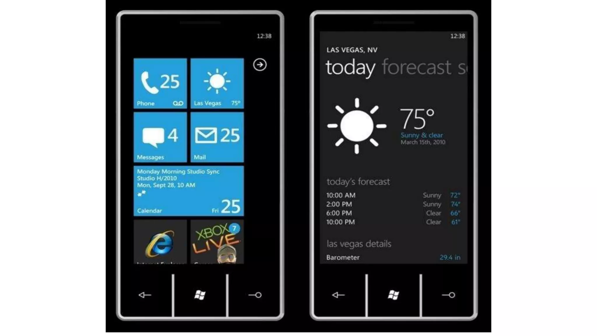
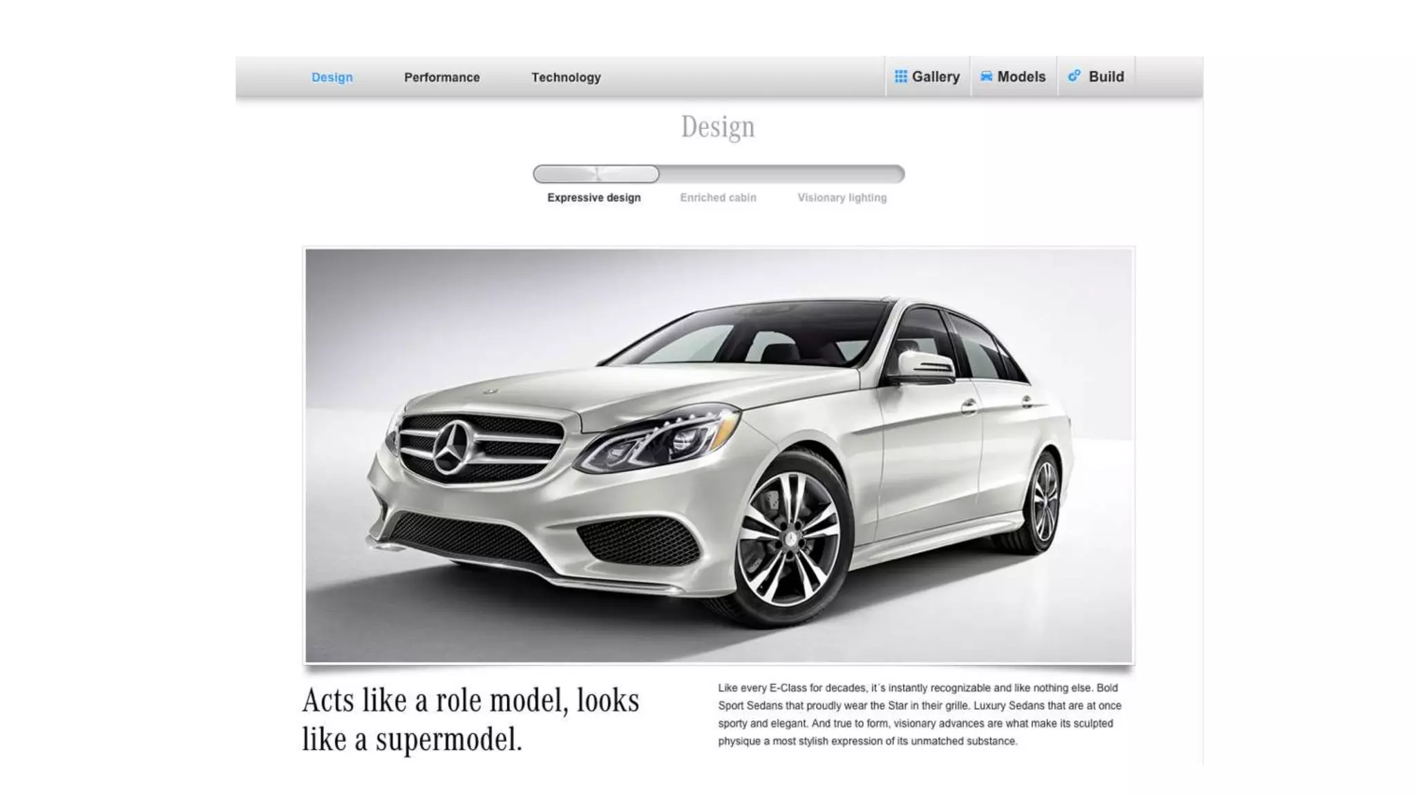
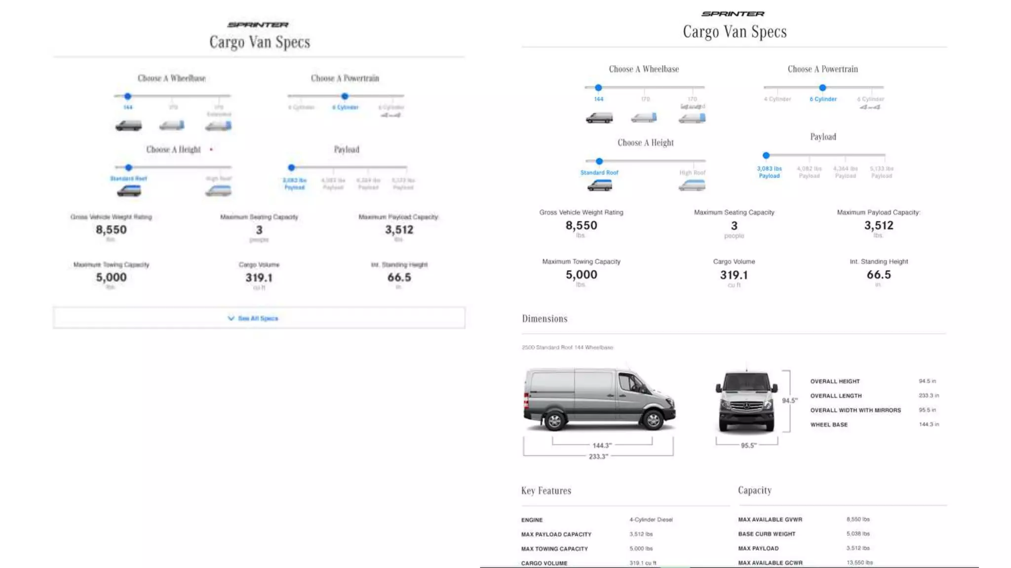
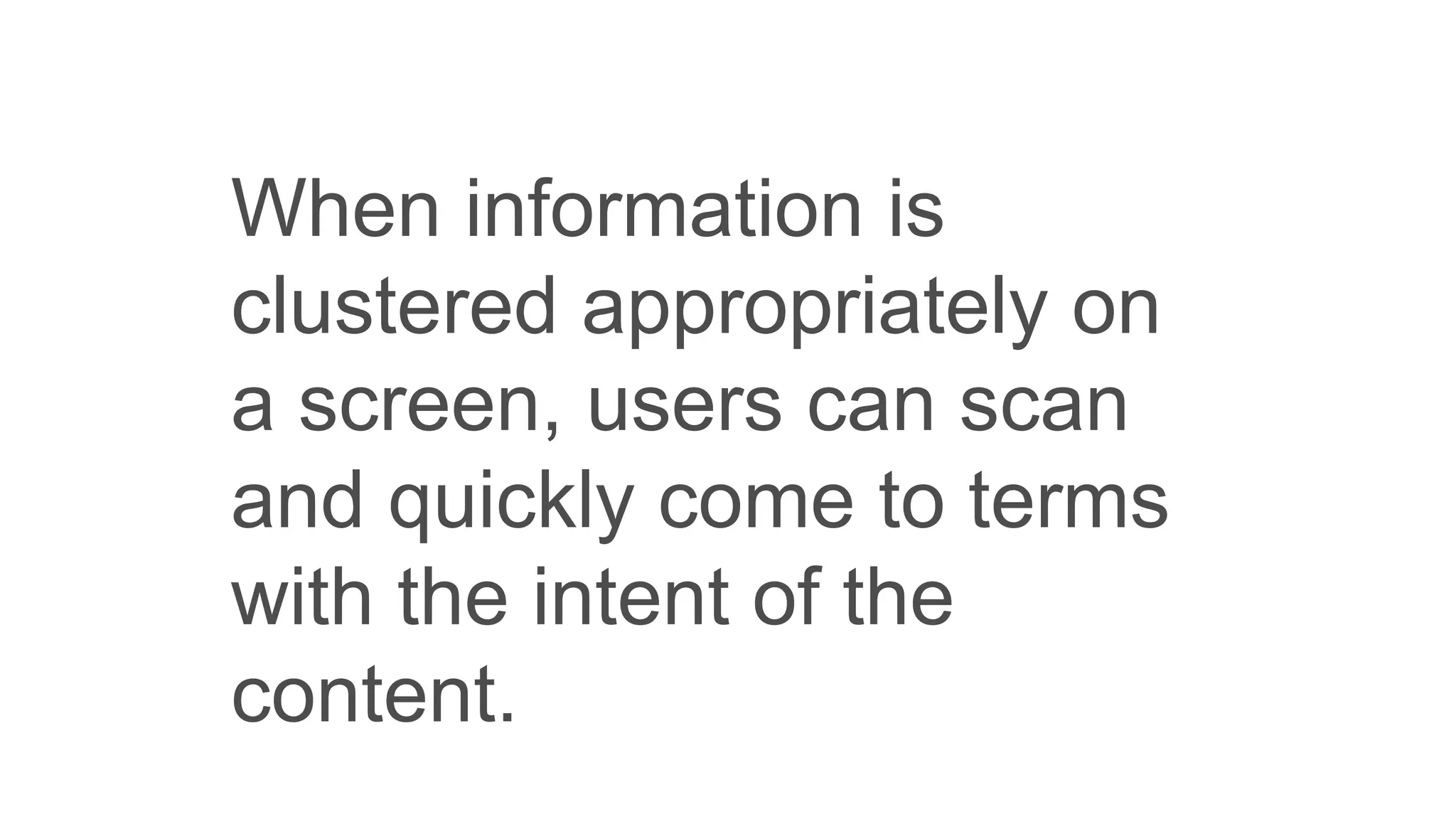
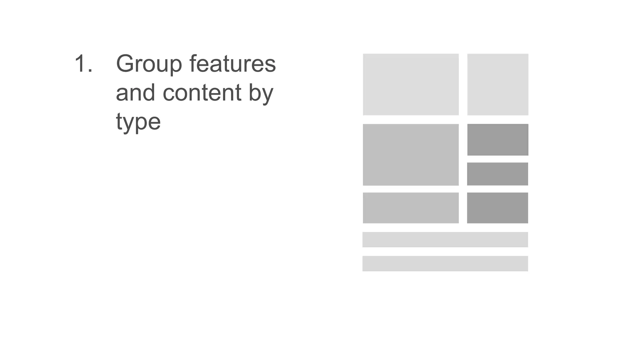
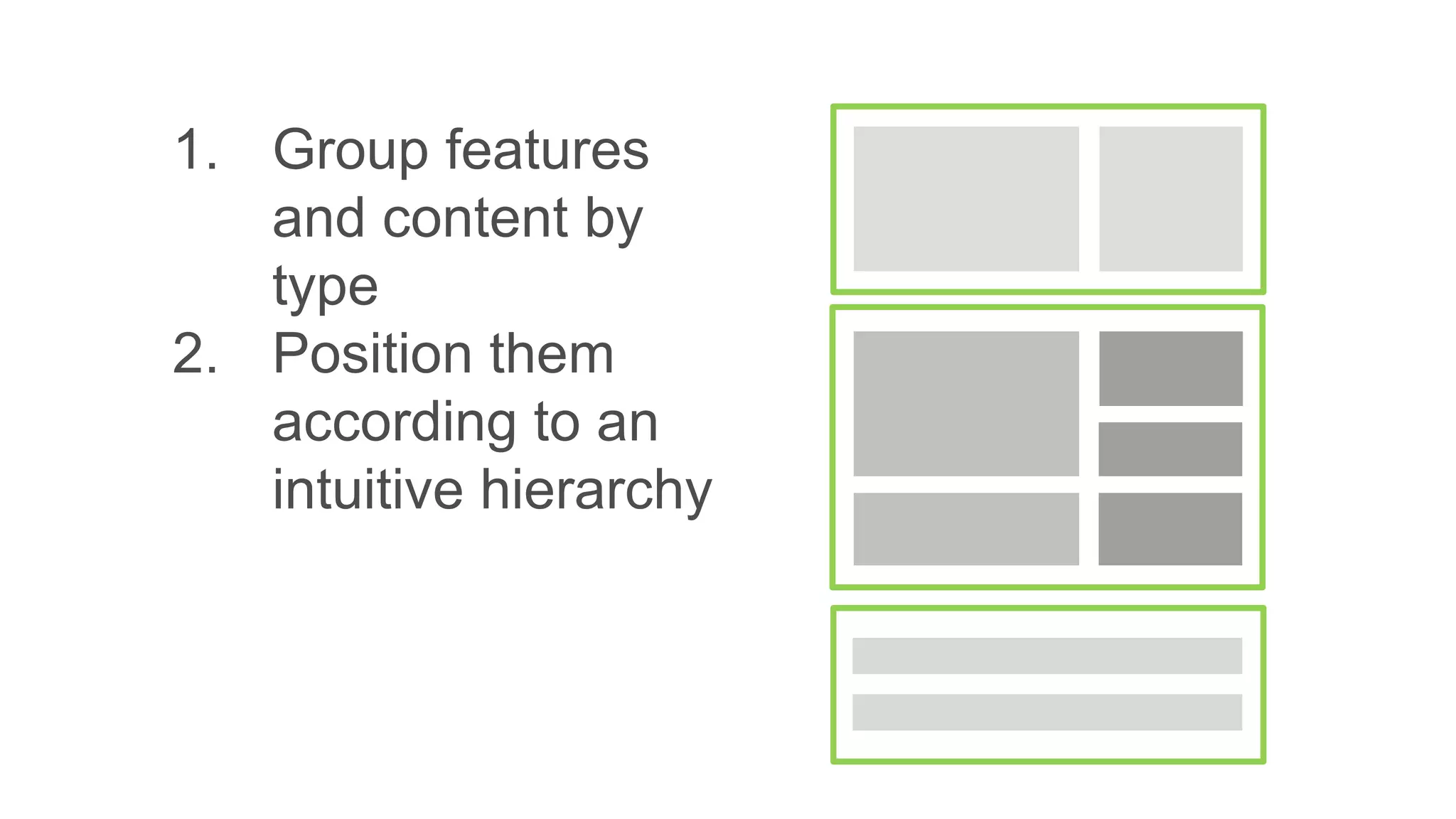
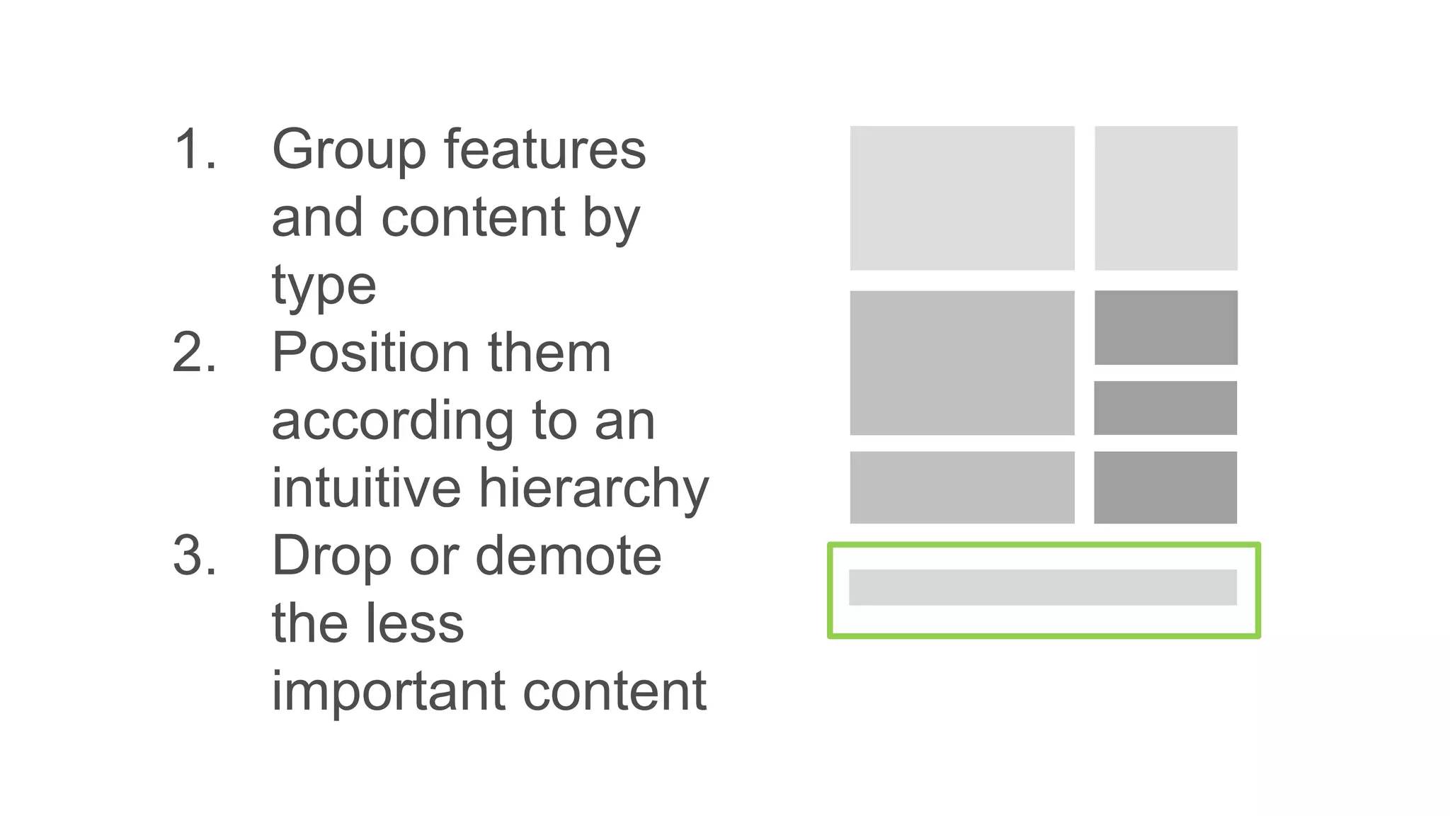
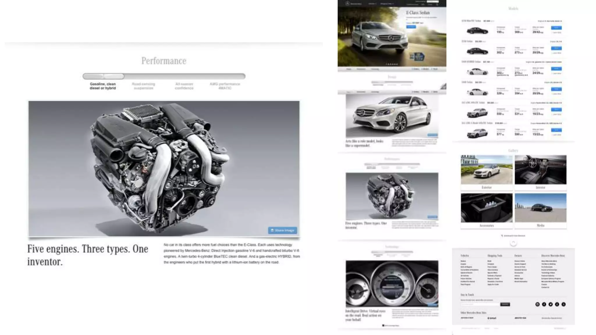
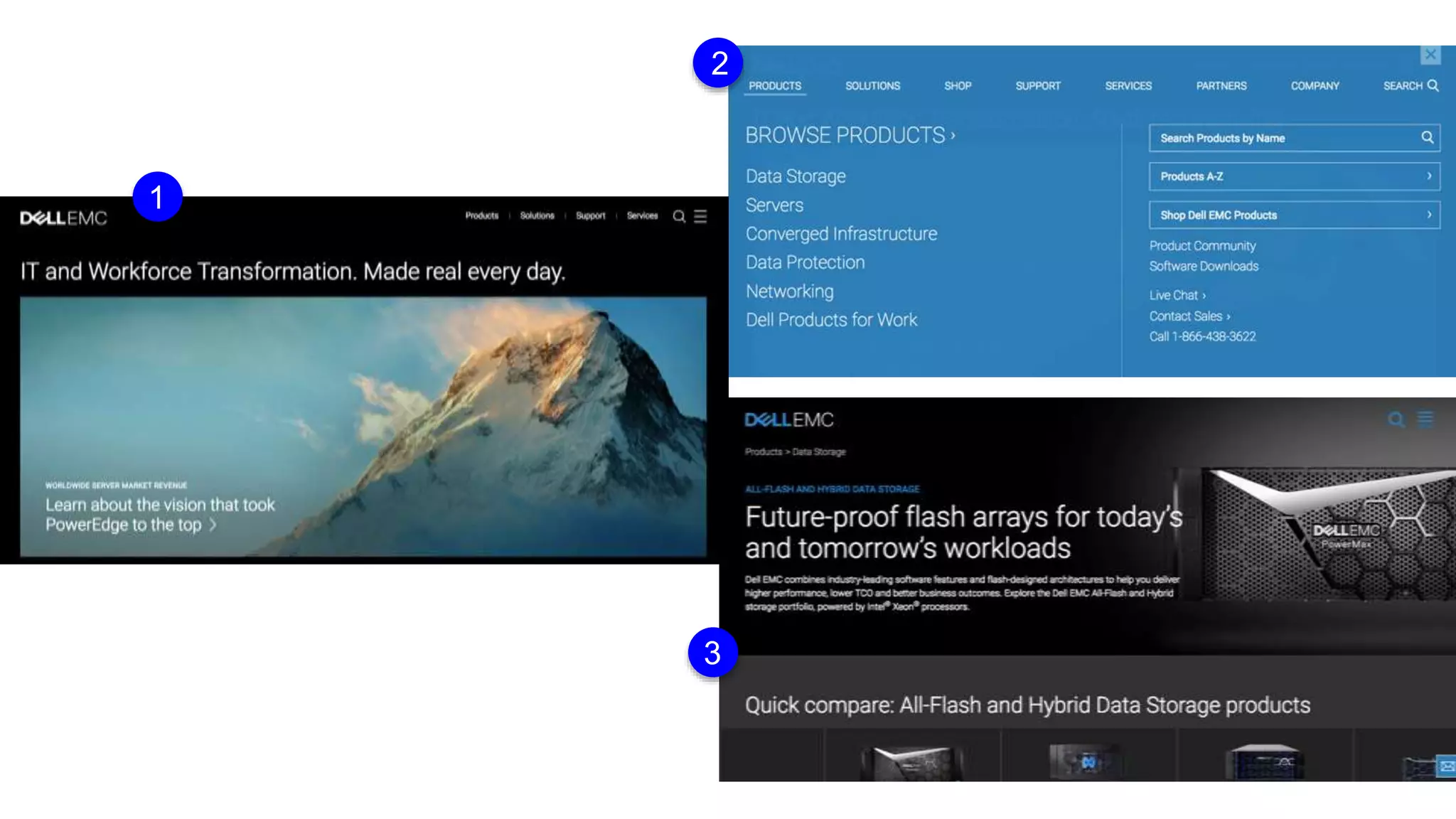
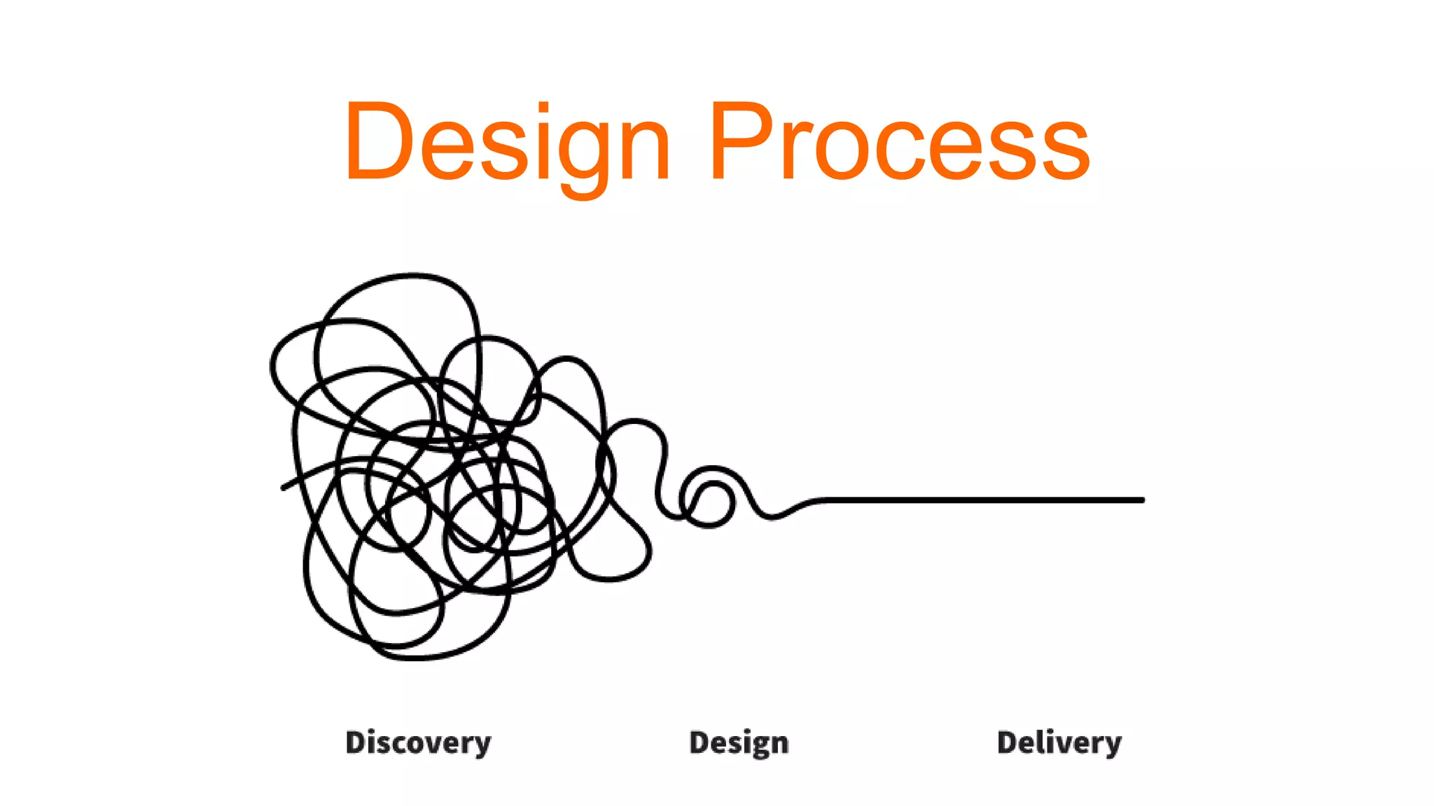
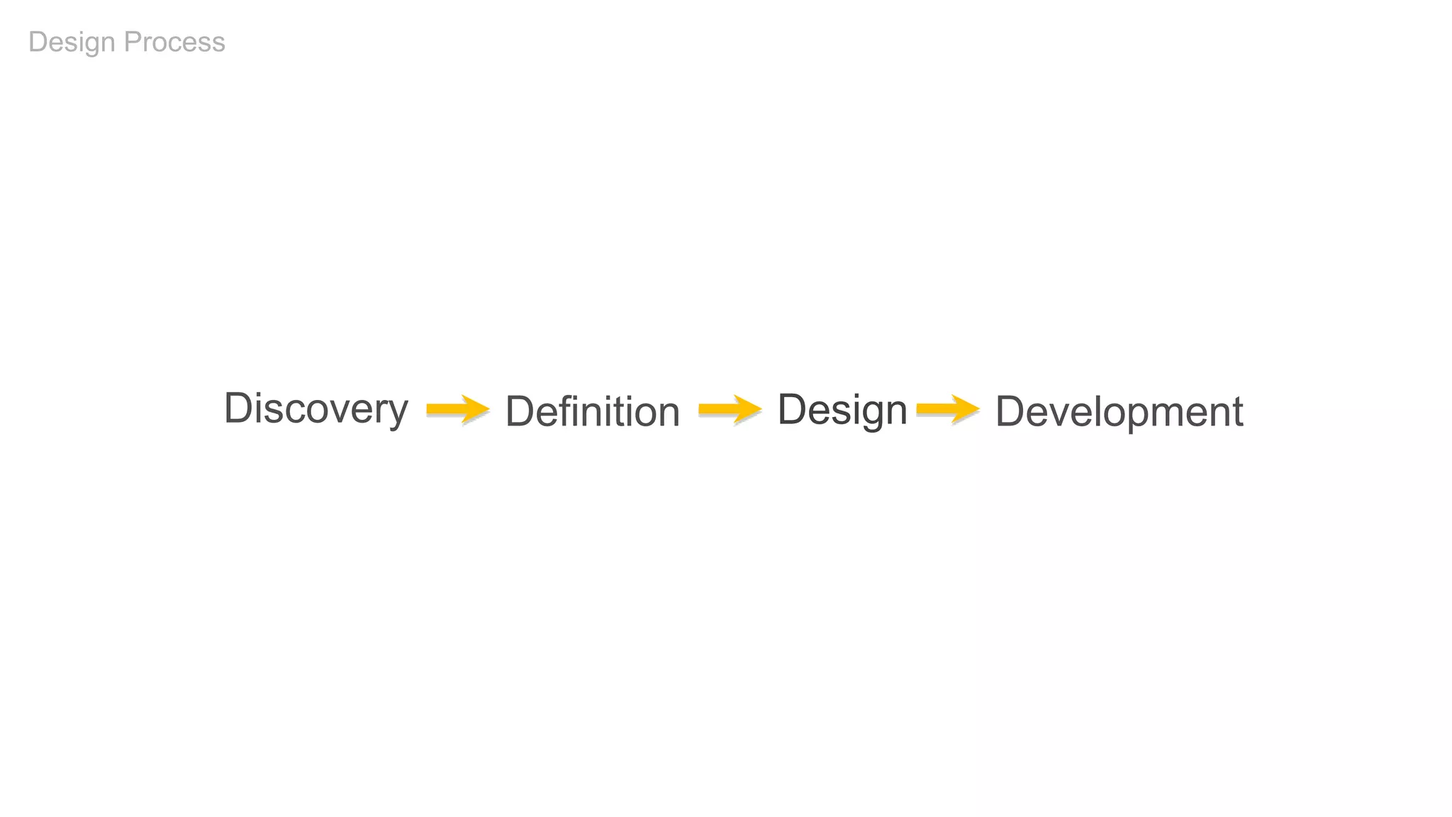
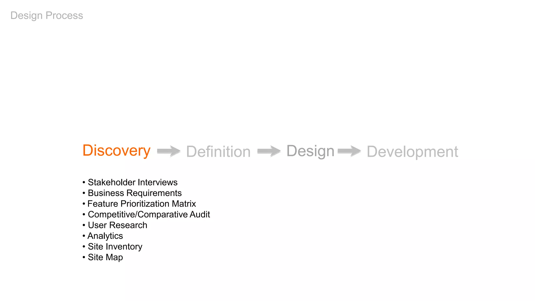
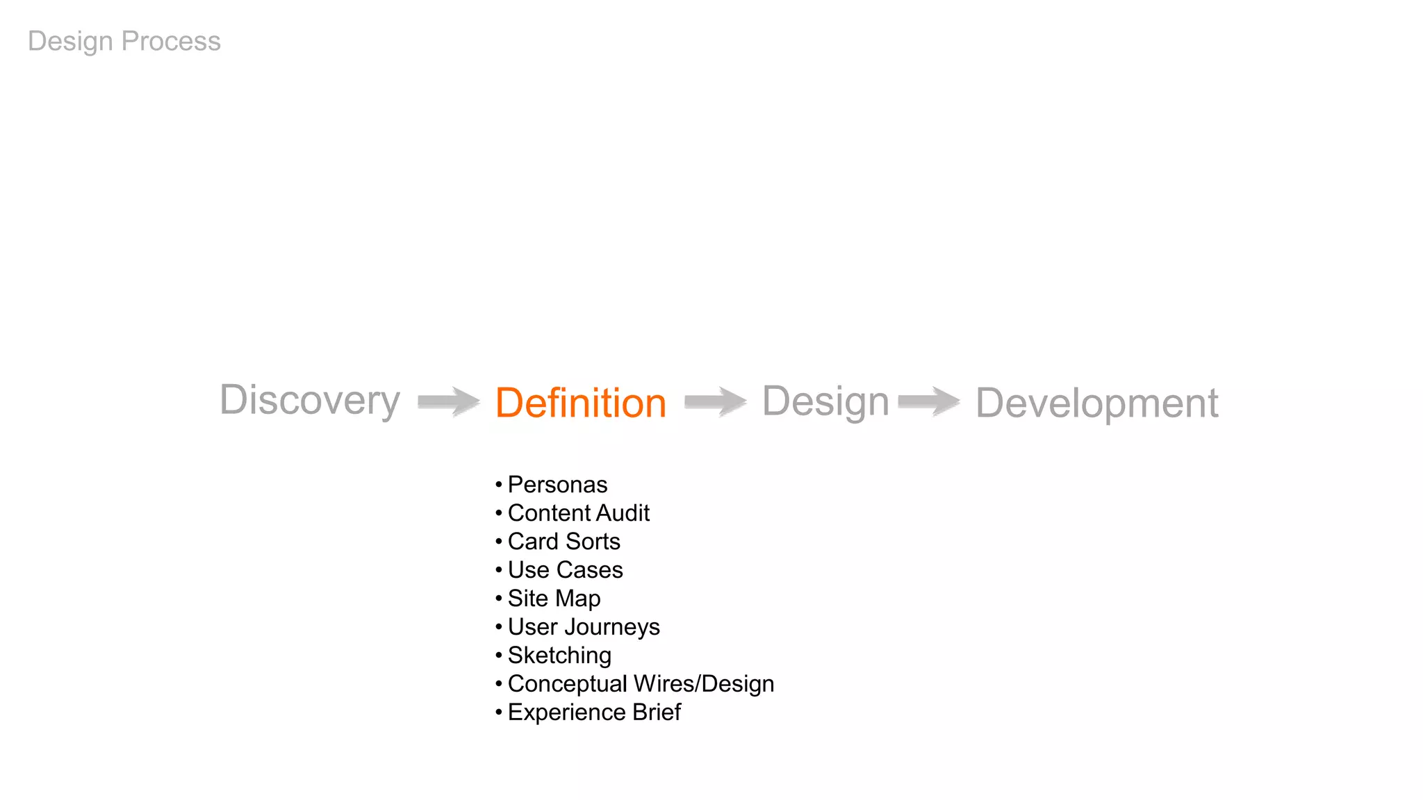
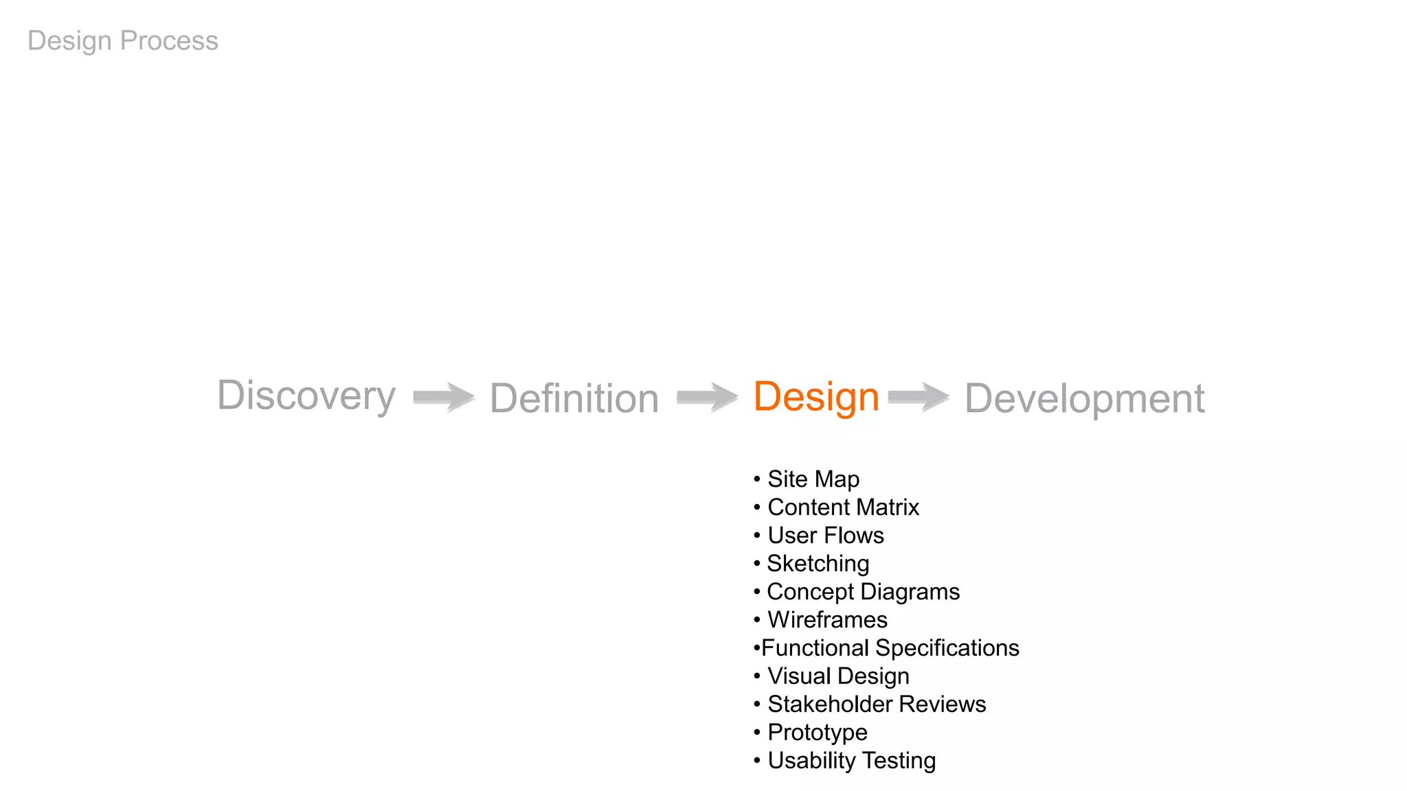
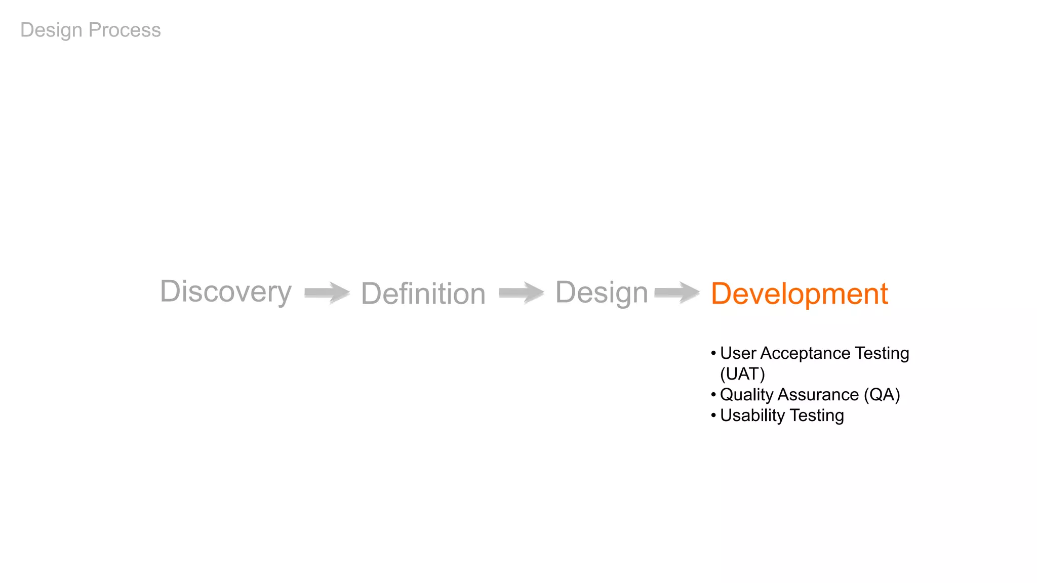
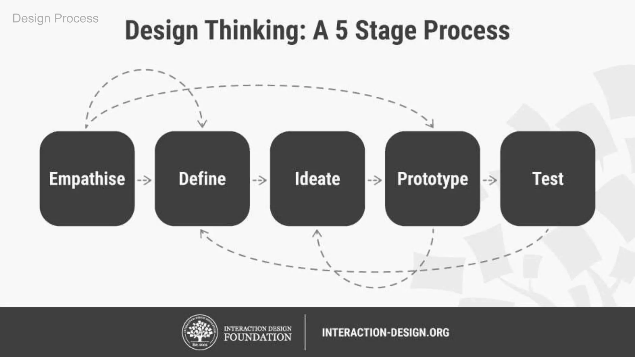
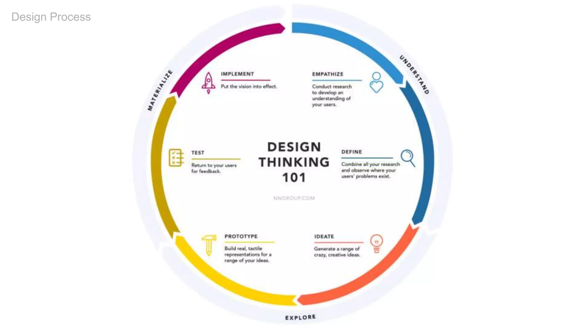
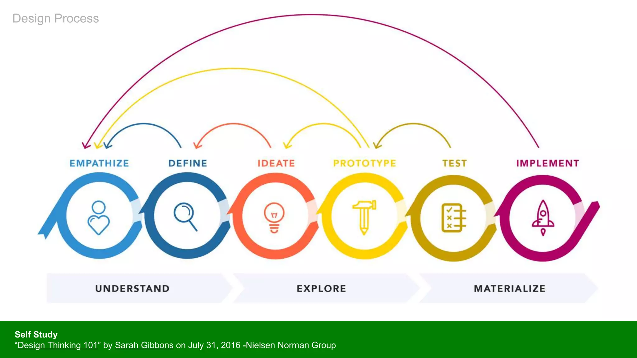
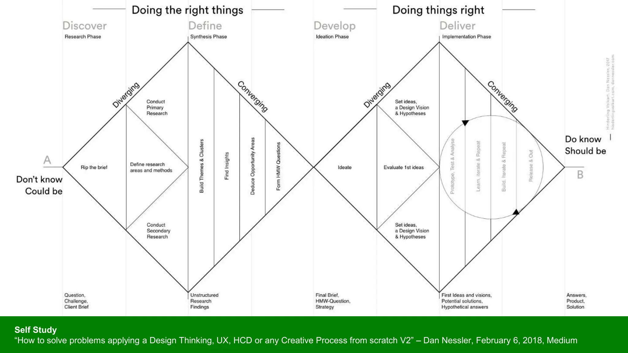
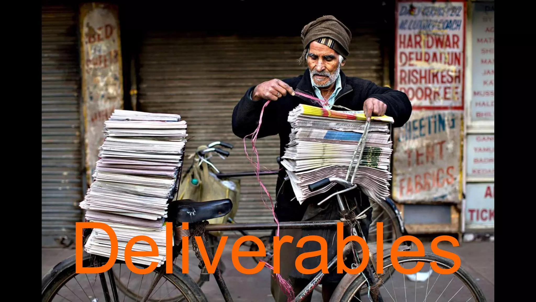
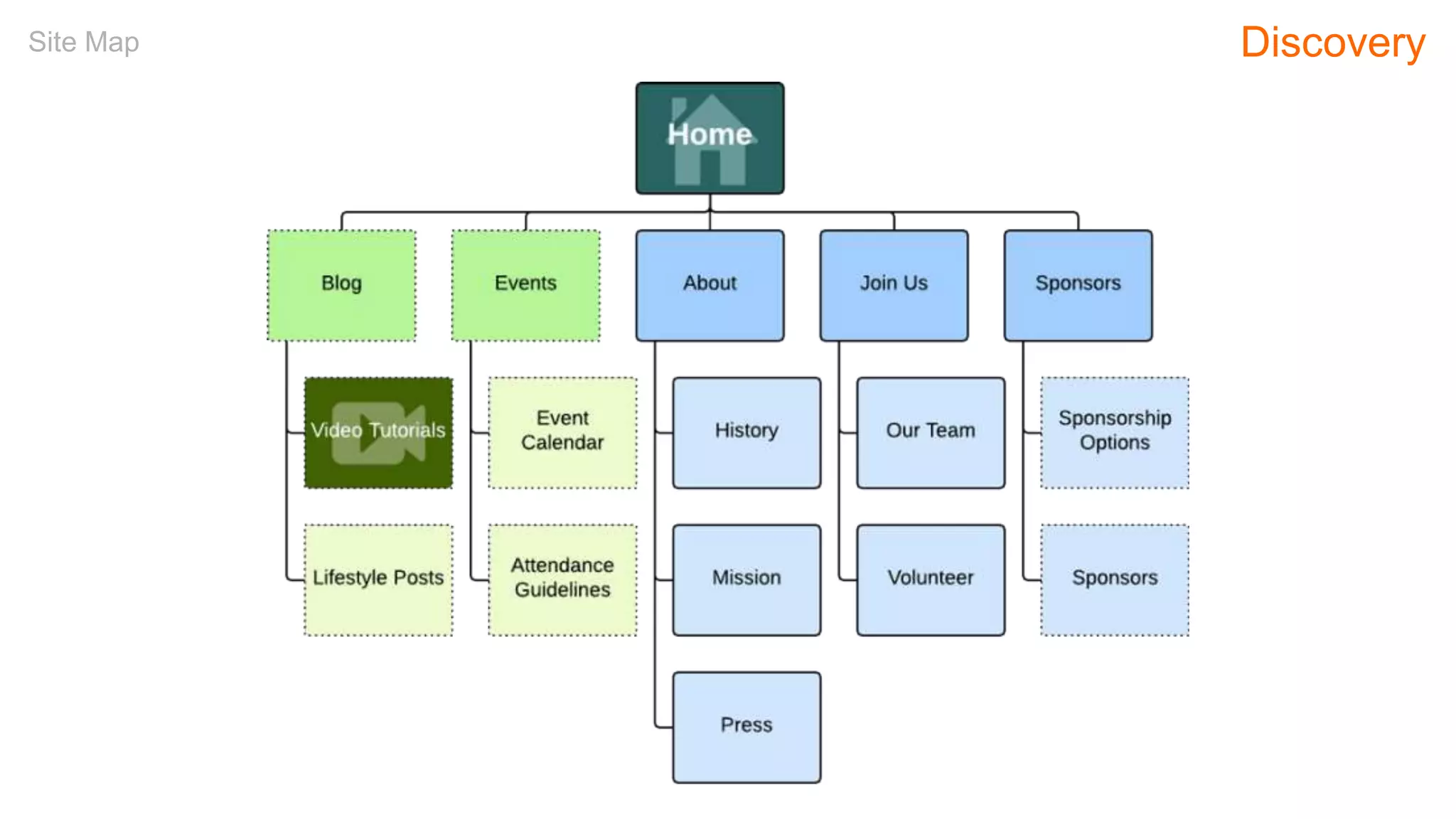
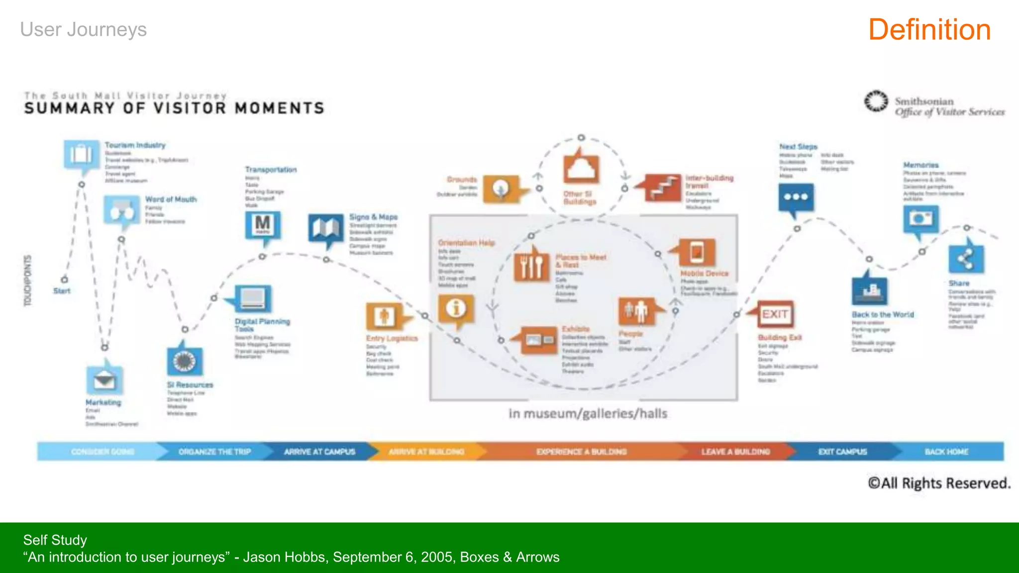
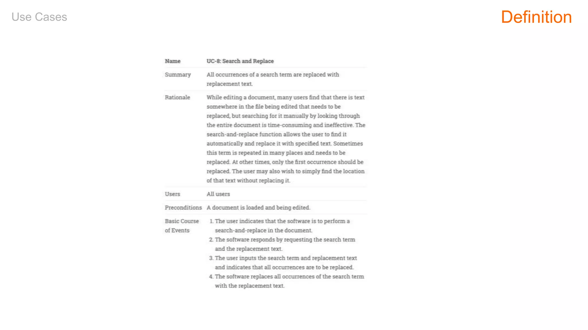
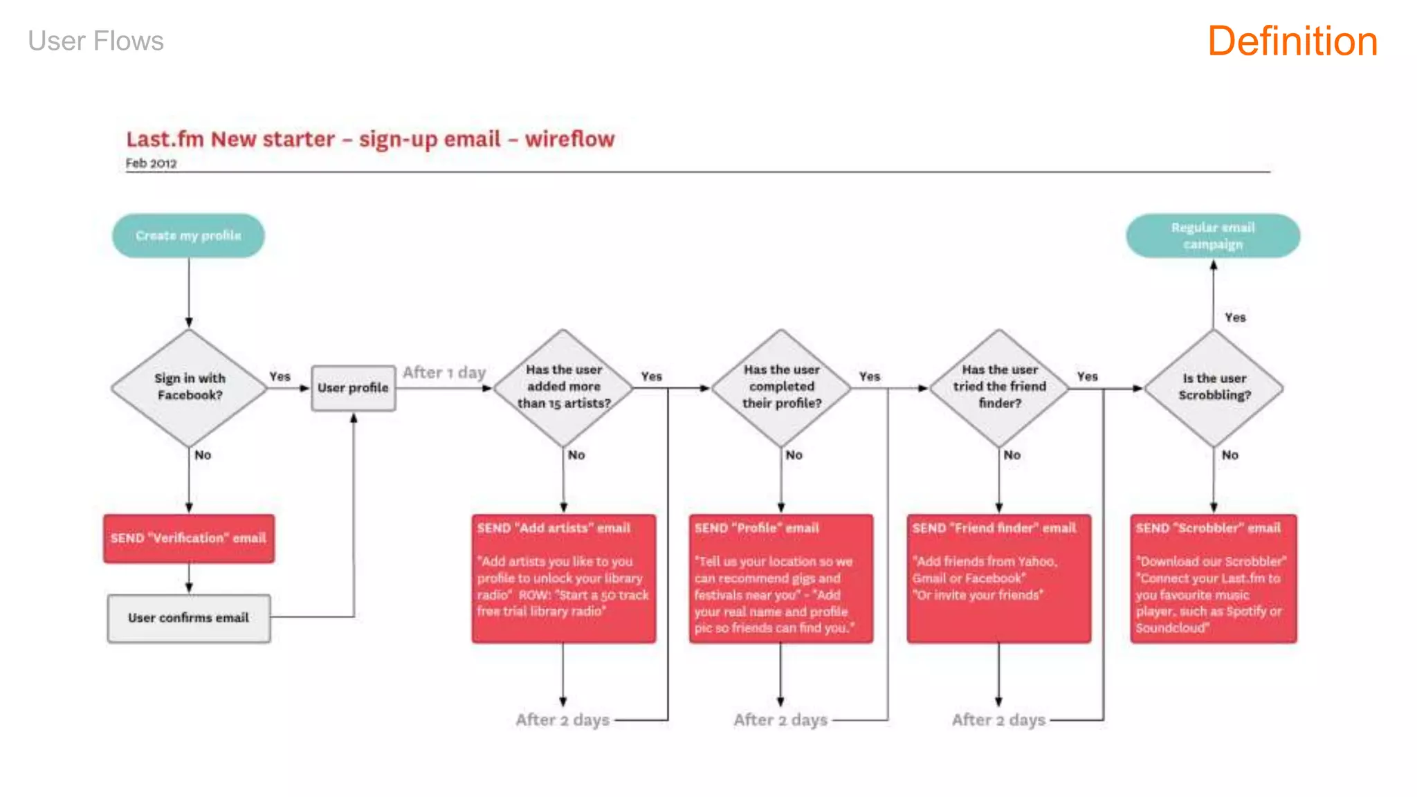
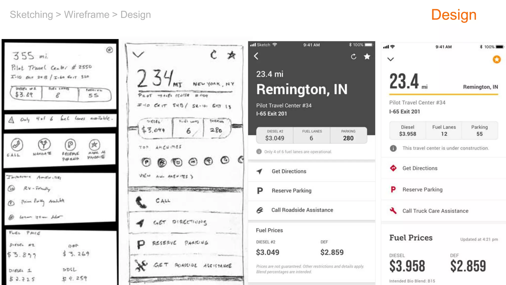
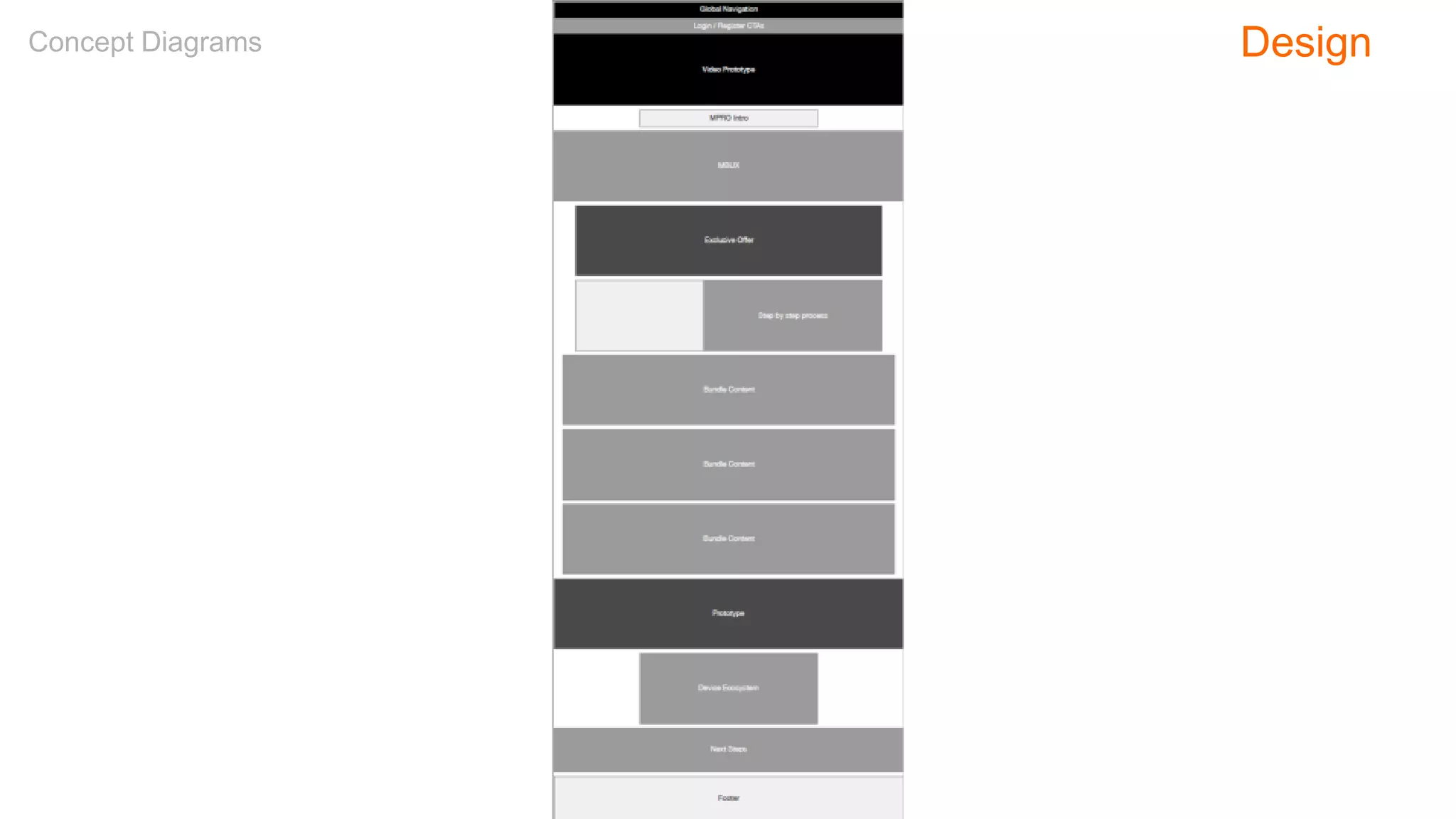
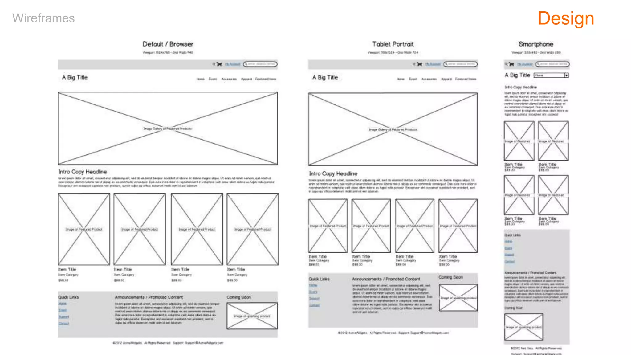
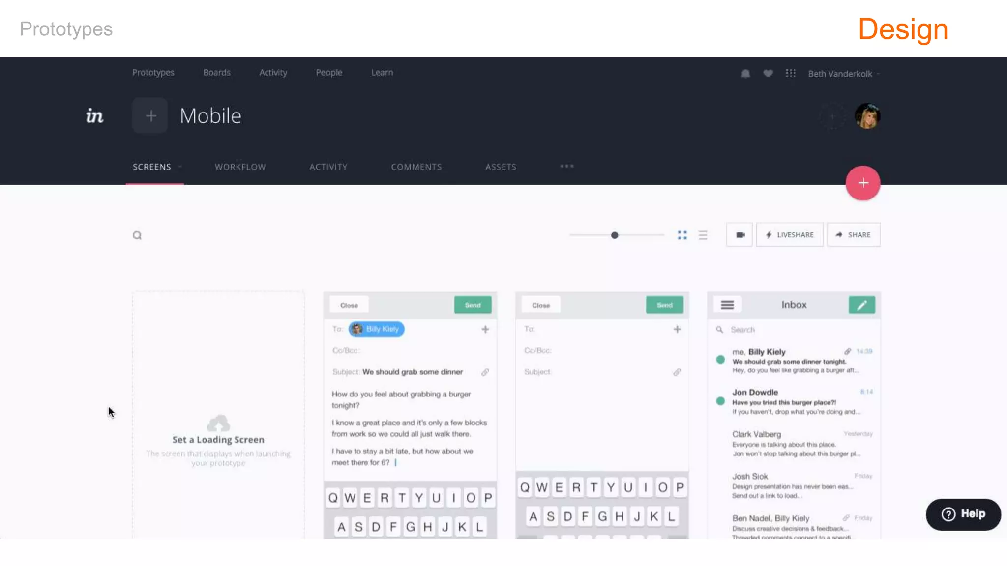
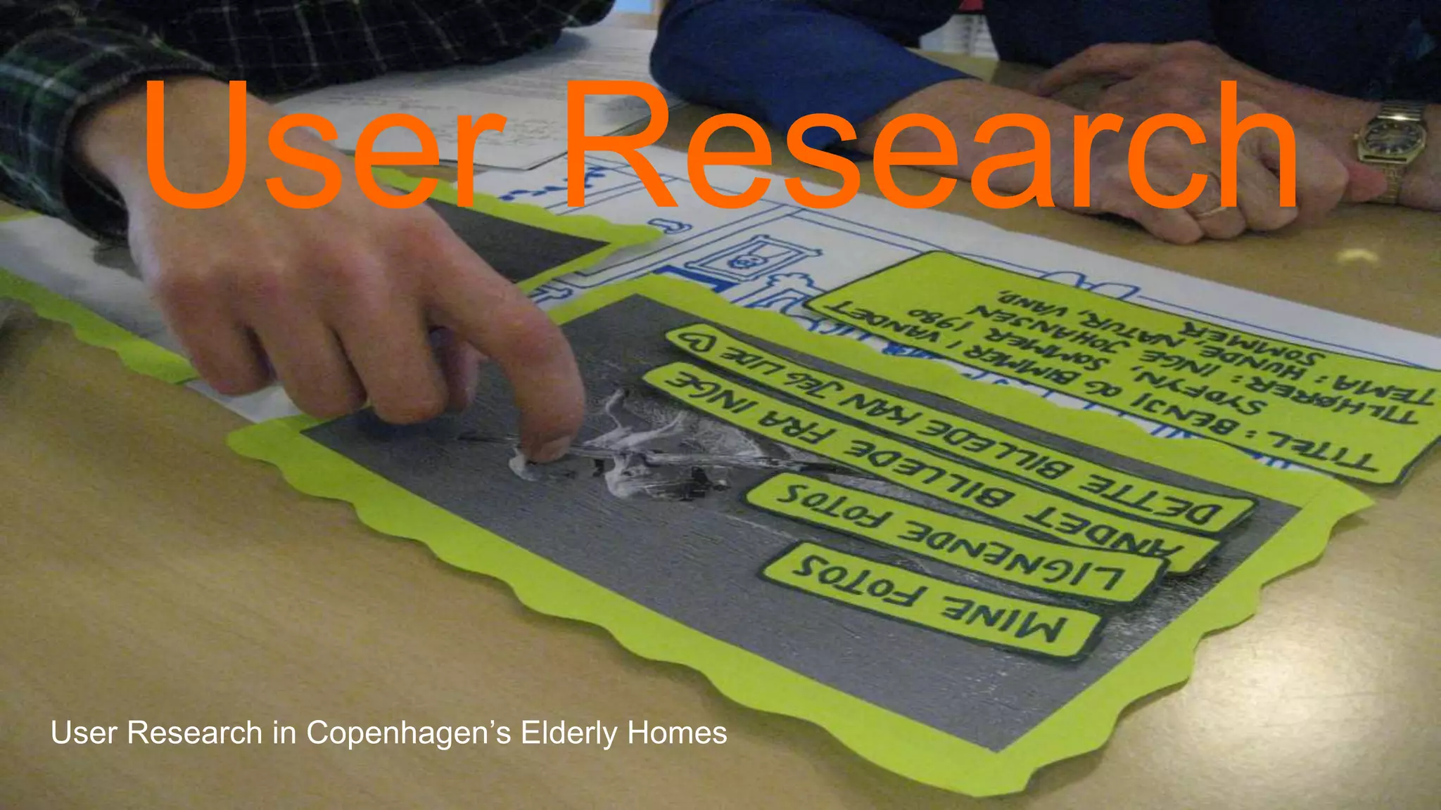
The document pertains to a workshop on user experience (UX) design led by Robert Stribley on December 7, 2019, outlining the goals, agenda, and key concepts in UX design, including principles, a design process, and methodologies such as Agile and Lean UX. It emphasizes the importance of user research, competitive reviews, and design deliverables like personas, wireframes, and usability testing in achieving effective user experiences. The workshop also highlights the historical context and evolution of UX and information architecture in the digital landscape.


![Wondershare Filmora 15.0.11 Crack for Mac Key Full Download [Latest] pptx](https://cdn.slidesharecdn.com/ss_thumbnails/software-251207184836-1d16ba16-thumbnail.jpg?width=640&height=640&fit=bounds)

![iStat Menus 7.20 Crack for MacOS 2026 Full Version [Latest] pptx](https://cdn.slidesharecdn.com/ss_thumbnails/softwareoverview-251207191544-22b737dc-thumbnail.jpg?width=640&height=640&fit=bounds)
![Moho Pro 14.4 Crack for MacOS Works Until 2050 [Latest] pptx](https://cdn.slidesharecdn.com/ss_thumbnails/softwareoverview-251207192639-797289c4-thumbnail.jpg?width=640&height=640&fit=bounds)
![CleanMyMac X v5.2.8 Crack for MacOS Full Version [Latest] pptx](https://cdn.slidesharecdn.com/ss_thumbnails/softwareoverview-251207194121-a81f0142-thumbnail.jpg?width=640&height=640&fit=bounds)
![AnyTrans for iOS 8.9.14.20251127 With Crack for MacOS [Latest] pptx](https://cdn.slidesharecdn.com/ss_thumbnails/softwareoverview-251207190907-2316965f-thumbnail.jpg?width=640&height=640&fit=bounds)


