Download as PDF, PPTX
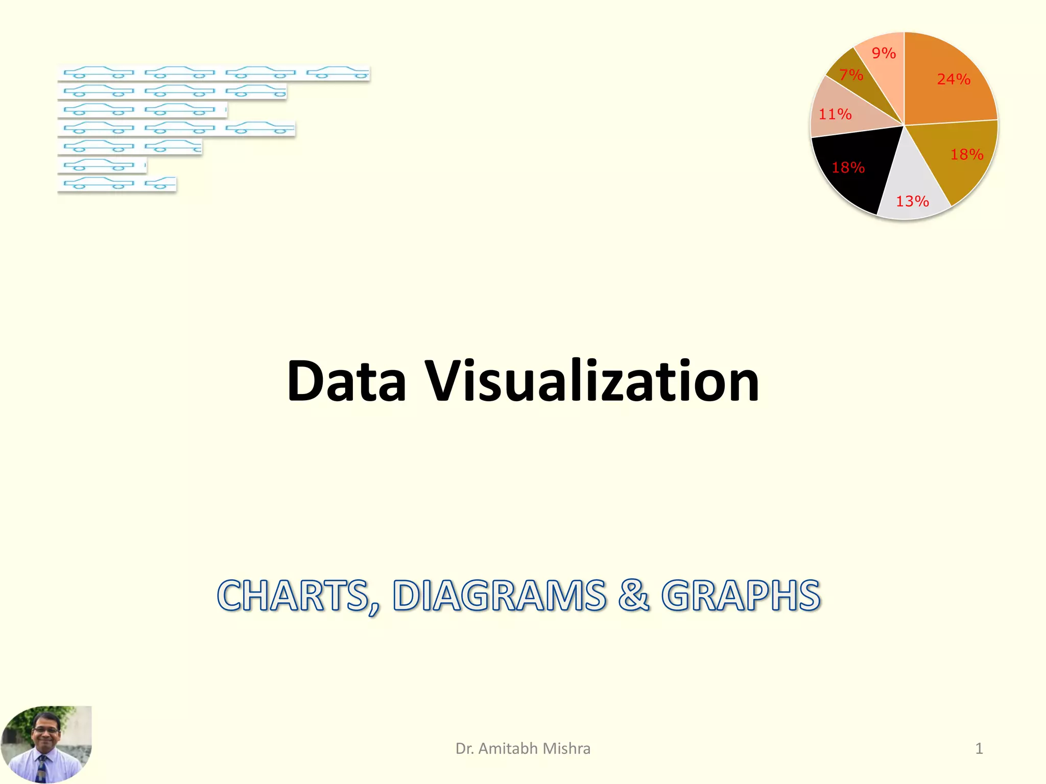
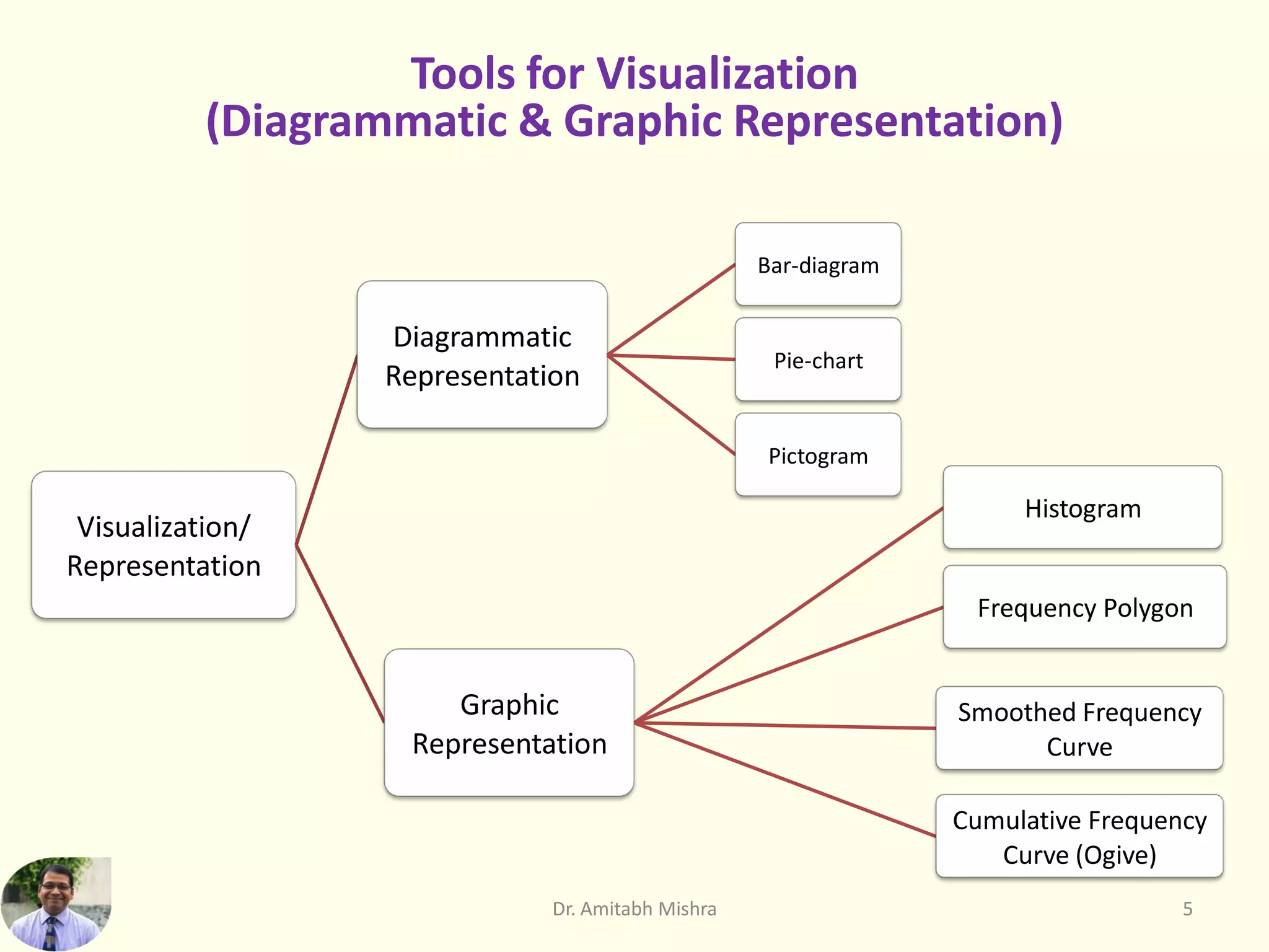

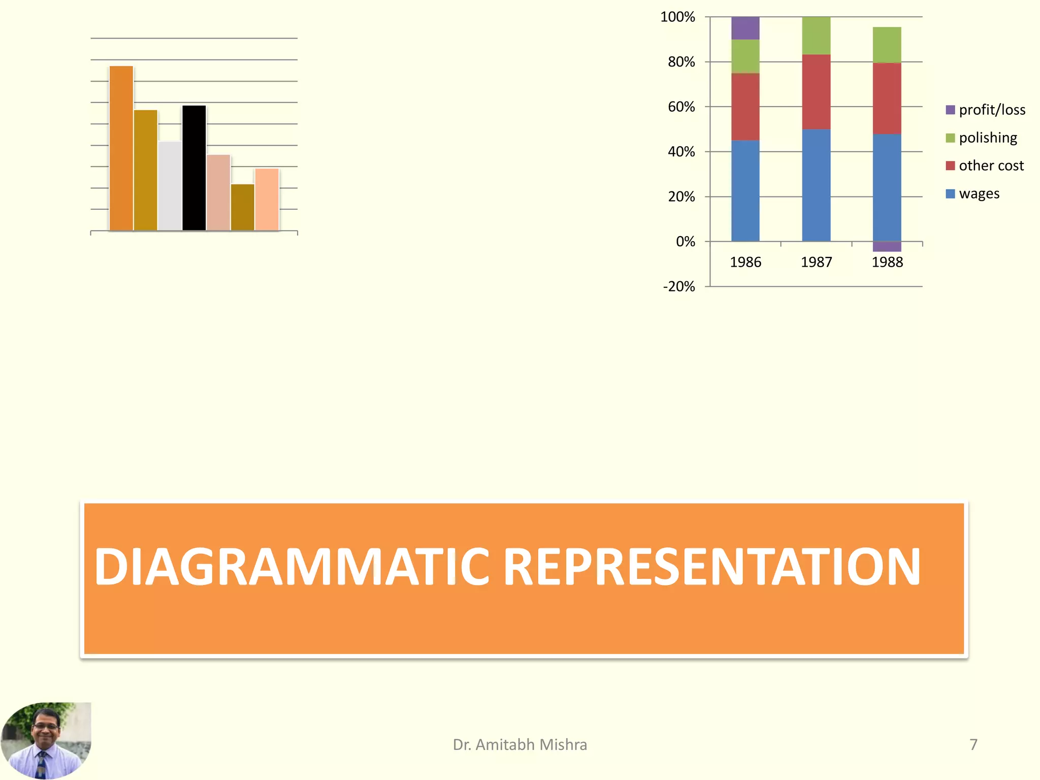
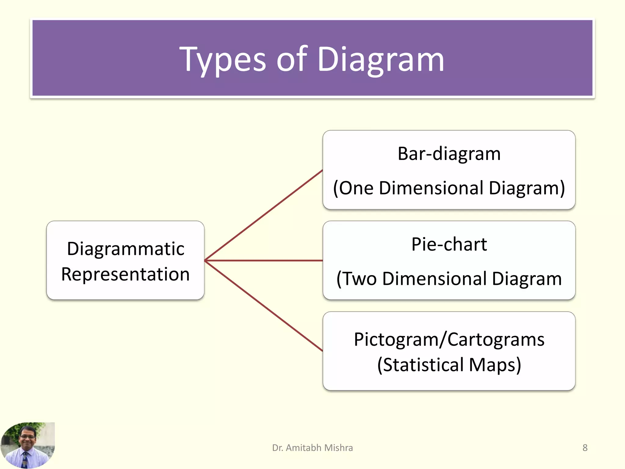

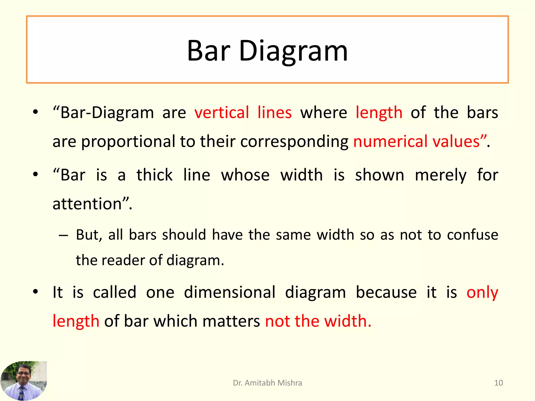
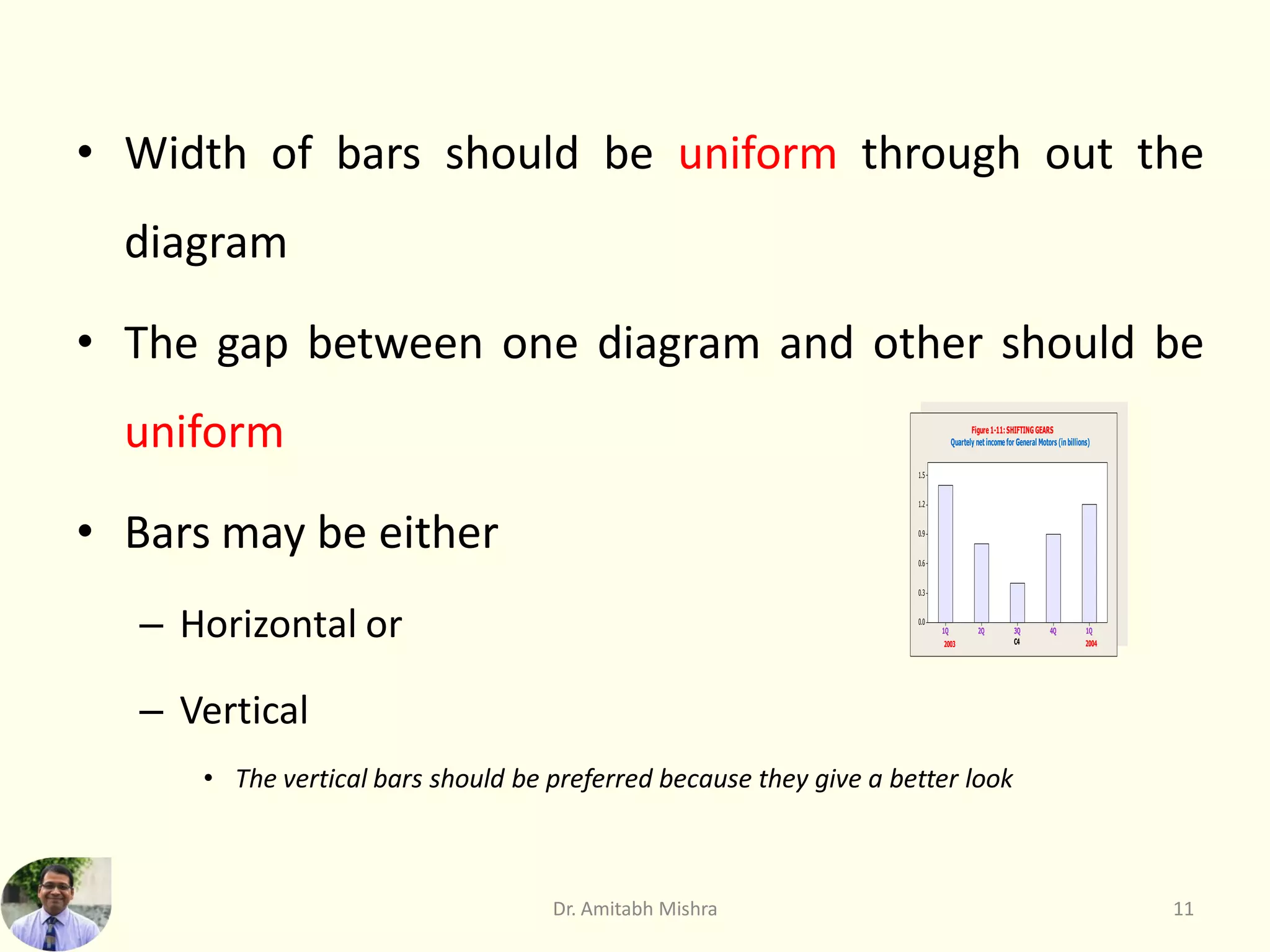

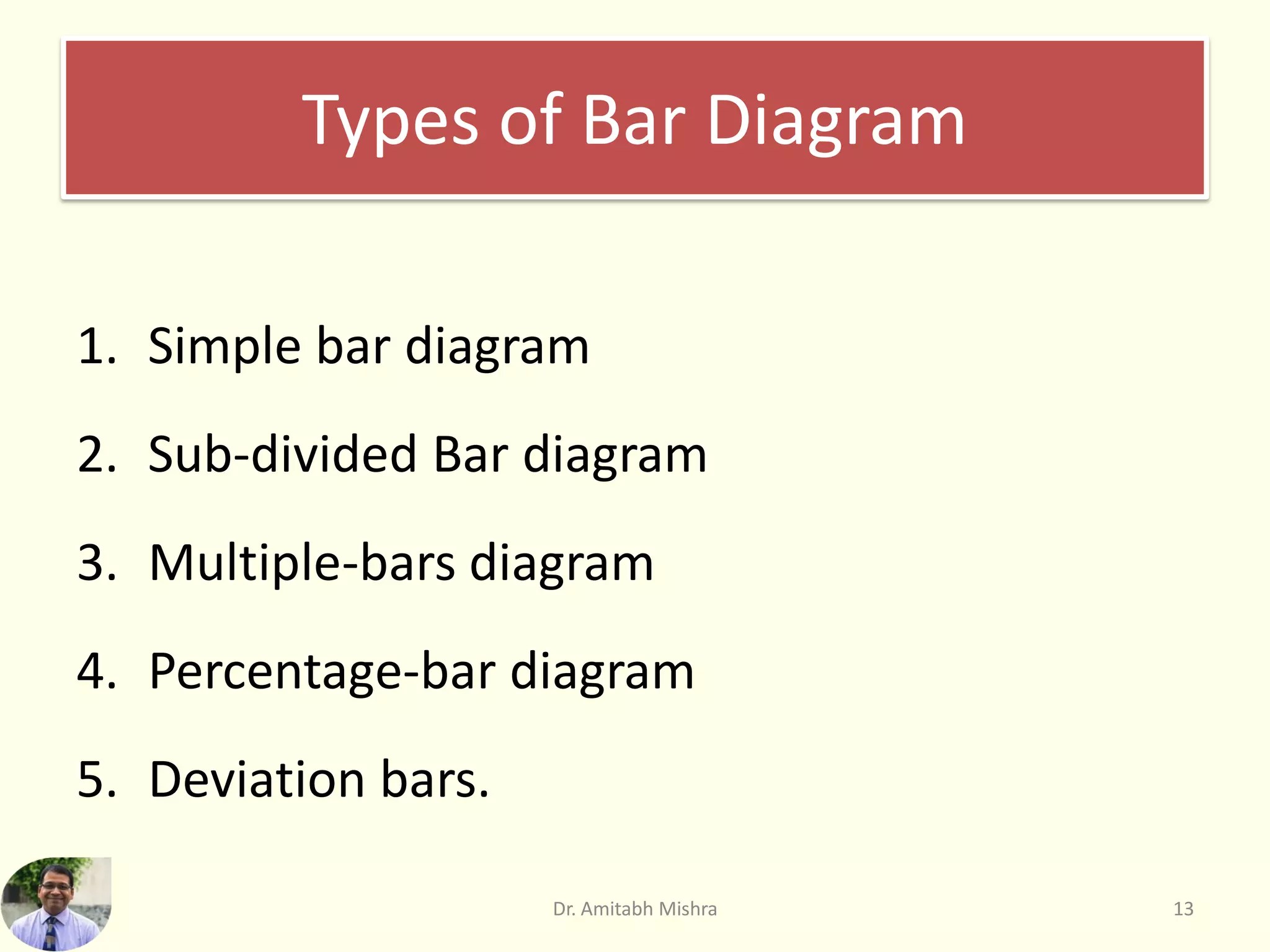


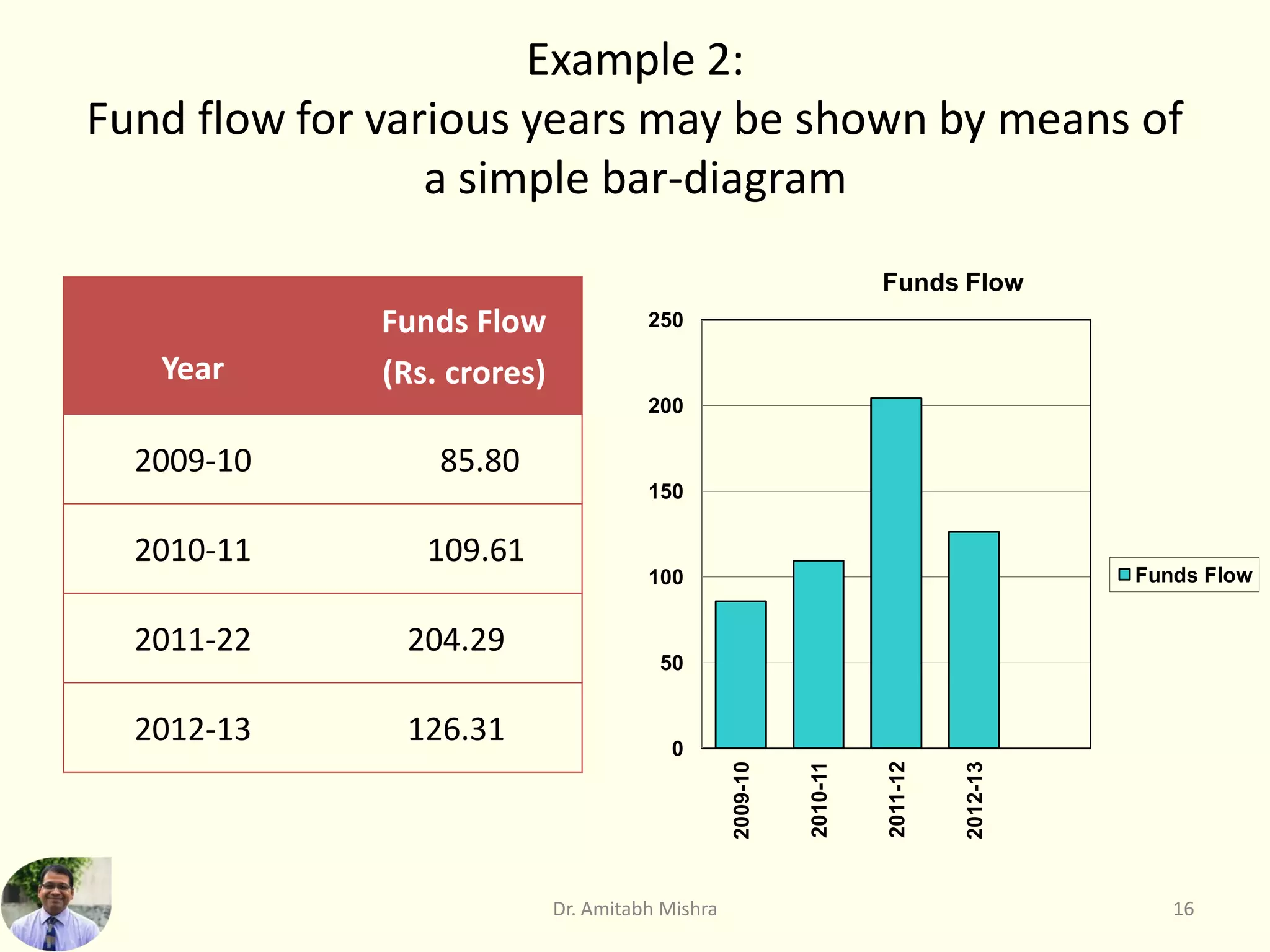


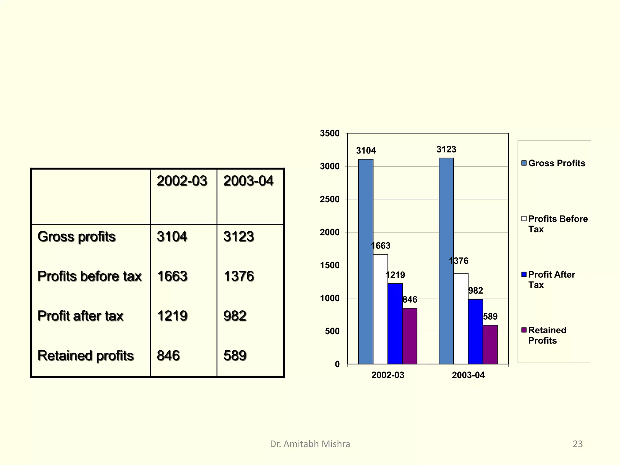


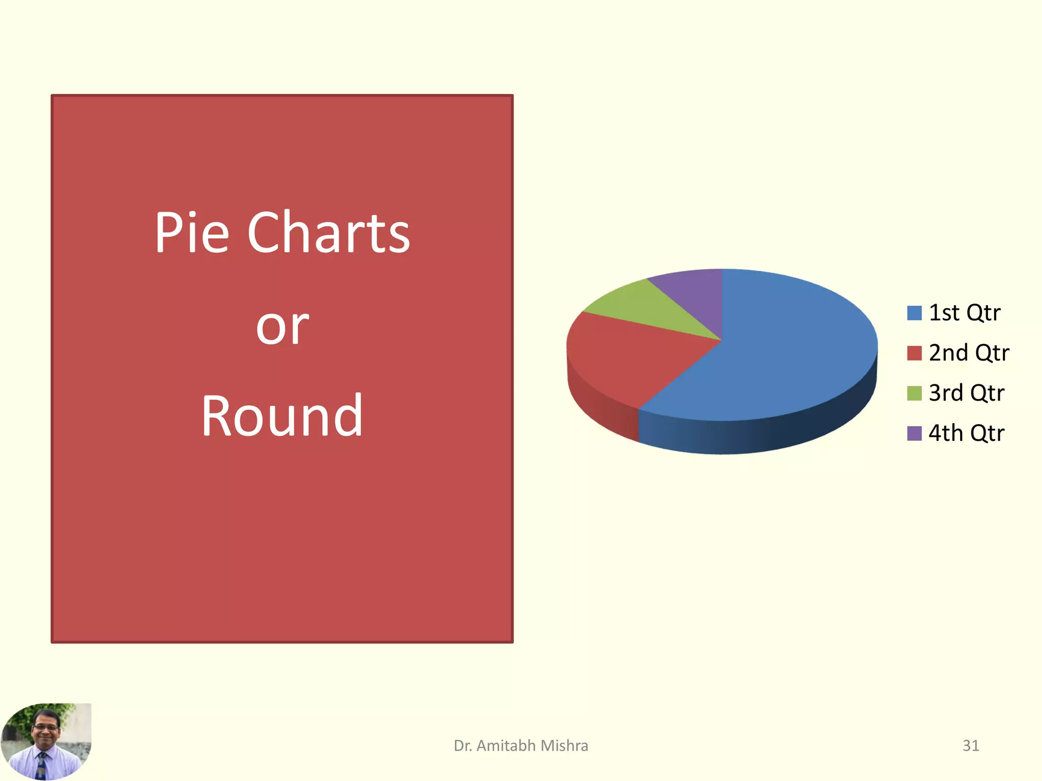

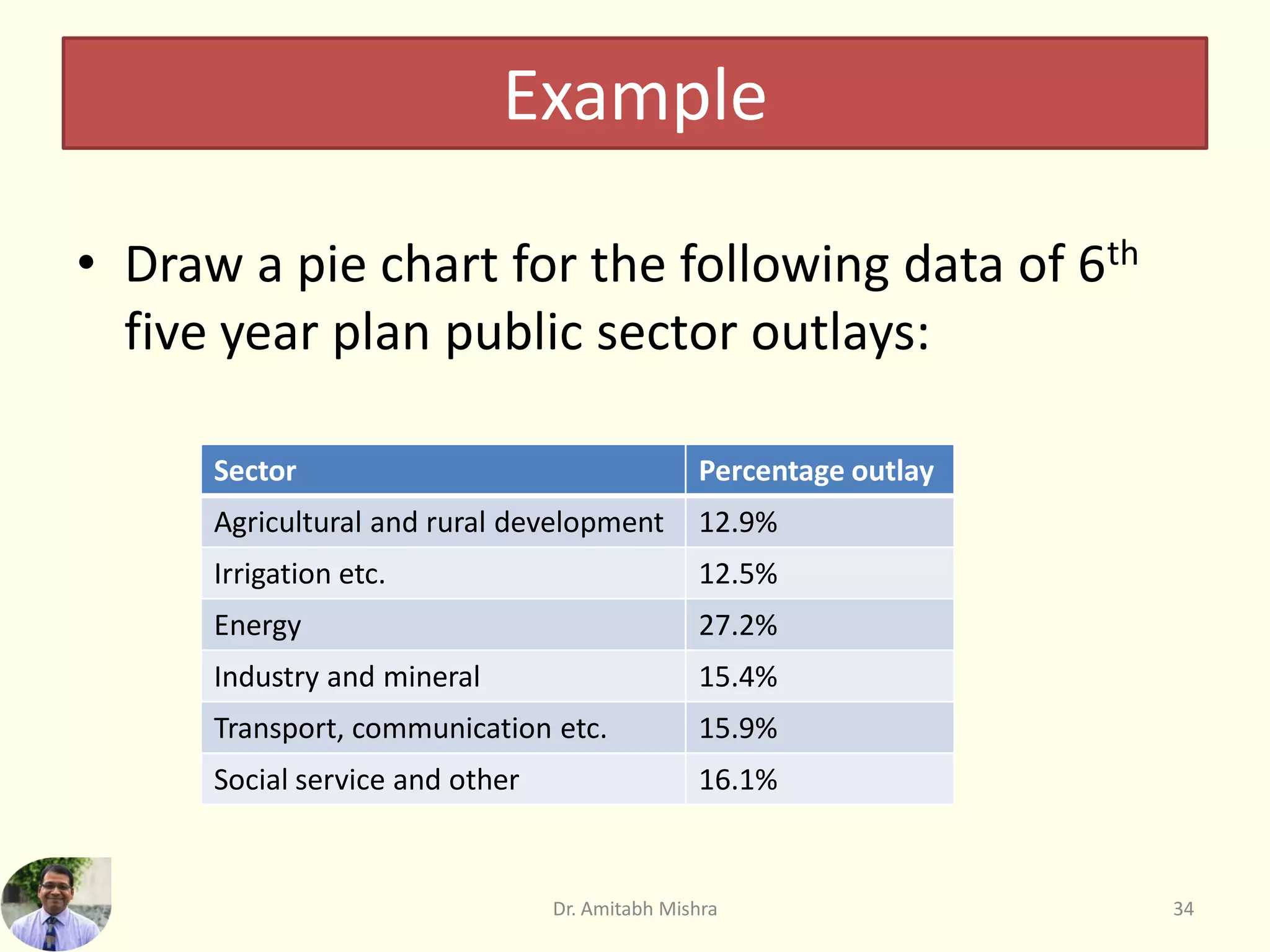


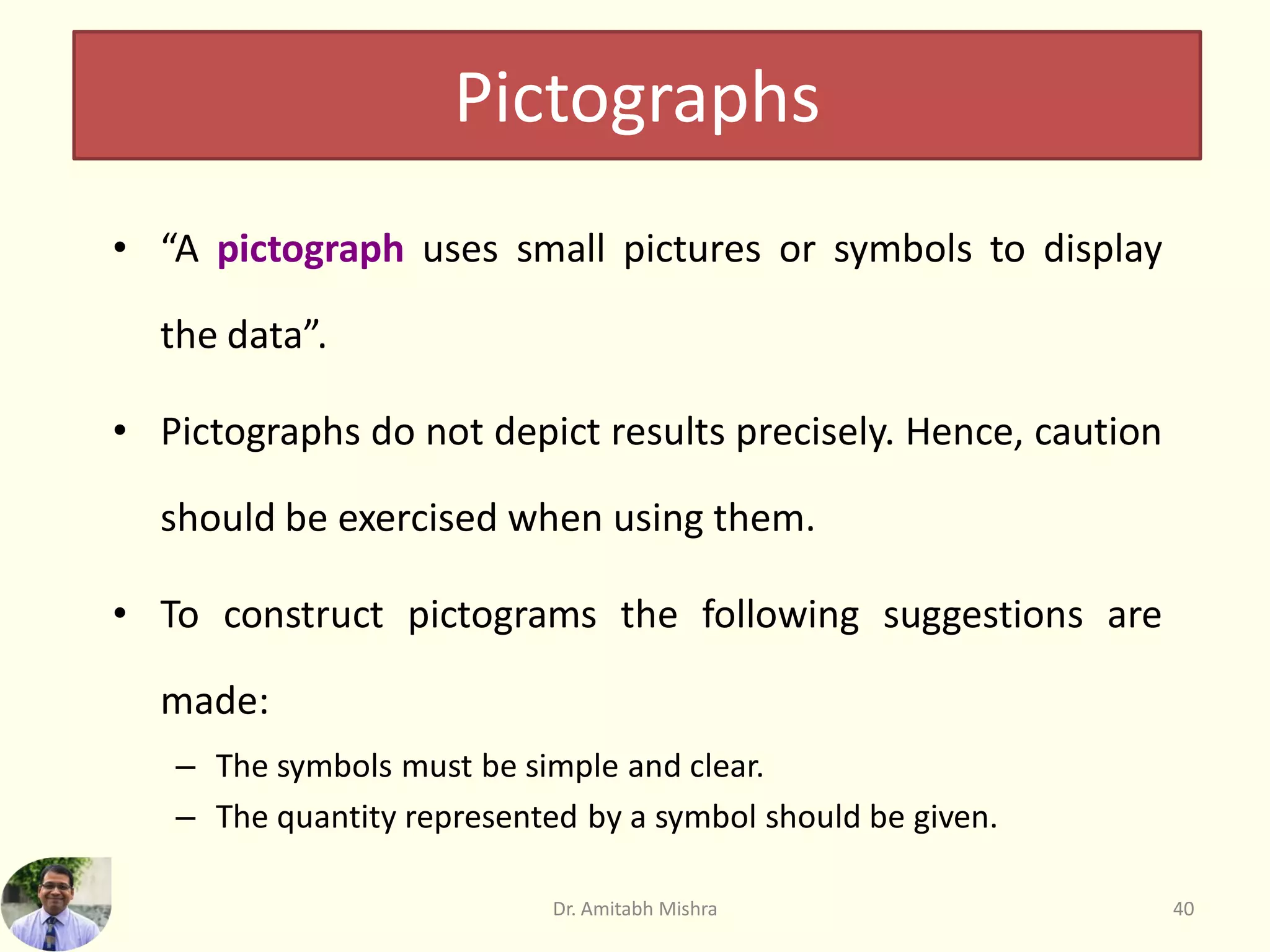
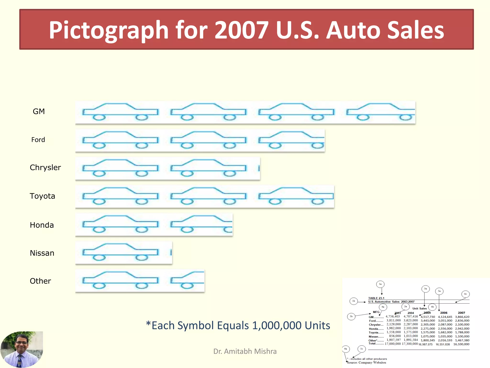

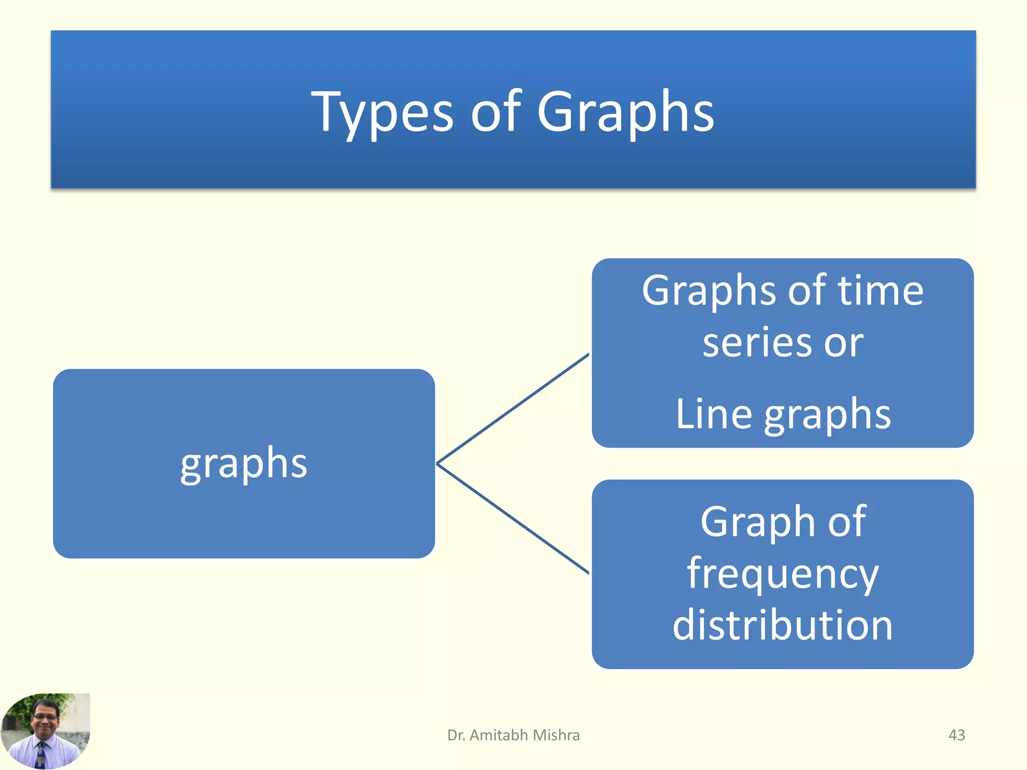
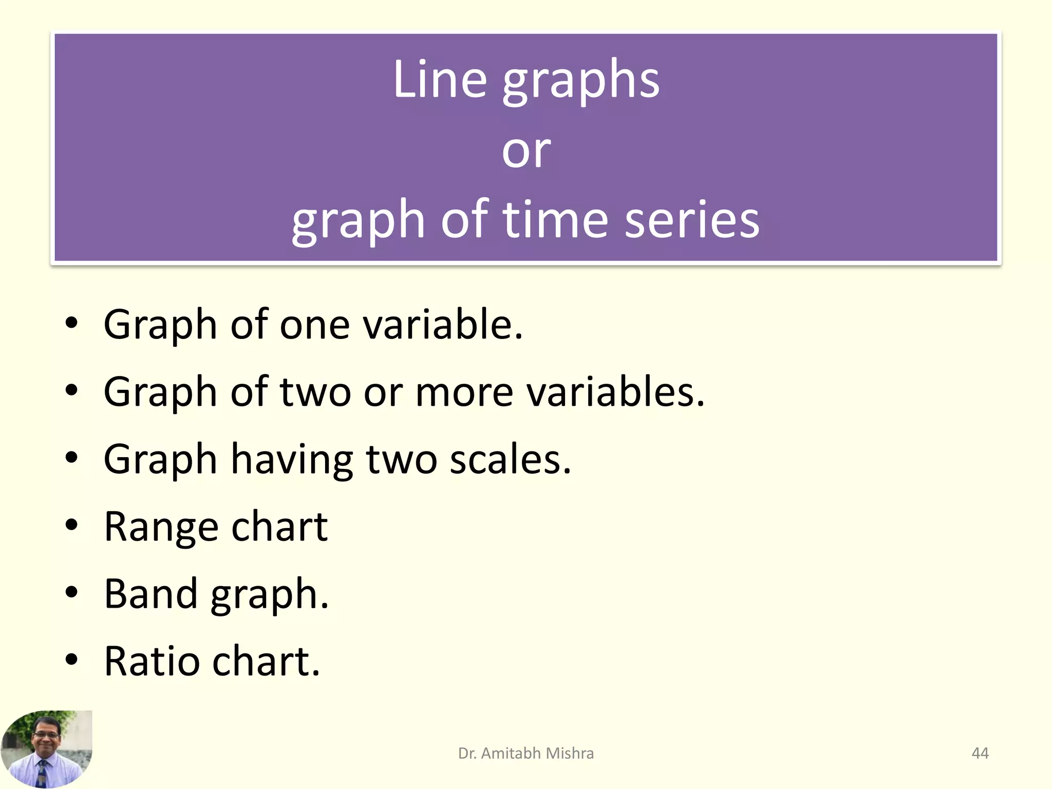


This document discusses various tools and methods for data visualization. It describes: 1) The key purposes of data visualization as conveying information through visual representations to give viewers insight into data structures and relationships. 2) Common diagrammatic representations like bar diagrams, pie charts, and pictograms as well as graphic representations like histograms and frequency curves. 3) How to construct different types of bar diagrams, pie charts, and pictograms to visually display one or more variables and their relationships in data. 4) The use of deviation bars to represent net excess or deficits and percentage bar diagrams to show components as a percentage of the total.