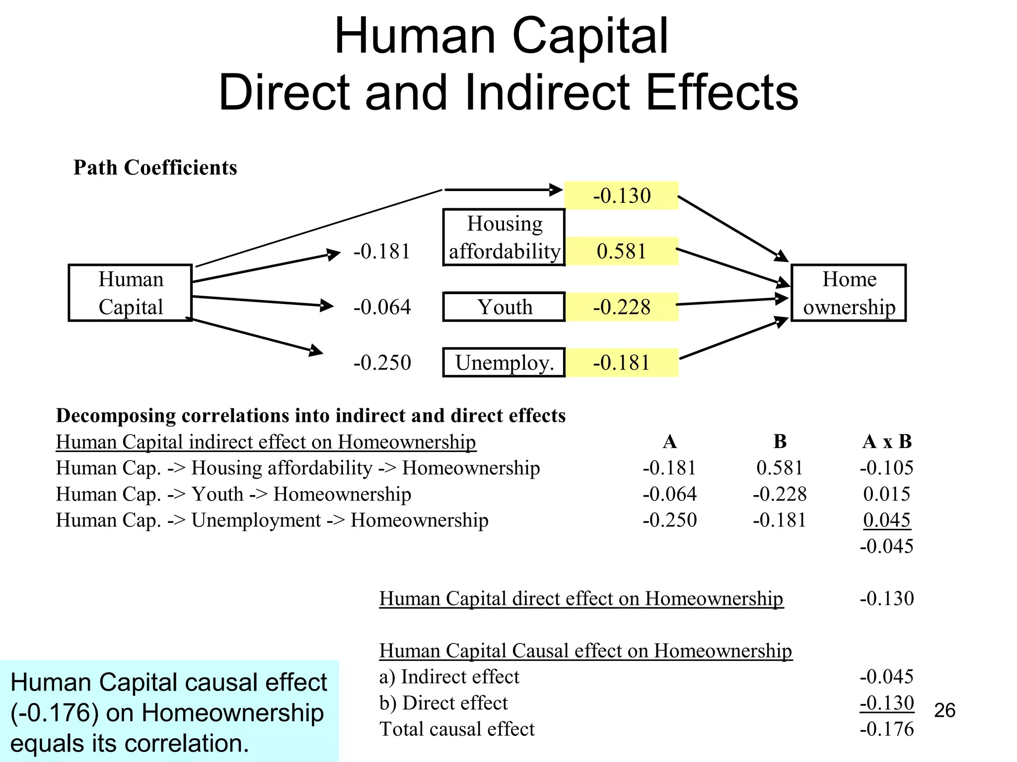
Data Mind Traps September 2009 Guy Lion
Introduction A data mind trap is when you use a quantitative method that does not fit the structure of the data.  As a result, you derive the wrong conclusion. We have come across several data mind traps when conducting modeling, data analysis, and hypothesis testing.  Today, we will cover the following ones: Testing many hypotheses using the same data set; Assuming data is normally distributed, when it is not, within an unpaired hypothesis framework; Confusing “statistically significant” with material; and Dealing with the causation issue.
Testing many hypotheses  with the same data…You run into a greater probability that a random event will be “statistically significant.”  That probability actually jumps to 40% if you test 10 hypotheses and 64% if you test 20 hypotheses!
Testing many hypotheses This is a mock up of an observational study testing 12 different foods impact on cholesterol (good or bad).  By observing 2400 individuals, we notice that the 200 who ate more tomatoes than the other 2200 have a slightly reduced level of cholesterol (197.7. mg/DL vs 203.5 respectively).  The p value is < 5% and Confidence level > 95% that eating tomatoes does reduce cholesterol.  WHAT’S WRONG WITH THIS?
The Zodiac Paradox “… the more we look for patterns, the more likely we are to find them, particularly when we don’t begin with a particular question… Then we leap to conclusions… for why we saw the results we did.”   Peter Austin, PhD, Clinical Evaluation Science .
How to fix the Zodiac Paradox? You have to adjust the P value threshold downward to reflect the # of hypotheses you are testing.  To reach the 95% confidence level, you adjust the P value following the formula shown above where n is the # of hypotheses.  As a close estimate, you can also divide the P value threshold by the number of hypotheses. Another way to avoid this issue is to use a second data set and test a single hypothesis: does eating tomatoes reduce cholesterol?
Assuming data is normally distributed  when it is not can lead to wrong conclusions within an unpaired hypothesis testing framework.  Always watch for the shape of your data distribution.
Looking at salary levels of two departments  If we assume the data is normally distributed, those two departments (Dept. A & Dept. B) are deemed to have the same salary level.  Using the unpaired t test, they represent two samples who come from populations with near identical distributions (P value 98%).  But, as we’ll find out the data is not normally distributed which invalidates our conclusion.
…  the data is not normally distributed! Using the Jarque-Bera test, there is a 0% probability that either Dept. B or the combined data sets are normally distributed.  This is obvious when looking at the histogram below.
Mann-Whitney test   Instead of dealing with average value the MW test deals with average rank.  Ranking of salaries are in ascending order.  The MW test neutralizes the impact of the salary outlier ($59,500).  This test suggests there is only a 47% probability that those two departments have the same salary level.  If they are different, the salary level of Dept. A is deemed the higher one (higher avg. rank).  Very different conclusion vs the unpaired t test…
“Statistically significant”  vs material   Example: A rep is marketing a math SAT prep course for a $1,000.  The rep tells you the course has improved students score and is associated with a P value of 5% or a 95% Confidence level.  Should you buy the course?  Statistically significant does not necessarily mean consequential or material for your business.  Sometimes completely trivial differences can be statistically significant simply because you have very large sample sizes.
Assessing an SAT math course with an Effect Size measure: Cohen’s d value Effect Size Cohen’s d value is set up similarly to the unpaired t test.  The main difference is that it measures the statistical distance in standard deviations instead of standard errors.
Cohen’s d information
Cohen’s d Confidence Interval   The Effect Size standard deviation formula allows to build Confidence Intervals around Effect Size values.  The “Ns” just stand for the size of a sample. Regarding this SAT prep course, stating that its 17 math point effect is small and has a 95% confidence interval of 0 to 33 math points provides you better info than stating simply it is statistically significant with a p value of 5%.
Gamma Index  (staying with SAT example) This is a nonparametric alternative to Cohen’s d in case variables are not normally distributed. I recalculated the Gamma Index so it is consistent in sign with Cohen’s d.  Now a positive Effect size (Z Value) denotes the Tests values being higher than the Controls’.
Dealing with the causation issue Causation is elusive to prove.  We’ll cover a couple of methods that get you  somewhat  closer.  Causation ultimately depends on your logical flows.  The stats can support the logic much more than the other way around.
Causation Part I:  Granger Causality
Granger Causality Independent Variable being tested
Granger Causality – the whole picture This method still does not fully demonstrate causality.  The rooster crows “Granger causes” sunrise.
Causation Part II:  Path Analysis We’ll illustrate Path Analysis through an example inspired from this book.  The author’s theory is that human capital causes homeownership rate to decline.   + -
Path Analysis:  Direct and Indirect Effects The Correlation of the independent variable can be decomposed into its Direct Effect and Indirect Effect on the dependent variable.  The Indirect Effect is derived from intermediary variables in between the independent and dependent one.  The Causal Effect is the sum of the mentioned Effects and should equal the Correlation.
The Path Analysis Diagram The Path Analysis Diagram defines our hypothesis.  Human Capital has an effect on:  Home Affordability (-) as highly educated wage earners bid up prices of homes, Demographic/youth (-), and Unemployment (-) as Human Capital lowers unemployment.  In turn, those intermediary variables have an effect on Homeownership rate:  Housing Affordability (+), if homes are more affordable homeownership goes up.  Demographic-Youth (% of population between 20 and 29), (-) as younger people starting out can ill afford homes, and  Unemployment (-) as unemployed lack the income to buy homes.  + -
The Actual Correlations We embedded the correlations within the diagram.  We also added a correlation directly from Human Capital to Home ownership.  Most correlation signs support the hypothesis except Unemployment.
Path Analysis With standardized variables within a single relationship the Correlation is equal to the Slope.
The Path Coefficients Given that the variables are standardized, all bivariate correlations already represent Path coefficients (in white).  We’ll calculate the Path coefficients in yellow with a regression model.  Dependent variable is Homeownership rate
Human Capital  Direct and Indirect Effects Human Capital causal effect (-0.176) on Homeownership equals its correlation.
Take Aways

Data Mind Traps

  • 1.
    Data Mind TrapsSeptember 2009 Guy Lion
  • 2.
    Introduction A datamind trap is when you use a quantitative method that does not fit the structure of the data. As a result, you derive the wrong conclusion. We have come across several data mind traps when conducting modeling, data analysis, and hypothesis testing. Today, we will cover the following ones: Testing many hypotheses using the same data set; Assuming data is normally distributed, when it is not, within an unpaired hypothesis framework; Confusing “statistically significant” with material; and Dealing with the causation issue.
  • 3.
    Testing many hypotheses with the same data…You run into a greater probability that a random event will be “statistically significant.” That probability actually jumps to 40% if you test 10 hypotheses and 64% if you test 20 hypotheses!
  • 4.
    Testing many hypothesesThis is a mock up of an observational study testing 12 different foods impact on cholesterol (good or bad). By observing 2400 individuals, we notice that the 200 who ate more tomatoes than the other 2200 have a slightly reduced level of cholesterol (197.7. mg/DL vs 203.5 respectively). The p value is < 5% and Confidence level > 95% that eating tomatoes does reduce cholesterol. WHAT’S WRONG WITH THIS?
  • 5.
    The Zodiac Paradox“… the more we look for patterns, the more likely we are to find them, particularly when we don’t begin with a particular question… Then we leap to conclusions… for why we saw the results we did.” Peter Austin, PhD, Clinical Evaluation Science .
  • 6.
    How to fixthe Zodiac Paradox? You have to adjust the P value threshold downward to reflect the # of hypotheses you are testing. To reach the 95% confidence level, you adjust the P value following the formula shown above where n is the # of hypotheses. As a close estimate, you can also divide the P value threshold by the number of hypotheses. Another way to avoid this issue is to use a second data set and test a single hypothesis: does eating tomatoes reduce cholesterol?
  • 7.
    Assuming data isnormally distributed when it is not can lead to wrong conclusions within an unpaired hypothesis testing framework. Always watch for the shape of your data distribution.
  • 8.
    Looking at salarylevels of two departments If we assume the data is normally distributed, those two departments (Dept. A & Dept. B) are deemed to have the same salary level. Using the unpaired t test, they represent two samples who come from populations with near identical distributions (P value 98%). But, as we’ll find out the data is not normally distributed which invalidates our conclusion.
  • 9.
    … thedata is not normally distributed! Using the Jarque-Bera test, there is a 0% probability that either Dept. B or the combined data sets are normally distributed. This is obvious when looking at the histogram below.
  • 10.
    Mann-Whitney test Instead of dealing with average value the MW test deals with average rank. Ranking of salaries are in ascending order. The MW test neutralizes the impact of the salary outlier ($59,500). This test suggests there is only a 47% probability that those two departments have the same salary level. If they are different, the salary level of Dept. A is deemed the higher one (higher avg. rank). Very different conclusion vs the unpaired t test…
  • 11.
    “Statistically significant” vs material Example: A rep is marketing a math SAT prep course for a $1,000. The rep tells you the course has improved students score and is associated with a P value of 5% or a 95% Confidence level. Should you buy the course? Statistically significant does not necessarily mean consequential or material for your business. Sometimes completely trivial differences can be statistically significant simply because you have very large sample sizes.
  • 12.
    Assessing an SATmath course with an Effect Size measure: Cohen’s d value Effect Size Cohen’s d value is set up similarly to the unpaired t test. The main difference is that it measures the statistical distance in standard deviations instead of standard errors.
  • 13.
  • 14.
    Cohen’s d ConfidenceInterval The Effect Size standard deviation formula allows to build Confidence Intervals around Effect Size values. The “Ns” just stand for the size of a sample. Regarding this SAT prep course, stating that its 17 math point effect is small and has a 95% confidence interval of 0 to 33 math points provides you better info than stating simply it is statistically significant with a p value of 5%.
  • 15.
    Gamma Index (staying with SAT example) This is a nonparametric alternative to Cohen’s d in case variables are not normally distributed. I recalculated the Gamma Index so it is consistent in sign with Cohen’s d. Now a positive Effect size (Z Value) denotes the Tests values being higher than the Controls’.
  • 16.
    Dealing with thecausation issue Causation is elusive to prove. We’ll cover a couple of methods that get you somewhat closer. Causation ultimately depends on your logical flows. The stats can support the logic much more than the other way around.
  • 17.
    Causation Part I: Granger Causality
  • 18.
    Granger Causality IndependentVariable being tested
  • 19.
    Granger Causality –the whole picture This method still does not fully demonstrate causality. The rooster crows “Granger causes” sunrise.
  • 20.
    Causation Part II: Path Analysis We’ll illustrate Path Analysis through an example inspired from this book. The author’s theory is that human capital causes homeownership rate to decline. + -
  • 21.
    Path Analysis: Direct and Indirect Effects The Correlation of the independent variable can be decomposed into its Direct Effect and Indirect Effect on the dependent variable. The Indirect Effect is derived from intermediary variables in between the independent and dependent one. The Causal Effect is the sum of the mentioned Effects and should equal the Correlation.
  • 22.
    The Path AnalysisDiagram The Path Analysis Diagram defines our hypothesis. Human Capital has an effect on: Home Affordability (-) as highly educated wage earners bid up prices of homes, Demographic/youth (-), and Unemployment (-) as Human Capital lowers unemployment. In turn, those intermediary variables have an effect on Homeownership rate: Housing Affordability (+), if homes are more affordable homeownership goes up. Demographic-Youth (% of population between 20 and 29), (-) as younger people starting out can ill afford homes, and Unemployment (-) as unemployed lack the income to buy homes. + -
  • 23.
    The Actual CorrelationsWe embedded the correlations within the diagram. We also added a correlation directly from Human Capital to Home ownership. Most correlation signs support the hypothesis except Unemployment.
  • 24.
    Path Analysis Withstandardized variables within a single relationship the Correlation is equal to the Slope.
  • 25.
    The Path CoefficientsGiven that the variables are standardized, all bivariate correlations already represent Path coefficients (in white). We’ll calculate the Path coefficients in yellow with a regression model. Dependent variable is Homeownership rate
  • 26.
    Human Capital Direct and Indirect Effects Human Capital causal effect (-0.176) on Homeownership equals its correlation.
  • 27.