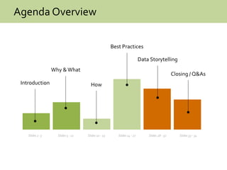
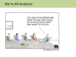
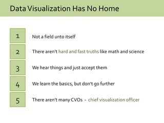
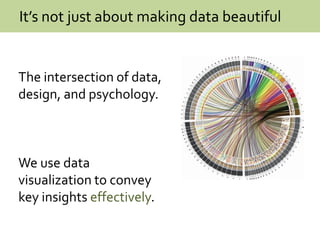
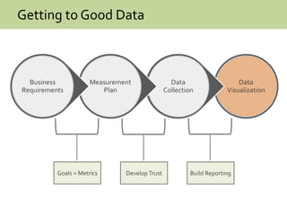
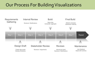
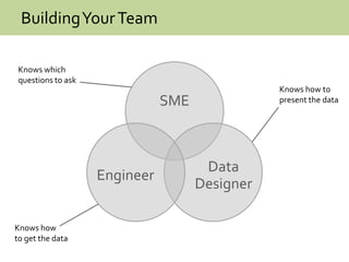
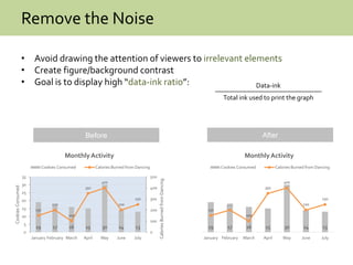
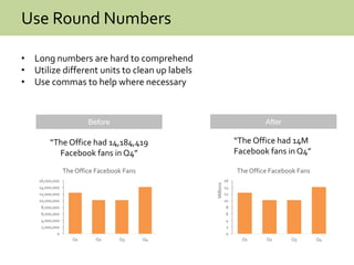
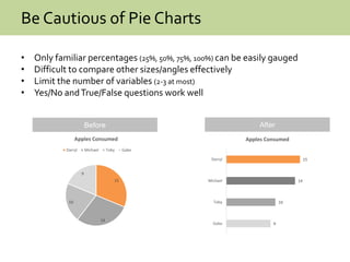
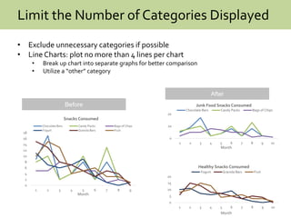
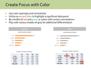
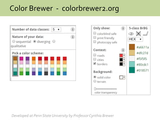
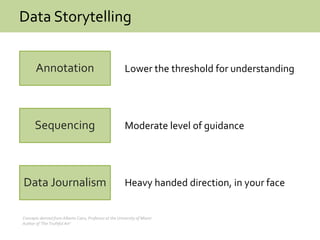
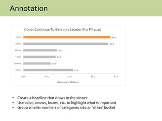
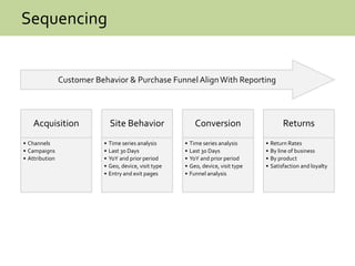
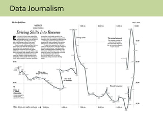
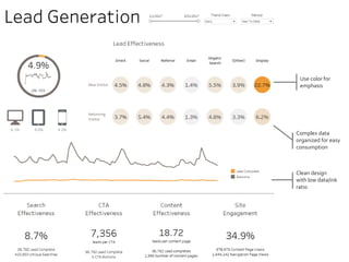
The document outlines best practices for effective data visualization design, emphasizing the importance of team composition and the integration of data, design, and psychology. It presents key strategies for creating visualizations that are clear, actionable, and focused, while addressing common pitfalls like overuse of pie charts, excessive categories, and poor aesthetics. Additionally, it highlights the role of storytelling in data presentation to enhance viewer understanding and engagement.


![[DSC Europe 25] Slobodan Dolinic - Smart and Intelligent Green Region.pptx](https://cdn.slidesharecdn.com/ss_thumbnails/0bribinjsp6ghwtvsvor-2-sigre-slobodan-dolinic-260115093812-c9c10e90-thumbnail.jpg?width=640&height=640&fit=bounds)


![[DSC Europe 25] Bojan Djuricic - Predictive Design Process.pdf](https://cdn.slidesharecdn.com/ss_thumbnails/5awdrbedqdek3gqu2ezy-4-the-predictive-design-bojan-djuricic-260120105856-6c399e9b-thumbnail.jpg?width=640&height=640&fit=bounds)


