1) The document describes the process of creating the front cover and double page spread for a magazine. It details how the author used shapes, colors, images and text in Adobe Photoshop to design the layout.
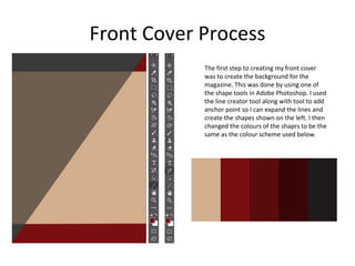
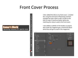
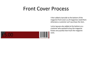
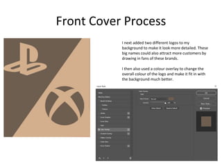
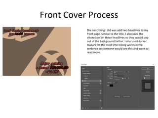
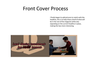
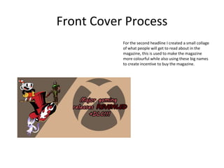
2) For the front cover, the author created a background, added the title and subtitle, included a barcode and price, logos, headlines and pictures.
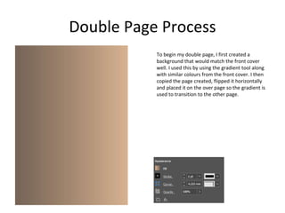
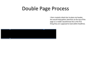
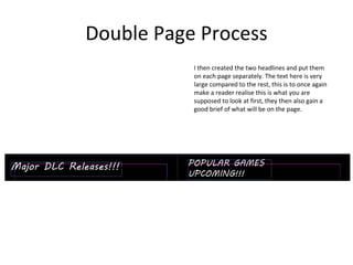
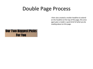
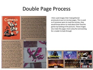
3) For the double page spread, the author made a background that matched the cover, added headers and subheaders, incorporated images related to the articles, and included the written text.