Download to read offline


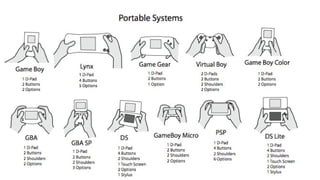


Contrast, repetition, alignment, and proximity (C.R.A.P.) are foundational principles of design that help organize information and prevent confusion. Contrast ensures different elements look distinct. Repetition unifies elements through consistent use of colors, logos, etc. Alignment positions elements purposefully on a page using measurements. Proximity groups similar elements and separates different ones using whitespace. These principles make designs more memorable and visually clear.