Downloaded 87 times


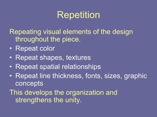


Desktop publishing follows four basic principles - contrast, repetition, alignment, and proximity. Contrast makes elements stand out and draws the reader's eye, while repetition strengthens unity by duplicating colors, shapes, fonts, and other visual elements. Alignment creates order by connecting all page items, and proximity groups related information together for clarity. These principles help organize content and create an easy to understand page structure.