Download to read offline

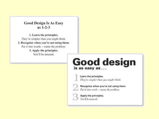
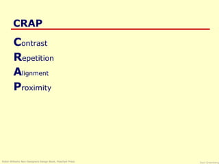
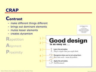
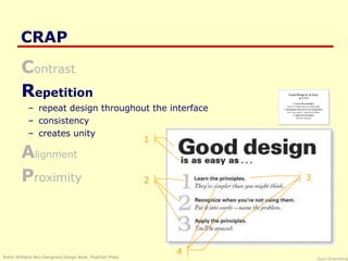
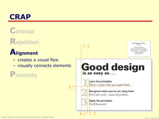
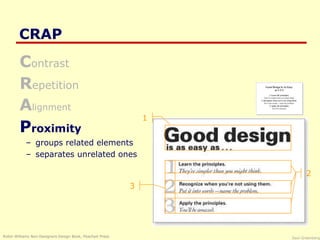
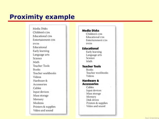
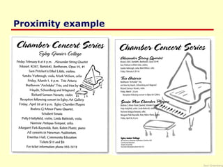

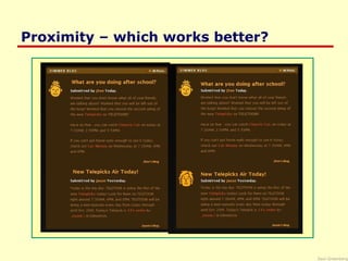
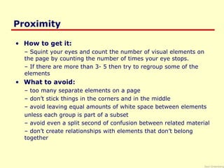


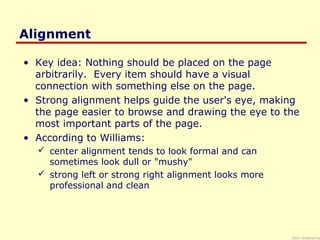
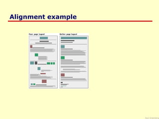
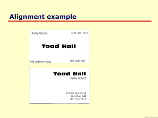
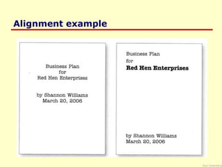


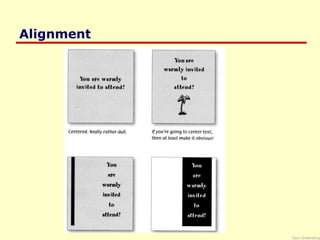
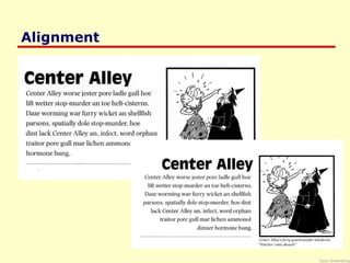
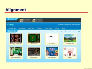

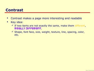
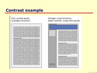
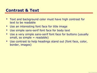

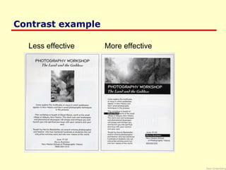

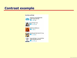

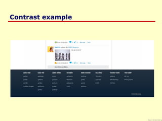
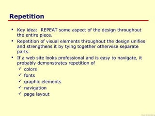
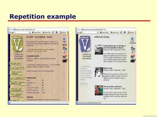
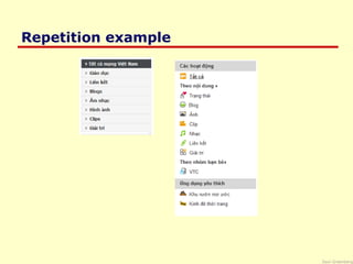

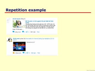
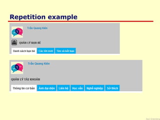


The document discusses the CRAP principles of design: Contrast, Repetition, Alignment, and Proximity. It provides examples and explanations of each principle. Contrast involves making different elements visually distinct. Repetition means using consistent formatting to unite a design. Alignment refers to positioning elements in a way that guides the eye through the design. Proximity groups related elements close together visually. The principles are intended to help non-designers create effective visual designs.


