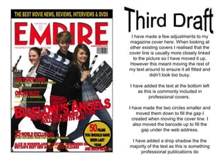
A2 Media Coursework
Magazine Cover
Idea behind Magazine Cover
As my main actor for my Teaser Trailer is a young boy I thought it a little
inappropriate to put a photo of him on the cover of my magazine. Plus looking
at other covers from existing magazines, there are rarely children included on
them and if there are, an adult actor is usually with them (see The Golden
Compass cover for Empire Magazine)
I therefore decided that following the recent success of Katherine Bigelow at
the Oscars, I wanted to do something a little more topical so I chose to
photograph the ‘new, up and coming female directors’. With a little help from
my media teacher, I came up with a fitting cover line that worked well. I then
took photographs to match that cover line.
Originally I wanted to have just one person on
my cover but I couldn’t get the right kind of
photo that would work on a Magazine Cover.
This is a selection of the photos I took.
After realising what I wanted my cover
line to be I knew I needed three people
for my photo. However these photos
don’t work because my models were a
little uncomfortable and wouldn’t pose.
After taking a succession of
unsuccessful photos like the
examples I have included on this
slide, I finally found one that I thought
would be suitable for my Magazine
Cover.
I chose this image as I feel it
was the strongest one out of
the many I took. They are all
looking at the camera and the
composition is interesting
I used the Quick Selection
tool on Photoshop to cut
them out so they are on a
white background
I chose to use the Empire Magazine
as my masthead because I like their
magazines and after looking at
some of the other magazine covers,
I feel that Empire gives me more
creative scope.
Both the website and some sort of
comment are featured on all of their
magazine covers so to make
professional I have included them too.
I then added the top part as it was a
little empty and many of the
magazines have something similar to
this on them. I chose black and gold
because they work really well with
the red.
As I had come up with the cover line
before I took the photo, it was easy
enough to make. I wanted the title to
be big and stand out. I chose to write
it in red as it links with the masthead.
I have also added a date to the top
of the magazine in the style that
Empire magazine do theirs.
Many of professional publications
stories can be included in different
shapes so I chose to do a circle as I
think it stands out well. I chose to
make it gold to link with the text at the
top. The red and black text stands out
against the gold but also links with
other areas of the cover.
The other articles of the magazine have
been written in red and gold to again link
with the rest of the magazine.
I have added a few things to my
magazine cover. I added a black
edge to the gold circle as I think this
makes it stand out far better.
I have put halos over the B and A in
my cover line to link with the text
and I think this works really well.
I have put gold lines under the
articles and I think this makes them
stand out more.
There is a barcode in the bottom
left-hand side to make it look more
authentic.
Finally I added the words ‘AND
MUCH MORE in the bottom right to
make readers want to find out what
else is included in the magazine.
I have made a few adjustments to my
magazine cover here. When looking at
other existing covers I realised that the
cover line is usually more closely linked
to the picture so I have moved it up.
However this meant moving the rest of
my text around to ensure it all fitted and
didn’t look too busy.
I have added the text at the bottom left
as this is commonly included in
professional covers.
I have made the two circles smaller and
moved them down to fill the gap I
created when moving the cover line. I
also moved the barcode up to fill the
gap under the web address.
I have added a drop shadow the the
majority of the text as this is something
professional publications do

A2 Media Coursework

  • 1.
  • 2.
    Idea behind MagazineCover As my main actor for my Teaser Trailer is a young boy I thought it a little inappropriate to put a photo of him on the cover of my magazine. Plus looking at other covers from existing magazines, there are rarely children included on them and if there are, an adult actor is usually with them (see The Golden Compass cover for Empire Magazine) I therefore decided that following the recent success of Katherine Bigelow at the Oscars, I wanted to do something a little more topical so I chose to photograph the ‘new, up and coming female directors’. With a little help from my media teacher, I came up with a fitting cover line that worked well. I then took photographs to match that cover line.
  • 3.
    Originally I wantedto have just one person on my cover but I couldn’t get the right kind of photo that would work on a Magazine Cover. This is a selection of the photos I took.
  • 4.
    After realising whatI wanted my cover line to be I knew I needed three people for my photo. However these photos don’t work because my models were a little uncomfortable and wouldn’t pose.
  • 5.
    After taking asuccession of unsuccessful photos like the examples I have included on this slide, I finally found one that I thought would be suitable for my Magazine Cover.
  • 6.
    I chose thisimage as I feel it was the strongest one out of the many I took. They are all looking at the camera and the composition is interesting I used the Quick Selection tool on Photoshop to cut them out so they are on a white background
  • 7.
    I chose touse the Empire Magazine as my masthead because I like their magazines and after looking at some of the other magazine covers, I feel that Empire gives me more creative scope.
  • 8.
    Both the websiteand some sort of comment are featured on all of their magazine covers so to make professional I have included them too.
  • 9.
    I then addedthe top part as it was a little empty and many of the magazines have something similar to this on them. I chose black and gold because they work really well with the red.
  • 10.
    As I hadcome up with the cover line before I took the photo, it was easy enough to make. I wanted the title to be big and stand out. I chose to write it in red as it links with the masthead. I have also added a date to the top of the magazine in the style that Empire magazine do theirs.
  • 11.
    Many of professionalpublications stories can be included in different shapes so I chose to do a circle as I think it stands out well. I chose to make it gold to link with the text at the top. The red and black text stands out against the gold but also links with other areas of the cover.
  • 12.
    The other articlesof the magazine have been written in red and gold to again link with the rest of the magazine.
  • 14.
    I have addeda few things to my magazine cover. I added a black edge to the gold circle as I think this makes it stand out far better. I have put halos over the B and A in my cover line to link with the text and I think this works really well. I have put gold lines under the articles and I think this makes them stand out more. There is a barcode in the bottom left-hand side to make it look more authentic. Finally I added the words ‘AND MUCH MORE in the bottom right to make readers want to find out what else is included in the magazine.
  • 15.
    I have madea few adjustments to my magazine cover here. When looking at other existing covers I realised that the cover line is usually more closely linked to the picture so I have moved it up. However this meant moving the rest of my text around to ensure it all fitted and didn’t look too busy. I have added the text at the bottom left as this is commonly included in professional covers. I have made the two circles smaller and moved them down to fill the gap I created when moving the cover line. I also moved the barcode up to fill the gap under the web address. I have added a drop shadow the the majority of the text as this is something professional publications do