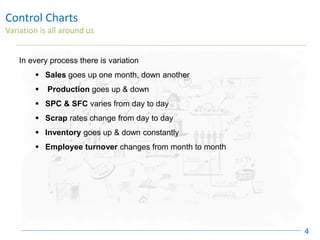
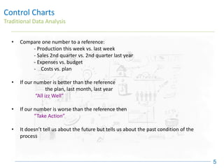
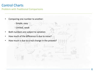
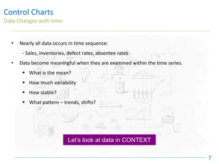
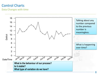
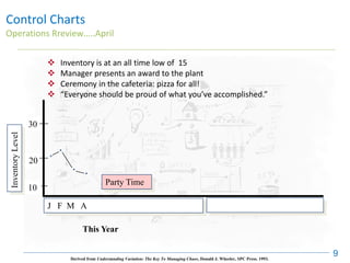
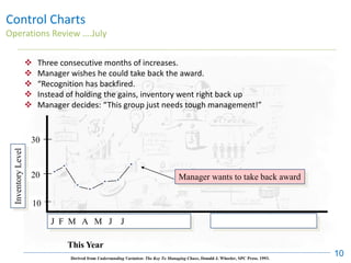
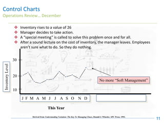
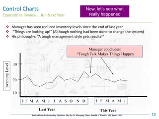
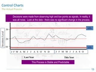
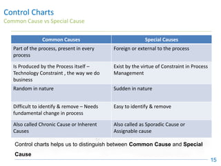
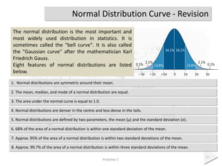
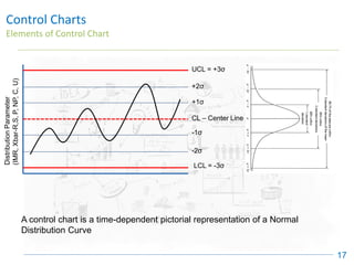
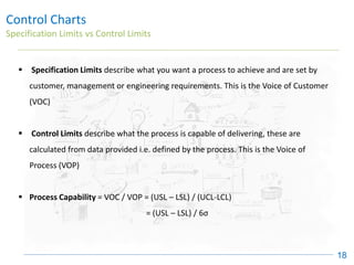
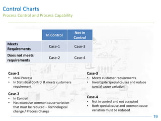
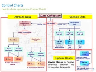
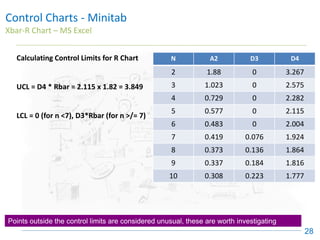
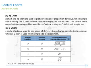
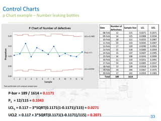
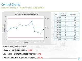
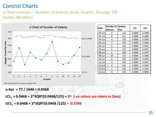
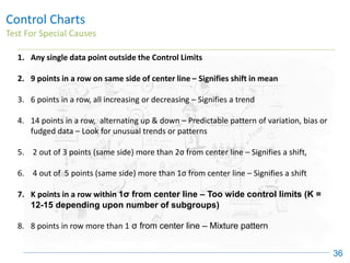
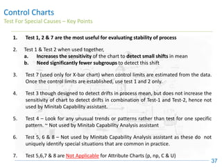
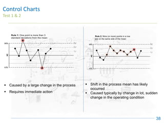
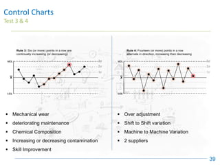
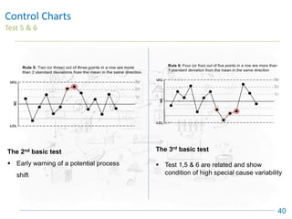
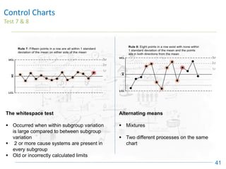
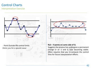
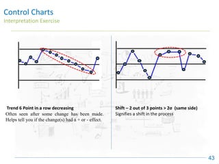
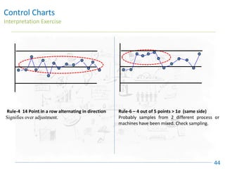
Control Charts
(Identifying Special Cause)
Control Charts
Purpose
2
• To distinguish Signals (Special Cause) from Noise (Common Cause)
• To show when a Process is:
– Stable & Predictable vs. Unstable & Unpredictable
• To measure whether intentional changes had the desired result
• Monitor key processes to maintain the gains
• To help determine when to take action , and when to leave the process alone
Control Charts
How to use Control Charts
3
✓ To identify opportunities for Improvement “Problems”
✓ To demonstrate that the process is stable before determining capability
✓ To determine if the measuring system is stable
✓ To show that improvements are real, not just random changes
Control Charts
Variation is all around us
4
In every process there is variation
▪ Sales goes up one month, down another
▪ Production goes up & down
▪ SPC & SFC varies from day to day
▪ Scrap rates change from day to day
▪ Inventory goes up & down constantly
▪ Employee turnover changes from month to month
Control Charts
Traditional Data Analysis
5
• Compare one number to a reference:
- Production this week vs. last week
- Sales 2nd quarter vs. 2nd quarter last year
- Expenses vs. budget
- Costs vs. plan
• If our number is better than the reference
the plan, last month, last year
“All izz Well”
• If our number is worse than the reference then
“Take Action”
• It doesn’t tell us about the future but tells us about the past condition of the
process
Control Charts
Problem with Traditional Comparisons
6
• Comparing one number to another:
- Simple, easy
- Limited, weak
• Both numbers are subject to variation
• How much of the difference is due to noise?
• How much is due to a real change in the process?
Control Charts
Data Changes with time
7
• Nearly all data occurs in time sequence:
- Sales, Inventories, defect rates, absentee rates
• Data become meaningful when they are examined within the time series.
▪ What is the mean?
▪ How much variability
▪ How stable?
▪ What pattern – trends, shifts?
Let’s look at data in CONTEXT
Control Charts
Data Changes with time
8
Jan-87
Mar-87
Jun-87
Sep-87
Dec-87
Mar-88
Jun-88
Sep-88
Dec-88
0
2
4
6
8
10
12
14
16
18
Date/Time
Deficit
Talking about any
number compared
to the previous
number is
meaningless.
What is happening
over time?
What is the behaviour of our process?
Is it stable?
What type of variation do we have?
20
30
Inventory
Level
10
J F M A
This Year
Control Charts
Operations Rreview…..April
9
Party Time
❖ Inventory is at an all time low of 15
❖ Manager presents an award to the plant
❖ Ceremony in the cafeteria: pizza for all!
❖ “Everyone should be proud of what you’ve accomplished.”
Derived from Understanding Variation: The Key To Managing Chaos, Donald J. Wheeler, SPC Press. 1993.
Control Charts
Operations Review ….July
10
❖ Three consecutive months of increases.
❖ Manager wishes he could take back the award.
❖ “Recognition has backfired.
❖ Instead of holding the gains, inventory went right back up
❖ Manager decides: “This group just needs tough management!”
Derived from Understanding Variation: The Key To Managing Chaos, Donald J. Wheeler, SPC Press. 1993.
Manager wants to take back award
10
J F M A M J J
This Year
Inventory
Level
30
20
20
10
J F M A M J J A S O N D
Derived from Understanding Variation: The Key To Managing Chaos, Donald J. Wheeler, SPC Press. 1993.
This Year
Inventory
Level
30
Control Charts
Operations Review… December
11
❖ Inventory rises to a value of 26
❖ Manager decides to take action.
❖ A “special meeting” is called to solve this problem once and for all.
❖ After a sound lecture on the cost of inventory, the manager leaves. Employees
aren’t sure what to do. So they do nothing.
No more “Soft Management”
Control Charts
Operations Review….Jun Next Year
12
❖ Manager has seen reduced inventory levels since the end of last year.
❖ “Things are looking-up!” (Although nothing had been done to change the system)
❖ His philosophy: “A tough management style gets results!”
Manager concludes:
“Tough Talk Makes Things Happen
10
J F M A M J J A S O N D J F M A M J
Derived from Understanding Variation: The Key To Managing Chaos, Donald J. Wheeler, SPC Press. 1993.
This Year
Last Year
Inventory
Level
30
20
Now, let’s see what
really happened
Control Charts
The Actual Process
13
20
30
10
Inventory
Level
UPL
J F M A M J J A S O N D J F M M J J A S O
LPL
Last Year This Year
UCL
LCL
Decisions were made from observing high and low points as signals. In reality, it
was all noise. Look at the data - there was no significant change in the process.
This Process is Stable and Predictable
Control Charts
History
14
• Developed by Dr. Walter Shewhart of Bell Labs in 1924’s
• Also known as Shewhart Chart and Statistical Process Control Charts
• During the 20’s Dr. Shewhart presented his theories in a series of lectures that
were published in a book, Economic Control of Quality Manufactured Product
(1931)
• Control Charts came into wide use during 1940’s as a result of war production
efforts
• The purpose of Control Charts back then, today, and in the future will always be to
identify special cause
Control Charts
Common Cause vs Special Cause
15
Common Causes Special Causes
Part of the process, present in every
process
Foreign or external to the process
Is Produced by the Process itself –
Technology Constraint , the way we do
business
Exist by the virtue of Constraint in Process
Management
Random in nature Sudden in nature
Difficult to identify & remove – Needs
fundamental change in process
Easy to identify & remove
Also called Chronic Cause or Inherent
Causes
Also called as Sporadic Cause or
Assignable cause
Control charts helps us to distinguish between Common Cause and Special
Cause
Normal Distribution Curve - Revision
ProSolve 1
16
The normal distribution is the most important and
most widely used distribution in statistics. It is
sometimes called the "bell curve". It is also called
the "Gaussian curve" after the mathematician Karl
Friedrich Gauss.
Eight features of normal distributions are listed
below.
7. Approx. 95% of the area of a normal distribution is within two standard deviations of the mean.
1. Normal distributions are symmetric around their mean.
2. The mean, median, and mode of a normal distribution are equal.
3. The area under the normal curve is equal to 1.0.
4. Normal distributions are denser in the centre and less dense in the tails.
5. Normal distributions are defined by two parameters, the mean (μ) and the standard deviation (σ).
6. 68% of the area of a normal distribution is within one standard deviation of the mean.
8. Approx. 99.7% of the area of a normal distribution is within three standard deviations of the mean.
Control Charts
Elements of Control Chart
17
UCL = +3σ
LCL = -3σ
CL – Center Line
+2σ
+1σ
-1σ
-2σ
Distribution
Parameter
(IMR,
Xbar-R,S,
P,
NP,
C,
U)
A control chart is a time-dependent pictorial representation of a Normal
Distribution Curve
Control Charts
Specification Limits vs Control Limits
18
▪ Specification Limits describe what you want a process to achieve and are set by
customer, management or engineering requirements. This is the Voice of Customer
(VOC)
▪ Control Limits describe what the process is capable of delivering, these are
calculated from data provided i.e. defined by the process. This is the Voice of
Process (VOP)
▪ Process Capability = VOC / VOP = (USL – LSL) / (UCL-LCL)
= (USL – LSL) / 6σ
Control Charts
Process Control and Process Capability
19
In Control
Not in
Control
Meets
Requirements
Case-1 Case-3
Does not meets
requirements
Case-2 Case-4
Case-1
• Ideal Process
• In Statistical Control & meets customers
requirement
Case-2
• In Control
• Has excessive common cause variation
that must be reduced – Technological
change / Process Change
Case-3
• Meets customer requirements
• Investigate Special causes and reduce
special cause variation
Case-4
• Not in control and not accepted
• Both special cause and common cause
variation must be reduced
Control Charts
How to chose appropriate Control Chart?
20
X & R
Chart
- X & S
Chart
-
Data Collection
Type of Data?
Measurement
Data
Variable Data
Subgroup
Size of 1
Subgroup
Size 2 to 9
Subgroup
Size > 9
X & MR
Chart
Individual
Measurement
Mean
and
Range
Mean
and
St.dev.
Cusum
Chart
EWMA
Chart
• Small shift in Mean
• Regardless of subgroup
size
• Continuous process
(I.e.: chemical, batch,…)
• Correlation of Mean
Count or
Classification
Data Attribute Data
Type of Attribute Data?
Count Data
Classification
Data
Fixed
Subgroup
Size
Variable
Subgroup
Fixed
Opportunity
Variable
Opportunity
C Chart U Chart
NP Chart P Chart
Number of Incidences /
defects
% or proportion defectives
Attribute Data Variable Data
Special Cases
Moving Range is Positive
difference between two
consecutive data points
Control Charts - Minitab
Individuals & Moving Range (IMR) chart
21
Stats > Control Charts > Variables Charts for Individuals > I-MR
Control Charts - Minitab
Individuals & Moving Range (IMR) chart
22
Stats > Control Charts > Variables Charts for Individuals > I-MR
Control Charts - Minitab
Individuals & Moving Range (IMR) chart
23
Stats > Control Charts > Variables Charts for Individuals > I-MR
Upper Control Limit
Lower Control Limit
Mean or Center Line
Points outside the control limits are considered unusual, these are worth investigating
Control Charts - Minitab
Xbar-R Chart
24
Stats > Control Charts > Variables Charts for Subgroups > Xbar-R
Control Charts - Minitab
Xbar-R Chart
25
Stats > Control Charts > Variables Charts for Subgroups > Xbar-R
Control Charts - Minitab
Xbar-R Chart
26
Stats > Control Charts > Variables Charts for Subgroups > Xbar-R
9-Feb
8-Feb
7-Feb
6-Feb
5-Feb
4-Feb
3-Feb
2-Feb
1-Feb
16.5
16.0
15.5
15.0
14.5
Date
Sample
Mean
_
_
X=15.396
UCL=16.447
LCL=14.344
9-Feb
8-Feb
7-Feb
6-Feb
5-Feb
4-Feb
3-Feb
2-Feb
1-Feb
4
3
2
1
0
Date
Sample
Range
_
R=1.822
UCL=3.853
LCL=0
Xbar-R Chart of 1, ..., 5
Upper Control Limit
Lower Control Limit
Mean or Center Line
Points outside the control limits are considered unusual, these are worth investigating
A B C D E F G H I
1 Date 1 2 3 4 5 Average Range
2 1-Feb 15.3 14.9 15.0 15.2 16.4 15.36 1.5
3 2-Feb 14.4 15.5 14.8 15.6 14.9 15.04 1.2
4 3-Feb 15.3 15.1 15.3 18.5 14.9 15.82 3.6
5 4-Feb 15.0 14.8 16.0 15.6 15.4 15.36 1.2
6 5-Feb 15.3 16.4 17.2 15.5 15.5 15.98 1.9
7 6-Feb 14.9 15.3 14.9 16.5 15.1 15.34 1.6
8 7-Feb 15.6 16.4 15.3 15.3 15.0 15.52 1.4
9 8-Feb 14.0 15.8 16.4 16.4 15.3 15.58 2.4
10 9-Feb 14.0 15.2 13.6 15.0 15.0 14.56 1.6
11
12 15.40 1.82
13
Grand
Mean
Mean
Range
Control Charts - Minitab
Xbar-R Chart – MS Excel
27
= AVERAGE(C2:G2)
= MAX(C2:G2) –
MIN(C2:G2)
= AVERAGE(H2:H10)
= AVERAGE(I2:I10)
UCL = Xbar (Grand Mean) + A2*Rbar (Mean Range) = 15.4 + 0.577*1.82 = 16.45
LCL = Xbar (Grand Mean) - A2*Rbar (Mean Range) = 15.4 – 0.577*1.82 = 14.34
Calculating Xbar & Control Limits for Xbar Chart
Control Charts - Minitab
Xbar-R Chart – MS Excel
28
Points outside the control limits are considered unusual, these are worth investigating
Calculating Control Limits for R Chart
UCL = D4 * Rbar = 2.115 x 1.82 = 3.849
LCL = 0 (for n <7), D3*Rbar (for n >/= 7)
N A2 D3 D4
2 1.88 0 3.267
3 1.023 0 2.575
4 0.729 0 2.282
5 0.577 0 2.115
6 0.483 0 2.004
7 0.419 0.076 1.924
8 0.373 0.136 1.864
9 0.337 0.184 1.816
10 0.308 0.223 1.777
Control Charts
Interpreting Control Charts
29
❑ Control charts are powerful tool for detecting special cause variation. If a
special cause is found
• If the Out of Control (OOC) is a part of trend, mark the beginning and end of the trend
• Analyze the process to determine the cause of OCC condition
• Correct the condition and prevent it from occurring
• Recalculate the control limits after removing OOC data points
• Re-evaluate the chart according to the new limits
❑ Control Limits are recalculated only when the cause fro the OOC
condition has been identified and corrected
Control Charts
Interpreting Range Charts
30
❑ Range charts are interpreted first
❑ In a Range chart, a single OOC point is often caused by miscalculation, mis-
plotting or wrong measurement. Verify accuracy of data first
❑ Trends in the Range data can be caused by,
✓ Real Changes in the variability of the process
✓ Changes in the measurement system
❑ Identify the cause of the OOC and re-calculate the control limits, excluding
the OOC data point
❑ If the data point is excluded for range calculations, exclude it from Xbar
calculations also.
Control Charts
Interpreting Xbar Charts
31
❑ The interpretation of control charts is based on the statistical probability of a
particular pattern occurring by complete chance (or being caused by random
variation)
❑ All of the test identify events that have less than 0.3% chance of occurring by
random chance
❑ The following rules are from Journal of Quality Technology, October 1984 and are
used by MINITAB
Control Charts
Attribute Charts
32
p / np Chart
p chart and np chart are used to plot percentage or proportion defective. When sample
size is varying use p chart and for constant sample size use np chart. The control limits
on p chart appear ragged because they reflect each subgroup’s individual sample size.
c / u Chart
c and u charts are used to plot count of defect. c is used when sample size is constant,
whereas u chart is used when sample size is not constant.
^LCL is set “Zero” for –ve values
Control Charts
p Chart example – Number leaking bottles
33
P-bar = 189 / 1614 = 0.1171
P1 = 12/115 = 0.1043
LCL1 = 0.117 – 3*SQRT(0.1171(1-0.1171)/115) = 0.0271
UCL2 = 0.117 + 3*SQRT(0.1171(1-0.1171)/115) = 0.2071
Date
Number of
defectives
Sample Size LCL UCL
08-Feb 12 115 0.0271 0.2071
09-Feb 14 125 0.0308 0.2034
10-Feb 18 111 0.0255 0.2087
11-Feb 13 133 0.0335 0.2007
12-Feb 17 120 0.0290 0.2052
13-Feb 15 118 0.0283 0.2059
14-Feb 15 137 0.0347 0.1995
15-Feb 16 108 0.0243 0.2099
16-Feb 11 110 0.0251 0.2091
17-Feb 14 124 0.0305 0.2037
18-Feb 13 128 0.0318 0.2024
19-Feb 14 144 0.0367 0.1975
20-Feb 17 141 0.0359 0.1983
Total 189 1614
Control Charts
np Chart example – Number of Leaking Bottles
34
P-bar = 164 / 1950 = 0.0841
nP-bar = 150* (164 / 1950) = 12.62
LCL = 12.62 – 3*SQRT(12.62(1-0.0841)) = 2.42
UCL = 12.62 + 3*SQRT(12.62(1-0.0841)) = 22.81
Date
Number of
Defectives
Sample Size
08-Feb 9 150
09-Feb 12 150
10-Feb 13 150
11-Feb 12 150
12-Feb 17 150
13-Feb 15 150
14-Feb 15 150
15-Feb 16 150
16-Feb 20 150
17-Feb 9 150
18-Feb 8 150
19-Feb 7 150
20-Feb 11 150
Total 164 1950
Control Charts
u Chart example – Number of defects (Leak, Scratch, Smudge, Off
Center, Wrinkles)
35
u-bar = 77 / 1646 = 0.0468
LCL1 = 0.0468 – 3*SQRT(0.0468/125) = 0^ (-ve values are taken as Zero)
UCL1 = 0.0468 + 3*SQRT(0.0468 /125) = 0.1048
Date
Number of
Defects
Sample
Size
LCL UCL
02-Jun 4 125 0.0000 0.1048
03-Jun 8 111 0.0000 0.1084
04-Jun 3 133 0.0000 0.1030
05-Jun 7 120 0.0000 0.1060
06-Jun 5 118 0.0000 0.1065
07-Jun 5 137 0.0000 0.1022
08-Jun 6 108 0.0000 0.1092
09-Jun 10 110 0.0000 0.1086
10-Jun 4 124 0.0000 0.1050
11-Jun 3 128 0.0000 0.1041
12-Jun 4 144 0.0000 0.1009
13-Jun 7 138 0.0000 0.1020
14-Jun 11 150 0.0000 0.0998
Control Charts
Test For Special Causes
36
1. Any single data point outside the Control Limits
2. 9 points in a row on same side of center line – Signifies shift in mean
3. 6 points in a row, all increasing or decreasing – Signifies a trend
4. 14 points in a row, alternating up & down – Predictable pattern of variation, bias or
fudged data – Look for unusual trends or patterns
5. 2 out of 3 points (same side) more than 2σ from center line – Signifies a shift,
6. 4 out of 5 points (same side) more than 1σ from center line – Signifies a shift
7. K points in a row within 1σ from center line – Too wide control limits (K =
12-15 depending upon number of subgroups)
8. 8 points in row more than 1 σ from center line – Mixture pattern
Control Charts
Test For Special Causes – Key Points
37
1. Test 1, 2 & 7 are the most useful for evaluating stability of process
2. Test 1 & Test 2 when used together,
a. Increases the sensitivity of the chart to detect small shifts in mean
b. Need significantly fewer subgroups to detect this shift
3. Test 7 (used only for X-bar chart) when control limits are estimated from the data.
Once the control limits are established, use test 1 and 2 only.
4. Test 3 though designed to detect drifts in process mean, but does not increase the
sensitivity of chart to detect drifts in combination of Test-1 and Test-2, hence not
used by Minitab Capability assistant.
5. Test 4 – Look for any unusual trends or patterns rather than test for one specific
pattern. ~ Not used by Minitab Capability Analysis assistant
6. Test 5, 6 & 8 – Not used by Minitab Capability Analysis assistant as these do not
uniquely identify special situations that are common in practice.
7. Test 5,6,7 & 8 are Not Applicable for Attribute Charts (p, np, C & U)
Control Charts
Test 1 & 2
38
▪ Caused by a large change in the process
▪ Requires immediate action
▪ Shift in the process mean has likely
occurred
▪ Caused typically by change in lot, sudden
change in the operating condition
Control Charts
Test 3 & 4
39
▪ Mechanical wear
▪ deteriorating maintenance
▪ Chemical Composition
▪ Increasing or decreasing contamination
▪ Skill Improvement
▪ Over adjustment
▪ Shift to Shift variation
▪ Machine to Machine Variation
▪ 2 suppliers
Control Charts
Test 5 & 6
40
The 2nd basic test
▪ Early warning of a potential process
shift
The 3rd basic test
▪ Test 1,5 & 6 are related and show
condition of high special cause variability
Control Charts
Test 7 & 8
41
The whitespace test
▪ Occurred when within subgroup variation
is large compared to between subgroup
variation
▪ 2 or more cause systems are present in
every subgroup
▪ Old or incorrectly calculated limits
Alternating means
▪ Mixtures
▪ Two different processes on the same
chart
Control Charts
Interpretation Exercise
42
- Point Outside the control limits
Alerts you for a special cause
Run – 9 points on same side of CL
Suggests the process has undergone a permanent
change (+ or -) and is now becoming stable.
Often requires that you re-compute the control
lines for future interpretation efforts.
Control Charts
Interpretation Exercise
43
Trend 6 Point in a row decreasing
Often seen after some change has been made.
Helps tell you if the change(s) had a + or - effect.
Shift – 2 out of 3 points > 2σ (same side)
Signifies a shift in the process
Control Charts
Interpretation Exercise
44
Rule-4 14 Point in a row alternating in direction
Signifies over adjustment.
Rule-6 – 4 out of 5 points > 1σ (same side)
Probably samples from 2 different process or
machines have been mixed. Check sampling.

Control Charts - six sigma green belt certification

  • 1.
  • 2.
    Control Charts Purpose 2 • Todistinguish Signals (Special Cause) from Noise (Common Cause) • To show when a Process is: – Stable & Predictable vs. Unstable & Unpredictable • To measure whether intentional changes had the desired result • Monitor key processes to maintain the gains • To help determine when to take action , and when to leave the process alone
  • 3.
    Control Charts How touse Control Charts 3 ✓ To identify opportunities for Improvement “Problems” ✓ To demonstrate that the process is stable before determining capability ✓ To determine if the measuring system is stable ✓ To show that improvements are real, not just random changes
  • 4.
    Control Charts Variation isall around us 4 In every process there is variation ▪ Sales goes up one month, down another ▪ Production goes up & down ▪ SPC & SFC varies from day to day ▪ Scrap rates change from day to day ▪ Inventory goes up & down constantly ▪ Employee turnover changes from month to month
  • 5.
    Control Charts Traditional DataAnalysis 5 • Compare one number to a reference: - Production this week vs. last week - Sales 2nd quarter vs. 2nd quarter last year - Expenses vs. budget - Costs vs. plan • If our number is better than the reference the plan, last month, last year “All izz Well” • If our number is worse than the reference then “Take Action” • It doesn’t tell us about the future but tells us about the past condition of the process
  • 6.
    Control Charts Problem withTraditional Comparisons 6 • Comparing one number to another: - Simple, easy - Limited, weak • Both numbers are subject to variation • How much of the difference is due to noise? • How much is due to a real change in the process?
  • 7.
    Control Charts Data Changeswith time 7 • Nearly all data occurs in time sequence: - Sales, Inventories, defect rates, absentee rates • Data become meaningful when they are examined within the time series. ▪ What is the mean? ▪ How much variability ▪ How stable? ▪ What pattern – trends, shifts? Let’s look at data in CONTEXT
  • 8.
    Control Charts Data Changeswith time 8 Jan-87 Mar-87 Jun-87 Sep-87 Dec-87 Mar-88 Jun-88 Sep-88 Dec-88 0 2 4 6 8 10 12 14 16 18 Date/Time Deficit Talking about any number compared to the previous number is meaningless. What is happening over time? What is the behaviour of our process? Is it stable? What type of variation do we have?
  • 9.
    20 30 Inventory Level 10 J F MA This Year Control Charts Operations Rreview…..April 9 Party Time ❖ Inventory is at an all time low of 15 ❖ Manager presents an award to the plant ❖ Ceremony in the cafeteria: pizza for all! ❖ “Everyone should be proud of what you’ve accomplished.” Derived from Understanding Variation: The Key To Managing Chaos, Donald J. Wheeler, SPC Press. 1993.
  • 10.
    Control Charts Operations Review….July 10 ❖ Three consecutive months of increases. ❖ Manager wishes he could take back the award. ❖ “Recognition has backfired. ❖ Instead of holding the gains, inventory went right back up ❖ Manager decides: “This group just needs tough management!” Derived from Understanding Variation: The Key To Managing Chaos, Donald J. Wheeler, SPC Press. 1993. Manager wants to take back award 10 J F M A M J J This Year Inventory Level 30 20
  • 11.
    20 10 J F MA M J J A S O N D Derived from Understanding Variation: The Key To Managing Chaos, Donald J. Wheeler, SPC Press. 1993. This Year Inventory Level 30 Control Charts Operations Review… December 11 ❖ Inventory rises to a value of 26 ❖ Manager decides to take action. ❖ A “special meeting” is called to solve this problem once and for all. ❖ After a sound lecture on the cost of inventory, the manager leaves. Employees aren’t sure what to do. So they do nothing. No more “Soft Management”
  • 12.
    Control Charts Operations Review….JunNext Year 12 ❖ Manager has seen reduced inventory levels since the end of last year. ❖ “Things are looking-up!” (Although nothing had been done to change the system) ❖ His philosophy: “A tough management style gets results!” Manager concludes: “Tough Talk Makes Things Happen 10 J F M A M J J A S O N D J F M A M J Derived from Understanding Variation: The Key To Managing Chaos, Donald J. Wheeler, SPC Press. 1993. This Year Last Year Inventory Level 30 20 Now, let’s see what really happened
  • 13.
    Control Charts The ActualProcess 13 20 30 10 Inventory Level UPL J F M A M J J A S O N D J F M M J J A S O LPL Last Year This Year UCL LCL Decisions were made from observing high and low points as signals. In reality, it was all noise. Look at the data - there was no significant change in the process. This Process is Stable and Predictable
  • 14.
    Control Charts History 14 • Developedby Dr. Walter Shewhart of Bell Labs in 1924’s • Also known as Shewhart Chart and Statistical Process Control Charts • During the 20’s Dr. Shewhart presented his theories in a series of lectures that were published in a book, Economic Control of Quality Manufactured Product (1931) • Control Charts came into wide use during 1940’s as a result of war production efforts • The purpose of Control Charts back then, today, and in the future will always be to identify special cause
  • 15.
    Control Charts Common Causevs Special Cause 15 Common Causes Special Causes Part of the process, present in every process Foreign or external to the process Is Produced by the Process itself – Technology Constraint , the way we do business Exist by the virtue of Constraint in Process Management Random in nature Sudden in nature Difficult to identify & remove – Needs fundamental change in process Easy to identify & remove Also called Chronic Cause or Inherent Causes Also called as Sporadic Cause or Assignable cause Control charts helps us to distinguish between Common Cause and Special Cause
  • 16.
    Normal Distribution Curve- Revision ProSolve 1 16 The normal distribution is the most important and most widely used distribution in statistics. It is sometimes called the "bell curve". It is also called the "Gaussian curve" after the mathematician Karl Friedrich Gauss. Eight features of normal distributions are listed below. 7. Approx. 95% of the area of a normal distribution is within two standard deviations of the mean. 1. Normal distributions are symmetric around their mean. 2. The mean, median, and mode of a normal distribution are equal. 3. The area under the normal curve is equal to 1.0. 4. Normal distributions are denser in the centre and less dense in the tails. 5. Normal distributions are defined by two parameters, the mean (μ) and the standard deviation (σ). 6. 68% of the area of a normal distribution is within one standard deviation of the mean. 8. Approx. 99.7% of the area of a normal distribution is within three standard deviations of the mean.
  • 17.
    Control Charts Elements ofControl Chart 17 UCL = +3σ LCL = -3σ CL – Center Line +2σ +1σ -1σ -2σ Distribution Parameter (IMR, Xbar-R,S, P, NP, C, U) A control chart is a time-dependent pictorial representation of a Normal Distribution Curve
  • 18.
    Control Charts Specification Limitsvs Control Limits 18 ▪ Specification Limits describe what you want a process to achieve and are set by customer, management or engineering requirements. This is the Voice of Customer (VOC) ▪ Control Limits describe what the process is capable of delivering, these are calculated from data provided i.e. defined by the process. This is the Voice of Process (VOP) ▪ Process Capability = VOC / VOP = (USL – LSL) / (UCL-LCL) = (USL – LSL) / 6σ
  • 19.
    Control Charts Process Controland Process Capability 19 In Control Not in Control Meets Requirements Case-1 Case-3 Does not meets requirements Case-2 Case-4 Case-1 • Ideal Process • In Statistical Control & meets customers requirement Case-2 • In Control • Has excessive common cause variation that must be reduced – Technological change / Process Change Case-3 • Meets customer requirements • Investigate Special causes and reduce special cause variation Case-4 • Not in control and not accepted • Both special cause and common cause variation must be reduced
  • 20.
    Control Charts How tochose appropriate Control Chart? 20 X & R Chart - X & S Chart - Data Collection Type of Data? Measurement Data Variable Data Subgroup Size of 1 Subgroup Size 2 to 9 Subgroup Size > 9 X & MR Chart Individual Measurement Mean and Range Mean and St.dev. Cusum Chart EWMA Chart • Small shift in Mean • Regardless of subgroup size • Continuous process (I.e.: chemical, batch,…) • Correlation of Mean Count or Classification Data Attribute Data Type of Attribute Data? Count Data Classification Data Fixed Subgroup Size Variable Subgroup Fixed Opportunity Variable Opportunity C Chart U Chart NP Chart P Chart Number of Incidences / defects % or proportion defectives Attribute Data Variable Data Special Cases Moving Range is Positive difference between two consecutive data points
  • 21.
    Control Charts -Minitab Individuals & Moving Range (IMR) chart 21 Stats > Control Charts > Variables Charts for Individuals > I-MR
  • 22.
    Control Charts -Minitab Individuals & Moving Range (IMR) chart 22 Stats > Control Charts > Variables Charts for Individuals > I-MR
  • 23.
    Control Charts -Minitab Individuals & Moving Range (IMR) chart 23 Stats > Control Charts > Variables Charts for Individuals > I-MR Upper Control Limit Lower Control Limit Mean or Center Line Points outside the control limits are considered unusual, these are worth investigating
  • 24.
    Control Charts -Minitab Xbar-R Chart 24 Stats > Control Charts > Variables Charts for Subgroups > Xbar-R
  • 25.
    Control Charts -Minitab Xbar-R Chart 25 Stats > Control Charts > Variables Charts for Subgroups > Xbar-R
  • 26.
    Control Charts -Minitab Xbar-R Chart 26 Stats > Control Charts > Variables Charts for Subgroups > Xbar-R 9-Feb 8-Feb 7-Feb 6-Feb 5-Feb 4-Feb 3-Feb 2-Feb 1-Feb 16.5 16.0 15.5 15.0 14.5 Date Sample Mean _ _ X=15.396 UCL=16.447 LCL=14.344 9-Feb 8-Feb 7-Feb 6-Feb 5-Feb 4-Feb 3-Feb 2-Feb 1-Feb 4 3 2 1 0 Date Sample Range _ R=1.822 UCL=3.853 LCL=0 Xbar-R Chart of 1, ..., 5 Upper Control Limit Lower Control Limit Mean or Center Line Points outside the control limits are considered unusual, these are worth investigating
  • 27.
    A B CD E F G H I 1 Date 1 2 3 4 5 Average Range 2 1-Feb 15.3 14.9 15.0 15.2 16.4 15.36 1.5 3 2-Feb 14.4 15.5 14.8 15.6 14.9 15.04 1.2 4 3-Feb 15.3 15.1 15.3 18.5 14.9 15.82 3.6 5 4-Feb 15.0 14.8 16.0 15.6 15.4 15.36 1.2 6 5-Feb 15.3 16.4 17.2 15.5 15.5 15.98 1.9 7 6-Feb 14.9 15.3 14.9 16.5 15.1 15.34 1.6 8 7-Feb 15.6 16.4 15.3 15.3 15.0 15.52 1.4 9 8-Feb 14.0 15.8 16.4 16.4 15.3 15.58 2.4 10 9-Feb 14.0 15.2 13.6 15.0 15.0 14.56 1.6 11 12 15.40 1.82 13 Grand Mean Mean Range Control Charts - Minitab Xbar-R Chart – MS Excel 27 = AVERAGE(C2:G2) = MAX(C2:G2) – MIN(C2:G2) = AVERAGE(H2:H10) = AVERAGE(I2:I10) UCL = Xbar (Grand Mean) + A2*Rbar (Mean Range) = 15.4 + 0.577*1.82 = 16.45 LCL = Xbar (Grand Mean) - A2*Rbar (Mean Range) = 15.4 – 0.577*1.82 = 14.34 Calculating Xbar & Control Limits for Xbar Chart
  • 28.
    Control Charts -Minitab Xbar-R Chart – MS Excel 28 Points outside the control limits are considered unusual, these are worth investigating Calculating Control Limits for R Chart UCL = D4 * Rbar = 2.115 x 1.82 = 3.849 LCL = 0 (for n <7), D3*Rbar (for n >/= 7) N A2 D3 D4 2 1.88 0 3.267 3 1.023 0 2.575 4 0.729 0 2.282 5 0.577 0 2.115 6 0.483 0 2.004 7 0.419 0.076 1.924 8 0.373 0.136 1.864 9 0.337 0.184 1.816 10 0.308 0.223 1.777
  • 29.
    Control Charts Interpreting ControlCharts 29 ❑ Control charts are powerful tool for detecting special cause variation. If a special cause is found • If the Out of Control (OOC) is a part of trend, mark the beginning and end of the trend • Analyze the process to determine the cause of OCC condition • Correct the condition and prevent it from occurring • Recalculate the control limits after removing OOC data points • Re-evaluate the chart according to the new limits ❑ Control Limits are recalculated only when the cause fro the OOC condition has been identified and corrected
  • 30.
    Control Charts Interpreting RangeCharts 30 ❑ Range charts are interpreted first ❑ In a Range chart, a single OOC point is often caused by miscalculation, mis- plotting or wrong measurement. Verify accuracy of data first ❑ Trends in the Range data can be caused by, ✓ Real Changes in the variability of the process ✓ Changes in the measurement system ❑ Identify the cause of the OOC and re-calculate the control limits, excluding the OOC data point ❑ If the data point is excluded for range calculations, exclude it from Xbar calculations also.
  • 31.
    Control Charts Interpreting XbarCharts 31 ❑ The interpretation of control charts is based on the statistical probability of a particular pattern occurring by complete chance (or being caused by random variation) ❑ All of the test identify events that have less than 0.3% chance of occurring by random chance ❑ The following rules are from Journal of Quality Technology, October 1984 and are used by MINITAB
  • 32.
    Control Charts Attribute Charts 32 p/ np Chart p chart and np chart are used to plot percentage or proportion defective. When sample size is varying use p chart and for constant sample size use np chart. The control limits on p chart appear ragged because they reflect each subgroup’s individual sample size. c / u Chart c and u charts are used to plot count of defect. c is used when sample size is constant, whereas u chart is used when sample size is not constant. ^LCL is set “Zero” for –ve values
  • 33.
    Control Charts p Chartexample – Number leaking bottles 33 P-bar = 189 / 1614 = 0.1171 P1 = 12/115 = 0.1043 LCL1 = 0.117 – 3*SQRT(0.1171(1-0.1171)/115) = 0.0271 UCL2 = 0.117 + 3*SQRT(0.1171(1-0.1171)/115) = 0.2071 Date Number of defectives Sample Size LCL UCL 08-Feb 12 115 0.0271 0.2071 09-Feb 14 125 0.0308 0.2034 10-Feb 18 111 0.0255 0.2087 11-Feb 13 133 0.0335 0.2007 12-Feb 17 120 0.0290 0.2052 13-Feb 15 118 0.0283 0.2059 14-Feb 15 137 0.0347 0.1995 15-Feb 16 108 0.0243 0.2099 16-Feb 11 110 0.0251 0.2091 17-Feb 14 124 0.0305 0.2037 18-Feb 13 128 0.0318 0.2024 19-Feb 14 144 0.0367 0.1975 20-Feb 17 141 0.0359 0.1983 Total 189 1614
  • 34.
    Control Charts np Chartexample – Number of Leaking Bottles 34 P-bar = 164 / 1950 = 0.0841 nP-bar = 150* (164 / 1950) = 12.62 LCL = 12.62 – 3*SQRT(12.62(1-0.0841)) = 2.42 UCL = 12.62 + 3*SQRT(12.62(1-0.0841)) = 22.81 Date Number of Defectives Sample Size 08-Feb 9 150 09-Feb 12 150 10-Feb 13 150 11-Feb 12 150 12-Feb 17 150 13-Feb 15 150 14-Feb 15 150 15-Feb 16 150 16-Feb 20 150 17-Feb 9 150 18-Feb 8 150 19-Feb 7 150 20-Feb 11 150 Total 164 1950
  • 35.
    Control Charts u Chartexample – Number of defects (Leak, Scratch, Smudge, Off Center, Wrinkles) 35 u-bar = 77 / 1646 = 0.0468 LCL1 = 0.0468 – 3*SQRT(0.0468/125) = 0^ (-ve values are taken as Zero) UCL1 = 0.0468 + 3*SQRT(0.0468 /125) = 0.1048 Date Number of Defects Sample Size LCL UCL 02-Jun 4 125 0.0000 0.1048 03-Jun 8 111 0.0000 0.1084 04-Jun 3 133 0.0000 0.1030 05-Jun 7 120 0.0000 0.1060 06-Jun 5 118 0.0000 0.1065 07-Jun 5 137 0.0000 0.1022 08-Jun 6 108 0.0000 0.1092 09-Jun 10 110 0.0000 0.1086 10-Jun 4 124 0.0000 0.1050 11-Jun 3 128 0.0000 0.1041 12-Jun 4 144 0.0000 0.1009 13-Jun 7 138 0.0000 0.1020 14-Jun 11 150 0.0000 0.0998
  • 36.
    Control Charts Test ForSpecial Causes 36 1. Any single data point outside the Control Limits 2. 9 points in a row on same side of center line – Signifies shift in mean 3. 6 points in a row, all increasing or decreasing – Signifies a trend 4. 14 points in a row, alternating up & down – Predictable pattern of variation, bias or fudged data – Look for unusual trends or patterns 5. 2 out of 3 points (same side) more than 2σ from center line – Signifies a shift, 6. 4 out of 5 points (same side) more than 1σ from center line – Signifies a shift 7. K points in a row within 1σ from center line – Too wide control limits (K = 12-15 depending upon number of subgroups) 8. 8 points in row more than 1 σ from center line – Mixture pattern
  • 37.
    Control Charts Test ForSpecial Causes – Key Points 37 1. Test 1, 2 & 7 are the most useful for evaluating stability of process 2. Test 1 & Test 2 when used together, a. Increases the sensitivity of the chart to detect small shifts in mean b. Need significantly fewer subgroups to detect this shift 3. Test 7 (used only for X-bar chart) when control limits are estimated from the data. Once the control limits are established, use test 1 and 2 only. 4. Test 3 though designed to detect drifts in process mean, but does not increase the sensitivity of chart to detect drifts in combination of Test-1 and Test-2, hence not used by Minitab Capability assistant. 5. Test 4 – Look for any unusual trends or patterns rather than test for one specific pattern. ~ Not used by Minitab Capability Analysis assistant 6. Test 5, 6 & 8 – Not used by Minitab Capability Analysis assistant as these do not uniquely identify special situations that are common in practice. 7. Test 5,6,7 & 8 are Not Applicable for Attribute Charts (p, np, C & U)
  • 38.
    Control Charts Test 1& 2 38 ▪ Caused by a large change in the process ▪ Requires immediate action ▪ Shift in the process mean has likely occurred ▪ Caused typically by change in lot, sudden change in the operating condition
  • 39.
    Control Charts Test 3& 4 39 ▪ Mechanical wear ▪ deteriorating maintenance ▪ Chemical Composition ▪ Increasing or decreasing contamination ▪ Skill Improvement ▪ Over adjustment ▪ Shift to Shift variation ▪ Machine to Machine Variation ▪ 2 suppliers
  • 40.
    Control Charts Test 5& 6 40 The 2nd basic test ▪ Early warning of a potential process shift The 3rd basic test ▪ Test 1,5 & 6 are related and show condition of high special cause variability
  • 41.
    Control Charts Test 7& 8 41 The whitespace test ▪ Occurred when within subgroup variation is large compared to between subgroup variation ▪ 2 or more cause systems are present in every subgroup ▪ Old or incorrectly calculated limits Alternating means ▪ Mixtures ▪ Two different processes on the same chart
  • 42.
    Control Charts Interpretation Exercise 42 -Point Outside the control limits Alerts you for a special cause Run – 9 points on same side of CL Suggests the process has undergone a permanent change (+ or -) and is now becoming stable. Often requires that you re-compute the control lines for future interpretation efforts.
  • 43.
    Control Charts Interpretation Exercise 43 Trend6 Point in a row decreasing Often seen after some change has been made. Helps tell you if the change(s) had a + or - effect. Shift – 2 out of 3 points > 2σ (same side) Signifies a shift in the process
  • 44.
    Control Charts Interpretation Exercise 44 Rule-414 Point in a row alternating in direction Signifies over adjustment. Rule-6 – 4 out of 5 points > 1σ (same side) Probably samples from 2 different process or machines have been mixed. Check sampling.