SlideShare a Scribd company logo
Double Page Spread Overview
Mixmagare known to change it up when it comes to
their double page spreads, however, they are also all
very similar in terms of layout, design and use of
images and text. They all feature general conventions
such as combining image and text in a 50:50 ratio, the
use of headlines, standfirsts, headers, page numbers
and the way the design and image reflect genre and
audience.

Firstly, on every single double page spread shown
above, the text is laid out in a column type format and
is either written in black or white. This is because it goes
together with the layout of the entire magazine; from
the front page onwards the majority of text that
appears is in a column format so it appears
sophisticated, going with the magazine‟s simplistic
design and also so the information is easily accessible
for the reader. The black and white appeals to the
male target audience, and also reinforce the
sophistication within the double page spreads making
them look professional and polished. Also, all (apart
from the interview features with JorisVoorn and
KeleOkereke) of the double page spreads feature a
large display font within them as a main sell-
line/headline on the spread. This is so the reader is
drawn into reading the spread – they may not have
noticed it if they hadn‟t have seen like giant, eye
catching font, and so by this clever technique, they
almost guarantee that the reader is drawn in.
Another key feature which makes the double page
spreads similar is the fact that none feature smaller
related images; although in the two „The Big 3‟ there
are smaller images and not one main image, the
smaller images are set out as a main image for each
section of the double page spread (this helps to break
the article down and help it appear less intimidating
and textual to the reader). The lack of lots of smaller
related images makes the page also appear more
organized and easier to read for the audience.All of
the double page spreads (as stated before when
speaking about text) feature black and white
somewhere within the double page spread. This yet
again reinforces Mixmag‟s sophisticated yet cool
brand identity and makes sure that there is a symbiotic
link between all of the double page spreads.

Depending on what the double page spread
contains, the layout can vary. For example, if it is an
interview, the layout tends to be image on one page,
with all the text in a column format on the other;
article type features usually have a main image in the
middle of the two pages, with two blocks of text (one
on the end of the right hand page, one on the end of
the left hand page) and „The Big 3‟ double page
spreads tend to have one bigger article on one page,
along with two smaller articles on the other. However,
these conventions are broken by the „Welcome to
Lame Academy‟ and „Teach You I Will‟ double page
spreads – they seem to have a random layout, which
doesn‟t have a known design to it. When the layout is
mixed up and is a bit less simple and uniform, the
article is usually a bit less „serious‟ in its content and
tends to reflect the more fun, vibrant side of dance
culture or it is a different style of article to an interview.
This again suggests Mixmag isn‟t afraid to refresh their
magazine through changing layout and style within
their double page spreads; they break boundaries
and like to occasionally change up their style.

There are also repeated uses of mise-en-scene, for
example, the costume of the people appearing in the
double page spreads is generally the same – females
are slightly more dressed up, whereas males tend to
look very causually dressed. This could suggest male
dominance; since males tend to dominate the world
of dance music, with more male DJ‟s than female,
whilst females are often shown to be the
revellers/partygoers. All of the males within the double
page spreads also have very similar facial expressions,
which tend to be quite serious and straightfaced
whereas the females look happy and like they‟re
having fun, again refinforcing the male dominance of
the dance music industry. Settings also tend to be
either a studio type setting or in the midst of a
club/rave/gig – the double page spreads which
feature artists tend to be studio based (other than
„playing with your submotions‟ however we see the
Submotion Orchestra in the middle of a gig) and so it
could be said that Mixmag tries to represent it‟s artist in
a way which shows how seriously they take music. The
artist based double page spreads tend to have a
more serious feel to them, whereas the double page
spreads which feature revellers tend to have a more
fun and vibrant edge; this will appeal to the reader as
it demonstrates how the artists main focus is to make
sure that the audience (who will be the reader) enjoy
their music.

There are also similiarities in the style of language used
for the headlines – they often tend to be variations on
famous phrases, such as „Welcome to the Lame
Academy‟ (linking to the show „Fame Academy‟) and
„Riddim is a Dancer‟ (linking to the legendary early
dance music song). „Playing with your Submotions‟ is
also a spin on the phrase “playing with your emotions”
and therefore Mixmag presents artists as unique,
through the clever use of language.

More Related Content

What's hot

Contents page overview
Contents page overviewContents page overview
Contents page overviewJake Shelvey
 
Magazine cover annotation
Magazine cover annotationMagazine cover annotation
Magazine cover annotationalexnotsophie
 
Magazine Comparison
Magazine ComparisonMagazine Comparison
Magazine Comparisonguest924bb5c
 
Magazine Comparison
Magazine ComparisonMagazine Comparison
Magazine Comparisonguestc740a47
 
Textual analysis of classic rock 2
Textual analysis of classic rock 2Textual analysis of classic rock 2
Textual analysis of classic rock 2alicesoph96
 
Analysing music magazines 3
Analysing music magazines 3Analysing music magazines 3
Analysing music magazines 3Aaronoraa Barlow
 
Front cover overview
Front cover overviewFront cover overview
Front cover overviewJake Shelvey
 
Front page drawn draft explanation
Front page drawn draft explanationFront page drawn draft explanation
Front page drawn draft explanationnailapb
 
Front cover overview
Front cover overviewFront cover overview
Front cover overviewDN02RZU
 
Magazine analysis
Magazine analysisMagazine analysis
Magazine analysisTaranb
 
Contents page analysis
Contents page analysisContents page analysis
Contents page analysisBenjamin Irons
 
How did you attract/address your audience?
How did you attract/address your audience?How did you attract/address your audience?
How did you attract/address your audience?ArmouredKangaroo
 
College Magazine Analysis.
College Magazine Analysis.College Magazine Analysis.
College Magazine Analysis.ArmouredKangaroo
 
Front cover analysis
Front cover analysisFront cover analysis
Front cover analysisasmediac15
 
Church Street Rebranding Process Book
Church Street Rebranding Process BookChurch Street Rebranding Process Book
Church Street Rebranding Process BookMegan Charles
 

What's hot (20)

Contents page overview
Contents page overviewContents page overview
Contents page overview
 
Magazine cover annotation
Magazine cover annotationMagazine cover annotation
Magazine cover annotation
 
Magazine Comparison
Magazine ComparisonMagazine Comparison
Magazine Comparison
 
Magazine Comparison
Magazine ComparisonMagazine Comparison
Magazine Comparison
 
Textual analysis of classic rock 2
Textual analysis of classic rock 2Textual analysis of classic rock 2
Textual analysis of classic rock 2
 
Analysing music magazines 3
Analysing music magazines 3Analysing music magazines 3
Analysing music magazines 3
 
Front cover overview
Front cover overviewFront cover overview
Front cover overview
 
Advert conventions
Advert conventionsAdvert conventions
Advert conventions
 
(Nme) contents page overview
(Nme) contents page overview(Nme) contents page overview
(Nme) contents page overview
 
Front page drawn draft explanation
Front page drawn draft explanationFront page drawn draft explanation
Front page drawn draft explanation
 
Front cover overview
Front cover overviewFront cover overview
Front cover overview
 
Magazine analysis
Magazine analysisMagazine analysis
Magazine analysis
 
Contents page analysis
Contents page analysisContents page analysis
Contents page analysis
 
How did you attract/address your audience?
How did you attract/address your audience?How did you attract/address your audience?
How did you attract/address your audience?
 
Task 3b
Task 3bTask 3b
Task 3b
 
College Magazine Analysis.
College Magazine Analysis.College Magazine Analysis.
College Magazine Analysis.
 
Front cover analysis
Front cover analysisFront cover analysis
Front cover analysis
 
Genre research.
Genre research.Genre research.
Genre research.
 
(Nme) front cover overview
(Nme) front cover overview(Nme) front cover overview
(Nme) front cover overview
 
Church Street Rebranding Process Book
Church Street Rebranding Process BookChurch Street Rebranding Process Book
Church Street Rebranding Process Book
 

Viewers also liked

Front cover analysis
Front cover analysisFront cover analysis
Front cover analysisbetsimegan
 
Contents page overview
Contents page overviewContents page overview
Contents page overviewbetsimegan
 
Front cover analysis 1
Front cover analysis 1Front cover analysis 1
Front cover analysis 1betsimegan
 
Questionnaire Analysis
Questionnaire AnalysisQuestionnaire Analysis
Questionnaire Analysisbetsimegan
 
Front cover analysis 1
Front cover analysis 1Front cover analysis 1
Front cover analysis 1betsimegan
 
Final questionnaire
Final questionnaireFinal questionnaire
Final questionnairebetsimegan
 
Double page spread overview
Double page spread overviewDouble page spread overview
Double page spread overviewbetsimegan
 
Contents page analysis 2
Contents page analysis 2Contents page analysis 2
Contents page analysis 2betsimegan
 
Double page spread analysis 1
Double page spread analysis 1Double page spread analysis 1
Double page spread analysis 1betsimegan
 
Final case study
Final case studyFinal case study
Final case studybetsimegan
 
Contents page analysis 1
Contents page analysis 1Contents page analysis 1
Contents page analysis 1betsimegan
 
Contents page analysis 2
Contents page analysis 2Contents page analysis 2
Contents page analysis 2betsimegan
 
Front cover overview
Front cover overviewFront cover overview
Front cover overviewbetsimegan
 
Costume ideas 3
Costume ideas 3Costume ideas 3
Costume ideas 3betsimegan
 
Contents page overview
Contents page overviewContents page overview
Contents page overviewbetsimegan
 

Viewers also liked (17)

Front cover analysis
Front cover analysisFront cover analysis
Front cover analysis
 
Contents page overview
Contents page overviewContents page overview
Contents page overview
 
Case Study
Case StudyCase Study
Case Study
 
Front cover analysis 1
Front cover analysis 1Front cover analysis 1
Front cover analysis 1
 
Questionnaire Analysis
Questionnaire AnalysisQuestionnaire Analysis
Questionnaire Analysis
 
Front cover analysis 1
Front cover analysis 1Front cover analysis 1
Front cover analysis 1
 
Final questionnaire
Final questionnaireFinal questionnaire
Final questionnaire
 
Double page spread overview
Double page spread overviewDouble page spread overview
Double page spread overview
 
Contents page analysis 2
Contents page analysis 2Contents page analysis 2
Contents page analysis 2
 
Double page spread analysis 1
Double page spread analysis 1Double page spread analysis 1
Double page spread analysis 1
 
Final case study
Final case studyFinal case study
Final case study
 
Pitch images
Pitch imagesPitch images
Pitch images
 
Contents page analysis 1
Contents page analysis 1Contents page analysis 1
Contents page analysis 1
 
Contents page analysis 2
Contents page analysis 2Contents page analysis 2
Contents page analysis 2
 
Front cover overview
Front cover overviewFront cover overview
Front cover overview
 
Costume ideas 3
Costume ideas 3Costume ideas 3
Costume ideas 3
 
Contents page overview
Contents page overviewContents page overview
Contents page overview
 

Similar to Double page spread overview final redraft feedback on blog

Double page spread analysis 1
Double page spread analysis 1Double page spread analysis 1
Double page spread analysis 1betsimegan
 
Double Page Overview
Double Page OverviewDouble Page Overview
Double Page OverviewJosh Naughton
 
Music magazine analysis grids
Music magazine analysis gridsMusic magazine analysis grids
Music magazine analysis gridserneststaszak
 
Codes and convention new
Codes and convention newCodes and convention new
Codes and convention newindia smith
 
Evaluation presentation
Evaluation presentationEvaluation presentation
Evaluation presentationEmily Brown
 
Question One of Analysis
Question One of AnalysisQuestion One of Analysis
Question One of AnalysisDanielAllpress
 
Evaluation: Part 5
Evaluation: Part 5Evaluation: Part 5
Evaluation: Part 5joenewman99
 
Magazine Textual Analysis
Magazine Textual AnalysisMagazine Textual Analysis
Magazine Textual AnalysisJwbread
 
Textual analysis
Textual analysisTextual analysis
Textual analysisJwbread
 
Music magazine double page spread
Music magazine double page spreadMusic magazine double page spread
Music magazine double page spreadSashawallen
 
Music magazine double page spread
Music magazine double page spreadMusic magazine double page spread
Music magazine double page spreadSashawallen
 
Kerrang Magazine Deconstruction
Kerrang Magazine Deconstruction Kerrang Magazine Deconstruction
Kerrang Magazine Deconstruction katedawsonn97
 
Analysing music magazine front covers kerrang
Analysing music magazine front covers   kerrangAnalysing music magazine front covers   kerrang
Analysing music magazine front covers kerrangernest16
 

Similar to Double page spread overview final redraft feedback on blog (20)

Double page spread analysis 1
Double page spread analysis 1Double page spread analysis 1
Double page spread analysis 1
 
Double Page Overview
Double Page OverviewDouble Page Overview
Double Page Overview
 
Question 1
Question 1Question 1
Question 1
 
Music magazine analysis grids
Music magazine analysis gridsMusic magazine analysis grids
Music magazine analysis grids
 
Codes and convention new
Codes and convention newCodes and convention new
Codes and convention new
 
Music magazine
Music magazineMusic magazine
Music magazine
 
Evaluation presentation
Evaluation presentationEvaluation presentation
Evaluation presentation
 
5sos work
5sos work5sos work
5sos work
 
Question One of Analysis
Question One of AnalysisQuestion One of Analysis
Question One of Analysis
 
Evaluation: Part 5
Evaluation: Part 5Evaluation: Part 5
Evaluation: Part 5
 
Magazine Textual Analysis
Magazine Textual AnalysisMagazine Textual Analysis
Magazine Textual Analysis
 
Textual analysis
Textual analysisTextual analysis
Textual analysis
 
Music magazine double page spread
Music magazine double page spreadMusic magazine double page spread
Music magazine double page spread
 
Music magazine double page spread
Music magazine double page spreadMusic magazine double page spread
Music magazine double page spread
 
Rocksound analysis
Rocksound analysisRocksound analysis
Rocksound analysis
 
Contents pages
Contents pagesContents pages
Contents pages
 
Recovered file 1
Recovered file 1Recovered file 1
Recovered file 1
 
Kerrang Magazine Deconstruction
Kerrang Magazine Deconstruction Kerrang Magazine Deconstruction
Kerrang Magazine Deconstruction
 
Evaluation question 1
Evaluation question 1Evaluation question 1
Evaluation question 1
 
Analysing music magazine front covers kerrang
Analysing music magazine front covers   kerrangAnalysing music magazine front covers   kerrang
Analysing music magazine front covers kerrang
 

More from betsimegan

Sub genres betsi final
Sub genres betsi finalSub genres betsi final
Sub genres betsi finalbetsimegan
 
Evaluation babyyy
Evaluation babyyyEvaluation babyyy
Evaluation babyyybetsimegan
 
Font analysis for slideshare
Font analysis for slideshareFont analysis for slideshare
Font analysis for slidesharebetsimegan
 
Practice shots
Practice shotsPractice shots
Practice shotsbetsimegan
 
Artist profile
Artist profileArtist profile
Artist profilebetsimegan
 
Location ideas
Location ideasLocation ideas
Location ideasbetsimegan
 
Exploring mise en scene final
Exploring mise en scene finalExploring mise en scene final
Exploring mise en scene finalbetsimegan
 
Front cover analysis 2
Front cover analysis 2Front cover analysis 2
Front cover analysis 2betsimegan
 
Final questionnaire
Final questionnaireFinal questionnaire
Final questionnairebetsimegan
 
Questionnaire analysis
Questionnaire analysisQuestionnaire analysis
Questionnaire analysisbetsimegan
 
Location ideas
Location ideasLocation ideas
Location ideasbetsimegan
 
Artist profile
Artist profileArtist profile
Artist profilebetsimegan
 
Exploring mise en scene final
Exploring mise en scene finalExploring mise en scene final
Exploring mise en scene finalbetsimegan
 

More from betsimegan (16)

Sub genres betsi final
Sub genres betsi finalSub genres betsi final
Sub genres betsi final
 
Evaluation babyyy
Evaluation babyyyEvaluation babyyy
Evaluation babyyy
 
Font analysis for slideshare
Font analysis for slideshareFont analysis for slideshare
Font analysis for slideshare
 
Font analysis
Font analysisFont analysis
Font analysis
 
Focus group
Focus groupFocus group
Focus group
 
Practice shots
Practice shotsPractice shots
Practice shots
 
Artist profile
Artist profileArtist profile
Artist profile
 
Location ideas
Location ideasLocation ideas
Location ideas
 
Costume ideas
Costume ideasCostume ideas
Costume ideas
 
Exploring mise en scene final
Exploring mise en scene finalExploring mise en scene final
Exploring mise en scene final
 
Front cover analysis 2
Front cover analysis 2Front cover analysis 2
Front cover analysis 2
 
Final questionnaire
Final questionnaireFinal questionnaire
Final questionnaire
 
Questionnaire analysis
Questionnaire analysisQuestionnaire analysis
Questionnaire analysis
 
Location ideas
Location ideasLocation ideas
Location ideas
 
Artist profile
Artist profileArtist profile
Artist profile
 
Exploring mise en scene final
Exploring mise en scene finalExploring mise en scene final
Exploring mise en scene final
 

Double page spread overview final redraft feedback on blog

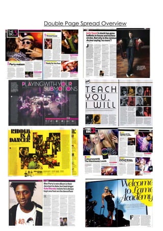
  • 2. Mixmagare known to change it up when it comes to their double page spreads, however, they are also all very similar in terms of layout, design and use of images and text. They all feature general conventions such as combining image and text in a 50:50 ratio, the use of headlines, standfirsts, headers, page numbers and the way the design and image reflect genre and audience. Firstly, on every single double page spread shown above, the text is laid out in a column type format and is either written in black or white. This is because it goes together with the layout of the entire magazine; from the front page onwards the majority of text that appears is in a column format so it appears sophisticated, going with the magazine‟s simplistic design and also so the information is easily accessible for the reader. The black and white appeals to the male target audience, and also reinforce the sophistication within the double page spreads making them look professional and polished. Also, all (apart from the interview features with JorisVoorn and KeleOkereke) of the double page spreads feature a large display font within them as a main sell- line/headline on the spread. This is so the reader is drawn into reading the spread – they may not have noticed it if they hadn‟t have seen like giant, eye catching font, and so by this clever technique, they almost guarantee that the reader is drawn in.
  • 3. Another key feature which makes the double page spreads similar is the fact that none feature smaller related images; although in the two „The Big 3‟ there are smaller images and not one main image, the smaller images are set out as a main image for each section of the double page spread (this helps to break the article down and help it appear less intimidating and textual to the reader). The lack of lots of smaller related images makes the page also appear more organized and easier to read for the audience.All of the double page spreads (as stated before when speaking about text) feature black and white somewhere within the double page spread. This yet again reinforces Mixmag‟s sophisticated yet cool brand identity and makes sure that there is a symbiotic link between all of the double page spreads. Depending on what the double page spread contains, the layout can vary. For example, if it is an interview, the layout tends to be image on one page, with all the text in a column format on the other; article type features usually have a main image in the middle of the two pages, with two blocks of text (one on the end of the right hand page, one on the end of the left hand page) and „The Big 3‟ double page spreads tend to have one bigger article on one page, along with two smaller articles on the other. However, these conventions are broken by the „Welcome to Lame Academy‟ and „Teach You I Will‟ double page spreads – they seem to have a random layout, which doesn‟t have a known design to it. When the layout is mixed up and is a bit less simple and uniform, the article is usually a bit less „serious‟ in its content and
  • 4. tends to reflect the more fun, vibrant side of dance culture or it is a different style of article to an interview. This again suggests Mixmag isn‟t afraid to refresh their magazine through changing layout and style within their double page spreads; they break boundaries and like to occasionally change up their style. There are also repeated uses of mise-en-scene, for example, the costume of the people appearing in the double page spreads is generally the same – females are slightly more dressed up, whereas males tend to look very causually dressed. This could suggest male dominance; since males tend to dominate the world of dance music, with more male DJ‟s than female, whilst females are often shown to be the revellers/partygoers. All of the males within the double page spreads also have very similar facial expressions, which tend to be quite serious and straightfaced whereas the females look happy and like they‟re having fun, again refinforcing the male dominance of the dance music industry. Settings also tend to be either a studio type setting or in the midst of a club/rave/gig – the double page spreads which feature artists tend to be studio based (other than „playing with your submotions‟ however we see the Submotion Orchestra in the middle of a gig) and so it could be said that Mixmag tries to represent it‟s artist in a way which shows how seriously they take music. The artist based double page spreads tend to have a more serious feel to them, whereas the double page spreads which feature revellers tend to have a more
  • 5. fun and vibrant edge; this will appeal to the reader as it demonstrates how the artists main focus is to make sure that the audience (who will be the reader) enjoy their music. There are also similiarities in the style of language used for the headlines – they often tend to be variations on famous phrases, such as „Welcome to the Lame Academy‟ (linking to the show „Fame Academy‟) and „Riddim is a Dancer‟ (linking to the legendary early dance music song). „Playing with your Submotions‟ is also a spin on the phrase “playing with your emotions” and therefore Mixmag presents artists as unique, through the clever use of language.