Fashion magazine covers follow certain conventions:
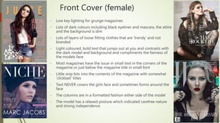
- Female covers use dim, dark lighting and colors to portray a grunge aesthetic with loose, layered clothing. Bold text contrasts and frames the model's face.
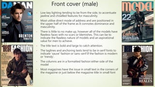
- Male covers use low-key side lighting to emphasize masculine features on models with flawless skin. Bold, large titles catch attention.
- Contents pages provide more images and descriptive text in a column format to inform readers about magazine contents.