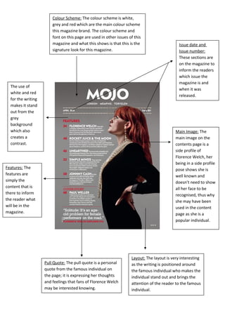
1. Colour Scheme: The colour scheme is white,
grey and red which are the main colour scheme
this magazine brand. The colour scheme and
font on this page are used in other issues of this
magazine and what this shows is that this is the
signature look for this magazine.
Issue date and
Issue number:
These sections are
on the magazine to
inform the readers
which issue the
magazine is and
when it was
released.
Main Image: The
main image on the
contents page is a
side profile of
Florence Welch, her
being in a side profile
pose shows she is
well known and
doesn’t need to show
all her face to be
recognised, thus why
she may have been
used in the content
page as she is a
popular individual.
Layout: The layout is very interesting
as the writing is positioned around
the famous individual who makes the
individual stand out and brings the
attention of the reader to the famous
individual.
Pull Quote: The pull quote is a personal
quote from the famous individual on
the page; it is expressing her thoughts
and feelings that fans of Florence Welch
may be interested knowing.
Features: The
features are
simply the
content that is
there to inform
the reader what
will be in the
magazine.
The use of
white and red
for the writing
makes it stand
out from the
grey
background
which also
creates a
contrast.