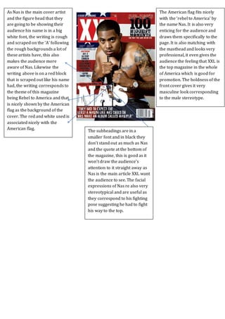
1. As Nas is the main cover artist
and the figure head that they
are going to be showing their
audience his name is in a big
white font, the writing is rough
and scraped on the ‘A’ following
the rough backgrounds a lot of
these artists have, this also
makes the audience more
aware of Nas. Likewise the
writing above is on a red block
that is scraped out like his name
had, the writing corresponds to
the theme of this magazine
being Rebel to America and that
is nicely shown by the American
flag as the background of the
cover. The red and white used is
associated nicely with the
American flag.
The American flag fits nicely
with the ‘rebel to America’ by
the name Nas. It is also very
enticing for the audience and
draws them specifically to the
page. It is also matching with
the masthead and looks very
professional, it even gives the
audience the feeling that XXL is
the top magazine in the whole
of America which is good for
promotion. The boldness of the
front cover gives it very
masculine look corresponding
to the male stereotype.
The subheadings are in a
smaller font and in black they
don’t stand out as much as Nas
and the quote at the bottom of
the magazine, this is good as it
won’t draw the audience’s
attention to it straight away as
Nas is the main article XXL want
the audience to see. The facial
expressions of Nas re also very
stereotypical and are useful as
they correspond to his fighting
pose suggesting he had to fight
his way to the top.