SlideShare a Scribd company logo
1 of 15
As MOJO is a monthly magazine it is quite expensive. That is why
everything in the front cover perfectly displayed and outlined, for
example the cutting out of the model and the position of where it is
placed. As seen it is very less busy and spread out around the page with
equal information on both sides.
Masthead: The name of the magazine is large and
bold on the page. The boldness of the masthead
compared to the other texts on the magazine cover
is allowing the title to stand out, which immediately
catches the audiences attention. However the
famous celebrity Madonna does cover up the
majority of the masthead making it difficult for the
audiences to view the masthead which could be a
problem as some viewers do not know the magazine
therefore it would be difficult to figure out the title.
This also shows the confidence of the magazine as it
is well known and the title doesn't’t need to stand
out. The typography of the masthead is serif as its
very formal. The colour of the masthead is black and
grey which is suitable for both genders
Main Image: The image of the famous Madonna is
used to take up a large amount of the cover. The
image however consists of black, white and different
shades of grey, this could perhaps give of a sense of
mystery to the audience. Madonna is obviously a
very famous singer in this contemporary society this
suggests that a wider audience would be interested
in the magazine due to her. The image is large and
eye catching, which would attract the audience.
Madonna's eyes are slightly closed, she has a nose
piercing of a cross, in which she is holding against
her lips with her tongue out slightly this gives of a
seductive look and also connotes some mystery to
the magazine which intrigues the viewer.
Cover Lines: Used to attract the reader so that they
want to buy the magazine to read the articles that
the magazine contains. The cover line acts as a
summary of what the magazine editors feel are the
most enticing features within the magazine. In this
case the topics on the cover lines differentiate as
one is talking about an interview with Madonna and
the others are the names of music bands which are
in the magazine.
Date: To show when the magazine was released,
usually referred only to the month and year which is
on this magazine. The date also shows that it is a
monthly magazine.
Selling Strap line : The strap line
is based on the top of the
magazine and just above the
masthead . The models name is in
large typography as she is very
famous and has many fans . The
model has had her appearance
changed so some audiences might
not recognise her straight away.
The colour of the image
corresponds with the title which
matches well together. Her lips
would be the main attraction due
to the colour and the fact that
there is a cross in-between them .
Her seductive appearance will also
attract many male audiences, as it
will stand out from the other
magazines.
Cover lines: The cover lines often
relate to the main image. As the first
cover line reads ‘from street punk to
pop majesty Madonna’. The other
cover lines relate to other famous
celebrities such as David Johanson, The
Betweens and Santana. The celebrity’s
names typography is quite large in
relation to the over text. The main one
is the one on top of the title making it
clear for the reader to see. Madonna’s
name is in gothic serif and in a darker
shade of blue this used to allow the
name to stand out from different
features on the magazine.
Colour Scheme: The main colours on
this magazine cover are black, white,
blue and red these variety of colours
are bound to attract both genders,
which means that both sexes would
be interested in buying the magazine.
Contents:
The content page for Mojos magazine is very detailed
and descriptive describing every aspect in the magazine.
It is made clear that are a lot of information about bands
and celebrities which meets the audiences expectations
because they are clearly interested in this type of music
therefore they want to find out more information. The
information is laid out under titles which makes it easier
f or the reader to know specifically what he/she is about
to read .
The layout:
The layout of the contents page is very clear which makes
it easier to read the information that is on the page. The
numbers of the pages are bright and red which stands out
allowing the reader to access the pages required. The
content is displayed in a list on the right, which gives the
impression of a large amount of content. A large amount of
content is important as it informs the reader about what
the magazine consists of by going in to further detail. It
also appeals to the reader because it is clear and the
reader is easily capable of accessing a lot of information
about a certain topic without a hassle.
Title:
The title for the contents page is simple and formal
looking. The white font used is bold and stands out
against the white background. The title stands out to the
audience because the font is much larger and bolder
than the actual text on the contents page. The other
title that read contents on the left hand side is bold and
stands out to the audience due to the contrast of the
lighter color (white) to the darker colors on the page .
The text is black on a faded white background to allow
the text to stand out. The off white suggests a vintage
feel which suits Bob Dylan.
Images:
The main image on the content page on the left stands out because it is the only
image on the page . The model on the image is looking directly at the camera
which also helps the image to stand out. The three images in the middle are placed
slanted which is dynamic and fits the slightly messy style of the page. There are
eight images on the page all at different sizes, this is due to the importance of the
image. The colours of the images also vary, some images are black and white and
some are extremely colourful and stand out to the audience and the reader. Which
will appeal to the audiences as they are bright colours which are gender neutral
which will attract a wider audience.
Layout
The layout of this double page is very
neat and in place making it easier to
read and access information. There are
also subheadings which summaries
what the each paragraph on the pages
consist of or feature. The titles are
displayed in a list which gives the
impression of a large amount of
content available to the reader.
Image
The images that are present in this
double page are clear which gives the
audience an idea of what the magazine
will consist of. There are 5 big images
on this double page each image
reflects on the paragraph that is below
it describing it to the audience
Text:
The double page spread is typed in a
simple black font and it is set out in
columns. Having the text written in
columns makes it easier for the reader
to read, as the text doesn't go across
the whole page, it also uses the space
of the page well and takes up more
room of the page. It also breaks the
information up and lets the reader
digest the information and not get
bored by not having a lot of text on the
page .
Colour scheme:
The main colour that stands out is red. This is the
first think the audience notice as the font is bold
and big . The colour red also connotes power and
anger which gives of a theme to the magazine.
Mojo is a popular music magazine which is published monthly in the United Kingdom. The main
target audiences for this magazine are teenagers and young adults as they are stereotypically
the most interested in ‘street’ ‘punk’ and ‘pop’ music. The main attraction to this magazine is
famous celebrity Madonna. The costume in which Madonna is wearing on this cover appears to
be church school uniform, which is a white blouse and a black coat. A school uniform connotes
unity and intelligence. Madonna's hair is fairly short, messy and looks like not much care has
been taken when doing her hair. Madonna is slightly off centre camera so that our attention is
being drawn straight to her. It has also been taken from a low angle so that Madonna looks
bigger than she is and has more authority. The setting of this is just Madonna stood in a studio
somewhere in front of a white background. That is the setting for this photograph. The facial
expressions which have been used on this cover is that Madonna is looking directly into the
camera with her eyes slightly squinted. Madonna has a nose piercing with a cross, which is
ironic as it is contradicting the faith of Christianity to urban fashion. This could indicate that the
magazine is using religious symbols to express themselves through religion ‘confessions of a
music junkie’. The fact that Madonna’s tongue is out could connote a rude immature and also
seductive image to the audience, which make the viewer’s believe that this is a mysterious
magazine. The colours which have been used on this cover are very good as the colours go with
each other. The colours which have been used are red, white, blue, grey and black. These
colours go very well with each other and this is why they have been used. The only other colour
which has been used is yellow so that it stands out; it is used for a banner stating that the
magazine comes with a free cd this interests the audience. The reason why the magazine is
quite expensive is because it is a monthly magazine and consists of a wide audience.
MOJO
Main Image: Lana Del Rey looks like a prom
queen gone wrong on the February 2012 issue of
UK’s Q magazine. The fact that there is blood on
her head yet she is still looking straight at the
camera suggests that she powerful and that there
is a mystery behind this magazine. The color red
does connote danger, speed and fear.
Strap Line: The strapline has an impact because of
the instruction ‘must’ this suggest that the
magazine Q is demanding the audience to
download the music, making the magazine
affective. It is brightly colored and and placed at
the top so the readers attention is drawn to it.
Cover lines: the cover line used has been
placed on a bright yellow circle, the text reads
‘26 festivals to blow your mind’ this text is in
black capitals, this contrast allows the cover
line to stand out to the reader.
The other cover lines on the Q magazine are
distorted so that they stand out. The colour of
these cover lines are white and pink which
stand out on the grey background , the font is
also bold which is eye catching and large which
makes it clear to the audience.
Layout and theme: the layout of the cover is
professional and effective as it allows the
important information on the magazine to
stand out due to its font and colour. The title is
clearly visible and it stands out but the reader
is immediately drawn to the main image of the
famous Lana Del Rey and the bright pink font
that states clearly her name. the background
of the magazine cover is neutral and appeals
to both genders.
Title: Q. The letter Q is large
and capital and is placed in
front of a bright red banner
making it stand out. This
states that the magazine is
dominant and successful in
the magazine industry . The
title is placed in the top left
hand corner making it clearly
visible to the audience.
Slogan: ‘DISCOVER GREAT
MUSIC’, This slogan is written
in bold capital letters and is
also in front of a red
background making it visible
to the audience . The word
discover suggests that there is
a mystery behind this
magazine , the word is also
active and encourages the
audience to want to read
about the content of the
magazine .
Language: ‘everybody's mad
for Lana del Rey so what’s so
bloody good ?’ the word
bloody is used as a play on
word and a rhetorical question
which makes the reader want
to find out what is behind this
statement. The name Lana del
Rey is in bright pink making it
stand out to the audience .
Central image: The central image of Lana del Rey Is a
appealing to the audience as she is a very famous and
widely loved celebrity. She is using direct mode of address
which engages the audience and establishes synthetic
personalisation, making the reader feel comfortable. The
image is also striking as she is wearing a bright white dress
and a tiara which connotes innocence and purity. However
the reader is intrigued as there is blood coming out of her
head which makes the reader wonder.
This article in particular appears to aim at a female
target audience preferably older teenagers and
young adults. This is because this article discusses
‘feminine’ topics such as hair, makeup and her outfit.
Lana Del Rey is wearing a white dress , this connotes
femininity and purity. The writer of this article uses
of intense description when describing Lana's facial
features and expressions, ‘the epic pout’ and ‘big
deep pools of her eyes’.
The first letter of the article is nearly the same length
of the page, and half the width. Often the first letter
of a magazine article is larger than the majority of
the text but this article has the first letter majorly
over exaggerated. Which graves the readers
attention encouraging them to carry on reading the
information on the page. The letter fills in the white
space of the page without having any other photos
besides the main photo of Lana Del Rey; the one
photo draws all the audiences attention to Lana. The
title of 'Lana Del Rey' is small part of the page, the
words seem irrelevant in comparison to the large
image of Lana which is more useful in defining who
the article is about. The image of Lana is very
colourful and contrasts with the opposite side which
is plain with just black and white colours. The colours
used in this article contrast well with the text and the
white background making it look neat and
professional. The main colours on this magazine
article are black white blue and red these colours
relate to both genders so it would attract a wider
audience. The colours also connote mystery which
encourages the audience to read the article .
Titles of stories – The titles e.g. ‘140 SONGS TO DOWNLOAD
NOW!’, ‘LANA DEL REY’ and ‘PROFESSOR GREEN’ are in a black
bold font which is clear, easy to read and stand out. It also fits
with the formal and multi-gender theme of neutral colours.
There is also a variation of songs which would suit a wider range
of people which makes this magazine successful as it is aimed at
a wider audience .
Content/Language – ‘140 SONGS TO DOWNLOAD NOW!’ is a
title that instructs the reader. It is active and direct, making the
reader feel as if they are missing out on something if they don’t
download the album. It is very encouraging and is one of the
largest sections featured on the page. The title is also in capitals
which could suggest that the magazine is shouting something at
the audience.
Layout – The titles are displayed in a list which appears neat
and gives the impression of a large amount of content available
to the reader to read. The layout of the contents page is very tidy
and well put in place making it easier for the audience to read
and access information. There are numbers in front of each bit of
text this makes it easier for the reader to access the information
without a hassle. The title also give a small hint of what the text
bellow consists of.
Images – In the largest image, an extreme close up of Lana Del
Rey, it is focusing on her eye. The main attraction in this image is
the blood that is running down her face. She is using direct mode
of address which includes the reader and makes them feel
comfortable. Her look is unusual and there is blood running
down her face which creates a sense of mystery to the reader.
This encourages them to find out about her story and why she
has blood running down her face. The other two images that are
on the contents page are much smaller making the main image
of Lana the main attraction on the page. These images are of
other celebrities and music bands.
Header: The header consists of the names of different artists
which are of the same genre of music. This informs the reader of
what the magazine consists of and what artists will be featured in
the magazine.
Colour scheme: The colours used on the front cover of this
magazine are bright and vibrant. The main colour that stands
out to the audience is the colour red, which is a strong colour, it
is used in certain sections of the cover to highlight and
emphasise the important features on the magazine. The red
also connotes rebellion which is linked to the genre of the rap.
The background that is used is a faint blue colour, this allows
the audience to focus on the main image of Eminem.
Masthead: The masthead VIBE is bold and in capital letters, this
makes it stand out and also appear more obvious and more
dramatic so that it fits to the genre of the music . The colours of
the masthead are black and red which are bold colours this
relates to Eminem’s music.
Cover Lines: The cover lines around the image of Eminem are in
much smaller fonts than the main cover lines . These cover lines
highlight the genre of the music and the artists that this specific
magazine consists of. The main cover line that stands out form the
magazine is the name EMINEM in capital letters. The last letter is
slightly covered by the image of Eminem this allows the image to
appear 3D which makes it stand out to the audience.
Main Image: The main is of Eminem looking straight at the
camera with a serious, hard looking expression on his face. The
image is of a mid shot Eminem has his arms crossed in a strong
stance. The pose and facial expressions has been used to show
of the rappers persona of being tough and strong. The crossing
of his arms allows his tattoos to stand out in front of the white
background, which also adds on to his look.
Double page:
This is a double page spread on Eminem on the magazine 'Vibe'.
The main colours used for this double page spread are white, black
and red. The red presents the contrast of him being covered in blood
and with the statement ' i almost died and i still went back to
using'. This could be a story behind the album that he has created .The
word 'Eminem' is written in the bottom right hand corner and the E is
written in red and is placed backwards, this is a trade mark for
Eminem. There is one image on the page and the picture is placed in
the middle of the page, breaking up the text making it stand out .
The page is split up into two parts, the picture separating them. This
makes the magazine unique compared to any other music magazine .
Main Image:
The picture is of Eminem is a long/mid-shot and it is the
main focus of the page, so the reader knows instantly what
the article will be about. The picture consists of
him holding a knife covered in blood. He is wearing a
white apron covered in blood which makes the audience
wonder. This shows that the article will be about
something personal about Eminem, and how he ' almost
died'. The text in the corner of the page links with the
picture and gives the audience a clue about how he
‘almost died'. It is a very powerful picture to have on the
page, as it is the first thing the reader would notice and
has an impact on the reader making them want to read
the whole article to find out what has happened to the rap
‘god’. In most of Eminem's images he appears to be a serial
killer, this adds on theme the violent theme to his music.
Text:
The double page spread is typed in a simple black font and it is set out
in columns. The typography used is sans serif which makes the
magazine look simple and sophisticated Having the text written in
columns makes it easier for the reader to read and also makes it look
very neat and organised, as the text doesn't go across the whole page, it
also uses the space of the page well and takes up more room of the
page.. The simplicity of the page encourages the reader to carry one
reading the content.
Colour scheme:
The colours that stand out from this double page are
red, white and black. These colours work well together,
contrasting with the white background. The fact that
there are limited colours make the pages appear very
simple and neat. The colour of the writing is black
making it stand out and also making it simple to read.
The colour rad on Eminem's clothing and face is very
bright making the first thing that catches the audiences
attention. These colours also work well together creating
a sense of mystery to the audience .
Main image:
This contents page focuses on the rap artist Eminem.
He is wearing a smart suite and is stood in front of a
dark red curtain and which allows him to stand out
from the rest of the features on the magazine. This
perhaps is an ideology for the dark music produced in
his new album. He is looking directly into he camera his
facial expressions are serious and quite intimidating ,
showing that there is a meaning behind his music. The
smart suit suggests that he is a professional at what
he does and that he is at the top oh his raping career.
Features:
The content features are placed on the right hand side
of the page and is written in a small grey font so the
attention isn't taken away from the main image of
Eminem. The magazine contents page does not make
clear that it is a contents page however the layout is
clear that it is a contents page from the 'features' sub-
title and the page numbers down the left side of the
text.
Text:
Some of the texts on the contents text is written in
yellow and is bold signifying its importance this makes
it stand out compared to the rest of the text. This is
useful as it helps the reader find out what each page
will consist of. The text is set out in a very simple way
making it clear to the reader and easier to read and
spot the feature that they are willing to read.
Colour scheme :
The colour scheme throughout the content page is
dark, allowing the main image of Eminem to stand out
to the audience. The dark colours featured on the
contents gives of a sense of mystery to the audience .
This could perhaps be the them of his new album.
Lana Del Rey is featured on this month's issue of
Vogue. She is a well known and loved artist. She
was relevant at that time as her new album was
released 'Born to Die' it came out to fantastic
chart placing's and rave reviews. Lana is the
main focus of the cover as she is looking directly
at the camera . She is also wearing a bright
yellow dress which stands out from the pale
pink background
Masthead:
The masthead of Vogue is used by all the
Vogues around the world, however what
changes is the colour of it. This is dependent
on the theme or topic of the magazine. In
this case pink which connotes femininity. The
letter G is blocked out by Lana’s head hover
the magazine is still recognisable due to its
publicity and fame.
Date of issue and price:
These feature on the left hand side of the cover,
which drawyour attention immediately due to
the big fonts are the main features in the
magazine. As Vogue is a monthly publication it
is useful as you know whether there is a new
issue in the magazine. Also the price being
underneath it as well is useful because for first
time buyers it lets them know straight away
how much they will be spending.
Colour scheme:
This issue of Vogue features different shades of
pink and some black . This contrast's well with
the white and yellow of Lana's outfit. The pink
is stereotypically a feminine colour which
appeals to the magazine's target audience as
the magazine consists of fashion related issues.
The colour scheme would be striking on the
shelf, hence grabbing more people's attention
and possibly more readers .
Font used and main
cover line:
The font used in the main
cover line is serif which is
feminine and classy which
makes the audience
straight away assume that
it is a fashion magazine.
Vogue uses deep pink
colours which shows up
well against the pale pink
background and yellow of
Lana's dress. There is a
different font used for the
main cover line which
allows it to stand out form
the rest. There is also an
exclamation mark at the
end which makes it exciting
for the audience . The
cover line takes up the
whole of the bottom of the
cover to show its
importance in the
magazine and that it might
relate to Lana. This also
grabs the audiences
attention as they are eager
to find out about Lana's
fabulous new look.
Main Celebrity Image
The colour of the mast head is bright
pink which immediately makes it
female targeted. The masthead is also
all in capital bold letters making it eye
catching to customers, even though
the font is simple it is still easily
recognisable and attention grabbing
The masthead is also placed behind
the main images head showing that it
is a well known, popular magazine as
you can still tell what magazine it is
and what its called even though a few
of the letters are covered by Alisha's
head. The colour of the mast head
immediately tells the audience that
this magazine is ‘girly’ and a summer
related magazine
Main image:
The main image on Cosmopolitan is of
Alesha Dixon she is a famous singer,
but the magazine are advertising is not
music. This image of Alisha could be
seen in a sexualised way as she is
looking directly into the camera and is
pulling a seductive look, showing the
whole of her body off, however this
image is not revealing as she is covered
up and wearing fashionable ‘chic’ like
clothes, making it less sexualised
compared to other main images. The
main image is also centred right in the
middle of the cover, it is the only image
used on the cover, making it more eye
catching and allowing it to stand out.
There are not many cover lines are
placed over the image this allows the
image to be centre of attention, it also
makes clear her face and pose making
it attention grabbing to the people that
see it.
Cover Lines:
The typography is sans serif. There
various cover lines used on this cover
of Cosmopolitan, this makes the cover
appear to be busy, fun and interesting,
making it eye catching to the
audience that see it as they will be
attracted at the main cover line which
reads ‘SUMMER’ in capital letters
which is attention grabbing and allows
it to stand out from other magazines
The cover lines also help outline the
main features that the magazine
consists of. The magazines cover lines
give of a sexual theme to the magazine
as the cover lines read 'New Orgasm',
'Fantasy Sex' and 'Careers' this also
targets a certain group in the
audience which is mainly female
young adults. This magazine would not
Features: The cover lines mention
make up, nail art and fashion which
indicate that the magazines main target
audience are female this is due to the
stereotypical view that makeup, nail art
and fashion is seen as a feminine thing.
The cover line underneath the main line
says 'See it, want it, wear it' this is catchy
and attention grabbing as they are short
snappy words that are easy to pick up
on. The feature 497 top fashion buy
stands out the most as it is written on
top of a orange stamp which makes it
eye catching
Masthead:
My music magazine plan
Salma El-sayed
MAGAZINE TITLE
MAIN IMAGE
COVER
LINE
COVER
LINE
FEATU
RES
FEATU
RES
BARCO
DE
DATE
SLOGAN
MAGAZINE TITLE
FACEBOOK/INSTAGRA
M
MAIN IMAGE
Text
FEATURES
MAIN IMAGE
Text
Text
Text
MAIN IMAGE
CELEB NAME
SOCIAL MEDIA

More Related Content

What's hot

Music Magazine Cover Analysis
Music Magazine Cover AnalysisMusic Magazine Cover Analysis
Music Magazine Cover Analysisfob163
 
Analyising music magazines
Analyising music magazinesAnalyising music magazines
Analyising music magazinesjessasmedia4
 
Similar music magazine analysis
Similar music magazine analysisSimilar music magazine analysis
Similar music magazine analysisJessica Davies
 
Textual Analysis
Textual AnalysisTextual Analysis
Textual Analysispinogo
 
Mood Board
Mood BoardMood Board
Mood Boardbanesybaby
 
Analyising music magazines
Analyising music magazinesAnalyising music magazines
Analyising music magazinesjessasmedia4
 
Analysis of Music Magazines
Analysis of Music MagazinesAnalysis of Music Magazines
Analysis of Music MagazinesBeniboy39
 
Task 3 - Music Magazine Analysis
Task 3 - Music Magazine AnalysisTask 3 - Music Magazine Analysis
Task 3 - Music Magazine Analysiselliemoore17
 
Music magazine analysis
Music magazine analysisMusic magazine analysis
Music magazine analysisAnastasijak
 
Film magazine cover
Film magazine cover Film magazine cover
Film magazine cover aya_wanis
 
Analyising music magazines
Analyising music magazinesAnalyising music magazines
Analyising music magazinesJess Stafford
 
Music mag analysed
Music mag analysedMusic mag analysed
Music mag analysedKayleighLHolley
 
Music mag analysed
Music mag analysedMusic mag analysed
Music mag analysedKayleighLHolley
 
Presentation1
Presentation1Presentation1
Presentation1Amy Moss
 
Pop music magazine
Pop music magazinePop music magazine
Pop music magazineKlarasa098
 
Music Magazine Evaluation
Music Magazine EvaluationMusic Magazine Evaluation
Music Magazine EvaluationLaurenTaylor8
 
Mixed Magazine cover analysis
Mixed Magazine cover analysis Mixed Magazine cover analysis
Mixed Magazine cover analysis carlaharrisss
 
GCSE Magazine Research and Planning
GCSE Magazine Research and PlanningGCSE Magazine Research and Planning
GCSE Magazine Research and PlanningNeill Ford
 
Analysis of cover page
Analysis of cover pageAnalysis of cover page
Analysis of cover pageKlarasa098
 

What's hot (20)

Music Magazine Cover Analysis
Music Magazine Cover AnalysisMusic Magazine Cover Analysis
Music Magazine Cover Analysis
 
Analyising music magazines
Analyising music magazinesAnalyising music magazines
Analyising music magazines
 
Similar music magazine analysis
Similar music magazine analysisSimilar music magazine analysis
Similar music magazine analysis
 
Textual Analysis
Textual AnalysisTextual Analysis
Textual Analysis
 
Mood Board
Mood BoardMood Board
Mood Board
 
Analyising music magazines
Analyising music magazinesAnalyising music magazines
Analyising music magazines
 
Analysis of Music Magazines
Analysis of Music MagazinesAnalysis of Music Magazines
Analysis of Music Magazines
 
Task 3 - Music Magazine Analysis
Task 3 - Music Magazine AnalysisTask 3 - Music Magazine Analysis
Task 3 - Music Magazine Analysis
 
Music magazine analysis
Music magazine analysisMusic magazine analysis
Music magazine analysis
 
Film magazine cover
Film magazine cover Film magazine cover
Film magazine cover
 
Analyising music magazines
Analyising music magazinesAnalyising music magazines
Analyising music magazines
 
Magazine Analyses
Magazine AnalysesMagazine Analyses
Magazine Analyses
 
Music mag analysed
Music mag analysedMusic mag analysed
Music mag analysed
 
Music mag analysed
Music mag analysedMusic mag analysed
Music mag analysed
 
Presentation1
Presentation1Presentation1
Presentation1
 
Pop music magazine
Pop music magazinePop music magazine
Pop music magazine
 
Music Magazine Evaluation
Music Magazine EvaluationMusic Magazine Evaluation
Music Magazine Evaluation
 
Mixed Magazine cover analysis
Mixed Magazine cover analysis Mixed Magazine cover analysis
Mixed Magazine cover analysis
 
GCSE Magazine Research and Planning
GCSE Magazine Research and PlanningGCSE Magazine Research and Planning
GCSE Magazine Research and Planning
 
Analysis of cover page
Analysis of cover pageAnalysis of cover page
Analysis of cover page
 

Similar to Mojo magazine

Presentation1[1]
Presentation1[1]Presentation1[1]
Presentation1[1]Domelar
 
Music magazine research
Music magazine researchMusic magazine research
Music magazine researchbroganl4
 
Deconstruction practice
Deconstruction practiceDeconstruction practice
Deconstruction practicerobynneve
 
Magazine research really official [recovered]
Magazine research really official [recovered]Magazine research really official [recovered]
Magazine research really official [recovered]eleanorwaring1
 
Textual Analysis
Textual AnalysisTextual Analysis
Textual Analysiseleanorwaring1
 
Magazine research really official [recovered]
Magazine research really official [recovered]Magazine research really official [recovered]
Magazine research really official [recovered]Karis Hays
 
Textual Analysis
Textual AnalysisTextual Analysis
Textual AnalysisNaomiclarkexx
 
GCSE Media Studies Magazine Production
GCSE Media Studies Magazine ProductionGCSE Media Studies Magazine Production
GCSE Media Studies Magazine ProductionMrs Downie
 
Textual analysis
Textual analysisTextual analysis
Textual analysismeganmoody
 
Magazine cover review
Magazine cover review Magazine cover review
Magazine cover review 09lakeland
 
Task 2,3
Task 2,3Task 2,3
Task 2,3akii786
 
Music magazine analysis powerpoint
Music magazine analysis powerpointMusic magazine analysis powerpoint
Music magazine analysis powerpointTaylorJohnston
 
Front Covers - Research Task
Front Covers - Research TaskFront Covers - Research Task
Front Covers - Research Taskbeckyjay26
 
3 Magazine front cover analysing
3 Magazine front cover analysing3 Magazine front cover analysing
3 Magazine front cover analysinglaylakeegan
 
AS Media Main Task Front Cover Research
AS Media Main Task Front Cover ResearchAS Media Main Task Front Cover Research
AS Media Main Task Front Cover ResearchPetramediastudies
 
Front cover analysis
Front cover analysisFront cover analysis
Front cover analysismollymediablog
 

Similar to Mojo magazine (20)

Presentation1[1]
Presentation1[1]Presentation1[1]
Presentation1[1]
 
Magazine PP
Magazine PPMagazine PP
Magazine PP
 
Music magazine research
Music magazine researchMusic magazine research
Music magazine research
 
Deconstruction practice
Deconstruction practiceDeconstruction practice
Deconstruction practice
 
Magazine research really official [recovered]
Magazine research really official [recovered]Magazine research really official [recovered]
Magazine research really official [recovered]
 
Textual Analysis
Textual AnalysisTextual Analysis
Textual Analysis
 
Magazine research really official [recovered]
Magazine research really official [recovered]Magazine research really official [recovered]
Magazine research really official [recovered]
 
Textual Analysis
Textual AnalysisTextual Analysis
Textual Analysis
 
GCSE Media Studies Magazine Production
GCSE Media Studies Magazine ProductionGCSE Media Studies Magazine Production
GCSE Media Studies Magazine Production
 
Textual analysis
Textual analysisTextual analysis
Textual analysis
 
Magazine cover review
Magazine cover review Magazine cover review
Magazine cover review
 
Magazine analysis
Magazine analysisMagazine analysis
Magazine analysis
 
Powerpointt
PowerpointtPowerpointt
Powerpointt
 
Magazine Cover Analysis
Magazine Cover AnalysisMagazine Cover Analysis
Magazine Cover Analysis
 
Task 2,3
Task 2,3Task 2,3
Task 2,3
 
Music magazine analysis powerpoint
Music magazine analysis powerpointMusic magazine analysis powerpoint
Music magazine analysis powerpoint
 
Front Covers - Research Task
Front Covers - Research TaskFront Covers - Research Task
Front Covers - Research Task
 
3 Magazine front cover analysing
3 Magazine front cover analysing3 Magazine front cover analysing
3 Magazine front cover analysing
 
AS Media Main Task Front Cover Research
AS Media Main Task Front Cover ResearchAS Media Main Task Front Cover Research
AS Media Main Task Front Cover Research
 
Front cover analysis
Front cover analysisFront cover analysis
Front cover analysis
 

Recently uploaded

EPANDING THE CONTENT OF AN OUTLINE using notes.pptx
EPANDING THE CONTENT OF AN OUTLINE using notes.pptxEPANDING THE CONTENT OF AN OUTLINE using notes.pptx
EPANDING THE CONTENT OF AN OUTLINE using notes.pptxRaymartEstabillo3
 
Call Girls in Dwarka Mor Delhi Contact Us 9654467111
Call Girls in Dwarka Mor Delhi Contact Us 9654467111Call Girls in Dwarka Mor Delhi Contact Us 9654467111
Call Girls in Dwarka Mor Delhi Contact Us 9654467111Sapana Sha
 
_Math 4-Q4 Week 5.pptx Steps in Collecting Data
_Math 4-Q4 Week 5.pptx Steps in Collecting Data_Math 4-Q4 Week 5.pptx Steps in Collecting Data
_Math 4-Q4 Week 5.pptx Steps in Collecting DataJhengPantaleon
 
Introduction to ArtificiaI Intelligence in Higher Education
Introduction to ArtificiaI Intelligence in Higher EducationIntroduction to ArtificiaI Intelligence in Higher Education
Introduction to ArtificiaI Intelligence in Higher Educationpboyjonauth
 
A Critique of the Proposed National Education Policy Reform
A Critique of the Proposed National Education Policy ReformA Critique of the Proposed National Education Policy Reform
A Critique of the Proposed National Education Policy ReformChameera Dedduwage
 
Computed Fields and api Depends in the Odoo 17
Computed Fields and api Depends in the Odoo 17Computed Fields and api Depends in the Odoo 17
Computed Fields and api Depends in the Odoo 17Celine George
 
Solving Puzzles Benefits Everyone (English).pptx
Solving Puzzles Benefits Everyone (English).pptxSolving Puzzles Benefits Everyone (English).pptx
Solving Puzzles Benefits Everyone (English).pptxOH TEIK BIN
 
Enzyme, Pharmaceutical Aids, Miscellaneous Last Part of Chapter no 5th.pdf
Enzyme, Pharmaceutical Aids, Miscellaneous Last Part of Chapter no 5th.pdfEnzyme, Pharmaceutical Aids, Miscellaneous Last Part of Chapter no 5th.pdf
Enzyme, Pharmaceutical Aids, Miscellaneous Last Part of Chapter no 5th.pdfSumit Tiwari
 
call girls in Kamla Market (DELHI) 🔝 >༒9953330565🔝 genuine Escort Service 🔝✔️✔️
call girls in Kamla Market (DELHI) 🔝 >༒9953330565🔝 genuine Escort Service 🔝✔️✔️call girls in Kamla Market (DELHI) 🔝 >༒9953330565🔝 genuine Escort Service 🔝✔️✔️
call girls in Kamla Market (DELHI) 🔝 >༒9953330565🔝 genuine Escort Service 🔝✔️✔️9953056974 Low Rate Call Girls In Saket, Delhi NCR
 
How to Make a Pirate ship Primary Education.pptx
How to Make a Pirate ship Primary Education.pptxHow to Make a Pirate ship Primary Education.pptx
How to Make a Pirate ship Primary Education.pptxmanuelaromero2013
 
Crayon Activity Handout For the Crayon A
Crayon Activity Handout For the Crayon ACrayon Activity Handout For the Crayon A
Crayon Activity Handout For the Crayon AUnboundStockton
 
Incoming and Outgoing Shipments in 1 STEP Using Odoo 17
Incoming and Outgoing Shipments in 1 STEP Using Odoo 17Incoming and Outgoing Shipments in 1 STEP Using Odoo 17
Incoming and Outgoing Shipments in 1 STEP Using Odoo 17Celine George
 
History Class XII Ch. 3 Kinship, Caste and Class (1).pptx
History Class XII Ch. 3 Kinship, Caste and Class (1).pptxHistory Class XII Ch. 3 Kinship, Caste and Class (1).pptx
History Class XII Ch. 3 Kinship, Caste and Class (1).pptxsocialsciencegdgrohi
 
Kisan Call Centre - To harness potential of ICT in Agriculture by answer farm...
Kisan Call Centre - To harness potential of ICT in Agriculture by answer farm...Kisan Call Centre - To harness potential of ICT in Agriculture by answer farm...
Kisan Call Centre - To harness potential of ICT in Agriculture by answer farm...Krashi Coaching
 
Alper Gobel In Media Res Media Component
Alper Gobel In Media Res Media ComponentAlper Gobel In Media Res Media Component
Alper Gobel In Media Res Media ComponentInMediaRes1
 
Class 11 Legal Studies Ch-1 Concept of State .pdf
Class 11 Legal Studies Ch-1 Concept of State .pdfClass 11 Legal Studies Ch-1 Concept of State .pdf
Class 11 Legal Studies Ch-1 Concept of State .pdfakmcokerachita
 
Pharmacognosy Flower 3. Compositae 2023.pdf
Pharmacognosy Flower 3. Compositae 2023.pdfPharmacognosy Flower 3. Compositae 2023.pdf
Pharmacognosy Flower 3. Compositae 2023.pdfMahmoud M. Sallam
 
SOCIAL AND HISTORICAL CONTEXT - LFTVD.pptx
SOCIAL AND HISTORICAL CONTEXT - LFTVD.pptxSOCIAL AND HISTORICAL CONTEXT - LFTVD.pptx
SOCIAL AND HISTORICAL CONTEXT - LFTVD.pptxiammrhaywood
 

Recently uploaded (20)

EPANDING THE CONTENT OF AN OUTLINE using notes.pptx
EPANDING THE CONTENT OF AN OUTLINE using notes.pptxEPANDING THE CONTENT OF AN OUTLINE using notes.pptx
EPANDING THE CONTENT OF AN OUTLINE using notes.pptx
 
Call Girls in Dwarka Mor Delhi Contact Us 9654467111
Call Girls in Dwarka Mor Delhi Contact Us 9654467111Call Girls in Dwarka Mor Delhi Contact Us 9654467111
Call Girls in Dwarka Mor Delhi Contact Us 9654467111
 
9953330565 Low Rate Call Girls In Rohini Delhi NCR
9953330565 Low Rate Call Girls In Rohini  Delhi NCR9953330565 Low Rate Call Girls In Rohini  Delhi NCR
9953330565 Low Rate Call Girls In Rohini Delhi NCR
 
_Math 4-Q4 Week 5.pptx Steps in Collecting Data
_Math 4-Q4 Week 5.pptx Steps in Collecting Data_Math 4-Q4 Week 5.pptx Steps in Collecting Data
_Math 4-Q4 Week 5.pptx Steps in Collecting Data
 
Introduction to ArtificiaI Intelligence in Higher Education
Introduction to ArtificiaI Intelligence in Higher EducationIntroduction to ArtificiaI Intelligence in Higher Education
Introduction to ArtificiaI Intelligence in Higher Education
 
Model Call Girl in Bikash Puri Delhi reach out to us at 🔝9953056974🔝
Model Call Girl in Bikash Puri  Delhi reach out to us at 🔝9953056974🔝Model Call Girl in Bikash Puri  Delhi reach out to us at 🔝9953056974🔝
Model Call Girl in Bikash Puri Delhi reach out to us at 🔝9953056974🔝
 
A Critique of the Proposed National Education Policy Reform
A Critique of the Proposed National Education Policy ReformA Critique of the Proposed National Education Policy Reform
A Critique of the Proposed National Education Policy Reform
 
Computed Fields and api Depends in the Odoo 17
Computed Fields and api Depends in the Odoo 17Computed Fields and api Depends in the Odoo 17
Computed Fields and api Depends in the Odoo 17
 
Solving Puzzles Benefits Everyone (English).pptx
Solving Puzzles Benefits Everyone (English).pptxSolving Puzzles Benefits Everyone (English).pptx
Solving Puzzles Benefits Everyone (English).pptx
 
Enzyme, Pharmaceutical Aids, Miscellaneous Last Part of Chapter no 5th.pdf
Enzyme, Pharmaceutical Aids, Miscellaneous Last Part of Chapter no 5th.pdfEnzyme, Pharmaceutical Aids, Miscellaneous Last Part of Chapter no 5th.pdf
Enzyme, Pharmaceutical Aids, Miscellaneous Last Part of Chapter no 5th.pdf
 
call girls in Kamla Market (DELHI) 🔝 >༒9953330565🔝 genuine Escort Service 🔝✔️✔️
call girls in Kamla Market (DELHI) 🔝 >༒9953330565🔝 genuine Escort Service 🔝✔️✔️call girls in Kamla Market (DELHI) 🔝 >༒9953330565🔝 genuine Escort Service 🔝✔️✔️
call girls in Kamla Market (DELHI) 🔝 >༒9953330565🔝 genuine Escort Service 🔝✔️✔️
 
How to Make a Pirate ship Primary Education.pptx
How to Make a Pirate ship Primary Education.pptxHow to Make a Pirate ship Primary Education.pptx
How to Make a Pirate ship Primary Education.pptx
 
Crayon Activity Handout For the Crayon A
Crayon Activity Handout For the Crayon ACrayon Activity Handout For the Crayon A
Crayon Activity Handout For the Crayon A
 
Incoming and Outgoing Shipments in 1 STEP Using Odoo 17
Incoming and Outgoing Shipments in 1 STEP Using Odoo 17Incoming and Outgoing Shipments in 1 STEP Using Odoo 17
Incoming and Outgoing Shipments in 1 STEP Using Odoo 17
 
History Class XII Ch. 3 Kinship, Caste and Class (1).pptx
History Class XII Ch. 3 Kinship, Caste and Class (1).pptxHistory Class XII Ch. 3 Kinship, Caste and Class (1).pptx
History Class XII Ch. 3 Kinship, Caste and Class (1).pptx
 
Kisan Call Centre - To harness potential of ICT in Agriculture by answer farm...
Kisan Call Centre - To harness potential of ICT in Agriculture by answer farm...Kisan Call Centre - To harness potential of ICT in Agriculture by answer farm...
Kisan Call Centre - To harness potential of ICT in Agriculture by answer farm...
 
Alper Gobel In Media Res Media Component
Alper Gobel In Media Res Media ComponentAlper Gobel In Media Res Media Component
Alper Gobel In Media Res Media Component
 
Class 11 Legal Studies Ch-1 Concept of State .pdf
Class 11 Legal Studies Ch-1 Concept of State .pdfClass 11 Legal Studies Ch-1 Concept of State .pdf
Class 11 Legal Studies Ch-1 Concept of State .pdf
 
Pharmacognosy Flower 3. Compositae 2023.pdf
Pharmacognosy Flower 3. Compositae 2023.pdfPharmacognosy Flower 3. Compositae 2023.pdf
Pharmacognosy Flower 3. Compositae 2023.pdf
 
SOCIAL AND HISTORICAL CONTEXT - LFTVD.pptx
SOCIAL AND HISTORICAL CONTEXT - LFTVD.pptxSOCIAL AND HISTORICAL CONTEXT - LFTVD.pptx
SOCIAL AND HISTORICAL CONTEXT - LFTVD.pptx
 

Mojo magazine

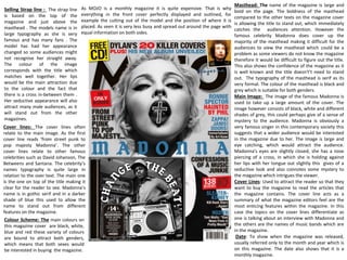
  • 1. As MOJO is a monthly magazine it is quite expensive. That is why everything in the front cover perfectly displayed and outlined, for example the cutting out of the model and the position of where it is placed. As seen it is very less busy and spread out around the page with equal information on both sides. Masthead: The name of the magazine is large and bold on the page. The boldness of the masthead compared to the other texts on the magazine cover is allowing the title to stand out, which immediately catches the audiences attention. However the famous celebrity Madonna does cover up the majority of the masthead making it difficult for the audiences to view the masthead which could be a problem as some viewers do not know the magazine therefore it would be difficult to figure out the title. This also shows the confidence of the magazine as it is well known and the title doesn't’t need to stand out. The typography of the masthead is serif as its very formal. The colour of the masthead is black and grey which is suitable for both genders Main Image: The image of the famous Madonna is used to take up a large amount of the cover. The image however consists of black, white and different shades of grey, this could perhaps give of a sense of mystery to the audience. Madonna is obviously a very famous singer in this contemporary society this suggests that a wider audience would be interested in the magazine due to her. The image is large and eye catching, which would attract the audience. Madonna's eyes are slightly closed, she has a nose piercing of a cross, in which she is holding against her lips with her tongue out slightly this gives of a seductive look and also connotes some mystery to the magazine which intrigues the viewer. Cover Lines: Used to attract the reader so that they want to buy the magazine to read the articles that the magazine contains. The cover line acts as a summary of what the magazine editors feel are the most enticing features within the magazine. In this case the topics on the cover lines differentiate as one is talking about an interview with Madonna and the others are the names of music bands which are in the magazine. Date: To show when the magazine was released, usually referred only to the month and year which is on this magazine. The date also shows that it is a monthly magazine. Selling Strap line : The strap line is based on the top of the magazine and just above the masthead . The models name is in large typography as she is very famous and has many fans . The model has had her appearance changed so some audiences might not recognise her straight away. The colour of the image corresponds with the title which matches well together. Her lips would be the main attraction due to the colour and the fact that there is a cross in-between them . Her seductive appearance will also attract many male audiences, as it will stand out from the other magazines. Cover lines: The cover lines often relate to the main image. As the first cover line reads ‘from street punk to pop majesty Madonna’. The other cover lines relate to other famous celebrities such as David Johanson, The Betweens and Santana. The celebrity’s names typography is quite large in relation to the over text. The main one is the one on top of the title making it clear for the reader to see. Madonna’s name is in gothic serif and in a darker shade of blue this used to allow the name to stand out from different features on the magazine. Colour Scheme: The main colours on this magazine cover are black, white, blue and red these variety of colours are bound to attract both genders, which means that both sexes would be interested in buying the magazine.
  • 2. Contents: The content page for Mojos magazine is very detailed and descriptive describing every aspect in the magazine. It is made clear that are a lot of information about bands and celebrities which meets the audiences expectations because they are clearly interested in this type of music therefore they want to find out more information. The information is laid out under titles which makes it easier f or the reader to know specifically what he/she is about to read . The layout: The layout of the contents page is very clear which makes it easier to read the information that is on the page. The numbers of the pages are bright and red which stands out allowing the reader to access the pages required. The content is displayed in a list on the right, which gives the impression of a large amount of content. A large amount of content is important as it informs the reader about what the magazine consists of by going in to further detail. It also appeals to the reader because it is clear and the reader is easily capable of accessing a lot of information about a certain topic without a hassle. Title: The title for the contents page is simple and formal looking. The white font used is bold and stands out against the white background. The title stands out to the audience because the font is much larger and bolder than the actual text on the contents page. The other title that read contents on the left hand side is bold and stands out to the audience due to the contrast of the lighter color (white) to the darker colors on the page . The text is black on a faded white background to allow the text to stand out. The off white suggests a vintage feel which suits Bob Dylan. Images: The main image on the content page on the left stands out because it is the only image on the page . The model on the image is looking directly at the camera which also helps the image to stand out. The three images in the middle are placed slanted which is dynamic and fits the slightly messy style of the page. There are eight images on the page all at different sizes, this is due to the importance of the image. The colours of the images also vary, some images are black and white and some are extremely colourful and stand out to the audience and the reader. Which will appeal to the audiences as they are bright colours which are gender neutral which will attract a wider audience.
  • 3. Layout The layout of this double page is very neat and in place making it easier to read and access information. There are also subheadings which summaries what the each paragraph on the pages consist of or feature. The titles are displayed in a list which gives the impression of a large amount of content available to the reader. Image The images that are present in this double page are clear which gives the audience an idea of what the magazine will consist of. There are 5 big images on this double page each image reflects on the paragraph that is below it describing it to the audience Text: The double page spread is typed in a simple black font and it is set out in columns. Having the text written in columns makes it easier for the reader to read, as the text doesn't go across the whole page, it also uses the space of the page well and takes up more room of the page. It also breaks the information up and lets the reader digest the information and not get bored by not having a lot of text on the page . Colour scheme: The main colour that stands out is red. This is the first think the audience notice as the font is bold and big . The colour red also connotes power and anger which gives of a theme to the magazine.
  • 4. Mojo is a popular music magazine which is published monthly in the United Kingdom. The main target audiences for this magazine are teenagers and young adults as they are stereotypically the most interested in ‘street’ ‘punk’ and ‘pop’ music. The main attraction to this magazine is famous celebrity Madonna. The costume in which Madonna is wearing on this cover appears to be church school uniform, which is a white blouse and a black coat. A school uniform connotes unity and intelligence. Madonna's hair is fairly short, messy and looks like not much care has been taken when doing her hair. Madonna is slightly off centre camera so that our attention is being drawn straight to her. It has also been taken from a low angle so that Madonna looks bigger than she is and has more authority. The setting of this is just Madonna stood in a studio somewhere in front of a white background. That is the setting for this photograph. The facial expressions which have been used on this cover is that Madonna is looking directly into the camera with her eyes slightly squinted. Madonna has a nose piercing with a cross, which is ironic as it is contradicting the faith of Christianity to urban fashion. This could indicate that the magazine is using religious symbols to express themselves through religion ‘confessions of a music junkie’. The fact that Madonna’s tongue is out could connote a rude immature and also seductive image to the audience, which make the viewer’s believe that this is a mysterious magazine. The colours which have been used on this cover are very good as the colours go with each other. The colours which have been used are red, white, blue, grey and black. These colours go very well with each other and this is why they have been used. The only other colour which has been used is yellow so that it stands out; it is used for a banner stating that the magazine comes with a free cd this interests the audience. The reason why the magazine is quite expensive is because it is a monthly magazine and consists of a wide audience. MOJO
  • 5. Main Image: Lana Del Rey looks like a prom queen gone wrong on the February 2012 issue of UK’s Q magazine. The fact that there is blood on her head yet she is still looking straight at the camera suggests that she powerful and that there is a mystery behind this magazine. The color red does connote danger, speed and fear. Strap Line: The strapline has an impact because of the instruction ‘must’ this suggest that the magazine Q is demanding the audience to download the music, making the magazine affective. It is brightly colored and and placed at the top so the readers attention is drawn to it. Cover lines: the cover line used has been placed on a bright yellow circle, the text reads ‘26 festivals to blow your mind’ this text is in black capitals, this contrast allows the cover line to stand out to the reader. The other cover lines on the Q magazine are distorted so that they stand out. The colour of these cover lines are white and pink which stand out on the grey background , the font is also bold which is eye catching and large which makes it clear to the audience. Layout and theme: the layout of the cover is professional and effective as it allows the important information on the magazine to stand out due to its font and colour. The title is clearly visible and it stands out but the reader is immediately drawn to the main image of the famous Lana Del Rey and the bright pink font that states clearly her name. the background of the magazine cover is neutral and appeals to both genders. Title: Q. The letter Q is large and capital and is placed in front of a bright red banner making it stand out. This states that the magazine is dominant and successful in the magazine industry . The title is placed in the top left hand corner making it clearly visible to the audience. Slogan: ‘DISCOVER GREAT MUSIC’, This slogan is written in bold capital letters and is also in front of a red background making it visible to the audience . The word discover suggests that there is a mystery behind this magazine , the word is also active and encourages the audience to want to read about the content of the magazine . Language: ‘everybody's mad for Lana del Rey so what’s so bloody good ?’ the word bloody is used as a play on word and a rhetorical question which makes the reader want to find out what is behind this statement. The name Lana del Rey is in bright pink making it stand out to the audience . Central image: The central image of Lana del Rey Is a appealing to the audience as she is a very famous and widely loved celebrity. She is using direct mode of address which engages the audience and establishes synthetic personalisation, making the reader feel comfortable. The image is also striking as she is wearing a bright white dress and a tiara which connotes innocence and purity. However the reader is intrigued as there is blood coming out of her head which makes the reader wonder.
  • 6. This article in particular appears to aim at a female target audience preferably older teenagers and young adults. This is because this article discusses ‘feminine’ topics such as hair, makeup and her outfit. Lana Del Rey is wearing a white dress , this connotes femininity and purity. The writer of this article uses of intense description when describing Lana's facial features and expressions, ‘the epic pout’ and ‘big deep pools of her eyes’. The first letter of the article is nearly the same length of the page, and half the width. Often the first letter of a magazine article is larger than the majority of the text but this article has the first letter majorly over exaggerated. Which graves the readers attention encouraging them to carry on reading the information on the page. The letter fills in the white space of the page without having any other photos besides the main photo of Lana Del Rey; the one photo draws all the audiences attention to Lana. The title of 'Lana Del Rey' is small part of the page, the words seem irrelevant in comparison to the large image of Lana which is more useful in defining who the article is about. The image of Lana is very colourful and contrasts with the opposite side which is plain with just black and white colours. The colours used in this article contrast well with the text and the white background making it look neat and professional. The main colours on this magazine article are black white blue and red these colours relate to both genders so it would attract a wider audience. The colours also connote mystery which encourages the audience to read the article .
  • 7. Titles of stories – The titles e.g. ‘140 SONGS TO DOWNLOAD NOW!’, ‘LANA DEL REY’ and ‘PROFESSOR GREEN’ are in a black bold font which is clear, easy to read and stand out. It also fits with the formal and multi-gender theme of neutral colours. There is also a variation of songs which would suit a wider range of people which makes this magazine successful as it is aimed at a wider audience . Content/Language – ‘140 SONGS TO DOWNLOAD NOW!’ is a title that instructs the reader. It is active and direct, making the reader feel as if they are missing out on something if they don’t download the album. It is very encouraging and is one of the largest sections featured on the page. The title is also in capitals which could suggest that the magazine is shouting something at the audience. Layout – The titles are displayed in a list which appears neat and gives the impression of a large amount of content available to the reader to read. The layout of the contents page is very tidy and well put in place making it easier for the audience to read and access information. There are numbers in front of each bit of text this makes it easier for the reader to access the information without a hassle. The title also give a small hint of what the text bellow consists of. Images – In the largest image, an extreme close up of Lana Del Rey, it is focusing on her eye. The main attraction in this image is the blood that is running down her face. She is using direct mode of address which includes the reader and makes them feel comfortable. Her look is unusual and there is blood running down her face which creates a sense of mystery to the reader. This encourages them to find out about her story and why she has blood running down her face. The other two images that are on the contents page are much smaller making the main image of Lana the main attraction on the page. These images are of other celebrities and music bands.
  • 8. Header: The header consists of the names of different artists which are of the same genre of music. This informs the reader of what the magazine consists of and what artists will be featured in the magazine. Colour scheme: The colours used on the front cover of this magazine are bright and vibrant. The main colour that stands out to the audience is the colour red, which is a strong colour, it is used in certain sections of the cover to highlight and emphasise the important features on the magazine. The red also connotes rebellion which is linked to the genre of the rap. The background that is used is a faint blue colour, this allows the audience to focus on the main image of Eminem. Masthead: The masthead VIBE is bold and in capital letters, this makes it stand out and also appear more obvious and more dramatic so that it fits to the genre of the music . The colours of the masthead are black and red which are bold colours this relates to Eminem’s music. Cover Lines: The cover lines around the image of Eminem are in much smaller fonts than the main cover lines . These cover lines highlight the genre of the music and the artists that this specific magazine consists of. The main cover line that stands out form the magazine is the name EMINEM in capital letters. The last letter is slightly covered by the image of Eminem this allows the image to appear 3D which makes it stand out to the audience. Main Image: The main is of Eminem looking straight at the camera with a serious, hard looking expression on his face. The image is of a mid shot Eminem has his arms crossed in a strong stance. The pose and facial expressions has been used to show of the rappers persona of being tough and strong. The crossing of his arms allows his tattoos to stand out in front of the white background, which also adds on to his look.
  • 9. Double page: This is a double page spread on Eminem on the magazine 'Vibe'. The main colours used for this double page spread are white, black and red. The red presents the contrast of him being covered in blood and with the statement ' i almost died and i still went back to using'. This could be a story behind the album that he has created .The word 'Eminem' is written in the bottom right hand corner and the E is written in red and is placed backwards, this is a trade mark for Eminem. There is one image on the page and the picture is placed in the middle of the page, breaking up the text making it stand out . The page is split up into two parts, the picture separating them. This makes the magazine unique compared to any other music magazine . Main Image: The picture is of Eminem is a long/mid-shot and it is the main focus of the page, so the reader knows instantly what the article will be about. The picture consists of him holding a knife covered in blood. He is wearing a white apron covered in blood which makes the audience wonder. This shows that the article will be about something personal about Eminem, and how he ' almost died'. The text in the corner of the page links with the picture and gives the audience a clue about how he ‘almost died'. It is a very powerful picture to have on the page, as it is the first thing the reader would notice and has an impact on the reader making them want to read the whole article to find out what has happened to the rap ‘god’. In most of Eminem's images he appears to be a serial killer, this adds on theme the violent theme to his music. Text: The double page spread is typed in a simple black font and it is set out in columns. The typography used is sans serif which makes the magazine look simple and sophisticated Having the text written in columns makes it easier for the reader to read and also makes it look very neat and organised, as the text doesn't go across the whole page, it also uses the space of the page well and takes up more room of the page.. The simplicity of the page encourages the reader to carry one reading the content. Colour scheme: The colours that stand out from this double page are red, white and black. These colours work well together, contrasting with the white background. The fact that there are limited colours make the pages appear very simple and neat. The colour of the writing is black making it stand out and also making it simple to read. The colour rad on Eminem's clothing and face is very bright making the first thing that catches the audiences attention. These colours also work well together creating a sense of mystery to the audience .
  • 10. Main image: This contents page focuses on the rap artist Eminem. He is wearing a smart suite and is stood in front of a dark red curtain and which allows him to stand out from the rest of the features on the magazine. This perhaps is an ideology for the dark music produced in his new album. He is looking directly into he camera his facial expressions are serious and quite intimidating , showing that there is a meaning behind his music. The smart suit suggests that he is a professional at what he does and that he is at the top oh his raping career. Features: The content features are placed on the right hand side of the page and is written in a small grey font so the attention isn't taken away from the main image of Eminem. The magazine contents page does not make clear that it is a contents page however the layout is clear that it is a contents page from the 'features' sub- title and the page numbers down the left side of the text. Text: Some of the texts on the contents text is written in yellow and is bold signifying its importance this makes it stand out compared to the rest of the text. This is useful as it helps the reader find out what each page will consist of. The text is set out in a very simple way making it clear to the reader and easier to read and spot the feature that they are willing to read. Colour scheme : The colour scheme throughout the content page is dark, allowing the main image of Eminem to stand out to the audience. The dark colours featured on the contents gives of a sense of mystery to the audience . This could perhaps be the them of his new album.
  • 11. Lana Del Rey is featured on this month's issue of Vogue. She is a well known and loved artist. She was relevant at that time as her new album was released 'Born to Die' it came out to fantastic chart placing's and rave reviews. Lana is the main focus of the cover as she is looking directly at the camera . She is also wearing a bright yellow dress which stands out from the pale pink background Masthead: The masthead of Vogue is used by all the Vogues around the world, however what changes is the colour of it. This is dependent on the theme or topic of the magazine. In this case pink which connotes femininity. The letter G is blocked out by Lana’s head hover the magazine is still recognisable due to its publicity and fame. Date of issue and price: These feature on the left hand side of the cover, which drawyour attention immediately due to the big fonts are the main features in the magazine. As Vogue is a monthly publication it is useful as you know whether there is a new issue in the magazine. Also the price being underneath it as well is useful because for first time buyers it lets them know straight away how much they will be spending. Colour scheme: This issue of Vogue features different shades of pink and some black . This contrast's well with the white and yellow of Lana's outfit. The pink is stereotypically a feminine colour which appeals to the magazine's target audience as the magazine consists of fashion related issues. The colour scheme would be striking on the shelf, hence grabbing more people's attention and possibly more readers . Font used and main cover line: The font used in the main cover line is serif which is feminine and classy which makes the audience straight away assume that it is a fashion magazine. Vogue uses deep pink colours which shows up well against the pale pink background and yellow of Lana's dress. There is a different font used for the main cover line which allows it to stand out form the rest. There is also an exclamation mark at the end which makes it exciting for the audience . The cover line takes up the whole of the bottom of the cover to show its importance in the magazine and that it might relate to Lana. This also grabs the audiences attention as they are eager to find out about Lana's fabulous new look. Main Celebrity Image
  • 12. The colour of the mast head is bright pink which immediately makes it female targeted. The masthead is also all in capital bold letters making it eye catching to customers, even though the font is simple it is still easily recognisable and attention grabbing The masthead is also placed behind the main images head showing that it is a well known, popular magazine as you can still tell what magazine it is and what its called even though a few of the letters are covered by Alisha's head. The colour of the mast head immediately tells the audience that this magazine is ‘girly’ and a summer related magazine Main image: The main image on Cosmopolitan is of Alesha Dixon she is a famous singer, but the magazine are advertising is not music. This image of Alisha could be seen in a sexualised way as she is looking directly into the camera and is pulling a seductive look, showing the whole of her body off, however this image is not revealing as she is covered up and wearing fashionable ‘chic’ like clothes, making it less sexualised compared to other main images. The main image is also centred right in the middle of the cover, it is the only image used on the cover, making it more eye catching and allowing it to stand out. There are not many cover lines are placed over the image this allows the image to be centre of attention, it also makes clear her face and pose making it attention grabbing to the people that see it. Cover Lines: The typography is sans serif. There various cover lines used on this cover of Cosmopolitan, this makes the cover appear to be busy, fun and interesting, making it eye catching to the audience that see it as they will be attracted at the main cover line which reads ‘SUMMER’ in capital letters which is attention grabbing and allows it to stand out from other magazines The cover lines also help outline the main features that the magazine consists of. The magazines cover lines give of a sexual theme to the magazine as the cover lines read 'New Orgasm', 'Fantasy Sex' and 'Careers' this also targets a certain group in the audience which is mainly female young adults. This magazine would not Features: The cover lines mention make up, nail art and fashion which indicate that the magazines main target audience are female this is due to the stereotypical view that makeup, nail art and fashion is seen as a feminine thing. The cover line underneath the main line says 'See it, want it, wear it' this is catchy and attention grabbing as they are short snappy words that are easy to pick up on. The feature 497 top fashion buy stands out the most as it is written on top of a orange stamp which makes it eye catching Masthead:
  • 13. My music magazine plan Salma El-sayed