
Recommended
More Related Content
What's hot
What's hot (19)
Viewers also liked
Similar to Magazine Double Page Spreads: Visual Storytelling Techniques
Similar to Magazine Double Page Spreads: Visual Storytelling Techniques (20)
More from Mollie Owen
More from Mollie Owen (20)
Recently uploaded
Recently uploaded (20)
Magazine Double Page Spreads: Visual Storytelling Techniques
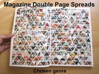
- 1. Magazine Double Page Spreads Chosen genre
- 2. NME Magazine • There is a quote from the band which is used as a title/masthead to give the reader a taste of what the entire article is going to be based on. • The buzz words; ‘World Exclusive’ entice the readers as this is a one of interview that will not be shown and published any where else. • The main medium close up shot is showing the lead singer of the band, highlighting his importance. • The other images on the double page spread and this is just a visual aspect to the article so the readers can feel like they can relate more to what is being said and their interview. • The text in the middle of the second of the pages on the double page spread regardless of its importance has only taken up not even a quarter of the entire two pages as the editor deemed the images to be of more importance and more eye catching, to lure the readers in at the start. • The colour scheme of the double page spread red, white and black. It’s a very typical colour scheme to be followed for rock bands. Fierce looking layout and impact colours. • The box presented information of the right hand side of the second page with a white background, offers additional and extra information about the band is exclusive as it is something you cannot read elsewhere, hence it being made to stand out on the vibrant white background.
- 3. Q Magazine • The text- ‘USA’, anchors in with the main full body shot of Florence Welch as she is sat on an American flag. • The main full body image bleed takes up just over half of the double page spread, including the picture of Florence, the flag and the USA anchor. • The main image is Florence Welch from a band called Florence and the machine. All of the colours link in with one another and blend together, e.g. Florence’s hair and the red lines on the American flag she is sitting on. • Florence appears to be looking into the eyes of the reader, as she’d looking directly into the camera. She is making a connection with the audience/readers and enticing them into read the article as they deem it more personal due to the connection that is apparent. • The drop capital at the start of the first paragraph grabs the attention of the audience, its reinforced also when it is the same font as the bold writing above; ‘got the love’. • ‘Got the love’ also applies and links back to one of Florence’s most famous songs; ‘You’ve got the love’. http://www.youtube.com/watch?v=PQZhN65vq9E
- 4. Billboard Magazine • This double page spread is an extremely discreet one as the middle cut of section between the two pages on the double page spread is usually prominent and visible. • The main image bleeds onto both of the double page spread pages as it the most prominent and eye catching part of the entire article, it’s there to entice the reader, as Idina looks so aesthetically it attracts not only males but females also, as they want to know more about how she looks so good, and where she got that dress, and what make-up she uses, and so on. • The colour schemes are all quite dull yet vibrant colours. The white flowers (roses) stands out and makes a lasting impact against the black dress and Idina’s jet black hair blends sophistically with the outfit as well. Also, the white roses in the dress match well with the writing and text on the page as they have been written in the same colour, and also her porcelain skin tone goes with the innocent and pure white scheme found. Furthermore, the magazine double page spread has supringsingly and juxtaposing sophisticated yet rustic, distressed vinatge look to it as although Idina is dressed and done up, her surroundings aren't what up's recognise stereotypical sophisticated surrounding to look like.