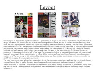
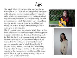
This document analyzes how the author's media product uses and challenges conventions of real music magazines.
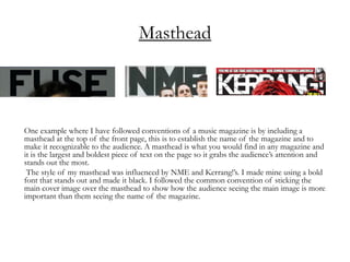
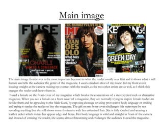
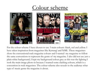
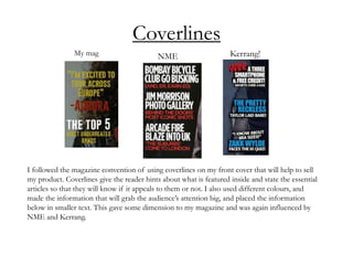
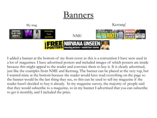
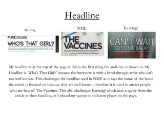
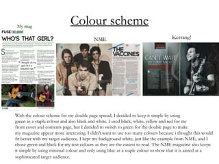
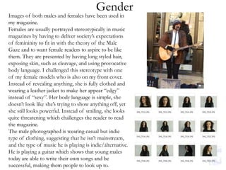
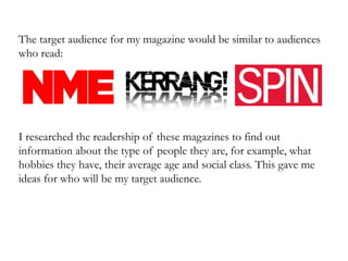
The author follows conventions like including a masthead and using coverlines, but challenges stereotypes with the front cover image. Female representation on the cover challenges portrayals as appealing to the "male gaze." Layout, colors, and images used also reference magazines like NME and Kerrang! while tailored for the author's target audience.
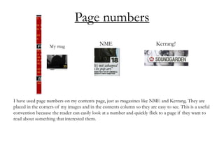
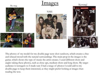
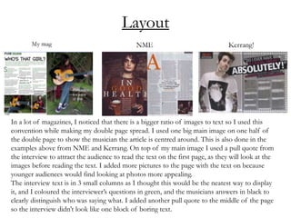
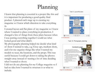
The contents page maximizes images over text for engagement. Double page spreads employ large central images, pull quotes, and a mix of photos and columns of text. Page design draws from examples but adapts them.
Throughout, the author considers representation of age, gender and social groups