SlideShare a Scribd company logo
MAGAZINE SLOGAN                                       Research and Design – Front Cover
                                         I have chosen to go with the colour scheme of
 MAST                                   black, red and white. These three colours
 HEAD                                   compliment each other well and allow me to
                                        make certain cover lines and quotes stand out
COVERLINE
                       Main             to capture the audiences attention. These
                                        colours are also quite professional and would
                      Picture           appeal to the target audience (hip-hop fans) in
COVERLINE                               comparison to using colours such as green,
                                        pink or yellow.
PULL QUOTE                              Another convention in which I would like to
                                        incorporate from my research of the hip-hop
                                        magazine XXL is the cover line being at a
                LINE                    slanted angle with the strap line anchoring it
         C OVER
                                        below. I used this effect to make the magazine
               LINE
                              BARCODE


         STRAP                          more interesting instead of the magazine
             BANNER
                                        front cover looking plain and boring with
                                        just a block text and a picture.
                                        A convention in which I would like to
                                        incorporate from XXL magazine is having
                                        the magazine slogan above the masthead,
                                        I feel that if the slogan was placed
                                        anywhere else it would take away from
                                        the impact that the brand will have on the
                                        audience.
Research and Design – Front Cover
    LOGO                                        2

SLOGAN                   I have chosen to alter my initial plans of the front cover
                         to this style.
                         I have chosen this house style over the initial one as
                         this is more structured and gives a professional look.
          MAIN PICTURE   I like the way that all of the text and cover lines are
                         placed at the bottom of the front cover, this gives the
                         audience a clear view of the featured artist and makes
           COVER         the magazine cover look less cluttered and edgy.
ARTIST NAME LINES        If the magazine did look cluttered and edgy the
                         audience would have a different view on the genre of
            STRAPLINE    the magazine, they would think it was based on Rock
BARCODE


             BANNER      or Metal.
Research and Design – Contents Page
  CONTENTS TITLE
 STRAPLINE OF MAIN ARTICLE
                                  I have chosen to place the title of contents
                                      at the top of page reaching both ends
                                      of the page with the strapline of the
                                      main article beneath it, I think this
  MAIN PICTURE                        structured look ties in with the rest of
  OF FEATURED                         the house style.
     ARTIST
                   PAGE NUMBERS
                   AND CONTENTS   I have chosen to place the page numbers
                                      and contents on the right hand side
                                      reaching the bottom of the page, this
                                      again ties in with the structured house
                                      style in which I wish to achieve.
BANNER OF PHOTOS
                                  I have decided to put the main picture of
                                      the artist below the strapline as it will
                                      anchor the picture correctly. The
                                      banner of photos below will also relate
                                      to the contents of the magazine and
                                      again stay within the structured house
                                      style.
Research and Design – Double Page Spread

                                      All of the chosen conventions on this page is
                     PULL QUOTE       again reinforcing the structured house style in
                   FROM THE ARTICLE
                                      which I am following.
WHOLE PAGE PHOTO                      The colour scheme is going to be white
 OF INTERVIEWED
      ARTIST
                    MAIN TEXT BODY
                                      background with black text, this makes it easy
                      OF ARTICLE      to read and it will look clean and professional.
                                      The pull quote from the article is going to be in
                                      a strong bold font and again it will be black.
                                      This will make the quote stand out from the
                                      page and entice the reader to read the full
                                      article.
                                      The main picture of the featured artist of the
                                      article is going to have a whole page spread of
                                      the picture.

More Related Content

What's hot

Front Cover Analysis
Front Cover AnalysisFront Cover Analysis
Front Cover Analysis
Charis Creber
 
Conventions of music magazines
Conventions of music magazinesConventions of music magazines
Conventions of music magazinesjackshukie
 
Double page spread analysis – blender 2
Double page spread analysis – blender 2Double page spread analysis – blender 2
Double page spread analysis – blender 2asmediac12
 
Analysing of front page drafts
Analysing of front page draftsAnalysing of front page drafts
Analysing of front page draftsAlexMarshall16
 
AS Media Evaluation: Question 1
AS Media Evaluation: Question 1AS Media Evaluation: Question 1
AS Media Evaluation: Question 1lewyi17
 
Analysing contents pages prep for blog
Analysing  contents pages prep for blogAnalysing  contents pages prep for blog
Analysing contents pages prep for blogasmediag12
 
Drafting ideas
Drafting ideasDrafting ideas
Drafting ideasasmediaf12
 
Evaluation Q1
Evaluation Q1Evaluation Q1
Evaluation Q1joedeer
 
Contents Page Analysis
Contents Page AnalysisContents Page Analysis
Contents Page Analysislydiaplatts
 
Textual analysis
Textual analysisTextual analysis
Textual analysisAmyDoyle_
 

What's hot (18)

Front Cover Analysis
Front Cover AnalysisFront Cover Analysis
Front Cover Analysis
 
Conventions of music magazines
Conventions of music magazinesConventions of music magazines
Conventions of music magazines
 
Double page spread analysis – blender 2
Double page spread analysis – blender 2Double page spread analysis – blender 2
Double page spread analysis – blender 2
 
Analysing of front page drafts
Analysing of front page draftsAnalysing of front page drafts
Analysing of front page drafts
 
AS Media Evaluation: Question 1
AS Media Evaluation: Question 1AS Media Evaluation: Question 1
AS Media Evaluation: Question 1
 
Evaluation
EvaluationEvaluation
Evaluation
 
Question 72
Question 72Question 72
Question 72
 
Analysing contents pages prep for blog
Analysing  contents pages prep for blogAnalysing  contents pages prep for blog
Analysing contents pages prep for blog
 
Drafting ideas
Drafting ideasDrafting ideas
Drafting ideas
 
Evaluation Q1
Evaluation Q1Evaluation Q1
Evaluation Q1
 
Evaluation
EvaluationEvaluation
Evaluation
 
Evaluation q1
Evaluation q1Evaluation q1
Evaluation q1
 
Contents page
Contents pageContents page
Contents page
 
Question 3
Question 3Question 3
Question 3
 
Magazine analysis film 1
Magazine analysis film 1Magazine analysis film 1
Magazine analysis film 1
 
Contents Page Analysis
Contents Page AnalysisContents Page Analysis
Contents Page Analysis
 
Textual analysis
Textual analysisTextual analysis
Textual analysis
 
3
33
3
 

Viewers also liked

Lonkaluento190913 #kopsy
Lonkaluento190913 #kopsyLonkaluento190913 #kopsy
Lonkaluento190913 #kopsy
Kirsti Lonka
 
Lonka ewf2013
Lonka ewf2013Lonka ewf2013
Lonka ewf2013
Kirsti Lonka
 
Research and Design of Music Magazines
Research and Design of Music MagazinesResearch and Design of Music Magazines
Research and Design of Music Magazinesconnorcrick
 
Kehitys- ja oppimispsykologia Lonkaluento110913final
Kehitys- ja oppimispsykologia Lonkaluento110913finalKehitys- ja oppimispsykologia Lonkaluento110913final
Kehitys- ja oppimispsykologia Lonkaluento110913final
Kirsti Lonka
 
Cеминар "Первое Впечатление"
Cеминар "Первое Впечатление"Cеминар "Первое Впечатление"
Cеминар "Первое Впечатление"
Natasha Tan
 
Educalonka2013
Educalonka2013Educalonka2013
Educalonka2013
Kirsti Lonka
 
танделова мадина
танделова мадинатанделова мадина
танделова мадинаmadytee
 
Praguelonkafinal2012
Praguelonkafinal2012Praguelonkafinal2012
Praguelonkafinal2012
Kirsti Lonka
 
Lonkaluento130913final
Lonkaluento130913finalLonkaluento130913final
Lonkaluento130913final
Kirsti Lonka
 
Ketonen et al. EFYE2013
Ketonen et al. EFYE2013Ketonen et al. EFYE2013
Ketonen et al. EFYE2013
Kirsti Lonka
 
Lonka minerva2013
Lonka minerva2013Lonka minerva2013
Lonka minerva2013
Kirsti Lonka
 
Encounterslonka2013long
Encounterslonka2013longEncounterslonka2013long
Encounterslonka2013long
Kirsti Lonka
 
Hip hop music genre
Hip hop music genreHip hop music genre
Hip hop music genreconnorcrick
 
Стиль активной мамы
Стиль активной мамыСтиль активной мамы
Стиль активной мамы
Natasha Tan
 
Secondary storage structure-Operating System Concepts
Secondary storage structure-Operating System ConceptsSecondary storage structure-Operating System Concepts
Secondary storage structure-Operating System Concepts
Arjun Kaimattathil
 

Viewers also liked (16)

Lonkaluento190913 #kopsy
Lonkaluento190913 #kopsyLonkaluento190913 #kopsy
Lonkaluento190913 #kopsy
 
Lonka ewf2013
Lonka ewf2013Lonka ewf2013
Lonka ewf2013
 
Research and Design of Music Magazines
Research and Design of Music MagazinesResearch and Design of Music Magazines
Research and Design of Music Magazines
 
Kehitys- ja oppimispsykologia Lonkaluento110913final
Kehitys- ja oppimispsykologia Lonkaluento110913finalKehitys- ja oppimispsykologia Lonkaluento110913final
Kehitys- ja oppimispsykologia Lonkaluento110913final
 
Cеминар "Первое Впечатление"
Cеминар "Первое Впечатление"Cеминар "Первое Впечатление"
Cеминар "Первое Впечатление"
 
Educalonka2013
Educalonka2013Educalonka2013
Educalonka2013
 
танделова мадина
танделова мадинатанделова мадина
танделова мадина
 
Praguelonkafinal2012
Praguelonkafinal2012Praguelonkafinal2012
Praguelonkafinal2012
 
Lonkaluento130913final
Lonkaluento130913finalLonkaluento130913final
Lonkaluento130913final
 
Ketonen et al. EFYE2013
Ketonen et al. EFYE2013Ketonen et al. EFYE2013
Ketonen et al. EFYE2013
 
Lonka minerva2013
Lonka minerva2013Lonka minerva2013
Lonka minerva2013
 
Projekt
ProjektProjekt
Projekt
 
Encounterslonka2013long
Encounterslonka2013longEncounterslonka2013long
Encounterslonka2013long
 
Hip hop music genre
Hip hop music genreHip hop music genre
Hip hop music genre
 
Стиль активной мамы
Стиль активной мамыСтиль активной мамы
Стиль активной мамы
 
Secondary storage structure-Operating System Concepts
Secondary storage structure-Operating System ConceptsSecondary storage structure-Operating System Concepts
Secondary storage structure-Operating System Concepts
 

Similar to Research and Design

One and five
One and fiveOne and five
One and fivekellym003
 
Task 1- Evaluation
Task 1- Evaluation Task 1- Evaluation
Task 1- Evaluation asmediaf12
 
Cover Production
Cover ProductionCover Production
Cover Production
Pikachunicorn
 
My Music Magazine - Plan
My Music Magazine - PlanMy Music Magazine - Plan
My Music Magazine - Plan
hhunjan07
 
Evaluation Question 1
Evaluation Question 1Evaluation Question 1
Evaluation Question 1asmediaf12
 
Annotating flatplans
Annotating flatplansAnnotating flatplans
Annotating flatplans
Bethany Quigley
 
Presentation
PresentationPresentation
PresentationMasumaU
 
Evaluation question 1
Evaluation  question 1Evaluation  question 1
Evaluation question 1ChloeHicks
 
Question 1 (Improved)
Question 1 (Improved)Question 1 (Improved)
Question 1 (Improved)
James Reeson
 
Evaluation q1
Evaluation q1Evaluation q1
Evaluation q1Ollie1994
 
Question 1-7
Question 1-7Question 1-7
Question 1-7shaqsuave
 
Analysing contents pages prep for blog ppt
Analysing  contents pages prep for blog pptAnalysing  contents pages prep for blog ppt
Analysing contents pages prep for blog pptasmediag12
 
Contents Page Analysis
Contents Page Analysis Contents Page Analysis
Contents Page Analysis lydiaplatts
 
Media evaluation. Blue Parker
Media evaluation. Blue ParkerMedia evaluation. Blue Parker
Media evaluation. Blue Parker
blueparker
 
Analysing contents pages prep for blog ppt
Analysing  contents pages prep for blog pptAnalysing  contents pages prep for blog ppt
Analysing contents pages prep for blog ppt
asmediag12
 
Evaluation question 1
Evaluation question 1 Evaluation question 1
Evaluation question 1 Rebeccahartx
 

Similar to Research and Design (20)

One and five
One and fiveOne and five
One and five
 
Task 1- Evaluation
Task 1- Evaluation Task 1- Evaluation
Task 1- Evaluation
 
Cover Production
Cover ProductionCover Production
Cover Production
 
My Music Magazine - Plan
My Music Magazine - PlanMy Music Magazine - Plan
My Music Magazine - Plan
 
Evaluation Question 1
Evaluation Question 1Evaluation Question 1
Evaluation Question 1
 
Annotating flatplans
Annotating flatplansAnnotating flatplans
Annotating flatplans
 
Question one
Question oneQuestion one
Question one
 
Presentation
PresentationPresentation
Presentation
 
Evaluation question 1
Evaluation  question 1Evaluation  question 1
Evaluation question 1
 
Question 1 (Improved)
Question 1 (Improved)Question 1 (Improved)
Question 1 (Improved)
 
Vibe magazine
Vibe magazineVibe magazine
Vibe magazine
 
Evaluation q1
Evaluation q1Evaluation q1
Evaluation q1
 
Question 1-7
Question 1-7Question 1-7
Question 1-7
 
Analysing contents pages prep for blog ppt
Analysing  contents pages prep for blog pptAnalysing  contents pages prep for blog ppt
Analysing contents pages prep for blog ppt
 
Evaluation Q5
Evaluation Q5Evaluation Q5
Evaluation Q5
 
Music magazine
Music magazineMusic magazine
Music magazine
 
Contents Page Analysis
Contents Page Analysis Contents Page Analysis
Contents Page Analysis
 
Media evaluation. Blue Parker
Media evaluation. Blue ParkerMedia evaluation. Blue Parker
Media evaluation. Blue Parker
 
Analysing contents pages prep for blog ppt
Analysing  contents pages prep for blog pptAnalysing  contents pages prep for blog ppt
Analysing contents pages prep for blog ppt
 
Evaluation question 1
Evaluation question 1 Evaluation question 1
Evaluation question 1
 

Research and Design

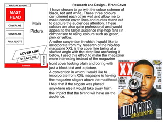
  • 1. MAGAZINE SLOGAN Research and Design – Front Cover I have chosen to go with the colour scheme of MAST black, red and white. These three colours HEAD compliment each other well and allow me to make certain cover lines and quotes stand out COVERLINE Main to capture the audiences attention. These colours are also quite professional and would Picture appeal to the target audience (hip-hop fans) in COVERLINE comparison to using colours such as green, pink or yellow. PULL QUOTE Another convention in which I would like to incorporate from my research of the hip-hop magazine XXL is the cover line being at a LINE slanted angle with the strap line anchoring it C OVER below. I used this effect to make the magazine LINE BARCODE STRAP more interesting instead of the magazine BANNER front cover looking plain and boring with just a block text and a picture. A convention in which I would like to incorporate from XXL magazine is having the magazine slogan above the masthead, I feel that if the slogan was placed anywhere else it would take away from the impact that the brand will have on the audience.
  • 2. Research and Design – Front Cover LOGO 2 SLOGAN I have chosen to alter my initial plans of the front cover to this style. I have chosen this house style over the initial one as this is more structured and gives a professional look. MAIN PICTURE I like the way that all of the text and cover lines are placed at the bottom of the front cover, this gives the audience a clear view of the featured artist and makes COVER the magazine cover look less cluttered and edgy. ARTIST NAME LINES If the magazine did look cluttered and edgy the audience would have a different view on the genre of STRAPLINE the magazine, they would think it was based on Rock BARCODE BANNER or Metal.
  • 3. Research and Design – Contents Page CONTENTS TITLE STRAPLINE OF MAIN ARTICLE I have chosen to place the title of contents at the top of page reaching both ends of the page with the strapline of the main article beneath it, I think this MAIN PICTURE structured look ties in with the rest of OF FEATURED the house style. ARTIST PAGE NUMBERS AND CONTENTS I have chosen to place the page numbers and contents on the right hand side reaching the bottom of the page, this again ties in with the structured house style in which I wish to achieve. BANNER OF PHOTOS I have decided to put the main picture of the artist below the strapline as it will anchor the picture correctly. The banner of photos below will also relate to the contents of the magazine and again stay within the structured house style.
  • 4. Research and Design – Double Page Spread All of the chosen conventions on this page is PULL QUOTE again reinforcing the structured house style in FROM THE ARTICLE which I am following. WHOLE PAGE PHOTO The colour scheme is going to be white OF INTERVIEWED ARTIST MAIN TEXT BODY background with black text, this makes it easy OF ARTICLE to read and it will look clean and professional. The pull quote from the article is going to be in a strong bold font and again it will be black. This will make the quote stand out from the page and entice the reader to read the full article. The main picture of the featured artist of the article is going to have a whole page spread of the picture.