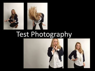
2. Long Shot, I think that this image could work as both a cover image and a double page spread. It is not a stereotypical imagee for a cover however the text positing would work well around the image as there is enough space to fit in the masthead and sell lines around the image, the pose is also original crouching down as appose to a stereotypical mid shot.
3. Mid shots are the most used images for magazine covers. This image uses the rule of thirds, keeping the eye line on the top third- Leaving enough room at the top for masthead to fit and positing the model again with enough room to fit sell lines around her. She is looking directly into the camera suggesting she is addressing the audience and has her hand on her hip, suggesting she has attitude which would fit in perfectly with my magazines genre.
4. Mid action shot. I asked my model to dance and ‘whip her hair’ back and forth in order to create this image. think it is effective and has been captured well by the camera, I also think that using a shot like this would make my magazine appear more fun and appeal to a younger audience, it would also most likely be used on a double page spread or contents as it is not clear enough or a good model positioning to use as a cover image.
5. This image is a mid shot however it is landscape with the model positioned to the far right of the frame, making her the first thing we are attracted to look at. I think this image would be ideal to use as a double page spread as the image could be separated and the rest of the background could be used for the article and it would give a sense of continuity as appose to breaking the image up too much, I think the body language in the image works well too, making it appear sexy with the necklace in her mouth but also giving an innocent impression, playing on the conventions of images for my genre.