SlideShare a Scribd company logo
1 of 3
The masthead Q relates to
‘cueing’ is the process of putting the cue leaver onto the vinyl
player. The ‘Q’ actually looks like this process. Q and cue are
both pronounces the same inferring Q is a magazine that is
delicately produced and is made with care. In addition the Q
masthead is visible on the front of every Q magazine and
therefore when people look at it they know exactly the genre of
the magazine. In addition the fact the Q is bold at a large font
suggests the magazine is a strong and successful magazine.
Subsequently, the red box behind the Q is a form of attracting
the customers, the point of the box is purely to stand out against
competitors. To continue the colour red has connotations of
love, death but also domination which suggests their target
audience is probably: middle aged working class.
The non direct address of Ed Sheeran infers that Ed Sheeran is
perusing a music career because of his music passion and therefore
he doesn’t need to focus on attracting an audience and he doesn’t
necessarily care about fame. An alternative negative interpretation is
perhaps Ed Sheeran doesn’t care about his connections with his fan
and therefore he has no interest in trying to interact with them. The
full bleed exaggerates how Ed Sheeran is the main focus and
consequently at the top of the hierarchy. In addition he looks quite
shocked as he cant believe he’s reached ‘global superstardom’!
Ed Sheeran is wearing a leather bomber jacket; the jacket has a
symbolic sign of being seen as ‘cool’ but alternatively the fact it’s the
style of a bomber jacket Makes Ed Sheeran seem relaxed he doesn’t
need to constantly try to gain fans he can just be himself. The light is
also directly on Ed sheerans face implying that his personality may
shine through more than his music. The fact he is holding is guitar
exaggerates his passion towards music but perhaps his guitar is his
main feature his fan base aspire to. In addition, having the guitar in
the full bleed informs the reader who may not necessarily know
what ‘q’ magazine contains what sort of genre is included. They
haven’t actually used any thumbnails because Q magazine is a strong
magazine using strong artists and therefore they don’t need to show
everything that’s inside. An alternative interpretation is just the fact
sometimes thumbnails can look quite unprofessional.
‘Q’ magazine has a continuous colour scheme throughout all their
magazines: red with the shades white, black and grey. On this front cover
the colour of importance is red, this means those at the top at the hierarchy:
Q magazine, Ed sheeran and one of the main selling points appeal clearly to
the reader. Therefore all those lower down the hierarchy are in white,
although they’re still important as they attract a wider range of audiences.
‘Ed sheeran- an everyday tale of one man, his guitar and global
superstardom…’ is the main selling line for q magazine hence why its
placed directly in the centre of the magazine. This highlights this story
is the centre of importance in this issue. Again, ‘Ed Sheeran’ is in red to
stand out but alongside that it’s also in a different font compared to
the rest of the sell lines. The use of the different font depicts Ed
sheeran is original with his own identity and doesn’t need to constantly
fit in. This is something an audience/ upcoming artists are likely to
aspire to because he’s got such a big fan base but at the same time he’s
extremely down to earth putting across the message that do what
makes you happy and let people except you for you. The other sell
lines (lower down in the hierarchy) but they’re there to appeal to the
audience informing them about what’s inside. The writing that’s in a
much bigger font are more prominent on the page making them be
one of the main reasons someone would potentially buy the magazine.
‘Q’ magazine contains some Administrative
detail on the front cover which is used to inform
the audience. The contain the price of the
magazine: £3.99. However the purpose of the
magazine is to make their audience so their
attention isn’t on the price.
Typography: The san serif font used on the front cover suggests the
magazine hasn’t got a specific gender it wants to appeal to as is if
used serif fonts it would seem a bit more girly.
The use of the banner: ‘ESSENTIAL!’ and the button: ‘50 albums of
2014 your definitive must hear list’ is a way of promoting what's
inside and as its large it could be one of their main selling points.
The masthead: Billboard is the largest san serif font on the front
cover suggesting it’s at the top of the hierarchy of importance and
again it’s something the audience may familiarize with and
therefore they want they want their audience to recognise that.
Although the full bleed of Katy Perry is actually covering some of
the mast head. This suggests two things… Firstly, Katy Perry is the
main selling point for the magazine and therefore needs to be the
centre of attention but secondly Billboard is so well known it
doesn’t need to be the main focus and despite the fact you cant
see all the letters because its so well known the audience will more
than likely be able to fill the gaps. To continue, the use of the blue
and yellow in the masthead connate the magazine is multi- gender
automatically increasing it’s target audience but also its more
visually appealing and eye catching for the audience.
The direct address of Katy Perry automatically creates a connection
with the audience also indicating that she’s someone who cares
about her fandom and wants to make them feel accepted and
wanted. The full bleed is of Katy Perry in a flowery rather unique
dress which you could argue links in with her personality. Flowers
have connotations of happiness and being fragile which is the view
many people may have of Katy, but in this magazine she appears to
be putting on a brave face at the same time you could say the
flowers represent Katy Perry blossoming into a strong solo artist.
This feature is something many up coming artists are likely to
aspire and therefore they’re likely to buy the magazine. In addition,
Katy Perry has a full face of makeup mainly using pink, this and the
pink background infer the magazine’s target audience is females.
Also, the fact she’s wearing a lot of makeup suggests she's trying to
be someone that everyone can look to but also just emphasising
the fact she’s a very girly character.
The main colour scheme is black and yellow including white
and orange. This makes the magazine just have more of a
professional look. ‘Billboard’ and ‘Katy Perry’ are both in
bold and at a bigger san serif font due to order of
importance: they’re at the top of the hierarchy and
audiences are generally quite materialistic so they tend to
see the things that are bigger and brighter first.
The use of including the date is to inform the reader if
they’re buying a new issue but also it helps them keep up to
date with when the next issue is due. However the
magazine doesn’t use any other administrative detail
making the magazine seem quite basic. At the same time
this could be inconvenient to the audience as they may
have to go out of their way to find out how much the
magazine costs although the price may be on the back.
Billboard doesn’t include many sell indicating they’re a very
strong magazine and they don’t need to promote
everything that’s inside their magazine they tend to focus
on promoting one main selling point. ‘Katy Perry’ is the
main sell line, she has a large fan base and increases the
magazines target audience. Katy Perry is also well known
and therefore allot of the general public would ever aspire
to here or be interested in the gossip said about her. The
other sell lines are in a small font. One of the sell lines that
stands out to me is ‘Beyond Farmvile’ as this isn’t
necessarily about music and therefore makes the magazine
suitable for all taste’s.
This magazine doesn’t include any banners but it
does include a button which is used to highlight
one of the magazines best bit: chart heat. The
range of artists named again, increases the target
audience. The fact the main titles are in yellow is
one visually appealing but secondly indicates their
no specific genre that this magazine is aimed at.
The direct adrdess of Rhianna along side her facial
expression: an over the top pose exaggerates her
confidence. She also looks quite love struck which
links to one of the main sell lines: ‘crazy in love’ Half of
Rhianna’s face Is covered suggesting she’s got a side to
her she’s either not proud of or doesn’t want people
to se however the fact she looks like a strong powerful
woman is a trait many will aspire to. Rhianna is
covering the masthead suggesting she’s at the top of
the hirachy .
The masthead RollingsStone is in a large font which
is red. It is partly covered suggesting it’s so well
known. Rolling stone is actually one of the most
well known bands which in a way makes this
magazine more respected and again stands out
more even though it isn’t named after the band.
The magazine is 44.99 suggesting their target
audience is middle to working class and it
perhaps not for children as its too expensive. It
indicates the magazine is quite grown up and
mature, something that mainly adults will enjoy.
In comparison to the magazine itself the
masthead is quite small but the fact it’s the only
thing in red makes it stand out but it also
indicates the magazine doesn’t need to boast its
already got a good brand image.
All of the sell lines are on the right as Rhianna is
looking to the left they don’t want to cover her
face symbolizing the respect people have for
her. In addition they’re very structured and in a
way it makes the magazine seem very
professional. Each sell line has its own visual
look showing that everything in the magazine is
original which you won’t be able to find any
where else.
There’s a range of typography used both serif
and san serif. Rhianna is serif which adds a
female touch to her and depicts that the ideal
target audience is females
There aren’t any thumbnails used as this is
more of a professional and grown up
magazine. Thumbnails are less serious and look
slightly less mature .
.
No slogans are used as the magazine is more
sophisticated. This ties in to why there’s no
buttons or banners, it just doesn’t fit with the
style of the magazine and because it’s well
known it doesn’t need to boast about what’s
inside people trust and respect the magazine.

More Related Content

What's hot

Music magazine research
Music magazine researchMusic magazine research
Music magazine researchbroganlan
 
Music Magazine Cover Analysis
Music Magazine Cover AnalysisMusic Magazine Cover Analysis
Music Magazine Cover Analysisguest288f3f
 
Analysing of front cover, double page spread and contnents page
Analysing of front cover, double page spread and contnents pageAnalysing of front cover, double page spread and contnents page
Analysing of front cover, double page spread and contnents pageJessicaPethrus
 
GCSE Media Studies Coursework - Magazine research and planning
GCSE Media Studies Coursework - Magazine research and planningGCSE Media Studies Coursework - Magazine research and planning
GCSE Media Studies Coursework - Magazine research and planningNeill Ford
 
Analysing 3 magazine covers
Analysing 3 magazine coversAnalysing 3 magazine covers
Analysing 3 magazine coversblack-bird
 
Magazine examples
Magazine examplesMagazine examples
Magazine exampleschlozfox
 
Analysis of magazines
Analysis of magazinesAnalysis of magazines
Analysis of magazinesasmediag13
 
My evaluation!
My evaluation!My evaluation!
My evaluation!chlozfox
 
All analysis
All analysisAll analysis
All analysisAmber_
 
All analysis
All analysisAll analysis
All analysisAmber_
 
How my magazine appeals to the target audience
How my magazine appeals to the target audienceHow my magazine appeals to the target audience
How my magazine appeals to the target audienceJoshd96
 
GCSE Media Studies Magazine Production
GCSE Media Studies Magazine ProductionGCSE Media Studies Magazine Production
GCSE Media Studies Magazine ProductionMrs Downie
 
Evaluation of blog
Evaluation of blogEvaluation of blog
Evaluation of blogSaskia Healy
 
All analysis
All analysisAll analysis
All analysisljeyash
 

What's hot (20)

Music magazine research
Music magazine researchMusic magazine research
Music magazine research
 
Music Magazine Cover Analysis
Music Magazine Cover AnalysisMusic Magazine Cover Analysis
Music Magazine Cover Analysis
 
Analysing of front cover, double page spread and contnents page
Analysing of front cover, double page spread and contnents pageAnalysing of front cover, double page spread and contnents page
Analysing of front cover, double page spread and contnents page
 
Media Courcework: Research Xx
Media Courcework: Research XxMedia Courcework: Research Xx
Media Courcework: Research Xx
 
GCSE Media Studies Coursework - Magazine research and planning
GCSE Media Studies Coursework - Magazine research and planningGCSE Media Studies Coursework - Magazine research and planning
GCSE Media Studies Coursework - Magazine research and planning
 
Analysing 3 magazine covers
Analysing 3 magazine coversAnalysing 3 magazine covers
Analysing 3 magazine covers
 
Magazine examples
Magazine examplesMagazine examples
Magazine examples
 
C1 a2
C1 a2C1 a2
C1 a2
 
Analysis of magazines
Analysis of magazinesAnalysis of magazines
Analysis of magazines
 
My evaluation!
My evaluation!My evaluation!
My evaluation!
 
All analysis
All analysisAll analysis
All analysis
 
All analysis
All analysisAll analysis
All analysis
 
How my magazine appeals to the target audience
How my magazine appeals to the target audienceHow my magazine appeals to the target audience
How my magazine appeals to the target audience
 
My Main Task All Research x
My Main Task All Research xMy Main Task All Research x
My Main Task All Research x
 
Content pages
Content pagesContent pages
Content pages
 
GCSE Media Studies Magazine Production
GCSE Media Studies Magazine ProductionGCSE Media Studies Magazine Production
GCSE Media Studies Magazine Production
 
Contents page evaluations
Contents page evaluationsContents page evaluations
Contents page evaluations
 
Evaluation of blog
Evaluation of blogEvaluation of blog
Evaluation of blog
 
All analysis
All analysisAll analysis
All analysis
 
Double page spread analysis
Double page spread analysisDouble page spread analysis
Double page spread analysis
 

Viewers also liked (15)

Ideas for photoshoot
Ideas for photoshootIdeas for photoshoot
Ideas for photoshoot
 
Contents
Contents Contents
Contents
 
Image ideas
Image ideasImage ideas
Image ideas
 
Feature Article Analysis
Feature Article AnalysisFeature Article Analysis
Feature Article Analysis
 
Meida pic
Meida pic Meida pic
Meida pic
 
Front cover analysis
Front cover analysisFront cover analysis
Front cover analysis
 
Contents cover analysis
Contents cover analysisContents cover analysis
Contents cover analysis
 
Cover lines
Cover linesCover lines
Cover lines
 
Media colour schemes
Media colour schemesMedia colour schemes
Media colour schemes
 
Chosen images
Chosen imagesChosen images
Chosen images
 
Proposal [autosaved]
Proposal [autosaved]Proposal [autosaved]
Proposal [autosaved]
 
Progress powerpoint final
Progress powerpoint final Progress powerpoint final
Progress powerpoint final
 
New media
New media New media
New media
 
Masthead analysis
Masthead analysisMasthead analysis
Masthead analysis
 
Brand g
Brand g Brand g
Brand g
 

Similar to Maganalysis

Signs and Signifiers
Signs and SignifiersSigns and Signifiers
Signs and Signifierstheogoodman
 
Magazine reppp
Magazine repppMagazine reppp
Magazine repppMel Kala
 
Anylising a music magazine
Anylising a music magazineAnylising a music magazine
Anylising a music magazineemmabestmedia
 
Pop music magazine
Pop music magazinePop music magazine
Pop music magazineKlarasa098
 
Billboard front page analysis
Billboard front page analysisBillboard front page analysis
Billboard front page analysisannabellehussey
 
Magazine front cover analysis
Magazine front cover analysisMagazine front cover analysis
Magazine front cover analysisemily_allenx
 
Analysis of Front Cover Music Magazine
Analysis of Front Cover Music MagazineAnalysis of Front Cover Music Magazine
Analysis of Front Cover Music Magazinecourteneyblack
 
Textually Analysing Music Magazines
Textually Analysing Music MagazinesTextually Analysing Music Magazines
Textually Analysing Music MagazinesHarry Jones
 
Analysing music magazine 2
Analysing music magazine 2Analysing music magazine 2
Analysing music magazine 2Mariah Loizou
 
L.i.i.a.r analysis of q magazine
L.i.i.a.r analysis of q magazineL.i.i.a.r analysis of q magazine
L.i.i.a.r analysis of q magazineemily_rhian18
 
Front cover analysis of music magazines
Front cover analysis of music magazinesFront cover analysis of music magazines
Front cover analysis of music magazineselliedavies1998
 
Magazine anotation
Magazine anotationMagazine anotation
Magazine anotationsarahwalley
 
Magazine Evaluation
Magazine EvaluationMagazine Evaluation
Magazine Evaluationannakings
 
Media Evaluation
Media EvaluationMedia Evaluation
Media Evaluationannakings
 
Magazine Evaluation
Magazine EvaluationMagazine Evaluation
Magazine Evaluationannakings
 

Similar to Maganalysis (20)

Signs and Signifiers
Signs and SignifiersSigns and Signifiers
Signs and Signifiers
 
Front Cover Analysis
Front Cover Analysis Front Cover Analysis
Front Cover Analysis
 
Front Cover Analysis
Front Cover AnalysisFront Cover Analysis
Front Cover Analysis
 
Magazine reppp
Magazine repppMagazine reppp
Magazine reppp
 
Anylising a music magazine
Anylising a music magazineAnylising a music magazine
Anylising a music magazine
 
Pop music magazine
Pop music magazinePop music magazine
Pop music magazine
 
Billboard front page analysis
Billboard front page analysisBillboard front page analysis
Billboard front page analysis
 
Magazine front cover analysis
Magazine front cover analysisMagazine front cover analysis
Magazine front cover analysis
 
Research
ResearchResearch
Research
 
Research
ResearchResearch
Research
 
Analysis of Front Cover Music Magazine
Analysis of Front Cover Music MagazineAnalysis of Front Cover Music Magazine
Analysis of Front Cover Music Magazine
 
Textually Analysing Music Magazines
Textually Analysing Music MagazinesTextually Analysing Music Magazines
Textually Analysing Music Magazines
 
Analysing music magazine 2
Analysing music magazine 2Analysing music magazine 2
Analysing music magazine 2
 
L.i.i.a.r analysis of q magazine
L.i.i.a.r analysis of q magazineL.i.i.a.r analysis of q magazine
L.i.i.a.r analysis of q magazine
 
Front cover analysis of music magazines
Front cover analysis of music magazinesFront cover analysis of music magazines
Front cover analysis of music magazines
 
Magazine anotation
Magazine anotationMagazine anotation
Magazine anotation
 
Magazine Evaluation
Magazine EvaluationMagazine Evaluation
Magazine Evaluation
 
Media Evaluation
Media EvaluationMedia Evaluation
Media Evaluation
 
Magazine Evaluation
Magazine EvaluationMagazine Evaluation
Magazine Evaluation
 
i-D mag front cover
i-D mag front coveri-D mag front cover
i-D mag front cover
 

Recently uploaded

办理西悉尼大学毕业证成绩单、制作假文凭
办理西悉尼大学毕业证成绩单、制作假文凭办理西悉尼大学毕业证成绩单、制作假文凭
办理西悉尼大学毕业证成绩单、制作假文凭o8wvnojp
 
(No.1)↠Young Call Girls in Sikanderpur (Gurgaon) ꧁❤ 9711911712 ❤꧂ Escorts
(No.1)↠Young Call Girls in Sikanderpur (Gurgaon) ꧁❤ 9711911712 ❤꧂ Escorts(No.1)↠Young Call Girls in Sikanderpur (Gurgaon) ꧁❤ 9711911712 ❤꧂ Escorts
(No.1)↠Young Call Girls in Sikanderpur (Gurgaon) ꧁❤ 9711911712 ❤꧂ EscortsDelhi Escorts Service
 
Authentic No 1 Amil Baba In Pakistan Amil Baba In Faisalabad Amil Baba In Kar...
Authentic No 1 Amil Baba In Pakistan Amil Baba In Faisalabad Amil Baba In Kar...Authentic No 1 Amil Baba In Pakistan Amil Baba In Faisalabad Amil Baba In Kar...
Authentic No 1 Amil Baba In Pakistan Amil Baba In Faisalabad Amil Baba In Kar...Authentic No 1 Amil Baba In Pakistan
 
E J Waggoner against Kellogg's Pantheism 8.pptx
E J Waggoner against Kellogg's Pantheism 8.pptxE J Waggoner against Kellogg's Pantheism 8.pptx
E J Waggoner against Kellogg's Pantheism 8.pptxJackieSparrow3
 
Dhule Call Girls #9907093804 Contact Number Escorts Service Dhule
Dhule Call Girls #9907093804 Contact Number Escorts Service DhuleDhule Call Girls #9907093804 Contact Number Escorts Service Dhule
Dhule Call Girls #9907093804 Contact Number Escorts Service Dhulesrsj9000
 
西伦敦大学毕业证学位证成绩单-怎么样做
西伦敦大学毕业证学位证成绩单-怎么样做西伦敦大学毕业证学位证成绩单-怎么样做
西伦敦大学毕业证学位证成绩单-怎么样做j5bzwet6
 
Call Girls in Govindpuri Delhi 💯Call Us 🔝8264348440🔝
Call Girls in Govindpuri Delhi 💯Call Us 🔝8264348440🔝Call Girls in Govindpuri Delhi 💯Call Us 🔝8264348440🔝
Call Girls in Govindpuri Delhi 💯Call Us 🔝8264348440🔝soniya singh
 
Breath, Brain & Beyond_A Holistic Approach to Peak Performance.pdf
Breath, Brain & Beyond_A Holistic Approach to Peak Performance.pdfBreath, Brain & Beyond_A Holistic Approach to Peak Performance.pdf
Breath, Brain & Beyond_A Holistic Approach to Peak Performance.pdfJess Walker
 
《塔夫斯大学毕业证成绩单购买》做Tufts文凭毕业证成绩单/伪造美国假文凭假毕业证书图片Q微信741003700《塔夫斯大学毕业证购买》《Tufts毕业文...
《塔夫斯大学毕业证成绩单购买》做Tufts文凭毕业证成绩单/伪造美国假文凭假毕业证书图片Q微信741003700《塔夫斯大学毕业证购买》《Tufts毕业文...《塔夫斯大学毕业证成绩单购买》做Tufts文凭毕业证成绩单/伪造美国假文凭假毕业证书图片Q微信741003700《塔夫斯大学毕业证购买》《Tufts毕业文...
《塔夫斯大学毕业证成绩单购买》做Tufts文凭毕业证成绩单/伪造美国假文凭假毕业证书图片Q微信741003700《塔夫斯大学毕业证购买》《Tufts毕业文...ur8mqw8e
 
REFLECTIONS Newsletter Jan-Jul 2024.pdf.pdf
REFLECTIONS Newsletter Jan-Jul 2024.pdf.pdfREFLECTIONS Newsletter Jan-Jul 2024.pdf.pdf
REFLECTIONS Newsletter Jan-Jul 2024.pdf.pdfssusere8ea60
 
Call Girls In Andheri East Call US Pooja📞 9892124323 Book Hot And
Call Girls In Andheri East Call US Pooja📞 9892124323 Book Hot AndCall Girls In Andheri East Call US Pooja📞 9892124323 Book Hot And
Call Girls In Andheri East Call US Pooja📞 9892124323 Book Hot AndPooja Nehwal
 
social media chat application main ppt.pptx
social media chat application main ppt.pptxsocial media chat application main ppt.pptx
social media chat application main ppt.pptxsprasad829829
 
Powerpoint on Writing a Newspaper Report.pptx
Powerpoint on Writing a Newspaper Report.pptxPowerpoint on Writing a Newspaper Report.pptx
Powerpoint on Writing a Newspaper Report.pptxNeelamMulchandani1
 
Call Girls In Karkardooma 83770 87607 Just-Dial Escorts Service 24X7 Avilable
Call Girls In Karkardooma 83770 87607 Just-Dial Escorts Service 24X7 AvilableCall Girls In Karkardooma 83770 87607 Just-Dial Escorts Service 24X7 Avilable
Call Girls In Karkardooma 83770 87607 Just-Dial Escorts Service 24X7 Avilabledollysharma2066
 
Call Girls in Kalyan Vihar Delhi 💯 Call Us 🔝8264348440🔝
Call Girls in Kalyan Vihar Delhi 💯 Call Us 🔝8264348440🔝Call Girls in Kalyan Vihar Delhi 💯 Call Us 🔝8264348440🔝
Call Girls in Kalyan Vihar Delhi 💯 Call Us 🔝8264348440🔝soniya singh
 
Postal Ballot procedure for employees to utilise
Postal Ballot procedure for employees to utilisePostal Ballot procedure for employees to utilise
Postal Ballot procedure for employees to utiliseccsubcollector
 

Recently uploaded (20)

🔝9953056974🔝!!-YOUNG BOOK model Call Girls In Aerocity Delhi Escort service
🔝9953056974🔝!!-YOUNG BOOK model Call Girls In Aerocity Delhi Escort service🔝9953056974🔝!!-YOUNG BOOK model Call Girls In Aerocity Delhi Escort service
🔝9953056974🔝!!-YOUNG BOOK model Call Girls In Aerocity Delhi Escort service
 
办理西悉尼大学毕业证成绩单、制作假文凭
办理西悉尼大学毕业证成绩单、制作假文凭办理西悉尼大学毕业证成绩单、制作假文凭
办理西悉尼大学毕业证成绩单、制作假文凭
 
(No.1)↠Young Call Girls in Sikanderpur (Gurgaon) ꧁❤ 9711911712 ❤꧂ Escorts
(No.1)↠Young Call Girls in Sikanderpur (Gurgaon) ꧁❤ 9711911712 ❤꧂ Escorts(No.1)↠Young Call Girls in Sikanderpur (Gurgaon) ꧁❤ 9711911712 ❤꧂ Escorts
(No.1)↠Young Call Girls in Sikanderpur (Gurgaon) ꧁❤ 9711911712 ❤꧂ Escorts
 
Model Call Girl in Lado Sarai Delhi reach out to us at 🔝9953056974🔝
Model Call Girl in Lado Sarai Delhi reach out to us at 🔝9953056974🔝Model Call Girl in Lado Sarai Delhi reach out to us at 🔝9953056974🔝
Model Call Girl in Lado Sarai Delhi reach out to us at 🔝9953056974🔝
 
Cheap Rate ➥8448380779 ▻Call Girls In Mg Road Gurgaon
Cheap Rate ➥8448380779 ▻Call Girls In Mg Road GurgaonCheap Rate ➥8448380779 ▻Call Girls In Mg Road Gurgaon
Cheap Rate ➥8448380779 ▻Call Girls In Mg Road Gurgaon
 
Authentic No 1 Amil Baba In Pakistan Amil Baba In Faisalabad Amil Baba In Kar...
Authentic No 1 Amil Baba In Pakistan Amil Baba In Faisalabad Amil Baba In Kar...Authentic No 1 Amil Baba In Pakistan Amil Baba In Faisalabad Amil Baba In Kar...
Authentic No 1 Amil Baba In Pakistan Amil Baba In Faisalabad Amil Baba In Kar...
 
E J Waggoner against Kellogg's Pantheism 8.pptx
E J Waggoner against Kellogg's Pantheism 8.pptxE J Waggoner against Kellogg's Pantheism 8.pptx
E J Waggoner against Kellogg's Pantheism 8.pptx
 
Dhule Call Girls #9907093804 Contact Number Escorts Service Dhule
Dhule Call Girls #9907093804 Contact Number Escorts Service DhuleDhule Call Girls #9907093804 Contact Number Escorts Service Dhule
Dhule Call Girls #9907093804 Contact Number Escorts Service Dhule
 
西伦敦大学毕业证学位证成绩单-怎么样做
西伦敦大学毕业证学位证成绩单-怎么样做西伦敦大学毕业证学位证成绩单-怎么样做
西伦敦大学毕业证学位证成绩单-怎么样做
 
Call Girls in Govindpuri Delhi 💯Call Us 🔝8264348440🔝
Call Girls in Govindpuri Delhi 💯Call Us 🔝8264348440🔝Call Girls in Govindpuri Delhi 💯Call Us 🔝8264348440🔝
Call Girls in Govindpuri Delhi 💯Call Us 🔝8264348440🔝
 
Breath, Brain & Beyond_A Holistic Approach to Peak Performance.pdf
Breath, Brain & Beyond_A Holistic Approach to Peak Performance.pdfBreath, Brain & Beyond_A Holistic Approach to Peak Performance.pdf
Breath, Brain & Beyond_A Holistic Approach to Peak Performance.pdf
 
《塔夫斯大学毕业证成绩单购买》做Tufts文凭毕业证成绩单/伪造美国假文凭假毕业证书图片Q微信741003700《塔夫斯大学毕业证购买》《Tufts毕业文...
《塔夫斯大学毕业证成绩单购买》做Tufts文凭毕业证成绩单/伪造美国假文凭假毕业证书图片Q微信741003700《塔夫斯大学毕业证购买》《Tufts毕业文...《塔夫斯大学毕业证成绩单购买》做Tufts文凭毕业证成绩单/伪造美国假文凭假毕业证书图片Q微信741003700《塔夫斯大学毕业证购买》《Tufts毕业文...
《塔夫斯大学毕业证成绩单购买》做Tufts文凭毕业证成绩单/伪造美国假文凭假毕业证书图片Q微信741003700《塔夫斯大学毕业证购买》《Tufts毕业文...
 
REFLECTIONS Newsletter Jan-Jul 2024.pdf.pdf
REFLECTIONS Newsletter Jan-Jul 2024.pdf.pdfREFLECTIONS Newsletter Jan-Jul 2024.pdf.pdf
REFLECTIONS Newsletter Jan-Jul 2024.pdf.pdf
 
Call Girls In Andheri East Call US Pooja📞 9892124323 Book Hot And
Call Girls In Andheri East Call US Pooja📞 9892124323 Book Hot AndCall Girls In Andheri East Call US Pooja📞 9892124323 Book Hot And
Call Girls In Andheri East Call US Pooja📞 9892124323 Book Hot And
 
social media chat application main ppt.pptx
social media chat application main ppt.pptxsocial media chat application main ppt.pptx
social media chat application main ppt.pptx
 
escort service sasti (*~Call Girls in Paschim Vihar Metro❤️9953056974
escort service  sasti (*~Call Girls in Paschim Vihar Metro❤️9953056974escort service  sasti (*~Call Girls in Paschim Vihar Metro❤️9953056974
escort service sasti (*~Call Girls in Paschim Vihar Metro❤️9953056974
 
Powerpoint on Writing a Newspaper Report.pptx
Powerpoint on Writing a Newspaper Report.pptxPowerpoint on Writing a Newspaper Report.pptx
Powerpoint on Writing a Newspaper Report.pptx
 
Call Girls In Karkardooma 83770 87607 Just-Dial Escorts Service 24X7 Avilable
Call Girls In Karkardooma 83770 87607 Just-Dial Escorts Service 24X7 AvilableCall Girls In Karkardooma 83770 87607 Just-Dial Escorts Service 24X7 Avilable
Call Girls In Karkardooma 83770 87607 Just-Dial Escorts Service 24X7 Avilable
 
Call Girls in Kalyan Vihar Delhi 💯 Call Us 🔝8264348440🔝
Call Girls in Kalyan Vihar Delhi 💯 Call Us 🔝8264348440🔝Call Girls in Kalyan Vihar Delhi 💯 Call Us 🔝8264348440🔝
Call Girls in Kalyan Vihar Delhi 💯 Call Us 🔝8264348440🔝
 
Postal Ballot procedure for employees to utilise
Postal Ballot procedure for employees to utilisePostal Ballot procedure for employees to utilise
Postal Ballot procedure for employees to utilise
 

Maganalysis

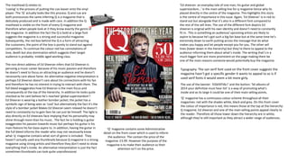
  • 1. The masthead Q relates to ‘cueing’ is the process of putting the cue leaver onto the vinyl player. The ‘Q’ actually looks like this process. Q and cue are both pronounces the same inferring Q is a magazine that is delicately produced and is made with care. In addition the Q masthead is visible on the front of every Q magazine and therefore when people look at it they know exactly the genre of the magazine. In addition the fact the Q is bold at a large font suggests the magazine is a strong and successful magazine. Subsequently, the red box behind the Q is a form of attracting the customers, the point of the box is purely to stand out against competitors. To continue the colour red has connotations of love, death but also domination which suggests their target audience is probably: middle aged working class. The non direct address of Ed Sheeran infers that Ed Sheeran is perusing a music career because of his music passion and therefore he doesn’t need to focus on attracting an audience and he doesn’t necessarily care about fame. An alternative negative interpretation is perhaps Ed Sheeran doesn’t care about his connections with his fan and therefore he has no interest in trying to interact with them. The full bleed exaggerates how Ed Sheeran is the main focus and consequently at the top of the hierarchy. In addition he looks quite shocked as he cant believe he’s reached ‘global superstardom’! Ed Sheeran is wearing a leather bomber jacket; the jacket has a symbolic sign of being seen as ‘cool’ but alternatively the fact it’s the style of a bomber jacket Makes Ed Sheeran seem relaxed he doesn’t need to constantly try to gain fans he can just be himself. The light is also directly on Ed sheerans face implying that his personality may shine through more than his music. The fact he is holding is guitar exaggerates his passion towards music but perhaps his guitar is his main feature his fan base aspire to. In addition, having the guitar in the full bleed informs the reader who may not necessarily know what ‘q’ magazine contains what sort of genre is included. They haven’t actually used any thumbnails because Q magazine is a strong magazine using strong artists and therefore they don’t need to show everything that’s inside. An alternative interpretation is just the fact sometimes thumbnails can look quite unprofessional. ‘Q’ magazine has a continuous colour scheme throughout all their magazines: red with the shades white, black and grey. On this front cover the colour of importance is red, this means those at the top at the hierarchy: Q magazine, Ed sheeran and one of the main selling points appeal clearly to the reader. Therefore all those lower down the hierarchy are in white, although they’re still important as they attract a wider range of audiences. ‘Ed sheeran- an everyday tale of one man, his guitar and global superstardom…’ is the main selling line for q magazine hence why its placed directly in the centre of the magazine. This highlights this story is the centre of importance in this issue. Again, ‘Ed Sheeran’ is in red to stand out but alongside that it’s also in a different font compared to the rest of the sell lines. The use of the different font depicts Ed sheeran is original with his own identity and doesn’t need to constantly fit in. This is something an audience/ upcoming artists are likely to aspire to because he’s got such a big fan base but at the same time he’s extremely down to earth putting across the message that do what makes you happy and let people except you for you. The other sell lines (lower down in the hierarchy) but they’re there to appeal to the audience informing them about what’s inside. The writing that’s in a much bigger font are more prominent on the page making them be one of the main reasons someone would potentially buy the magazine. ‘Q’ magazine contains some Administrative detail on the front cover which is used to inform the audience. The contain the price of the magazine: £3.99. However the purpose of the magazine is to make their audience so their attention isn’t on the price. Typography: The san serif font used on the front cover suggests the magazine hasn’t got a specific gender it wants to appeal to as is if used serif fonts it would seem a bit more girly. The use of the banner: ‘ESSENTIAL!’ and the button: ‘50 albums of 2014 your definitive must hear list’ is a way of promoting what's inside and as its large it could be one of their main selling points.
  • 2. The masthead: Billboard is the largest san serif font on the front cover suggesting it’s at the top of the hierarchy of importance and again it’s something the audience may familiarize with and therefore they want they want their audience to recognise that. Although the full bleed of Katy Perry is actually covering some of the mast head. This suggests two things… Firstly, Katy Perry is the main selling point for the magazine and therefore needs to be the centre of attention but secondly Billboard is so well known it doesn’t need to be the main focus and despite the fact you cant see all the letters because its so well known the audience will more than likely be able to fill the gaps. To continue, the use of the blue and yellow in the masthead connate the magazine is multi- gender automatically increasing it’s target audience but also its more visually appealing and eye catching for the audience. The direct address of Katy Perry automatically creates a connection with the audience also indicating that she’s someone who cares about her fandom and wants to make them feel accepted and wanted. The full bleed is of Katy Perry in a flowery rather unique dress which you could argue links in with her personality. Flowers have connotations of happiness and being fragile which is the view many people may have of Katy, but in this magazine she appears to be putting on a brave face at the same time you could say the flowers represent Katy Perry blossoming into a strong solo artist. This feature is something many up coming artists are likely to aspire and therefore they’re likely to buy the magazine. In addition, Katy Perry has a full face of makeup mainly using pink, this and the pink background infer the magazine’s target audience is females. Also, the fact she’s wearing a lot of makeup suggests she's trying to be someone that everyone can look to but also just emphasising the fact she’s a very girly character. The main colour scheme is black and yellow including white and orange. This makes the magazine just have more of a professional look. ‘Billboard’ and ‘Katy Perry’ are both in bold and at a bigger san serif font due to order of importance: they’re at the top of the hierarchy and audiences are generally quite materialistic so they tend to see the things that are bigger and brighter first. The use of including the date is to inform the reader if they’re buying a new issue but also it helps them keep up to date with when the next issue is due. However the magazine doesn’t use any other administrative detail making the magazine seem quite basic. At the same time this could be inconvenient to the audience as they may have to go out of their way to find out how much the magazine costs although the price may be on the back. Billboard doesn’t include many sell indicating they’re a very strong magazine and they don’t need to promote everything that’s inside their magazine they tend to focus on promoting one main selling point. ‘Katy Perry’ is the main sell line, she has a large fan base and increases the magazines target audience. Katy Perry is also well known and therefore allot of the general public would ever aspire to here or be interested in the gossip said about her. The other sell lines are in a small font. One of the sell lines that stands out to me is ‘Beyond Farmvile’ as this isn’t necessarily about music and therefore makes the magazine suitable for all taste’s. This magazine doesn’t include any banners but it does include a button which is used to highlight one of the magazines best bit: chart heat. The range of artists named again, increases the target audience. The fact the main titles are in yellow is one visually appealing but secondly indicates their no specific genre that this magazine is aimed at.
  • 3. The direct adrdess of Rhianna along side her facial expression: an over the top pose exaggerates her confidence. She also looks quite love struck which links to one of the main sell lines: ‘crazy in love’ Half of Rhianna’s face Is covered suggesting she’s got a side to her she’s either not proud of or doesn’t want people to se however the fact she looks like a strong powerful woman is a trait many will aspire to. Rhianna is covering the masthead suggesting she’s at the top of the hirachy . The masthead RollingsStone is in a large font which is red. It is partly covered suggesting it’s so well known. Rolling stone is actually one of the most well known bands which in a way makes this magazine more respected and again stands out more even though it isn’t named after the band. The magazine is 44.99 suggesting their target audience is middle to working class and it perhaps not for children as its too expensive. It indicates the magazine is quite grown up and mature, something that mainly adults will enjoy. In comparison to the magazine itself the masthead is quite small but the fact it’s the only thing in red makes it stand out but it also indicates the magazine doesn’t need to boast its already got a good brand image. All of the sell lines are on the right as Rhianna is looking to the left they don’t want to cover her face symbolizing the respect people have for her. In addition they’re very structured and in a way it makes the magazine seem very professional. Each sell line has its own visual look showing that everything in the magazine is original which you won’t be able to find any where else. There’s a range of typography used both serif and san serif. Rhianna is serif which adds a female touch to her and depicts that the ideal target audience is females There aren’t any thumbnails used as this is more of a professional and grown up magazine. Thumbnails are less serious and look slightly less mature . . No slogans are used as the magazine is more sophisticated. This ties in to why there’s no buttons or banners, it just doesn’t fit with the style of the magazine and because it’s well known it doesn’t need to boast about what’s inside people trust and respect the magazine.