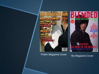
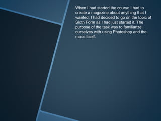
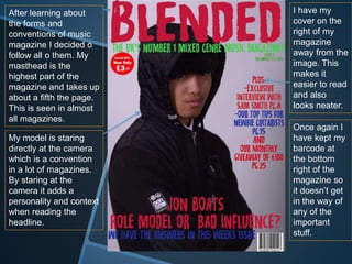
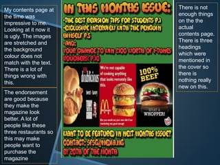
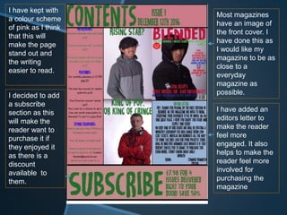
Prelim Magazine Cover
My Magazine Cover
When I had started the course I had to
create a magazine about anything that I
wanted. I had decided to go on the topic of
Sixth Form as I had just started it. The
purpose of the task was to familiarize
ourselves with using Photoshop and the
macs itself.
I put the title at the
top of the magazine
because this is what
I thought was right at
the time. This turned
out to be something
that goes with the
conventions of
magazines.
My cover line is also
at the top of the
magazine, this is
also something that
was expected.
My house
style on this
magazine was
orange and
reds. I should
not have used
four different
fonts and
should have
stuck with
one.
I have the
barcode at the
bottom out of
the way of the
image and
text. This is
something I
though was
right in a
magazine.
My main image
takes up the whole
page however, the
model is on the right.
I do not like that
choice now.
After learning about
the forms and
conventions of music
magazine I decided o
follow all o them. My
masthead is the
highest part of the
magazine and takes up
about a fifth the page.
This is seen in almost
all magazines.
My model is staring
directly at the camera
which is a convention
in a lot of magazines.
By staring at the
camera it adds a
personality and context
when reading the
headline.
I have my
cover on the
right of my
magazine
away from the
image. This
makes it
easier to read
and also
looks neater.
Once again I
have kept my
barcode at
the bottom
right of the
magazine so
it doesn’t get
in the way of
any of the
important
stuff.
My contents page at
the time was
impressive to me.
Looking at it now it
is ugly. The images
are stretched and
the background
colour does not
match with the text.
There is a lot of
things wrong with
this.
There is not
enough things
on the the
actual
contents page.
There is three
headings
which were
mentioned in
the cover so
there is
nothing really
new on this.
The endorsement
are good because
they make the
magazine look
better. A lot of
people like these
three restaurants so
this may make
people want to
purchase the
magazine
Most magazines
have an image of
the front cover. I
have done this as
I would like my
magazine to be as
close to a
everyday
magazine as
possible.
I have added an
editors letter to
make the reader
feel more
engaged. It also
helps to make the
reader feel more
involved for
purchasing the
magazine
I have kept with
a colour scheme
of pink as I think
that this will
make the page
stand out and
the writing
easier to read.
I decided to add
a subscribe
section as this
will make the
reader want to
purchase it if
they enjoyed it
as there is a
discount
available to
them.

Conclusion q7

  • 2.
  • 3.
    When I hadstarted the course I had to create a magazine about anything that I wanted. I had decided to go on the topic of Sixth Form as I had just started it. The purpose of the task was to familiarize ourselves with using Photoshop and the macs itself.
  • 4.
    I put thetitle at the top of the magazine because this is what I thought was right at the time. This turned out to be something that goes with the conventions of magazines. My cover line is also at the top of the magazine, this is also something that was expected. My house style on this magazine was orange and reds. I should not have used four different fonts and should have stuck with one. I have the barcode at the bottom out of the way of the image and text. This is something I though was right in a magazine. My main image takes up the whole page however, the model is on the right. I do not like that choice now.
  • 5.
    After learning about theforms and conventions of music magazine I decided o follow all o them. My masthead is the highest part of the magazine and takes up about a fifth the page. This is seen in almost all magazines. My model is staring directly at the camera which is a convention in a lot of magazines. By staring at the camera it adds a personality and context when reading the headline. I have my cover on the right of my magazine away from the image. This makes it easier to read and also looks neater. Once again I have kept my barcode at the bottom right of the magazine so it doesn’t get in the way of any of the important stuff.
  • 6.
    My contents pageat the time was impressive to me. Looking at it now it is ugly. The images are stretched and the background colour does not match with the text. There is a lot of things wrong with this. There is not enough things on the the actual contents page. There is three headings which were mentioned in the cover so there is nothing really new on this. The endorsement are good because they make the magazine look better. A lot of people like these three restaurants so this may make people want to purchase the magazine
  • 7.
    Most magazines have animage of the front cover. I have done this as I would like my magazine to be as close to a everyday magazine as possible. I have added an editors letter to make the reader feel more engaged. It also helps to make the reader feel more involved for purchasing the magazine I have kept with a colour scheme of pink as I think that this will make the page stand out and the writing easier to read. I decided to add a subscribe section as this will make the reader want to purchase it if they enjoyed it as there is a discount available to them.