Download to read offline

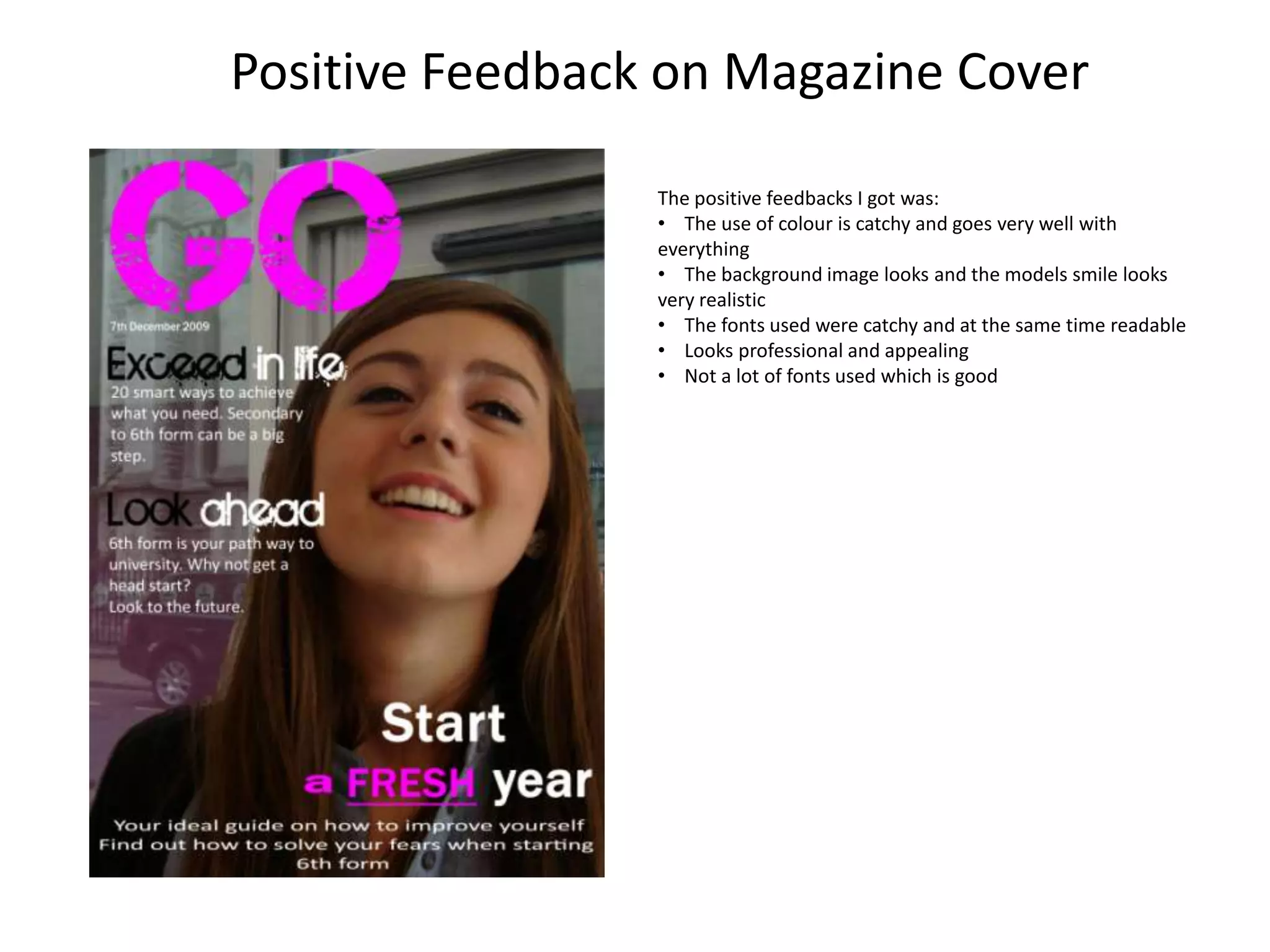
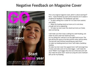
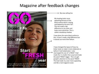
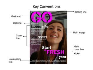
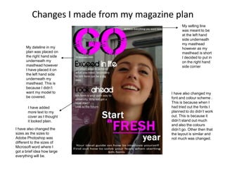
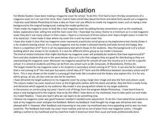
The student created a magazine cover for a school publication about starting 6th form. They received positive feedback on the use of color, realistic images, and readable fonts. Negative feedback suggested adding a selling line, making the heading and main cover line stand out more. The student made changes like adding a white selling line in the corner, giving the heading a shadow to stand out, and making the word "FRESH" larger in the main cover line. The revisions improved the professionalism and appeal of the cover based on key magazine design conventions.


