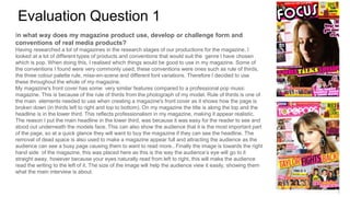
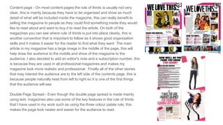
My magazine uses conventions from real media products to appear professional and realistic. On the front cover, I followed the rule of thirds by placing the title along the top and main headline in the lower third, with the image on the right side to guide the eye. The content page also uses conventions like rule of thirds and a large central image to draw the eye to stories of interest. Even on text-heavy spreads, I apply techniques like the three-color palette rule to make the pages neat and easy to read. Overall, my magazine adopts standard formatting rules and features found in professional pop music magazines.