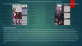
contents page distracts the reader/s
from the cover lines.
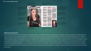
Looking back at my preliminary task for a student magazine and progression to a final music magazine product, I learned several skills. I learned how to follow the forms and conventions of existing magazines through research to develop my own unique product. I applied skills in Photoshop and InDesign to convey aspects of real magazines. I also learned to develop my initial ideas more creatively. Overall, I felt I conveyed a more polished, themed product compared to my preliminary task by using the tools and experience I gained.