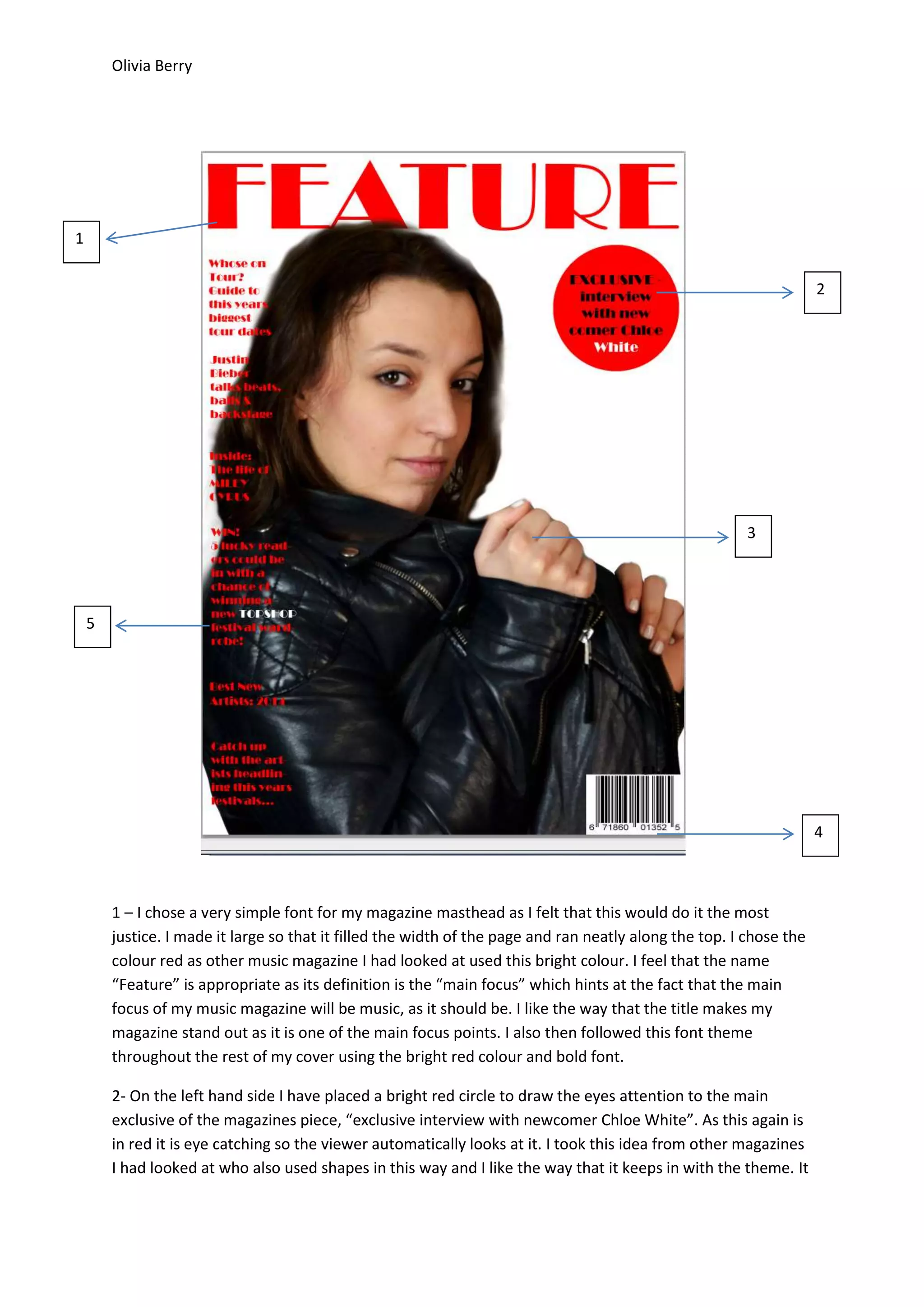
1. The author chose a simple red font for the magazine masthead to stand out and drew inspiration from other music magazines.
2. A bright red circle draws attention to the main exclusive interview, taking the idea from other magazines to use shapes and break up white space.
3. The main model image is centered to be clearly seen without obstruction, fitting the style and article. It was professionally photographed against a white backdrop.


![Screen shots of front cover]](https://cdn.slidesharecdn.com/ss_thumbnails/screenshotsoffrontcover-130307044929-phpapp01-thumbnail.jpg?width=640&height=640&fit=bounds)


