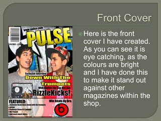
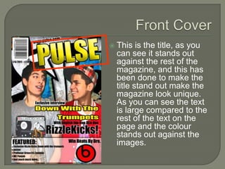
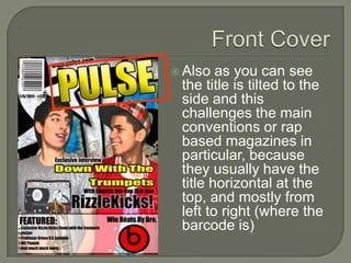
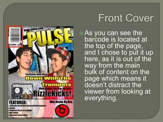
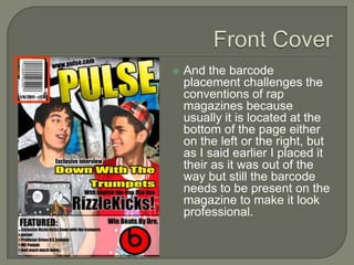
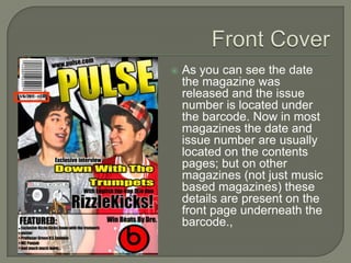
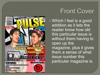
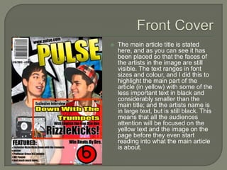
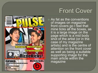
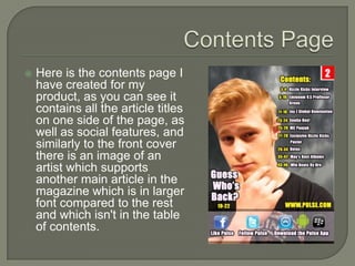
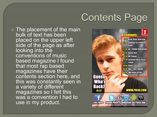
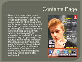
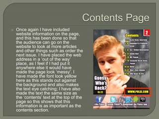
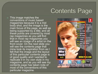
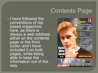
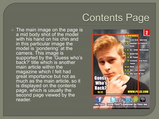
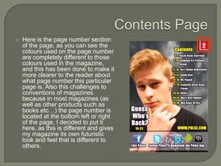
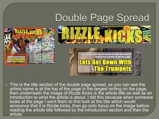
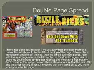
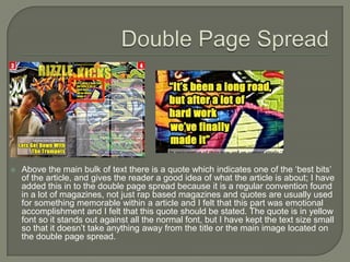
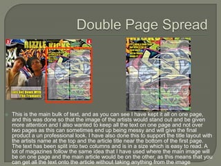
By Kamar Ali
 In this presentation I will be looking at the
  front cover, contents page and the double
  page spread that I created for my music
  based magazine.
 I will be analysing all the pages and how
  these pages use, develop and challenge
  original conventions of magazines and in
  particular rap magazines as this is the
  genre of the magazine that I created.
I will be going through each page and
 highlighting each feature and stating why I
 included that particular feature, what
 inspired me to include that particular
 feature and while doing this I will be going
 back to the conventions of rap magazines
 and comparing.
 Here is the front
 cover I have created.
 As you can see it is
 eye catching, as the
 colours are bright
 and I have done this
 to make it stand out
 against other
 magazines within the
 shop.
   This is the title, as you
    can see it stands out
    against the rest of the
    magazine, and this has
    been done to make the
    title stand out make the
    magazine look unique.
    As you can see the text
    is large compared to the
    rest of the text on the
    page and the colour
    stands out against the
    images.
 Also  as you can see
 the title is tilted to the
 side and this
 challenges the main
 conventions or rap
 based magazines in
 particular, because
 they usually have the
 title horizontal at the
 top, and mostly from
 left to right (where the
 barcode is)
 Asyou can see the
 barcode is located at
 the top of the page,
 and I chose to put it up
 here, as it is out of the
 way from the main
 bulk of content on the
 page which means it
 doesn’t distract the
 viewer from looking at
 everything.
   And the barcode
    placement challenges the
    conventions of rap
    magazines because
    usually it is located at the
    bottom of the page either
    on the left or the right, but
    as I said earlier I placed it
    their as it was out of the
    way but still the barcode
    needs to be present on the
    magazine to make it look
    professional.
   As you can see the date
    the magazine was
    released and the issue
    number is located under
    the barcode. Now in most
    magazines the date and
    issue number are usually
    located on the contents
    pages; but on other
    magazines (not just music
    based magazines) these
    details are present on the
    front page underneath the
    barcode.,
 Which I feel is a good
 addition as it lets the
 reader know how old
 this particular issue is
 without them having to
 open up the
 magazine, plus it gives
 them a sense of what
 issue number this
 particular magazine is.
   The main article title is stated
    here, and as you can see it has
    been placed so that the faces of
    the artists in the image are still
    visible. The text ranges in font
    sizes and colour, and I did this to
    highlight the main part of the
    article (in yellow) with some of the
    less important text in black and
    considerably smaller than the
    main title; and the artists name is
    in large text, but is still black. This
    means that all the audiences
    attention will be focused on the
    yellow text and the image on the
    page before they even start
    reading into what the main article
    is about.
   Usually the main article within
    a magazine is highlighted in
    the front page in eye catching
    text which is about the same
    size as the magazine titles
    text; I have avoided this
    particular convention because
    I feel that the magazine title is
    important and should stand out
    due to it being like a ‘branding
    label’ on the magazine, plus I
    want the viewer to first look at
    the title of the magazine before
    then looking at the image
    followed by the main article
    title, and it has been placed in
    such a position to make this
    possible.
   Here is the panel section that
    was one of my own ideas, as I
    felt when magazines had
    ‘other articles ‘ named all over
    the page and there was no
    order to the front covers which
    made them seem ‘messy’ and
    un professional to me.
   I decided to introduce a panel
    at the bottom of the page,
    which would contain all the
    ‘other features’ of the
    magazine including other
    important articles within the
    magazine as well as
    completion information.
   The inclusion of this bar also
    means that this section is almost
    separate to the rest of the page
    and all the text is not spread
    around meaning that the majority
    of the audiences attention will be
    on the image rather than the text
    spread around the page.
   This bar is something that is not
    seen in other magazines of this
    genre and I obtained the idea of
    this bar from a newspaper as I felt
    that I gave order to the paper and
    allowed for the focus of the main
    image on the paper as well as
    keeping the content on the page
    ‘neat and tidy’ meaning that the
    front cover will maintain a
    professional look and feel.
   The main image located on the
    page is supporting the main
    article and is a image of ‘Rizzle
    Kicks’. As you can see it is the
    only image on the page and
    has been made large and
    centred on the page meaning
    that it will be one of the first
    features of the page which will
    catch the audiences attention.
    I have also added a artistic
    effect to this image to give it a
    ‘cartoony’ look and feel making
    the image look like it is part of
    the graffiti wall in the
    background.
   As fat as the conventions
    of images on magazine
    front covers go I feel that
    mine ticks all the boxes, as
    it is a large image on the
    page which is a mid body
    shot of the artist (or in the
    case of my magazine
    artists) and is the centre of
    attention on the front cover
    as well as being a suitable
    supporting image for the
    main article within the
    magazine
   I feel that my front cover is professional and looks good,
    it has all the main conventions of magazines as well as
    being able to maintain some of the main conventions of
    magazines within the same genre as itself. I feel that the
    magazine front cover will appeal to the target audience
    because it is eye catching and bright, but not so much
    that it looks childish. I also feel that the colours used in
    the main text on the front cover as well as the image are
    eye catching and represents the magazine as well as the
    social groups within.
   I feel that the front cover has a certain order to it, as
    everything isn’t scattered around the page and
    everything has been ‘sectioned’ in a sense which gives
    the magazine front cover a professional look without
    spoiling the overall look and still maintaining its appeal to
    the target audience.
   Here is the contents page I
    have created for my
    product, as you can see it
    contains all the article titles
    on one side of the page, as
    well as social features, and
    similarly to the front cover
    there is an image of an
    artist which supports
    another main article in the
    magazine which is in larger
    font compared to the rest
    and which isn't in the table
    of contents.
   This is the main bulk of text on
    the page, and this is what
    makes the contents page, in
    this text there is information on
    all the articles in this particular
    issue of the magazine. I have
    used the same type of font that
    has been used on the rest of
    the magazine and I have
    highlighted the page numbers
    in yellow for two reasons: one,
    to match the colour scheme of
    the overall magazine and two,
    to make the page numbers
    stand out so someone who is
    reading will be able to see
    which articles are on a
    particular page.
   The placement of the main
    bulk of text has been
    placed on the upper left
    side of the page as after
    looking into the
    conventions of music
    based magazine I found
    that most rap based
    magazines have their
    contents section here, and
    this was constantly seen in
    a variety of different
    magazines so I felt this
    was a convention I had to
    use in my product.
   Here is the transparent panel,
    which was also seen on the front
    cover; on this page it contains
    social features which expand the
    audiences experience as they will
    be able to go online and connect
    to my magazine in many different
    ways and keep up dated with
    what is happening with the
    magazine as well as information
    on what may be upcoming in the
    future. I have decided to include
    these features on my contents
    page for reasons explained as I
    feel this is a great addition and
    the audience will feel more
    connectivity with the magazine
    and they will be able to stay
    connected.
   Once again I have included
    website information on the page,
    and this has been done so that
    the audience can go on the
    website to look at more articles
    and other things such as order the
    next issue. I have placed the web
    address in a ‘out of the way’
    place, as I feel if I had put it
    anywhere else it would have
    made the page look ‘messy’. I
    have made the font look yellow
    here as this stands out against
    the background and also makes
    the text eye catching; I have also
    made the text the same size as
    the ‘contents’ text at the top of the
    page so this shows that this
    information is as important as the
    contents section.
   This image matches the
    conventions of music based
    magazines because it is a mid
    body shot, and the image is the
    main focus of the page, as well as
    being supported by a title; and all
    these points are covered by most
    rap magazines as you will find
    that in most rap magazines you
    will see an image of a artist on the
    front cover. On the next slide you
    will see the contents page that
    mine took its inspiration from as I
    felt that the image and the layout
    of this particular contents page is
    of good quality and I wanted to
    replicate it in my own style in my
    magazine, and as you will see my
    contents page has taken note of
    most of the conventions of this
    particular magazine.
I have followed the
 conventions of rap
 based magazines
 here, as there is
 always a web address
 either on the contents
 page or the front
 cover, and I have
 included it on both
 pages, while being
 able to keep the
 information out of the
 way.
   The main image on the page is
    a mid body shot of the model
    with his hand on his chin and
    in this particular image the
    model is ‘pondering’ at the
    camera. This image is
    supported by the ‘Guess who’s
    back?’ title which is another
    main article within the
    magazine which I felt had
    great importance but not as
    much as the main article, so it
    is displayed on the contents
    page, which is usually the
    second page viewed by the
    reader.
   Here is the page number section
    of the page, as you can see the
    colours used on the page number
    are completely different to those
    colours used in the magazine,
    and this has been done to make it
    more clearer to the reader about
    what page number this particular
    page is. Also this challenges to
    conventions of magazines
    because in most magazines (as
    well as other products such as
    books etc…) the page number is
    located at the bottom left or right
    of the page, I decided to put it
    here, as this is different and gives
    my magazine its own futuristic
    look and feel that is different to
    others.
   I think that my contents page is professional and is suitable for
    the target audience; it includes all the main conventions you
    would expect from a rap based magazine contents page as
    well as the main conventions of magazine contents pages in
    general. The image used is of good quality and is the type of
    image you would expect from a magazine such as mine.
    I feel that I have got all the right information on my contents
    page, such as contents, connectivity features, website,
    secondary article and a image; as well as including my own
    design features.
   I have taken inspiration from a contents page that really
    caught my eye and I aimed to follow the conventions that this
    particular contents page set and reproduce them while adding
    my own style to the finished product.
   I feel that my contents page is of high quality, and since the
    draft stage of this project the target audience who have gotten
    involved have liked my ideas for the contents page.
   This is the double page spread I have created for my product. As this article is
    based on the hip-hop duo ‘Rizzle kicks’ I have gone with the same theme which
    was present on the front cover, and I have once again used bright but not child
    like colours as this is what this particular group is about. As you can see there are
    all the normal features you would come to expect from a double page spread
    within a rap magazine which follow the conventions of magazines; and in other
    cases I have challenged these conventions and made my double page spread
    look different and exciting, which is what the target audience want.
   This is the title section of the double page spread, as you can see the
    artists name is at the top of the page in the largest writing on the page,
    then underneath the image of Rizzle Kicks is the article title as well as an
    introduction to what the article is about. I did this because when someone
    looks at the page I want them to first look at the title which would
    announce that it is Rizzle kicks, then go onto focus on the image before
    reading the article title followed by the introduction section and then the
    article.
   I have also done this because it moves away from the more traditional
    convention which would be the title at the top of the page, followed by a
    introduction underneath the title, then the article over both pages. Also
    with the re arrangement of the title section of the double page spread it
    gives my double page spread that futuristic and innovative look that my
    front cover/contents page deliver. I have also made sure that the main title
    and the artist title are in yellow, meaning that they stand out to you more
    when you view the page.
   Above the main bulk of text there is a quote which indicates one of the ‘best bits’
    of the article, and gives the reader a good idea of what the article is about; I have
    added this in to the double page spread because it is a regular convention found
    in a lot of magazines, not just rap based magazines and quotes are usually used
    for something memorable within a article and I felt that this part was emotional
    accomplishment and I felt that this quote should be stated. The quote is in yellow
    font so it stands out against all the normal font, but I have kept the text size small
    so that it doesn’t take anything away from the title or the main image located on
    the double page spread.
   This is the main bulk of text, and as you can see I have kept it all on one page,
    and this was done so that the image of the artists would stand out and be given
    more attention and I also wanted to keep all the text on one page and not over
    two pages as this can sometimes end up being messy and will give the final
    product a un professional look. I have also done this to support the title layout with
    the artists name at the top and the article title near the bottom of the first page.
    The text has been split into two columns and is in a size which is easy to read. A
    lot of magazines follow the same idea that I have used where the main image will
    be on one page and the main article would be on the other, as this means that you
    can get all the text onto the article without taking anything from the image
   Here is the main image which is used in this article, as you can see it dominates
    most of the first page, with the article title taking up the rest of the page. The
    image is a mid body shot of the duo Rizzle Kicks and it is a suitable image foe this
    particular article. A lot of magazines follow a convention where the main image on
    a article is dominating most of a page and text is present on the other, and this is
    the convention that I mainly followed, but I added my own look and feel to the
    page with the placement of the title under the image and if you look it gives a
    poster like impression as the image is dominating and then the text supporting the
    image is below. The background is also suitable as this is the same theme that
    was used on the front cover and so I wanted to carry this on to maintain a
    professional look and feel to the magazine and this article.
   I feel that my double page spread has been made to a professional
    standard and will appeal to the target audience; I implemented all the
    main conventions for rap based magazines into my double page
    spread and I have also challenged some, as well as adding my own
    style into the pages.
   I feel that the presentation of this particular page is great and I feel
    that the organization is good as everything seems to have been
    placed in the right spot. The title placement is interesting as it is not
    something seen often in magazines and goes completely against the
    standard conventions of double page spread, but it is factors such as
    this which give my product that unique look and feel which other
    products don’t have.
   I feel the article has been presented well and the text is easy to read
    as it is not to small and it is against a slightly transparent panel to
    make sure that the background dose not out shade the text making it
    impossible to read.
   The image has been placed well, where it is in a position to be the
    centre of attention of the page without being anything to extravagant
    and this image follows the main conventions such as mid body shot,
    dominate most of a particular page and be related to the article.

My music based magazine evaluation

  • 1.
  • 2.
     In thispresentation I will be looking at the front cover, contents page and the double page spread that I created for my music based magazine.  I will be analysing all the pages and how these pages use, develop and challenge original conventions of magazines and in particular rap magazines as this is the genre of the magazine that I created.
  • 3.
    I will begoing through each page and highlighting each feature and stating why I included that particular feature, what inspired me to include that particular feature and while doing this I will be going back to the conventions of rap magazines and comparing.
  • 5.
     Here isthe front cover I have created. As you can see it is eye catching, as the colours are bright and I have done this to make it stand out against other magazines within the shop.
  • 6.
    This is the title, as you can see it stands out against the rest of the magazine, and this has been done to make the title stand out make the magazine look unique. As you can see the text is large compared to the rest of the text on the page and the colour stands out against the images.
  • 7.
     Also as you can see the title is tilted to the side and this challenges the main conventions or rap based magazines in particular, because they usually have the title horizontal at the top, and mostly from left to right (where the barcode is)
  • 8.
     Asyou cansee the barcode is located at the top of the page, and I chose to put it up here, as it is out of the way from the main bulk of content on the page which means it doesn’t distract the viewer from looking at everything.
  • 9.
    And the barcode placement challenges the conventions of rap magazines because usually it is located at the bottom of the page either on the left or the right, but as I said earlier I placed it their as it was out of the way but still the barcode needs to be present on the magazine to make it look professional.
  • 10.
    As you can see the date the magazine was released and the issue number is located under the barcode. Now in most magazines the date and issue number are usually located on the contents pages; but on other magazines (not just music based magazines) these details are present on the front page underneath the barcode.,
  • 11.
     Which Ifeel is a good addition as it lets the reader know how old this particular issue is without them having to open up the magazine, plus it gives them a sense of what issue number this particular magazine is.
  • 12.
    The main article title is stated here, and as you can see it has been placed so that the faces of the artists in the image are still visible. The text ranges in font sizes and colour, and I did this to highlight the main part of the article (in yellow) with some of the less important text in black and considerably smaller than the main title; and the artists name is in large text, but is still black. This means that all the audiences attention will be focused on the yellow text and the image on the page before they even start reading into what the main article is about.
  • 13.
    Usually the main article within a magazine is highlighted in the front page in eye catching text which is about the same size as the magazine titles text; I have avoided this particular convention because I feel that the magazine title is important and should stand out due to it being like a ‘branding label’ on the magazine, plus I want the viewer to first look at the title of the magazine before then looking at the image followed by the main article title, and it has been placed in such a position to make this possible.
  • 14.
    Here is the panel section that was one of my own ideas, as I felt when magazines had ‘other articles ‘ named all over the page and there was no order to the front covers which made them seem ‘messy’ and un professional to me.  I decided to introduce a panel at the bottom of the page, which would contain all the ‘other features’ of the magazine including other important articles within the magazine as well as completion information.
  • 15.
    The inclusion of this bar also means that this section is almost separate to the rest of the page and all the text is not spread around meaning that the majority of the audiences attention will be on the image rather than the text spread around the page.  This bar is something that is not seen in other magazines of this genre and I obtained the idea of this bar from a newspaper as I felt that I gave order to the paper and allowed for the focus of the main image on the paper as well as keeping the content on the page ‘neat and tidy’ meaning that the front cover will maintain a professional look and feel.
  • 16.
    The main image located on the page is supporting the main article and is a image of ‘Rizzle Kicks’. As you can see it is the only image on the page and has been made large and centred on the page meaning that it will be one of the first features of the page which will catch the audiences attention. I have also added a artistic effect to this image to give it a ‘cartoony’ look and feel making the image look like it is part of the graffiti wall in the background.
  • 17.
    As fat as the conventions of images on magazine front covers go I feel that mine ticks all the boxes, as it is a large image on the page which is a mid body shot of the artist (or in the case of my magazine artists) and is the centre of attention on the front cover as well as being a suitable supporting image for the main article within the magazine
  • 18.
    I feel that my front cover is professional and looks good, it has all the main conventions of magazines as well as being able to maintain some of the main conventions of magazines within the same genre as itself. I feel that the magazine front cover will appeal to the target audience because it is eye catching and bright, but not so much that it looks childish. I also feel that the colours used in the main text on the front cover as well as the image are eye catching and represents the magazine as well as the social groups within.  I feel that the front cover has a certain order to it, as everything isn’t scattered around the page and everything has been ‘sectioned’ in a sense which gives the magazine front cover a professional look without spoiling the overall look and still maintaining its appeal to the target audience.
  • 20.
    Here is the contents page I have created for my product, as you can see it contains all the article titles on one side of the page, as well as social features, and similarly to the front cover there is an image of an artist which supports another main article in the magazine which is in larger font compared to the rest and which isn't in the table of contents.
  • 21.
    This is the main bulk of text on the page, and this is what makes the contents page, in this text there is information on all the articles in this particular issue of the magazine. I have used the same type of font that has been used on the rest of the magazine and I have highlighted the page numbers in yellow for two reasons: one, to match the colour scheme of the overall magazine and two, to make the page numbers stand out so someone who is reading will be able to see which articles are on a particular page.
  • 22.
    The placement of the main bulk of text has been placed on the upper left side of the page as after looking into the conventions of music based magazine I found that most rap based magazines have their contents section here, and this was constantly seen in a variety of different magazines so I felt this was a convention I had to use in my product.
  • 23.
    Here is the transparent panel, which was also seen on the front cover; on this page it contains social features which expand the audiences experience as they will be able to go online and connect to my magazine in many different ways and keep up dated with what is happening with the magazine as well as information on what may be upcoming in the future. I have decided to include these features on my contents page for reasons explained as I feel this is a great addition and the audience will feel more connectivity with the magazine and they will be able to stay connected.
  • 24.
    Once again I have included website information on the page, and this has been done so that the audience can go on the website to look at more articles and other things such as order the next issue. I have placed the web address in a ‘out of the way’ place, as I feel if I had put it anywhere else it would have made the page look ‘messy’. I have made the font look yellow here as this stands out against the background and also makes the text eye catching; I have also made the text the same size as the ‘contents’ text at the top of the page so this shows that this information is as important as the contents section.
  • 25.
    This image matches the conventions of music based magazines because it is a mid body shot, and the image is the main focus of the page, as well as being supported by a title; and all these points are covered by most rap magazines as you will find that in most rap magazines you will see an image of a artist on the front cover. On the next slide you will see the contents page that mine took its inspiration from as I felt that the image and the layout of this particular contents page is of good quality and I wanted to replicate it in my own style in my magazine, and as you will see my contents page has taken note of most of the conventions of this particular magazine.
  • 26.
    I have followedthe conventions of rap based magazines here, as there is always a web address either on the contents page or the front cover, and I have included it on both pages, while being able to keep the information out of the way.
  • 27.
    The main image on the page is a mid body shot of the model with his hand on his chin and in this particular image the model is ‘pondering’ at the camera. This image is supported by the ‘Guess who’s back?’ title which is another main article within the magazine which I felt had great importance but not as much as the main article, so it is displayed on the contents page, which is usually the second page viewed by the reader.
  • 29.
    Here is the page number section of the page, as you can see the colours used on the page number are completely different to those colours used in the magazine, and this has been done to make it more clearer to the reader about what page number this particular page is. Also this challenges to conventions of magazines because in most magazines (as well as other products such as books etc…) the page number is located at the bottom left or right of the page, I decided to put it here, as this is different and gives my magazine its own futuristic look and feel that is different to others.
  • 30.
    I think that my contents page is professional and is suitable for the target audience; it includes all the main conventions you would expect from a rap based magazine contents page as well as the main conventions of magazine contents pages in general. The image used is of good quality and is the type of image you would expect from a magazine such as mine.  I feel that I have got all the right information on my contents page, such as contents, connectivity features, website, secondary article and a image; as well as including my own design features.  I have taken inspiration from a contents page that really caught my eye and I aimed to follow the conventions that this particular contents page set and reproduce them while adding my own style to the finished product.  I feel that my contents page is of high quality, and since the draft stage of this project the target audience who have gotten involved have liked my ideas for the contents page.
  • 32.
    This is the double page spread I have created for my product. As this article is based on the hip-hop duo ‘Rizzle kicks’ I have gone with the same theme which was present on the front cover, and I have once again used bright but not child like colours as this is what this particular group is about. As you can see there are all the normal features you would come to expect from a double page spread within a rap magazine which follow the conventions of magazines; and in other cases I have challenged these conventions and made my double page spread look different and exciting, which is what the target audience want.
  • 33.
    This is the title section of the double page spread, as you can see the artists name is at the top of the page in the largest writing on the page, then underneath the image of Rizzle Kicks is the article title as well as an introduction to what the article is about. I did this because when someone looks at the page I want them to first look at the title which would announce that it is Rizzle kicks, then go onto focus on the image before reading the article title followed by the introduction section and then the article.
  • 34.
    I have also done this because it moves away from the more traditional convention which would be the title at the top of the page, followed by a introduction underneath the title, then the article over both pages. Also with the re arrangement of the title section of the double page spread it gives my double page spread that futuristic and innovative look that my front cover/contents page deliver. I have also made sure that the main title and the artist title are in yellow, meaning that they stand out to you more when you view the page.
  • 35.
    Above the main bulk of text there is a quote which indicates one of the ‘best bits’ of the article, and gives the reader a good idea of what the article is about; I have added this in to the double page spread because it is a regular convention found in a lot of magazines, not just rap based magazines and quotes are usually used for something memorable within a article and I felt that this part was emotional accomplishment and I felt that this quote should be stated. The quote is in yellow font so it stands out against all the normal font, but I have kept the text size small so that it doesn’t take anything away from the title or the main image located on the double page spread.
  • 36.
    This is the main bulk of text, and as you can see I have kept it all on one page, and this was done so that the image of the artists would stand out and be given more attention and I also wanted to keep all the text on one page and not over two pages as this can sometimes end up being messy and will give the final product a un professional look. I have also done this to support the title layout with the artists name at the top and the article title near the bottom of the first page. The text has been split into two columns and is in a size which is easy to read. A lot of magazines follow the same idea that I have used where the main image will be on one page and the main article would be on the other, as this means that you can get all the text onto the article without taking anything from the image
  • 37.
    Here is the main image which is used in this article, as you can see it dominates most of the first page, with the article title taking up the rest of the page. The image is a mid body shot of the duo Rizzle Kicks and it is a suitable image foe this particular article. A lot of magazines follow a convention where the main image on a article is dominating most of a page and text is present on the other, and this is the convention that I mainly followed, but I added my own look and feel to the page with the placement of the title under the image and if you look it gives a poster like impression as the image is dominating and then the text supporting the image is below. The background is also suitable as this is the same theme that was used on the front cover and so I wanted to carry this on to maintain a professional look and feel to the magazine and this article.
  • 38.
    I feel that my double page spread has been made to a professional standard and will appeal to the target audience; I implemented all the main conventions for rap based magazines into my double page spread and I have also challenged some, as well as adding my own style into the pages.  I feel that the presentation of this particular page is great and I feel that the organization is good as everything seems to have been placed in the right spot. The title placement is interesting as it is not something seen often in magazines and goes completely against the standard conventions of double page spread, but it is factors such as this which give my product that unique look and feel which other products don’t have.  I feel the article has been presented well and the text is easy to read as it is not to small and it is against a slightly transparent panel to make sure that the background dose not out shade the text making it impossible to read.  The image has been placed well, where it is in a position to be the centre of attention of the page without being anything to extravagant and this image follows the main conventions such as mid body shot, dominate most of a particular page and be related to the article.