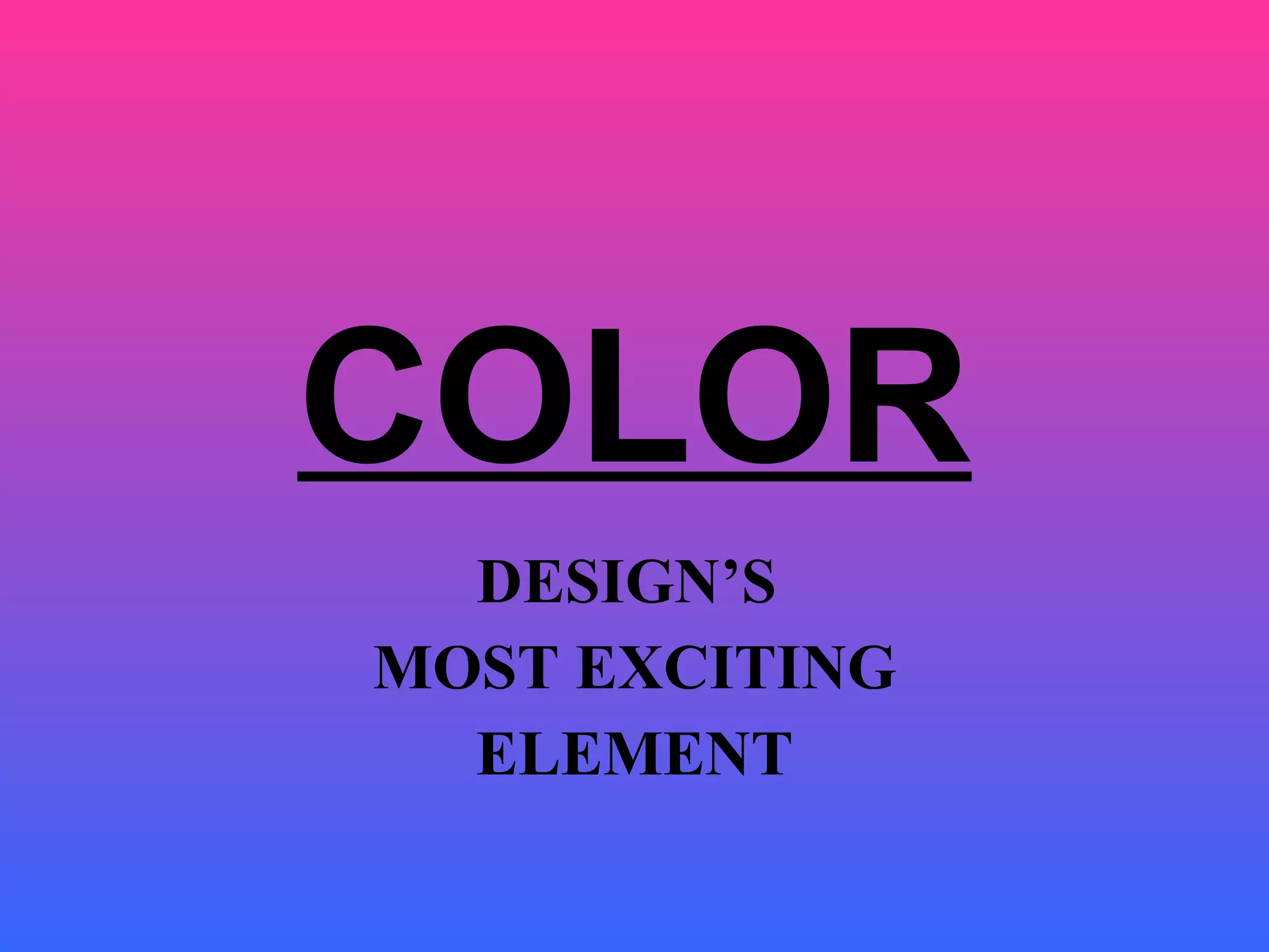
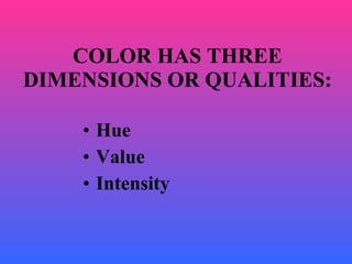
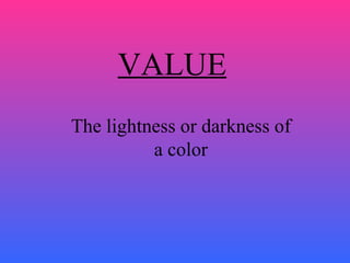
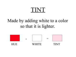
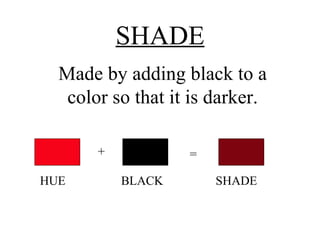
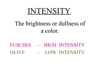
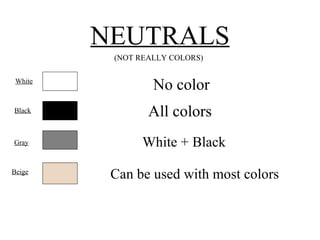
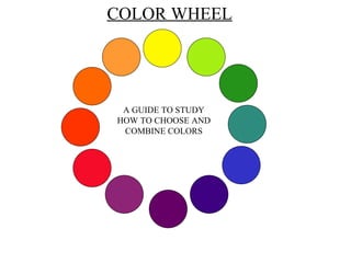
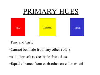
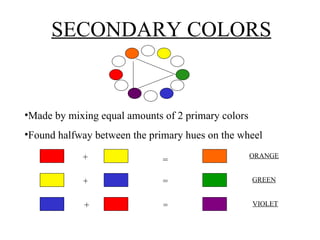
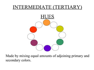
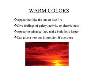
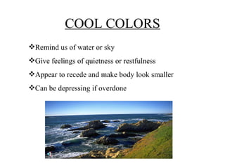
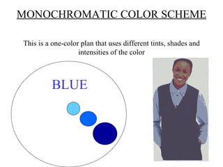
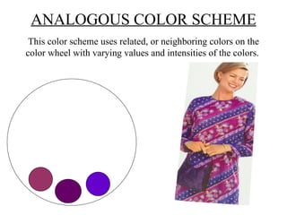
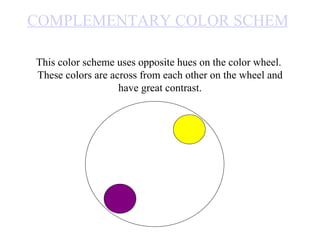
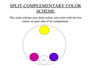
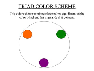
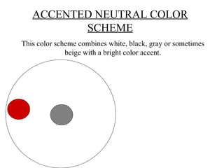
COLOR DESIGN’S  MOST EXCITING ELEMENT
Hue Value  Intensity COLOR HAS THREE DIMENSIONS OR QUALITIES:
HUE RED  YELLOW  VIOLET The name given to a color.
VALUE The lightness or darkness of a color
TINT Made by adding white to a color so that it is lighter. + = HUE  WHITE  TINT
SHADE Made by adding black to a color so that it is darker. + = HUE  BLACK  SHADE
INTENSITY The brightness or dullness of a color. FUSCHIA  -  HIGH  INTENSITY OLIVE  -  LOW  INTENSITY
NEUTRALS (NOT REALLY COLORS) No color All colors White + Black Can be used with most colors White Black Gray Beige
COLOR WHEEL A GUIDE TO STUDY HOW TO CHOOSE AND COMBINE COLORS
PRIMARY HUES Pure and basic Cannot be made from any other colors All other colors are made from these Equal distance from each other on color wheel RED YELLOW BLUE
SECONDARY COLORS Made by mixing equal amounts of 2 primary colors Found halfway between the primary hues on the wheel + = + + = = ORANGE GREEN VIOLET
INTERMEDIATE (TERTIARY) HUES Made by mixing equal amounts of adjoining primary and secondary colors.
THE COLOR WHEEL CAN BE DIVIDED INTO WARM AND COOL COLORS
WARM COLORS Appear hot like the sun or like fire Give feelings of gaiety, activity or cheerfulness Appear to advance-they make body look larger Can give a nervous impression if overdone
COOL COLORS Remind us of water or sky Give feelings of quietness or restfulness Appear to recede and make body look smaller Can be depressing if overdone
MONOCHROMATIC COLOR SCHEME This is a one-color plan that uses different tints, shades and intensities of the color BLUE
ANALOGOUS COLOR SCHEME This color scheme uses related, or neighboring colors on the color wheel with varying values and intensities of the colors.
COMPLEMENTARY COLOR SCHEME This color scheme uses opposite hues on the color wheel.  These colors are across from each other on the wheel and have great contrast.
SPLIT-COMPLEMENTARY COLOR SCHEME This color scheme uses three colors, one color with the two colors on each side of its complement. VIOLET
TRIAD COLOR SCHEME This color scheme combines three colors equidistant on the color wheel and has a great deal of contrast.
ACCENTED NEUTRAL COLOR SCHEME This color scheme combines white, black, gray or sometimes beige with a bright color accent.
All colors are beautiful, depending on personal taste.  If not used wisely or combined well, color can cause apparel to look too gaudy or very drab. Harmony results when hues, values and intensities are combined in a pleasing way.

Colors

  • 1.
    COLOR DESIGN’S MOST EXCITING ELEMENT
  • 2.
    Hue Value Intensity COLOR HAS THREE DIMENSIONS OR QUALITIES:
  • 3.
    HUE RED YELLOW VIOLET The name given to a color.
  • 4.
    VALUE The lightnessor darkness of a color
  • 5.
    TINT Made byadding white to a color so that it is lighter. + = HUE WHITE TINT
  • 6.
    SHADE Made byadding black to a color so that it is darker. + = HUE BLACK SHADE
  • 7.
    INTENSITY The brightnessor dullness of a color. FUSCHIA - HIGH INTENSITY OLIVE - LOW INTENSITY
  • 8.
    NEUTRALS (NOT REALLYCOLORS) No color All colors White + Black Can be used with most colors White Black Gray Beige
  • 9.
    COLOR WHEEL AGUIDE TO STUDY HOW TO CHOOSE AND COMBINE COLORS
  • 10.
    PRIMARY HUES Pureand basic Cannot be made from any other colors All other colors are made from these Equal distance from each other on color wheel RED YELLOW BLUE
  • 11.
    SECONDARY COLORS Madeby mixing equal amounts of 2 primary colors Found halfway between the primary hues on the wheel + = + + = = ORANGE GREEN VIOLET
  • 12.
    INTERMEDIATE (TERTIARY) HUESMade by mixing equal amounts of adjoining primary and secondary colors.
  • 13.
    THE COLOR WHEELCAN BE DIVIDED INTO WARM AND COOL COLORS
  • 14.
    WARM COLORS Appearhot like the sun or like fire Give feelings of gaiety, activity or cheerfulness Appear to advance-they make body look larger Can give a nervous impression if overdone
  • 15.
    COOL COLORS Remindus of water or sky Give feelings of quietness or restfulness Appear to recede and make body look smaller Can be depressing if overdone
  • 16.
    MONOCHROMATIC COLOR SCHEMEThis is a one-color plan that uses different tints, shades and intensities of the color BLUE
  • 17.
    ANALOGOUS COLOR SCHEMEThis color scheme uses related, or neighboring colors on the color wheel with varying values and intensities of the colors.
  • 18.
    COMPLEMENTARY COLOR SCHEMEThis color scheme uses opposite hues on the color wheel. These colors are across from each other on the wheel and have great contrast.
  • 19.
    SPLIT-COMPLEMENTARY COLOR SCHEMEThis color scheme uses three colors, one color with the two colors on each side of its complement. VIOLET
  • 20.
    TRIAD COLOR SCHEMEThis color scheme combines three colors equidistant on the color wheel and has a great deal of contrast.
  • 21.
    ACCENTED NEUTRAL COLORSCHEME This color scheme combines white, black, gray or sometimes beige with a bright color accent.
  • 22.
    All colors arebeautiful, depending on personal taste. If not used wisely or combined well, color can cause apparel to look too gaudy or very drab. Harmony results when hues, values and intensities are combined in a pleasing way.