School Magazine
For our preliminary task we were told to create our own
magazine cover and contents page for our school, which
features a medium close-up photograph of a student
which we took personally, plus some suitably laid-out text
and a masthead (etc.). I intended to make my magazine
look classy and different to normal school magazines.
There would be appropriate stories for my school and
suitable giveaways/snatches that the students will find fun
and useful.
On the next few slides will be all the research I’ve
done for my preliminary task.
Date:
Let’s us know when the magazine was published and the
type of edition let’s us know what sort of things they’ll
need to purchase for the future. For example as this is a
summer edition it’ll tell you about up and coming sports
clubs and events and when the school will be closing for
summer
Main Image:
This shows the main story which
is featured in this particular
magazine. The publishers make
it a bigger than the other stories
on the front cover so that us (as
an audience) know that there’ll
be a lot of information/advice in
this section.
Secondary Stories:
These are the other key
stories that are found in this
magazine. The secondary
stories are normally the
ones that are important to
look at but not as
important/significant as the
main story. This is portrayed
through smaller text,
however the page numbers
are shown in bold so that
the reader will see that first
and flick to those pages.
Masthead:
The title of this
magazine is shown in
bold writing, capital
letters and a vibrant
colour. This is
because when you’re
searching a magazine
rack the vibrant colour
will catch your eye
more than a plain
black headline would.
Strap/Sell Line:
This part of the magazine
has to be persuasive and
positive. As it is aimed at
parents the message
should be clean and clear.
As you can see the
message here is ‘Helping
you make the right choices
for your children’,
meaning that this
magazine is all about
giving parents tips to
helping their children
through school.
What is on the front cover?
On the front cover is a
picture of a girl who must
be going into her exam
period as the title of this
story is ‘Exam Choices’.
This is on the front cover
because exams are very
important and significant
for a young adolescents
future life. A lot of parents
would and children going
through exams would read
this so that they know what
they’re in for and to gain
some advice on how to
handle themselves
throughout it.
What is good about this magazine?
There are lot of bright colours meaning that
this magazine will catch any possible readers
eyes. Also by having such a big moment in a
child’s life as the main story will be a big catch
for many parents and students out there.
What is bad about the magazine?
I feel that in order to make this
magazine a bit better the publishers
should add a few more images.
Although there is a huge image right
on the front I feel that by giving a
few more images of other stories it
will make the audience want to
purchase the magazine even more as
they’ll know a bit more about what’s
going on in the magazine.
Masthead:
By having big bright ;letters
and numbers it attracts us
to the magazine more. If
they were to have a plain
and ordinary black title it
would be boring, meaning
that nobody would want to
buy it. Also, by the title
being specific to a certain
type of audience (16-18
year olds) it means that
they’ll get a lot of people
wanting to buy it in order to
help them through 6th form.
Main story/Image:
You can tell this is the main story
as the pink writing (title) is bigger
that the others, signifying that this
is the article that’s it’s featuring the
most of. Although this is a good
idea, to some people it may not be
very clear as all the main/key
stories that are featured in this
magazine are printed in yellow and
fuchsia pink. Following this the
main image is of two school girls
that are either already at sixth form
or are just going into. This shows
that the magazine is just mainly
based for sixth formers (apart from
the title) as they're not wearing
normal school clothes indicating
that they’re higher up in their
education.
Date
As this magazine is from October
time it signifies that it is a new
term and all the children have just
recently come back to school. This
means that the magazine may have
various features on starting a new
school or how to cope with a new
term (especially if you’re going into
GCSE period)
Secondary Stories:
These are the other main
featured stories in this
magazine. Although they
follow the colour scheme of
this magazine they stand out
as much as the main
headline does. This means
it’s not clear enough and
people may get confused.
What is on the front cover?
On the front cover is a picture of two
girls who are in who are either already
in sixth form or just going into. On
this magazine they’ve decided to use
the colours pink and yellow. These
are very bright colours which stand
out on the magazine, attracting
attention.
What is good about this magazine?
I think the bright colours are a big hit with this
magazine. As they’ve used bright and vibrant
colours it attracts the audience’s eyes to this
magazine an makes them want to open it up as
they’ll be intrigued by the colour scheme.
What is bad about this magazine?
Personally I think that there aren’t enough
images on the front cover. Although there is a
main image that takes up the whole page it has
no relevance to the actual magazine apart from
them looking like they go to a sixth form. Also
as all the headings of the key featured articles
are in the same colours, fonts and very similar
sizes it means that it can be quite confusing to
the reader.
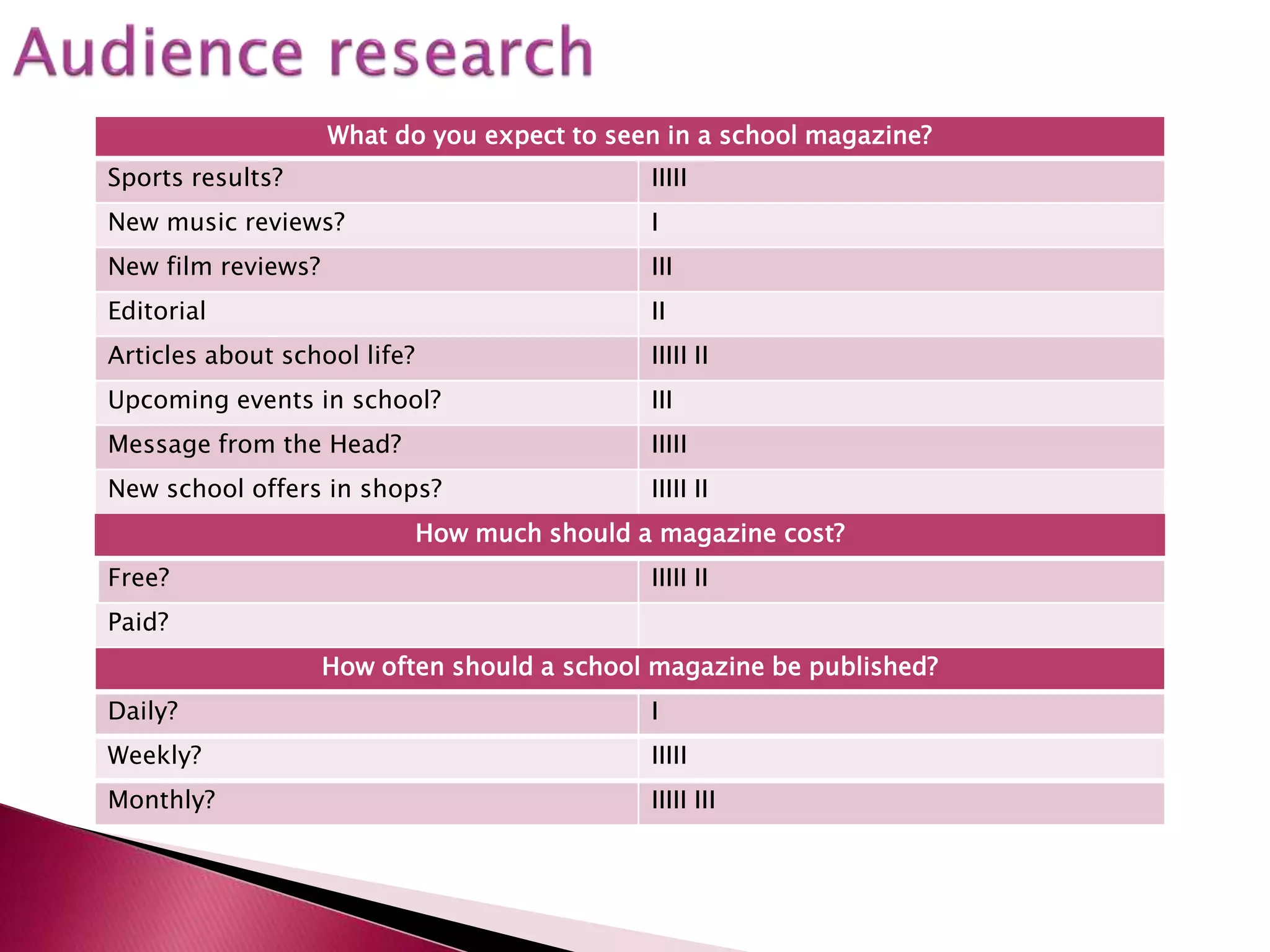
What do you expect to seen in a school magazine?
Sports results? IIIII
New music reviews? I
New film reviews? III
Editorial II
Articles about school life? IIIII II
Upcoming events in school? III
Message from the Head? IIIII
New school offers in shops? IIIII II
How much should a magazine cost?
Free? IIIII II
Paid?
How often should a school magazine be published?
Daily? I
Weekly? IIIII
Monthly? IIIII III
What is successful and what has the student done well?
On the front cover the masthead is very prominent and
visible as they’ve made it pop out of the page through the
boldness and capital letters used. Also it’s prominent
because it’s been laid out in a different way to the other
headlines so we look at it more for being different
What could be improved?
They could have a barcode on the fornt cover and maybe
less images on the contents page so that it’s not as
confusing.
Have they fulfilled the brief?
Yes
Do you think you are able to produce similar work?
Yes I think this would be challenging yet creative
What skills do you need to improve to produce such work?
I need too be able to use photoshop and my time
management skills.
Front Cover Template Contents Template
Front Cover Contents Page

Preliminary Task

  • 1.
  • 2.
    For our preliminarytask we were told to create our own magazine cover and contents page for our school, which features a medium close-up photograph of a student which we took personally, plus some suitably laid-out text and a masthead (etc.). I intended to make my magazine look classy and different to normal school magazines. There would be appropriate stories for my school and suitable giveaways/snatches that the students will find fun and useful.
  • 3.
    On the nextfew slides will be all the research I’ve done for my preliminary task.
  • 4.
    Date: Let’s us knowwhen the magazine was published and the type of edition let’s us know what sort of things they’ll need to purchase for the future. For example as this is a summer edition it’ll tell you about up and coming sports clubs and events and when the school will be closing for summer Main Image: This shows the main story which is featured in this particular magazine. The publishers make it a bigger than the other stories on the front cover so that us (as an audience) know that there’ll be a lot of information/advice in this section. Secondary Stories: These are the other key stories that are found in this magazine. The secondary stories are normally the ones that are important to look at but not as important/significant as the main story. This is portrayed through smaller text, however the page numbers are shown in bold so that the reader will see that first and flick to those pages. Masthead: The title of this magazine is shown in bold writing, capital letters and a vibrant colour. This is because when you’re searching a magazine rack the vibrant colour will catch your eye more than a plain black headline would. Strap/Sell Line: This part of the magazine has to be persuasive and positive. As it is aimed at parents the message should be clean and clear. As you can see the message here is ‘Helping you make the right choices for your children’, meaning that this magazine is all about giving parents tips to helping their children through school.
  • 5.
    What is onthe front cover? On the front cover is a picture of a girl who must be going into her exam period as the title of this story is ‘Exam Choices’. This is on the front cover because exams are very important and significant for a young adolescents future life. A lot of parents would and children going through exams would read this so that they know what they’re in for and to gain some advice on how to handle themselves throughout it. What is good about this magazine? There are lot of bright colours meaning that this magazine will catch any possible readers eyes. Also by having such a big moment in a child’s life as the main story will be a big catch for many parents and students out there. What is bad about the magazine? I feel that in order to make this magazine a bit better the publishers should add a few more images. Although there is a huge image right on the front I feel that by giving a few more images of other stories it will make the audience want to purchase the magazine even more as they’ll know a bit more about what’s going on in the magazine.
  • 6.
    Masthead: By having bigbright ;letters and numbers it attracts us to the magazine more. If they were to have a plain and ordinary black title it would be boring, meaning that nobody would want to buy it. Also, by the title being specific to a certain type of audience (16-18 year olds) it means that they’ll get a lot of people wanting to buy it in order to help them through 6th form. Main story/Image: You can tell this is the main story as the pink writing (title) is bigger that the others, signifying that this is the article that’s it’s featuring the most of. Although this is a good idea, to some people it may not be very clear as all the main/key stories that are featured in this magazine are printed in yellow and fuchsia pink. Following this the main image is of two school girls that are either already at sixth form or are just going into. This shows that the magazine is just mainly based for sixth formers (apart from the title) as they're not wearing normal school clothes indicating that they’re higher up in their education. Date As this magazine is from October time it signifies that it is a new term and all the children have just recently come back to school. This means that the magazine may have various features on starting a new school or how to cope with a new term (especially if you’re going into GCSE period) Secondary Stories: These are the other main featured stories in this magazine. Although they follow the colour scheme of this magazine they stand out as much as the main headline does. This means it’s not clear enough and people may get confused.
  • 7.
    What is onthe front cover? On the front cover is a picture of two girls who are in who are either already in sixth form or just going into. On this magazine they’ve decided to use the colours pink and yellow. These are very bright colours which stand out on the magazine, attracting attention. What is good about this magazine? I think the bright colours are a big hit with this magazine. As they’ve used bright and vibrant colours it attracts the audience’s eyes to this magazine an makes them want to open it up as they’ll be intrigued by the colour scheme. What is bad about this magazine? Personally I think that there aren’t enough images on the front cover. Although there is a main image that takes up the whole page it has no relevance to the actual magazine apart from them looking like they go to a sixth form. Also as all the headings of the key featured articles are in the same colours, fonts and very similar sizes it means that it can be quite confusing to the reader.
  • 8.
    What do youexpect to seen in a school magazine? Sports results? IIIII New music reviews? I New film reviews? III Editorial II Articles about school life? IIIII II Upcoming events in school? III Message from the Head? IIIII New school offers in shops? IIIII II How much should a magazine cost? Free? IIIII II Paid? How often should a school magazine be published? Daily? I Weekly? IIIII Monthly? IIIII III
  • 9.
    What is successfuland what has the student done well? On the front cover the masthead is very prominent and visible as they’ve made it pop out of the page through the boldness and capital letters used. Also it’s prominent because it’s been laid out in a different way to the other headlines so we look at it more for being different What could be improved? They could have a barcode on the fornt cover and maybe less images on the contents page so that it’s not as confusing. Have they fulfilled the brief? Yes Do you think you are able to produce similar work? Yes I think this would be challenging yet creative What skills do you need to improve to produce such work? I need too be able to use photoshop and my time management skills.
  • 10.
    Front Cover TemplateContents Template
  • 11.