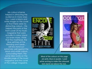
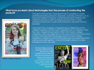
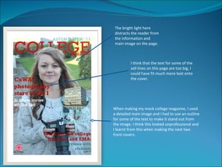
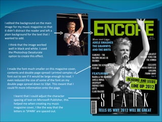
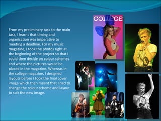
Throughout my research, I began to notice that most music magazines are specific to a particular
    genre of music and I found it very hard to find a magazine that catered for purely chart/pop
    music for teenagers. For example, Mojo magazine features a lot of different artists but it’s
    rare that chart music will be covered. Also Kerrang magazine is a purely rock magazine that
    only appeals to people who like rock music. I wanted to make my magazine appeal to as
    many people as possible and I thought the easiest way to do this was to base it on current,
    pop music. This meant that the target audience for my magazine would most likely be
    teenagers. I tried to appeal to this target market by featuring a young, up and coming star on
    the cover.
I wanted to have a similar target audience for my college magazine, obviously, with it being a
    college magazine I want it to appeal to students at college and prospective students which
    means they will predominately be teenagers. I tried to create a young looking magazine with
    a fashion feel so that it appeals more to the fashionable teenage market.
Despite these differences, I used inspiration from NME magazine for the contents page of my
    music magazine – I liked the clean, simple layout and the very simple colour scheme. Also I
    took inspiration from New magazine’s contents page for my college magazine – I thought
    that it had a vibrant feel that would appeal to teenagers.
My music magazine in particular, I feel definitely represents teenagers and possibly people in their 20s. The
     music featured is very new and most of it is in the charts. This target audience was my intention when
     planning the music magazine. Although I wanted to make my music magazine appeal to as many people as
     possible, I think that it may only appeal to people who like chart/pop music. However, I don’t think this is
     such a bad thing because there is not many magazines on the market that cater for this group of people.
The design of the magazine is quite bold overall, I decided to use colours that would attract attention such as
     bright greens and blues along with darker background colours. I think this, again represents the audience
     that I was aiming for, I find that bold, bright colours appeal to younger generations as opposed to people
     over 40 for example.
I tried to keep the design gender neutral so that it could appeal to as many people as possible, I made a point
     of doing this after my college magazine turned out to look very much like a women’s fashion magazine.
     Although I thought that the college magazine would appeal to teenagers, I thought that it might not
     represent the teenage market as a whole.


                                                   I tried various colour schemes for the cover of my music
                                               magazine but I eventually decided that green and sky blue was
                                                the combination that I liked most, I thought that the blue and
                                               green stood out well on the background and the overall cover
                                                                   looked bold and exciting.
As I’ve made magazines for this coursework, the media institution that would distribute my
    product is the print industry. The magazine would need to be printed to be sold in shops
    and supermarkets all over the country so I would need to print the magazine on a large
    scale if it was to be sold in the real world.
I would use advertisements in other established magazines and newspapers to promote my
    product which would also be involved in the printing industry.


I planned my magazines to be aimed at teenagers. The college magazine is aimed at
teenagers attending college and looking to start studying at college. The magazine appeals
to them because of it’s news and offers relating to college life.
The music magazine, similarly is aimed at teenagers, I created a wide target audience by
appealing to both male and female, and by featuring music that is widely recognised and
listened to. I featured young musicians and used images and a design that I think would
appeal to people of this age group. I wanted the magazine to be cheap so it is accessible
to most people as a lot of teenagers often don’t have a lot of money to spend on luxuries
like magazines.
In my college magazine and especially the
   music magazine, I used informal
   language throughout that teenagers
   would relate to. The colour scheme of
   the music magazine is very bold which
   would attract attention on the
   newsstand of a shop.
                   The colour scheme on my double page spread, I think,
                   is particularly striking. I first decided on which image I
                   wanted to use for my double page spread, then I used
                   colours that would match/compliment the image. As
                   you can see I used a faded image background as I
                   think it gives the page more depth and I thought that
                   the white text stood out well against this dark
                   background. The quote text and the title for the page
                   matched the colour of the lighting in the image which
                   helped the whole article to tie in together. I then based
                   the rest of the magazine around this colour scheme as
                   you can see on the contents and front cover of the
                   music magazine.
My colour scheme
 helped in attracting the
 audience in more ways
 too, I used a black and
white image on the cover
   so that there were no
 distracting colours – this
  helped the parts of the
 front cover of my music
    magazine that were
 actually in colour stand
   out even more. I think
 that the masthead, the
    blue sell lines at the
  ‘Reading and Leeds...’
     sell line stand out
extremely well against the
 black and white colours
  surrounding them. The
 same idea works on the        Most of the colours on this page
double page of the music       are pink, blue or purple. I used
magazine and the cover        white writing to make the coloured
of the college magazine.        text stand out above the rest.
Throughout this process, I have learnt that it is possible to create
                        professional looking products using basic, everyday software such as
                        Microsoft Publisher. However, I combined Microsoft Publisher with
                        Adobe Photoshop to edit my images and give them a more
                        professional look than I could have achieved in Microsoft Paint for
                        example.

                        I also learnt how to design a magazine layout. Reflecting on the
                        college magazine and the music magazine that I’ve created, I think
                        the music magazine looks better. When I first made a college
                        magazine, I used very large text on the cover and found it hard to find
                        a colour that matched the background of my mock college
                        magazine. I worked out which fonts looked best and especially which
                        colours work well together – I found that bright colours on a dark
                        background work very well.


                           My final college and music
                           magazines featured images
                                   that had very simple
                           backgrounds, this directed
                          the viewers attention to the
                             things on the page that I
MOCK college magazine         wanted them to look at.
                          Also, it made it much easier
                           to find colours of font that
                                  worked well with the
                                          background.
The bright light here
distracts the reader from
the information and
main image on the page.


         I think that the text for some of the
         sell lines on this page are too big, I
         could have fit much more text onto
         the cover.


When making my mock college magazine, I used
a detailed main image and I had to use an outline
for some of the text to make it stand out from
the image. I think this looked unprofessional and
I learnt from this when making the next two
front covers.
I edited the background on the main
image for my music magazine so that
it didn’t distract the reader and left a
plain background for the text that I
wanted to add.

   I think that the image worked
   well in black and white. I used
   the Photoshop Desaturate
   option to create this effect.


  I made the font much smaller on this magazine cover,
  contents and double page spread I printed samples of
  font out to see if it would be large enough to read. I
  even reduced the size of some of the font on my
  double page spread down to 10pt. This meant that I
  could fit more information onto the page.

       I learnt that I could adjust the character
       spacing of text on Microsoft Publisher, this
       helped me when creating my music
       magazine cover, I like the way that the
       letters in ‘SPARK’ are spaced out.
On all of my covers, I edited the masthead and the main image together in Photoshop so
that part of the image overlapped the masthead. I thought this made the magazine look
more professional.
FRONT COVER
I am pleased with both my
preliminary task and the full product,
however, I think that after completing
the college magazine I was able to
design and make the music magazine
with less research because of the
knowledge I’d previously gained.
               I think out of everything,
I’ve learnt about the layout of a
magazine most. I created a few
different designs for the college
magazine before I was satisfied with
the result. I used existing magazine
research to see how their content is
arranged on the page. I found that a
lot of the text in a magazine is quite      I liked the large sell line at
small. The first design I created of the    the bottom of the page in
college magazine didn’t look as             the final college magazine
professional as it could have in my         – I decided to keep this
opinion and I rectified this in the         idea when moving onto the
college and music magazines by using        music magazine.
smaller font.
FRONT COVER                                          I’ve found that by using three key
I’ve learnt from designing my initial                colours, the magazine can look
college magazine cover that it is much               more eye catching and visually
easier and clearer for the reader if you             appealing. I kept this idea
have a plain background image. It’s                  throughout making my music
easier to find a text colour that will work          magazine. As you can see, the
with the image and there is often more               cover of my music magazine
space on the page to fit information.                features black, green and blue
                                                     mainly.
                           This cover of Q for
                           example seems quite
                           cluttered even though
                           it doesn’t feature a
                           huge amount of text.
                           The heavily detailed
                           background makes it
                           harder to read the text
                           and distracts me from
                           the information that is
                           being displayed.
CONTENTS PAGE
Each time that I designed a new contents page, I learnt that there needed to be more information on the
page and less blank space. You can see the difference between my first contents page (bottom left) and
my final contents page (bottom right). The area is filled up more on the music magazine contents page
whereas the two college magazine pages have more empty space. I realised that a long block of text
wasn’t appealing to the reader after getting feedback on my contents page, so when I created the music
magazine I decided to split the contents into sections with images relating to articled and headings above
articles so that readers would be able to find what they’re looking for easily.
From my preliminary task to the main
task, I learnt that timing and
organisation was imperative to
meeting a deadline. For my music
magazine, I took the photos right at
the beginning of the project so that I
could then decide on colour schemes
and where the pictures would be
placed in the magazine. Whereas in
the college magazine, I designed
layouts before I took the final cover
image which then meant that I had to
change the colour scheme and layout
to suit the new image.

Evaluation 2

  • 2.
    Throughout my research,I began to notice that most music magazines are specific to a particular genre of music and I found it very hard to find a magazine that catered for purely chart/pop music for teenagers. For example, Mojo magazine features a lot of different artists but it’s rare that chart music will be covered. Also Kerrang magazine is a purely rock magazine that only appeals to people who like rock music. I wanted to make my magazine appeal to as many people as possible and I thought the easiest way to do this was to base it on current, pop music. This meant that the target audience for my magazine would most likely be teenagers. I tried to appeal to this target market by featuring a young, up and coming star on the cover. I wanted to have a similar target audience for my college magazine, obviously, with it being a college magazine I want it to appeal to students at college and prospective students which means they will predominately be teenagers. I tried to create a young looking magazine with a fashion feel so that it appeals more to the fashionable teenage market. Despite these differences, I used inspiration from NME magazine for the contents page of my music magazine – I liked the clean, simple layout and the very simple colour scheme. Also I took inspiration from New magazine’s contents page for my college magazine – I thought that it had a vibrant feel that would appeal to teenagers.
  • 3.
    My music magazinein particular, I feel definitely represents teenagers and possibly people in their 20s. The music featured is very new and most of it is in the charts. This target audience was my intention when planning the music magazine. Although I wanted to make my music magazine appeal to as many people as possible, I think that it may only appeal to people who like chart/pop music. However, I don’t think this is such a bad thing because there is not many magazines on the market that cater for this group of people. The design of the magazine is quite bold overall, I decided to use colours that would attract attention such as bright greens and blues along with darker background colours. I think this, again represents the audience that I was aiming for, I find that bold, bright colours appeal to younger generations as opposed to people over 40 for example. I tried to keep the design gender neutral so that it could appeal to as many people as possible, I made a point of doing this after my college magazine turned out to look very much like a women’s fashion magazine. Although I thought that the college magazine would appeal to teenagers, I thought that it might not represent the teenage market as a whole. I tried various colour schemes for the cover of my music magazine but I eventually decided that green and sky blue was the combination that I liked most, I thought that the blue and green stood out well on the background and the overall cover looked bold and exciting.
  • 4.
    As I’ve mademagazines for this coursework, the media institution that would distribute my product is the print industry. The magazine would need to be printed to be sold in shops and supermarkets all over the country so I would need to print the magazine on a large scale if it was to be sold in the real world. I would use advertisements in other established magazines and newspapers to promote my product which would also be involved in the printing industry. I planned my magazines to be aimed at teenagers. The college magazine is aimed at teenagers attending college and looking to start studying at college. The magazine appeals to them because of it’s news and offers relating to college life. The music magazine, similarly is aimed at teenagers, I created a wide target audience by appealing to both male and female, and by featuring music that is widely recognised and listened to. I featured young musicians and used images and a design that I think would appeal to people of this age group. I wanted the magazine to be cheap so it is accessible to most people as a lot of teenagers often don’t have a lot of money to spend on luxuries like magazines.
  • 5.
    In my collegemagazine and especially the music magazine, I used informal language throughout that teenagers would relate to. The colour scheme of the music magazine is very bold which would attract attention on the newsstand of a shop. The colour scheme on my double page spread, I think, is particularly striking. I first decided on which image I wanted to use for my double page spread, then I used colours that would match/compliment the image. As you can see I used a faded image background as I think it gives the page more depth and I thought that the white text stood out well against this dark background. The quote text and the title for the page matched the colour of the lighting in the image which helped the whole article to tie in together. I then based the rest of the magazine around this colour scheme as you can see on the contents and front cover of the music magazine.
  • 6.
    My colour scheme helped in attracting the audience in more ways too, I used a black and white image on the cover so that there were no distracting colours – this helped the parts of the front cover of my music magazine that were actually in colour stand out even more. I think that the masthead, the blue sell lines at the ‘Reading and Leeds...’ sell line stand out extremely well against the black and white colours surrounding them. The same idea works on the Most of the colours on this page double page of the music are pink, blue or purple. I used magazine and the cover white writing to make the coloured of the college magazine. text stand out above the rest.
  • 7.
    Throughout this process,I have learnt that it is possible to create professional looking products using basic, everyday software such as Microsoft Publisher. However, I combined Microsoft Publisher with Adobe Photoshop to edit my images and give them a more professional look than I could have achieved in Microsoft Paint for example. I also learnt how to design a magazine layout. Reflecting on the college magazine and the music magazine that I’ve created, I think the music magazine looks better. When I first made a college magazine, I used very large text on the cover and found it hard to find a colour that matched the background of my mock college magazine. I worked out which fonts looked best and especially which colours work well together – I found that bright colours on a dark background work very well. My final college and music magazines featured images that had very simple backgrounds, this directed the viewers attention to the things on the page that I MOCK college magazine wanted them to look at. Also, it made it much easier to find colours of font that worked well with the background.
  • 8.
    The bright lighthere distracts the reader from the information and main image on the page. I think that the text for some of the sell lines on this page are too big, I could have fit much more text onto the cover. When making my mock college magazine, I used a detailed main image and I had to use an outline for some of the text to make it stand out from the image. I think this looked unprofessional and I learnt from this when making the next two front covers.
  • 9.
    I edited thebackground on the main image for my music magazine so that it didn’t distract the reader and left a plain background for the text that I wanted to add. I think that the image worked well in black and white. I used the Photoshop Desaturate option to create this effect. I made the font much smaller on this magazine cover, contents and double page spread I printed samples of font out to see if it would be large enough to read. I even reduced the size of some of the font on my double page spread down to 10pt. This meant that I could fit more information onto the page. I learnt that I could adjust the character spacing of text on Microsoft Publisher, this helped me when creating my music magazine cover, I like the way that the letters in ‘SPARK’ are spaced out.
  • 10.
    On all ofmy covers, I edited the masthead and the main image together in Photoshop so that part of the image overlapped the masthead. I thought this made the magazine look more professional.
  • 11.
    FRONT COVER I ampleased with both my preliminary task and the full product, however, I think that after completing the college magazine I was able to design and make the music magazine with less research because of the knowledge I’d previously gained. I think out of everything, I’ve learnt about the layout of a magazine most. I created a few different designs for the college magazine before I was satisfied with the result. I used existing magazine research to see how their content is arranged on the page. I found that a lot of the text in a magazine is quite I liked the large sell line at small. The first design I created of the the bottom of the page in college magazine didn’t look as the final college magazine professional as it could have in my – I decided to keep this opinion and I rectified this in the idea when moving onto the college and music magazines by using music magazine. smaller font.
  • 12.
    FRONT COVER I’ve found that by using three key I’ve learnt from designing my initial colours, the magazine can look college magazine cover that it is much more eye catching and visually easier and clearer for the reader if you appealing. I kept this idea have a plain background image. It’s throughout making my music easier to find a text colour that will work magazine. As you can see, the with the image and there is often more cover of my music magazine space on the page to fit information. features black, green and blue mainly. This cover of Q for example seems quite cluttered even though it doesn’t feature a huge amount of text. The heavily detailed background makes it harder to read the text and distracts me from the information that is being displayed.
  • 13.
    CONTENTS PAGE Each timethat I designed a new contents page, I learnt that there needed to be more information on the page and less blank space. You can see the difference between my first contents page (bottom left) and my final contents page (bottom right). The area is filled up more on the music magazine contents page whereas the two college magazine pages have more empty space. I realised that a long block of text wasn’t appealing to the reader after getting feedback on my contents page, so when I created the music magazine I decided to split the contents into sections with images relating to articled and headings above articles so that readers would be able to find what they’re looking for easily.
  • 14.
    From my preliminarytask to the main task, I learnt that timing and organisation was imperative to meeting a deadline. For my music magazine, I took the photos right at the beginning of the project so that I could then decide on colour schemes and where the pictures would be placed in the magazine. Whereas in the college magazine, I designed layouts before I took the final cover image which then meant that I had to change the colour scheme and layout to suit the new image.