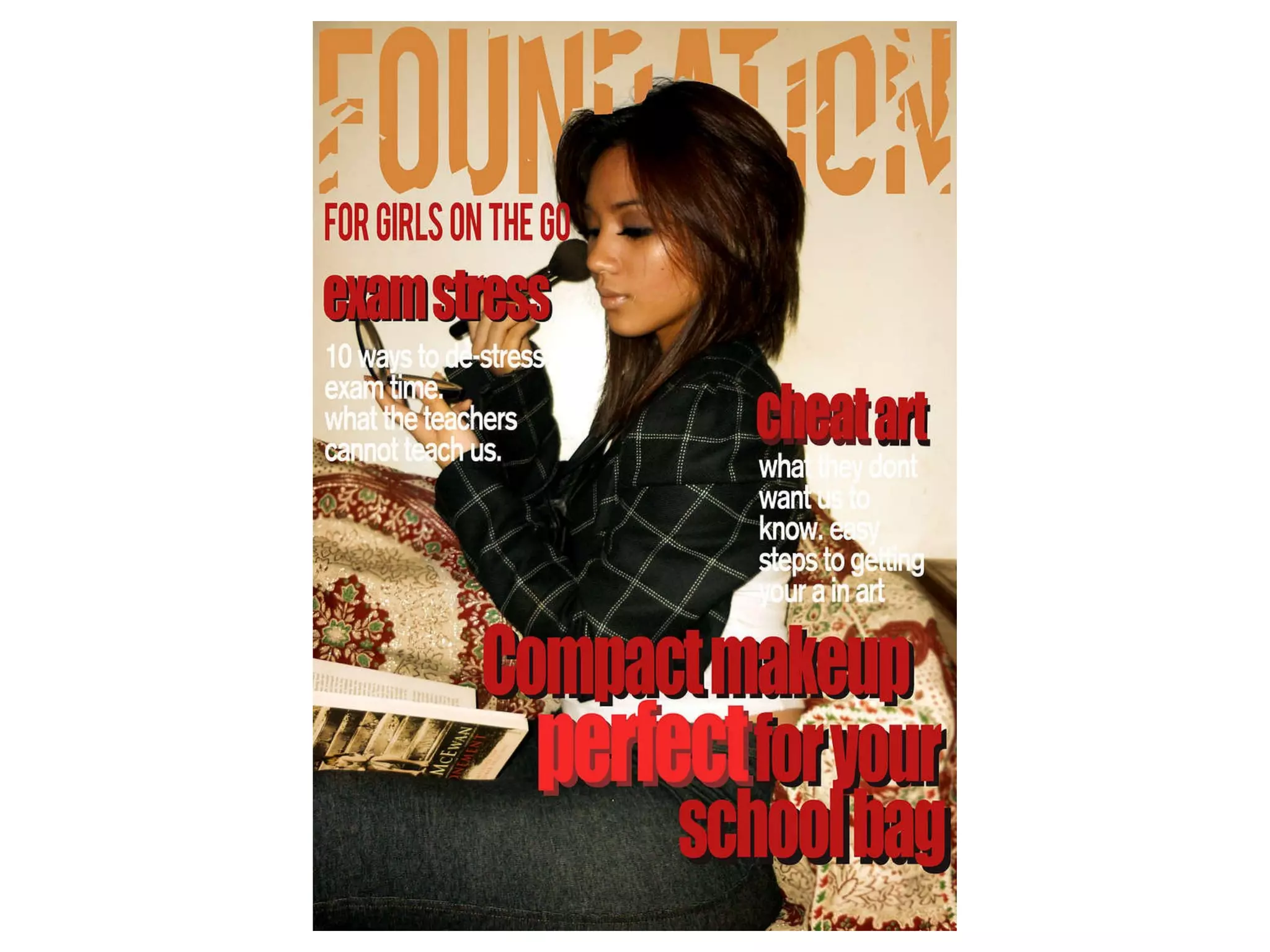
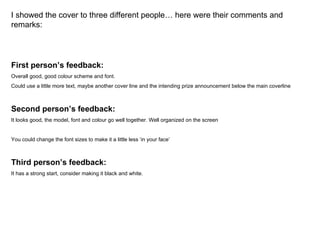
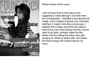
I showed the cover to three different people… here were their comments and remarks: First person’s feedback: Overall good, good colour scheme and font.  Could use a little more text, maybe another cover line and the intending prize announcement below the main coverline Second person’s feedback:  It looks good, the model, font and colour go well together. Well organized on the screen You could change the font sizes to make it a little less ‘in your face’ Third person’s feedback:  It has a strong start, consider making it black and white.
Edited version of the cover: I did not have time to fully take on the suggestions made although I did take them into consideration. I decided to de-saturate the image, which instead of giving it the intending bold feel, it made it look like a photocopy. I realised that in black and white the colours need to be a lot more striking and this I would need to go back, perhaps make the title darker and the selling line either very light (verging on white) or darker still. I do realise that these things will overall improve my cover.
In my magazine cover, I decided to stay away from the stereotypic conventions that usually befall a school magazine. The layout itself does not use the third left rule for it is unlikely that the promise of school related things will attract readers. If someone was in a shop looking through the heaps of tabloid magazines, only then do I think the third left rule will be relevant. The magazine itself appeals to a very niche audience. It is primarily aimed at school girls between 14-21 who care about their appearance just as much as they do their education. These girls would be looking for school fashion, easy ways of getting ready, making exams easier, coping with school issues and that what this magazine is going to cover. I have used varying font sizes of sans serif font, I have used a another colour in the background of the text to make some titles stand out. This will push some information to the back and bring others out. I have chosen those colours because I wanted to ad a vintage feel to the magazine, removing it with the sterility usually found in photography and covers in general. The layout of my magazine will allow the reader to follow the information easily as it is laid out to the natural flow of ones eye.
My magazine is available in the shops as it attracts all types of girls from all around. The magazine is called FOUNDATION which connotes stability, being the bottom (which no-one would want to be at), strength but it is also makeup and this will appeal to girls in the age range I specified. This magazine represents those people (primarily girls) who take pride in their appearance, it targets them because there is usually little focus on appearance and education running parallel in a positive way.

Cover Evaluation

  • 1.
  • 2.
    I showed thecover to three different people… here were their comments and remarks: First person’s feedback: Overall good, good colour scheme and font. Could use a little more text, maybe another cover line and the intending prize announcement below the main coverline Second person’s feedback: It looks good, the model, font and colour go well together. Well organized on the screen You could change the font sizes to make it a little less ‘in your face’ Third person’s feedback: It has a strong start, consider making it black and white.
  • 3.
    Edited version ofthe cover: I did not have time to fully take on the suggestions made although I did take them into consideration. I decided to de-saturate the image, which instead of giving it the intending bold feel, it made it look like a photocopy. I realised that in black and white the colours need to be a lot more striking and this I would need to go back, perhaps make the title darker and the selling line either very light (verging on white) or darker still. I do realise that these things will overall improve my cover.
  • 4.
    In my magazinecover, I decided to stay away from the stereotypic conventions that usually befall a school magazine. The layout itself does not use the third left rule for it is unlikely that the promise of school related things will attract readers. If someone was in a shop looking through the heaps of tabloid magazines, only then do I think the third left rule will be relevant. The magazine itself appeals to a very niche audience. It is primarily aimed at school girls between 14-21 who care about their appearance just as much as they do their education. These girls would be looking for school fashion, easy ways of getting ready, making exams easier, coping with school issues and that what this magazine is going to cover. I have used varying font sizes of sans serif font, I have used a another colour in the background of the text to make some titles stand out. This will push some information to the back and bring others out. I have chosen those colours because I wanted to ad a vintage feel to the magazine, removing it with the sterility usually found in photography and covers in general. The layout of my magazine will allow the reader to follow the information easily as it is laid out to the natural flow of ones eye.
  • 5.
    My magazine isavailable in the shops as it attracts all types of girls from all around. The magazine is called FOUNDATION which connotes stability, being the bottom (which no-one would want to be at), strength but it is also makeup and this will appeal to girls in the age range I specified. This magazine represents those people (primarily girls) who take pride in their appearance, it targets them because there is usually little focus on appearance and education running parallel in a positive way.