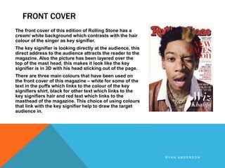
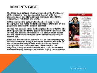
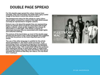
This document summarizes and analyzes the design choices made across the front cover, contents page, and a double page article spread from a magazine. On the front cover, colors are used that link to the featured singer's appearance to draw in readers. The contents page continues this color scheme and uses color and contrast effectively for readability. The double page spread features the band in a greyscale photo with unusual dark coloring that provides a reverse stereotype from their typical bright style, with the photo prioritized over text.