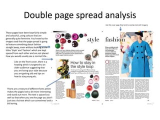
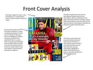
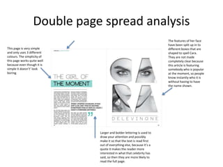
Critical analysis
on Fashion magazine
Fashion Magazines
Vogue –
This magazine targets a female audience ranging from 18-50 year olds who more than
half have been through education and employment.
Front Cover Analysis
Vogue usually uses around 3 different
font colours to compliment the image,
they tend to be colours that blend well
with the outfit or makeup of the model.
They use the brighter colours on the
text that is featuring things that are
popular at that moment or just
something stereotypical that women
are to take interest in. having these
certain bits of text highlighted makes
you look at it and think about it first,
which is more likely to catch the
audience’s eye.
The magazine only sometimes
displays the name of the person
on the cover, on this particular
cover only the first name is
mentioned in big lettering. The
person used in this cover is
somebody who is popular at the
moment so this will attract the
audience and may influence
their decision on purchasing the
magazine. The person featured
tends to look quite classy, well
dressed and covered up which
is generally what the target
audience would want to see
and give them ideas about how
they should dress themselves.
Sometimes the magazine chooses to place their images so that
the head of the model is covering up the ‘G’ on the title. As
this is a well known magazine the public know which letter is
being covered because they are aware of the magazine.
The topics that are shown suggest that the
magazine is for an older and more mature higher
class audience. ‘How to hold on to your style’ is
an example of this. The magazine is trying to
connect with the audience giving them tips and
advise on fashion etc, which would be one of the
main reasons somebody from the target
audience would want to purchase the magazine.
On this magazine cover certain words are used that
suggest that you should improve yourself and by buying
this magazine you will be able to read about how to do
so.
Compared to most magazines, Vogue is
usually quite simple with their front covers.
They keep it quite basic so it has that classy
look to it. So the women that are of the
target age range are most likely to chose
this magazine over something such as
Cosmopolitan etc which has more of a
younger look to it.
Double page spread analysis
Like on the front cover, there is a
heading which is targeted to an
older audience suggesting that
you are losing your style because
you are getting old and tips on
how to stay young etc.
These pages have been kept fairly simple
and colourful, using colours that are
generally quite feminine. You know by the
images used that the page spread is going
to feature something about fashion
straight away, even without looking at the
titles ‘Style’ and ‘Fashion’ which are kept
spaced from each other and are not placed
how you would usually see a normal title..
Like the cover page they tend to overlap text with imagery
There are a mixture of different fonts which
makes the pages look a bit more interesting
and stand out more. The text is spaced out
well so that when you see the page you don’t
just see a lot text which can sometimes look a
bit boring.
Grazia
Grazia is a fashion magazine that has a
large female audience with the highest
percentage of readers being aged 35-44
Front Cover Analysis
Like Vogue magazine, Grazia is also
very popular so is as well able to
cover up a letter with the head of an
image.
The colours used in this cover
are quite bold and stand out
well, they are feminine in a
mature type of way. The text is
also quite simple and easy to
read. With the most eye
catching bits highlighted in
yellow. The colours also are
used in a way that compliments
the image being used.
The person featuring on the
front of the magazine is usually
somebody very popular. On this
issue it is Rihanna. They have
her name highlighted in bold to
attract your attention and
underneath there is a quote.
They are using a quote that goes
with a celebrity news story that
is current. By using this quote it
makes the readers want to read
more about it so will therefore
purchase the magazine.
The types of articles are ones that are
stereotypical things that women are
interested in, which are displayed on this
page. Stuff to do with diets, marriages, dating
and clothing. Because of this Grazia are more
likely to maintain a very popular reputation by
giving their readers what they want.
Double page spread analysis
This page is very simple
and only uses 3 different
colours. The simplicity of
this page works quite well
because even though it is
simple it doesn’t’ look
boring.
The features of her face
have been split up in to
different boxes that are
shaped to spell Cara.
They are not made
completely clear because
this article is featuring
somebody who is popular
at the moment, so people
know instantly who it is
without having to have
the name shown.
Larger and bolder lettering is used to
draw your attention and possibly
make it so that the text is read first
out of everything else, because it’s a
quote it makes the reader more
interested in what that celebrity has
said, so then they are more likely to
read the full page.

Magazine Anaylsis 2

  • 1.
  • 2.
    Fashion Magazines Vogue – Thismagazine targets a female audience ranging from 18-50 year olds who more than half have been through education and employment.
  • 3.
    Front Cover Analysis Vogueusually uses around 3 different font colours to compliment the image, they tend to be colours that blend well with the outfit or makeup of the model. They use the brighter colours on the text that is featuring things that are popular at that moment or just something stereotypical that women are to take interest in. having these certain bits of text highlighted makes you look at it and think about it first, which is more likely to catch the audience’s eye. The magazine only sometimes displays the name of the person on the cover, on this particular cover only the first name is mentioned in big lettering. The person used in this cover is somebody who is popular at the moment so this will attract the audience and may influence their decision on purchasing the magazine. The person featured tends to look quite classy, well dressed and covered up which is generally what the target audience would want to see and give them ideas about how they should dress themselves. Sometimes the magazine chooses to place their images so that the head of the model is covering up the ‘G’ on the title. As this is a well known magazine the public know which letter is being covered because they are aware of the magazine. The topics that are shown suggest that the magazine is for an older and more mature higher class audience. ‘How to hold on to your style’ is an example of this. The magazine is trying to connect with the audience giving them tips and advise on fashion etc, which would be one of the main reasons somebody from the target audience would want to purchase the magazine. On this magazine cover certain words are used that suggest that you should improve yourself and by buying this magazine you will be able to read about how to do so. Compared to most magazines, Vogue is usually quite simple with their front covers. They keep it quite basic so it has that classy look to it. So the women that are of the target age range are most likely to chose this magazine over something such as Cosmopolitan etc which has more of a younger look to it.
  • 4.
    Double page spreadanalysis Like on the front cover, there is a heading which is targeted to an older audience suggesting that you are losing your style because you are getting old and tips on how to stay young etc. These pages have been kept fairly simple and colourful, using colours that are generally quite feminine. You know by the images used that the page spread is going to feature something about fashion straight away, even without looking at the titles ‘Style’ and ‘Fashion’ which are kept spaced from each other and are not placed how you would usually see a normal title.. Like the cover page they tend to overlap text with imagery There are a mixture of different fonts which makes the pages look a bit more interesting and stand out more. The text is spaced out well so that when you see the page you don’t just see a lot text which can sometimes look a bit boring.
  • 5.
    Grazia Grazia is afashion magazine that has a large female audience with the highest percentage of readers being aged 35-44
  • 6.
    Front Cover Analysis LikeVogue magazine, Grazia is also very popular so is as well able to cover up a letter with the head of an image. The colours used in this cover are quite bold and stand out well, they are feminine in a mature type of way. The text is also quite simple and easy to read. With the most eye catching bits highlighted in yellow. The colours also are used in a way that compliments the image being used. The person featuring on the front of the magazine is usually somebody very popular. On this issue it is Rihanna. They have her name highlighted in bold to attract your attention and underneath there is a quote. They are using a quote that goes with a celebrity news story that is current. By using this quote it makes the readers want to read more about it so will therefore purchase the magazine. The types of articles are ones that are stereotypical things that women are interested in, which are displayed on this page. Stuff to do with diets, marriages, dating and clothing. Because of this Grazia are more likely to maintain a very popular reputation by giving their readers what they want.
  • 7.
    Double page spreadanalysis This page is very simple and only uses 3 different colours. The simplicity of this page works quite well because even though it is simple it doesn’t’ look boring. The features of her face have been split up in to different boxes that are shaped to spell Cara. They are not made completely clear because this article is featuring somebody who is popular at the moment, so people know instantly who it is without having to have the name shown. Larger and bolder lettering is used to draw your attention and possibly make it so that the text is read first out of everything else, because it’s a quote it makes the reader more interested in what that celebrity has said, so then they are more likely to read the full page.