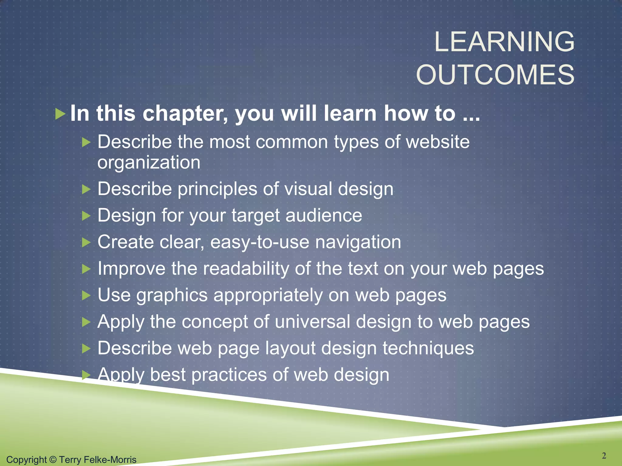
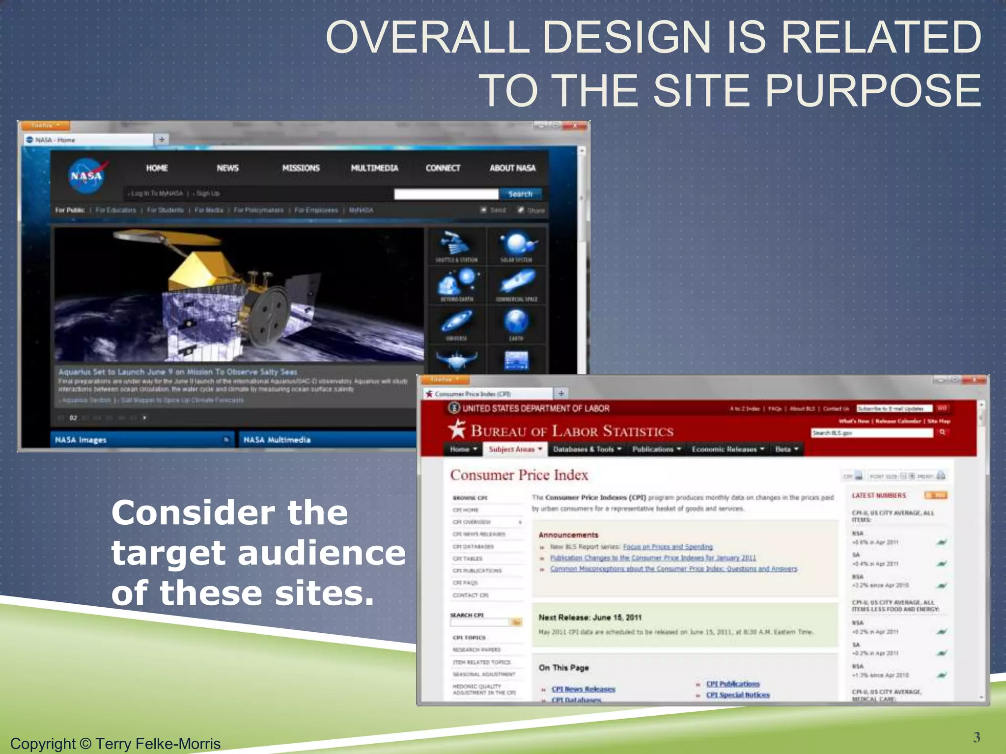
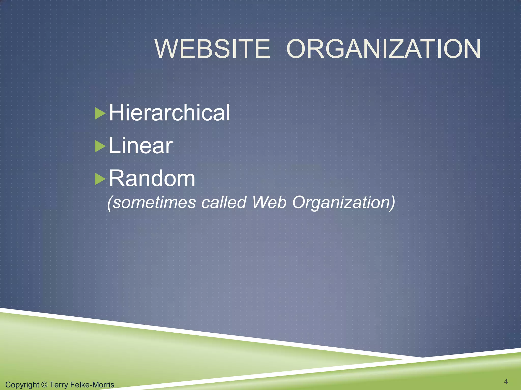
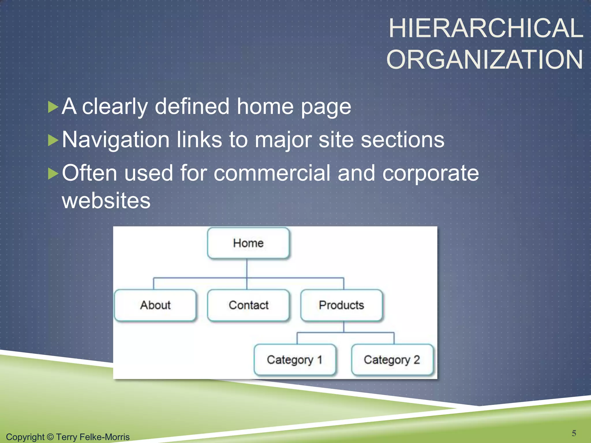
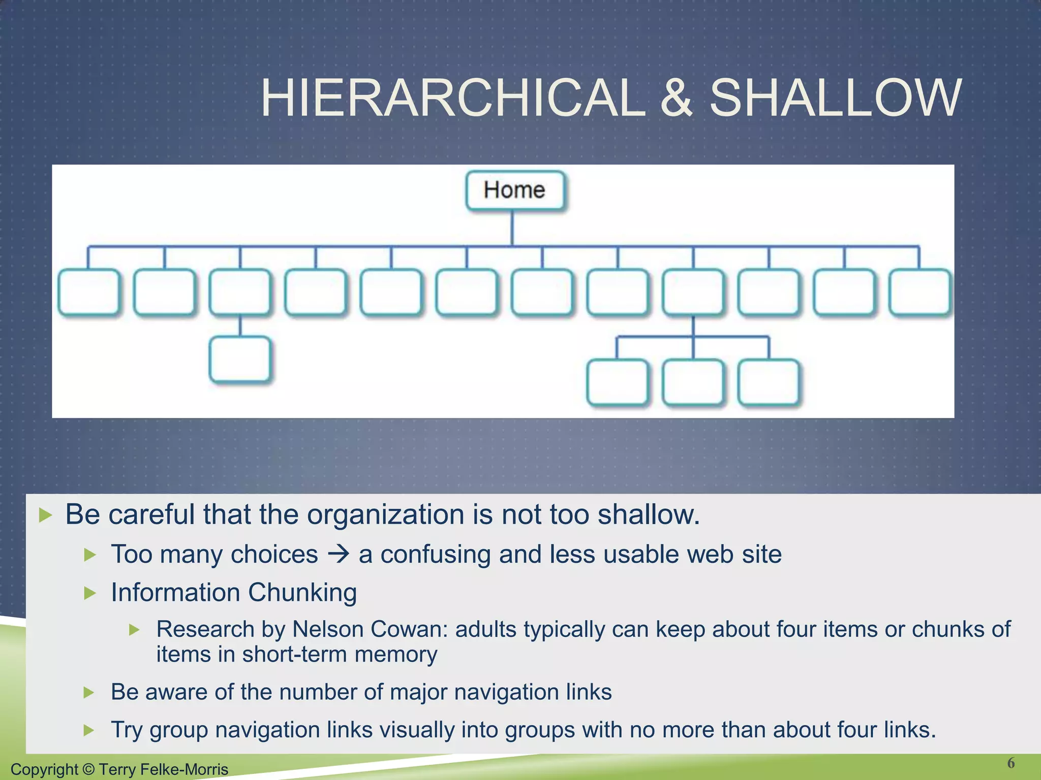
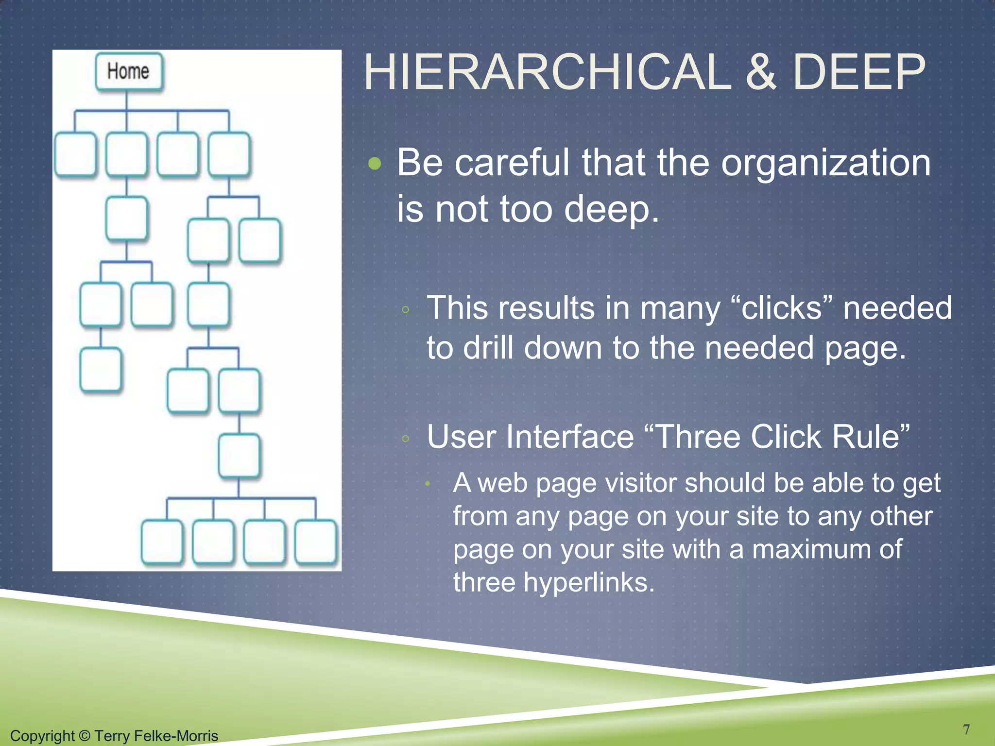
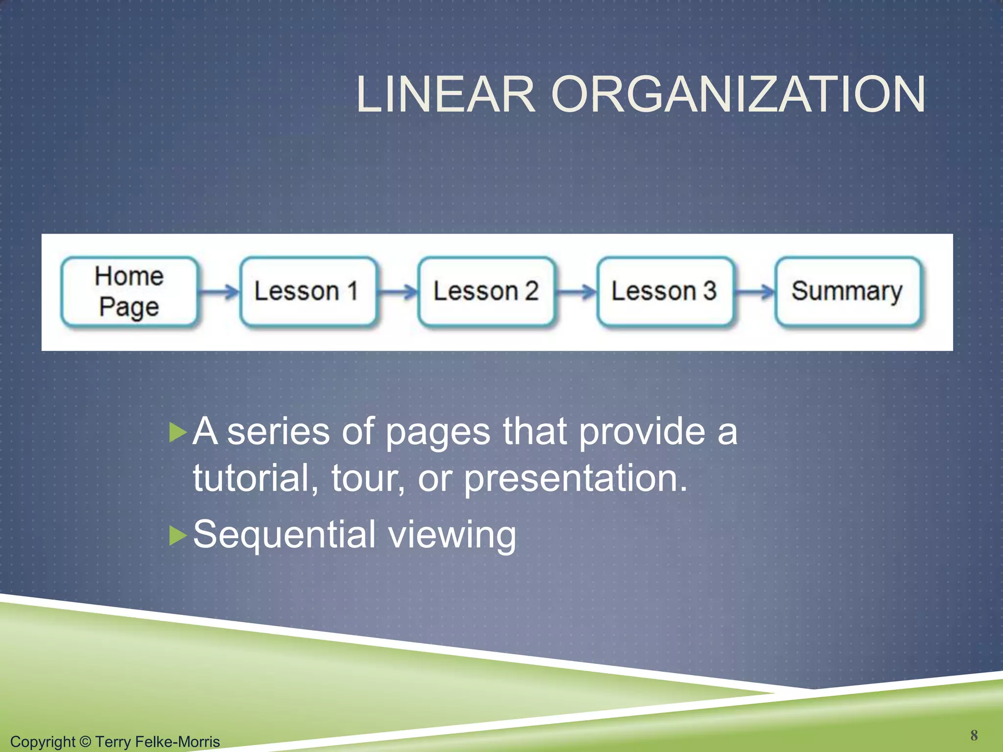
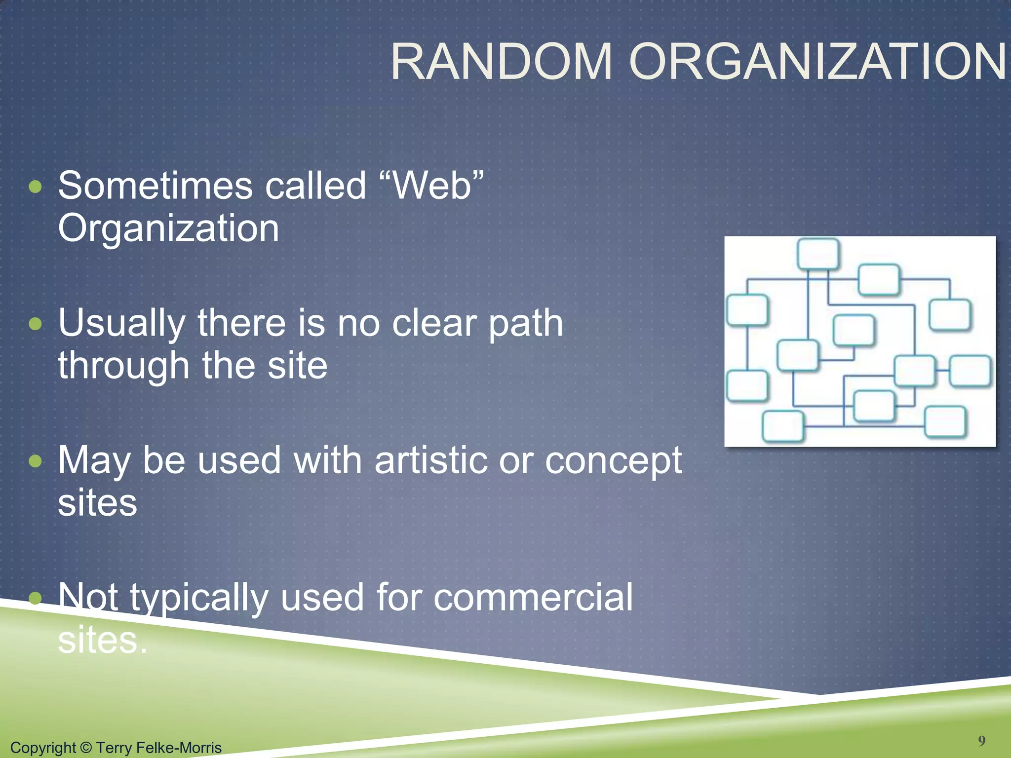
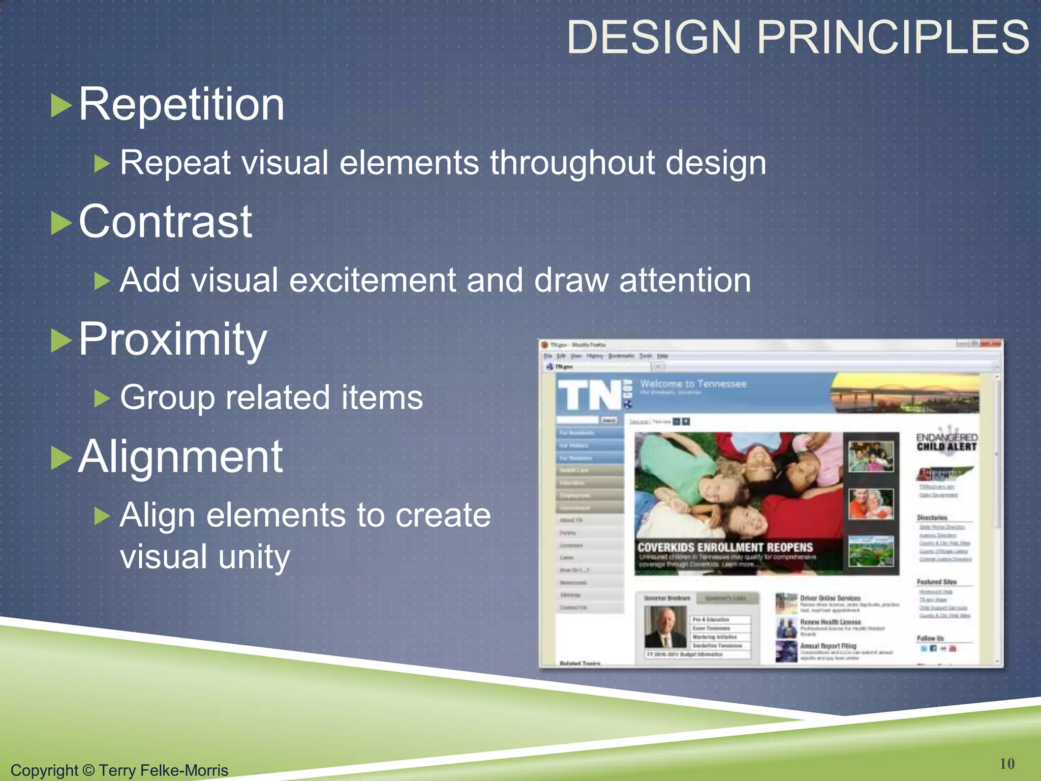
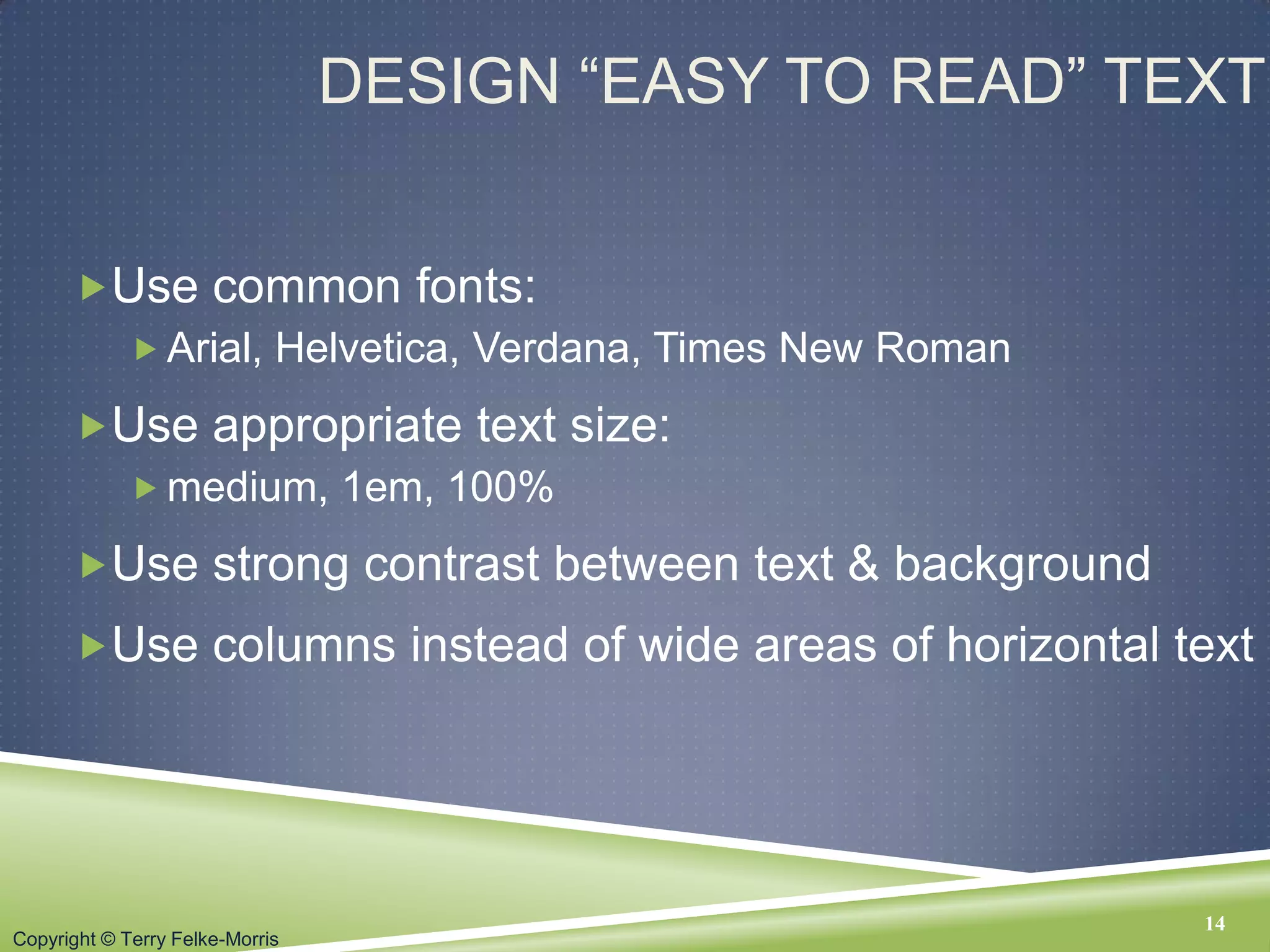
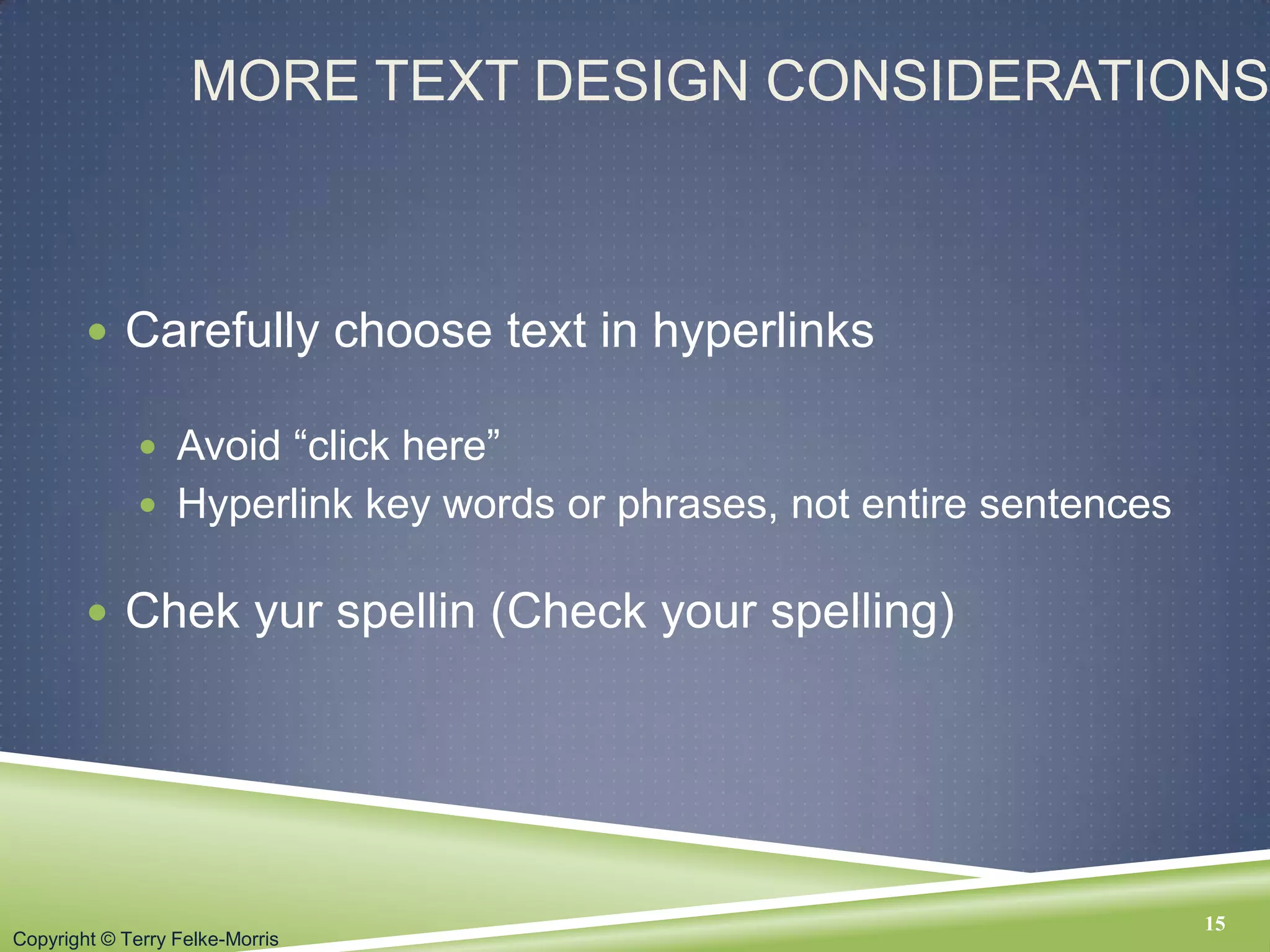
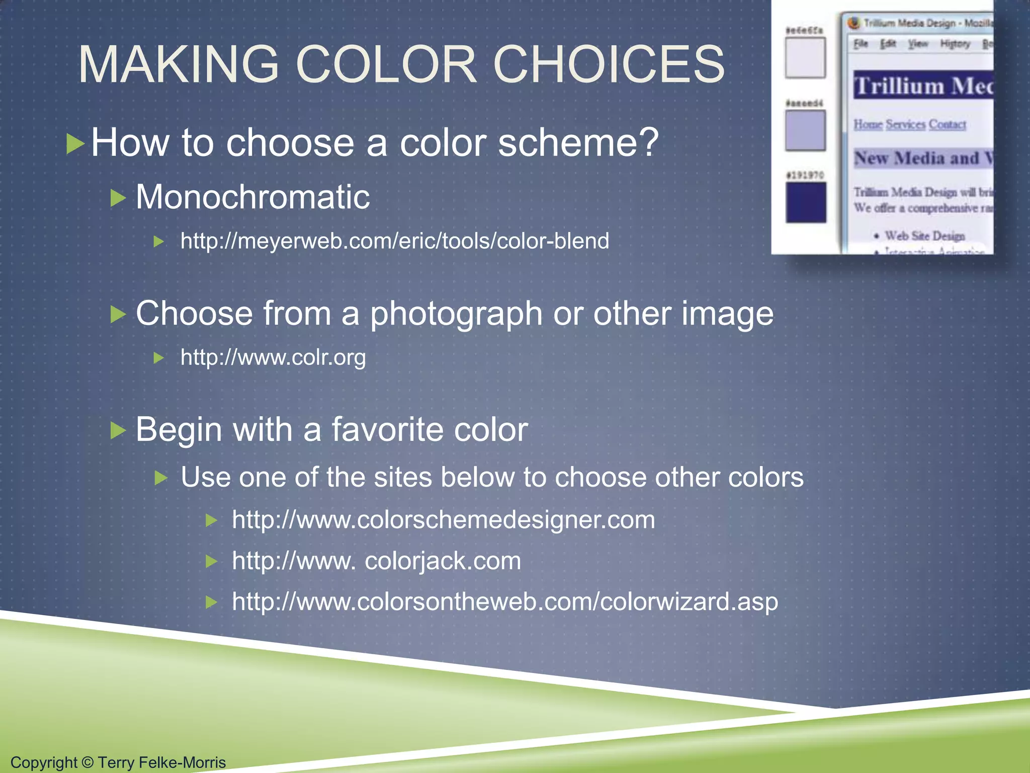
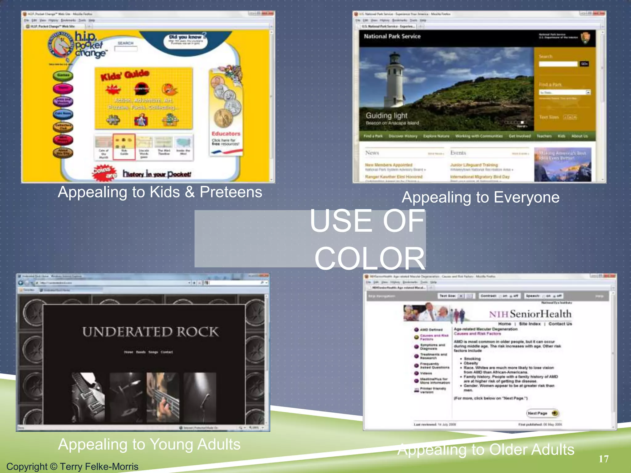
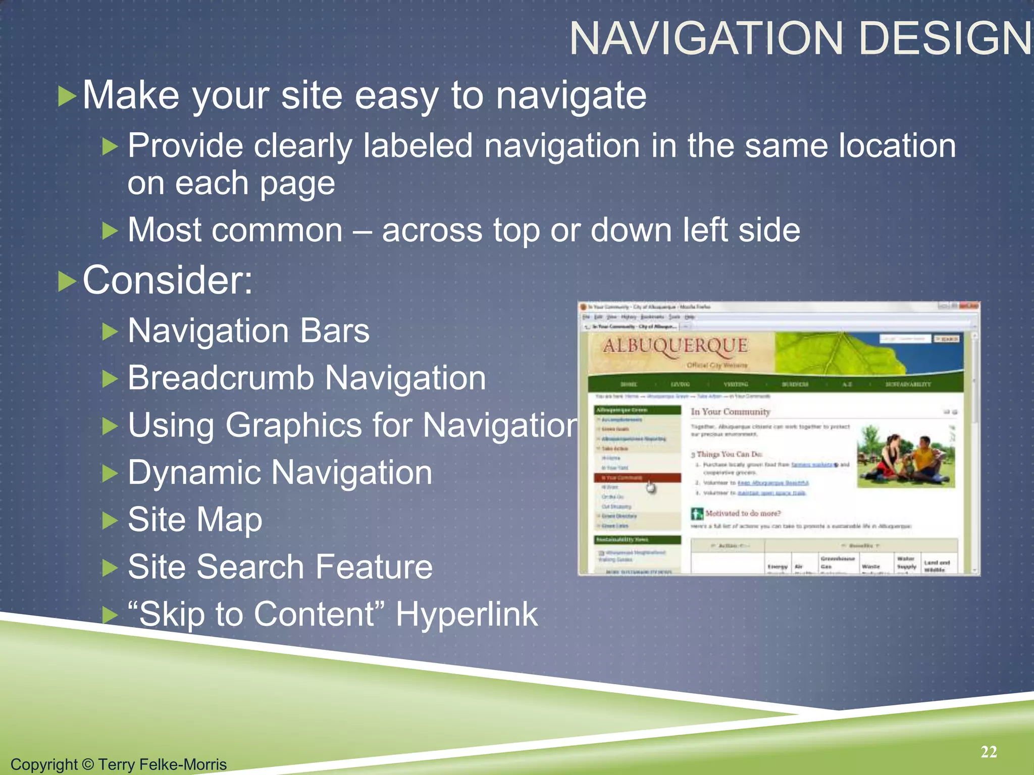
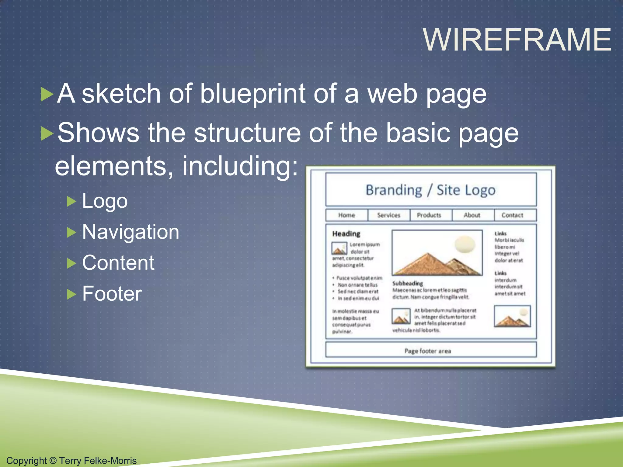
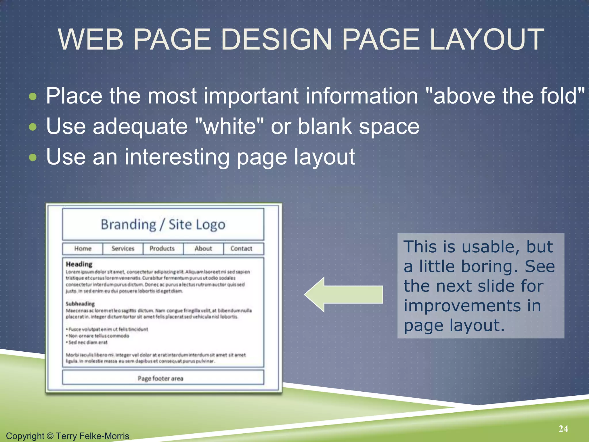
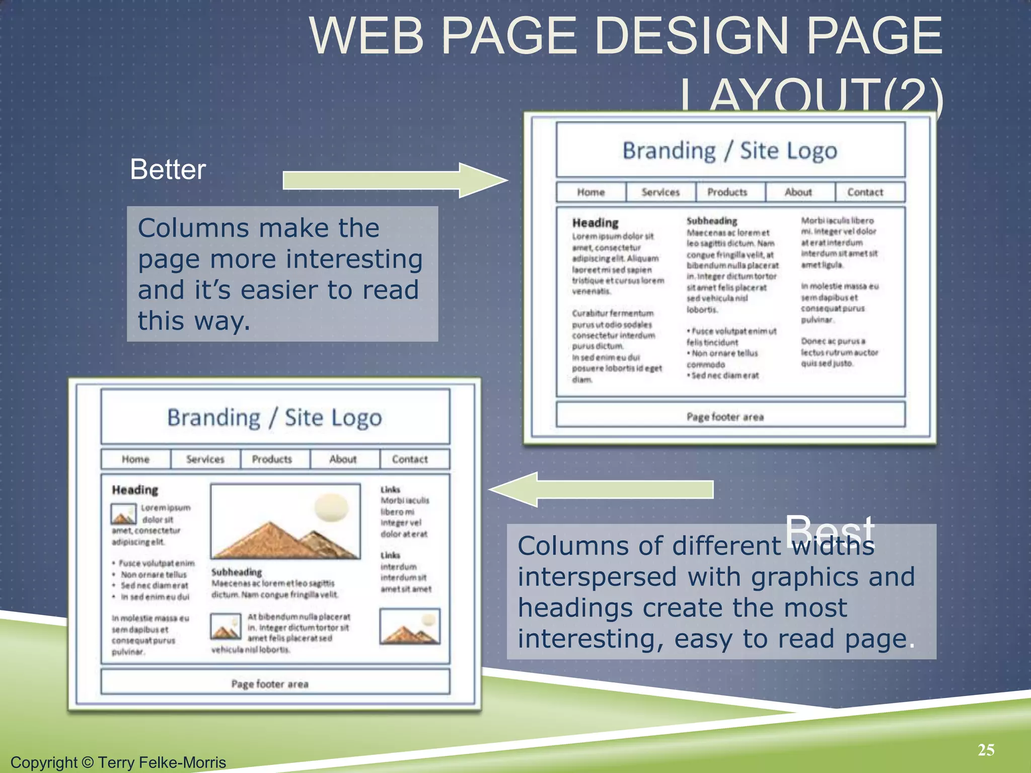
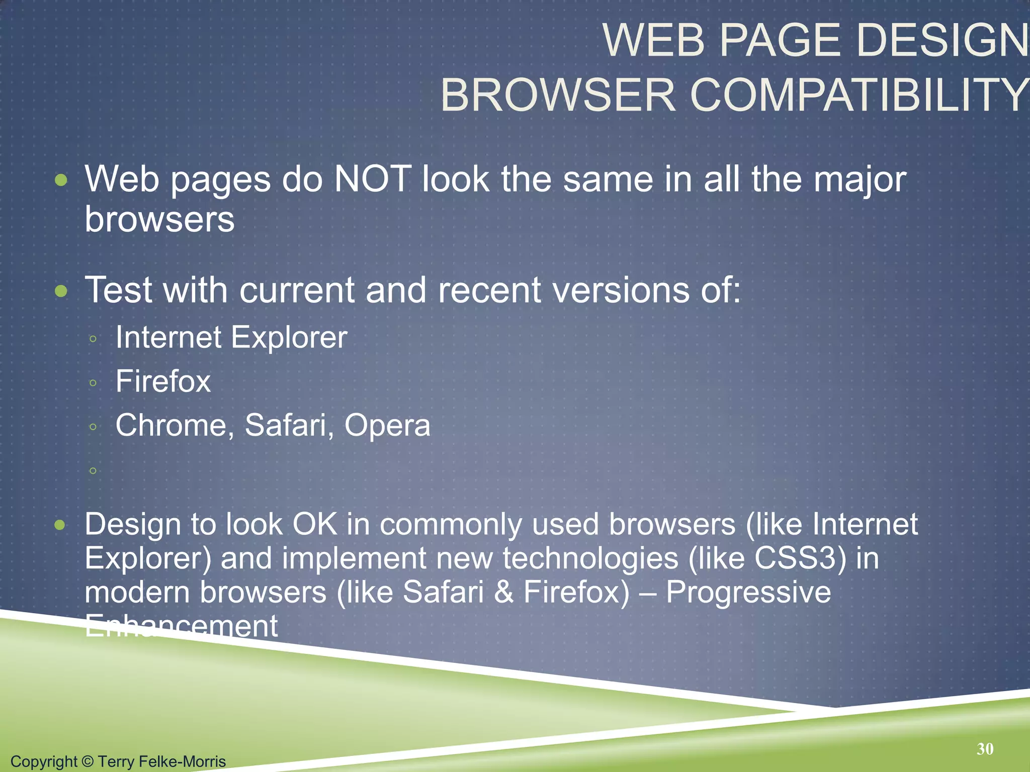
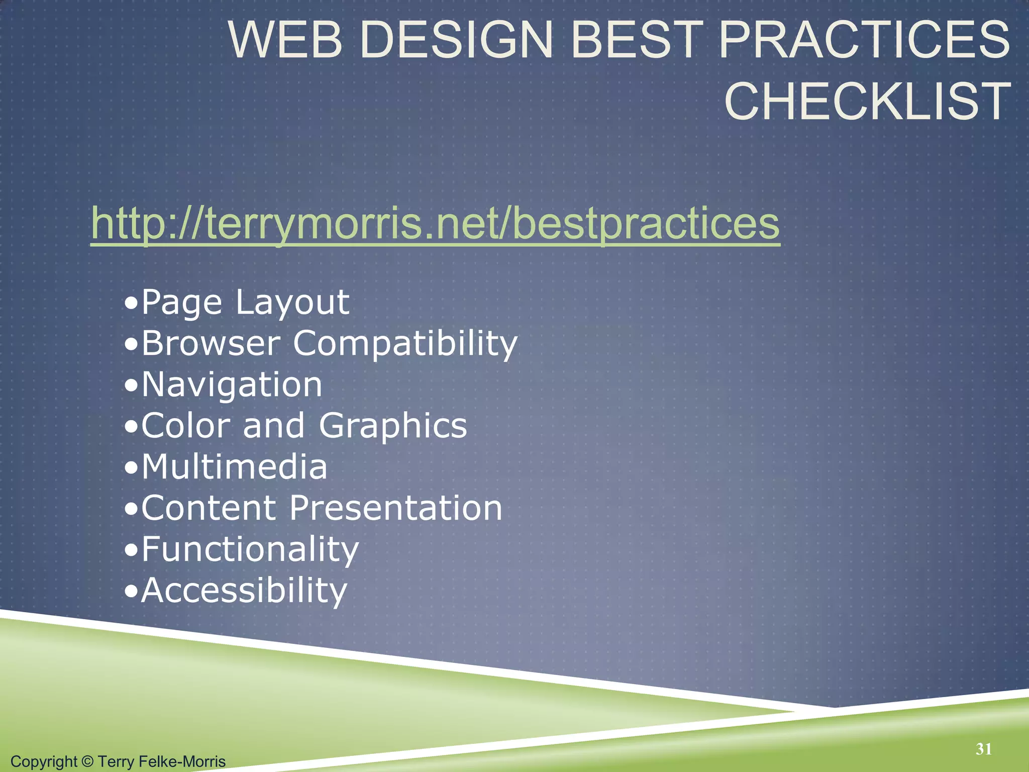
Science 7 - LAND and SEA BREEZE and its Characteristics
Â
Chapter 5 - Web Design
1. Copyright Š Terry Felke-Morris
WEB DEVELOPMENT &
DESIGN FOUNDATIONS WITH
HTML5
Chapter 5
Key Concepts
1Copyright Š Terry Felke-Morris
2. Copyright Š Terry Felke-Morris
LEARNING
OUTCOMES
īIn this chapter, you will learn how to ...
ī Describe the most common types of website
organization
ī Describe principles of visual design
ī Design for your target audience
ī Create clear, easy-to-use navigation
ī Improve the readability of the text on your web pages
ī Use graphics appropriately on web pages
ī Apply the concept of universal design to web pages
ī Describe web page layout design techniques
ī Apply best practices of web design
2
3. Copyright Š Terry Felke-Morris
OVERALL DESIGN IS RELATED
TO THE SITE PURPOSE
3
Consider the
target audience
of these sites.
4. Copyright Š Terry Felke-Morris
WEBSITE ORGANIZATION
īHierarchical
īLinear
īRandom
(sometimes called Web Organization)
4
5. Copyright Š Terry Felke-Morris
HIERARCHICAL
ORGANIZATION
īA clearly defined home page
īNavigation links to major site sections
īOften used for commercial and corporate
websites
5
6. Copyright Š Terry Felke-Morris
HIERARCHICAL & SHALLOW
ī Be careful that the organization is not too shallow.
ī Too many choices ī a confusing and less usable web site
ī Information Chunking
ī Research by Nelson Cowan: adults typically can keep about four items or chunks of
items in short-term memory
ī Be aware of the number of major navigation links
ī Try group navigation links visually into groups with no more than about four links.
6
7. Copyright Š Terry Felke-Morris
HIERARCHICAL & DEEP
ī Be careful that the organization
is not too deep.
âĻ This results in many âclicksâ needed
to drill down to the needed page.
âĻ User Interface âThree Click Ruleâ
ī A web page visitor should be able to get
from any page on your site to any other
page on your site with a maximum of
three hyperlinks.
7
8. Copyright Š Terry Felke-Morris
LINEAR ORGANIZATION
īA series of pages that provide a
tutorial, tour, or presentation.
īSequential viewing
8
9. Copyright Š Terry Felke-Morris
RANDOM ORGANIZATION
ī Sometimes called âWebâ
Organization
ī Usually there is no clear path
through the site
ī May be used with artistic or concept
sites
ī Not typically used for commercial
sites.
9
10. Copyright Š Terry Felke-Morris
DESIGN PRINCIPLES
īRepetition
ī Repeat visual elements throughout design
īContrast
ī Add visual excitement and draw attention
īProximity
ī Group related items
īAlignment
ī Align elements to create
visual unity
10
11. Copyright Š Terry Felke-Morris
DESIGN TO PROVIDE FOR
ACCESSIBILITY
âThe power of the Web is in its universality. Access by
everyone regardless of disability is an essential aspect.â â
Tim Berners-Lee
ī Who benefits from increased accessibility?
ī A person with a physical disability
ī A person using a slow Internet connection
ī A person using an old, out-dated computer
ī A person using a mobile phone
īLegal Requirement: Section 508
īStandards: WCAG 2.0
11
12. Copyright Š Terry Felke-Morris
DESIGN FOR ACCESSIBILITY
ī Web Content Accessibility Guidelines 2.0
WCAG 2.0
âĻ http://www.w3.org/TR/WCAG20/Overview
âĻ http://www.w3.org/WAI/WCAG20/quickref
Based on Four Principles (POUR)
1. Perceivable
Content must be Perceivable
2. Operable
Interface components in the content must be Operable
3. Understandable
Content and controls must be Understandable
4. Robust.
Content should be Robust enough to work with current
and future user agents, including assistive technologies
12
13. Copyright Š Terry Felke-Morris
WRITING FOR THE WEB
īAvoid long blocks of text
īUse bullet points
īUse headings and subheadings
īUse short paragraphs
13
14. Copyright Š Terry Felke-Morris
DESIGN âEASY TO READâ TEXT
īUse common fonts:
ī Arial, Helvetica, Verdana, Times New Roman
īUse appropriate text size:
ī medium, 1em, 100%
īUse strong contrast between text & background
īUse columns instead of wide areas of horizontal text
14
15. Copyright Š Terry Felke-Morris
MORE TEXT DESIGN CONSIDERATIONS
ī Carefully choose text in hyperlinks
ī Avoid âclick hereâ
ī Hyperlink key words or phrases, not entire sentences
ī Chek yur spellin (Check your spelling)
15
16. Copyright Š Terry Felke-Morris
MAKING COLOR CHOICES
īHow to choose a color scheme?
ī Monochromatic
ī http://meyerweb.com/eric/tools/color-blend
ī Choose from a photograph or other image
ī http://www.colr.org
ī Begin with a favorite color
ī Use one of the sites below to choose other colors
ī http://www.colorschemedesigner.com
ī http://www. colorjack.com
ī http://www.colorsontheweb.com/colorwizard.asp
17. Copyright Š Terry Felke-Morris
USE OF
COLOR
Appealing to Kids & Preteens
17
Appealing to Young Adults
Appealing to Everyone
Appealing to Older Adults
18. Copyright Š Terry Felke-Morris
CHECKPOINT
1. List the four basic principles of design.
View the home page of your school and describe
how each principle is applied.
2. View http://www.walmart.com,
http://www.mugglenet.com, and
http://www. sesamestreet.org/muppet
Describe the target audience for each site.
How do their designs differ?
Do the sites meet the needs of their target
audiences?
18
19. Copyright Š Terry Felke-Morris
USE OF GRAPHICS & MULTIMEDIA
ī File size and dimension matter
ī Provide for robust navigation
ī Antialiased/aliased text considerations
ī Provide alternate text
ī Use only necessary multimedia
19
20. Copyright Š Terry Felke-Morris
GRAPHIC DESIGN BEST
PRACTICES(1)
ī Be careful with large graphics!
âĻ Remember 60K recommendation
ī Use the alt attribute to supply descriptive alternate
text
ī Be sure your message gets across even if images
are not displayed.
âĻ If using images for navigation provide plain text links at the bottom
of the page.
ī Use animation only if it makes the page more
effective and provide a text description.
20
21. Copyright Š Terry Felke-Morris
GRAPHIC DESIGN BEST
PRACTICES(2)
ī Choose colors on the web palette if consistency across
older Windows/Mac platforms is needed
ī Use anti-aliased text in images
ī Use only necessary images
ī Reuse images
ī Goal: image file size should be as small as possible
21
Do you really
need to see a
photo of my
dog right now?
22. Copyright Š Terry Felke-Morris
NAVIGATION DESIGN
īMake your site easy to navigate
ī Provide clearly labeled navigation in the same location
on each page
ī Most common â across top or down left side
īConsider:
ī Navigation Bars
ī Breadcrumb Navigation
ī Using Graphics for Navigation
ī Dynamic Navigation
ī Site Map
ī Site Search Feature
ī âSkip to Contentâ Hyperlink
22
23. Copyright Š Terry Felke-Morris
WIREFRAME
īA sketch of blueprint of a web page
īShows the structure of the basic page
elements, including:
ī Logo
ī Navigation
ī Content
ī Footer
24. Copyright Š Terry Felke-Morris
WEB PAGE DESIGN PAGE LAYOUT
ī Place the most important information "above the fold"
ī Use adequate "white" or blank space
ī Use an interesting page layout
24
This is usable, but
a little boring. See
the next slide for
improvements in
page layout.
25. Copyright Š Terry Felke-Morris
WEB PAGE DESIGN PAGE
LAYOUT(2)
Better
25
Best
Columns make the
page more interesting
and itâs easier to read
this way.
Columns of different widths
interspersed with graphics and
headings create the most
interesting, easy to read page.
26. Copyright Š Terry Felke-Morris
PAGE LAYOUT DESIGN TECHNIQUES
ī Ice Design
âĻ AKA rigid or fixed design
âĻ Fixed-width, usually at left margin
ī Jello Design
âĻ Page content typically centered
âĻ Often configured with a fixed or percentage width such as
80%
ī Liquid Design
âĻ Page expands to fill the browser at all resolutions.
26
27. Copyright Š Terry Felke-Morris
DESIGN FOR THE MOBILE WEB
ī Design Considerations:
ī Small screen size
ī Low bandwidth
ī Font, color, and media issues
ī Awkward controls,
limited processor and memory
ī Functionality
27
28. Copyright Š Terry Felke-Morris
WEB PAGE DESIGN LOAD TIME
ī Watch the load time of your pages
ī Try to limit web page document and associated media
to under 60K on the home page
28
29. Copyright Š Terry Felke-Morris
WEB PAGE DESIGN
SCREEN RESOLUTION
ī Test at various screen resolutions
âĻ Most widely used: 1024x768, 1280x800, and
1366x768
ī Design to look good at various screen
resolutions
âĻ Centered page content
âĻ Set to either a fixed or percentage width
29
30. Copyright Š Terry Felke-Morris
WEB PAGE DESIGN
BROWSER COMPATIBILITY
ī Web pages do NOT look the same in all the major
browsers
ī Test with current and recent versions of:
âĻ Internet Explorer
âĻ Firefox
âĻ Chrome, Safari, Opera
âĻ
ī Design to look OK in commonly used browsers (like Internet
Explorer) and implement new technologies (like CSS3) in
modern browsers (like Safari & Firefox) â Progressive
Enhancement
30
31. Copyright Š Terry Felke-Morris
WEB DESIGN BEST PRACTICES
CHECKLIST
http://terrymorris.net/bestpractices
31
âĸPage Layout
âĸBrowser Compatibility
âĸNavigation
âĸColor and Graphics
âĸMultimedia
âĸContent Presentation
âĸFunctionality
âĸAccessibility
32. Copyright Š Terry Felke-Morris
CHECKPOINT
1. View the home page of your school. Use the Best Practices Checklist
(Table 5.1) to evaluate the page. Describe the results.
2. View your favorite web site (or a URL provided by your instructor).
ī Maximize and resize the browser window.
ī Decide whether the site uses ice, jello, or liquid design.
ī Adjust the screen resolution on your monitor
(Start > Control Panel > Display > Settings) to a different
resolution than you normally use.
ī Does the site look similar or very different?
ī List two recommendations for improving the design of the site
.
3. List three best practices of using graphics on web pages. View the
home page of your school. Describe the use of graphic design best
practices on this page.
32
33. Copyright Š Terry Felke-Morris
SUMMARY
īThis chapter introduced you to best
practices of web design.
ī The choices you make in the use of
color, graphics, and text should be based
on your particular target audience.
.
33