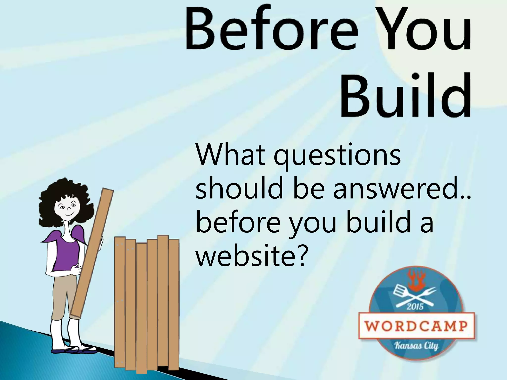
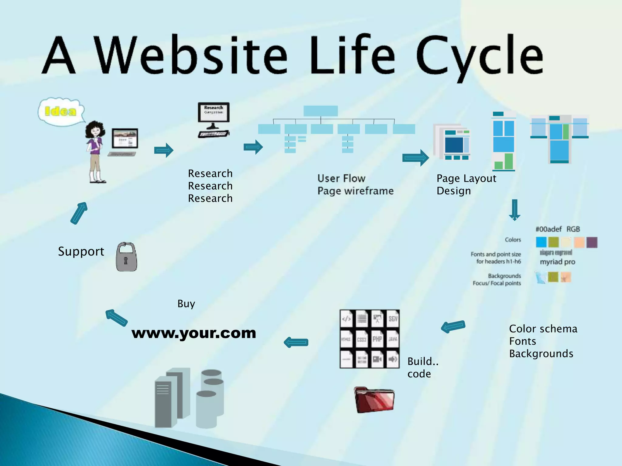
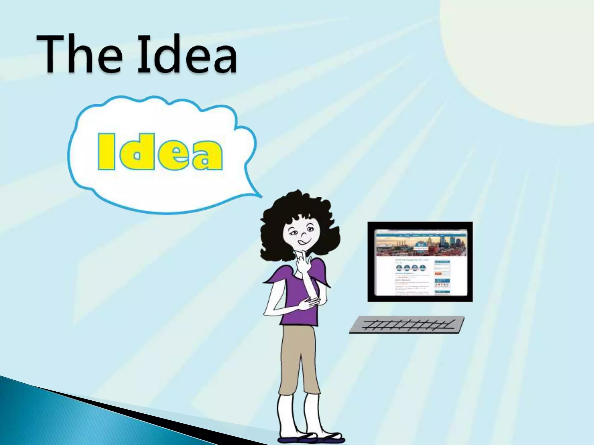
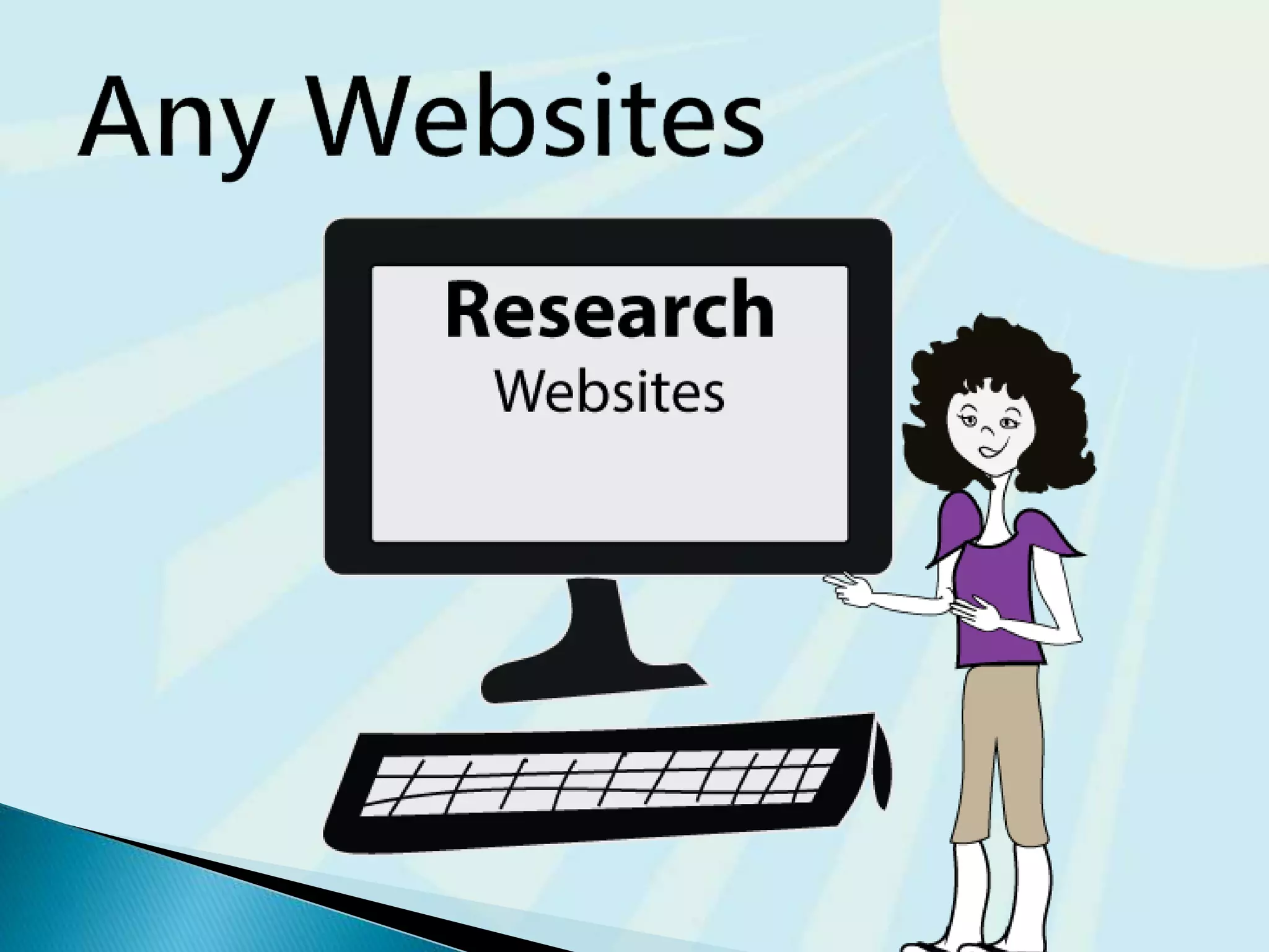
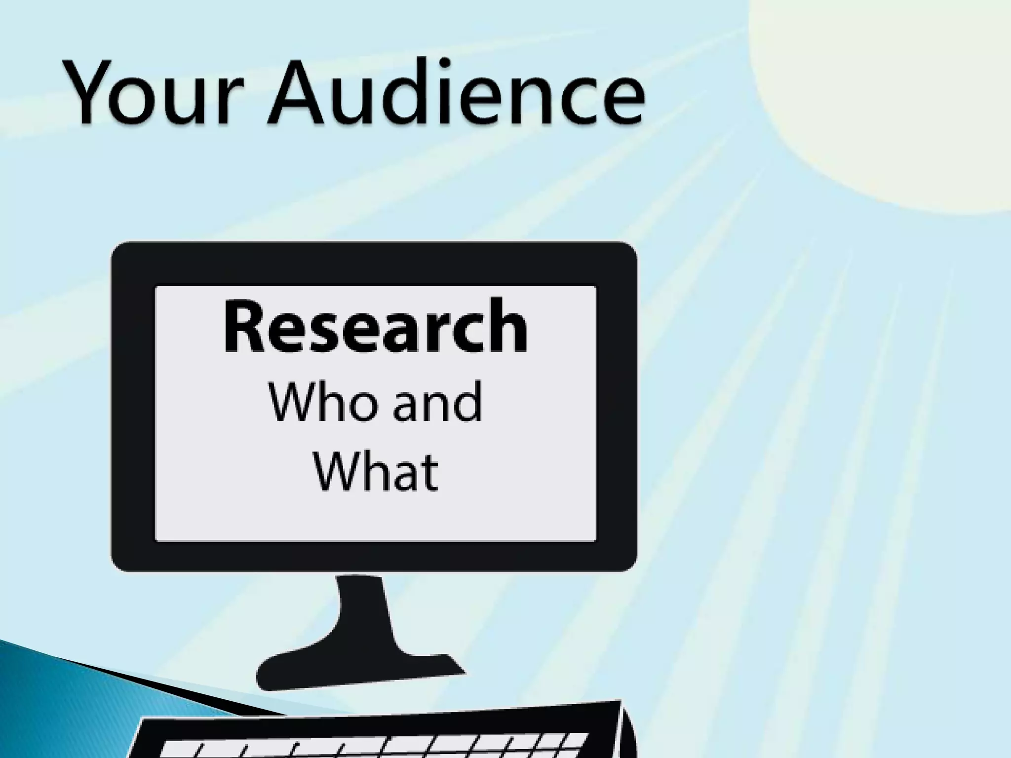
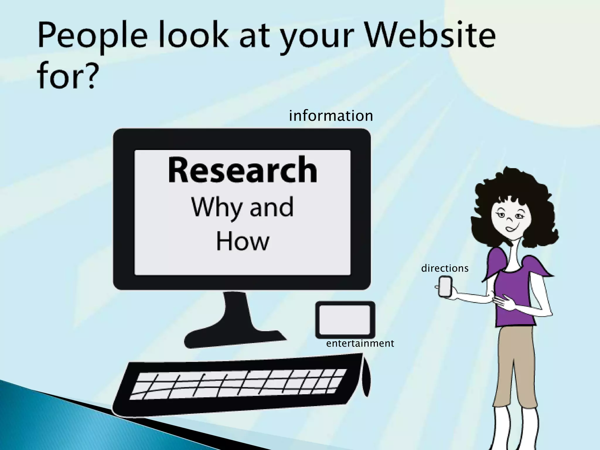
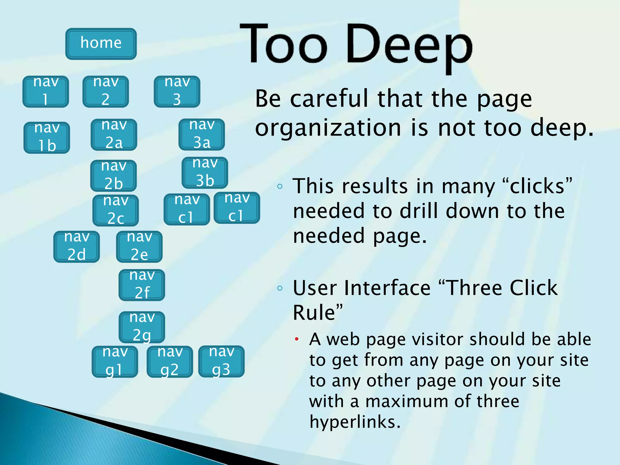
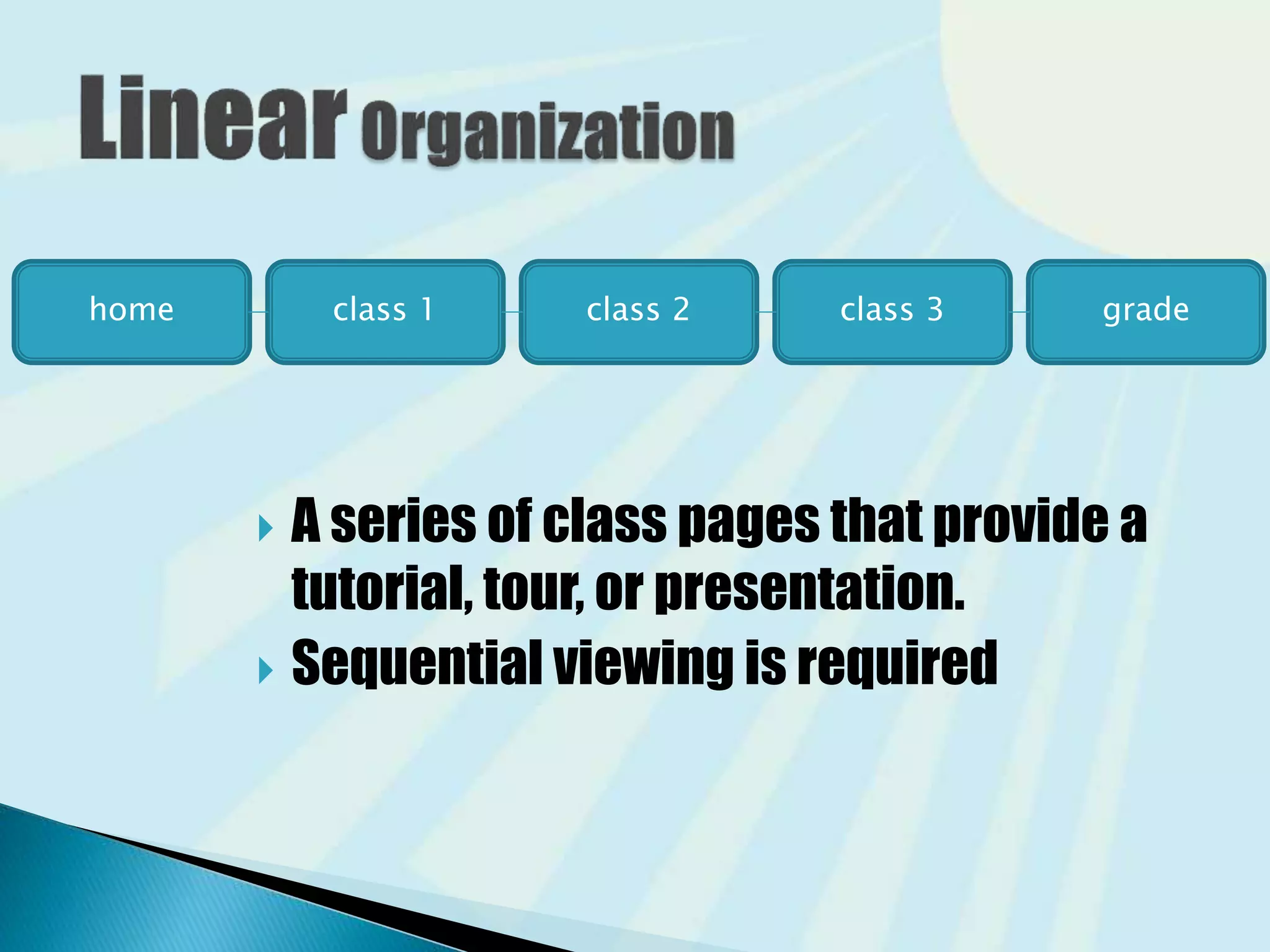
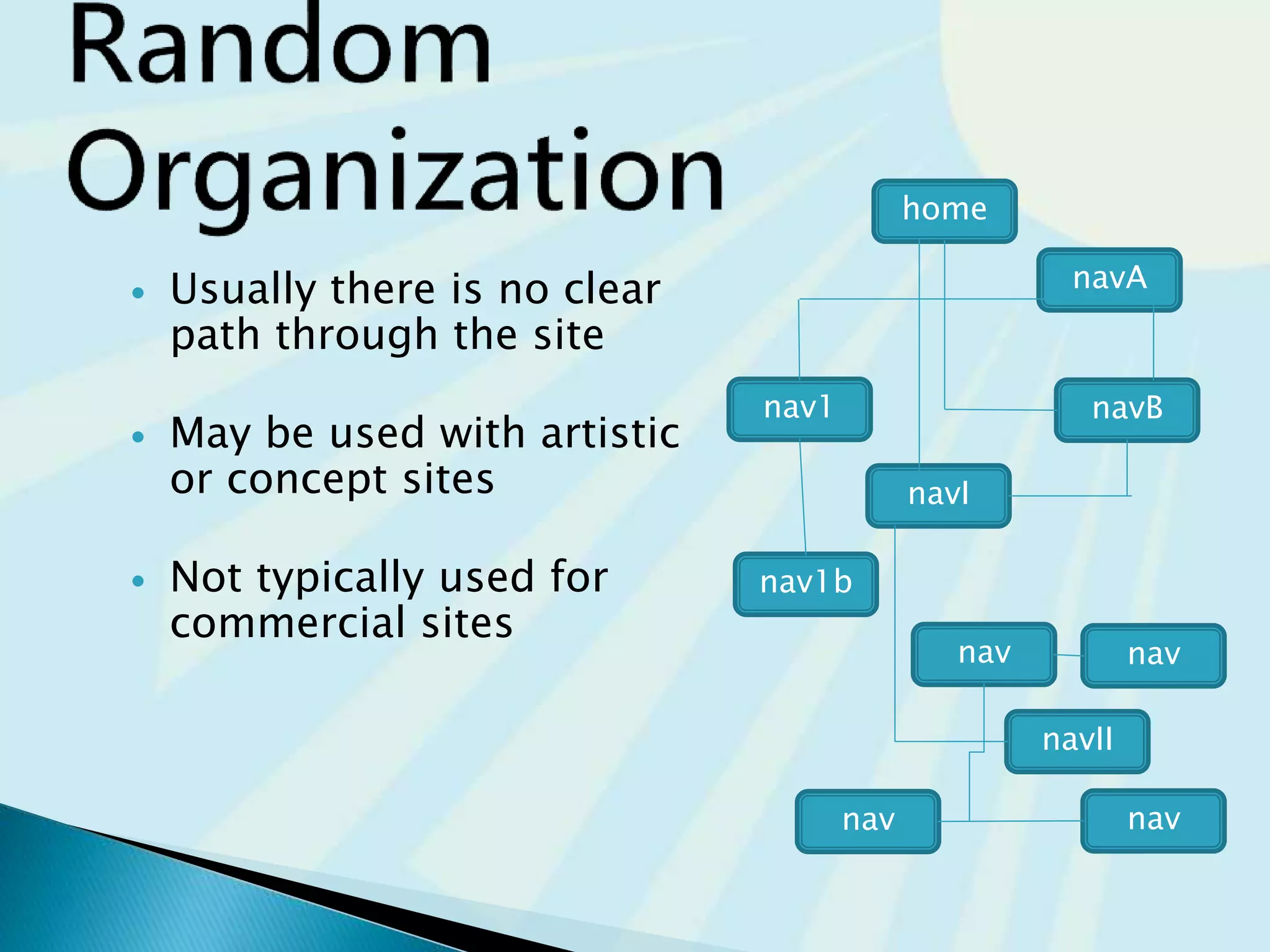
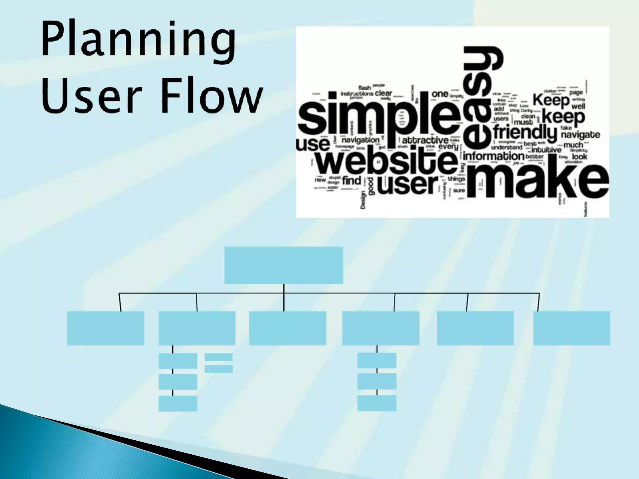
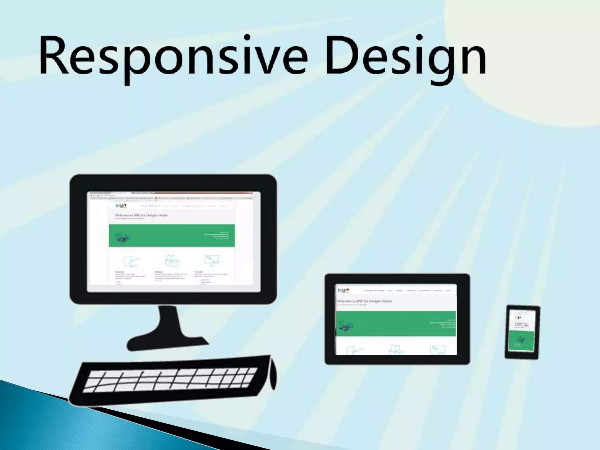
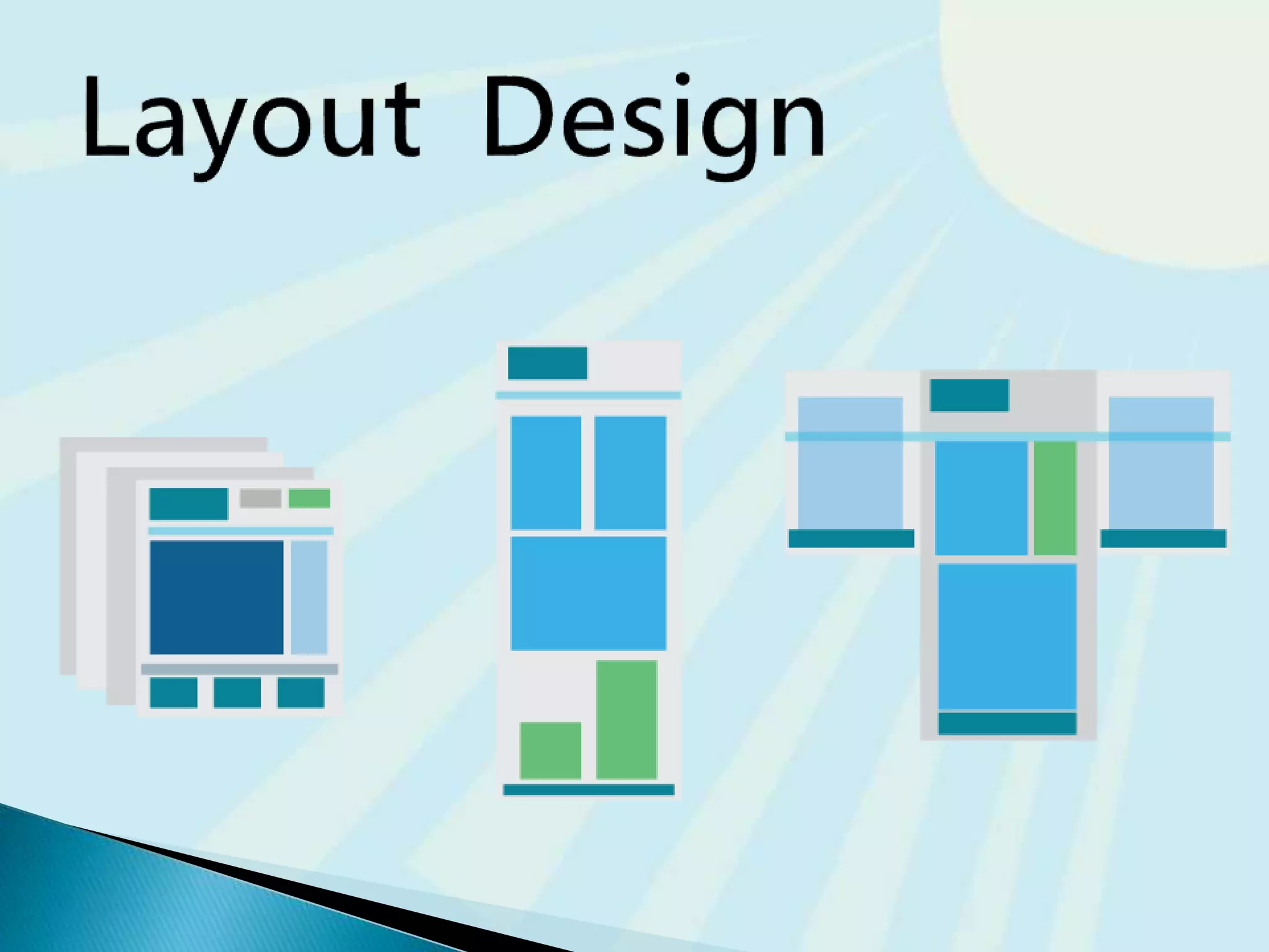
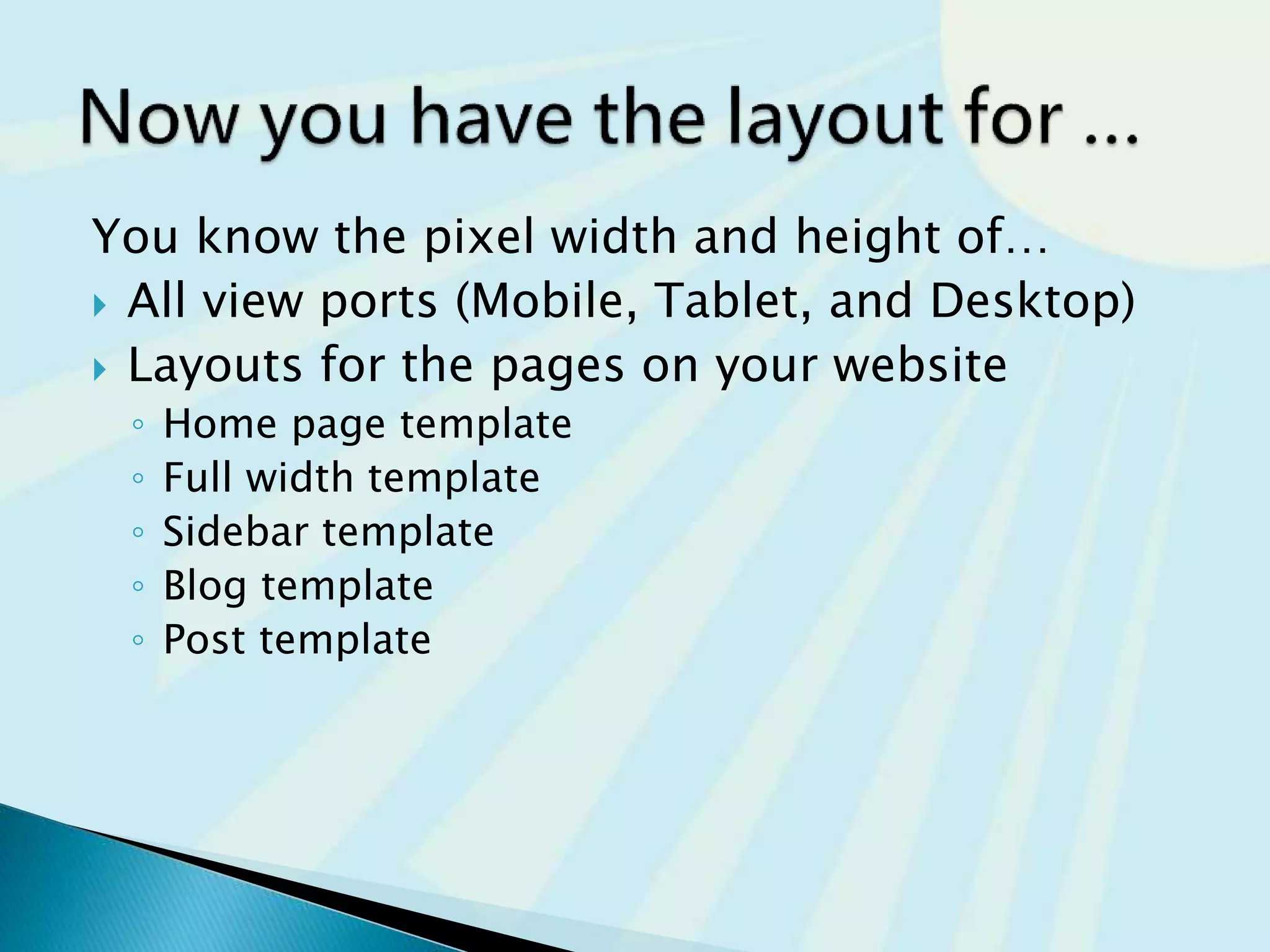
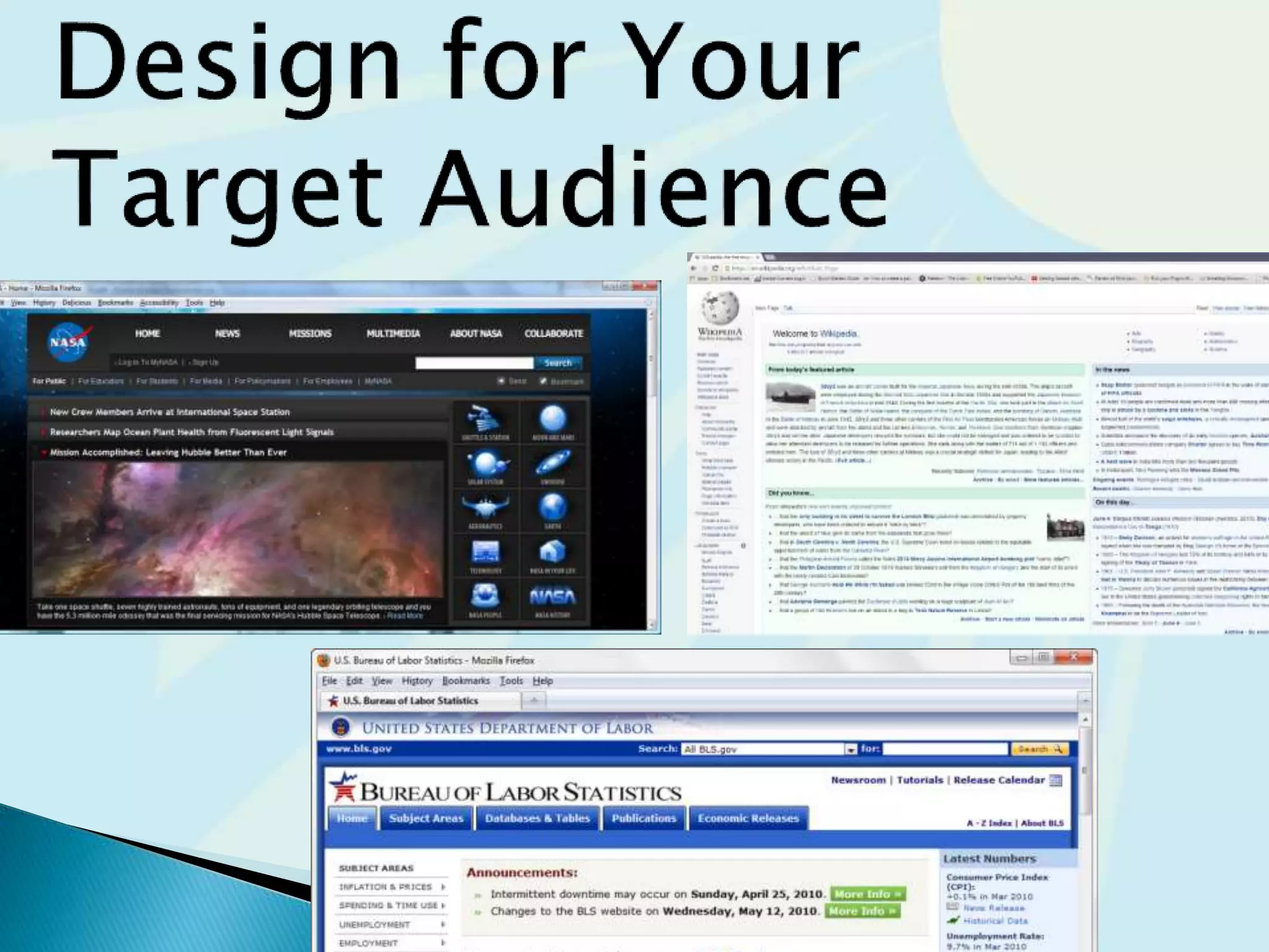
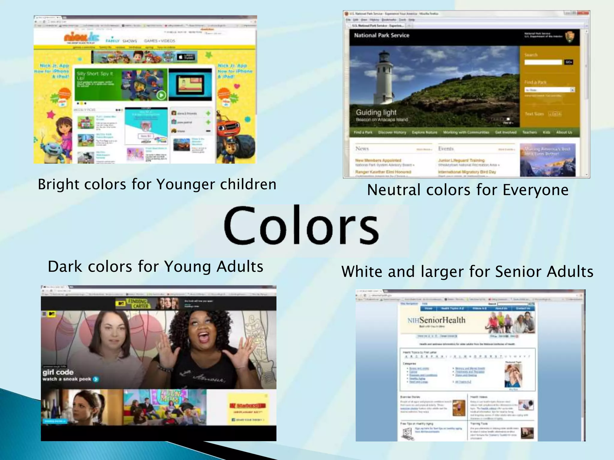
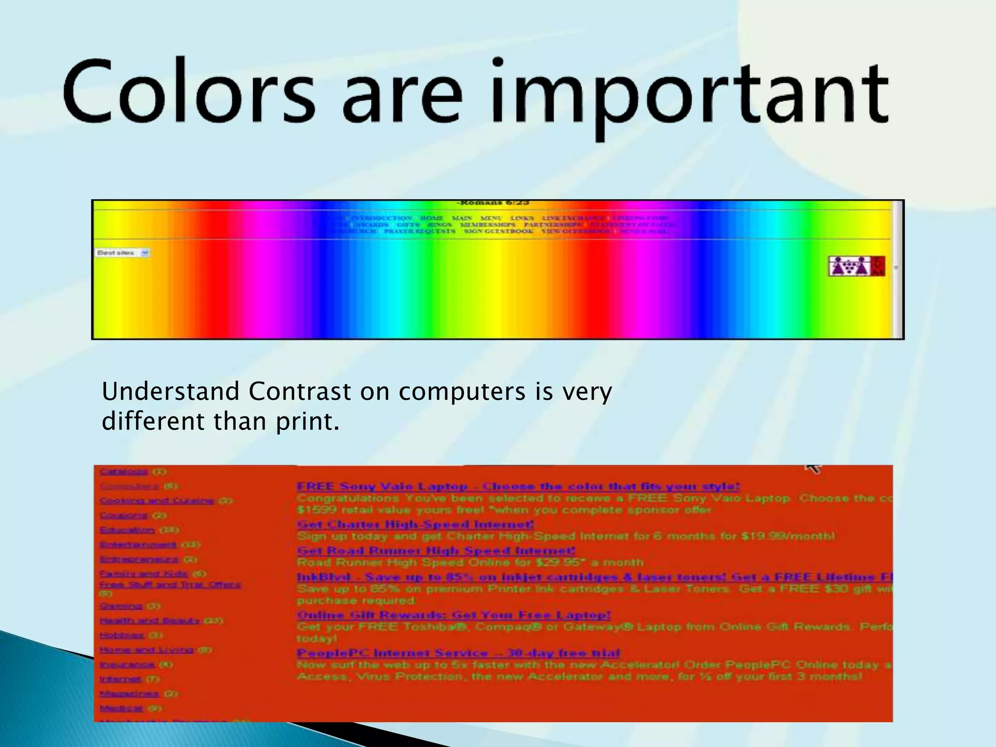
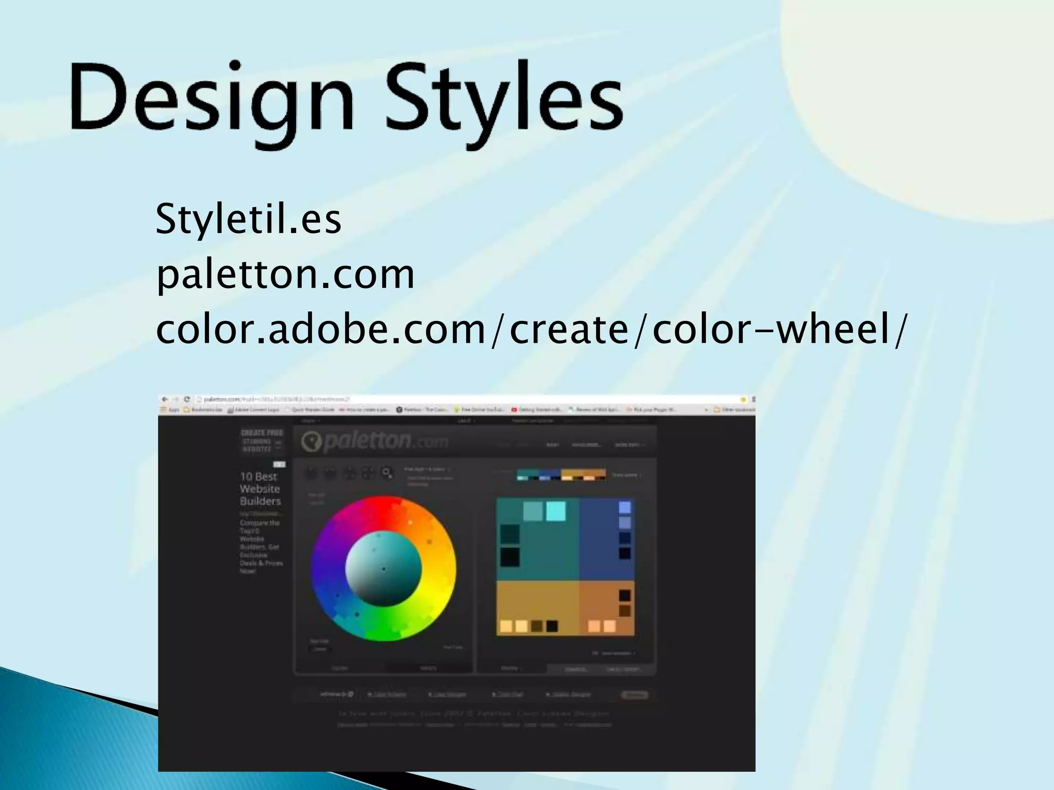
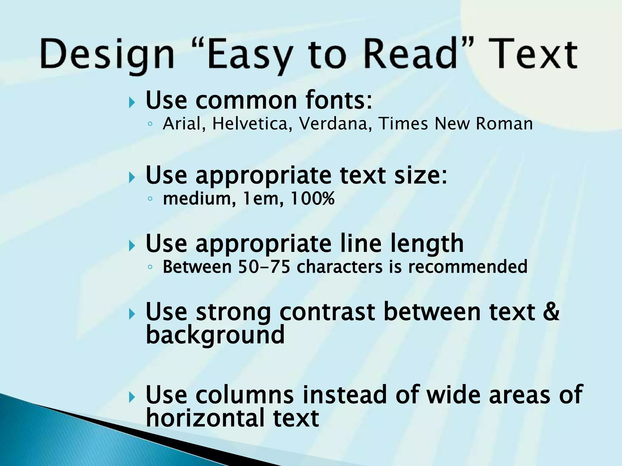
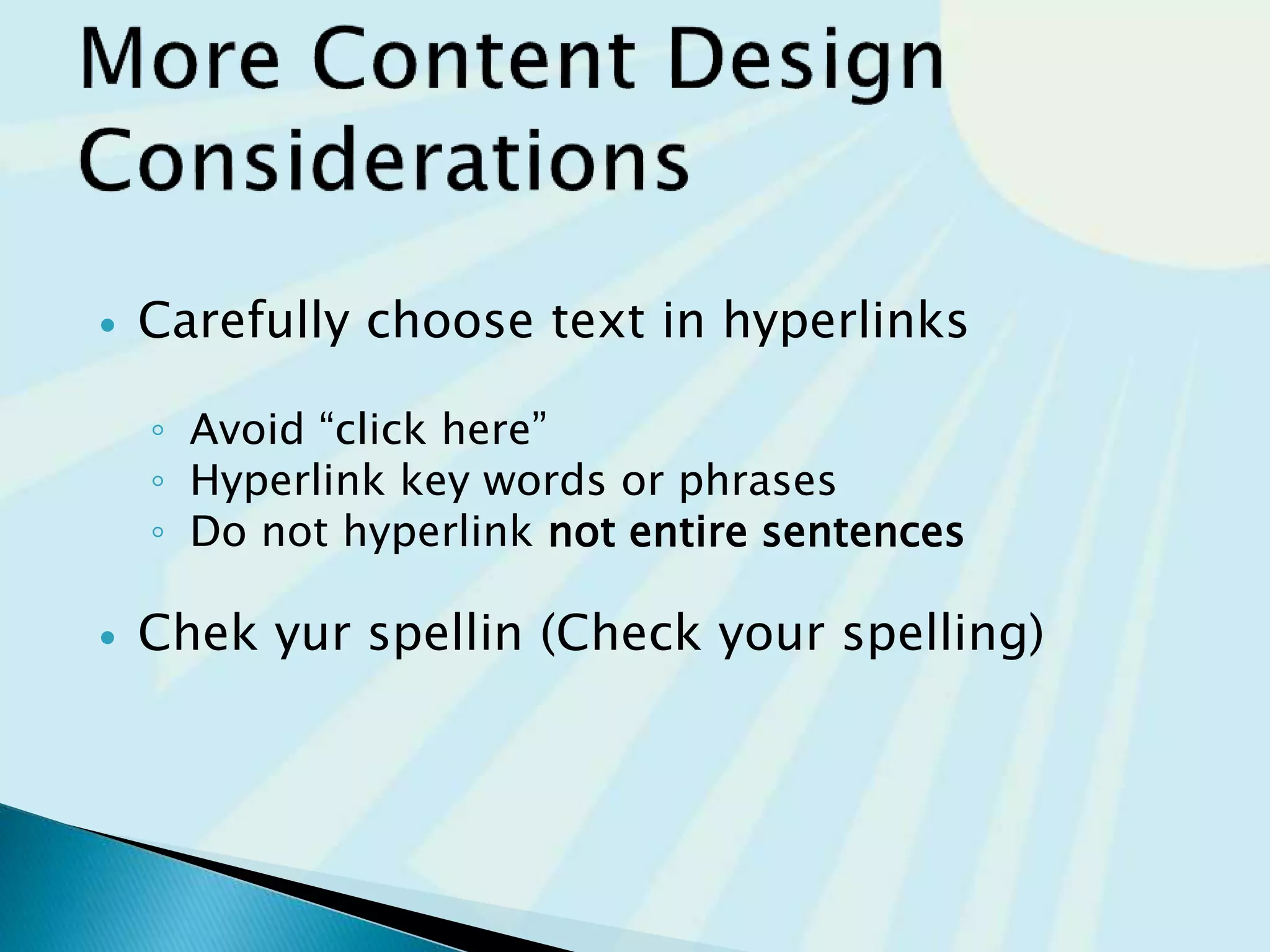
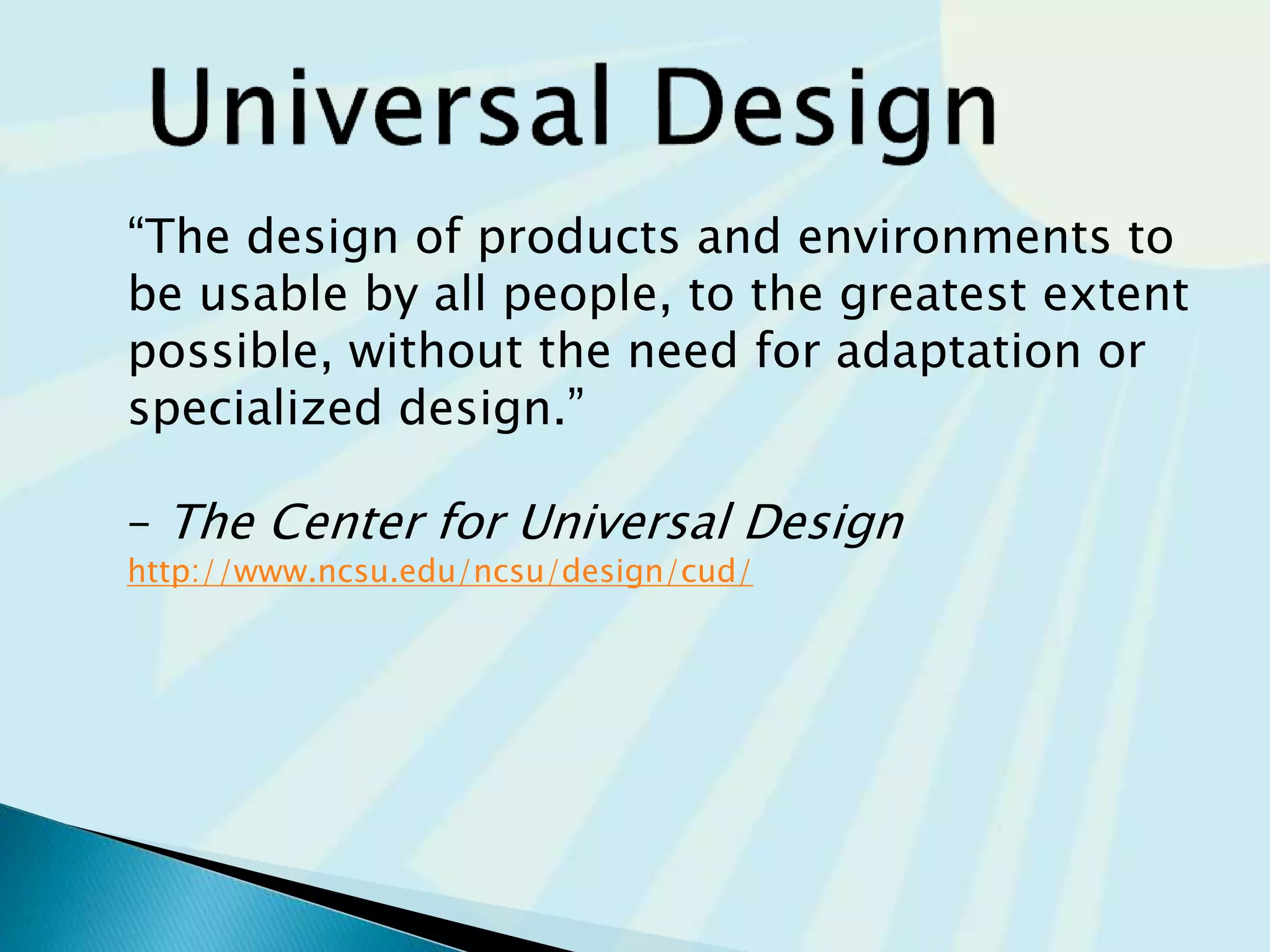
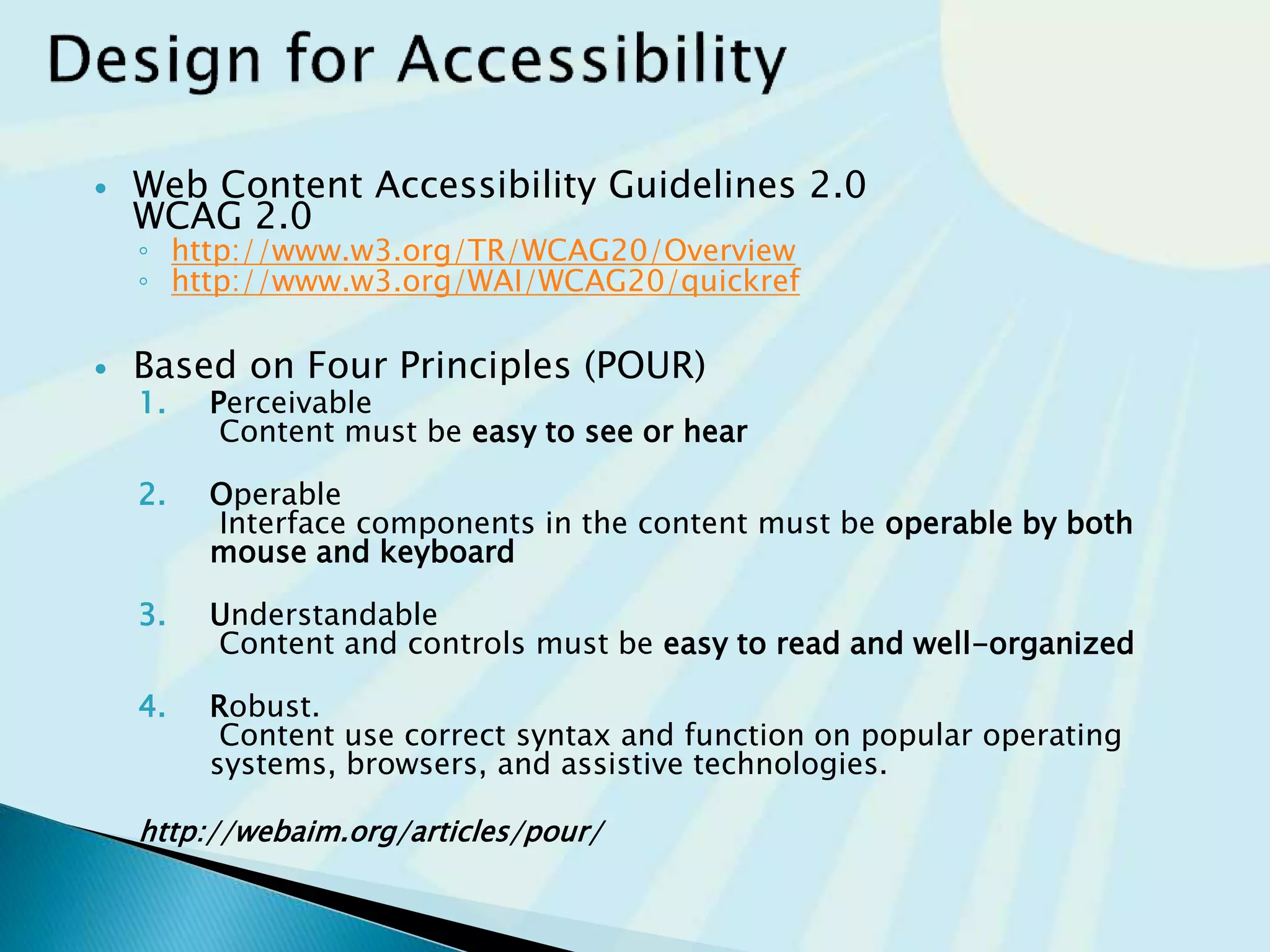
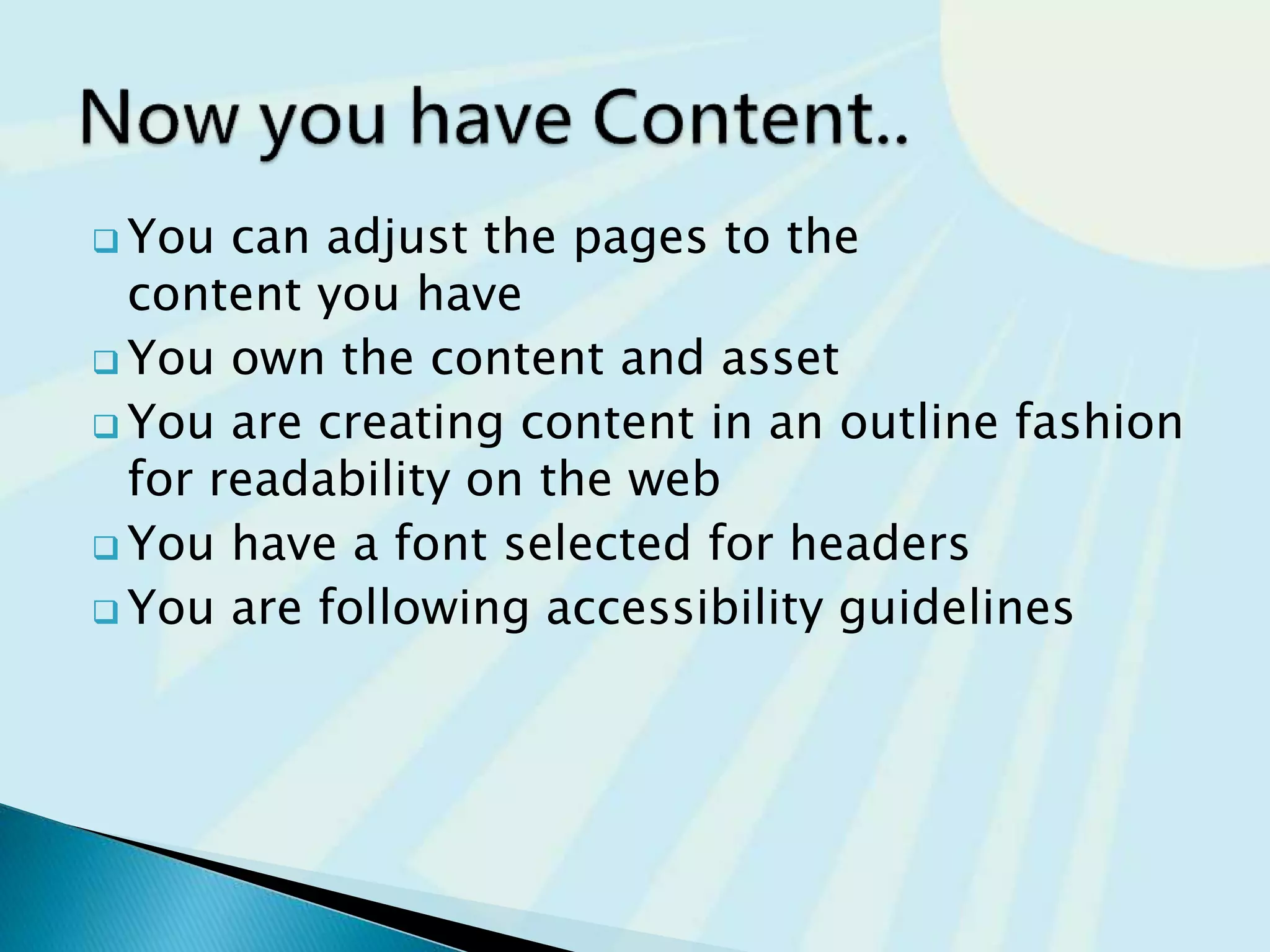
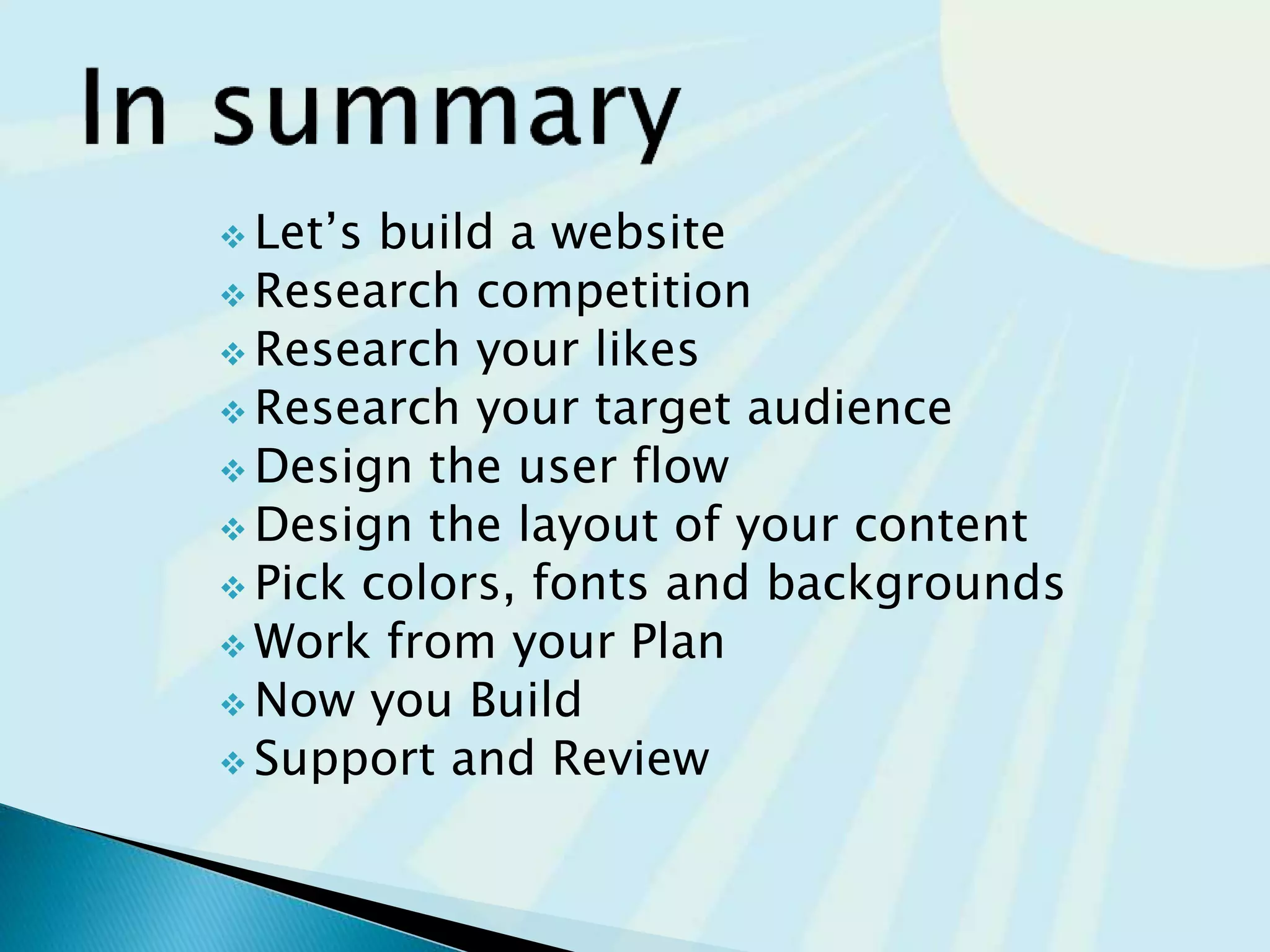
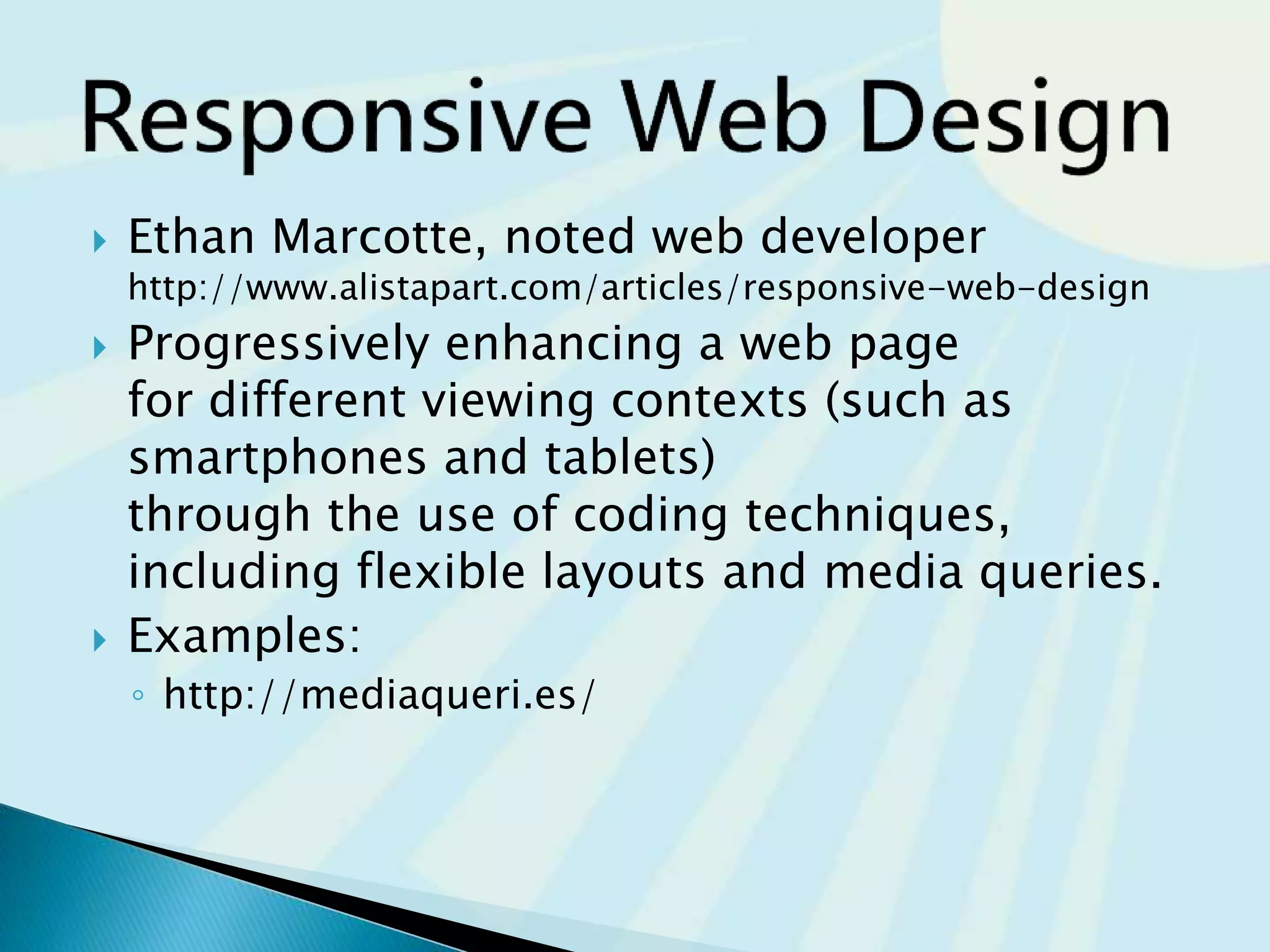
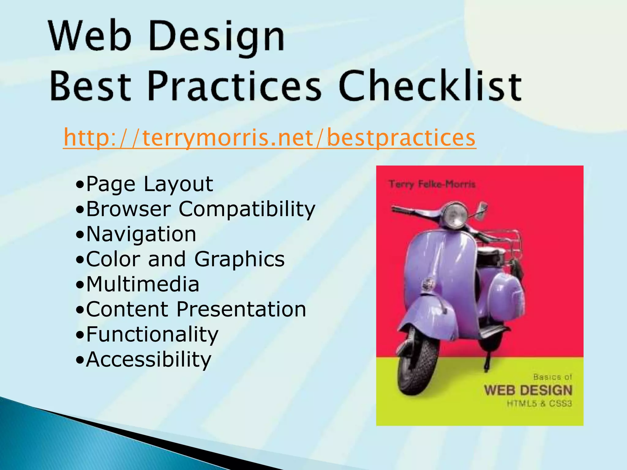
What questions
should be answered..
before you build a
website?
Research
Research
Research
Page Layout
Design
Color schema
Fonts
Backgrounds
Build..
code
Buy
Support
www.your.com
content
Start
Building
Start
Building
•Idea
•Tools
•Build
List what
you know
1. We want a website
2. We have a domain
3. We have hosting
4. We need help
Pros | Cons
directions
information
entertainment
 What you want on your website?
 What you don’t on your website?
 Who is your Target audience
 Age
 Tech savvy
 and more…
 Why are they viewing your site or business?
 How are they going to search for your
business or information?
 Static- basic information that never changes
 Dynamic- Contact, poll, or form information where you are
collecting information from the user
 Blog- NEWS or information that is current or new on the site daily,
weekly, or even monthly
 Make your site easy to navigate
◦ Provide clearly labeled navigation in the same
location on each page
◦ Most common – across top or down left side
19
Mobile navigation touch elements
 Hierarchical
◦ Too Shallow
◦ Too Deep
 Linear
 Random
http://writemaps.com/
 A clearly defined
home page
 Navigation links to
major site sections
 Often used for
commercial and
corporate websites
home
about products contact
product1 product2
 Be careful the page navigation is
not too shallow.
 They all have the same weight
 Too many immediate choices
 Confusing and less usable website.
home
nav
2
nav
13
nav
5
nav
7
nav
9
nav
11
nav
4
nav
3
nav
1
nav
8
nav
10
nav
12
nav
6
nav
3a
nav
3b
Be careful that the page
organization is not too deep.
◦ This results in many “clicks”
needed to drill down to the
needed page.
◦ User Interface “Three Click
Rule”
 A web page visitor should be able
to get from any page on your site
to any other page on your site
with a maximum of three
hyperlinks.
nav
1
nav
2
nav
3
nav
2a
nav
2b
nav
3b
nav
3a
nav
2c
nav
2e
nav
2d
home
nav
1b
nav
c1
nav
c1
nav
g3
nav
g1
nav
g2
nav
2g
nav
2f
 A series of class pages that provide a
tutorial, tour, or presentation.
 Sequential viewing is required
home class 1 class 2 class 3 grade
 Usually there is no clear
path through the site
 May be used with artistic
or concept sites
 Not typically used for
commercial sites
nav
navII
nav
navnav
nav1b
navI
navBnav1
navA
home
 your navigations (menus) and the hierarchy of
your website.
Do you need sidebar menus?
Footer menus?
Remember to have a
Terms of Service page and Privacy Policy page
You may even need a DMCA page if you have material
that is copyright
◦ Freeprivacypolicy.com
◦ Plugin https://wordpress.org/plugins/auto-terms-of-service-and-privacy-policy/
Fixed Layout
◦ rigid design
◦ Fixed-width often
at left margin
Centered box
◦ More appealing if
fixed box of content is
centered
Fluid Layout
◦ “liquid” design
◦ Expands to fill the
browser at all
resolutions.
Responsive:
◦ Page content typically
centered and often
configured with a
percentage width
such as 90%-100%
 Test at various screen resolutions
measurements of devices are in pixels
◦ Most widely used: 1024x768, 1366x768, and 1280x800
◦ Tablets 768X1024
◦ Phones 320X768
 Design to look good at various screen resolutions
◦ Centered page content
◦ Set to either a fixed or percentage width
72pixels / inch
You know the pixel width and height of…
 All view ports (Mobile, Tablet, and Desktop)
 Layouts for the pages on your website
◦ Home page template
◦ Full width template
◦ Sidebar template
◦ Blog template
◦ Post template
 Yourself
 Management
 CEO
 Target consumers
Bright colors for Younger children
Dark colors for Young Adults
Neutral colors for Everyone
White and larger for Senior Adults
Understand Contrast on computers is very
different than print.
Styletil.es
paletton.com
color.adobe.com/create/color-wheel/
 http://subtlepatterns.com/
 Create your styles
 Repetition
◦ Repeat visual elements
throughout design
 Contrast
◦ Add visual excitement and
draw attention
 Proximity
◦ Group related items
 Alignment
◦ Align elements to create
visual unity
 Colors for your target audience
 Understanding of design principles
 Fonts and Size in point for h1-h6
 Subtle patterns for backgrounds
 Establishing the Content before the build
will help determine what pages you really
need
 Use of images, videos, and audio when
appropriate, but not just because
 Pages should be filled with content that
is relevant to your website
 Avoid long blocks of text
 Use bullet points
◦ Easy
◦ To
◦ Read
 Use headings and subheadings
◦ People scan content on the web
 Use short paragraphs
Contrary to popular belief, Lorem Ipsum is not simply random
text. It has roots in a piece of classical Latin literature from 45
BC, making it over 2000 years old. Richard McClintock, a Latin
professor at Hampden-Sydney College in Virginia, looked up
one of the more obscure Latin words, consectetur, from a
Lorem Ipsum passage, and going through the cites of the word
in classical literature, discovered the undoubtable source.
Lorem Ipsum comes from sections 1.10.32 and 1.10.33 of "de
Finibus Bonorum et Malorum" (The Extremes of Good and Evil)
by Cicero, written in 45 BC. This book is a treatise on the
theory of ethics, very popular during the Renaissance. The first
line of Lorem Ipsum, "Lorem ipsum dolor sit amet..", comes
from a line in section 1.10.32.
The standard chunk of Lorem Ipsum used since the 1500s is
reproduced below for those interested. Sections 1.10.32 and
1.10.33 from "de Finibus Bonorum et Malorum" by Cicero are
also reproduced in their exact original form, accompanied by
English versions from the 1914 translation by H. Rackham.
Loremipsum
The standard 1500s
"Lorem ipsum dolor sit amet, consectetur adipiscing
elit, sed do eiusmod tempor incididunt ut labore et
dolore magna aliqua. Ut enim ad minim veniam, quis
nostrud exercitation ullamco
Lorem Ipsum
laboris nisi ut aliquip ex ea commodo consequat. Duis
aute irure dolor in reprehenderit in voluptate velit esse
cillum dolore eu fugiat nulla pariatur. Excepteur sint
occaecat cupidatat non proident, sunt in culpa qui
officia deserunt mollit anim id est laborum."
 Reliability and information
◦ Relevant information makes the credibility of
the site
◦ Link to sites you know are established and
provide more value to your site
 Ethical use of information
◦ You should own Photographs
◦ Copyright and the Web
 Use common fonts:
◦ Arial, Helvetica, Verdana, Times New Roman
 Use appropriate text size:
◦ medium, 1em, 100%
 Use appropriate line length
◦ Between 50-75 characters is recommended
 Use strong contrast between text &
background
 Use columns instead of wide areas of
horizontal text
 Carefully choose text in hyperlinks
◦ Avoid “click here”
◦ Hyperlink key words or phrases
◦ Do not hyperlink entire sentences
 Chek yur spellin (Check your spelling)
“The design of products and environments to
be usable by all people, to the greatest extent
possible, without the need for adaptation or
specialized design.”
– The Center for Universal Design
http://www.ncsu.edu/ncsu/design/cud/
 Web Content Accessibility Guidelines 2.0
WCAG 2.0
◦ http://www.w3.org/TR/WCAG20/Overview
◦ http://www.w3.org/WAI/WCAG20/quickref
 Based on Four Principles (POUR)
1. Perceivable
Content must be easy to see or hear
2. Operable
Interface components in the content must be operable by both
mouse and keyboard
3. Understandable
Content and controls must be easy to read and well-organized
4. Robust.
Content uses correct syntax and function on popular operating
systems, browsers, and assistive technologies.
http://webaim.org/articles/pour/
 You can adjust the pages to the
content you have
 You own the content and assets
 You are creating content in an outline fashion
for readability on the web
 You have a font selected for headers
 You are following accessibility guidelines
Research
Research
Research
Page Layout
Design
Color schema
Fonts
Backgrounds
Build..
code
Buy
Support
www.your.com
content
 Let’s build a website
 Research competition
 Research your likes
 Research your target audience
 Gather Content
 Design the user flow
 Design the layout of your content
 Pick colors, fonts and backgrounds
 Work from your Plan
 Now you Build
 Support and Review
@mw4designs
MWforDesigns.com
JCCC.edu/ce
http://www.slideshare.net/mwfordesigns/before-you-build-a-website-2015
 Graphics & Multi media
 Page Load times
 Mobile Design Checklist
 Responsive Web Design
 Web Design Best Practices Checklist
 File size and dimension matter
 Provide for robust navigation
 Antialiased/aliased text considerations
 Provide alternate text
 Use only necessary multimedia
 Watch the load time of your pages
 It should be 2-5 sec max
 Try to limit web page document and associated
media to under 60K on the home page
 Small screen size ~320 – 500 px
 Larger font point size
 Larger buttons for touch
 Bandwidth issues
 Single-column layout
 Maximize contrast
 Optimize images for mobile display
 Descriptive alternate text for images
 Avoid display of
non-essential content
 Ethan Marcotte, noted web developer
http://www.alistapart.com/articles/responsive-web-design
 Progressively enhancing a web page
for different viewing contexts (such as
smartphones and tablets)
through the use of coding techniques,
including flexible layouts and media queries.
 Examples:
◦ http://mediaqueri.es/
http://terrymorris.net/bestpractices
•Page Layout
•Browser Compatibility
•Navigation
•Color and Graphics
•Multimedia
•Content Presentation
•Functionality
•Accessibility
@mw4designs
MWforDesigns.com
maryw@mwfordesigns.com
JCCC.edu/ce
http://www.slideshare.net/mwfordesigns/before-you-build-a-website-2015
@mw4designs
MWforDesigns.com
maryw@mwfordesigns.com
JCCC.edu/ce
http://www.slideshare.net/mwfordesigns/before-you-build-a-website-2015

Before you build a website 2015

  • 1.
    What questions should beanswered.. before you build a website?
  • 2.
  • 4.
  • 5.
  • 6.
  • 10.
    List what you know 1.We want a website 2. We have a domain 3. We have hosting 4. We need help
  • 12.
  • 15.
  • 17.
     What youwant on your website?  What you don’t on your website?  Who is your Target audience  Age  Tech savvy  and more…  Why are they viewing your site or business?  How are they going to search for your business or information?
  • 18.
     Static- basicinformation that never changes  Dynamic- Contact, poll, or form information where you are collecting information from the user  Blog- NEWS or information that is current or new on the site daily, weekly, or even monthly
  • 19.
     Make yoursite easy to navigate ◦ Provide clearly labeled navigation in the same location on each page ◦ Most common – across top or down left side 19
  • 21.
  • 22.
     Hierarchical ◦ TooShallow ◦ Too Deep  Linear  Random http://writemaps.com/
  • 23.
     A clearlydefined home page  Navigation links to major site sections  Often used for commercial and corporate websites home about products contact product1 product2
  • 24.
     Be carefulthe page navigation is not too shallow.  They all have the same weight  Too many immediate choices  Confusing and less usable website. home nav 2 nav 13 nav 5 nav 7 nav 9 nav 11 nav 4 nav 3 nav 1 nav 8 nav 10 nav 12 nav 6 nav 3a nav 3b
  • 25.
    Be careful thatthe page organization is not too deep. ◦ This results in many “clicks” needed to drill down to the needed page. ◦ User Interface “Three Click Rule”  A web page visitor should be able to get from any page on your site to any other page on your site with a maximum of three hyperlinks. nav 1 nav 2 nav 3 nav 2a nav 2b nav 3b nav 3a nav 2c nav 2e nav 2d home nav 1b nav c1 nav c1 nav g3 nav g1 nav g2 nav 2g nav 2f
  • 26.
     A seriesof class pages that provide a tutorial, tour, or presentation.  Sequential viewing is required home class 1 class 2 class 3 grade
  • 27.
     Usually thereis no clear path through the site  May be used with artistic or concept sites  Not typically used for commercial sites nav navII nav navnav nav1b navI navBnav1 navA home
  • 29.
     your navigations(menus) and the hierarchy of your website. Do you need sidebar menus? Footer menus? Remember to have a Terms of Service page and Privacy Policy page You may even need a DMCA page if you have material that is copyright ◦ Freeprivacypolicy.com ◦ Plugin https://wordpress.org/plugins/auto-terms-of-service-and-privacy-policy/
  • 30.
    Fixed Layout ◦ rigiddesign ◦ Fixed-width often at left margin Centered box ◦ More appealing if fixed box of content is centered
  • 31.
    Fluid Layout ◦ “liquid”design ◦ Expands to fill the browser at all resolutions. Responsive: ◦ Page content typically centered and often configured with a percentage width such as 90%-100%
  • 32.
     Test atvarious screen resolutions measurements of devices are in pixels ◦ Most widely used: 1024x768, 1366x768, and 1280x800 ◦ Tablets 768X1024 ◦ Phones 320X768  Design to look good at various screen resolutions ◦ Centered page content ◦ Set to either a fixed or percentage width 72pixels / inch
  • 35.
    You know thepixel width and height of…  All view ports (Mobile, Tablet, and Desktop)  Layouts for the pages on your website ◦ Home page template ◦ Full width template ◦ Sidebar template ◦ Blog template ◦ Post template
  • 36.
     Yourself  Management CEO  Target consumers
  • 38.
    Bright colors forYounger children Dark colors for Young Adults Neutral colors for Everyone White and larger for Senior Adults
  • 39.
    Understand Contrast oncomputers is very different than print.
  • 40.
  • 41.
  • 42.
     Repetition ◦ Repeatvisual elements throughout design  Contrast ◦ Add visual excitement and draw attention  Proximity ◦ Group related items  Alignment ◦ Align elements to create visual unity
  • 45.
     Colors foryour target audience  Understanding of design principles  Fonts and Size in point for h1-h6  Subtle patterns for backgrounds
  • 46.
     Establishing theContent before the build will help determine what pages you really need  Use of images, videos, and audio when appropriate, but not just because  Pages should be filled with content that is relevant to your website
  • 47.
     Avoid longblocks of text  Use bullet points ◦ Easy ◦ To ◦ Read  Use headings and subheadings ◦ People scan content on the web  Use short paragraphs Contrary to popular belief, Lorem Ipsum is not simply random text. It has roots in a piece of classical Latin literature from 45 BC, making it over 2000 years old. Richard McClintock, a Latin professor at Hampden-Sydney College in Virginia, looked up one of the more obscure Latin words, consectetur, from a Lorem Ipsum passage, and going through the cites of the word in classical literature, discovered the undoubtable source. Lorem Ipsum comes from sections 1.10.32 and 1.10.33 of "de Finibus Bonorum et Malorum" (The Extremes of Good and Evil) by Cicero, written in 45 BC. This book is a treatise on the theory of ethics, very popular during the Renaissance. The first line of Lorem Ipsum, "Lorem ipsum dolor sit amet..", comes from a line in section 1.10.32. The standard chunk of Lorem Ipsum used since the 1500s is reproduced below for those interested. Sections 1.10.32 and 1.10.33 from "de Finibus Bonorum et Malorum" by Cicero are also reproduced in their exact original form, accompanied by English versions from the 1914 translation by H. Rackham. Loremipsum The standard 1500s "Lorem ipsum dolor sit amet, consectetur adipiscing elit, sed do eiusmod tempor incididunt ut labore et dolore magna aliqua. Ut enim ad minim veniam, quis nostrud exercitation ullamco Lorem Ipsum laboris nisi ut aliquip ex ea commodo consequat. Duis aute irure dolor in reprehenderit in voluptate velit esse cillum dolore eu fugiat nulla pariatur. Excepteur sint occaecat cupidatat non proident, sunt in culpa qui officia deserunt mollit anim id est laborum."
  • 48.
     Reliability andinformation ◦ Relevant information makes the credibility of the site ◦ Link to sites you know are established and provide more value to your site  Ethical use of information ◦ You should own Photographs ◦ Copyright and the Web
  • 49.
     Use commonfonts: ◦ Arial, Helvetica, Verdana, Times New Roman  Use appropriate text size: ◦ medium, 1em, 100%  Use appropriate line length ◦ Between 50-75 characters is recommended  Use strong contrast between text & background  Use columns instead of wide areas of horizontal text
  • 50.
     Carefully choosetext in hyperlinks ◦ Avoid “click here” ◦ Hyperlink key words or phrases ◦ Do not hyperlink entire sentences  Chek yur spellin (Check your spelling)
  • 51.
    “The design ofproducts and environments to be usable by all people, to the greatest extent possible, without the need for adaptation or specialized design.” – The Center for Universal Design http://www.ncsu.edu/ncsu/design/cud/
  • 52.
     Web ContentAccessibility Guidelines 2.0 WCAG 2.0 ◦ http://www.w3.org/TR/WCAG20/Overview ◦ http://www.w3.org/WAI/WCAG20/quickref  Based on Four Principles (POUR) 1. Perceivable Content must be easy to see or hear 2. Operable Interface components in the content must be operable by both mouse and keyboard 3. Understandable Content and controls must be easy to read and well-organized 4. Robust. Content uses correct syntax and function on popular operating systems, browsers, and assistive technologies. http://webaim.org/articles/pour/
  • 53.
     You canadjust the pages to the content you have  You own the content and assets  You are creating content in an outline fashion for readability on the web  You have a font selected for headers  You are following accessibility guidelines
  • 54.
  • 55.
     Let’s builda website  Research competition  Research your likes  Research your target audience  Gather Content  Design the user flow  Design the layout of your content  Pick colors, fonts and backgrounds  Work from your Plan  Now you Build  Support and Review
  • 57.
  • 58.
     Graphics &Multi media  Page Load times  Mobile Design Checklist  Responsive Web Design  Web Design Best Practices Checklist
  • 59.
     File sizeand dimension matter  Provide for robust navigation  Antialiased/aliased text considerations  Provide alternate text  Use only necessary multimedia
  • 60.
     Watch theload time of your pages  It should be 2-5 sec max  Try to limit web page document and associated media to under 60K on the home page
  • 61.
     Small screensize ~320 – 500 px  Larger font point size  Larger buttons for touch  Bandwidth issues  Single-column layout  Maximize contrast  Optimize images for mobile display  Descriptive alternate text for images  Avoid display of non-essential content
  • 62.
     Ethan Marcotte,noted web developer http://www.alistapart.com/articles/responsive-web-design  Progressively enhancing a web page for different viewing contexts (such as smartphones and tablets) through the use of coding techniques, including flexible layouts and media queries.  Examples: ◦ http://mediaqueri.es/
  • 63.
    http://terrymorris.net/bestpractices •Page Layout •Browser Compatibility •Navigation •Colorand Graphics •Multimedia •Content Presentation •Functionality •Accessibility
  • 64.
  • 65.