CBSE Class 6 Maths Data Handling Worksheets with Answers This worksheet is for class 6 maths, comprising the topic of data handling It will help students develop a better understanding of data collection and its representation in different forms
The document discusses collecting and analyzing data through surveys. It defines key terms like variables, category data, and discrete data. Category data is described in words, while discrete data uses numbers. Data can be organized and presented in tables, tally charts, frequency tables, dot plots, and bar graphs. Bar graphs can show and compare data, with either a horizontal or vertical orientation. The document provides examples of each term and type of data presentation. It concludes with a summary of the key points and practice questions.
This document discusses teaching data handling and statistics to children. It covers 5 key stages of data handling: posing questions, collecting data, processing data, representing data, and interpreting data. Some example activities are described that involve sorting data in different ways. Progression in techniques for sorting data is outlined. The use of ICT tools like 2Simple software, Excel, and different types of graphs like bar graphs, pie charts and line graphs is also discussed. Interpreting data through calculating averages, means, medians and modes is covered. The document provides directed tasks to further develop subject knowledge around discrete and continuous data types.
This unit asks students to record data on physical tasks in small groups, then add the results to a spreadsheet and database. Students will analyze the findings to determine how well each person performed. The unit covers spreadsheets, databases, and collecting and recording data. Students will design a data collection form, input their results, and query the database to create reports. They will also form a hypothesis based on the data and review their work.
This document introduces real analysis. It defines real numbers as the collection of rational numbers, which can be written as fractions, and irrational numbers, which cannot. Real numbers are represented on the number line. Analysis involves the study of limiting processes like convergence, divergence, continuity, and differentiability. Real analysis specifically studies these limits and processes involving real variables.
This document discusses data handling and different ways to represent data visually. It explains tally marks and how they can be used to collect data efficiently. It also defines and provides examples of pictographs and bar graphs. Pictographs use pictures to represent data, while bar graphs use rectangular bars of varying heights. The document contains examples of questions answered using data from pictographs and bar graphs, including finding totals, identifying most/least popular items, and comparing amounts between categories.
This document provides information and lesson plans for teaching students about sampling and statistics. It includes an agenda, standards, types of sampling, activities, and homework. The key points are:
- The lessons will teach students about random sampling and how it allows inferences about populations from samples. Different sampling methods like simple random and stratified are introduced.
- Activities include analyzing sample data from rectangles to understand bias and variation, practicing sampling techniques, and identifying errors in sampling.
- Homework involves reading about samples and populations and doing problems generating random numbers to select samples.
De vry math221 all ilabs latest 2016 novemberlenasour
This document provides instructions for completing a statistics lab assignment involving analyzing data from a student survey. The lab involves creating graphs in Excel, calculating descriptive statistics, and finding confidence intervals. Students are asked to calculate measures like means, standard deviations, and binomial probabilities for variables measuring things like student heights, money, time spent watching TV, and coin flip results. Confidence intervals are found for sleep hours and heights by gender.
This document provides an overview of student performance data from various assessments that teachers can use to inform instructional planning. It includes sample reading assessment data from individual students, as well as summarized math assessment data by standard. Teachers are prompted to consider how they will use the data to plan, and any remaining questions they have about accessing and interpreting the data. They are also instructed to discuss with their director how to access and utilize the assessment information.
Statistics is the study of collecting, organizing, analyzing, and interpreting data. It was introduced in 1791 in English by Sir John Sinclair when he published the first volume of a statistical account of Scotland. SPSS is a widely used software package for statistical analysis and data management. It allows users to easily enter and manage data, conduct statistical analyses, and display results in graphs and tables.
Structure of a manuscript: Day 4 article_writing_noteAshok Pandey
The document provides guidance on presenting results in research papers. It discusses that the results section should:
1) Summarize the key findings from the study in a clear and concise manner without interpreting the results or providing unnecessary details.
2) Present results objectively using tables, figures and plain language while highlighting important findings.
3) Describe results in the past tense and follow best practices for displaying data through appropriate use of tables and figures.
This document provides information on finding, analysis, and SPSS in research methodology. It defines what findings are, describes sample characteristics and descriptive univariate statistics. It also explains what SPSS is, how to use SPSS, when it should be used, its interface including data view and variable view, how to create variables in SPSS, and how SPSS can be applied in research.
This document outlines a lesson on collecting and analyzing data on student fruit preferences. Students will rank their preferences for 4 fruits from most to least preferred. Their rankings will be compiled and different methods will be used to analyze the data, including determining the class favorite fruit based on the mode, median, sums of rankings, and bar graphs. The goal is for students to understand that there are various ways to summarize data and determine patterns or favorites.
This document discusses various statistical software packages. It provides information on:
- Open source packages like R and SciPy which are free to use.
- Public domain packages such as CSPro and Epi Info which are developed by government organizations for use in fields like epidemiology.
- Freeware packages like WinBUGS and Winpepi that can be downloaded and used at no cost.
- Proprietary packages including SAS, SPSS, and MATLAB that usually require purchasing a license but provide comprehensive statistical functionality.
Commonly used statistical software in pharmacy include SAS, SPSS, GraphPad InStat, and GraphPad Prism. SPSS allows for a range of descriptive, bivariate
The document provides information about the ReadiStep test, which measures 8th grade students' readiness for high school, college, and careers. It discusses what skills and subjects the test evaluates, how to prepare, what to expect on test day, and how the results can help students improve. The test covers reading, writing, and math skills through multiple choice questions. After taking the test, students will receive score reports showing their performance relative to peers and how to interpret their scores to enhance their academic path.
The document describes 4 math problems from a Grade 8 standardized test. Problem 1 asks students to solve a linear equation using properties of rational numbers. Problem 2 defines irrational numbers and converting repeating decimals to fractions. Problem 3 requires interpreting the equation for a linear function and examples of non-linear functions. Problem 4 involves estimating very large or small quantities using numbers in scientific notation.
Homework 1
Introduction to Statistics
Be sure you have reviewed this module/week’s lesson and presentations before proceeding to the homework exercises. Number all responses. Review the “Homework Instructions: General” document for an example of how homework assignments must look.
Homework 1 does not include any SPSS output and consists only of Part I.
The document provides instructions for conducting a survey in 4 steps:
1) Create questions for the survey. Questions should be clear, close-ended, and address the objective of what is hoped to be learned.
2) Ask the questions to a sample of people. For a class project, 20-30 classmates will be surveyed.
3) Tally the results by adding up the responses. Results should be organized into a table.
4) Present the results using graphs, charts, or other visuals like pie charts, bar graphs and line graphs. The presentation should explain what was learned from the survey.
This document provides an introduction to basic statistics concepts. It instructs students to collect data on the ages of classmates, organize it into a frequency table or graph, and answer questions about the distribution of ages. The document explains that statistics involves gathering, arranging, and presenting numeric data systematically, such as through tables, graphs or by sorting data in ascending or descending order. It defines statistics as the study of collecting, analyzing and interpreting data to address research questions.
The document provides instructions for organizing and presenting statistical data using frequency tables and histograms. It discusses how to construct a frequency table by grouping raw data into intervals and tallying the frequencies. It then explains how to create a histogram by using the frequency table to draw rectangles whose widths represent intervals and heights represent frequencies. The lesson emphasizes that frequency tables and histograms are useful tools for organizing large data sets and communicating patterns in the data visually.
The role of statistics and the data analysis process.pptJakeCuenca10
This document provides an overview of key concepts in statistics and the data analysis process. It defines statistics as the science of collecting, analyzing, and drawing conclusions from data. It explains that one should study statistics to be informed when evaluating decisions. It also discusses variables, data, types of variables, populations and samples, descriptive and inferential statistics, and ways to organize and summarize data through graphs like bar charts and dotplots.
Chapter 4 Problem 31. For problem three in chapter four, a teac.docxrobertad6
Chapter 4: Problem 3
1. For problem three in chapter four, a teacher wants to display her students number of responses for each day of the week. And she wants to do that with a bar chart. Since she hasn't taken a stats class, she comes to you for help. You first enter her data into SPSS and the results look like this-- When you look at your data set, you'll see that it actually has the wrong level of measurement. Notice that there's a little Venn diagram at the top of each column, which indicates that your data has been entered as nominal. That would be correct if you were noting which day of the week a student participated, but since you're noting how often a given student participated, the correct level of measurement is a scale. Go ahead and change that. Watch how I do that. Under variable view, under measure, you just want to click each one and turn it into a scale. You can also cut and paste these, and I can show you that in another video. Once you have them changed, go back to data view, and you'll see that at the top it has changed in two little rulers. The next question is, how do I get SPSS to display the average score per day rather the total number of individual scores, which might look like a mess, and it's why this question is a toughie. To do that we go under graphs, and you'll see that you have two options, you can do a Chart Builder or a Legacy Dialog. For this question we want to use the Legacy Dialog. We go to Bar and when we click that, there are two questions-- one, what type of bar chart? We want a simple one. And then, how do you want the data in their area displayed? Do we want to summarize for the groups? We really don't. We want summary of separate variables where each day of the week is a variable. We click on Define and then here you'll see every day of the week. You want to bring that over and you see your bar charts are going to represent the mean for every day of the week. As a good habit you want to make sure you title it, I called it "Students' Engagement During Group Discussion." The second one is by day of week. We hit Continue, and then when we hit OK, you're going to see your output pop up. And here is our bar chart-- every day of the week showing the average student engagement. And this is how you answer problem 3 in chapter 4. Good luck.
2. Identify whether these distributions are negatively skewed, positively skewed, or not skewed at all and explain why you describe them that way.
a. This talented group of athletes scored very high on the vertical jump task.
b. On this incredibly crummy test, everyone received the same score.
c. On the most difficult spelling test of the year, the third graders wept as the scores were delivered and then their parents complained.
3. Use the data available as Chapter 4 Data Set 3 on pie preference to create a pie chart ☺ using SPSS.
4. For each of the followin.
This document provides an introduction to a unit on organizing, summarizing, and interpreting data. It outlines the materials and expectations for the online lessons. The first lesson will focus on defining data and different ways of collecting and analyzing it. Students will then learn about classifying data by type and number of variables. The lesson will demonstrate displaying data using graphs like histograms, frequency tables, and box plots. It will also cover describing data distributions and comparing data sets using measures of center, spread, and shape.
Qualitative research data is interpretive and descriptive in nature. The best way to organize and manage qualitative data is through coding or grouping the data to look for patterns in the findings. Good qualitative data management involves having a clear file naming system, a data tracking system, and securely storing data during and after the research process. Qualitative data collection methods aim to understand people's experiences through techniques like interviews, observations, and focus groups to gain an in-depth perspective.
Here are my recommendations for graphs to use for each data set:
- Comparison of annual snowfall between resorts: Bar graph or line graph. Both would clearly show the snowfall amounts and how they compare each year.
- Time spent watching TV: Histogram. It can accommodate a large data set and show the distribution of hours watched.
- Wind speed over 3 weeks: Line graph. A line graph is best to show changes in a measurement over time.
- Favorite summer activity: Pie or bar graph. These are best for categorical data to compare proportions for each category.
This document discusses conducting a mini-research on students' performance in mathematics. It provides steps to take, including stating the problem, designing the research, gathering data, using statistical treatment on the data, and formulating conclusions and recommendations. An example is given of a mini-research on the performance of Grade 10 MDL students in mathematics for the third quarter. The results found the average grade was 84% and recommendations were made to provide intervention to the 25% of students who scored below 75%. Learning tasks are also provided to have students conduct their own mini-research on student performance.
This document provides notes for online students about quantitative data analysis and SPSS. It discusses that the lecture series will cover basic ideas in quantitative data analysis. It notes that many different statistical software programs are available but that the course will use SPSS because it is easy to use and popular for statistical analysis.
This document provides the lesson plan for a 3rd grade math class focusing on collecting and organizing data about discrimination in the community. Students will identify the population, sample, and variables for their study. They will develop a questionnaire to gather data and organize it into frequency tables. The lesson teaches students how to create frequency tables for both grouped and ungrouped data. As an activity, students will work together to define the topics for their study on discrimination, develop a questionnaire, and create frequency tables to analyze the collected data.
Statistics- Statistical Investigations Workshop 1Angela Lee
This document guides students through a statistics workshop on using a statistical investigation process called "data detective". It involves the following steps:
1. Defining a problem or question. An example problem is given about determining student interest in buying school lunches.
2. Planning how to collect data to solve the problem. An example plan is given to survey students about lunch preferences.
3. Collecting data by surveying classmates.
4. Analyzing the data through bar graphs showing survey results. Example graphs are provided.
5. Drawing a conclusion by looking at the graphs and determining if the problem was solved. Students are then asked to conduct their own investigation.
Delta Analytics is a 501(c)3 non-profit in the Bay Area. We believe that data is powerful, and that anybody should be able to harness it for change. Our teaching fellows partner with schools and organizations worldwide to work with students excited about the power of data to do good.
Welcome to the course! These modules will teach you the fundamental building blocks and the theory necessary to be a responsible machine learning practitioner in your own community. Each module focuses on accessible examples designed to teach you about good practices and the powerful (yet surprisingly simple) algorithms we use to model data.
To learn more about our mission or provide feedback, take a look at www.deltanalytics.org.
This document provides an overview of a data science curriculum for grade 9 students. It covers 4 chapters:
1. Introduction to data - Students will learn about data, information, the DIKW model, how data influences lives, data footprints, and data loss/recovery.
2. Arranging and collecting data - Students will learn about data collection, variables, data sources, big data, questioning data, and univariate/multivariate data.
3. Data visualizations - Students will learn the importance of visualization and how to plot data using histograms, shapes, and single/multivariate plots.
4. Ethics in data science - Students will learn ethical guidelines for data analysis, the need for governance,
This document discusses techniques for processing and presenting data. It explains that data should be edited to check for accuracy and consistency, coded to organize qualitative data numerically, and tabulated by arranging it in tables. The document then describes three methods for presenting data: textual presentation using paragraphs, tabular presentation arranging data in tables, and graphical presentation using visuals like charts and graphs. It provides examples of each presentation method and emphasizes that data should be logically organized and clearly presented to facilitate interpretation.
This document provides an overview of the schedule and assignments for a class on visual information. The schedule includes an assignment briefing, information and map exercise, presentation, and introduction to visual information. It will also cover an Illustrator tutorial and more examples. A creative exercise is included at the end. The document also discusses different types of numbers and how they can represent information through quantity, order, and identification. Examples are provided of using numbers to indicate these concepts. It explores the differences between using pictures and text to convey information, providing examples like maps, diagrams, timelines, and information graphics. The final part provides instructions for an exercise involving placing a photo in Illustrator and dividing it into columns of color to represent the image.
This document provides guidance on analyzing and interpreting data from programs. It discusses the importance of having an analysis plan early on to ensure the data collected will answer evaluation questions. Both quantitative and qualitative data analysis techniques are covered, including descriptive statistics, coding themes from qualitative data, and discussing limitations. The document emphasizes starting with a plan, cleaning and organizing data, analyzing both numbers and narratives, interpreting results, and reflecting on what was learned as well as limitations.
The document describes a lesson where fourth grade students are introduced to decimals through measuring objects in the classroom using a meter stick divided into tenths. Students work in groups to measure and record lengths, then create bar graphs on computers and the board to display their results. The teacher facilitates discussion by asking open-ended questions to help students make sense of decimals and develop their reasoning and understanding of measurement. Students demonstrate their understanding of decimals by recording measurements correctly using decimal notation.
Similar to CBSE Class 6 Maths Data Handling Worksheets with Answers (20)
Five year plans in India Goals and Achievements – CBSE Class 12.pdfTakshila Learning
Five-year plans in India Goals and Achievements: The Five-Year Plans were national economic programmes that were centralized and integrated. Joseph Stalin implemented the first such plan in the Soviet Union in 1928.
General Knowledge Questions for Kids – Our Earth.pdfTakshila Learning
Some of the important General Knowledge gk questions from Our Earth for class 5 Students which will help them to prepare for various school level entrance tests
Inside Our Earth _ Interior of the Earth – Class 7 Geography(Social Science)Takshila Learning
Interior of the Earth In this article, we will study the interior of the earth diagram, three layers of the earth Crust, Mantle, and Core chapter 2 of Class 7 Social science Geography Inside our earth class 7 notes
Cell The fundamental unit of life Class 9 Science Notes.pdfTakshila Learning
The fundamental unit of life notes A cell is a structural and fundamental unit of life A cell is capable of independent existence and can carry out all the functions which are necessary for a living being, Such as nutrition, respiration, excretion, transportation,
NCERT CBSE Class 5 Science Animal Organs for breathing in animals.pdfTakshila Learning
NCERT CBSE Class 5 Science Animal Every animal has unique characteristics and features They will have distinct ears, eyes, and skin Some might have horns, some long tails, some with a short bushy
CBSE NCERT For Solutions Class 5 Science Diseases.pdfTakshila Learning
CBSE NCERT For Solutions Class 5 Science Diseases Learn What is a disease, Causes of Diseases Like Malaria, Chickenpox Plague, Noncommunicable or deficiency Diseases
This worksheet is for Class 2 Science, comprising the topic of the Human Body Parts It will help students develop a better understanding of the Human Body
This document provides an English grammar practice worksheet on pronouns for class 1 students. It contains exercises for students to choose the correct pronouns to fill in blanks in sentences. It also contains exercises for students to rewrite sentences using pronouns instead of repeated nouns. The document advertises the website takshilalearning.com and provides links to download additional English worksheets for class 1 students on topics like prepositions, verbs, and more.
English Grammar Worksheet - A preposition is a term that shows how a noun is related to the other words in a sentence Download the free Preposition Worksheet for practice.
English Grammar for Class 5 - Common and Proper Nouns.pdfTakshila Learning
Common and Proper nouns worksheets with answers Proper nouns are the words that refer to a unique person, animal, or thing The easiest way to spot a proper noun is they always begin with a capital letter
Cyber security refers to the practice of protecting computer systems and networks from malicious outside interference Download Practice Grade 4 Computer Worksheet
NCERT & CBSE For Class 6 Science Parts of a plant Chapter – 7.pdfTakshila Learning
NCERT CBSE For Class 6 Science Parts of a plant Chapter 7 - Root, Features of a root, Type of root, Features of Stem, Parts of a Leaf, Parts of a flower. A typical plant has different parts in its body viz, Roots, stem, leaves, flowers and fruits. The part which is present under ground is known as roots
A keyboard is one of the most used input devices for entering text into a computer or any other electronic device. This worksheet is for Class 4 Computers, comprising the topic of keyboards. It will help students develop a better understanding of the keyboard and how and why it gets used.
Soil – Process of soil formation Class 7 Science.pdfTakshila Learning
The document discusses soil formation and types of soil. It explains that soil is formed through processes like physical weathering, chemical weathering, and biological weathering which break down rocks. There are three main types of soil - sandy soil which is light and drains quickly, clayey soil which is dense and retains water, and loamy soil which is a mix and balances the properties. Soil has various uses including in agriculture, pottery, medicine, and building.
Sentences and Their Types With Examples | Class 5 English WorksheetTakshila Learning
Sentences types worksheet A sentence is a set of words that completes a thought or an idea It starts with a capital letter and ends with a full stop. Download PDF
Strategies for Effective Upskilling is a presentation by Chinwendu Peace in a Your Skill Boost Masterclass organisation by the Excellence Foundation for South Sudan on 08th and 09th June 2024 from 1 PM to 3 PM on each day.
How to Make a Field Mandatory in Odoo 17Celine George
In Odoo, making a field required can be done through both Python code and XML views. When you set the required attribute to True in Python code, it makes the field required across all views where it's used. Conversely, when you set the required attribute in XML views, it makes the field required only in the context of that particular view.
Beyond Degrees - Empowering the Workforce in the Context of Skills-First.pptxEduSkills OECD
Iván Bornacelly, Policy Analyst at the OECD Centre for Skills, OECD, presents at the webinar 'Tackling job market gaps with a skills-first approach' on 12 June 2024
Philippine Edukasyong Pantahanan at Pangkabuhayan (EPP) CurriculumMJDuyan
(𝐓𝐋𝐄 𝟏𝟎𝟎) (𝐋𝐞𝐬𝐬𝐨𝐧 𝟏)-𝐏𝐫𝐞𝐥𝐢𝐦𝐬
𝐃𝐢𝐬𝐜𝐮𝐬𝐬 𝐭𝐡𝐞 𝐄𝐏𝐏 𝐂𝐮𝐫𝐫𝐢𝐜𝐮𝐥𝐮𝐦 𝐢𝐧 𝐭𝐡𝐞 𝐏𝐡𝐢𝐥𝐢𝐩𝐩𝐢𝐧𝐞𝐬:
- Understand the goals and objectives of the Edukasyong Pantahanan at Pangkabuhayan (EPP) curriculum, recognizing its importance in fostering practical life skills and values among students. Students will also be able to identify the key components and subjects covered, such as agriculture, home economics, industrial arts, and information and communication technology.
𝐄𝐱𝐩𝐥𝐚𝐢𝐧 𝐭𝐡𝐞 𝐍𝐚𝐭𝐮𝐫𝐞 𝐚𝐧𝐝 𝐒𝐜𝐨𝐩𝐞 𝐨𝐟 𝐚𝐧 𝐄𝐧𝐭𝐫𝐞𝐩𝐫𝐞𝐧𝐞𝐮𝐫:
-Define entrepreneurship, distinguishing it from general business activities by emphasizing its focus on innovation, risk-taking, and value creation. Students will describe the characteristics and traits of successful entrepreneurs, including their roles and responsibilities, and discuss the broader economic and social impacts of entrepreneurial activities on both local and global scales.
This document provides an overview of wound healing, its functions, stages, mechanisms, factors affecting it, and complications.
A wound is a break in the integrity of the skin or tissues, which may be associated with disruption of the structure and function.
Healing is the body’s response to injury in an attempt to restore normal structure and functions.
Healing can occur in two ways: Regeneration and Repair
There are 4 phases of wound healing: hemostasis, inflammation, proliferation, and remodeling. This document also describes the mechanism of wound healing. Factors that affect healing include infection, uncontrolled diabetes, poor nutrition, age, anemia, the presence of foreign bodies, etc.
Complications of wound healing like infection, hyperpigmentation of scar, contractures, and keloid formation.
Pengantar Penggunaan Flutter - Dart programming language1.pptx
CBSE Class 6 Maths Data Handling Worksheets with Answers
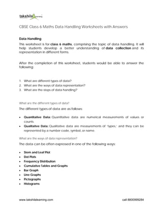
1. www.takshilalearning.com call 8800999284
CBSE Class 6 Maths Data Handling Worksheets with Answers
Data Handling
This worksheet is for class 6 maths, comprising the topic of data handling. It will
help students develop a better understanding of data collection and its
representation in different forms.
After the completion of this worksheet, students would be able to answer the
following:
1. What are different types of data?
2. What are the ways of data representation?
3. What are the steps of data handling?
What are the different types of data?
The different types of data are as follows:
Quantitative Data: Quantitative data are numerical measurements of values or
counts.
Qualitative Data: Qualitative data are measurements of ‘types,’ and they can be
represented by a number code, symbol, or name.
What are the ways of data representation?
The data can be often expressed in one of the following ways:
Stem and Leaf Plot
Dot Plots
Frequency Distribution
Cumulative Tables and Graphs
Bar Graph
Line Graphs
Pictographs
Histograms
2. www.takshilalearning.com call 8800999284
What are the steps of data handling?
In the data handling process, below are the steps involved:
Step I: In the very first step of this process, the problem statement should be
identified as well as defined thoroughly.
Step II: The appropriate data for the particular problem statement needs to be
collected.
Step III: The data gathered should be presented in a meaningful and
understandable manner. It is possible to accomplish this by organising the
collected data in tally marks, table shapes, and other similar formats.
Step IV: Because a graphical or visual representation of the data makes analysis
and comprehension easier, the data can be displayed in graphs, charts, such
as bar graphs and pie charts, and many more.
Step V: The data should be analysed so that the essential information can be
derived from the data, allowing for subsequent actions to be taken.
Step VI: We may deduce the solution to the statement of the problem from the
data analysis.
Now that we have understood how data is collected and analysed, let’s look at
some problems and try to analyse the data.
1. In August 2014, children from six societies of Jaipur were given pulse polio
Drops. The society wise number of children was as follows:
Represent the data by pictograph.
2. The bar graph represents the frequency of vowels in English Paragraph writing.
1. Which of the following letters appeared less than 30 times?
2. Which letter appeared the most?
3. Which letter did you find 40 times?
4. Make a list of all of the vowels in decreasing order of frequency.
3. The below table represents the marks obtained by 6 students in English. For
each name, use a scale of 0.5 cm on the horizontal axis, and 0.5 cm for the
same number of marks on the vertical axis.
4. www.takshilalearning.com call 8800999284
2.
1. Letter “o” appeared less than 30 times.
2. Letter “i” appeared the maximum number of times.
3. Letter “a” appeared 40 times.
4. i, e, u, a, o is the decreasing order of all frequencies.
3. The required bar graph is represented as:
CBSE Class 6 Maths Data Handling Worksheets with Answers Download PDF