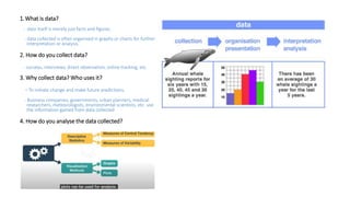
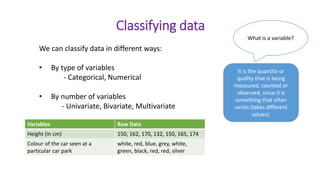
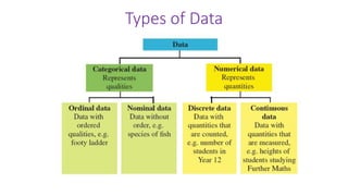
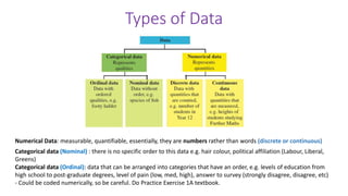
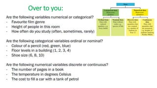
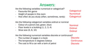
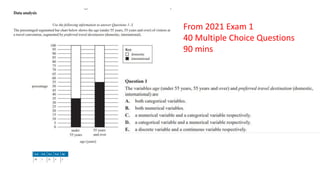
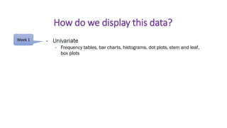
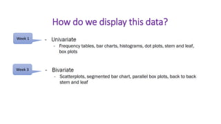
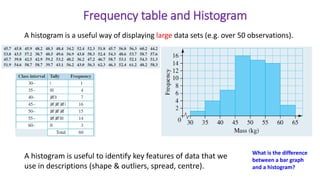
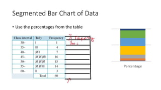
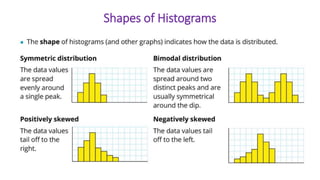
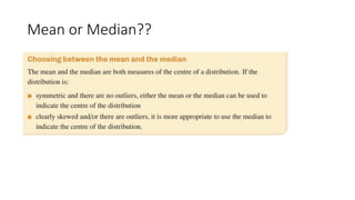
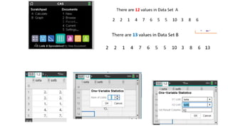
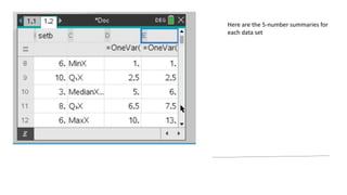
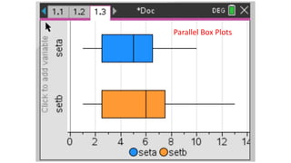
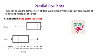
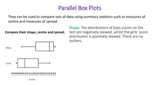
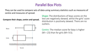
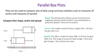
Welcome to General
Mathematics Unit 3
Week 1 - Organising, summarising and
interpreting data
Welcome 
Materials needed for every online lesson:
- VSV FM Unit 3 book
- Cambridge FM textbook
- CAS calculator
Expectations:
- Respect for every student in the online environment
- Everyone’s opinion is valued
- We encourage you to participate and ask questions throughout
- Most of all, enjoy 
Data Analysis (CORE)
Warm up activity
1. What is data?
2. How do you collect data?
3. Why collect data? Who uses it?
4. How do you analyse the data collected?
1.What is data?
- data itself is merely just facts and figures.
- data collected is often organised in graphs or charts for further
interpretation or analysis.
2. How do you collect data?
- surveys, interviews, direct observation, online tracking, etc.
3. Why collect data? Who uses it?
- To initiate change and make future predictions.
- Business companies, governments, urban planners, medical
researchers, meteorologists, environmental scientists, etc. use
the information gained from data collected
4. How do you analyse the data collected?
We can classify data in different ways:
• By type of variables
- Categorical, Numerical
• By number of variables
- Univariate, Bivariate, Multivariate
Classifying data
What is a variable?
It is the quantity or
quality that is being
measured, counted or
observed, since it is
something that often
varies (takes different
values).
Variables Raw Data
Height (in cm) 150, 162, 170, 132, 150, 165, 174
Colour of the car seen at a
particular car park
white, red, blue, grey, white,
green, black, red, red, silver
Types of Data
Types of Data
Numerical Data: measurable, quantifiable, essentially, they are numbers rather than words (discrete or continuous)
Categorical data (Nominal) : there is no specific order to this data e.g. hair colour, political affiliation (Labour, Liberal,
Greens)
Categorical data (Ordinal): data that can be arranged into categories that have an order, e.g. levels of education from
high school to post-graduate degrees, level of pain (low, med, high), answer to survey (strongly disagree, disagree, etc)
- Could be coded numerically, so be careful. Do Practice Exercise 1A textbook.
Over to you:
Answers:
From 2021 Exam 1
40 Multiple Choice Questions
90 mins
How do we display this data?
Week 1
How do we display this data?
Week 1
Week 3
Displaying data
What is this graph called?
For what type of
data do we use it??
Displaying data
Frequency Table and Histogram
A histogram is a useful way of displaying large data sets (e.g. over 50 observations).
How do you do the tally?
Frequency table and Histogram
What is the difference
between a bar graph
and a histogram?
A histogram is a useful way of displaying large data sets (e.g. over 50 observations).
A histogram is useful to identify key features of data that we
use in descriptions (shape & outliers, spread, centre).
Label both
axes
Frequency table and Histogram
What is the difference
between a bar graph
and a histogram?
A histogram is a useful way of displaying large data sets (e.g. over 50 observations).
A histogram is useful to identify key features of data that we
use in descriptions (shape & outliers, spread, centre).
Segmented Bar Chart of Data
• Use the percentages from the table
Shapes of Histograms
Mean or Median??
Dot Plots
Best for small set of
discrete numerical data
Segmented Bar Chart
Can you describe the shape of the distribution from the stem plot?
You must use
specific word(s) to
describe the shape
Stem and Leaf Plot
Important as
Measures of centre?
Measures of spread?
I’ve learnt
them
before
Measures of centre?
Measures of spread?
Measures of centre or central tendency  mode, median, mean
Measures of spread  range, interquartile range
 standard deviation
(i) Find the modal and median test scores achieved by the boys and girls.
(ii) Who perform better – the boys or the girls? Justify your answer.
Remember:
Count the number of data
values on each side of the
stem before you find the
median value.
(i) Find the modal and median test scores achieved by the girls and boys.
(ii)Who performed better – the girls or the boys? Justify your answer.
There are 10 boys and 10 girls.
(i) Modal test scores for
 girls = 16 and 19
 boys = 13 and 14
Median score for
 girls =16.5
 boys = 14
(ii) The girls did better because they have a
higher median score.
To further justify, calculate their mean score.
Girls average = 166/10 = 16.6 marks
Boys average = 139/10 = 13.9 marks
Median for girls:
12, 15, 16, 16, 16, 17, 17, 19, 19, 19
Median = average of the two middle values
Can you tell the shape of each stem plot?
A box plot gives us a very clear visual display of how the data are spread out. It shows where its centre (median) lies, and
how varied the values are. A box plot uses five critical numbers, referred to as the five-number summary, to provide a
visual summary of a distribution.
Box Plots
Refer VSV Week 1
Learning Serve 3
for more details
Lower quartile
Upper quartile
What is
Q1, Q2
and Q3?
Finding the five-number summary of an even numbered data set Versus an odd numbered data set
There are 13 values in Data Set B
There are 12 values in Data Set A
2 2 1 4 7 6 5 5 10 3 8 6
Step 1: Re-arrange them in ascending order
1 2 2 3 4 5 5 6 6 7 8 10
Step 2: Find min., Q1, median, Q3, max.
2 2 1 4 7 6 5 5 10 3 8 6 13
Step 1: Re-arrange them in ascending order
Step 2: Find min., Q1, median, Q3, max.
1 2 2 3 4 5 5 6 6 7 8 10 13
Five number summary:
Min =
Q1 =
Median =
Q3 =
Max =
Five number summary:
Min =
Q1 =
Median =
Q3 =
Max =
Finding the five-number summary of an even numbered data set Versus an odd numbered data set
There are 13 values in Data Set B
There are 12 values in Data Set A
2 2 1 4 7 6 5 5 10 3 8 6
Step 1: Re-arrange them in ascending order
1 2 2 3 4 5 5 6 6 7 8 10
Step 2: Find min., Q1, median, Q3, max.
2 2 1 4 7 6 5 5 10 3 8 6 13
Step 1: Re-arrange them in ascending order
Step 2: Find min., Q1, median, Q3, max.
1 2 2 3 4 5 5 6 6 7 8 10 13
Five number summary:
Min = 1
Q1 = 2.5
Median = 5
Q3 = 6.5
Max = 10
Five number summary:
Min = 1
Q1 = 2.5
Median = 5
Q3 = 7.5
Max = 13
Here are the 5-number summaries for
each data set
Parallel Box Plots
Finding the five-number summary of an even numbered data set Versus an odd numbered data set
There are 13 values in Data Set B
There are 12 values in Data Set A
2 2 1 4 7 6 5 5 10 3 8 6
Step 1: Re-arrange them in ascending order
1 2 2 3 4 5 5 6 6 7 8 10
Step 2: Find min., Q1, median, Q3, max.
2 2 1 4 7 6 5 5 10 3 8 6 13
Step 1: Re-arrange them in ascending order
Step 2: Find min., Q1, median, Q3, max.
1 2 2 3 4 5 5 6 6 7 8 10 13
Five number summary:
Min = 1
Q1 = 2.5
Median = 5
Q3 = 6.5
Max = 10
Five number summary:
Min = 1
Q1 = 2.5
Median = 5
Q3 = 7.5
Max = 13
Outliers
Work out the five number
summary , LF and UF
Lower Fence =
(LF)
Upper Fence =
(UF)
Outliers
Lower Fence =
(LF)
Upper Fence =
(UF)
Describing Box Plots
Further reading:
Textbook pages 68 -70
- Outliers
Comparing Distributions
- Outliers
Median
Range and IQR
Skewedness
Values outside the LF and UF.
(Usually their presence/absence is mentioned together with the shape)
Comparing Distributions
They can be used to compare sets of data using summary statistics such as measures of
centre and measures of spread.
Compare their shape, centre and spread.
Parallel Box Plots
Parallel Box Plots
Shape: The distributions of boys scores on the
test are negatively skewed, whilst the girls’ score
distribution is positively skewed. There are no
outliers.
Compare their shape, centre and spread.
They can be used to compare sets of data using summary statistics such as measures of
centre and measures of spread.
Centre: The median score for boys is higher
(M = 23) than for girls (M= 9.5).
Parallel Box Plots
Shape: The distributions of boys scores on the test are
negatively skewed, whilst the girls’ score distribution is
positively skewed. There are no outliers.
Compare their shape, centre and spread.
They can be used to compare sets of data using summary statistics such as measures of
centre and measures of spread.
Centre: The median score for boys is higher (M = 23) than
for girls (M= 9.5).
Spread: This IQR is smaller for boys (IQR = 9.5) than for girls
(IQR =12). The range of scores for boys (range = 18.5) and
girls (range = 19) is almost the same.
log 10 000 =4
log 1 = 0
Log Scales
Using Logarithmic (base 10) scale for DATA
RAW DATA LOG(DATA)
Refer to Cambridge textbook Chapter 1E 10 100 1000 10 000 100 000
2017 VCAA Exam 1
2017 VCAA Exam 1
Answer D
2023 Week 1 Lesson Powerpoint.pptx

2023 Week 1 Lesson Powerpoint.pptx

  • 1.
    Welcome to General MathematicsUnit 3 Week 1 - Organising, summarising and interpreting data
  • 3.
    Welcome  Materials neededfor every online lesson: - VSV FM Unit 3 book - Cambridge FM textbook - CAS calculator Expectations: - Respect for every student in the online environment - Everyone’s opinion is valued - We encourage you to participate and ask questions throughout - Most of all, enjoy 
  • 4.
    Data Analysis (CORE) Warmup activity 1. What is data? 2. How do you collect data? 3. Why collect data? Who uses it? 4. How do you analyse the data collected?
  • 5.
    1.What is data? -data itself is merely just facts and figures. - data collected is often organised in graphs or charts for further interpretation or analysis. 2. How do you collect data? - surveys, interviews, direct observation, online tracking, etc. 3. Why collect data? Who uses it? - To initiate change and make future predictions. - Business companies, governments, urban planners, medical researchers, meteorologists, environmental scientists, etc. use the information gained from data collected 4. How do you analyse the data collected?
  • 6.
    We can classifydata in different ways: • By type of variables - Categorical, Numerical • By number of variables - Univariate, Bivariate, Multivariate Classifying data What is a variable? It is the quantity or quality that is being measured, counted or observed, since it is something that often varies (takes different values). Variables Raw Data Height (in cm) 150, 162, 170, 132, 150, 165, 174 Colour of the car seen at a particular car park white, red, blue, grey, white, green, black, red, red, silver
  • 7.
  • 8.
    Types of Data NumericalData: measurable, quantifiable, essentially, they are numbers rather than words (discrete or continuous) Categorical data (Nominal) : there is no specific order to this data e.g. hair colour, political affiliation (Labour, Liberal, Greens) Categorical data (Ordinal): data that can be arranged into categories that have an order, e.g. levels of education from high school to post-graduate degrees, level of pain (low, med, high), answer to survey (strongly disagree, disagree, etc) - Could be coded numerically, so be careful. Do Practice Exercise 1A textbook.
  • 9.
  • 10.
  • 11.
    From 2021 Exam1 40 Multiple Choice Questions 90 mins
  • 13.
    How do wedisplay this data? Week 1
  • 14.
    How do wedisplay this data? Week 1 Week 3
  • 15.
    Displaying data What isthis graph called? For what type of data do we use it??
  • 16.
  • 17.
    Frequency Table andHistogram A histogram is a useful way of displaying large data sets (e.g. over 50 observations). How do you do the tally?
  • 18.
    Frequency table andHistogram What is the difference between a bar graph and a histogram? A histogram is a useful way of displaying large data sets (e.g. over 50 observations). A histogram is useful to identify key features of data that we use in descriptions (shape & outliers, spread, centre). Label both axes
  • 19.
    Frequency table andHistogram What is the difference between a bar graph and a histogram? A histogram is a useful way of displaying large data sets (e.g. over 50 observations). A histogram is useful to identify key features of data that we use in descriptions (shape & outliers, spread, centre).
  • 20.
    Segmented Bar Chartof Data • Use the percentages from the table
  • 21.
  • 22.
  • 23.
  • 25.
    Dot Plots Best forsmall set of discrete numerical data
  • 26.
  • 27.
    Can you describethe shape of the distribution from the stem plot? You must use specific word(s) to describe the shape Stem and Leaf Plot Important as
  • 28.
    Measures of centre? Measuresof spread? I’ve learnt them before
  • 29.
    Measures of centre? Measuresof spread? Measures of centre or central tendency  mode, median, mean Measures of spread  range, interquartile range  standard deviation
  • 31.
    (i) Find themodal and median test scores achieved by the boys and girls. (ii) Who perform better – the boys or the girls? Justify your answer. Remember: Count the number of data values on each side of the stem before you find the median value.
  • 32.
    (i) Find themodal and median test scores achieved by the girls and boys. (ii)Who performed better – the girls or the boys? Justify your answer. There are 10 boys and 10 girls. (i) Modal test scores for  girls = 16 and 19  boys = 13 and 14 Median score for  girls =16.5  boys = 14 (ii) The girls did better because they have a higher median score. To further justify, calculate their mean score. Girls average = 166/10 = 16.6 marks Boys average = 139/10 = 13.9 marks Median for girls: 12, 15, 16, 16, 16, 17, 17, 19, 19, 19 Median = average of the two middle values Can you tell the shape of each stem plot?
  • 33.
    A box plotgives us a very clear visual display of how the data are spread out. It shows where its centre (median) lies, and how varied the values are. A box plot uses five critical numbers, referred to as the five-number summary, to provide a visual summary of a distribution. Box Plots Refer VSV Week 1 Learning Serve 3 for more details Lower quartile Upper quartile What is Q1, Q2 and Q3?
  • 34.
    Finding the five-numbersummary of an even numbered data set Versus an odd numbered data set There are 13 values in Data Set B There are 12 values in Data Set A 2 2 1 4 7 6 5 5 10 3 8 6 Step 1: Re-arrange them in ascending order 1 2 2 3 4 5 5 6 6 7 8 10 Step 2: Find min., Q1, median, Q3, max. 2 2 1 4 7 6 5 5 10 3 8 6 13 Step 1: Re-arrange them in ascending order Step 2: Find min., Q1, median, Q3, max. 1 2 2 3 4 5 5 6 6 7 8 10 13 Five number summary: Min = Q1 = Median = Q3 = Max = Five number summary: Min = Q1 = Median = Q3 = Max =
  • 35.
    Finding the five-numbersummary of an even numbered data set Versus an odd numbered data set There are 13 values in Data Set B There are 12 values in Data Set A 2 2 1 4 7 6 5 5 10 3 8 6 Step 1: Re-arrange them in ascending order 1 2 2 3 4 5 5 6 6 7 8 10 Step 2: Find min., Q1, median, Q3, max. 2 2 1 4 7 6 5 5 10 3 8 6 13 Step 1: Re-arrange them in ascending order Step 2: Find min., Q1, median, Q3, max. 1 2 2 3 4 5 5 6 6 7 8 10 13 Five number summary: Min = 1 Q1 = 2.5 Median = 5 Q3 = 6.5 Max = 10 Five number summary: Min = 1 Q1 = 2.5 Median = 5 Q3 = 7.5 Max = 13
  • 37.
    Here are the5-number summaries for each data set
  • 38.
  • 39.
    Finding the five-numbersummary of an even numbered data set Versus an odd numbered data set There are 13 values in Data Set B There are 12 values in Data Set A 2 2 1 4 7 6 5 5 10 3 8 6 Step 1: Re-arrange them in ascending order 1 2 2 3 4 5 5 6 6 7 8 10 Step 2: Find min., Q1, median, Q3, max. 2 2 1 4 7 6 5 5 10 3 8 6 13 Step 1: Re-arrange them in ascending order Step 2: Find min., Q1, median, Q3, max. 1 2 2 3 4 5 5 6 6 7 8 10 13 Five number summary: Min = 1 Q1 = 2.5 Median = 5 Q3 = 6.5 Max = 10 Five number summary: Min = 1 Q1 = 2.5 Median = 5 Q3 = 7.5 Max = 13
  • 40.
    Outliers Work out thefive number summary , LF and UF Lower Fence = (LF) Upper Fence = (UF)
  • 41.
  • 42.
    Describing Box Plots Furtherreading: Textbook pages 68 -70
  • 43.
  • 44.
    - Outliers Median Range andIQR Skewedness Values outside the LF and UF. (Usually their presence/absence is mentioned together with the shape) Comparing Distributions
  • 45.
    They can beused to compare sets of data using summary statistics such as measures of centre and measures of spread. Compare their shape, centre and spread. Parallel Box Plots
  • 46.
    Parallel Box Plots Shape:The distributions of boys scores on the test are negatively skewed, whilst the girls’ score distribution is positively skewed. There are no outliers. Compare their shape, centre and spread. They can be used to compare sets of data using summary statistics such as measures of centre and measures of spread.
  • 47.
    Parallel Box Plots Shape:The distributions of boys scores on the test are negatively skewed, whilst the girls’ score distribution is positively skewed. There are no outliers. Compare their shape, centre and spread. They can be used to compare sets of data using summary statistics such as measures of centre and measures of spread. Centre: The median score for boys is higher (M = 23) than for girls (M= 9.5).
  • 48.
    Parallel Box Plots Shape:The distributions of boys scores on the test are negatively skewed, whilst the girls’ score distribution is positively skewed. There are no outliers. Compare their shape, centre and spread. They can be used to compare sets of data using summary statistics such as measures of centre and measures of spread. Centre: The median score for boys is higher (M = 23) than for girls (M= 9.5). Spread: This IQR is smaller for boys (IQR = 9.5) than for girls (IQR =12). The range of scores for boys (range = 18.5) and girls (range = 19) is almost the same.
  • 49.
    log 10 000=4 log 1 = 0 Log Scales
  • 50.
    Using Logarithmic (base10) scale for DATA
  • 51.
  • 52.
    Refer to Cambridgetextbook Chapter 1E 10 100 1000 10 000 100 000
  • 53.
  • 54.
    2017 VCAA Exam1 Answer D